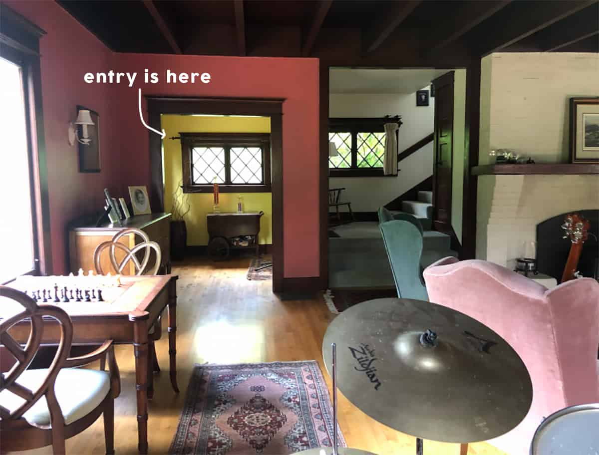
**It’s election day and I hope you all had the opportunity to vote. I’m sure many of us will be glued to political sites and the news, and when you are ready for a design distraction while we await the results, I’ve got one for you today. xx There are some rooms that I’m struggling with (the living room), but this little entry is so bright and contained that I feel like no matter what we do it’s going to be so cute. Obviously, it’s the first room that you walk into and see, so it has the opportunity to set the tone for the house. You can see it from the living room so it should correspond, but it has a clear delineation of space so it’s the perfect little room to wallpaper with a pattern that will catch your eye from the living room and give you (me) a little burst of happiness even when you aren’t in it.
The Entry Before
There she was before the project started – it was darker for sure (and fun fact–we salvaged one of those smaller windows in the entry and put in the new guest bath. It is inoperable but so cute).
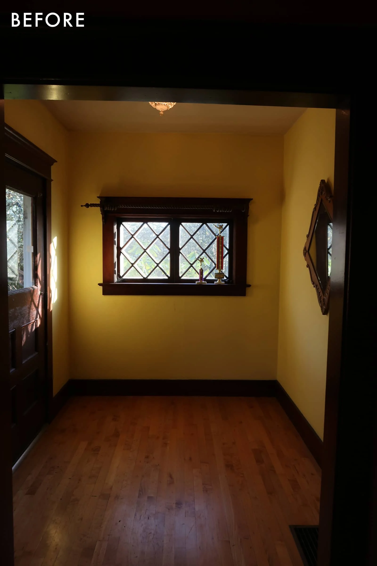
You get a good idea of the bones from this shot. It’s a nice generous size–big enough for a bench or console, coat rack, a big piece of art, maybe some candle sconces, a rug, etc. This room feels so easy to me which I really really appreciate 🙂
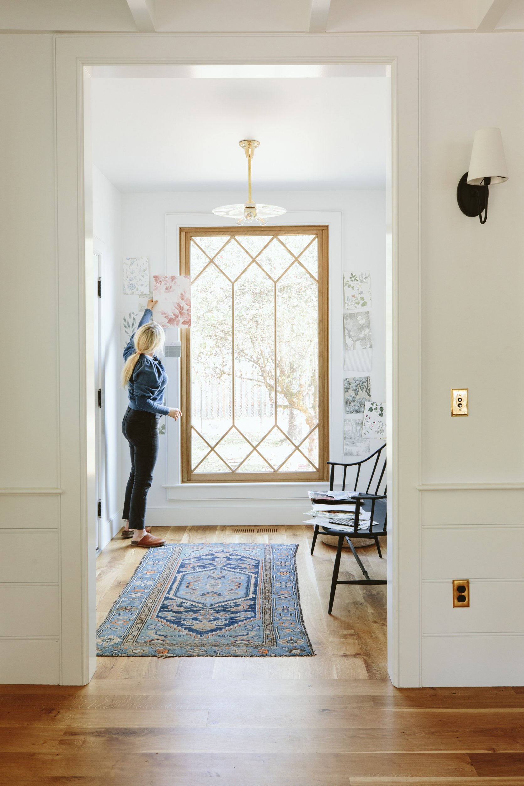
That custom Sierra pacific white oak window made my entry dreams come true. It brought so much light into the space, with views of the ancient apple orchard. ARCIFORM (hi Stephyn) helped draw out the proportions of the window grid so that it married the two styles of the house–the upstairs diamond pattern with the simpler squared-off pattern of the new windows on the first floor (we did this special pattern in the entry and sunroom but it was very splurgy so we kept the rest of the windows a simple grid for budget reasons). Knowing that we have yet to paint the living room, I kinda want to dial that room in before we make a wallpaper decision in here. Remember that the living room is more our problem child so I need to give that baby the attention it deserves before helping the easy kid learn math. Or maybe I’ll just choose my favorite and keep building the rooms together. I’m having such issues focusing and making any decisions in the living room (I think have SAD, btw) but I NEED to keep moving so maybe I will just choose my favorite in here and hope/feel confident that we’ll make it work with whatever we choose in the living room.
The light fixture is a vintage milk glass disc from Rejuvenation’s vintage and antique section. We put it on an unlacquered metal rod and their experts used a 3-bulb vintage base – which looks so awesome. We love that it has a presence but doesn’t distract from the window and isn’t too busy.
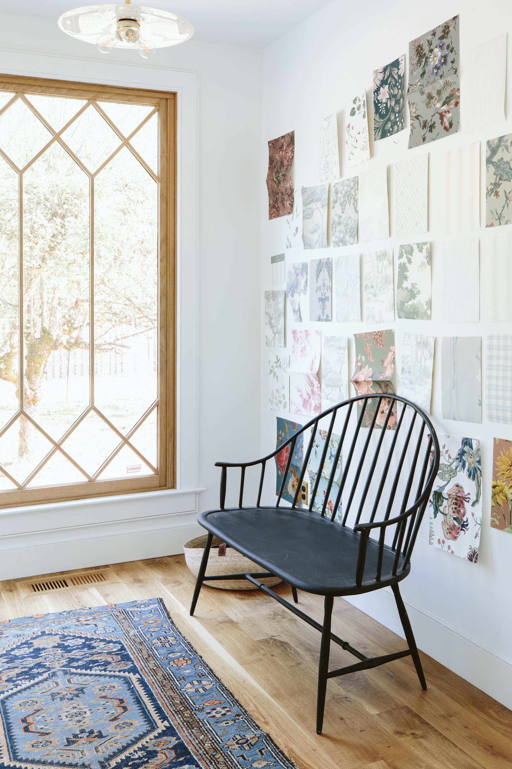
I love that Rejuvenation bench in here, but it’s actually a metal outdoor bench and we need a longer piece in here anyway, but she is really good. I’ve ordered this one from Thos. Moser which I think is going to be stunning and we’ll put this metal bench out on the front or back porch.
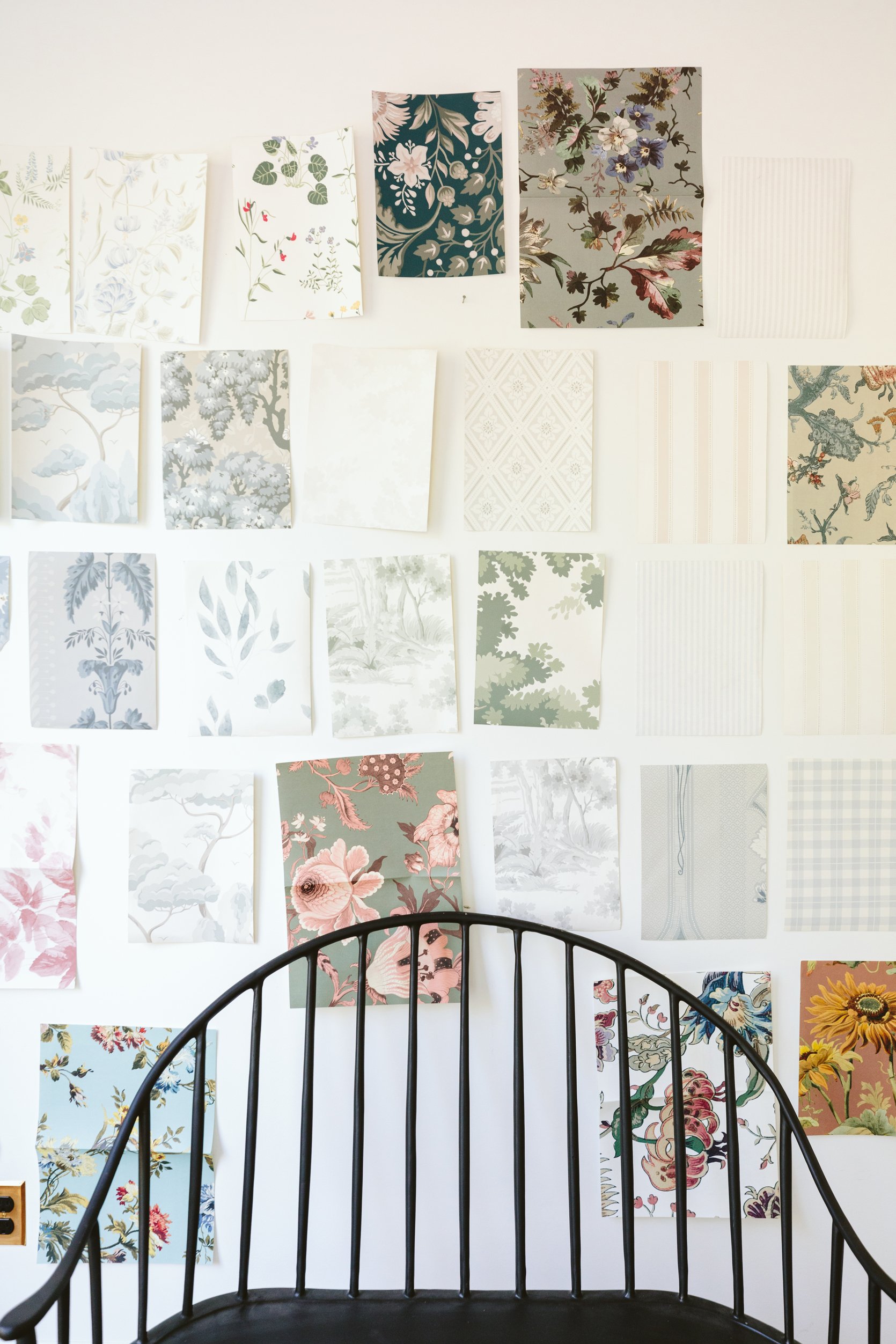
The wallpapers are mostly from Scandinavian Wallpaper, Schumacher, and House of Hackney. After we shot this I also was reminded by a reader about Kelly Ventura‘s new line. I promptly ordered so many samples that I just received and they are SO GORGEOUS. While I love all of these for different reasons I think Brian and I both want something that is soft, not too bold, and while I can go far into the floral world we both want it to be less Eccentric English Granny and more Chic Scandinavian Farmer, because that’s a thing (??). I actually ordered the bolder patterns for the upstairs guest bath (the pink bath) but I figured looking at them here gives us more to compare to and might help us hone in on what we love more.
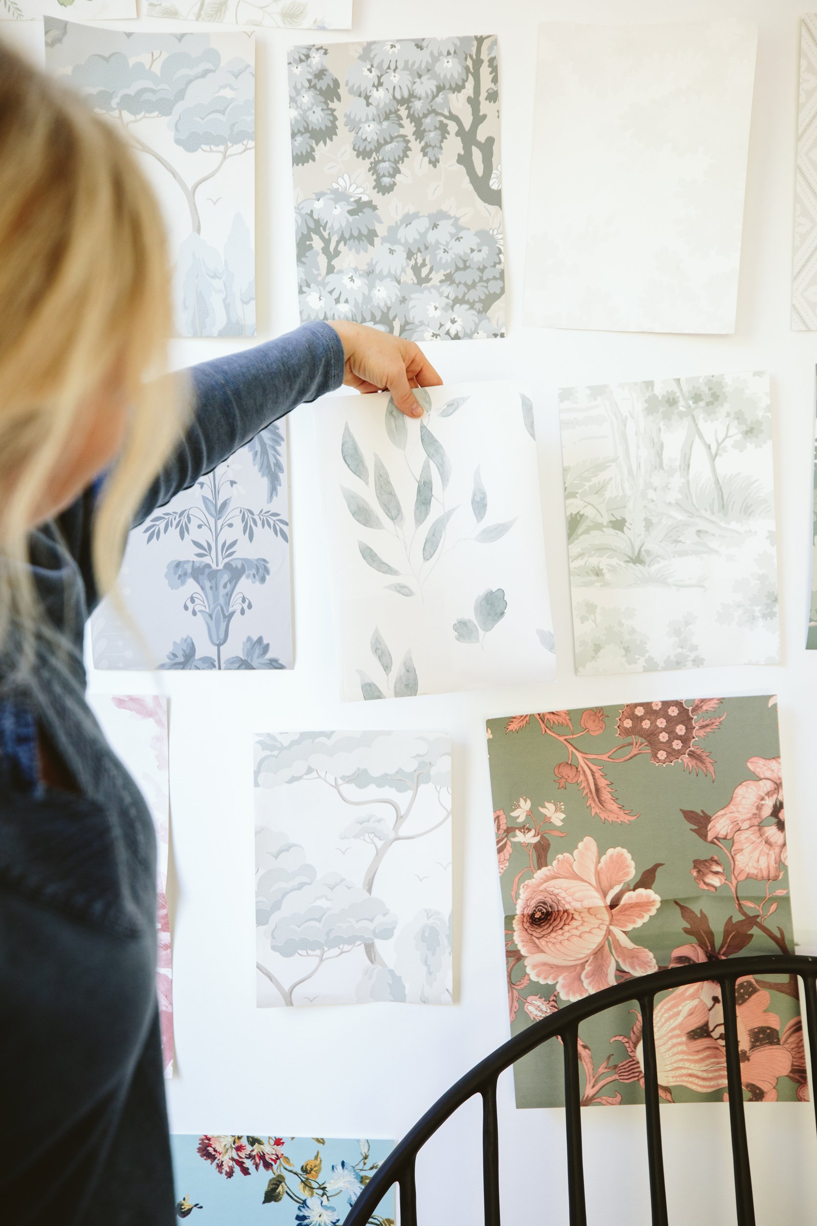
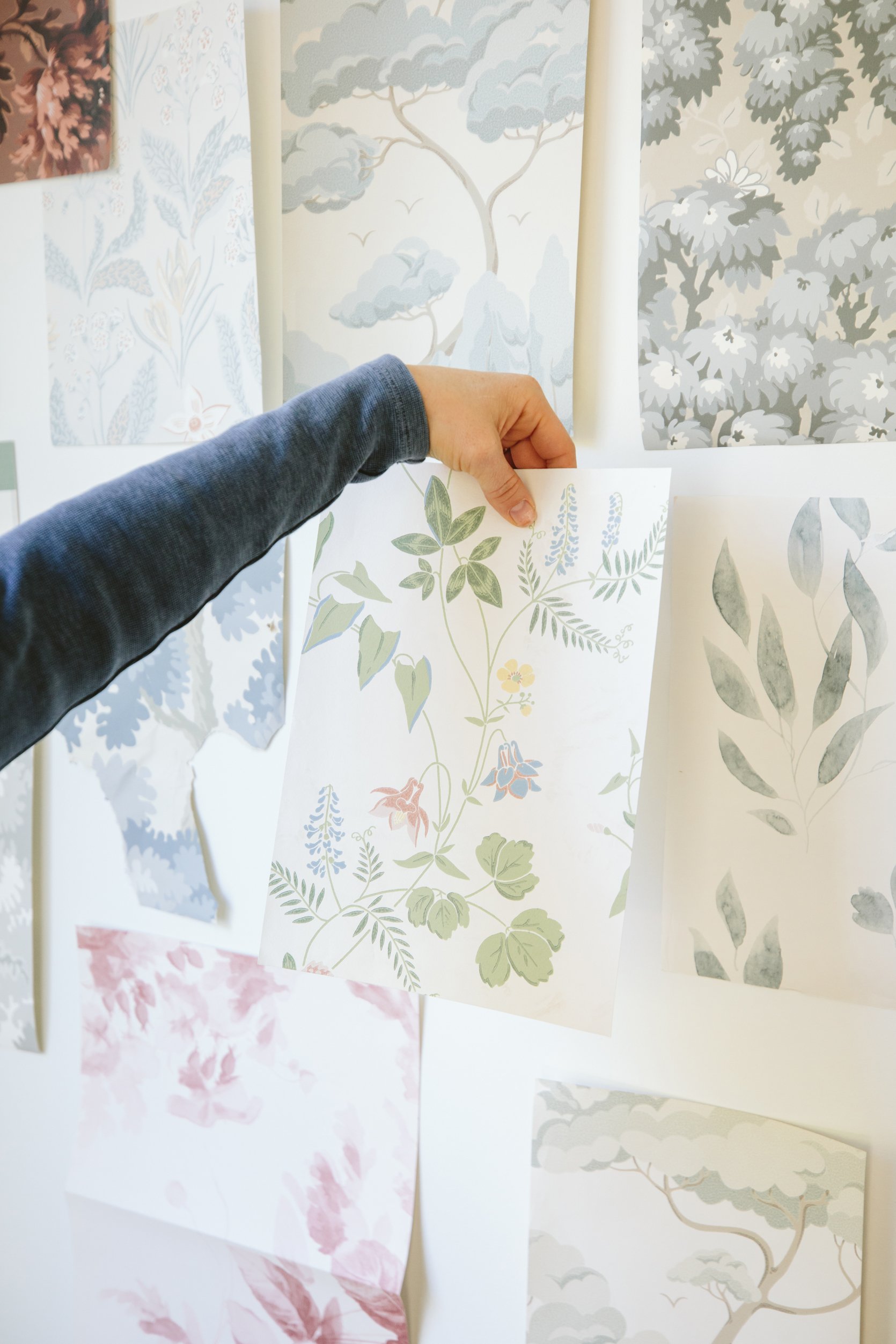
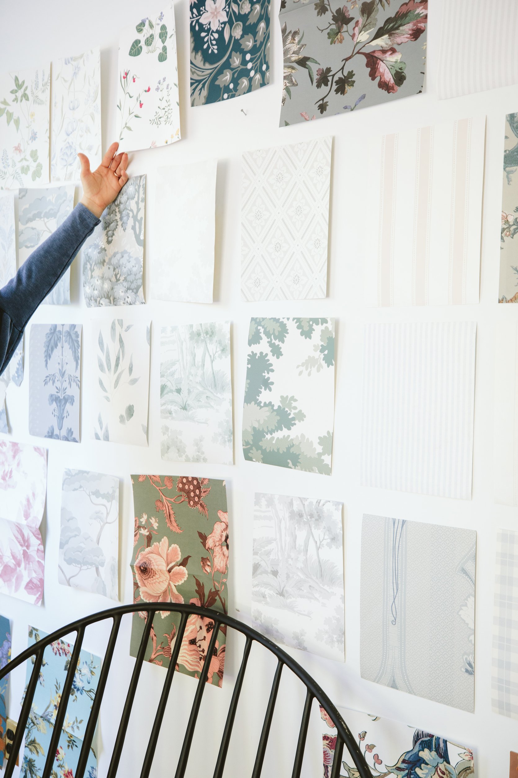
It’s hard to decide because some of my favorites up on that wall we’ve seen a million times and nothing should be wrong with that, but it’s making it harder to commit. While others might be less ‘classic’ or more contemporary. I can’t tell you how helpful it is to be able to stare at it in these photos – giving me some distance from it which offers a bit of clarity.
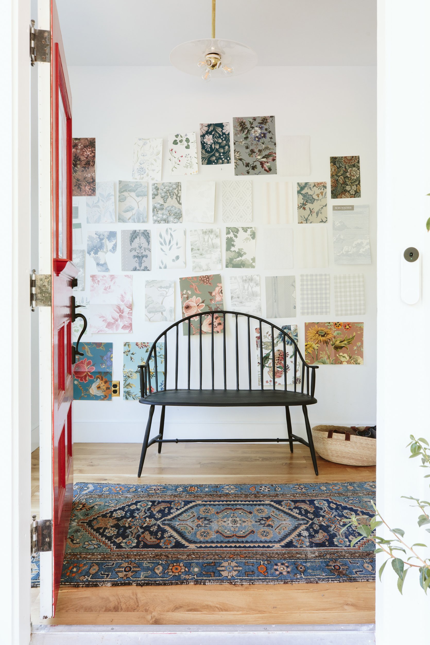
Unfortunately, there is no clear winner yet. Brian really likes the one that is blue watercolor leaves and the longer we sit with it the more I think he’s right – at first, I thought it might be a bit too mellow but it has such nice movement, with an organic pattern that has life but definitely not bold. But some of these Kelly Ventura floral patterns (not shown) are so beautiful and just excite me more. But I’ve also learned that not everything has to be exciting and with the window, rug, art, candle sconces that I’d like to add, coat stand (yet to buy), bench, and light fixture there are already a lot of beautiful things happening. Stay tuned 🙂
Resources:
Floors: Oregon White Oak by Zena Flooring
Door Color: Poinsettia by Sherwin-Williams
Wall Color: Extra White by Sherwin-Williams
Windows: White Oak Sierra Pacific Windows
Bench: Rejuvenation
Light: Rejuvenation
Rug: Vintage
Basket: The Citizenry
Photos by Kaitlin Green
THIS POST WAS ORIGINALLY PUBLISHED HERE.
