Today is an epic show-and-tell for all of those who have been following along on this project. It’s our farmhouse kitchen reveal, where after two years of ARCIFORM and I tweaking renderings, our Pinocchio has come to life. And I’m not lying, I love this real boy more than I thought possible. When we first walked into the kitchen two and a half months ago, after all the plastic was finally removed from painting, it was a super surreal feeling — like I’d been here before. I knew this kitchen so well, even though it had only existed on a computer screen. The emotional relationship with the room was deep and complicated. As all creatives know, after working on something for a long time (almost two years), when you are finally “done” and you put it out into the world, it’s really hard to know how good it is, or what “good” even means in this nutty universe full of endless images, extreme creativity, trends, and comparisons — especially when it comes to your home, a space so deeply personal. Anyone designing their home or creating a piece of art has such an intertwined history with the piece/room, an emotional relationship with every decision they made, and likely a fraught connection with their own creativity and confidence. Expectations are impossible to manage internally — and likely externally — throughout the process. So, I’m VERY, VERY, VERY excited to say that while I’m too close to it to know how “good” this kitchen is, it doesn’t matter — we love the hell out of this room and feel excited and proud to cook in here with our family for hours and hours each week. The colors. The materials. The light. The functionality. The soul. We really, really, really love it.
Before we get into the nitty gritty and all of the pretty photos, Brian shot a quick video tour of me in the kitchen so y’all can interact with the space. Just wait for the ad to play first then enjoy:)
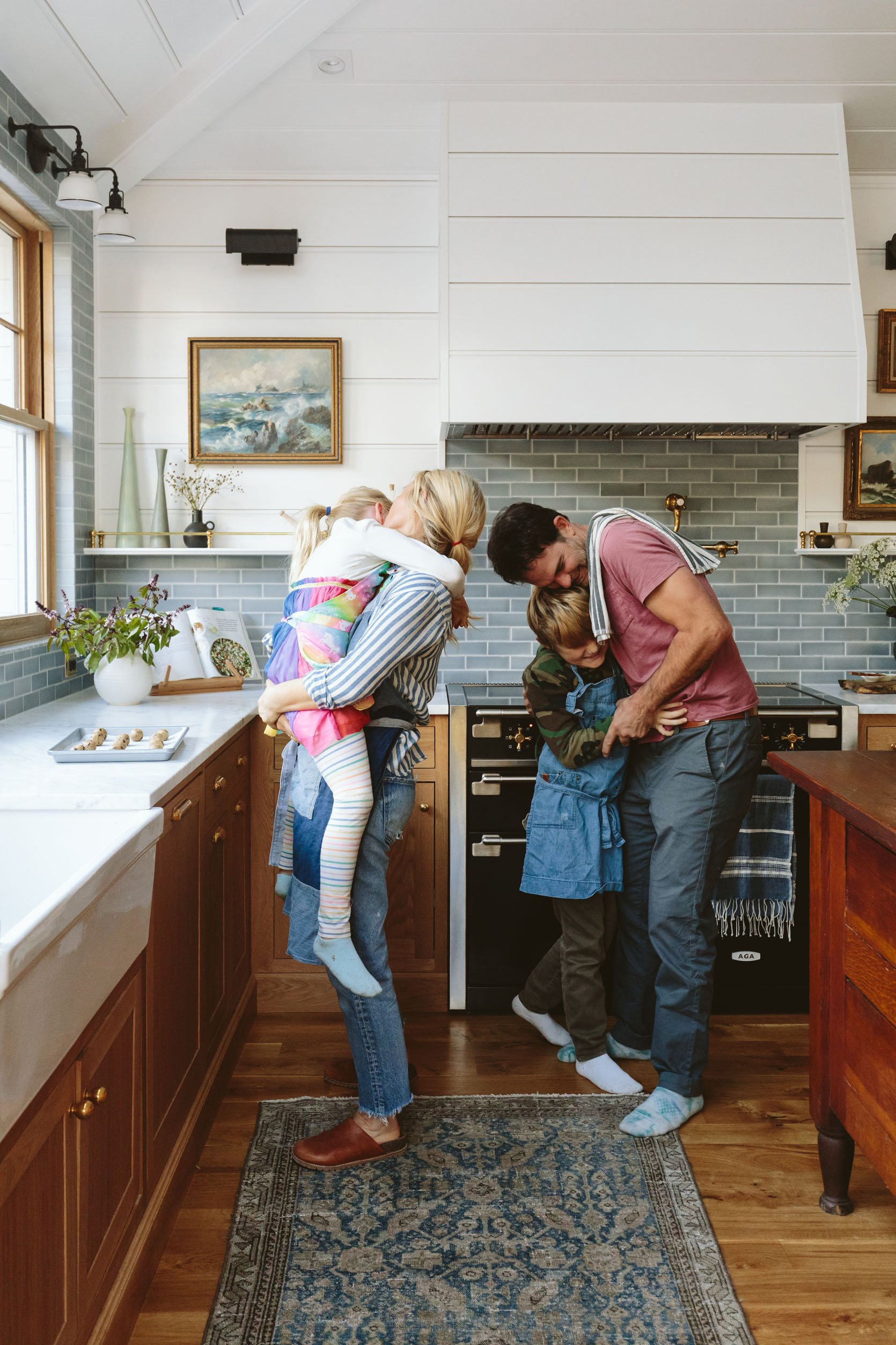
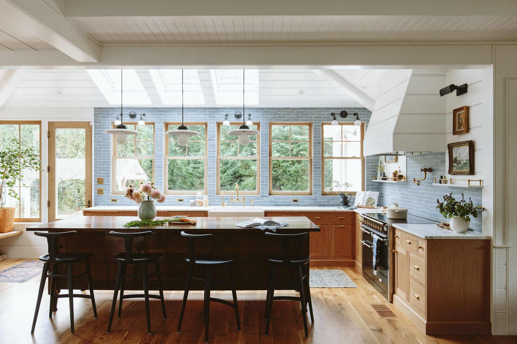
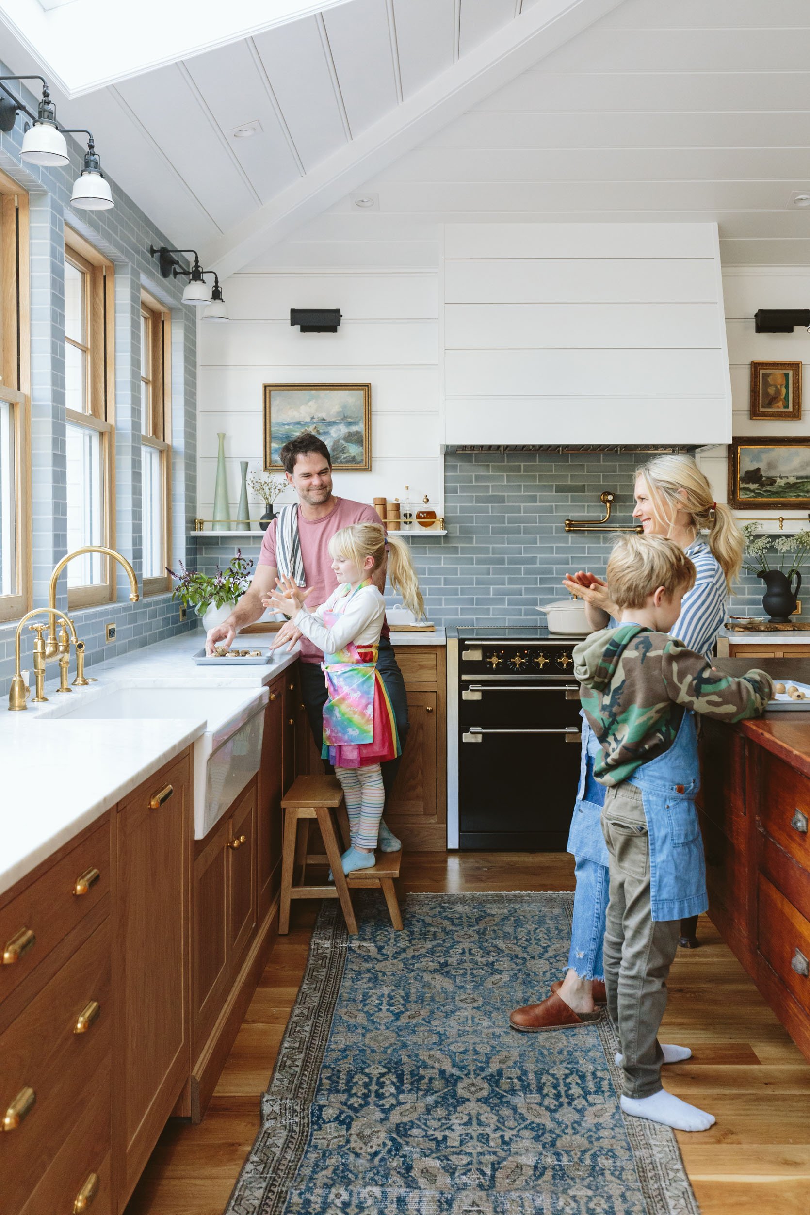
Proof of our love (with some help from tickling our kids). I think the biggest challenge of this entire home was (and still is) figuring out how to lean in to “farmhouse” in a way that feels modern and “us,” something that isn’t too safe but also not taking a risk or going after any trend that I would get sick of. Finding that perfect spot between busy and boring, or timeless and on trend, takes more obsession and thought than you’d think. And for better or worse, I’ve become more and more conservative the older I get (public regrets will do that to you). The obsessing worked, and I’m happy to report that there are very few things I would tweak — and I have such love for all the details and materials. I gushed about every detail in the design post for this kitchen, but now that it’s fully installed and you can see how everything plays together, I’ll give you a quick (ha) rundown of why I think it works and any lessons you could possibly glean.
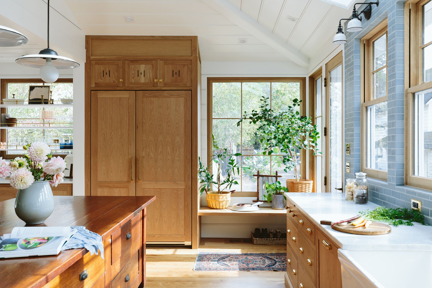
The White Oak Custom Cabinetry
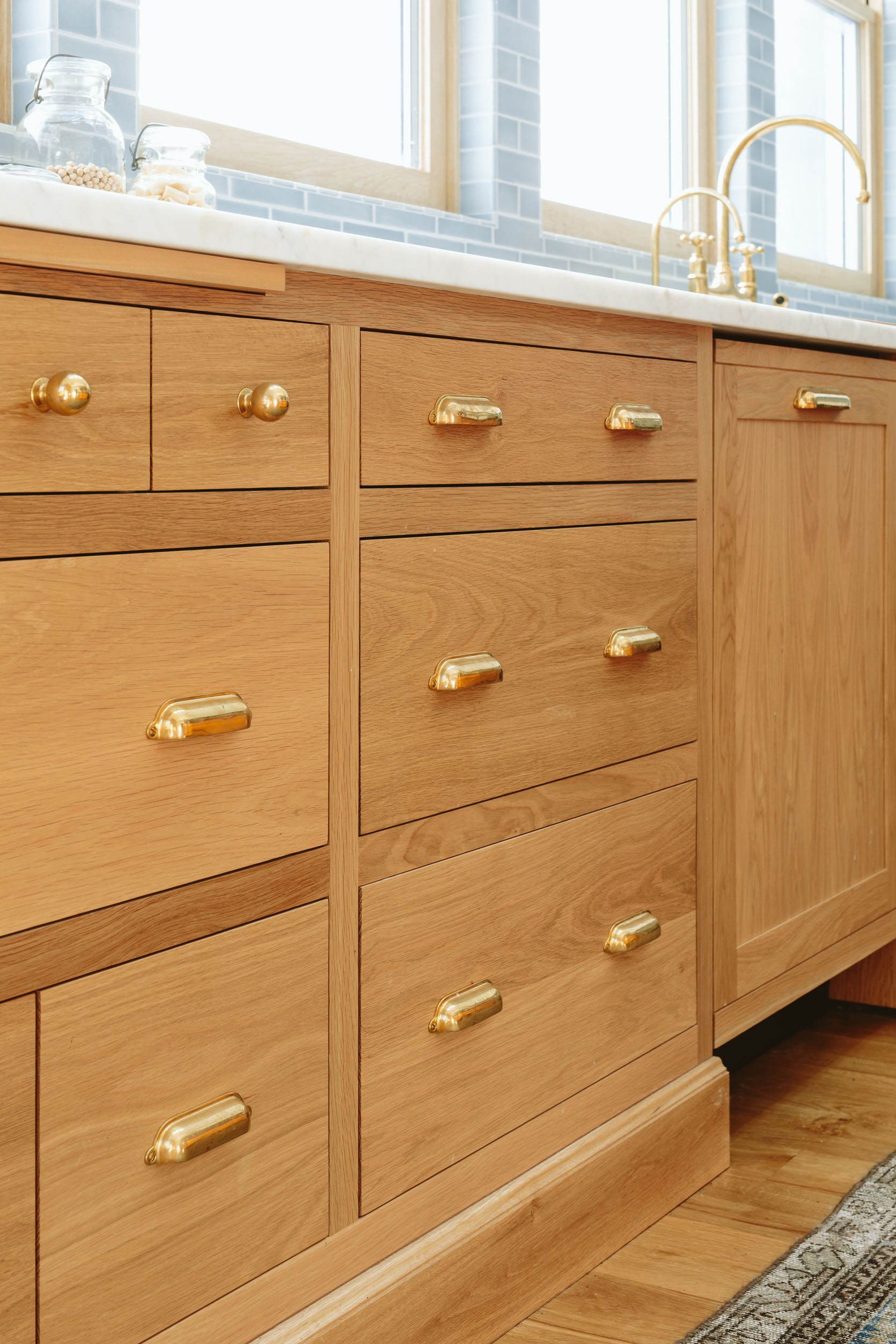
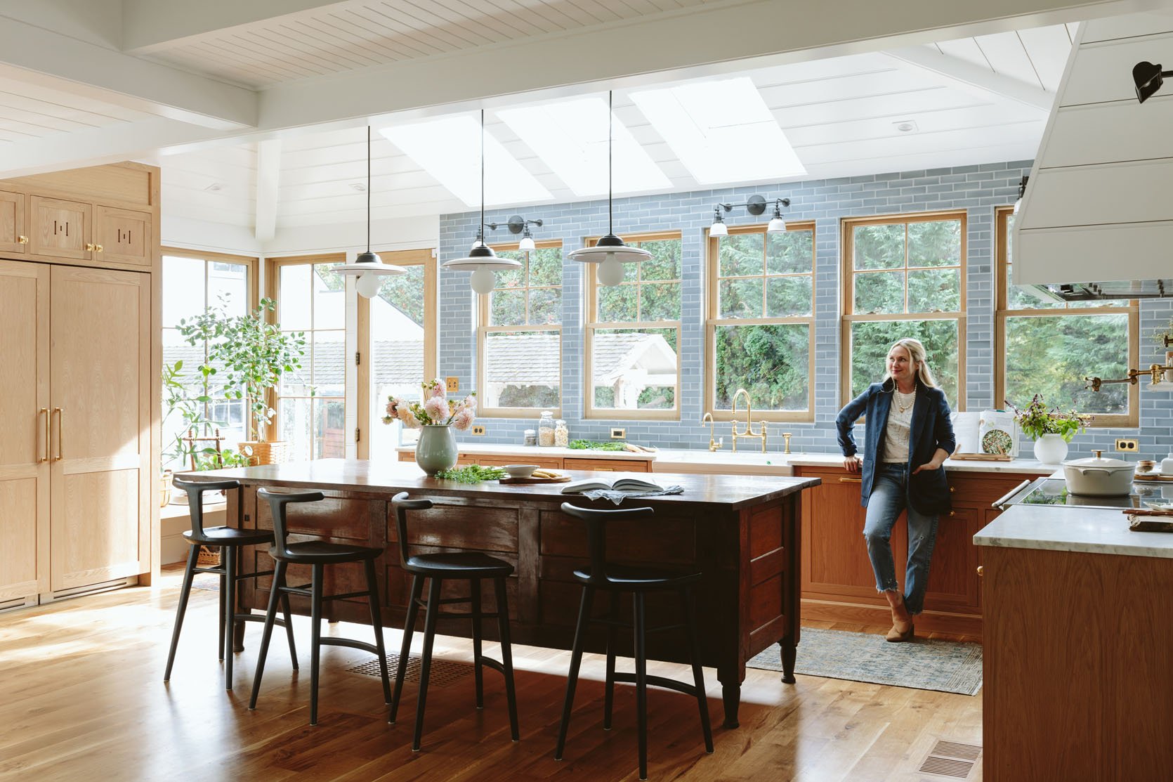
The cabinets from Unique Kitchens & Baths are just so stunning (and high quality). Laying out the cabinets and navigating the perfect functionality took time with the UKB and ARCIFORM teams (and it was so fun, documented here), but choosing the white oak shaker-style boxes and fronts was something we wanted almost from the beginning. For like five minutes we were nervous about mixing the white oak with the darker wood of the island, but Anne from ARCIFORM assured us early on that mixing awesome woods together always works, and she was right. We partnered with Unique Kitchens & Baths, who are FULL-SERVICE and incredibly experienced. You don’t need a designer — they will be your designer as part of their service, plus they do all the renderings, etc. (You still pick tile and lighting, but they’ll plug it in to the design. We didn’t go the renderings route because we didn’t want to show you their SketchUp drawings, since that would literally have given the whole kitchen away — they look so real!!) We wrote about it in this post, but I need you to know how high quality they are, how beautiful they are, how experienced they are — all of it. We are going to shoot the insides of the cabinets soon so you can see all the functionality. If you are in the market for custom cabinetry, they are also giving 10% off with the code “EH2022” and like I said, they’ll do a lot of the nitty-gritty rendering work and elevations for you so you can absolutely save on hiring a designer. Cabinets come as prebuilt boxes (which is the European style, rather than piece by piece), and they come packed in blankets, which they take back with them, i.e., no wasteful packaging (which was a really lovely perk we didn’t know about at the beginning).
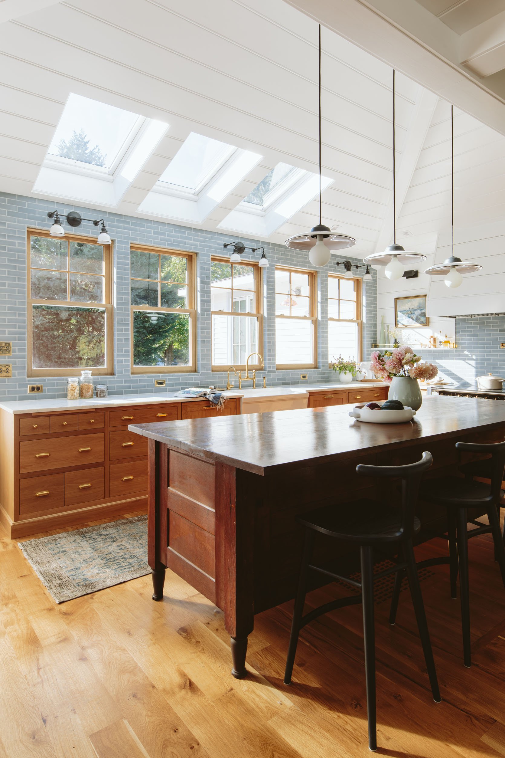
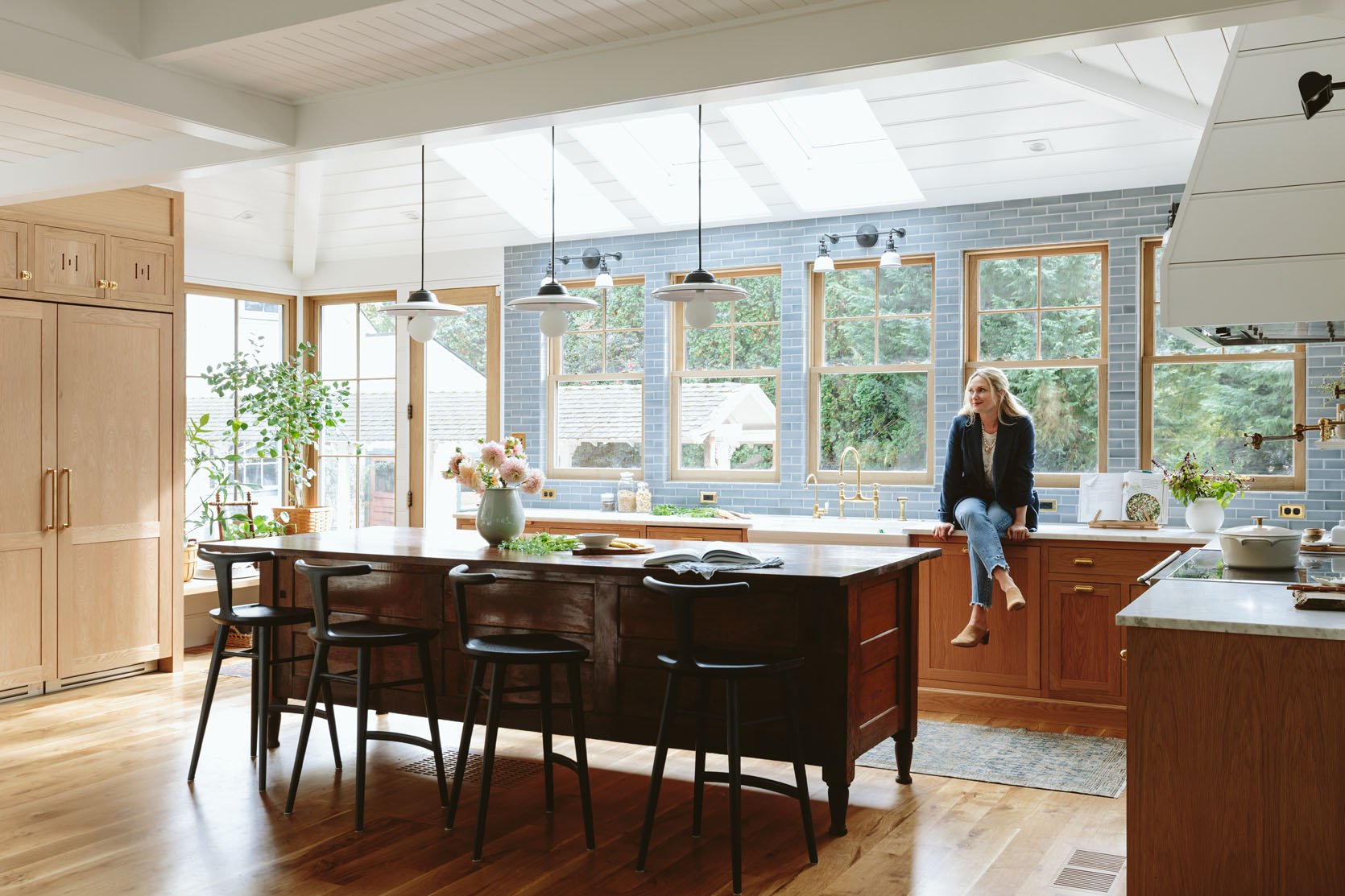
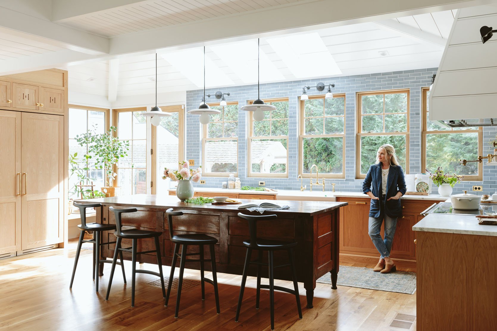
The Vintage Island
As you know, we wanted a vintage island to bring in age and soul, but finding the right one proved to be very difficult…until one day it wasn’t. 🙂 Just when I was about to give up on the search, Britney from Aurora Mills texted me that she had just got this piece, and after going to visit it myself, we checked that box very enthusiastically. It was PERFECT.
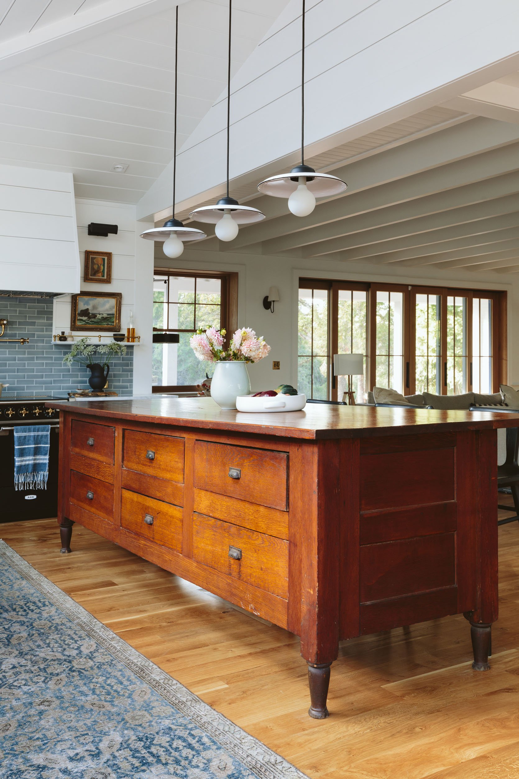
Island (vintage)
It seems to be an old store counter, because its sheer size means that it must have been in something commercial (it’s more than 9′ long). The six drawers on the front side function pretty well — heavier and harder to open/close than new drawers, but they are actually really deep, so we store our colanders, Tupperware, and random cooking tools in there. (It’s a mess right now, TBH, but the org is coming soon.) It’s white oak with an old reddish stain that we actually love. It’s solid, adds so much soul, and feels casual but not too shabby-chic (nothing wrong with that, just not what we are going for in the kitchen). If you are wondering how they made the top bigger to have an overhang, stay tuned for a post on that.
The Lighting: Pendants, Sconces, Picture Lights (And One Semi-Flush)
Sconces | Picture Lights | Pendants | Pendant Bulbs
I love them so, so much. Very early on I knew that I wanted these cute little enamel shades with black trim. At first, everyone else thought they were too casual, not fancy enough for such a high-end house, but I was so sure that these were our lights because of that. This configuration does have a very utilitarian vibe — it’s casual and not glam at all or overly traditional, and yet it feels so pulled together and cohesive, and the hits of black make your eye dance around the room. It dresses down the formality of the tile and the hits of brass, in exactly the way that I wanted it to. We chose the Fairview Traditional 2-Light Sconce and paired it with the Carson Shallow Dome Reflector Shade on a cord, with the Clyde picture lights flanking the range. I seriously couldn’t be happier. And remember that with Rejuvenation you have so many finish options (brushed brass, polished nickel, unlacquered brass, etc.) and shade options (glass, opaque glass, a lot of colored shades, copper, silver), so if you like the shape and style but wish it were a bit more traditional or less utilitarian then you can play on their website and configure them until you find what you want.
Also, Rejuvenation offers the best bulb for each fixture depending on which room it’s in, and they helped weigh in on all of our bulbs. I LOVE the big round porcelain (still LED) bulbs in the pendants — they made the disk pendants even more playful and fun. I want to write a whole post about this bulb-pairing process because I learned a ton. STAY TUNED! 🙂
Sconces | Picture Lights | Pendants | Pendant Bulbs
We had to swag the corded pendants from one junction box (in the middle of the ceiling, which is unfortunately NOT centered over the island because the architecture of the roofline didn’t allow for it). I don’t think we even took a photo of what the ceiling looks like with the cords, so stay tuned for that too (but it looks so good!).
You can see here the sconces work so well together. The Clyde is being discontinued, and I tried to switch out to one of the other picture lights that is not on its way out, but the J box was already cut into the paneling, and the circle was too big for the smaller art light canopy. (That happened in our L.A. living room, too, I just realized — I wish there were more standard sizes of J boxes for this exact purpose.) So if you are still renovating you have the opportunity to choose a more delicate picture light like the Ridgewood or the Cabinet Maker’s, but you need to tell your GC and electrician about the size of the canopy prior to cutting the drywall or paneling.
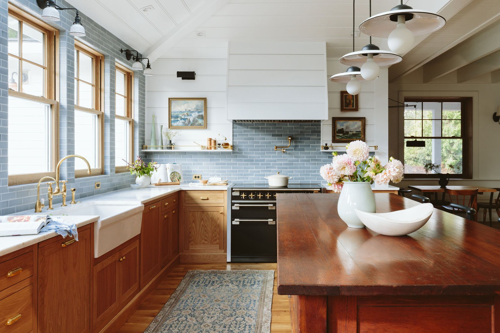
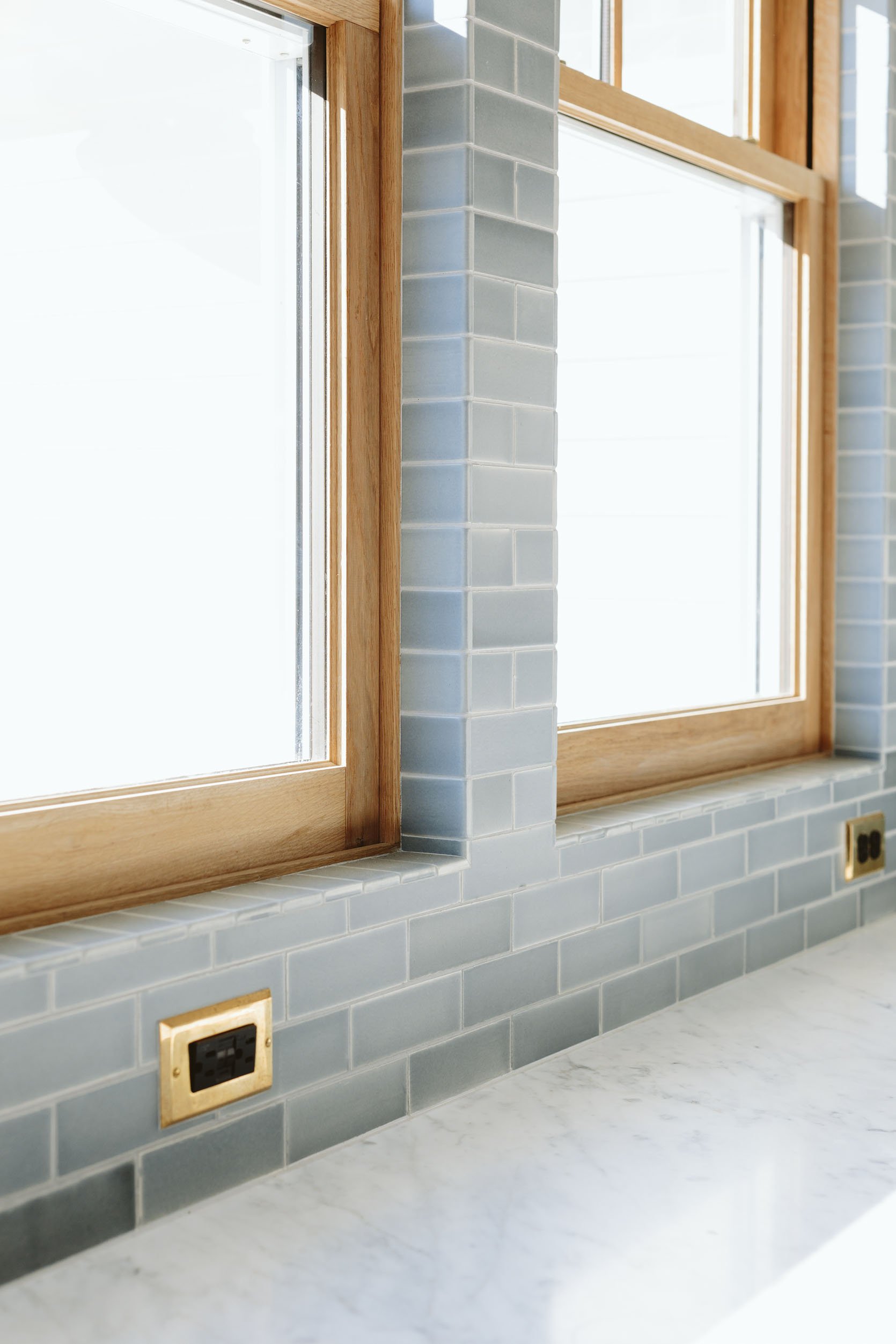
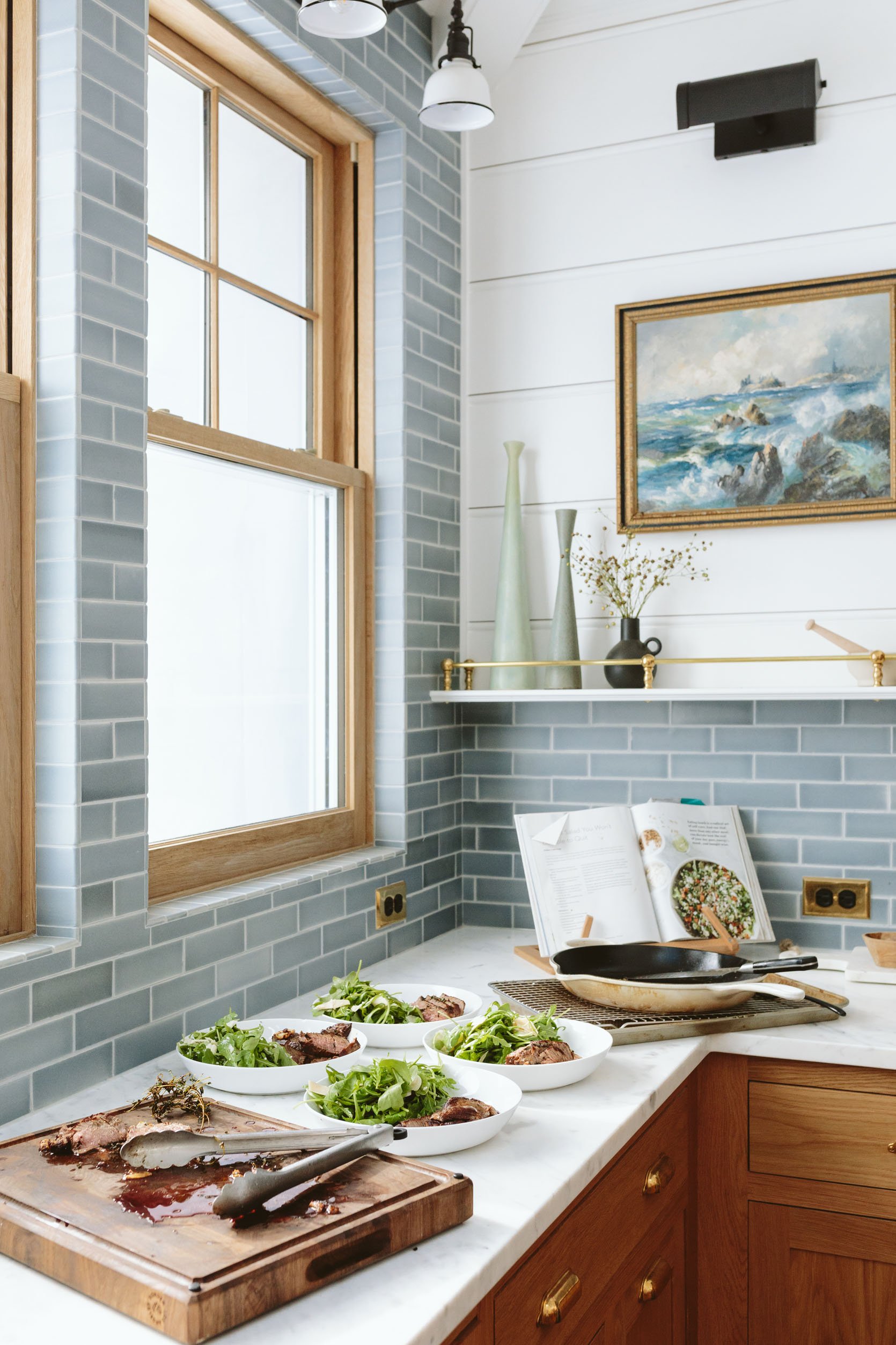
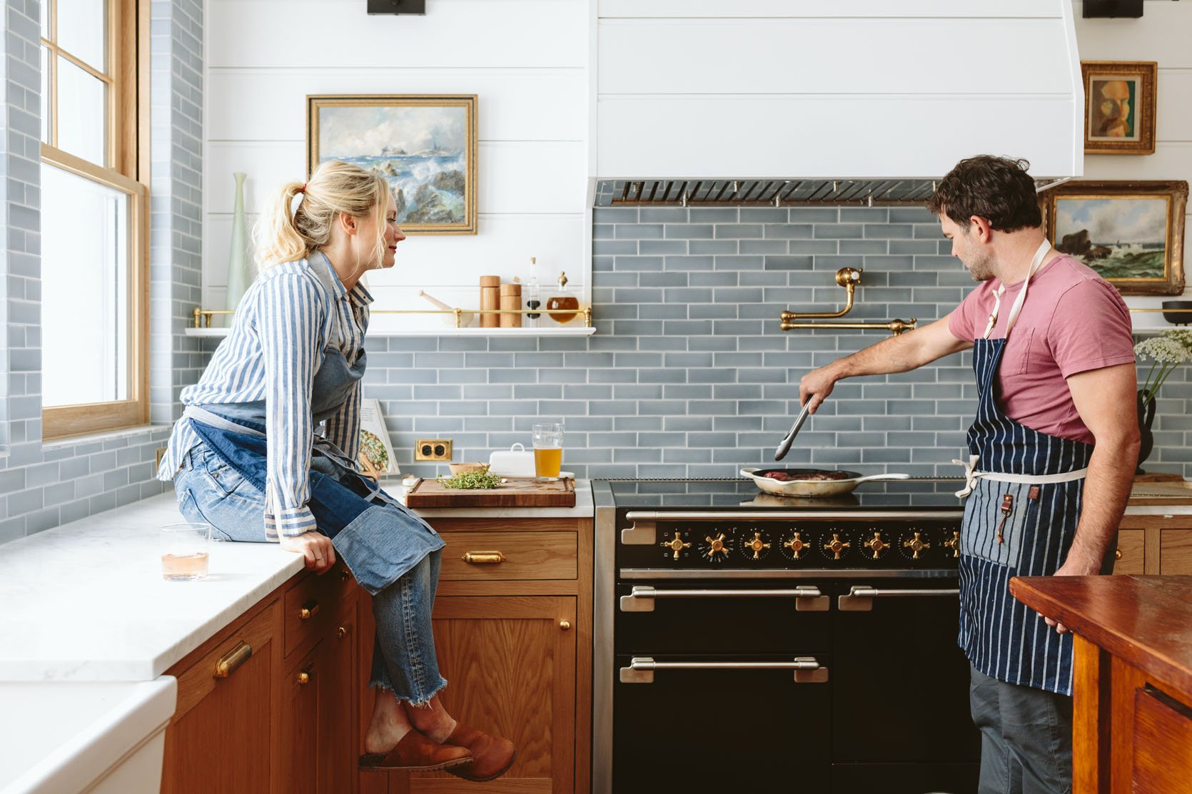
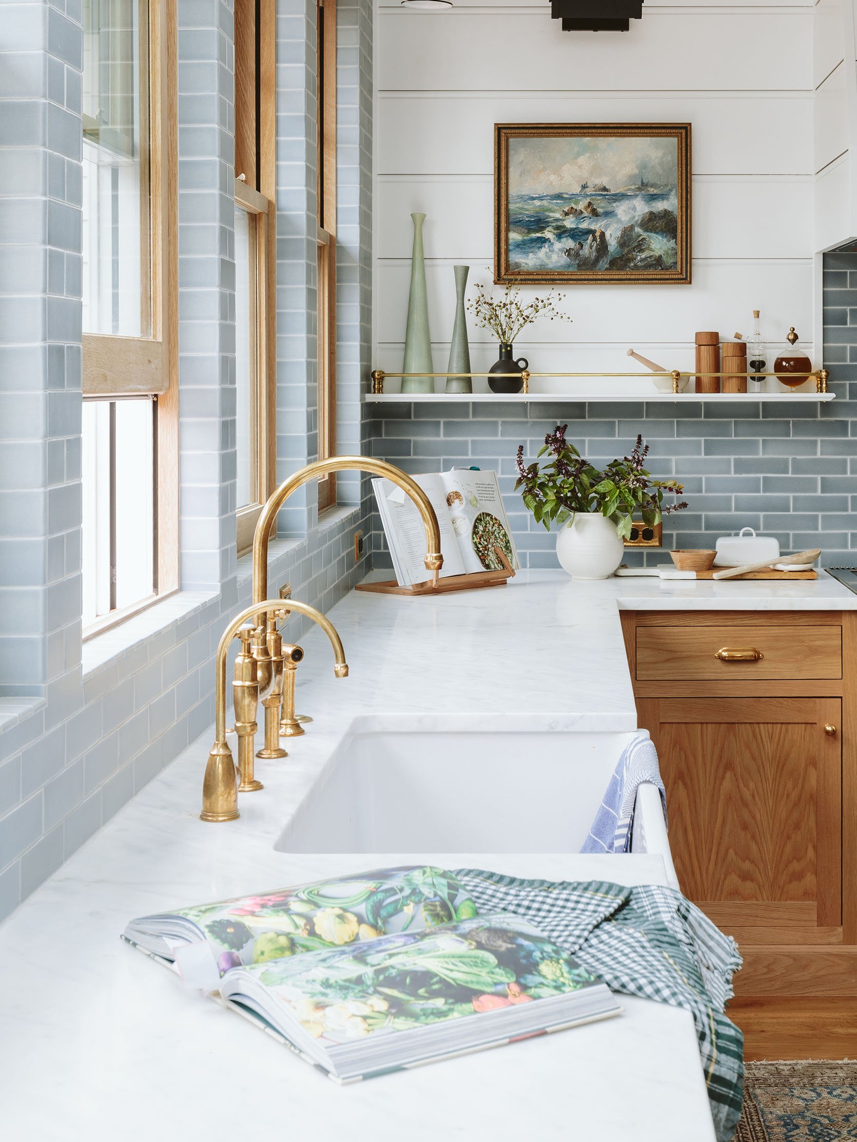
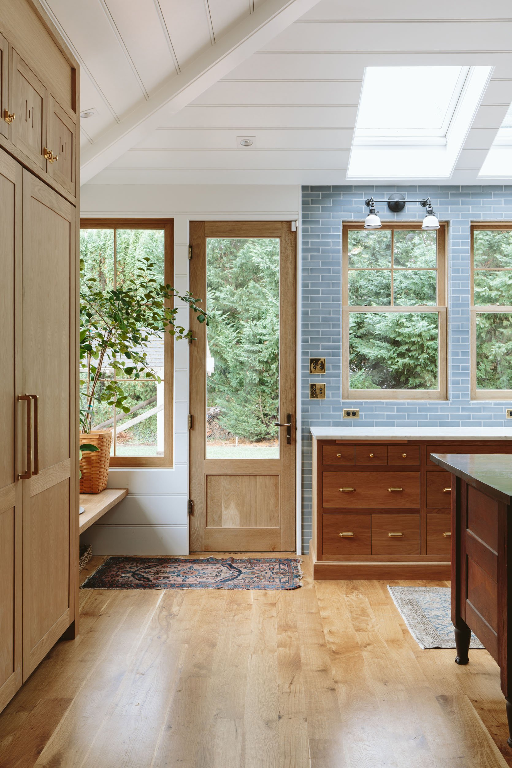
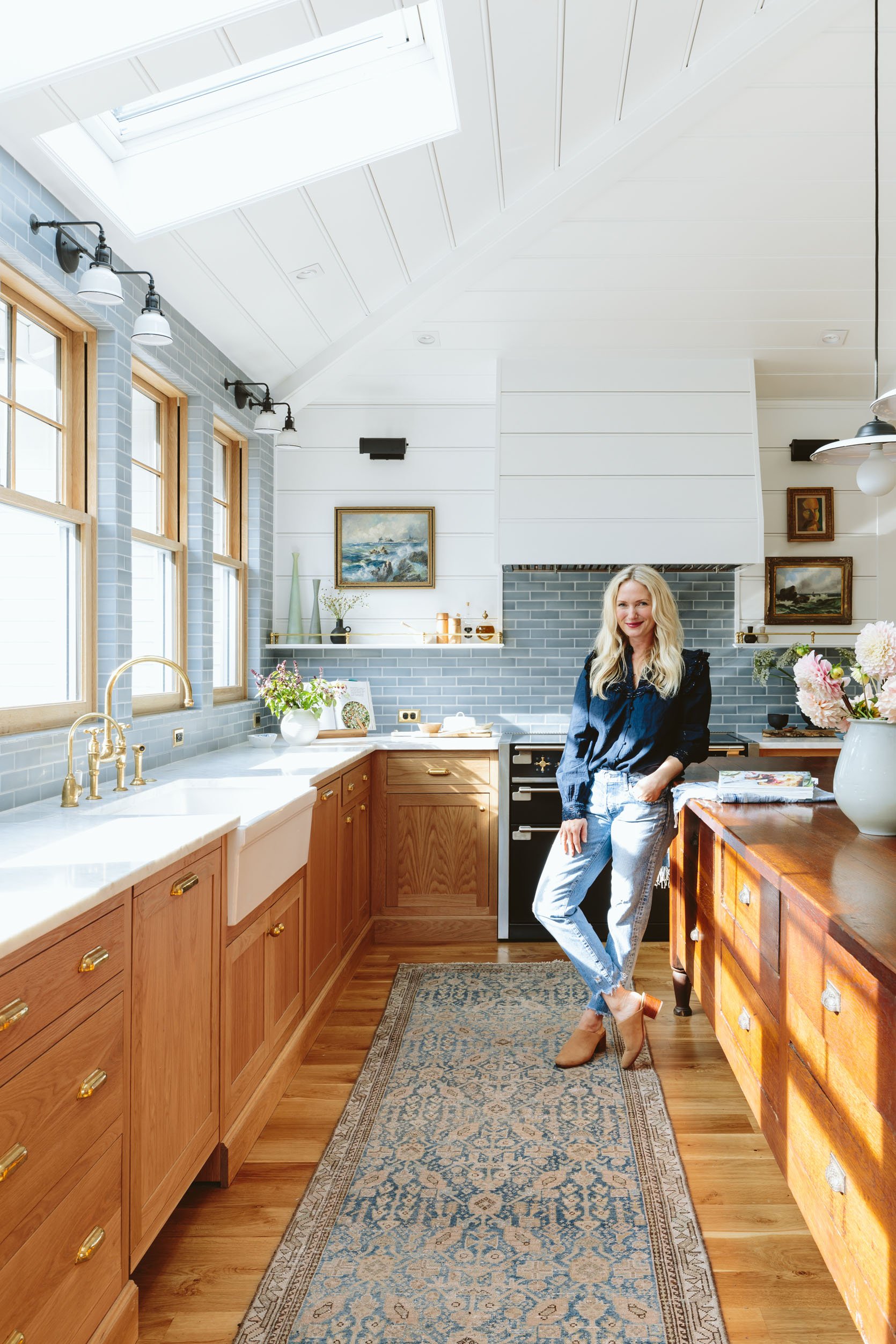
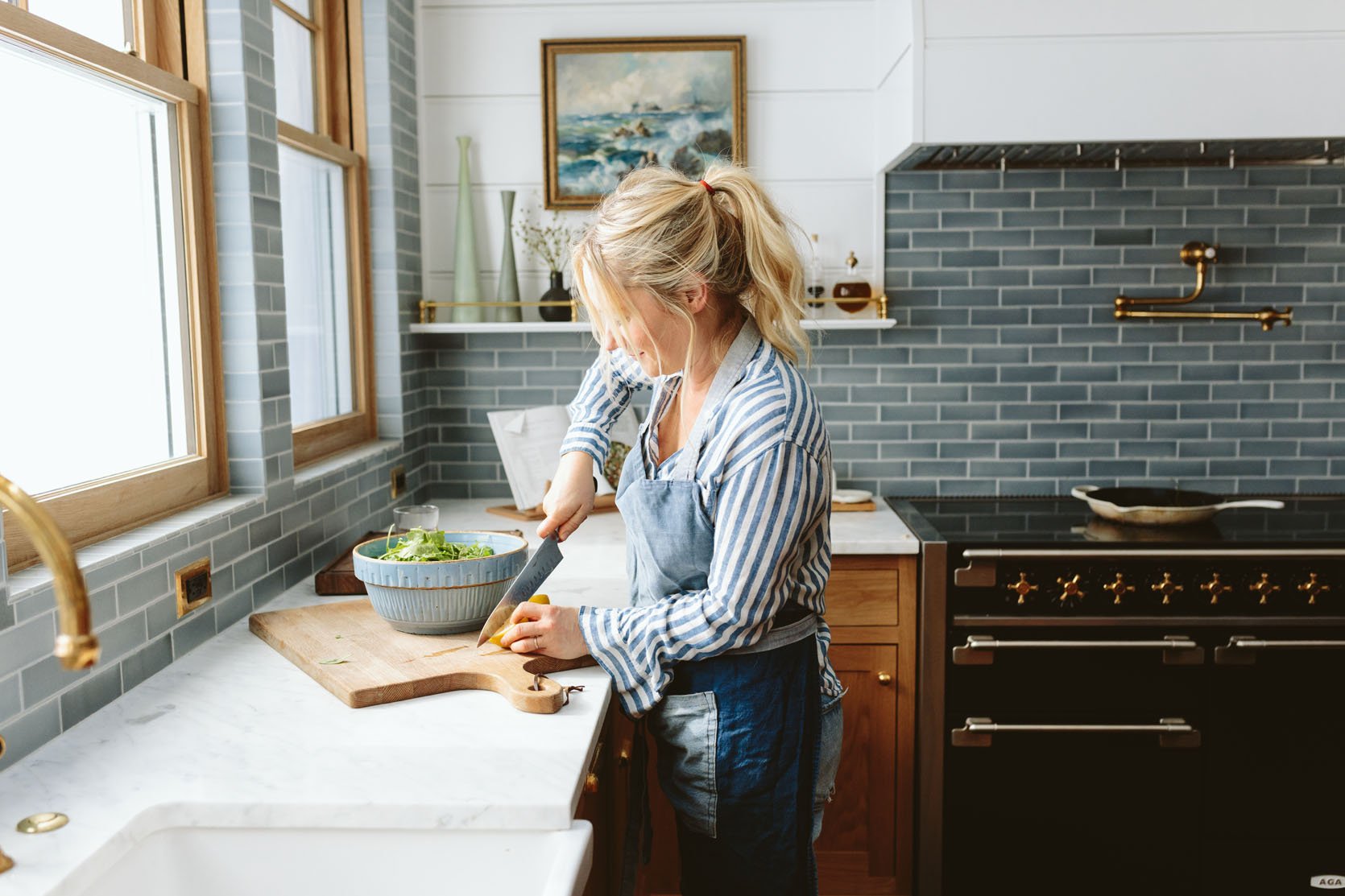
The World’s Best Denim-Colored Tile
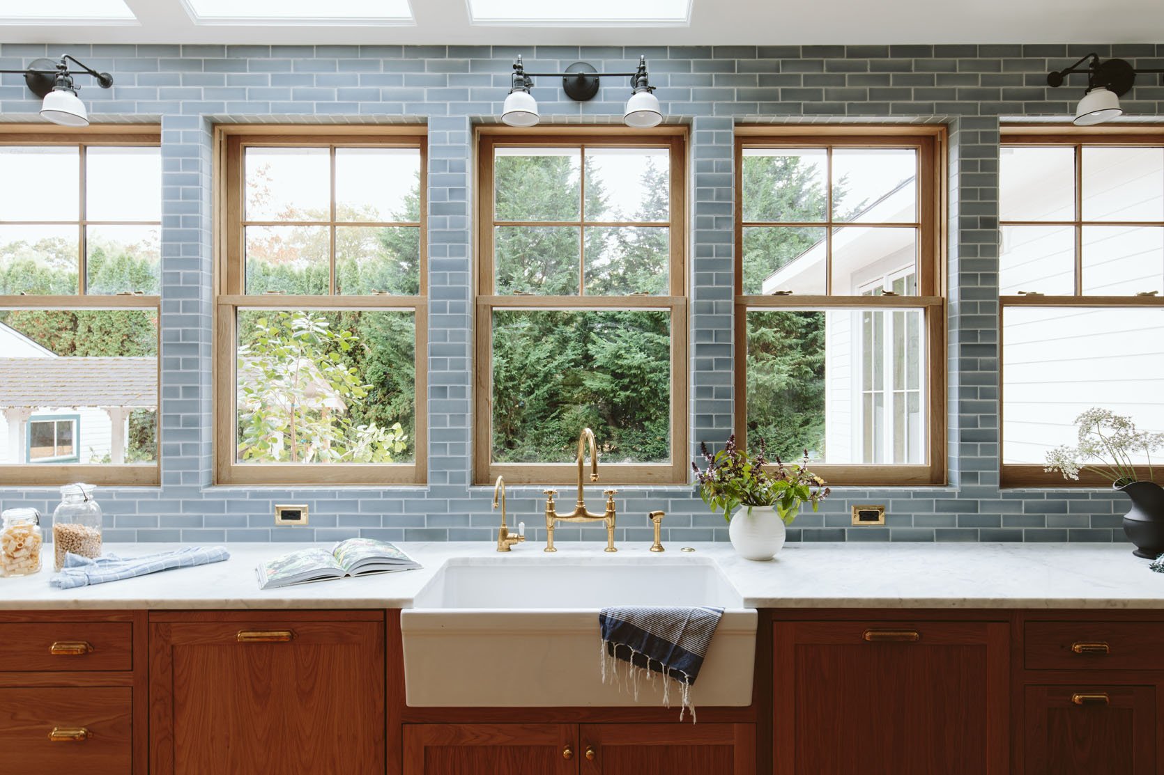
Oh, Pratt + Larson, how I LOVE YOU. I am so excited to say that this blue tile might be my favorite tile I’ve ever installed (tied with the sunroom and our bathroom…and the mudroom!!). Maybe it’s because trying to find that perfect blue/gray is so hard, and this one is PERFECT. We worked again with Pratt + Larson on all the tile in the house, locally made in Portland (we didn’t even have to ship it, which is just lovely for everyone). I brought my favorite Levi’s jeans to color-match and create our own custom color for the backsplash, but after looking at all of their colors, I realized that they actually had one already. While one of the best things about Pratt + Larson is their ability to color-match and create custom tile, they also have such a deep inventory of colors in different finishes that it didn’t really make sense to make a new color if what they had was already perfect. This one is called P-146 (in their parchment line), and it has the most perfect soft, almost watercolor-like variation of blues and grays.
I love how Level Plane (our installers) tile-wrapped the window jambs — with MASSIVE help from ARCIFORM’s design team (Stephyn!), as figuring out the math for what is internally called the “tile take-off” was a lot. As you can see (or maybe not) we needed finished endpieces for the jamb so that you don’t have to stare at an unfinished edge (like the rest of the wall tile is, although butted together).
The Marble Countertops
After MUCH DEBATE, we both agreed that real stone is the way to go in this house (although we love our quartz at the mountain house, too). My thoughts/feelings are that I love marble in older-style stones like this one, but you have to be ready for etchings and staining (we already have a few). We got ours from Bedrosians, and it’s a Carrara but with a lot of negative space and way less veining than usual.
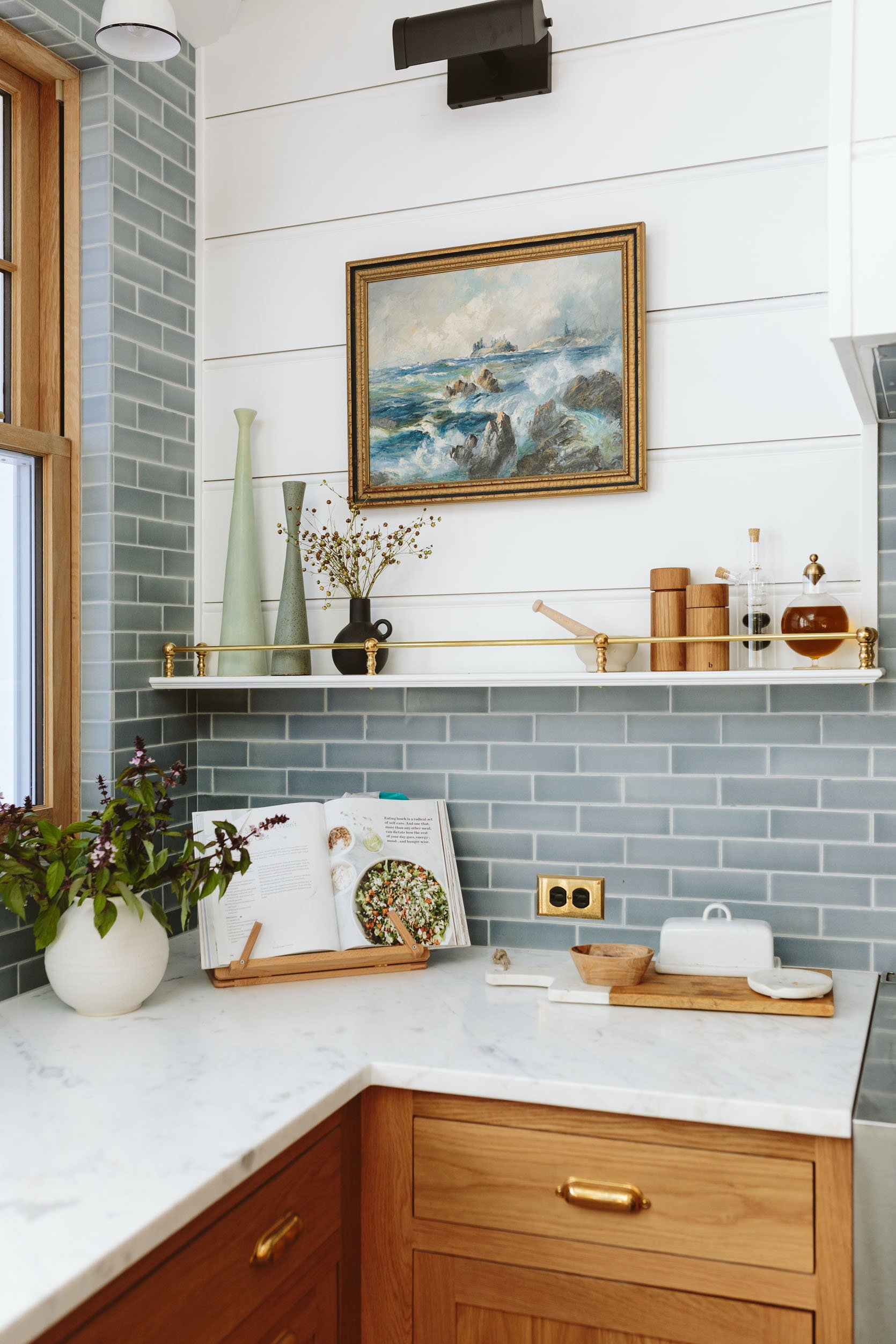
Tall Vases (unavailable) | Black Vase (similar) | Ceramic Mortar & Pestle | Salt and Pepper Grinders | Glass Vinegar + Oil Cruet | Glass and Brass Cruet | Art (vintage) | Round Vase | Cookbook | Cookbook Stand | Cutting Board | Wooden Mini Bowl (unavailable) | Butter Dish | Spoon Rest
It’s super pretty but quiet (Brian doesn’t love a dramatic vein, and for this house, I totally agreed). We probably could have done a never-to-be-stained porcelain (there are some from Bedrosians that look like marble and are SO CONVINCING), but I love what we chose, and it just feels right. We decided not to do a bullnose or any sort of interesting lip on the front, mostly because we didn’t feel like we needed it, and it does cost more/take more time (although it’s nominal, maybe a couple hundred dollars more).
The Range Wall
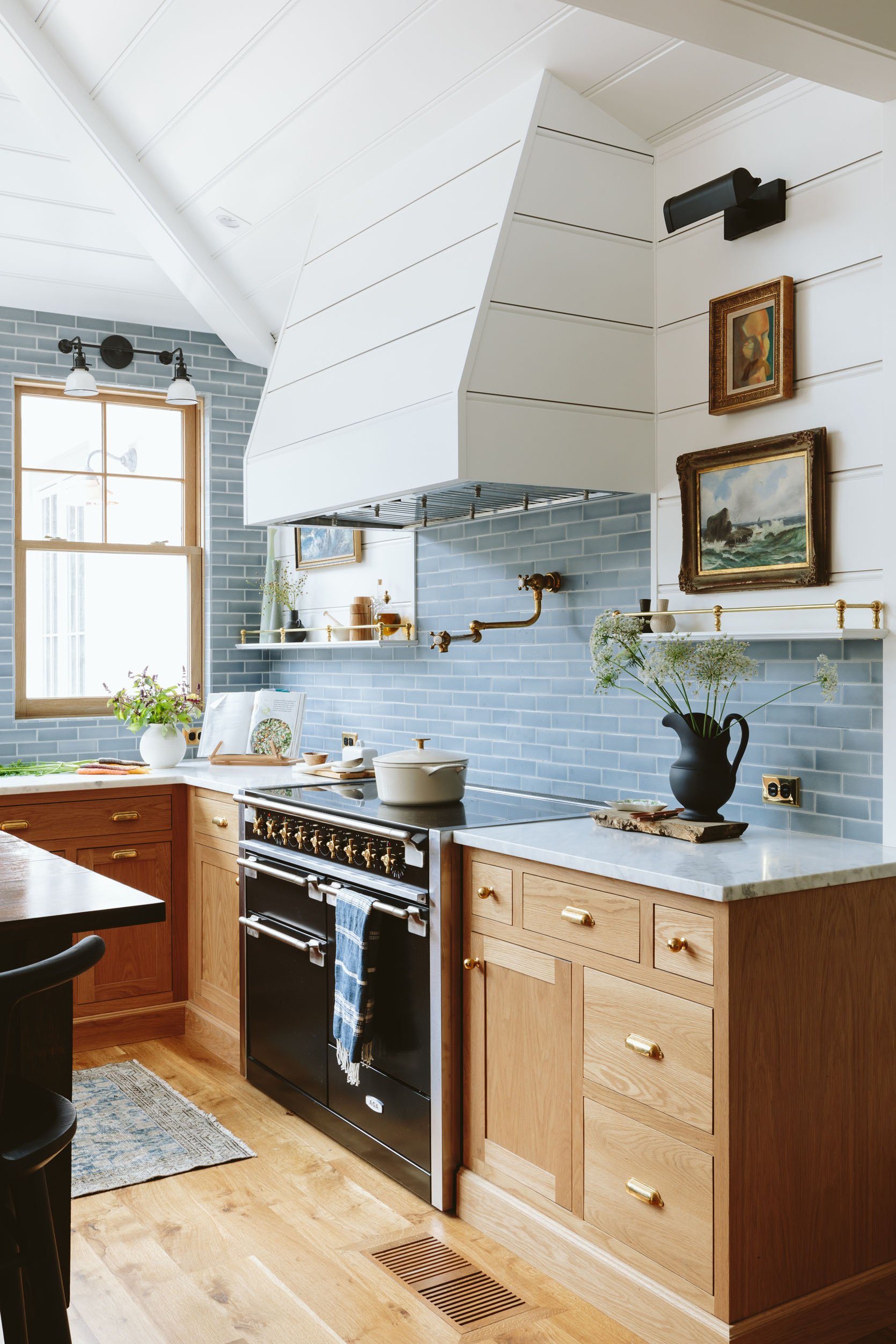
Range | Dutch Oven | Kitchen Towel (similar) | Wood Board (similar) | Pitcher | Art (vintage)
I have a LOT to tell you about cooking with induction, which warrants a full post (already shot, coming at you soon, and spoiler — we love it). But this wall is clearly the statement wall, grounded by the Aga Elise from Build with Ferguson. We flanked the range with 4″ shelving (just enough for spices, oils, and art) and added some of my favorite things. The hood was a simple insert, which ARCIFORM clad in the paneling and painted out in Sherwin-Williams Extra White SW 7006. I mean, it’s the most beautiful range, and so far we are loving the induction cooking (with a learning curve that I’ll explain).
The Outlets, Light Switches, And Hardware
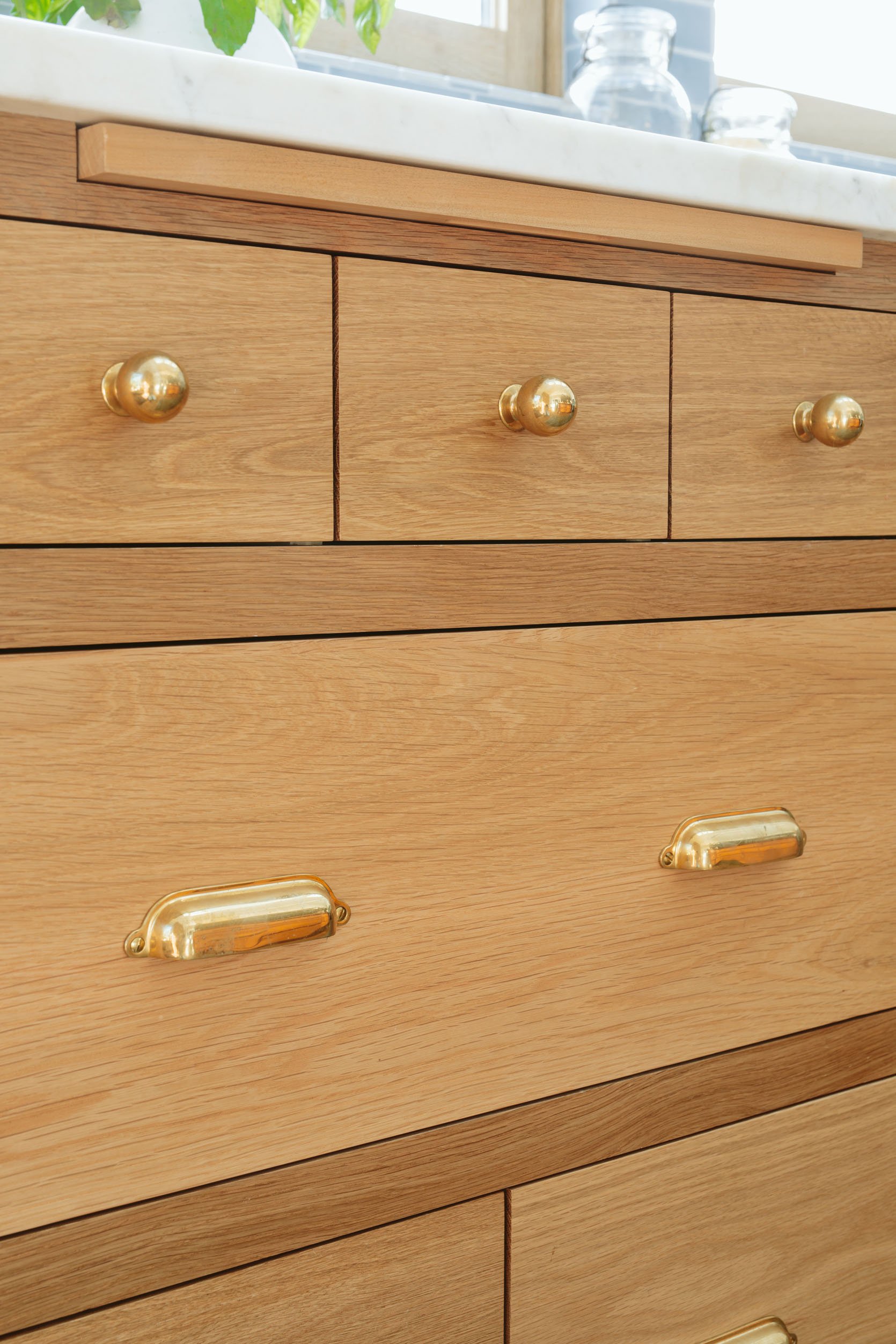
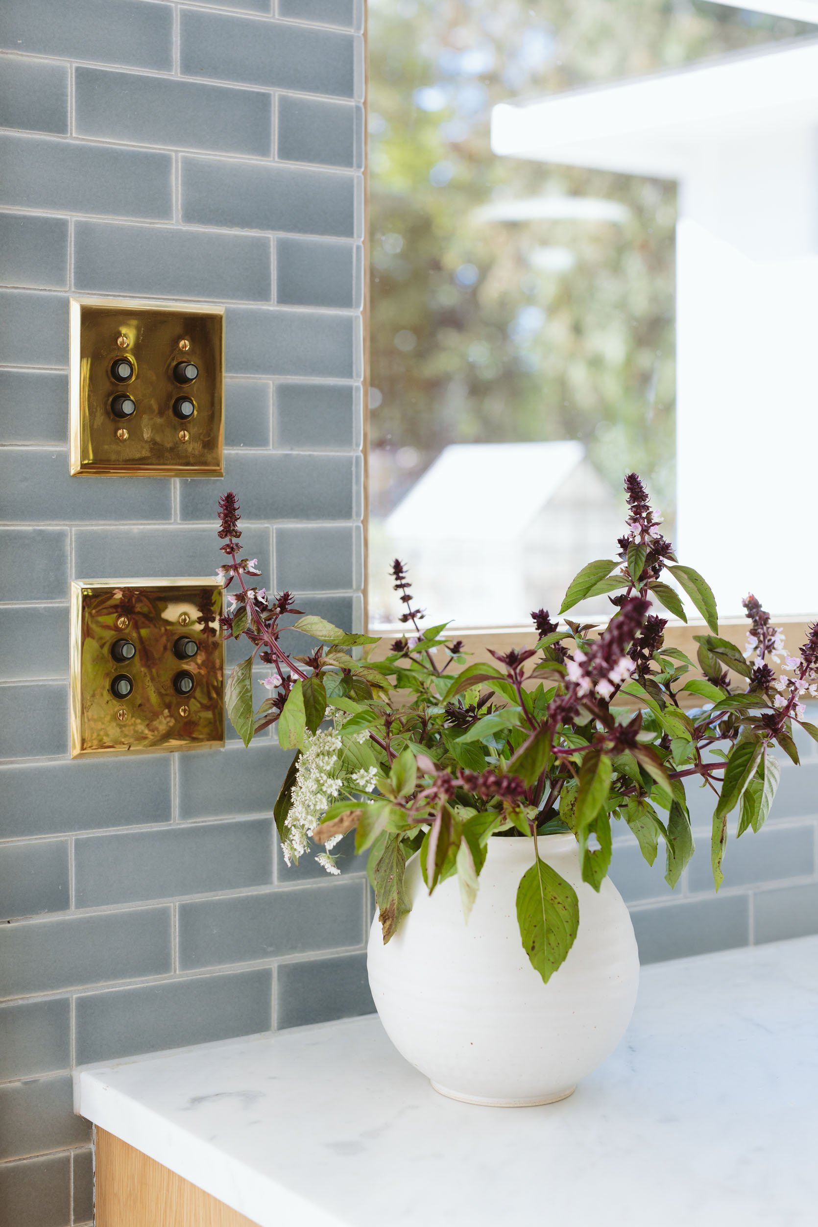
Cabinet and Drawer Knobs | Drawer Handles | Push-Button Switchplates | Outlet Switchplates
We went with unlacquered brass for everything (hardware, light switches), and the patina already looks wonderful. All of our outlets and light switches from Rejuvenation have a black finish for the actual outlet and the knobs (bottom is on and off, top is dimming). We are super happy with these light switches, by the way — they give a vintage/classic vibe, but they are pretty intuitive to use. You can get just on/off and add dimmers, like we did here, or combine USB outlets in with the light switches in other areas (they offer a million configurations).
Bridge Gooseneck Faucet + Pot Filler (And Sink)
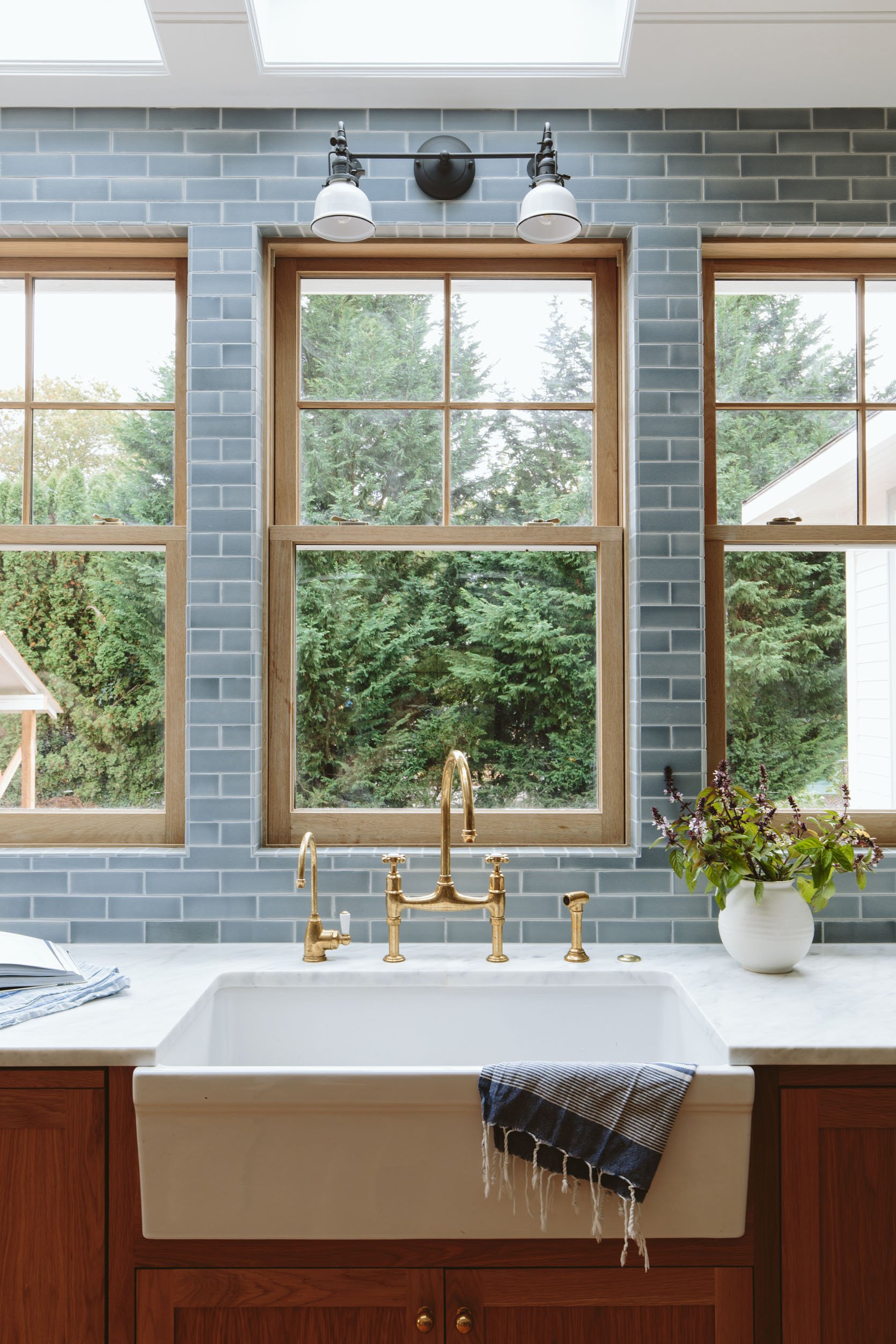
Faucet with Rinse | Filter Tap | Sink
After much debate, we decided to go with unlacquered brass gooseneck faucets and ordered these from deVOL, because we loved the style, finish, and the cross handles. They are so pretty, but yes, we have to take care of them with a special wax product. We were willing to do it in the kitchen, but we decided against it in the bathrooms for maintenance reasons. I wrote a whole post about caring for unlacquered plumbing specifically (because of its exposure to water, it is harder to maintain), but the heart wants what the heart wants.
We also ordered a beautiful large farmhouse sink from Rejuvenation that has this pretty front apron detail — it’s special yet super classic:)
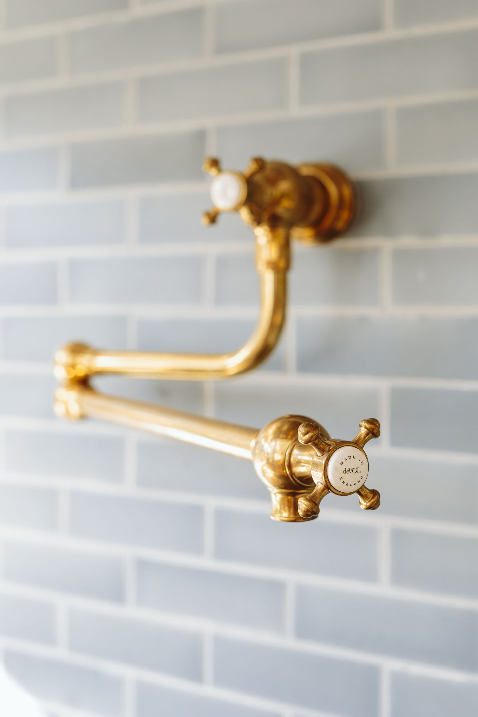
Pot Filler Tap | Faucet with Rinse | Filter Tap
The Natural Light (All Hail The Skylights And The Windows)
Double Hung Windows | Door | Picture Windows | Skylights
We really should just call the kitchen the “glass sunroom.” We were desperate for natural light in the previously very dark west-facing living room (now with a covered porch), and y’all, we got it by bringing it in through the kitchen. The kitchen has a full wall of windows (white oak, double-hung, from Sierra Pacific Windows), and we didn’t stop there — we added three Velux skylights that flood it with natural light overhead, even on the darkest days. On super sunny days, there is some harsh side light in the kitchen, but only for a couple of hours (around 11 a.m. to 1 p.m.), and only if you are sitting at the island (it’s fine when you are cooking). It does not bother us at all, since it’s something we predicted and planned around. It’s just wonderful. When it rains, you hear it louder in here, but it’s usually when I’m cooking up some soup and listening to a podcast, and it’s okay. (I can’t wait till the view out of the kitchen is landscaped. Fun fact: Windows bring in light, but you also see more of the outside obviously, so when it’s a construction zone…)
The Velux Skylights
Double Hung Windows | Door | Picture Windows | Skylights | Jars (vintage – similar) | White Handled Bowl | Light Blue Vase (unavailable)
I’m obsessed with that shot, seeing the skylights with the windows with the vaulted ceiling with the pendants — it came together so well! The skylights of course are solar-powered and have light-filtering shades that can be controlled via a remote. They are south-facing, with large trees blocking the views the second half of the day. We went with large skylights, and their lead time is always surprisingly fast (think weeks not months, but it varies, obviously), so if you are remodeling, it’s not too late to add them. 🙂 When integrated well into the design (and ARCIFORM did an amazing job facing out the insides with wood), I think they work well even in older homes like ours.
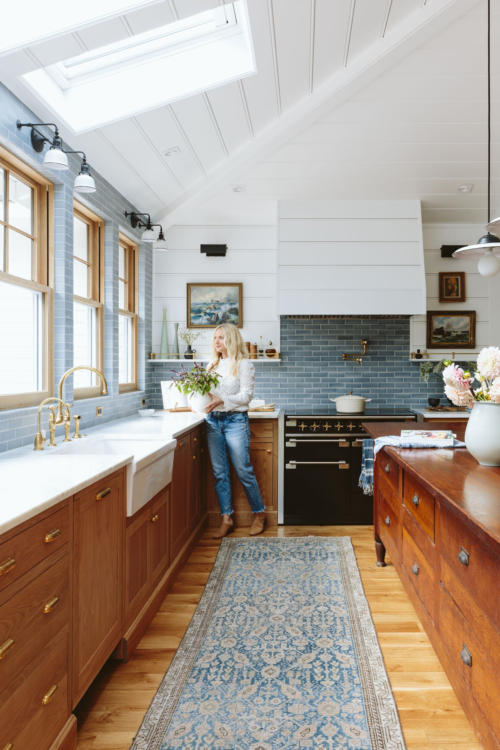
A quick callout to the paint color: Sherwin-Williams Extra White SW 7006. I love it in here so much with the warmth of the wood. It is a cooler white (which I don’t think I fully realized), so know that when choosing it, but if you are looking for a cool white (which looks great with natural light and blue tones), then Sherwin-Williams Extra White is excellent.
Jars (vintage – similar) | Light Blue Dish Towel (similar) | Cookbook | Dark Blue Dish Towel (similar) | Round Vase | Black Pitcher | Double Hung Windows
The Sierra Pacific Windows are white oak on the inside (aluminum clad on the outside) and add so much warmth in a really simple way. We did a classic two-over-two grid on the top, with clear on the bottom. Of course, we didn’t just stop there…
Light Blue Vase (unavailable) | Cutting Board (vintage – similar) | Door | Picture Windows
We also have these three non-operable windows in the corner and on the east side behind the bar — big picture windows that let in a lot of light and give views of what will someday be pretty trees and landscaping. (I actually had to buy plants to put near the window on the outside so you couldn’t see so clearly some of the construction that was ruining the photos.) The windows are simulated divided lites (which means there are three-dimensional grids on both the inside and outside of the double-paned glass, with a “shadow bar” in between to look like true divided lite windows), with white oak grids and frames. My goodness, I love them.
The Kitchen Entry “Bench/Table”
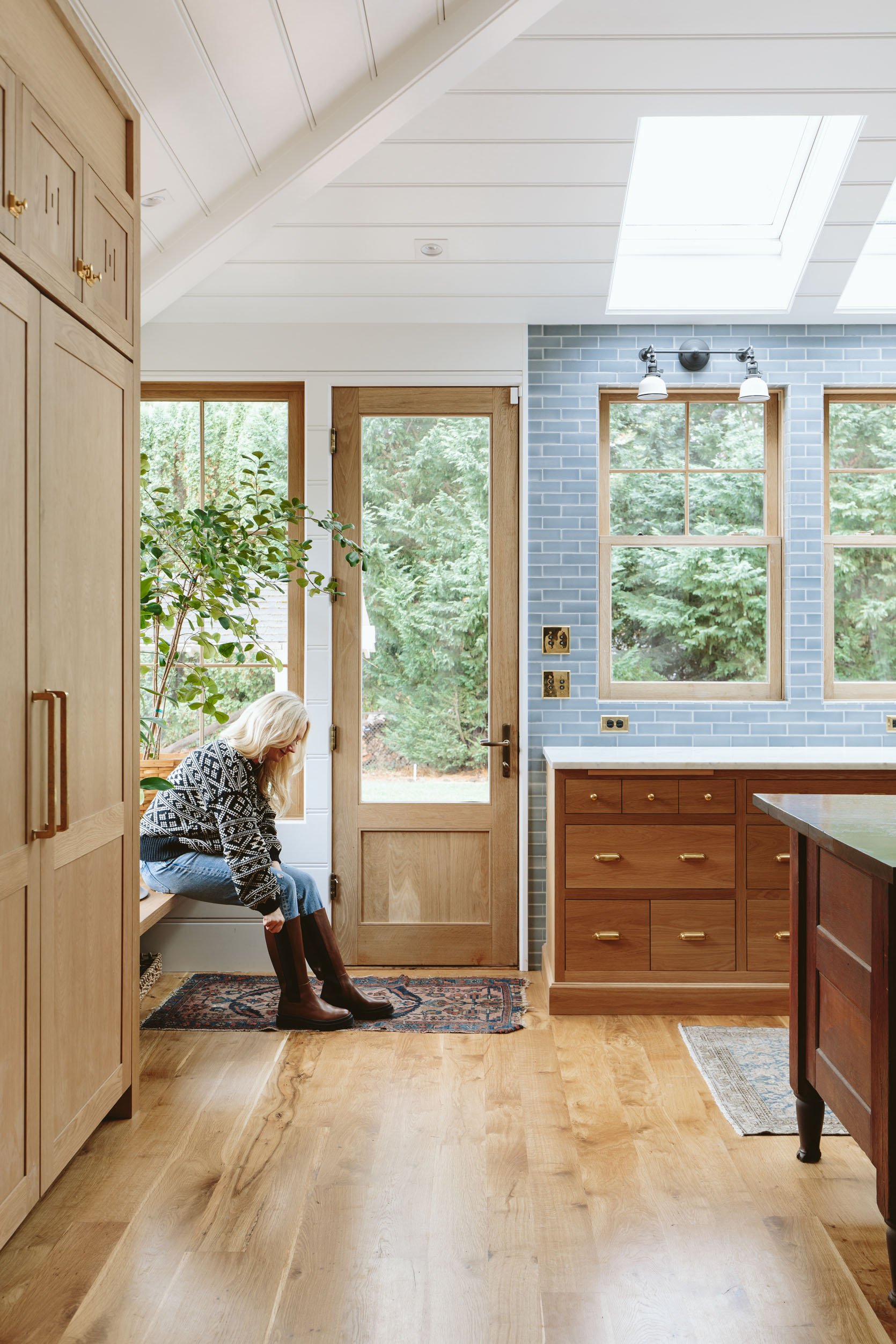
For those of you following closely, you know about my mudroom woes, and I’m still firmly against this area being treated as the mudroom. However, the landscaping is still far from done, so right now no one can get into the mudroom from the backyard until there is a hardscape path to it (it’s a mud walk right now). So this is where we come in and out of half the time (the other half being through the front entrance). We debated about installing this at bench height (to sit down easier and put on shoes) or a low table height (to charge devices on and hold more underneath), and ultimately the lower bench just looked better. Of course with two big plants there isn’t much room to sit, but only one of them is staying there (the low wide one is now in the sunroom and was there to distract from the construction outside).
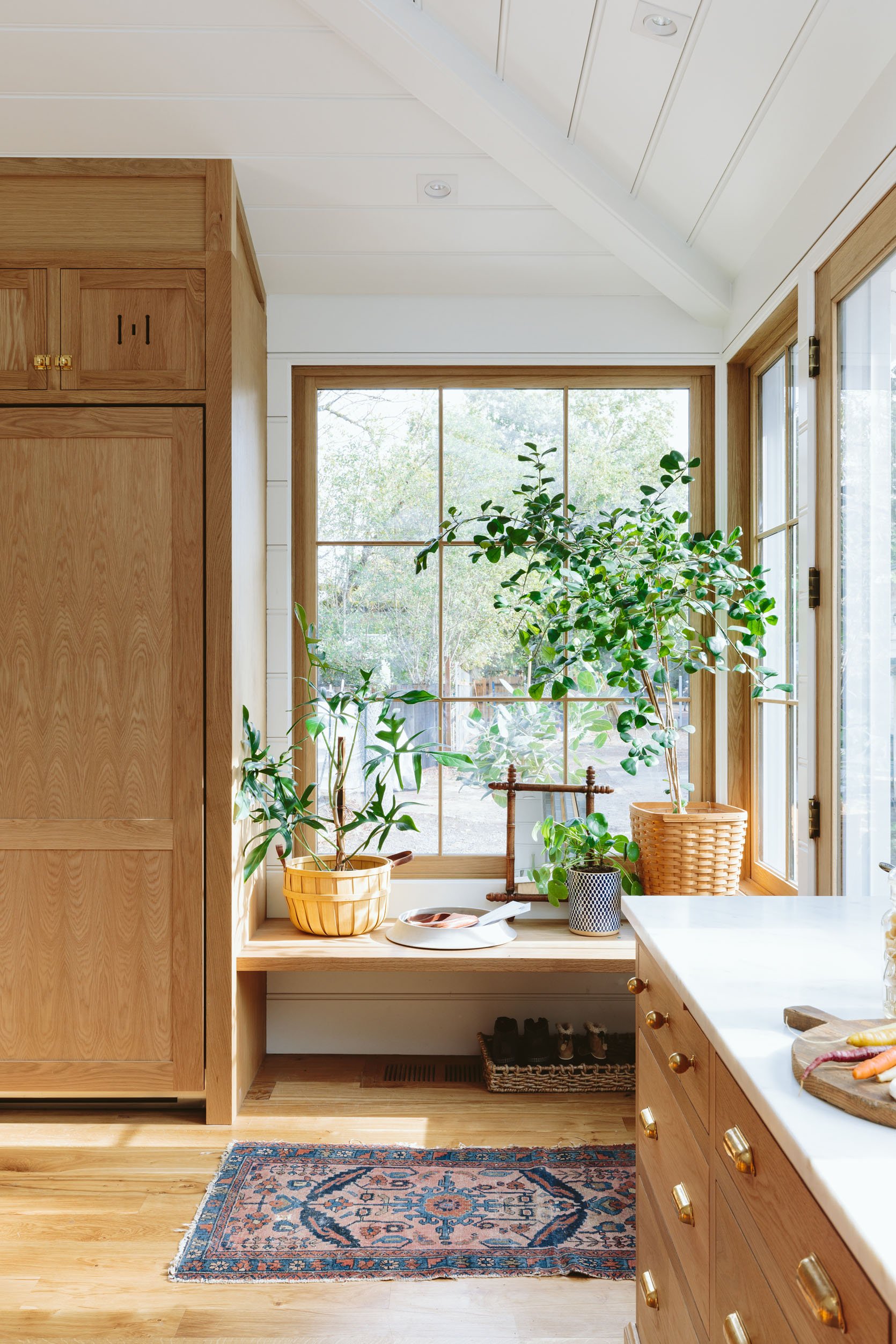
Low Basket | Ceramic Tray | Blue Planter | Mirror (vintage – similar) | Tall Basket (vintage – similar) | Rug (vintage) | Shoe Tray (similar)
It is a great backpack and grocery drop zone also because it’s deep enough (almost 24″) to really provide a lot of space. We are moving the charging zone to the bar and pantry areas (adding more USB charging plugs there), and then I might add a little wall-mounted shelf for the side of the fridge to put phones or watches in while charging (we have no joke like 10+ devices to charge, not including laptops or iPads: headphones x 2, my flashlight beanie, Apple Watch x 2, Kindles, Gabb watches, our phones — so much). I might even hang that mirror on the side of the fridge with the shelf below it (that holds keys as well). Stay tuned on that.
Our Beautiful Wood Flooring
How beautiful is this flooring?! It’s Oregon white oak, born and raised (and milled) here at Zena ForestProducts, a family mill that’s 30 minutes away. If you are in the market for stunning flooring that is not crazy expensive, I highly recommend this one. It is real wood, but engineered onto a tongue-and-groove backing (which we really wanted, as our mountain house flooring is real wood and has splintered, gapped, and buckled, as did our real wood flooring in L.A.). We love it so much.
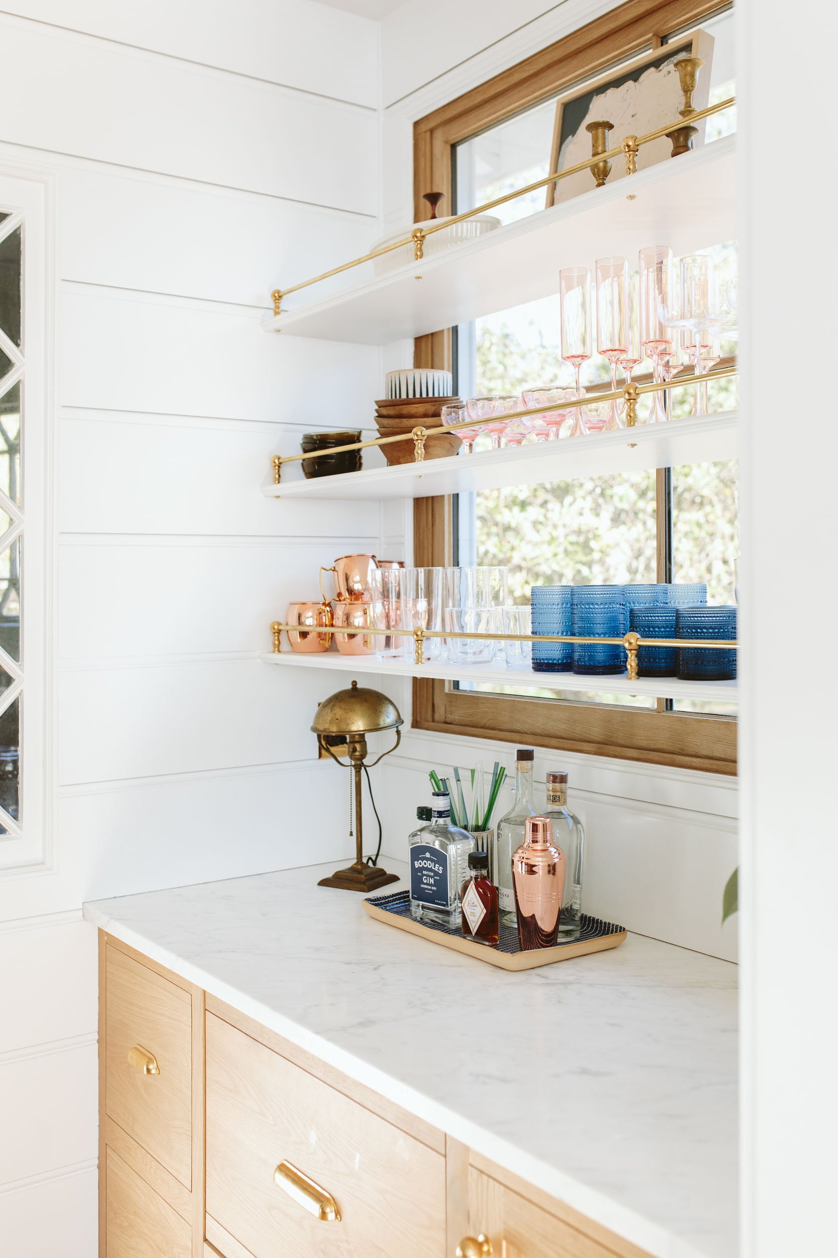
The Bar Area
Fridge Column | Freezer Column | Appliance Pulls | Cupboard Latch
On the other side of the BlueStar fridge and freezer columns, which we LOVE (more info to come on those), we have the bar…
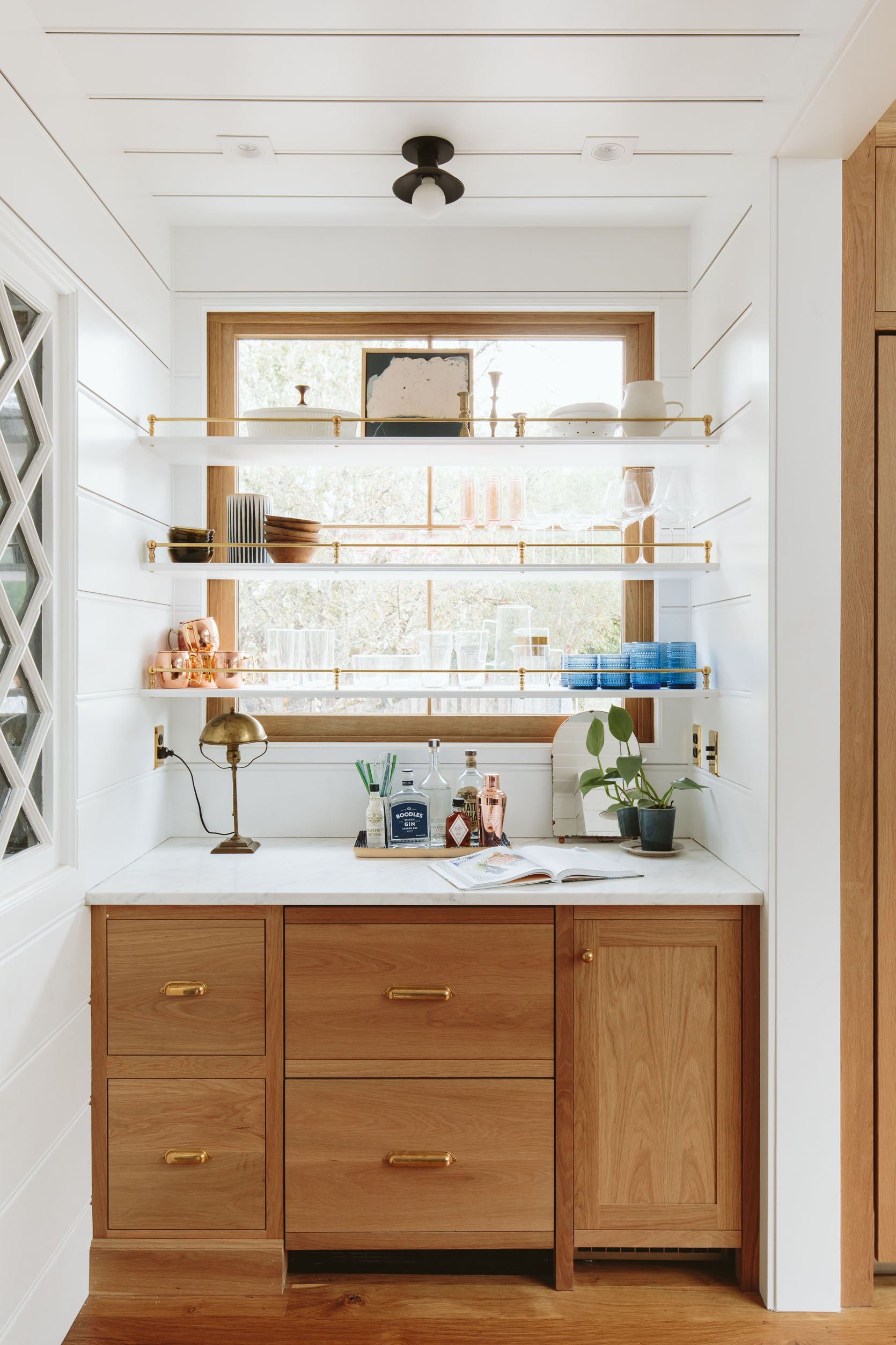
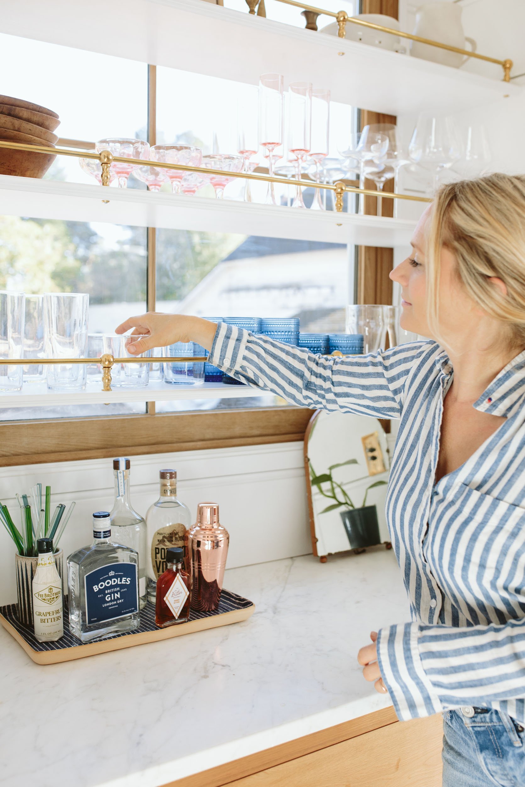
Brass Spindle Gallery Shelf Rail
Top Self: Serving Bowl (similar) | Candlesticks (vintage – similar) | Art (unavailable) | Colander | Pitcher
Middle Self: Amber Bowls (vintage – similar) | Ceramic Planter (similar) | Wooden Bowl (vintage – similar) | Pink Coups (vintage – similar) | Flute Glasses | Tall Coups | Wine Glasses
Bottom Shelf: Copper Mugs | Tall Glasses | Short Glasses | Beer Glasses | Tall Pitcher | Blue Glasses
This area is meant to serve all things drinks and cold snacks. We always intended to put a window here with the shelves in front of it with mostly glassware on them — and it worked. We got the brass rails from Pepe & Carols, which they sell by the foot and with individual rod brackets. Jamie and the ARCIFORM team built and installed the shelves wall to wall (through some carpentry magic), and they are 12″ deep. If you’re curious why one side of the bar has a toe-kick and the other side doesn’t, it’s because we did a toe-kick throughout the whole kitchen. However, for this section, since the fridge drawers and the pebble ice machine both need venting you can’t put a toe-kick there. Whoops. So we should have done furniture-style legs for the drawers on the left. I actually didn’t notice until I saw the photo!
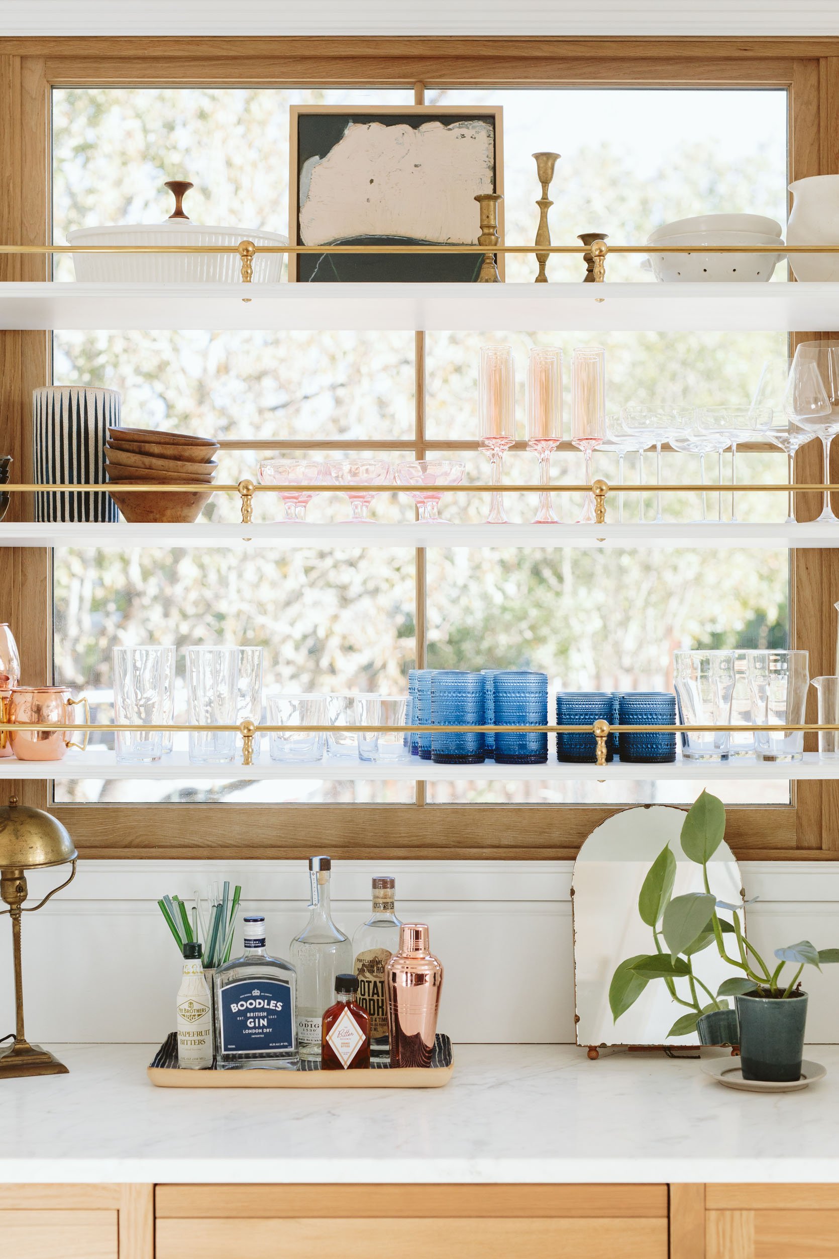
Lamp (vintage – similar) | Tray | Glass Straws | Copper Cocktail Shaker (similar) | Mirror (vintage –similar) | Blue Planter | Small Plate (similar)
What you can’t see YET is where our actual food is. We have a pantry to the left of the bar that isn’t ready to be shot yet, but hopefully soon.
The Vintage Rug
Rug (vintage)
I truly hadn’t thought about going down the Persian rug route, but then I received this as a genuine gift from District Loom (in collaboration with Unique Kitchens & Baths) and couldn’t believe how perfect it was (they had schemed behind my back to find the one they knew would work). And now I’m back on the vintage Persian rug train because, my goodness, they are so durable and forgiving (you can’t see ONE piece of dirt, and trust me, there are a lot).
The Counter Stools
I couldn’t be happier with the stools from Fernweh. They are so sculptural and sturdy — heirloom pieces that we are so glad we invested in. And I love how the black talks to the black accents in the lighting. They come in other wood tones and heights as well (dining chairs and barstools).
WE LOVE IT SO MUCH
The layout and function absolutely works for us, and I’m back to cooking most nights when I can because chopping, souping, and listening to podcasts is how I shift from work to mom at the end of the day. I love being in here so much. Chopping on the island while someone else sits at the counter and chats with me is my favorite time of day. I truly had no idea how much joy I’d get from cooking till the past couple of years, and now I see why people obsess about the function and warmth of a kitchen.
So much more to tell you that didn’t fit in this post: everything about the appliances, all things “induction range,” all my favorite kitchen accessories (some seen, some not), a full pantry tour, and even inside all our cabinets. But mostly it just works so well for our family and feels so “us.” A huge thanks to ARCIFORM for the years of drawings, measuring, and making sure it all actually came together. And then big thanks to our partners who are all linked up below. That’s it for today’s show-and-tell. I hope you like it. 🙂
Kitchen Resources:
Cabinetry: Unique Kitchens & Baths
Countertops: Bedrosians Tile & Stone
White Oak Windows and Doors: Sierra Pacific Windows
Skylights: Velux
Tile: Pratt + Larson
Appliances (sans Fridge and Freezer): Build with Ferguson
Fridge and Freezer: BlueStar
Flooring: Zena Forest Products(Oregon grown and milled)
Lighting, Switches, Outlets, and Sink: Rejuvenation
Wall Color: Sherwin Williams, “Extra White” (which is a cool white, FYI).
Faucets: deVOL Kitchens
Vintage Island: Aurora Mills
Counter Stools: Fernweh Woodworking
*Design by Emily Henderson and ARCIFORM
*Photos by Kaitlin Green
THIS POST WAS ORIGINALLY PUBLISHED HERE.
