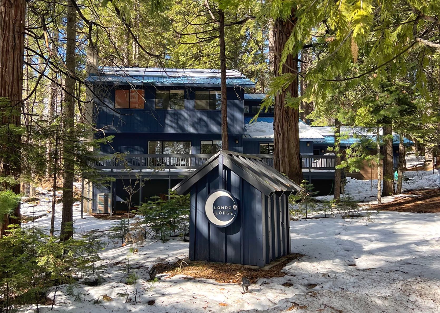
The kitchen at Londo Lodge, my home near Yosemite, was one of the main reasons I bought it. The house sits in an area where most of the homes are either small cabins that have been owned by city dwellers for decades, full-size homes for full-time residents, and a few larger homes that are used as vacation rental homes. My goal for Londo Lodge is to eventually just have it as a vacation home to share with my friends and family. But my plan for the foreseeable future is to rent it out on Airbnb to help pay for all the renovations I want to do to make it into my dream home. I’ve been fixing it up continuously since I got it in October 2020. But the first true renovation on the docket is the kitchen.
I’m prioritizing the kitchen for a few reasons. Firstly, I’m convinced that the kitchen really sets the tone for the rest of the house and has the ability to make the whole home feel higher-end when renovated correctly. When I updated my parents’ Sonoma County kitchen years ago, it changed their house from feeling like a dated, suburban house into a beautiful, sophisticated place. I don’t plan on selling Londo Lodge soon (or ever, really) but every realtor out there will tell you, to renovate your kitchen and bathrooms first if you want your home’s value to go up.
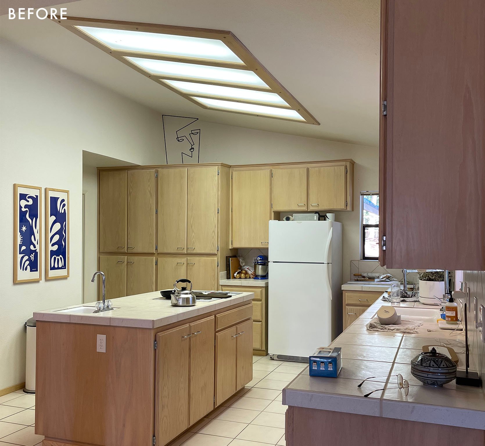
As I’ve said before, the kitchen is actually FINE as-is. But I didn’t buy this house because I loved the style. I bought this house because it was an incredible deal. It’s 3000 sq/ft and it was $590,000, which is what a house about half that size would cost in my town today. That probably sounds crazy to anyone who doesn’t live in California but yeah, it’s expensive here! I’ve always been a fan of the “buy the ugliest house in a nice neighborhood” ethic – the idea that you get more value if you buy something that’s not turnkey but has the potential to be beautiful.
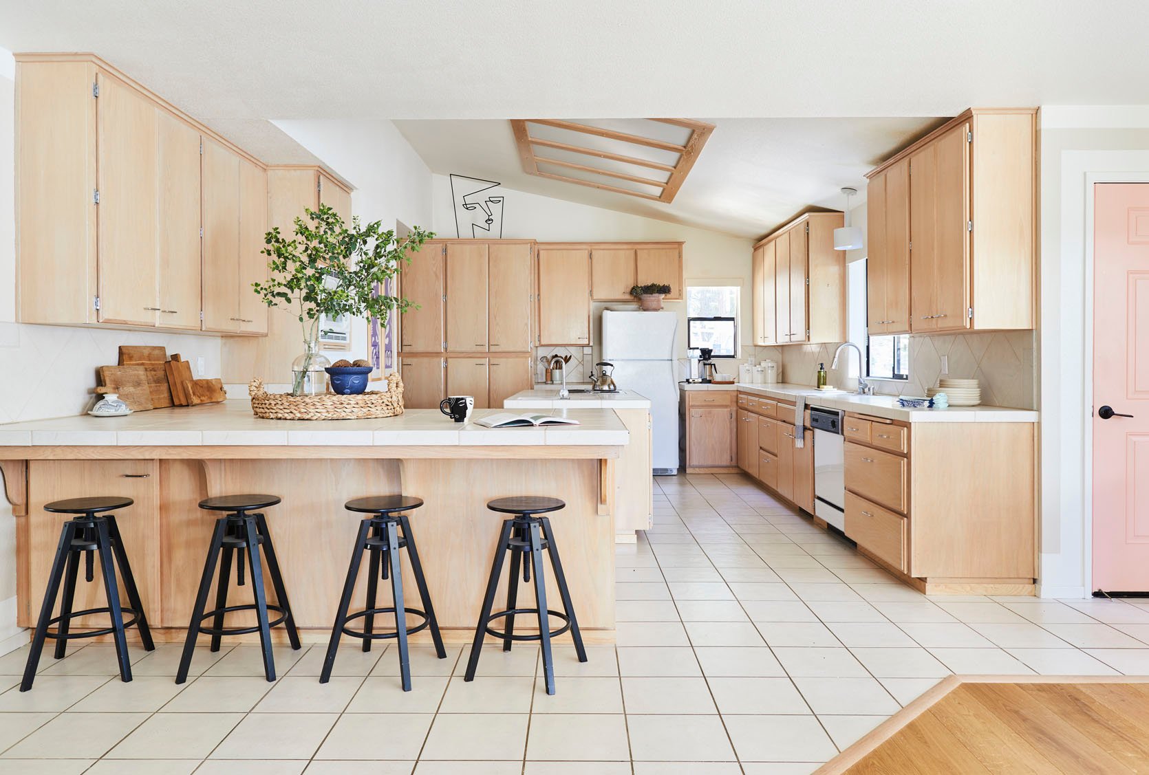
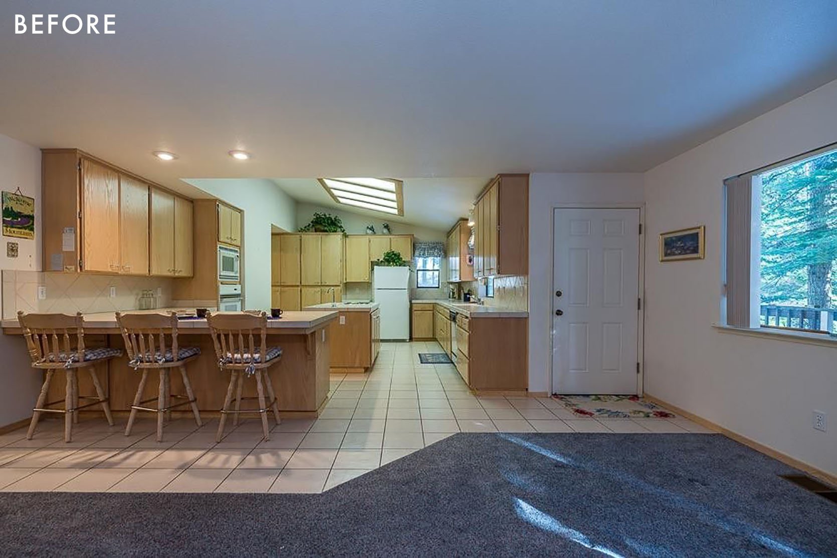
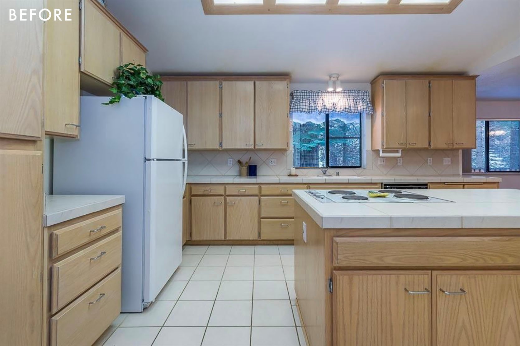
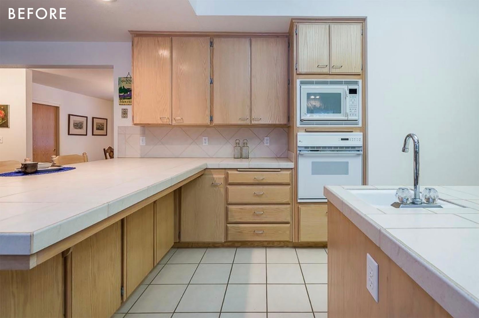
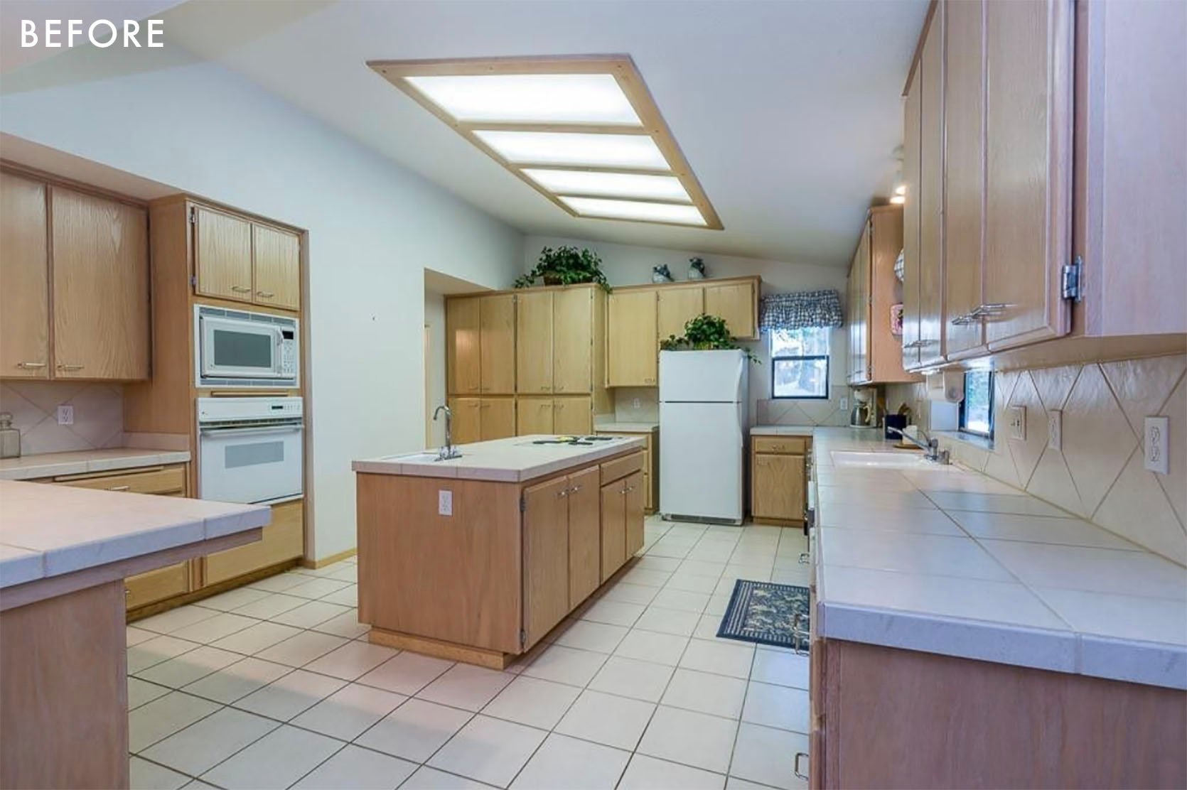
I never met the sellers of this house, but I can tell they were the kind of people who loved gathering in the kitchen – it’s a space designed for many people to be in it at the same time without getting in each other’s way. And I think it’s a really nicely designed kitchen. When it was new in 1992, I’m sure it was top of the line. The appliances are fancy for the time, it has a lot of space, and it just feels really nice in there.
Before I get to my plans for the kitchen, I need to explain my master plan for the house. The eventual plan is to convert the current garage into a new, large-scale living room, add a mudroom off the front of the house, and build a garage on the right side of the house. Now if you look at the elevation of the front of the house with that addition, it’s a bit awkward. But the saving grace is that it’s actually very hard to see the whole house from the outside. It’s mostly blocked by trees, especially from the road. So while I’d love to have the exterior of the house make sense, I think swapping out doors and windows, adding some wood accents, and changing the siding to a shingle, it’s going to look a lot more historic and romantic than it does now.
The Dream Renovation Plan
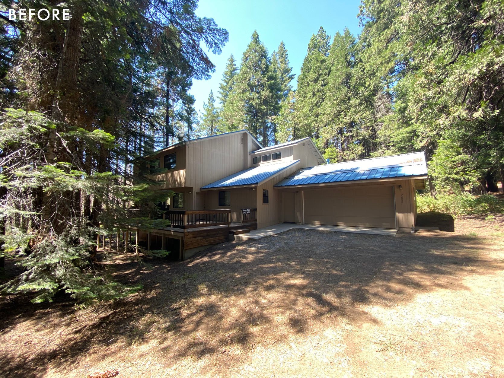
This angle of the house shows what the exterior looked like when I moved in. I’ve since painted it a luscious, rich blue (Goodnight Moon by Clare) and that’s completely changed the way it feels – it looks a lot more elegant now. Basically, my stylistic issue with my plan is that I’m going to basically be tacking a ranch house onto a two-story box. But I’ve gone over a number of different concepts (adding a second floor everywhere, putting the garage in the back of the house, and so on) and none of them make as much sense or are as cost-effective as just making the garage into a living room and plopping a garage on the end of the house. Is it a beautiful and perfect front elevation? No. But will it give me the interior spaces I want? Yes. And I think it’s going to be so hard for people to actually stand back and see the whole thing because of the woods that I don’t think the awkward design would be that noticeable.
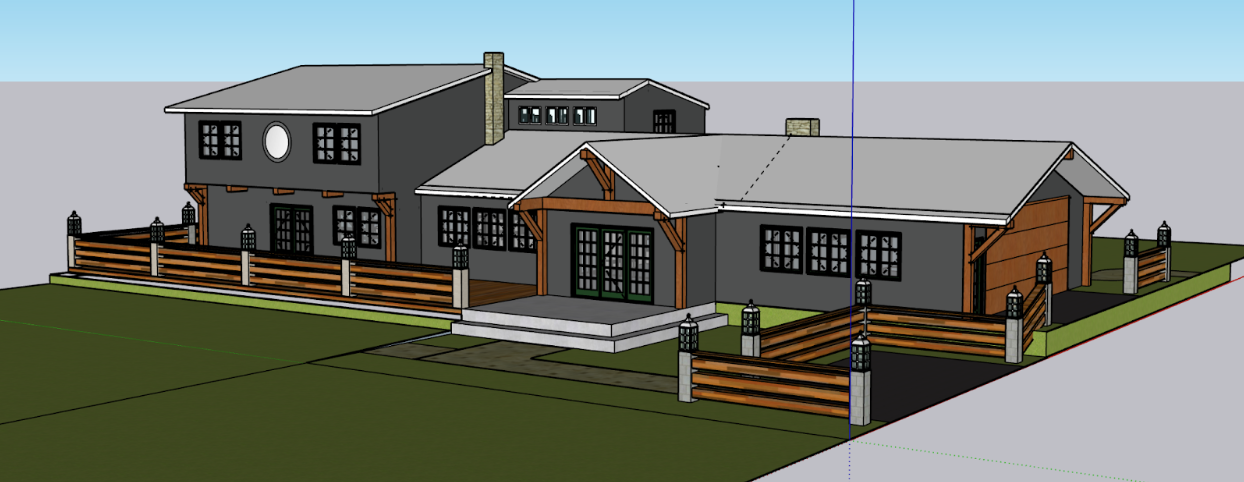
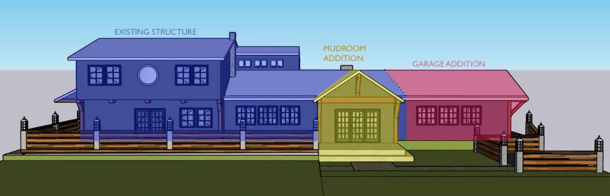
The eventual vibe I’m going for is a combination of Craftsman and Cape Cod styles. Rather than feeling like you’re walking into a 90s box when you arrive, I want people to feel like they’re coming into a home built in 1929, the year the house in Yosemite Valley where I grew up was built. Of course, there are going to be some giveaways that it’s a newer build, but the overall goal is to just make this feel like a place with some history. And luckily, the architecture is rectangular and simple enough that re-skinning everything should make it look vastly different. Again, I don’t want any historic preservationists coming for me being like “well technically that’s not the kind of joinery you’d see in a 1929 Craftsman!” The point is to create a home that tells a romantic story. If I wanted to create an actually historically accurate Craftsman home I would have to start from scratch and that’s way out of my budget.
A lot of friends and designers who have seen the house have been like “why not just make it super modern since it has all these contemporary lines?” And the answer to that is that I am not really attracted to contemporary spaces. While I love beautiful, modern cabins like Emily’s, my association with homes in the woods is that they are old, historic spaces like the homes me and my friends grew up in Yosemite. Plus, quite frankly, I think it’s a lot harder to create a truly timeless look when going modern in a cabin. The goal here is to create spaces that will look just as inviting and relevant in twenty years as they look when they’re freshly remodeled.
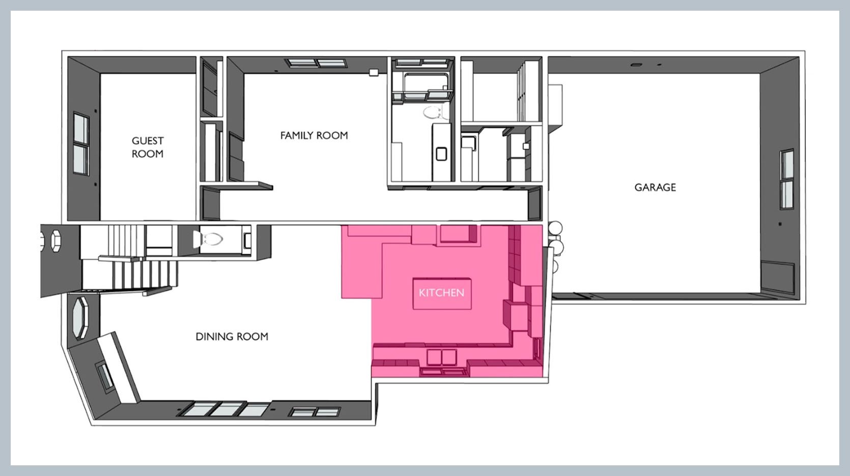
The footprint of the kitchen is not gonna change much. As I said, I really like how the space feels and generally how it’s laid out. The main differences are that I’m adding an exterior door (which will eventually become a hallway when the home’s addition gets built), I’m moving the range to the wall where the refrigerator sits, and I’m building an entire (beautiful) refrigeration wall where the broom closet and cabinets are currently.
Okay, sorry if all that was boring! I just needed to explain the backstory because some of the above facts impact how I designed the kitchen. Let’s see what the actual plans are!
The Overall Kitchen Design Plan
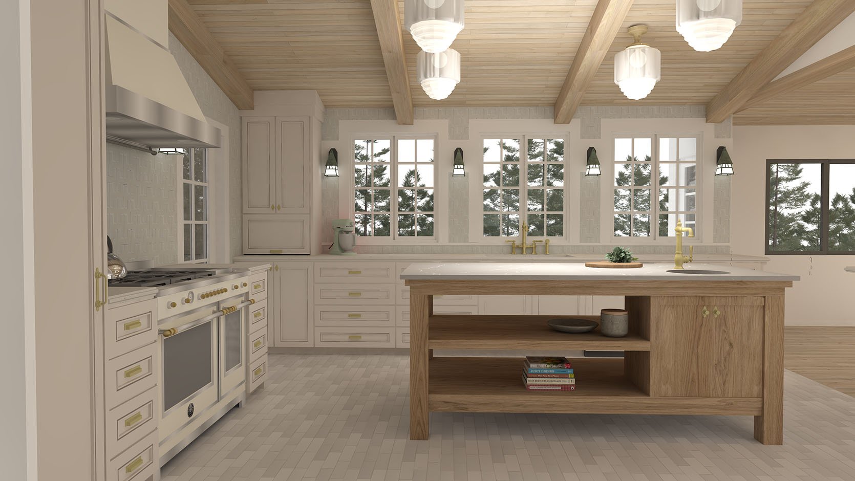
The style I am going for the house is historic and traditional. Often, people tell me they think my style is “clean and modern” but I have always been a lot more attracted to historic homes than to modern ones. For my dream house, I want something that feels like it has some age and history. One of the things I noticed after moving into the house was that the kitchen has a LOT of cabinets. Like borderline too many cabinets. Especially for a vacation house. I’m not sure I’ll ever live in this house full-time again so I know I definitely don’t need that many cabinets. Half of them currently have nothing in them. So my first decision was to get rid of the upper cabinets on the east side of the house and replace them with windows. For a home in the woods, this house has a perplexing lack of windows and doors, almost as if to keep you away from the outdoors. A goal is to make the property a more integrated outdoor/indoor experience.
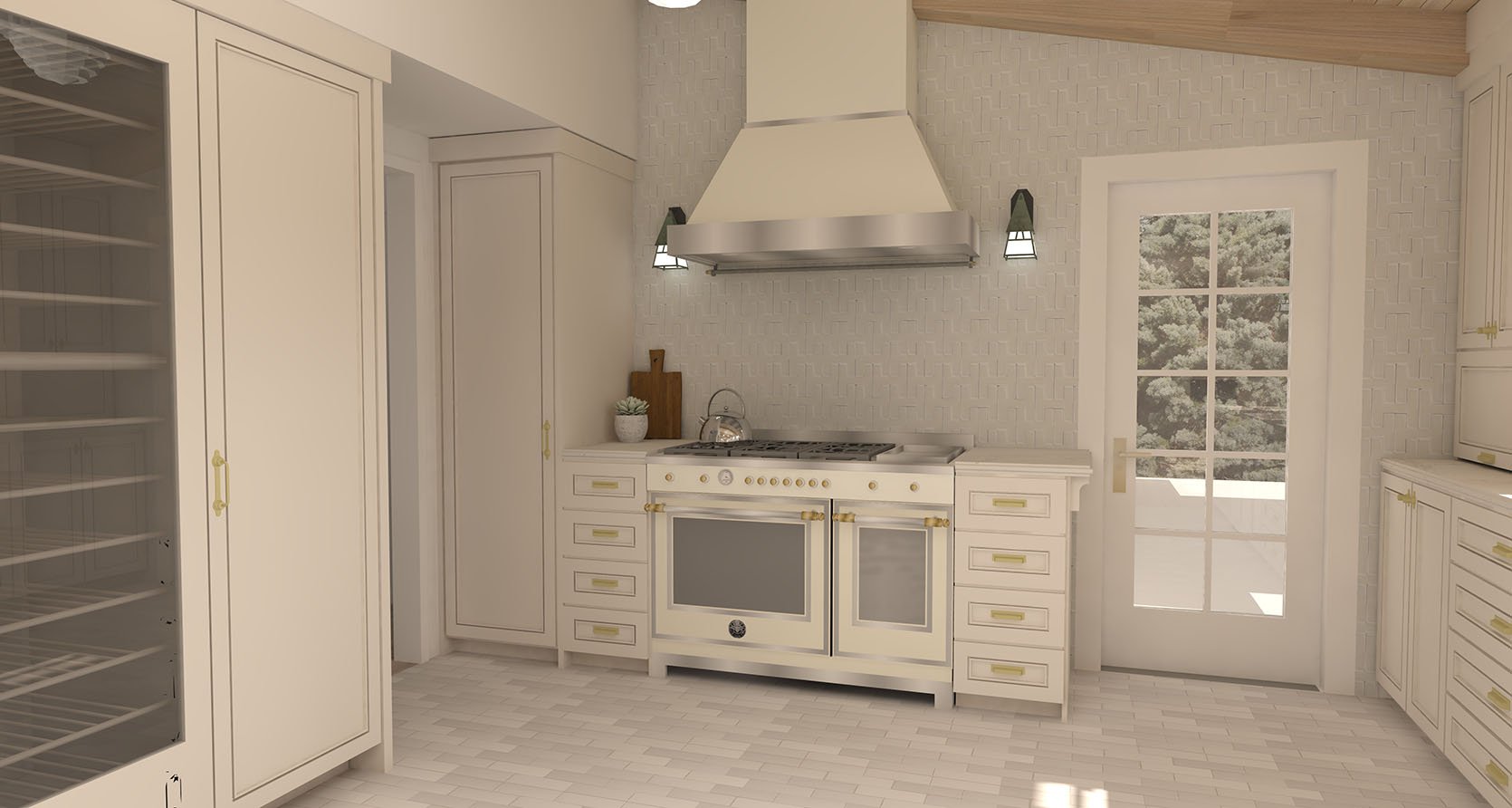
The Range Wall
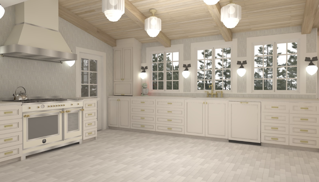
Before I even closed on the house, I reached out to Bertazzoni to pitch the kitchen to them. I was honestly surprised when they agreed to sponsor (i.e. send appliances in exchange for a set of deliverables) because they’d already sponsored my parent’s kitchen and my LA chateau’s makeovers. Most brands will engage with an influencer once, but after they’ve done so they’re kind of over you – they’ve gotten what they need out of you (your audience’s eyeballs). But I’ve met the actual Bertazzoni’s. It’s a family company and they’re pretty loyal to their partners, so I was delighted to get to work with them again (especially because I’ve been coveting my mom’s Heritage Range ever since she got it). Quite frankly, without the Bertazzoni sponsorship, this kitchen would NOT be possible so I am VERY thankful for it.
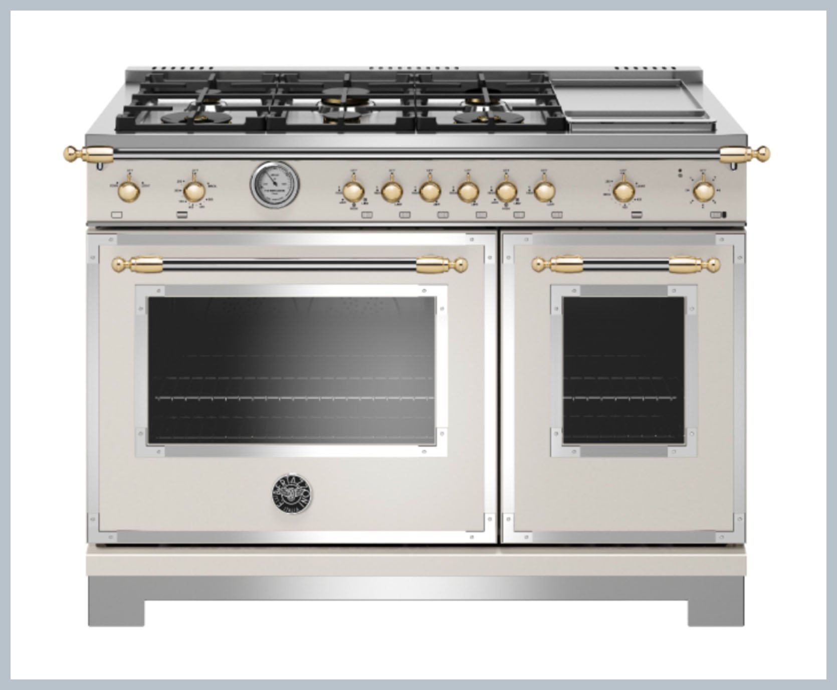
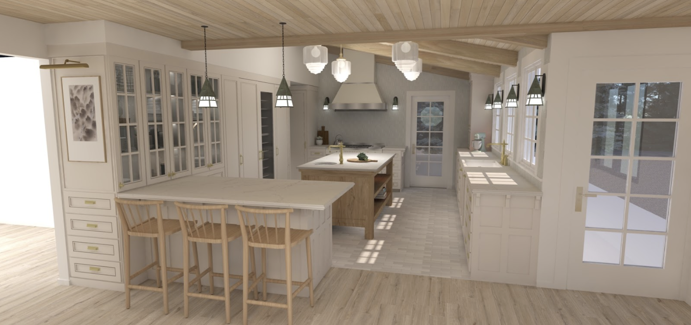
I can’t even believe this gorgeous range is going in my new kitchen. Like I feel oddly not worthy. I’m doing the Bertazzoni Heritage Range (that’s the brass accents all over). The Metalli accents also come in copper and black, but I loved how warm the gold was. The color I’m going with is Avorio, which is a warm ivory that is going to set the tone for the color palette of the whole room.
I’m also doing the matching Heritage Range Hood with Metalli accents. It has a hang bar at the back and I may do something SHOCKING with it: hang pots! But probably only if I get really cute copper pots and pans to hang there that I will get mad if anyone touches unless they sign a contract agreeing to polish them once finished. Hi, I like looking at pretty things and I like things to be perfect all the time. SO SUE ME!
The Tile Choices! (And Orientation Question)
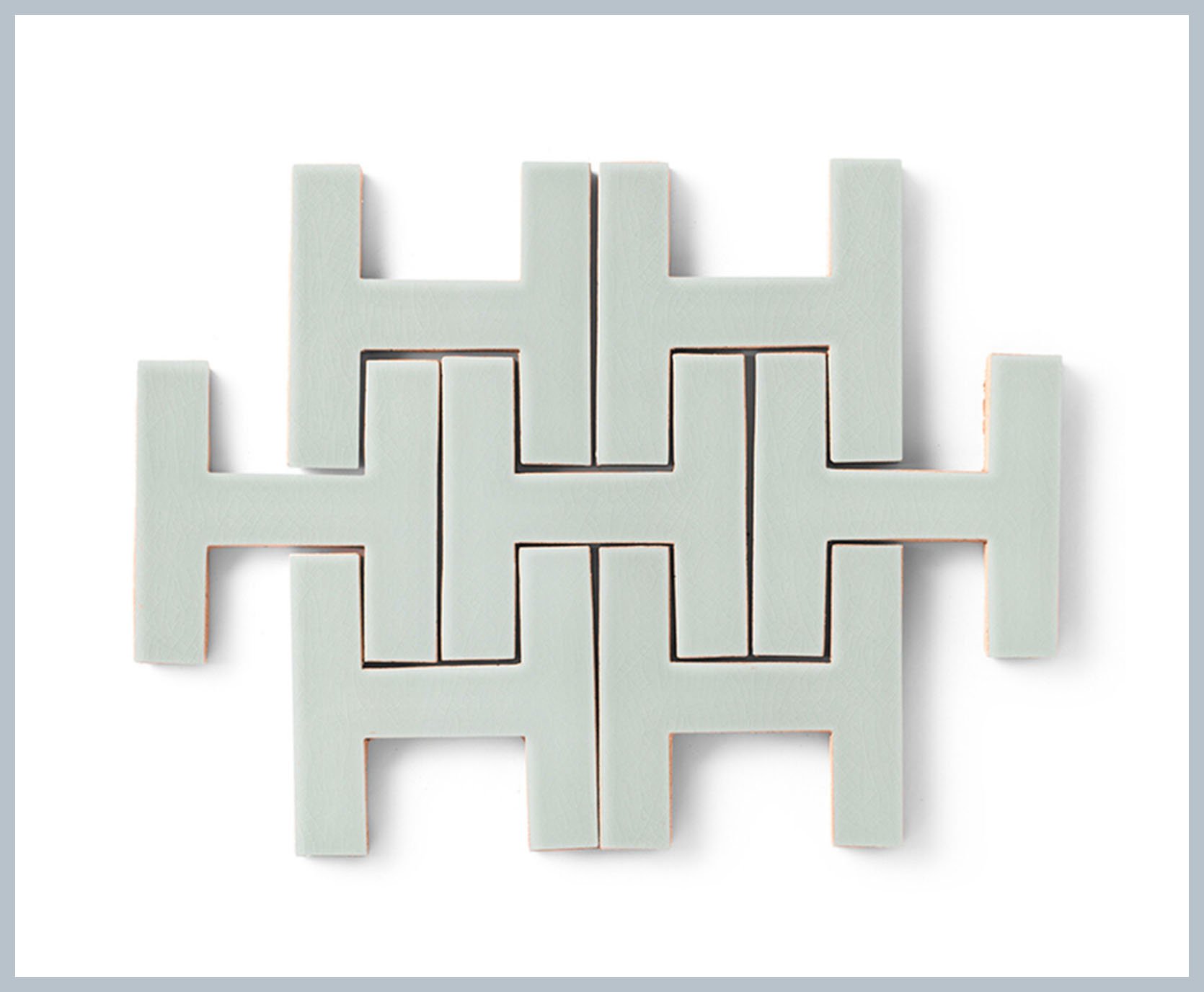
Behind the hood and the range, the walls will be tiled with Fireclay Tile’s Chaine Homme (the color is “Mist.” Because of all the cabinetry, appliances, and windows, there actually isn’t a lot of wall space in this kitchen. So I decided to just tile all the way up to the ceiling around the room. I used Chaine Homme in the Orcondo kitchen years ago and I have always loved it. And I wanted to bring in some color while keeping everything light and airy, so I decided to go with a faint version of a color I’ve been using all over the house since I moved in (it’s kind of a gray-blue-green).
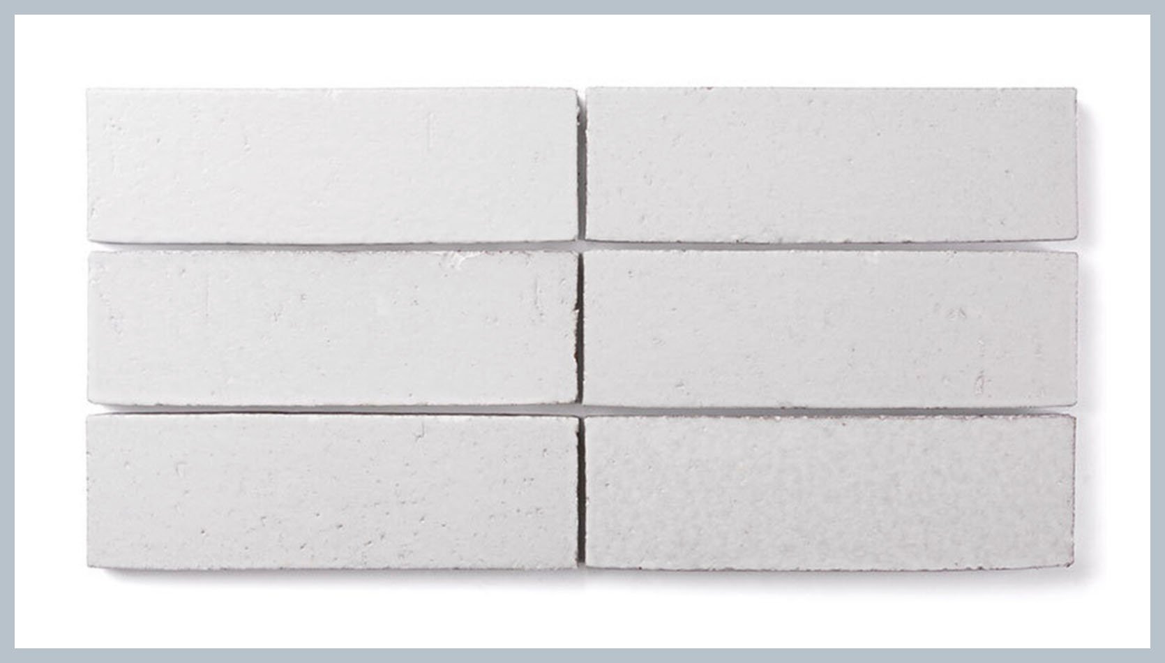
For the flooring, I’m going with another Fireclay Tile. It’s their Brick in the 2.5” x 8” proportion (in the color White Mountains). My original idea was to do this in a weave pattern, but the brand doesn’t technically advise that because the tiles are designed to be irregular and organic (meaning some tilers will have a problem with keeping a grid pattern because the tiles have slightly varying lengths and widths). This is because they’re handmade, which is the whole point and makes them feel a lot more earthy. As of now, my plan is to stagger them but I also LOVE what my friend Shavonda did in her kitchen, which was the pattern I was originally thinking of. Yes, there’s a little bit of a rustic, organic edge to it. But I like how it turned out in her house. I think ultimately I’ll make the decisions based on what the tile installer seems comfortable with. Because even though Shavonda’s floor *looks* like it has a lot of random things happening in it, you can tell it was done by someone who knows what they’re doing and intentionally created the kind of line variation she has.
DEBATE #1: How should I lay the floor tile?
- Stagger it
- Lay it in a weave pattern
- Straight stack it
The Island (And Prep Sink Debate)
I love the amount of prep space in the current kitchen and didn’t want to lose any of it. So I plan to keep an island in the middle of the room. But I wanted it to feel more like a piece of furniture than a cabinet, so I’m having Justin, a longtime friend and the carpenter from my show “Build Me Up”, build me a custom, large island out of white oak. Originally I contemplated doing a chop block top or just wood, but I decided that I wanted something a little more resilient because I will be renting this place out.
The plan is to have the island sit off the floor about 6” so it feels lighter and more open. The island is going to have a sink so there will likely be some piping that goes through the bottom of the island, but it won’t be visible from most places because the sink itself will be far enough in that you’d have to be pretty close/low to see the pipes.
DEBATE #2: Should I buy a bigger sink?
Now, here’s where another debate item comes in. Originally, I simply wanted to replace the bar sink in the current island with another bar sink. So I ordered the very cute Porto Fino bar sink from Kohler and called it a day. But the longer that sink sits in my garage, the more it haunts me that it may end up feeling too small once installed.
In my parent’s kitchen, we installed a beautiful bar sink thinking that’s where we’d put the water filtration system. We ended up NOT doing that (I can’t really remember why) so then we ended up with a smaller sink that had a stationary faucet. It is fine unless we’re all over there cooking and we want two sinks that are fully functional for cooking and washing dishes. The thing that ended up being wrong with my mom’s sink is that we wanted a pull-down faucet so we could rinse things down the drain (for some reason we had the foresight to put a disposal in that sink but not the foresight to put a pull-down faucet). So my mom actually has added a spout that pivots to this faucet (don’t be mad, Kallista! It doesn’t look half bad!). But that whole experience taught me that if you have sinks in your kitchen, you probably are going to want them to be fully functional if you ever plan on having multiple people helping with cooking and cleaning at once.
In sourcing my own sink, I had the foresight to choose a pull-down faucet (the beautiful Kohler Artifacts Pull–Down in Brushed Brass). But now I’m thinking I messed up on the size of that sink. The main sink on the window wall is the Kohler Bakersfield sink, which is 31” wide so I’m now thinking I may want to swap out the island sink for something in the 25” range like the 25” wide Glen Falls sink or something similar.
The pros to keeping the Porto Fino sink are:
- I already have it
- I love the cute round shape and how it differentiates it from the main sink
- What if I never end up using that island sink to wash vegetables or do dishes?
The pros to getting a bigger sink are:
- It’ll be big enough to wash pots and pans
- It’ll be big enough to soak dishes
- It will be rectangular and match the shape of the main sink
What do you think?
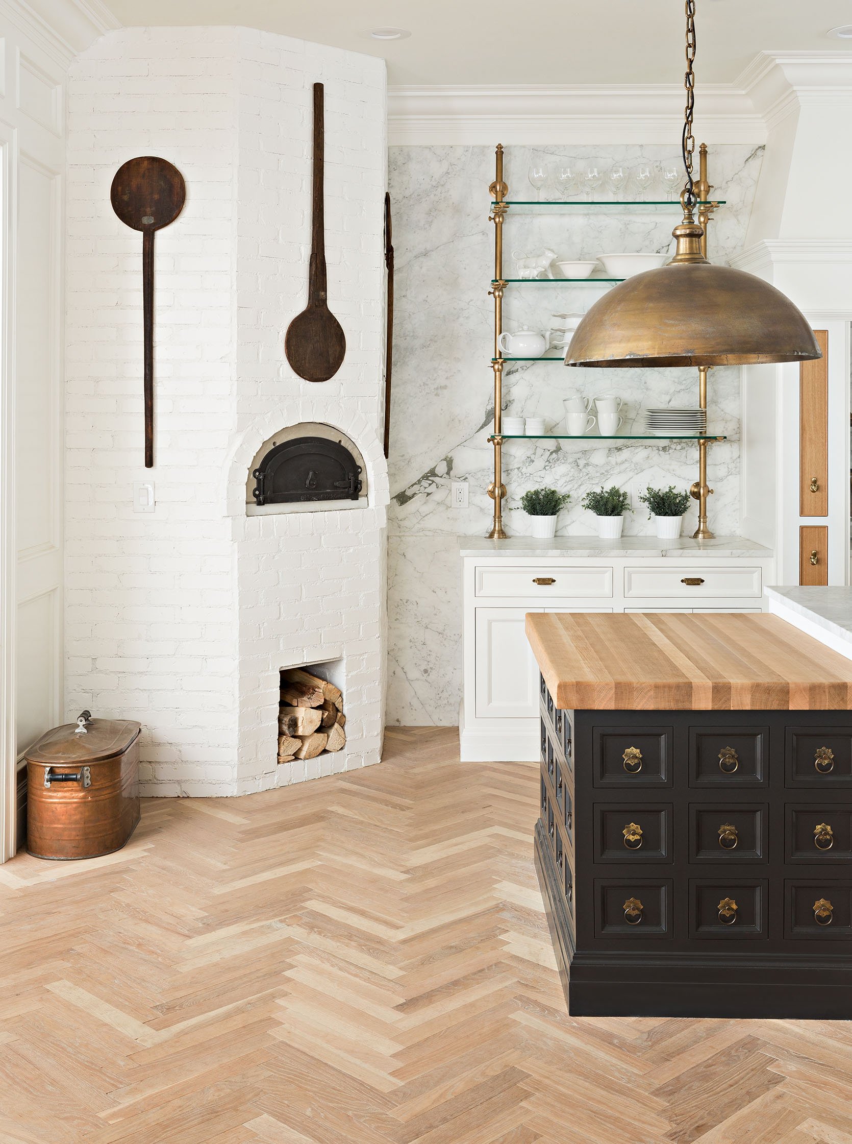
A Wood-Fired Oven????
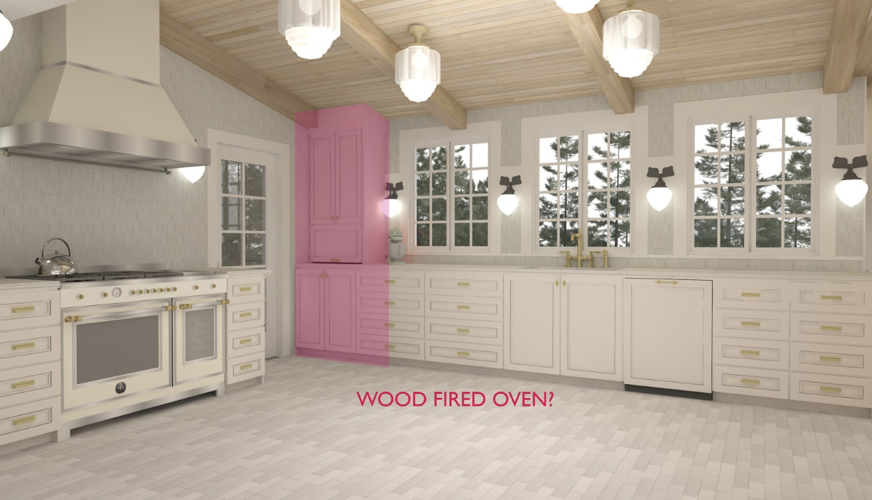
Okay, while we’re still on this side of the room, I want to throw another debate item at you and this one is kind of a curveball because I literally just thought of it. SHOULD I BUILD A PRETTY BUT MOSTLY DECORATIVE PIZZA OVEN/FIREPLACE THING? I’ve never put these in a kitchen for a client so I have zero experience with them, but I guess the correct term for them is “wood-fired oven.” They were common in the European kitchens of yesteryear (or yestercentury more like it). But they’re not often found in modern kitchens. For some reason, everyone who has a pizza oven puts it outside. But why let the yard have all the fun?
Here’s my thinking here. And yes, it’s going to be long-winded because I’m incapable of telling a short story. Have any of you been watching that Netflix show “The World’s Most Amazing Vacation Rentals”? Well, I spent all week VERY SICK with food poisoning and/or salmonella (yay!) and I have watched pretty much the whole thing now. I have some notes about how absolutely bonkers the hosts’ responses to everything are but I’ll keep those to myself (oops I said it!). But it’s a fun show and the hosts are really charming even if it seems like their heads might pop off from excitement every time they walk into a new room.
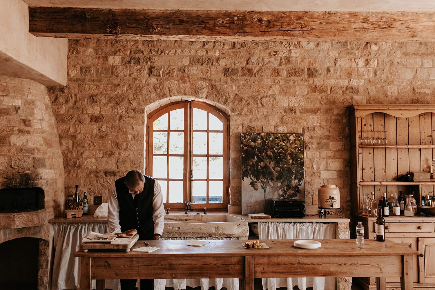
Anyyyyywayyyy, in one episode the show went to Sunstone Winery, which is a beautiful property in Santa Ynez that looks like it’s in the Mediterranean and is a thousand years old. It’s really beautifully done and in one shot, they showed the kitchen (above). And in that kitchen was… A fireplace? A pizza oven? Both? It was a wood-fired oven. And I was like, “MA’AM! I WANT THAT!”
Now, will I ever cook a pizza in that oven? Probably not. Will I burn fires in it and feel cozy? Absolutely. I could just install a fireplace in the kitchen but I think the novelty of it actually functioning to cook is pretty fun. In the light research I’ve done, in California, you’re allowed to build a wood-burning pizza oven in a kitchen but not a regular wood-burning fireplace (I’m pretty sure you can’t put those in anywhere). Which is fine, I could just do a gas fireplace in there. But I think it would be mostly just something to look at, something that occasionally gets used, and hopefully something that leaves the faint tint of smoke and wood in the air. I just like the presence of something that feels old-world like this in the kitchen and it also would allow me to bring in another element – stone.
So here’s my question. Is it stupid to install an indoor wood-fired oven just because I want to look at it? Even though I’d probably only make like three pizzas per year in it and maybe one loaf of bread? It could also be fun to roast marshmallows in with my niece and nephews. But mostly I’d probably just have it styled with a few logs and look at it all the time. There are companies (like this one) that make the inserts so I could just build it into a corner and pretend I live in the olden days (which sometimes I do because the power goes off a lot here and quite honestly I’d probably use this wood-fired oven to cook in those cases).
I’d also have to get rid of the appliance garage to make way for the wood-fired oven, but I think I can find another place for that. I’d probably relocate it to the space to the left of the refrigeration columns.
DEBATE #3 – Should I add a wood-fired oven just for fun and literally no other reason?
So let’s all vote. Is the wood-fired oven thing?:
- Totally a waste of money and cabinet space.
- A fun way to bring in something novel and another finish, stone!
My Grand Fridge Wall
One change I’m really excited about is the integrated refrigeration columns on the west wall of the kitchen. I wanted this kitchen to feel as old-world and warm as possible, so I am going with Bertazzoni’s Panel-Ready Built-In Columns and I could not be more excited about it. As it’s laid out now, the refrigerator will be on the right, a glass-fronted wine fridge will be in the center, and a freezer column will be on the left. Each column is 24” wide and at first, I thought that might not be enough refrigeration but once I thought about how tall the units are (83”) I realized I was gaining a lot more space than I have now with a full-size refrigerator/freezer combo.
To the left of the refrigeration is something I really wanted in the kitchen: glass-fronted cabinets. Now, this is not something I recommend to clients most of the time. I only really recommend this to designers, stylists, and people who love arranging things. Because these cabinets will have to be expertly styled all the time or they will look terrible. But I wanted a place to store my “pretty-but-please-don’t-touch” pottery collection. I have a lot of pretty dishes and one-of-a-kind pottery I would like a place to display. And I also want a reason to start collecting more. Like a lot of you, I am obsessed with beautiful handmade pottery. Since this house will be a vacation rental, and also to add some style and charm to these cabinets, I may have the cabinet maker add those old-timey brass locks with the old-timey keys so I can make sure no one accesses these shelves when I don’t want them to. They’ll also be a source of light for that side of the room. The shelves will be glass to let light through and the shelving will be illuminated from above.
This side of the room involves one of the only real demos we’re going to have to do in here – knocking out what is currently a broom closet in the adjacent hall so I can sink all that refrigeration into that wall. I’ve had to do some drywall work in the house myself and honestly, it kind of taught me that drywall is a lot easier to work with than one would expect.
Pretty Yet Super Durable Countertops
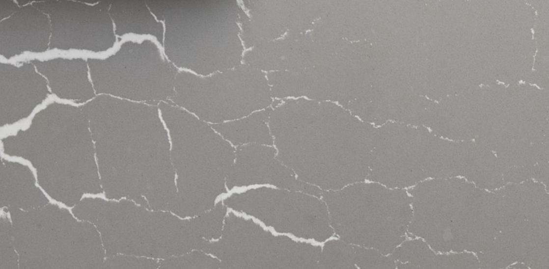

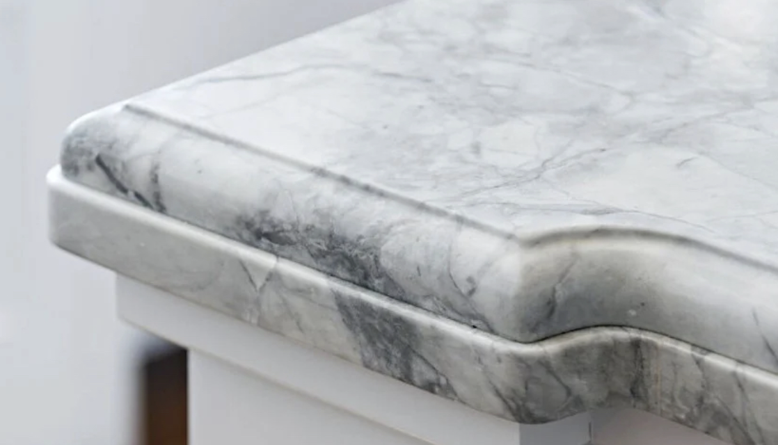
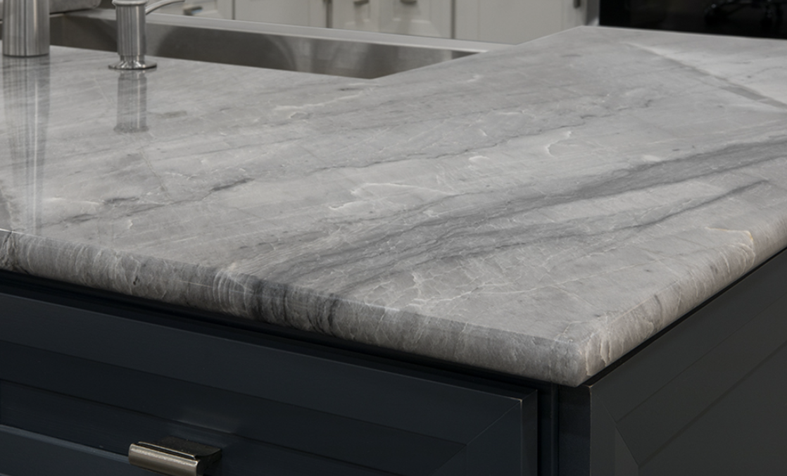
As I said in describing the island above, the idea with it was to make it feel like a standalone piece of furniture. One of the ways I’m planning on doing this is with the countertop. For most of the counters in the kitchen, I plan to use Cambria’s Inverness Frost. This is a REALLY beautiful new pattern from them. The technology and artistry with these countertops keeps getting more and more impressive year after year. And this particular pattern features debossed veining that makes it look impossibly real. I wanted the main counters to feel light so I’m going with a marble look everywhere except the island, where I’m using their Clare design. I’ll also likely differentiate the finishes (you can do them matte or polished) to drive home that they are two different things. And finally, I’m planning on edging them differently. For the perimeter countertops, I’m planning a more traditional profile in a 1.5” depth/thickness:
For the island, I’m looking to do something simpler like this at a ¾” thickness:
Originally I wanted the entire island, including the top, to be wood, but the more I thought about it the more I didn’t want to deal with water damage around the sink or having to be “that person” who always yelled at everyone to wipe up any moisture around the sink.
I’ve oddly never done a non-rectangular edging on a countertop in any of my projects, so I thought this was a good opportunity to try something new.
Lighting And Some QUESTIONS
Quick note before this next discussion: that thing over the current island is NOT a skylight. It’s fluorescent lights and it kills my soul every time it’s turned on. I’ve cooked in the dark many a night rather than be bathed in that blue, blaring light of death.
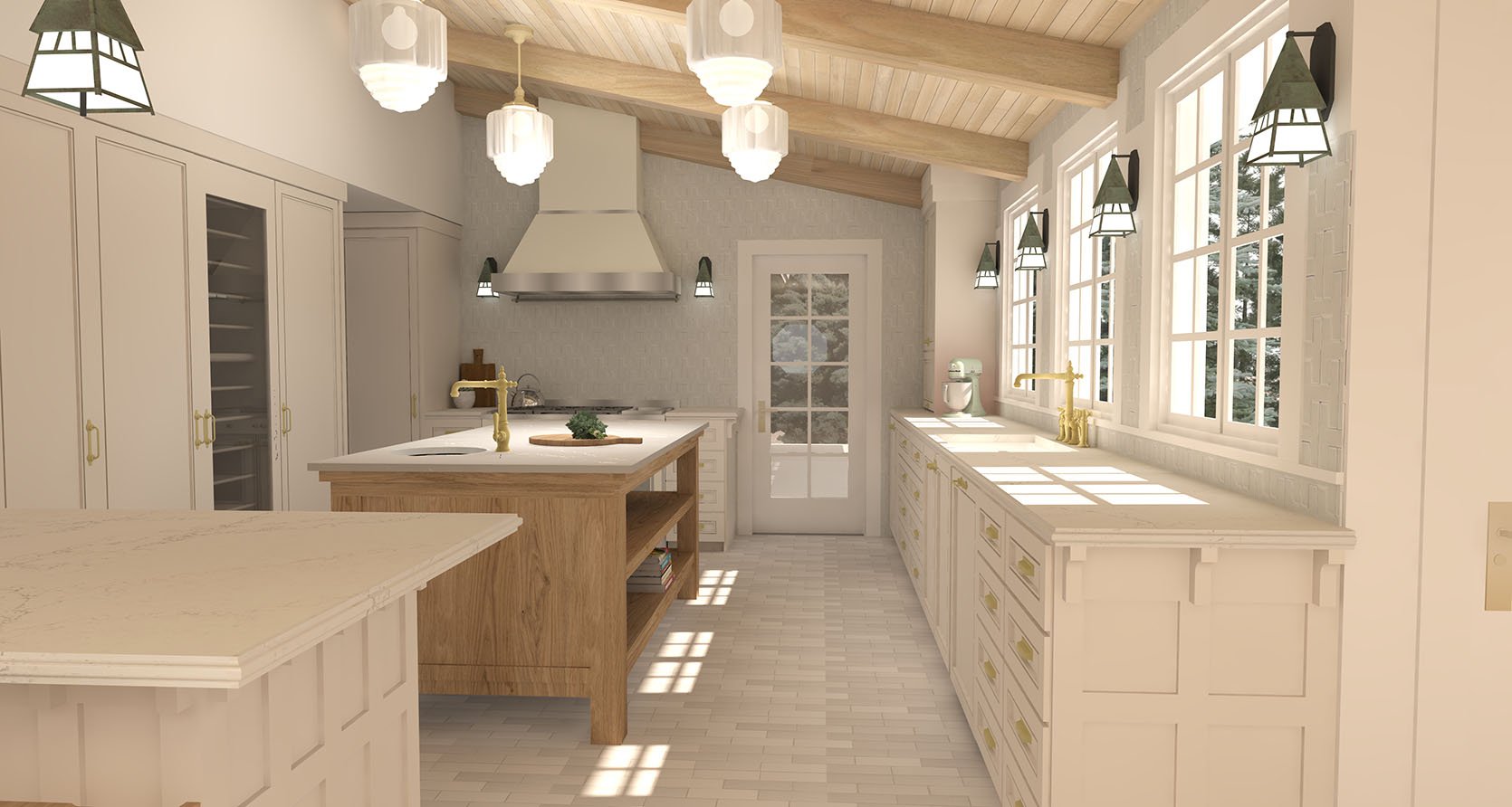
Now, here’s something fun to talk about: LIGHTING. My overall plan for the house is to avoid recessed lighting anywhere in favor of having pretty, practical lights wherever possible. I have a general disdain for the way recessed lights have become a fix-all for lighting issues because they’re often installed in haphazard and careless ways. My pet peeve is going into a house and seeing a ceiling where there are recessed lights all over with no pattern or sense of symmetry. It’s as if people think just because they’re recessed, they’re invisible. So you look at many a modern ceiling and you see something that looks like swiss cheese. And the light itself is harsh and directional. Which, yes, is fine when you’re not looking at it. But oh man, when you look at it! My eyes!
I’m not fully anti-recessed, I just wish they were installed with more care, in more intentional patterns, and with softer light. So in a room where you need lots of light to see what you’re doing, and where there are no cabinets to hide under-counter lighting in, where do you put lights? I decided to do four to six large milk glass pendants (these are from Rejuvenation but I’m not sure I’ll be able to afford them so the exact fixture is TBD). These will provide a wash of light for the whole space. And like all the lights in my home, they’ll be on a dimmer.
For the “work” lights, I’m looking at something kinda weird. Outdoor lights. I was playing around with the absolutely stunning Wildwood Sconce from Rejuvenation but unfortunately, it turned out to be way too big for the indoor application I was looking for (they’re not fully to scale in the render above, they’re a bit bigger than that in person). It might work for a bigger kitchen, but the sconce would project too much into the space and make it feel too tight.
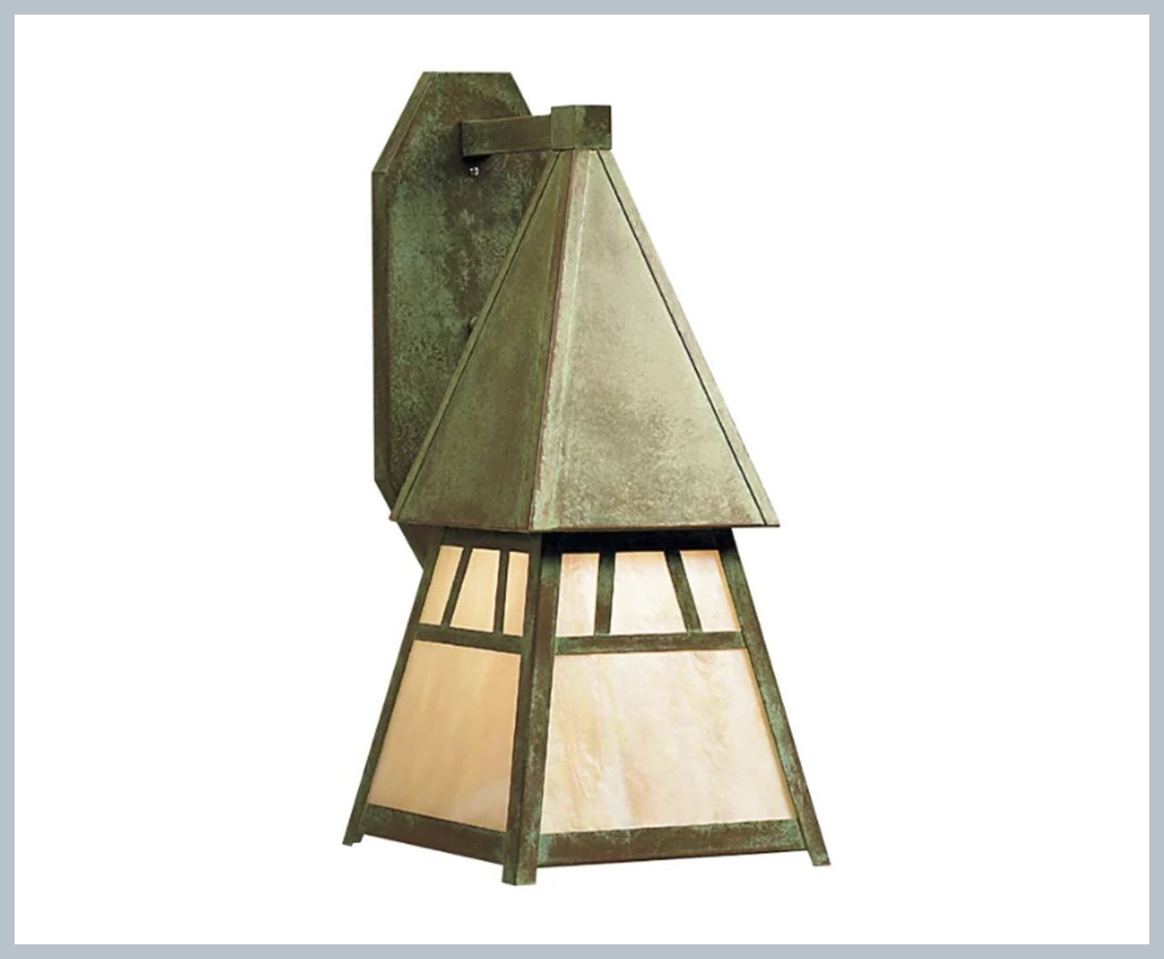
In the renders, I’ve shown these interesting/borderline weird wall sconces from Arroyo Craftsman. Here’s what I like about them. Firstly, I love that they bring in some rustic warmth with their verdigris finish. It feels somehow appropriate for a cabin to have a nod to the outdoors here and there so the fact that they’re not indoor fixtures seems unexpected and novel to me. I also love that the green color calls back to the faint green in the wall tile. These sconces come in a number of different sizes, including one small enough that it won’t impede the workspace. And because they are meant to go outside, I think they’ll be way easier to keep clean than something with a cloth shade. Finally, they also come in a hanging pendant in the exact same proportion as the wall sconce so if I want to create a perimeter or light for working around the room, I can keep it consistent. If you’ll notice, all the scones and the two pendants of the same style are hung at the same height to give some symmetry around the room.
DEBATE #4 – Are outdoor sconces an edgy addition or will they make me look like I don’t know what I’m doing?
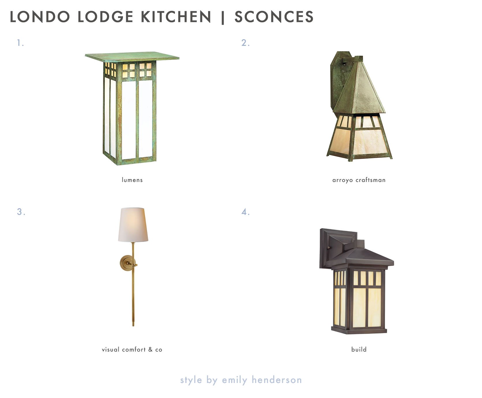
1. Burnham Single Light 13″ Tall Outdoor Wall Sconce | 2. Dartmouth | 3. Bryant Large Tail Sconce | 4. Glasgow GW Outdoor Wall Sconce
Okay, so here’s what I’m going back and forth on and what I need your help with. Firstly, is this idea weird in a cool way that’s like, “Oh fun, he did something inventive by using exterior lighting inside!” Or is it more like, “Does that man whose literal job it is to know, not know that that’s an exterior sconce he just put in his kitchen?”
If I do choose an exterior sconce, should I go with something more rectangular and less edgy than the Dartmouth sconce? Maybe those would drive the Craftsman nod home a little more efficiently? Or should I go a completely different direction and go with something like the Bryant Sconce (the one with the shade) to take the kitchen in a more approachable, aspirational Nancy Meyers direction? Finally, Build.com and a number of other sites sell cheaper versions of a craftsman-style sconce. The Dartmouth is about $350 in the size I’m looking at, which adds up when you multiply it by six. While I’m really attracted to the finish of the Dartmouth, there’s something really clean about the Build.com version that may feel a bit more appropriate in a kitchen. What do you think?
If it helps with your decision, the ceiling lights I’m currently looking at are these:
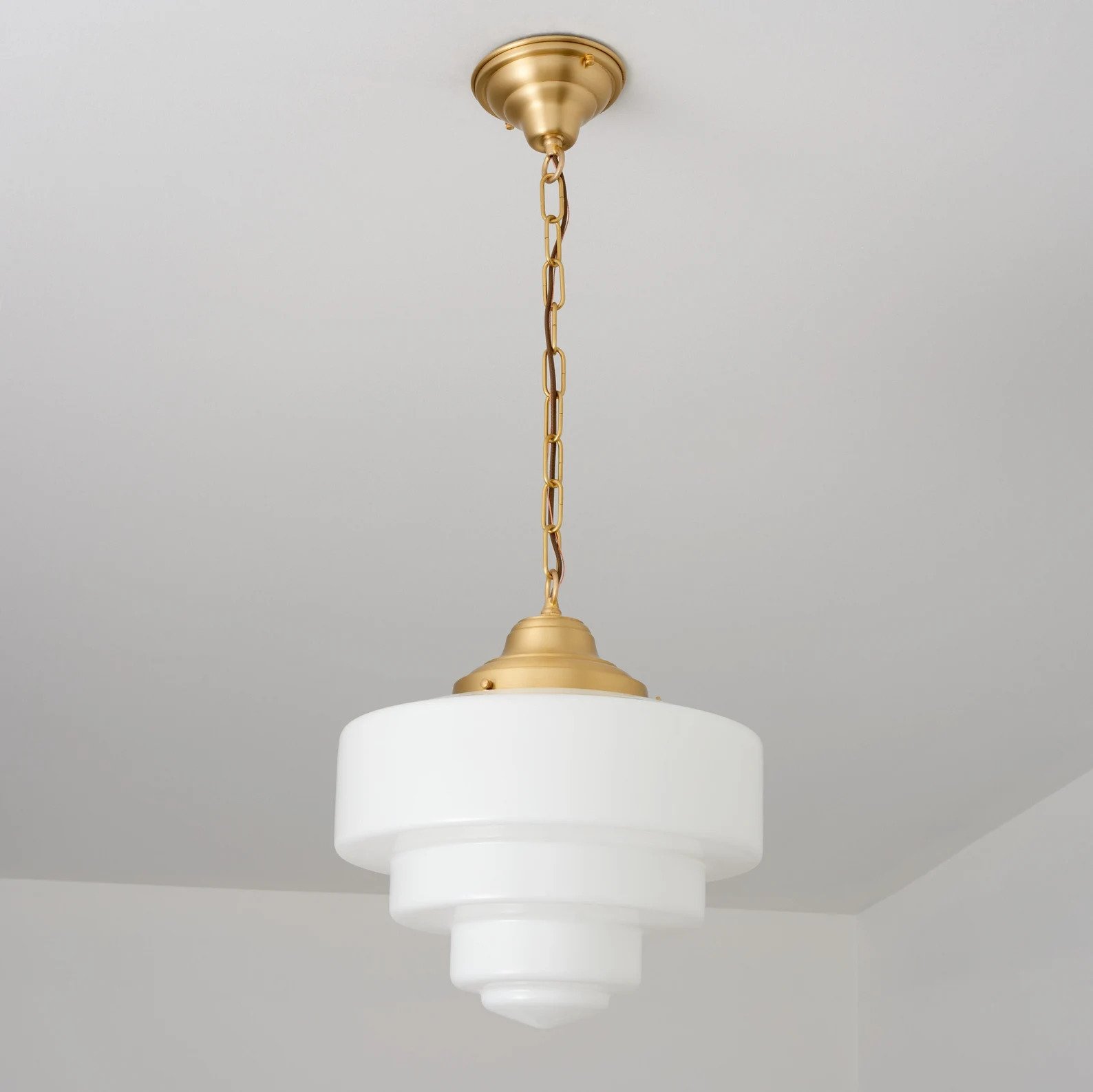
I love mixing in a little deco with some of the craftsman elements. Craftsman came about a little earlier (1901, Art Deco around 1910) but they coexisted for a while and I think they complement each other nicely. Which brings me to two more debates…
The Big Style Question…
DEBATE #5 – Does Art Deco go with Craftsman?
Firstly, do you think these Art Deco-inspired wedding cake pendants go with the angular-yet-still-blatantly-Craftsman Dartmouth sconces?
The second debate in this section is slightly harder to explain but I’ll try. One of my friends thought it looked weird to match the pendants over the peninsula to the sconces on the walls around the room. He thought they should match, at least stylistically, the hanging pendants on the ceiling because they are ceiling fixtures. My thinking was to match the light fixtures based on height. But I’m also a sucker for creating a system of logic in a home and sticking with it. For example, “the doors are black in this house.” Creating simple rules like that tends to put peoples’ minds at ease – people like symmetry, continuity, and cohesion. So I am very swayed by the “the pendants should match the style of the bigger ceiling pendants” argument, but I also really like how the Dartmouth pendants currently look contrasting the larger ceiling pendants. I’m not totally settled on the ceiling fixtures but I know for sure I want something large with a milk glass/white shade so that the light is soft yet abundant. So no matter what, it will be some large fixture in brass (I gotta bring in those Bertazzoni Metalli accents!) with a glass white shade/globe of some sort.
So what do you think?
- Ceiling fixtures should match to create a more logical system of design for the kitchen.
- The Craftsman pendants that match the sconces work best because they are at the same height around the room.
Today’s Final Thoughts
Sorry, are you exhausted yet? I know I am. A few general things about this design. Firstly, I had the renderer add those beams for effect but I don’t know if they’ll actually make it into the room. My plan for the whole house is to clad the ceiling in wood, so I know I want something warm up there, but I don’t know just yet if that’s going to involve beams. The reason I’m waiting on paneling the ceiling is that I have some renovations upstairs that will involve breaking through the downstairs ceiling for piping, etc so I don’t want to do anything before then.
Second, the style of the cabinets is likely gonna change back to a simpler shaker-style cabinet front, likely with a lot less drawers and more cabinets. The reason for the style change is really that I was just trying too hard NOT to do shaker because it’s become so ubiquitous. So I did shaker with a bead on it for these renders, which I think is really pretty but doesn’t feel as appropriate to bring into a Craftsman-ish space. As a content producer, sometimes you feel pressure to do things just so that they are noteworthy and interesting, not because you think they are actually right for the space. I want to share ideas and takeaways with people that are helpful and interesting and haven’t been seen over and over, so I was just trying to do any cabinet style aside from shaker. But shaker just makes the most sense, it’s the style of cabinet we had in the little Craftsman bungalow in Yosemite where I grew up, so I’m going with that.
I basically put drawers everywhere, which is they’re all over the rendering. And I do really love a drawer vs a cabinet. But they’re just way more expensive, so in order to afford the cabinetry I may have to nix most of the drawers in favor of more budget-friendly cabinet doors. I’d be lying if I said that didn’t bum me out, but I’m hoping if it really bothers me someday I’ll be able to replace them with drawers.
And finally, I’m adding the door to the kitchen because the plan is to make it into a hallway that will be part of the home’s northern addition. There’s a big chance I’ll never be able to afford that. So I have to approach the design of this room with my master plan in mind, while also being mindful that it may never happen. It’s a weird feeling, not being able to renovate your house all at once. You’re constantly telling people, “well this will make sense when ____ happens!” It’s all a leap of faith that things are going to continue going in the right direction.
I’m pretty confident that I will be able to figure out how to do the full home renovation I envisioned the first time I set my eyes on Londo Lodge. But sometimes talking about it I feel foolish–like I’m somehow talking about a fantastical future that may never be. But, as with other parts of life, I think it’s good to be ambitious even if there’s the chance you’ll never meet your own grand plans. So the course I’m taking with Londo Lodge is one of tackling projects as I can afford them. It’s not always easy to keep house projects in digestible chunks, but that’s the tact I’m trying to take so I can pay for things as I go.
Will Londo Lodge ever turn into the grand, historic space I want it to? Will this kitchen turn out to be the mountain version of Coastal Grandma? Will having this kitchen turn me into a Nancy Meyers character who wears ivory cable knit sweaters, drinks white wine, and is constantly hosting giant yet effortless dinners in my home? FOLLOW ALONG WHY DON’T YOU AND FIND OUT!
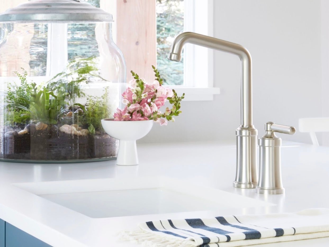
Opening Image Credits: Photo by Sara Ligorria-Tramp
THIS POST WAS ORIGINALLY PUBLISHED HERE.
