When I see a colorful home, it reminds me of why I love interiors. A colorful home is not only exciting to look at, but it shows the art form that is interior design in a really powerful way. Much like a painting, the decision to use color (or not use color) in a room plays a huge role in how a space will turn out. Although there are no strict rules, there are ways to use color well and Dee Murphy’s home is a prime example of that. Her home is colorful yet balanced, making it feel personal, layered, and eclectic. As I said there are no rules, but virtually touring her home is like taking a Masterclass on how to use color (and pattern) in your home. So, shall we begin taking notes? Let’s get into it.
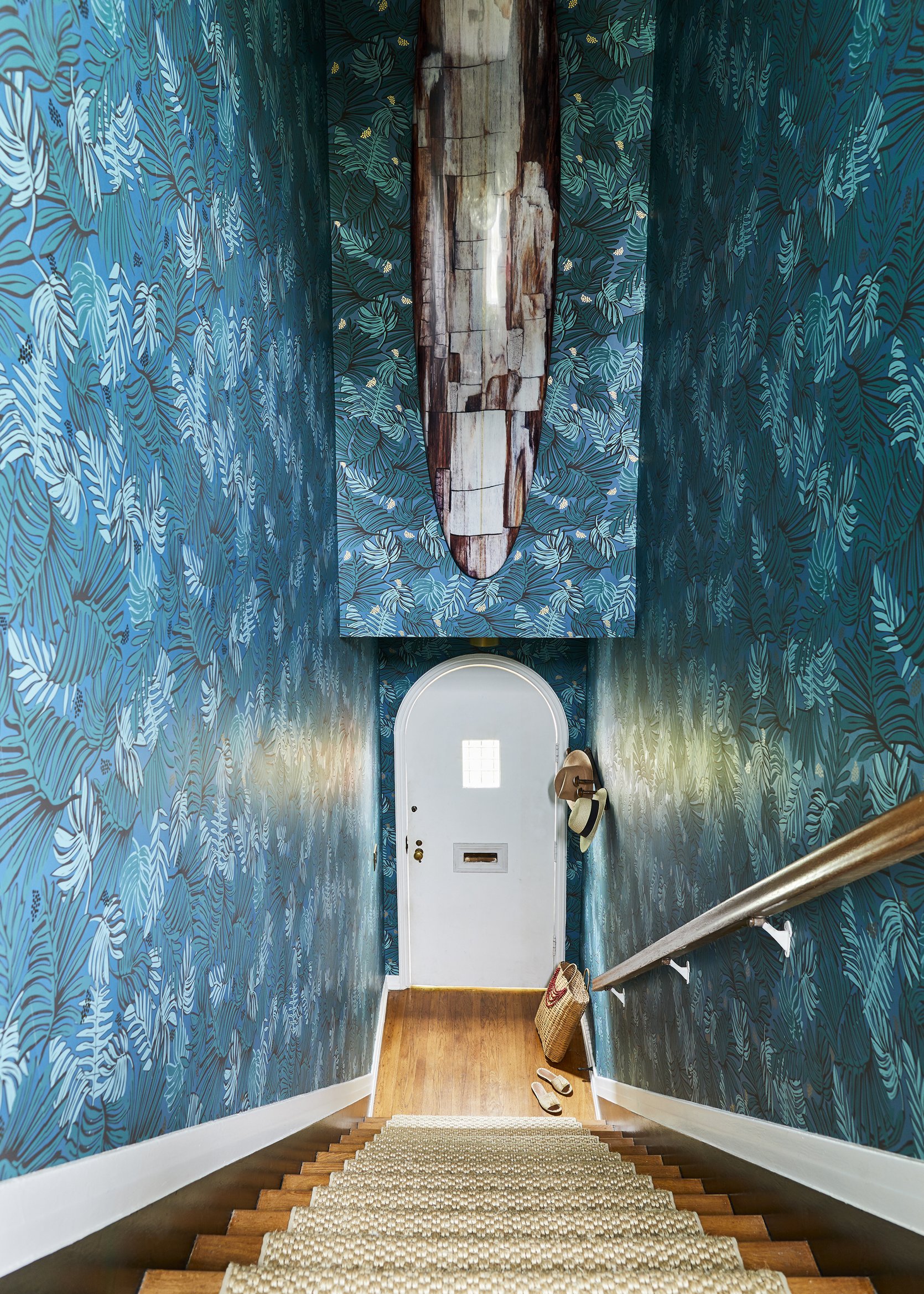
The entry stairway wallpaper should give you a good idea of her style and bravery when it comes to pattern and color. The size of the stairway and her commitment to this wallpaper really intrigued me so I asked how she chose this wallpaper for this space (and how she approaches choosing wallpaper in general):
“When I choose wallpaper, whether for myself or for one of my clients, the inspiration comes from both the home (how old is the space, what does the architecture provide?), and from the aesthetic we are aiming for (moody and cozy, bright and cheerful?). My home was built in 1920 and feels very much like a Parisian apartment. You enter from a center courtyard into a tall, somewhat dark staircase. I wanted the wallpaper to be impactful and dramatic, to embrace the moodiness, and to ‘speak to’ the flowers and foliage just outside the front door.”
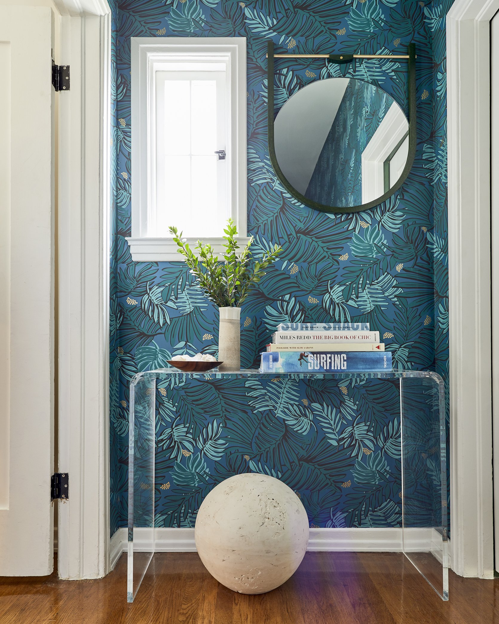
At the top of the stairs, you can see Dee’s expert eye when it comes to mixing colors, tones, and patterns. The wallpaper brings in varying tones of blues and greens which she complements with the green framed mirror. The plant and coffee table books pepper in more blues and greens, which are grounded by the clear glass console table. For more movement and texture, there is the concrete ball sculpture that is both bold and dramatic. This might be one of my favorite vignettes ever! It is balanced, eclectic, and so fun.
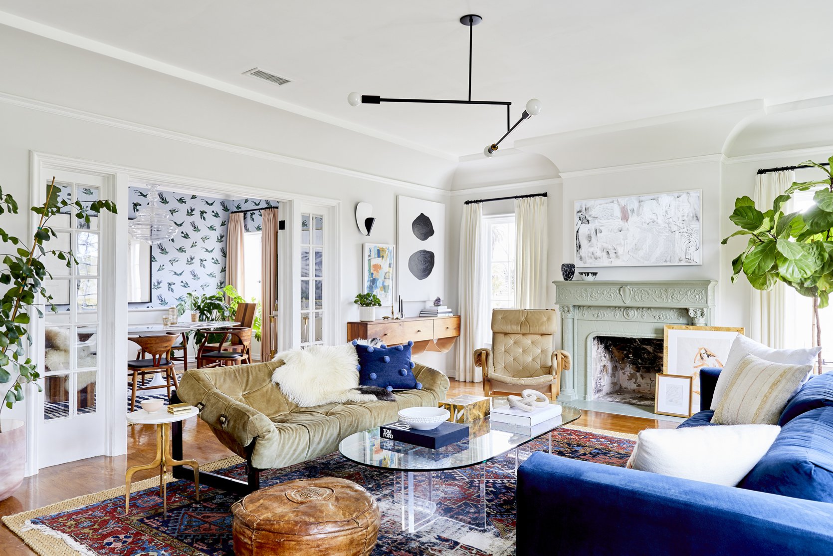
Immediately to the left of the stairs, you enter the most sun-filled room of the house where Dee wanted to play with the beautiful tension between dark and light.
When introducing colors to a neutral room, balance and cohesion are key so I asked how she goes about mixing colors. She explained, “When mixing colors in a room, you begin with the strongest hues from your statement piece (for me that usually means the wallpaper or the rug), and you layer in some accessories in those shades. The more interesting and fun part, though, is to find the ‘supporting cast’, and to work those less obvious choices into the room.”
In this case, the colorful Persian rug creates the backdrop for so many different colors to come through. The most obvious is blue, which is showcased most notably with the gorgeous blue sofa. Then you see more blues peppered throughout. The throw pillow, the coffee table book, the art, and even the wallpaper in the connecting dining room create a calming cohesion throughout the space.
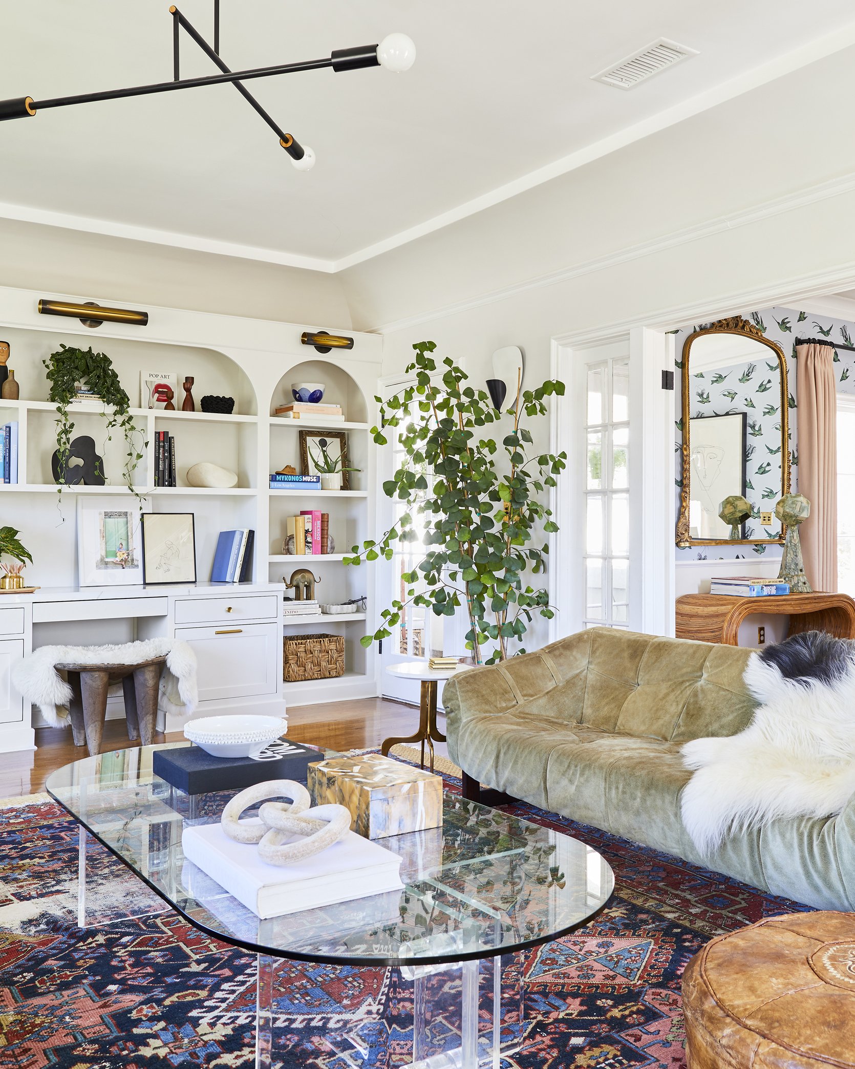
The more subtle tones in the rug allow for other colors to shine in the room as well. The tan sofa color is pulled from the rug so it feels very connected to the rest of the room. The styling on the bookcase also speaks to the rug so there is so much continuity throughout the space.
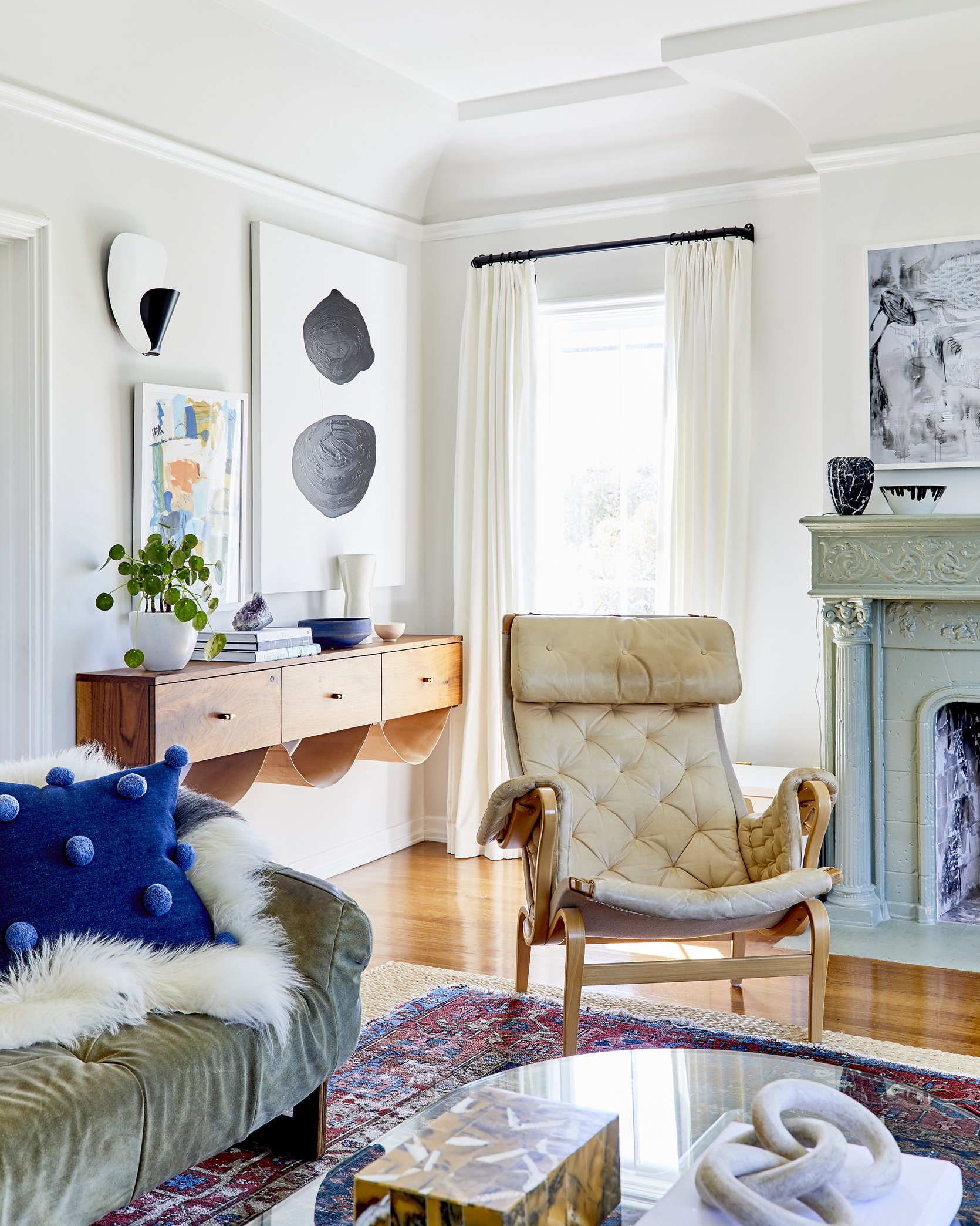
It is my opinion that we can’t fully appreciate color without first recognizing the absence of it in a space. In this room, for instance, the white walls and molding create a canvas for all of the colors and patterns to really pop. With a really bold wall color or wallpaper in here, all the wonderful colors in this room could get lost, so the white walls are the perfect backdrop.
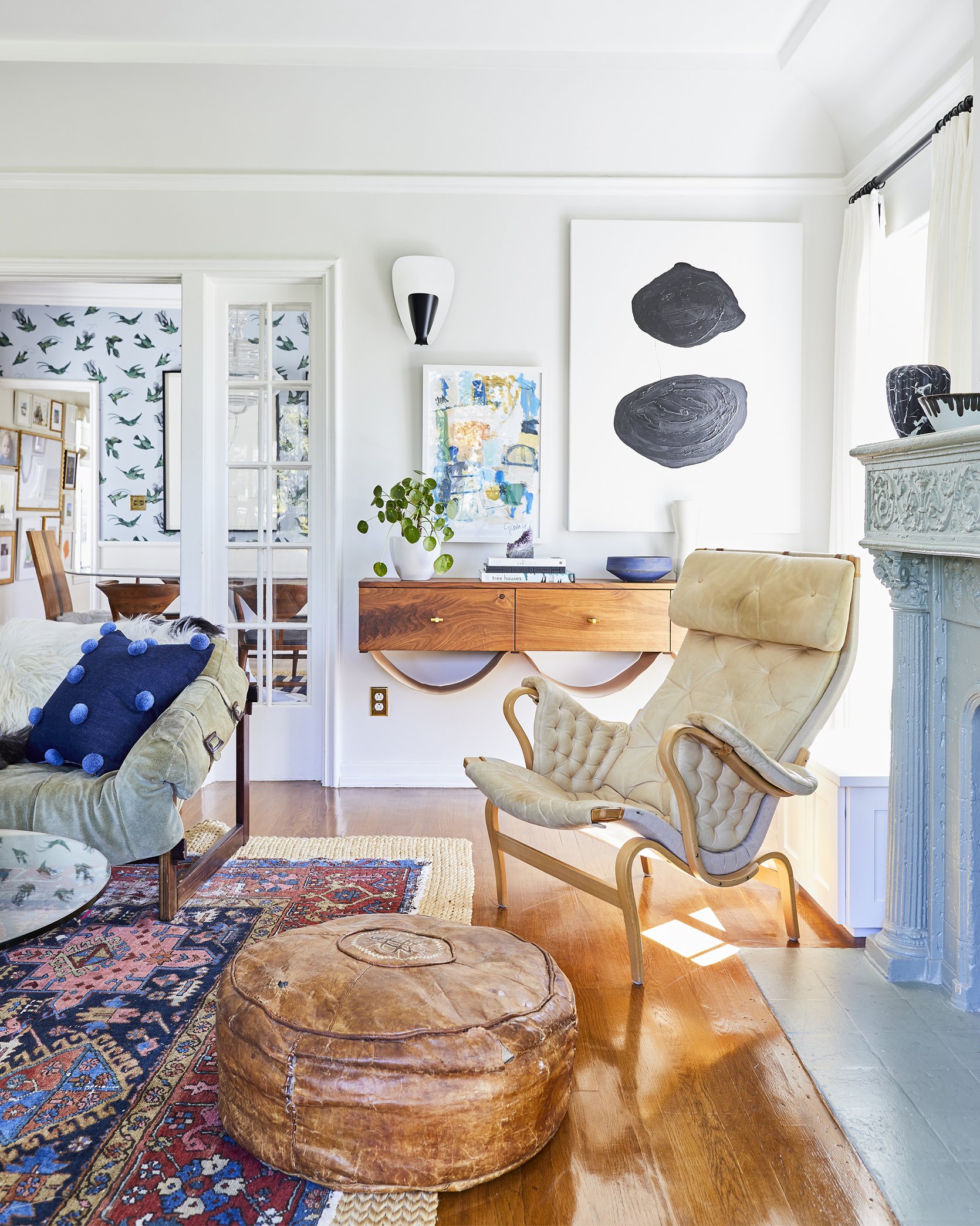
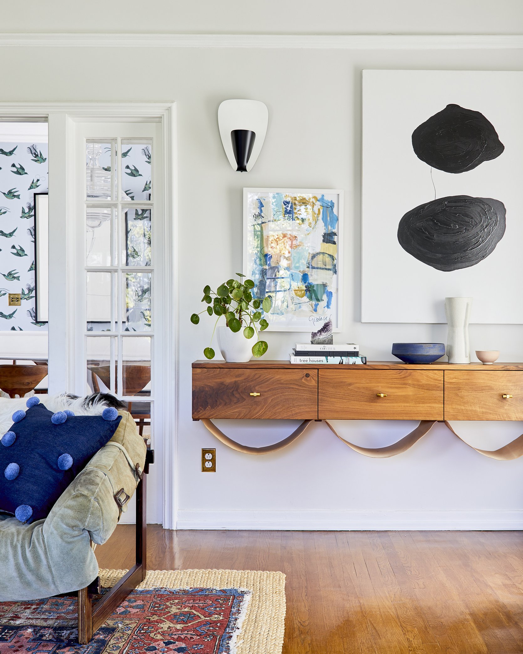
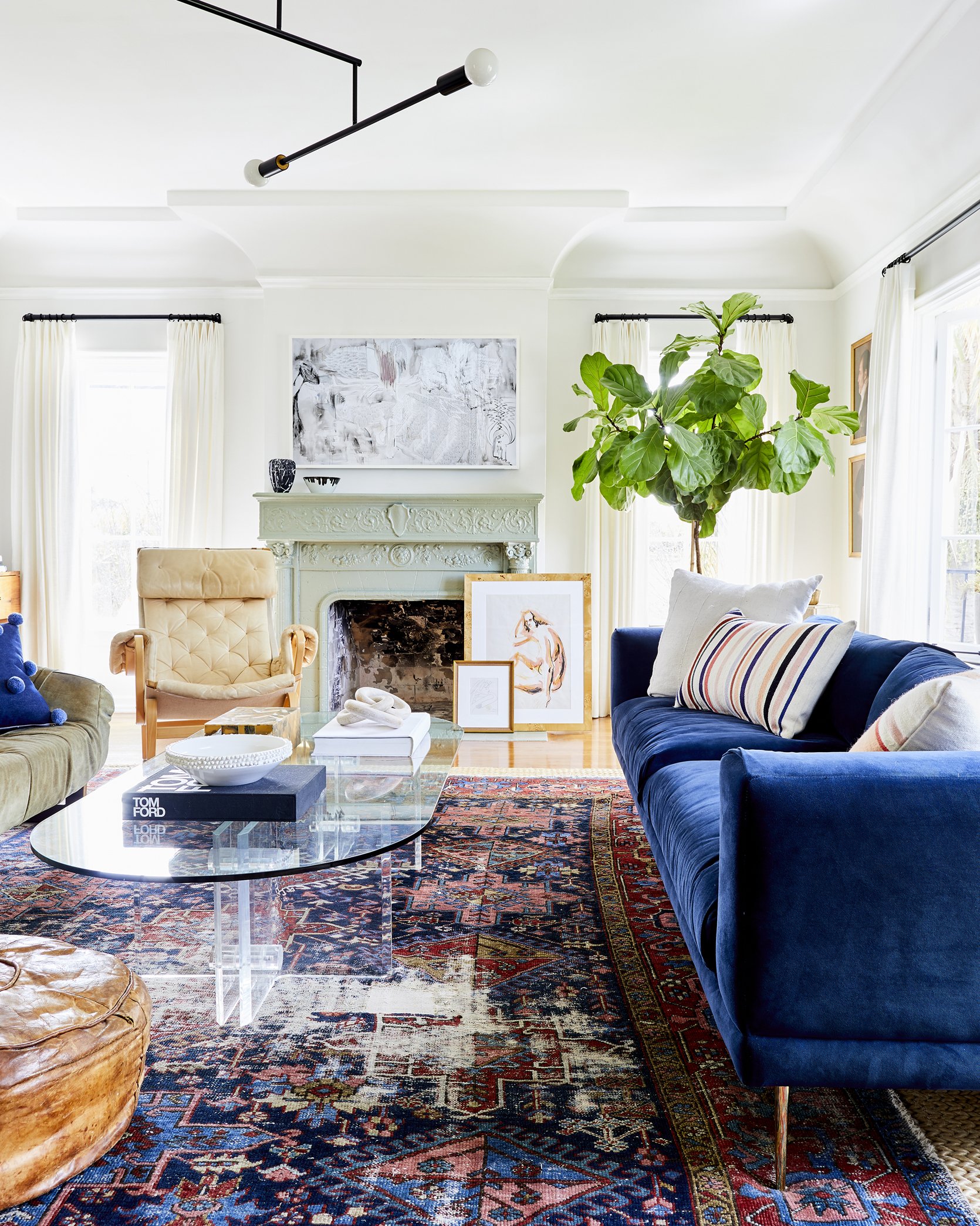
I love how the light green fireplace breaks up the white walls and adds another calming color to the space. I was really curious about this color choice so I asked Dee if it was painted prior to her living there, or if she painted it herself. She told me, “The fireplace was painted that color when we bought the home, and I always found it to be an interesting choice, so I have lived with it that way for the past six years. I recently repaired the firebox, though, and had a stone specialist take a look at what might be underneath that green. There are roughly six layers of paint! I am finally going to strip it all off to restore and reveal the original stone, which will accentuate the beautiful details.”
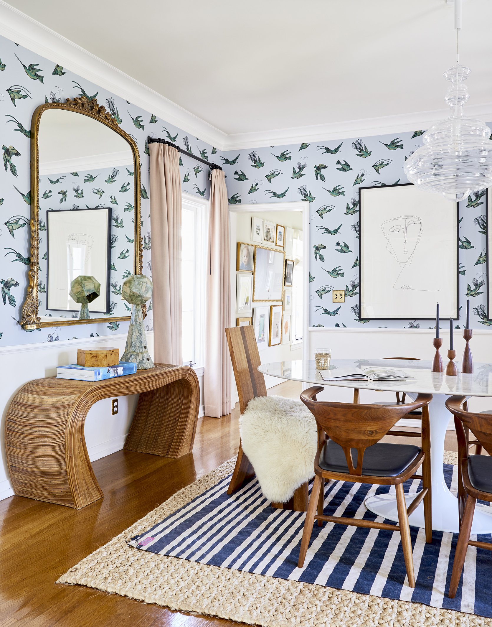
In the dining room, the wallpaper is the focal point that introduces color and pattern but instead of pulling colors straight from the wallpaper, she introduces new colors and patterns for an eclectic look. The pink curtains are light and neutral enough that they blend with the room effortlessly and speak to the light wood tones and the jute rug. The stripe pattern on the rug adds another dynamic pattern to the mix that creates more visual interest.
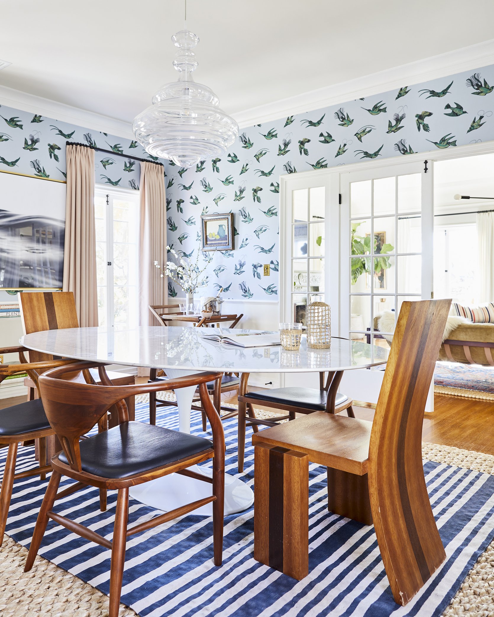
With many colors and patterns blending together, I love that she kept the wood tones similar so the space feels grounded. By the way, how incredible are those chairs?? I am sure you have already noticed that Dee has a keen eye for blending vintage and contemporary furniture, which gives her home a sense of warmth and “lived-in” energy that is intoxicating.
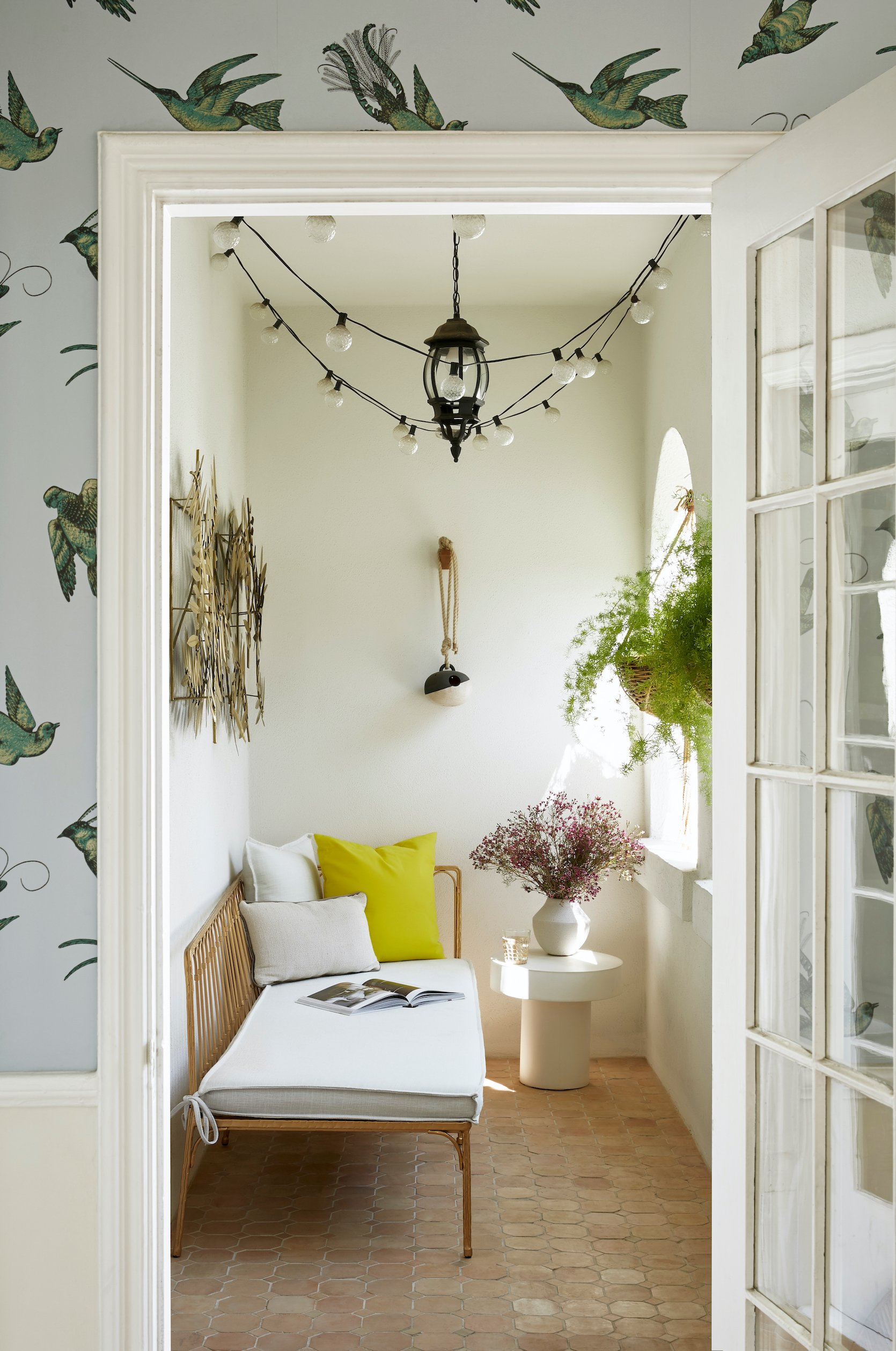
This balcony off the dining room is SO dreamy and I love that she kept this area of the home quite neutral and inviting.
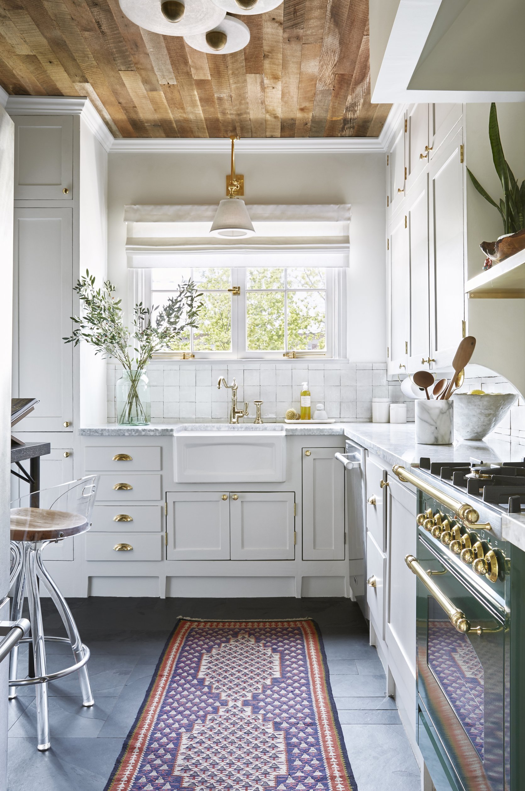
In her kitchen, Dee still manages to play with color in a really exciting way through decor. Of course, the vintage rug runner adds fun doses of color and pattern that really pop against the white cabinets and neutral tile backsplash. I also love the wood paneling on the ceiling that adds so much texture and warmth, which contrasts the dark floor tile.
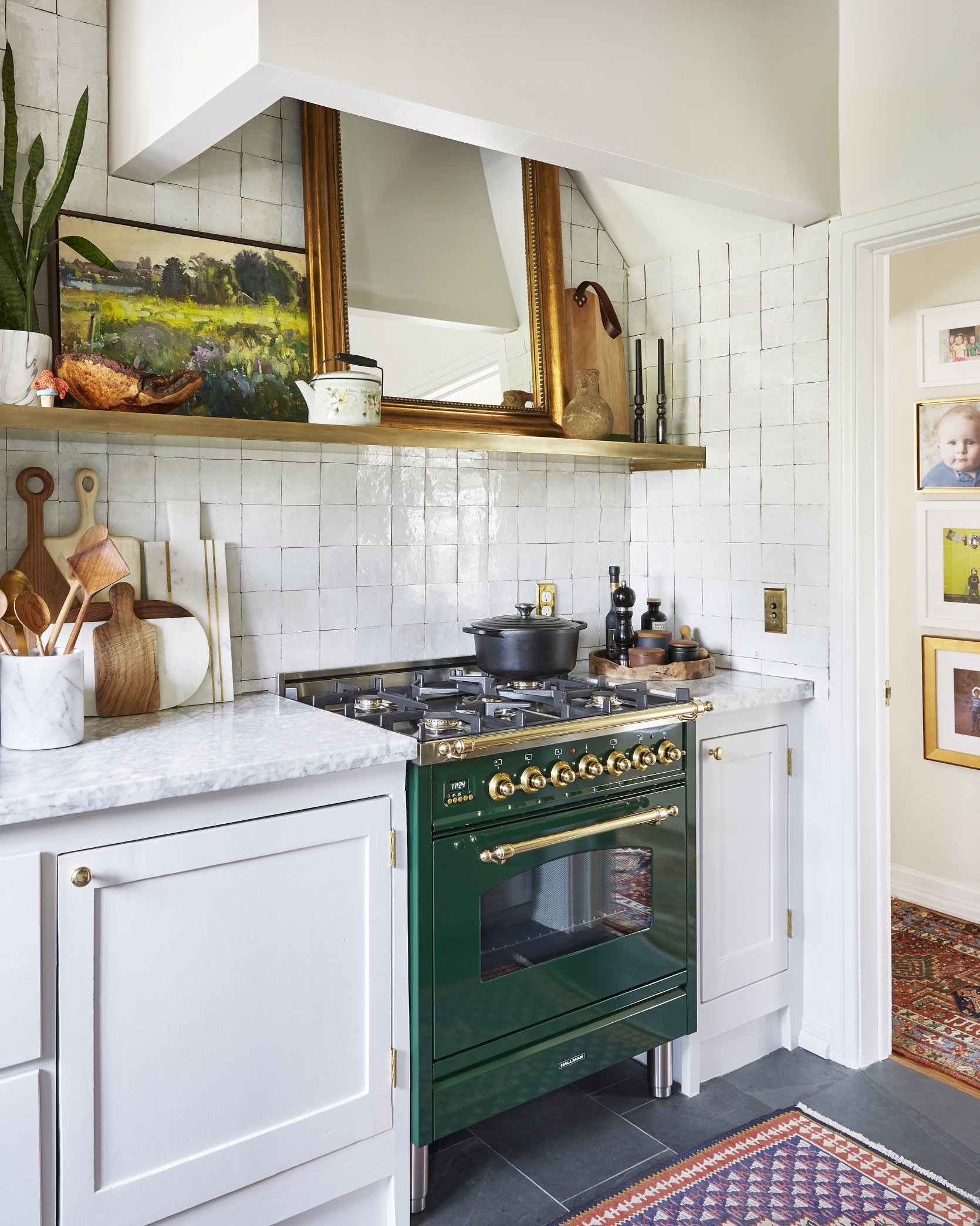
The green oven range creates another powerful color moment that I am obsessed with. I also love how she played with more green tones by adding the landscape oil painting. It is also worth noting that we are big fans of leaning mirrors in kitchens 🙂

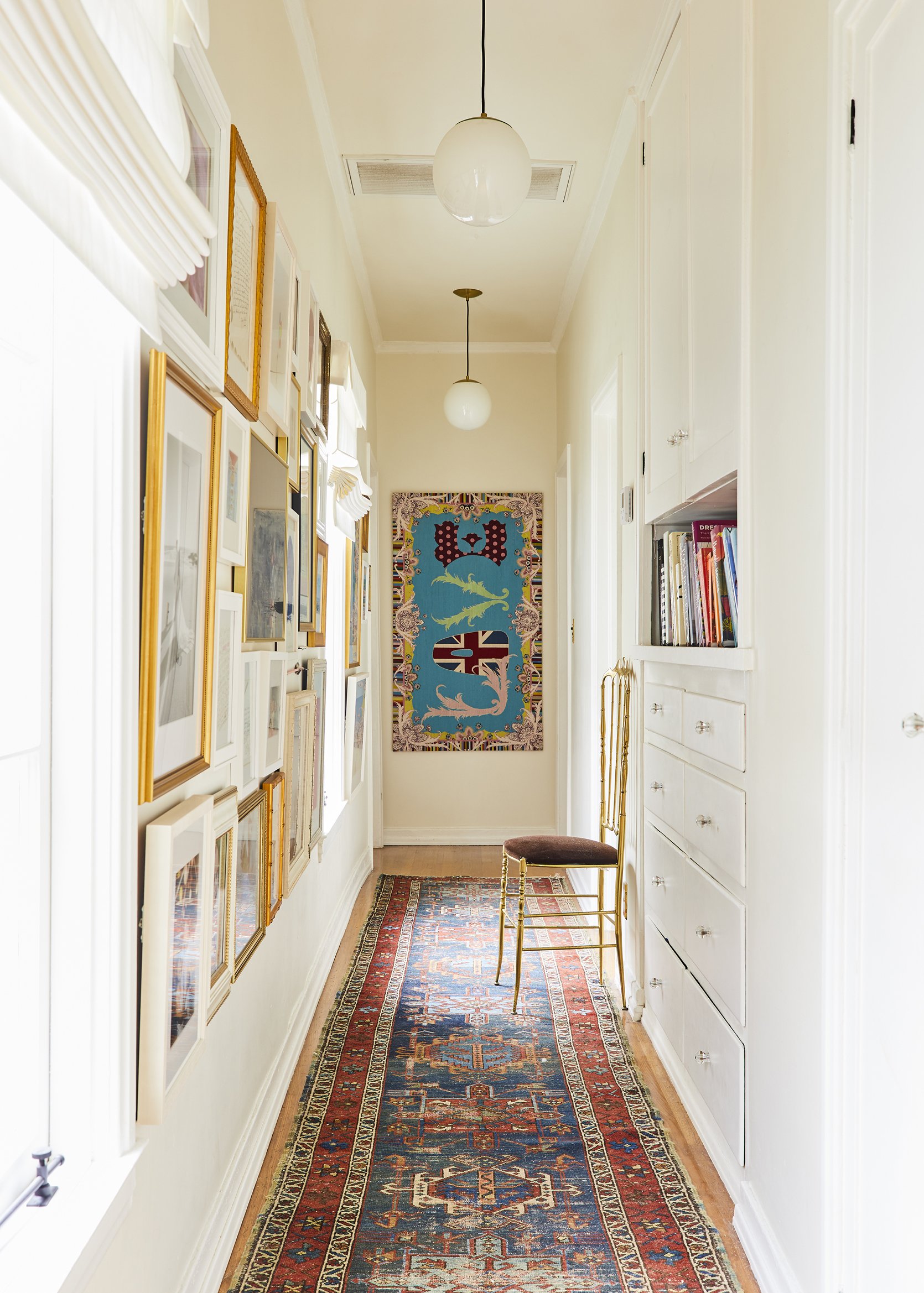
In the hallway, I really love this colorful wall-to-wall gallery wall that displays a mixture of art and family photos. The different frames make it feel extremely eclectic and personal.
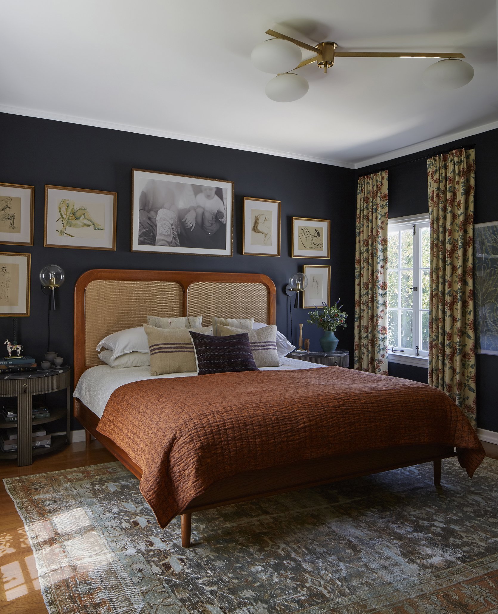
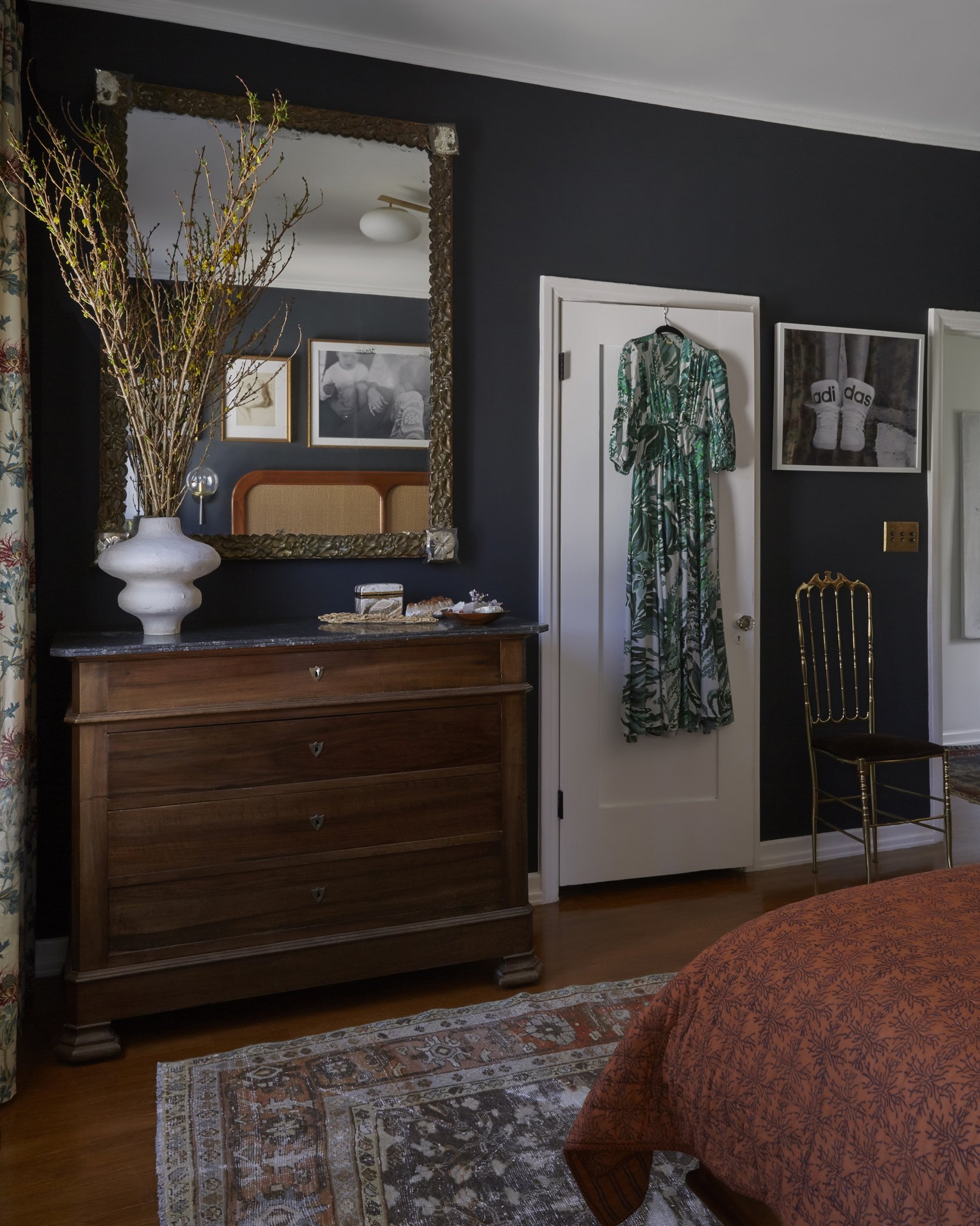
Dee’s bedroom is a primary example of maintaining a cohesive (but striking) color palette. I even wrote an entire post about it here. Again, the rug acts as the perfect jumping-off point which allowed her to pull colors from and sprinkle them throughout the room.
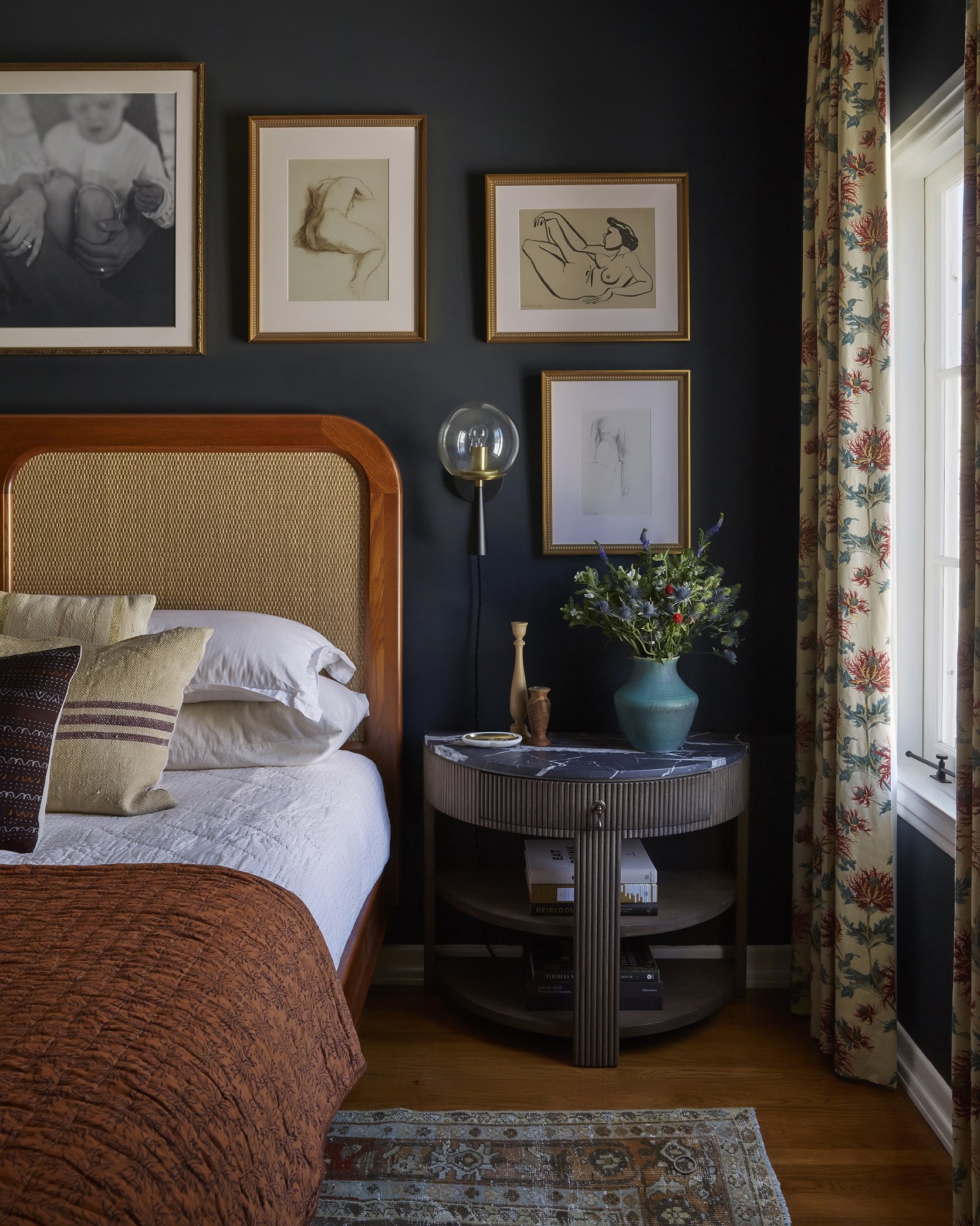
The wall color (Off-Black by Farrow & Ball) immediately pulls you in and creates a moody vibe, but I love how she sprinkled in warmth through the decor. The brass details, wood tones, and floral accents balance the room so it doesn’t come across as dark or gloomy.
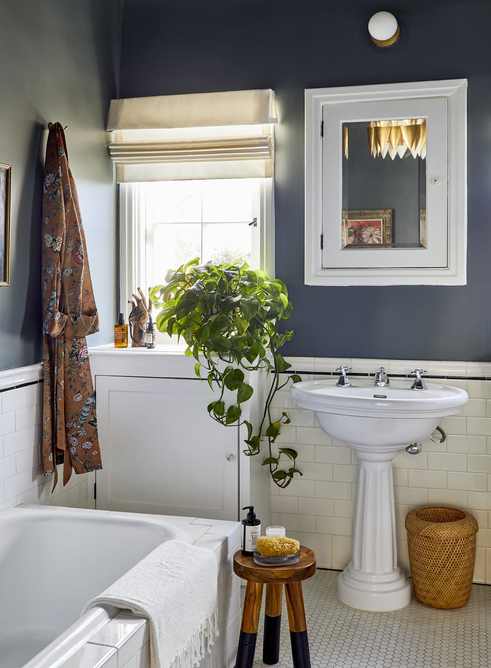
The bathroom mirrors the moodiness of the bedroom which creates continuity between the two spaces. I love how she honored the architecture of the home by working with the vintage tile and keeping the decor classic and timeless.
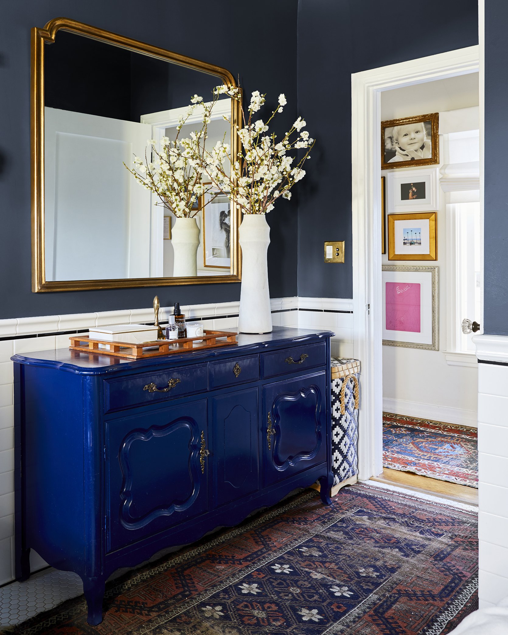
Another way she expertly mixes colors is by playing with different tones. The dark blue paint color is paired with a brighter, more saturated blue dresser and both are tied together with the blues in the vintage rug.
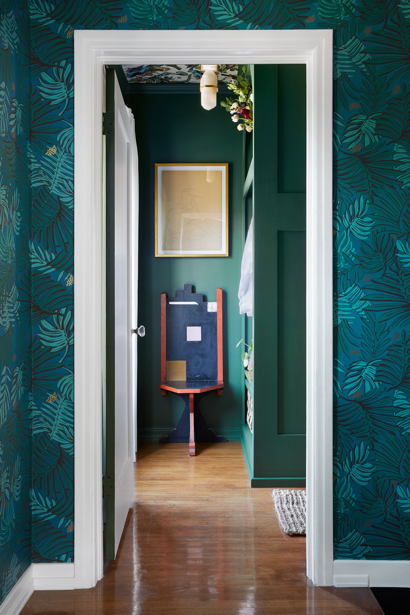
To end this home tour, we are going full circle and back to where we started. Off of the entry stairway to the right, there is this magical bunkroom that is doused in rich color and pattern.
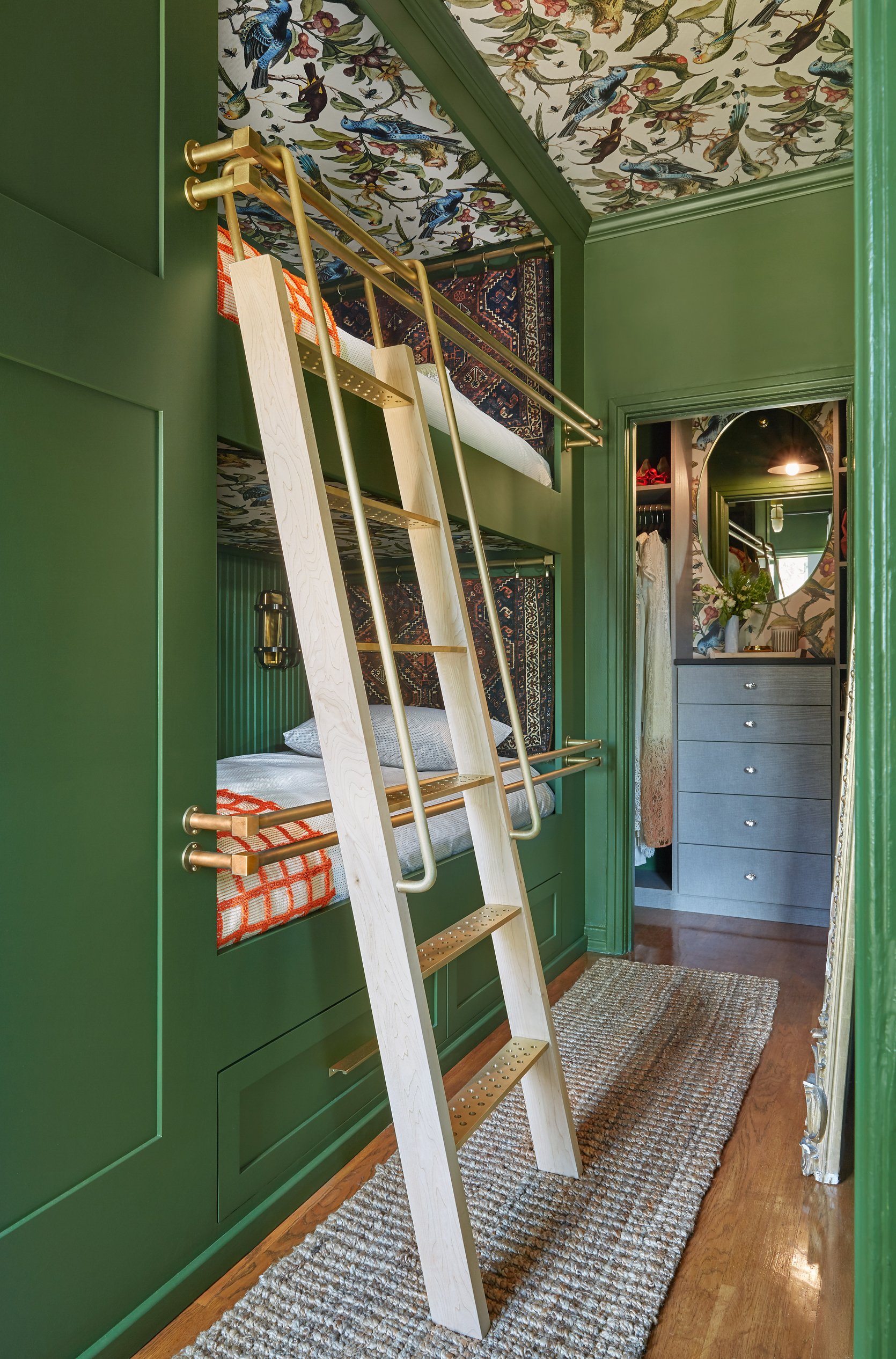
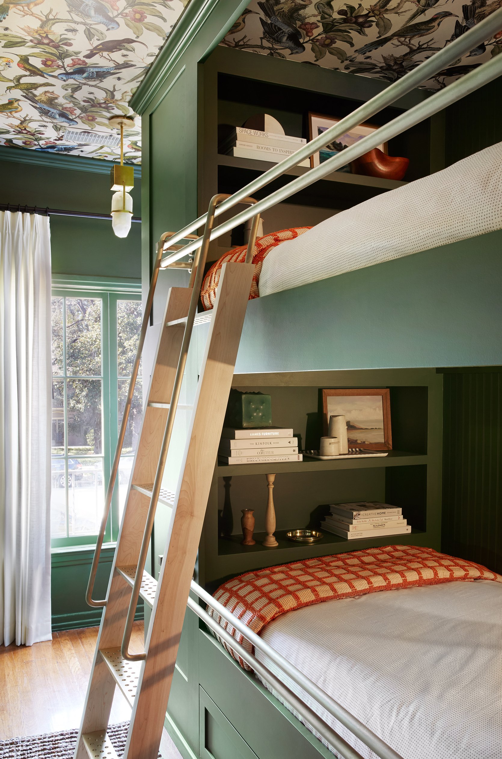
Isn’t it lovely?? The green paint color is a custom color by Fine Paints of Europe and it is STUNNING. It is such a happy color that pairs beautifully with the whimsical wallpaper. For more color and texture, I love how she hung tapestries on brass rods in each bunk, which almost gives a ‘headboard’ effect. This is such a cool feature that creates a really dynamic, eclectic look.
Big thanks to Dee Murphy for giving us a tour of her vibrant home. Which part is your favorite? Sound off in the comments! xx
*Design by Dee Murphy
**Styled by Velinda Hellen
***Photos by Sara Ligorria-Tramp and Zeke Ruelas
THIS POST WAS ORIGINALLY PUBLISHED HERE.
