Welcome to another “Made it into the book but kinda got cut” blog segment – specifically about bathroom “rule breakers”. It’s about those creatives that said “yeah, we know what we are supposed to do when designing a bathroom” and then did whatever the hell they wanted, knocking it out of the park. They are seriously inspiring. So today I’ll show you some photos that are in the book by these creatives (comment if you like these kinds of posts!). But I’m writing specifically about “the rules” that were broken – to help inspire and empower you to break the rules, should you feel up for it. I’ll be honest that rule-breaking, when it comes to permanent finishes (tile, flooring, custom pieces), makes me VERY nervous and I’m far more restrained than I wish I was. So seeing rooms like these, proving that the risks are very much worth it, is something I NEED in order to muster up the bravery.
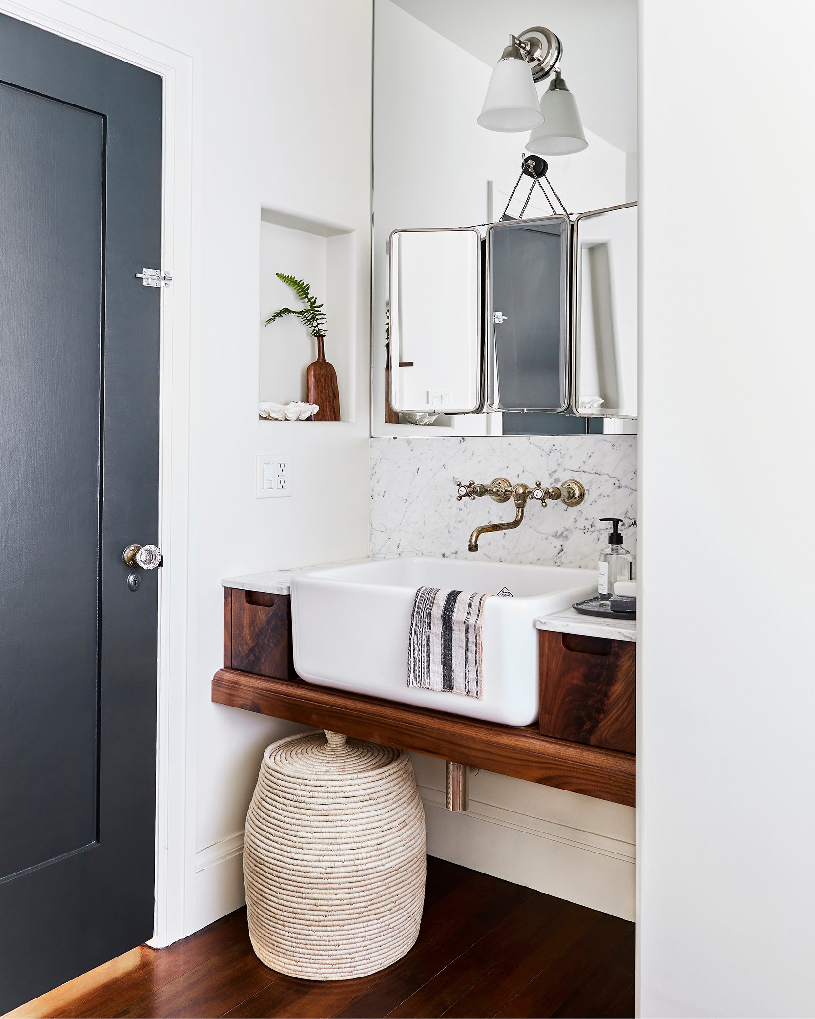
William Hunter’s work is throughout the book. Remember that house that we staged to sell in Eagle Rock, CA? Well, the reason we agreed to do that (beyond the great portfolio work) was to get our cameras on his rule-breaking because it was GOOD. This is their hall bathroom in a vintage bungalow house. He sunk in a farmhouse utility sink (so chunky), and then the simplest yet most genius move here is hanging the vintage trifold mirror over the installed more builder-grade mirror. Lastly, he did a more contemporary cut-out handle for the vanity I suppose with hopes of not adding more to the space, keeping it quiet. So we have unlikely styles mixed together, exciting decor, and an oversized sink. I just LOVE IT.
This is my best friend’s bathroom and it’s NUTS. Her best move by far is suspending that mirror in front of the asymmetrical window – thus balancing the space. Also, talk about some AWESOME natural light when getting ready in the morning.
A less risk-averse person might have either put the vanity on the wall to the right, made the vanity smaller (bummer), or maybe have made the window shorter so that the mirror was attached to the wall like the one on the right. All seem sad/wrong options after seeing how absolutely incredible it looks as is.
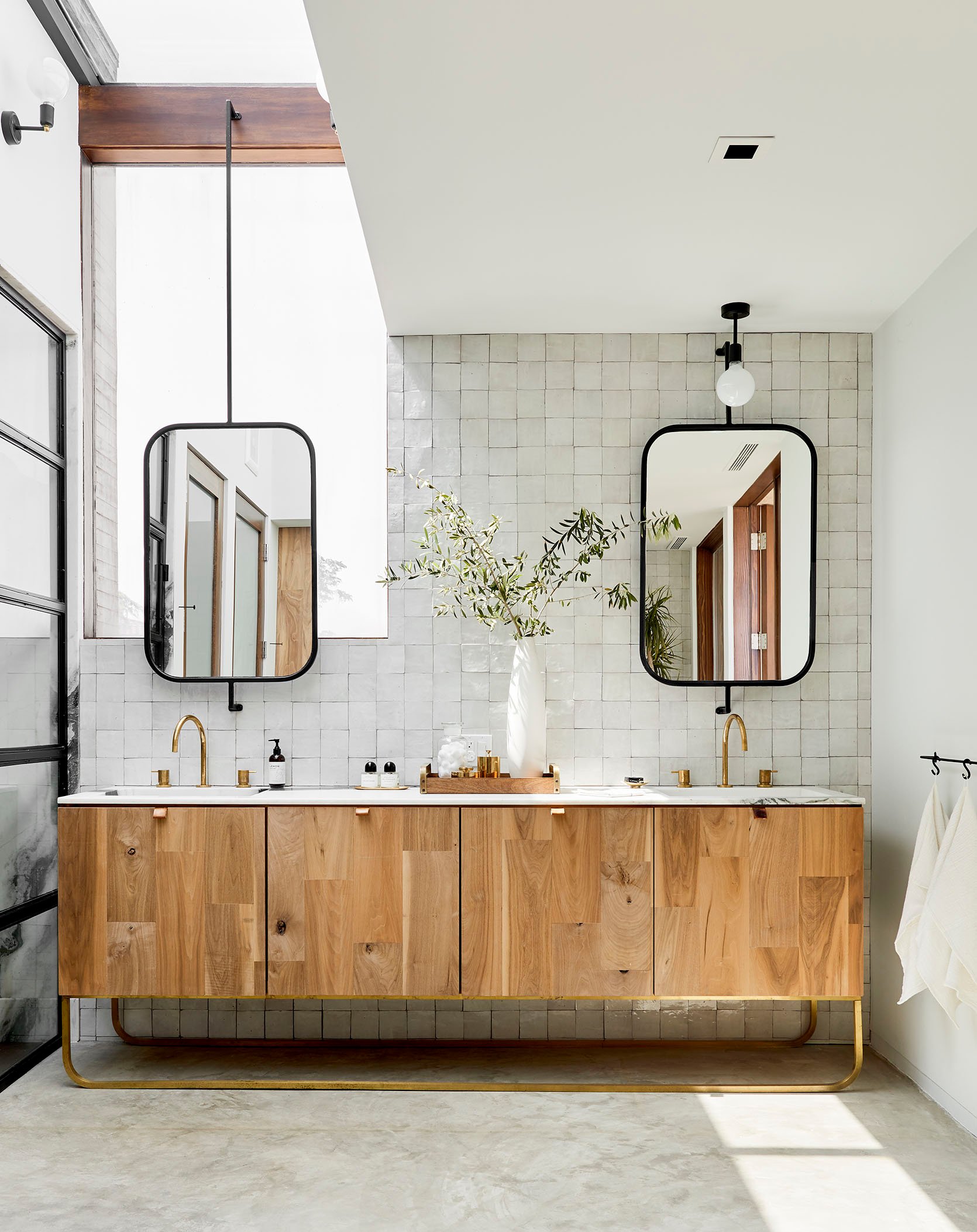
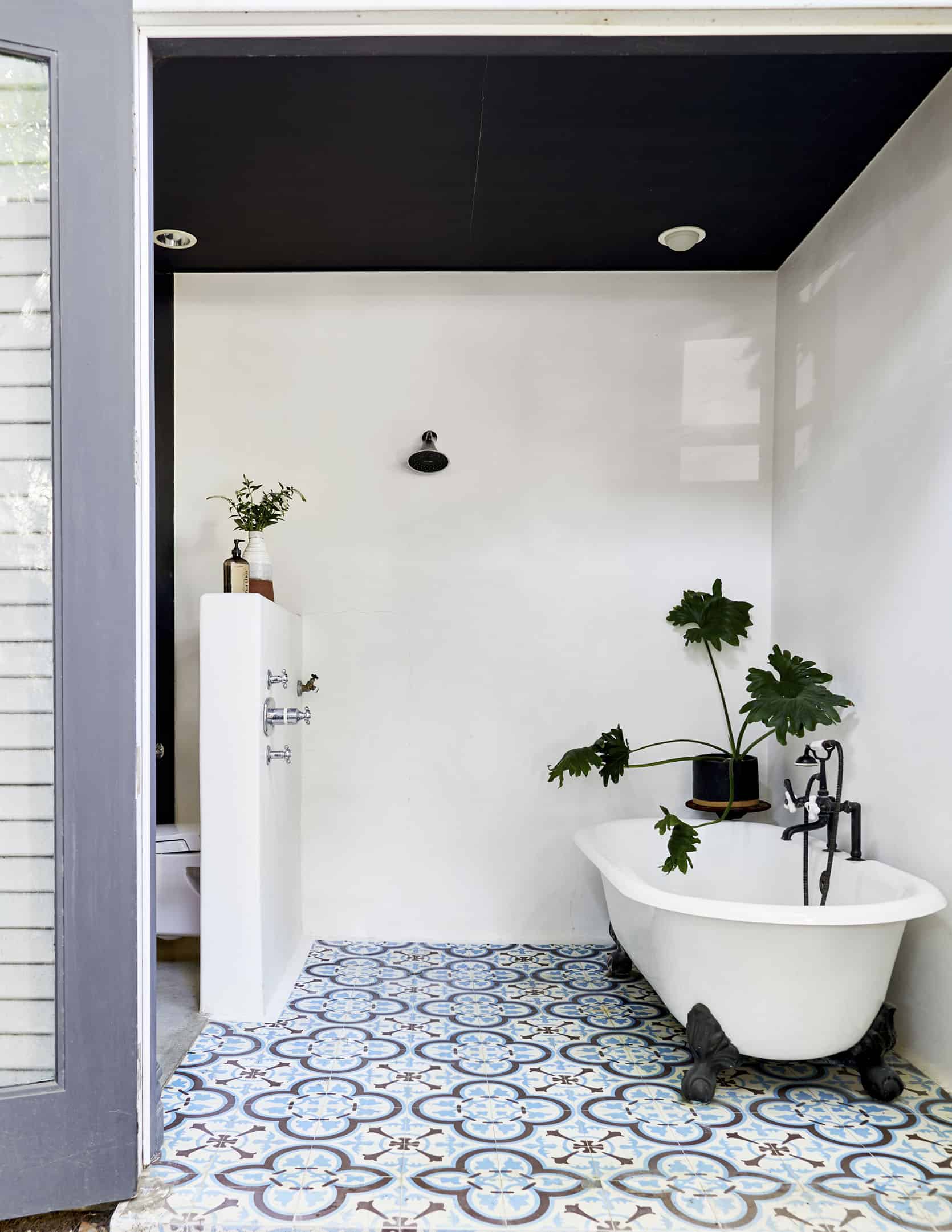
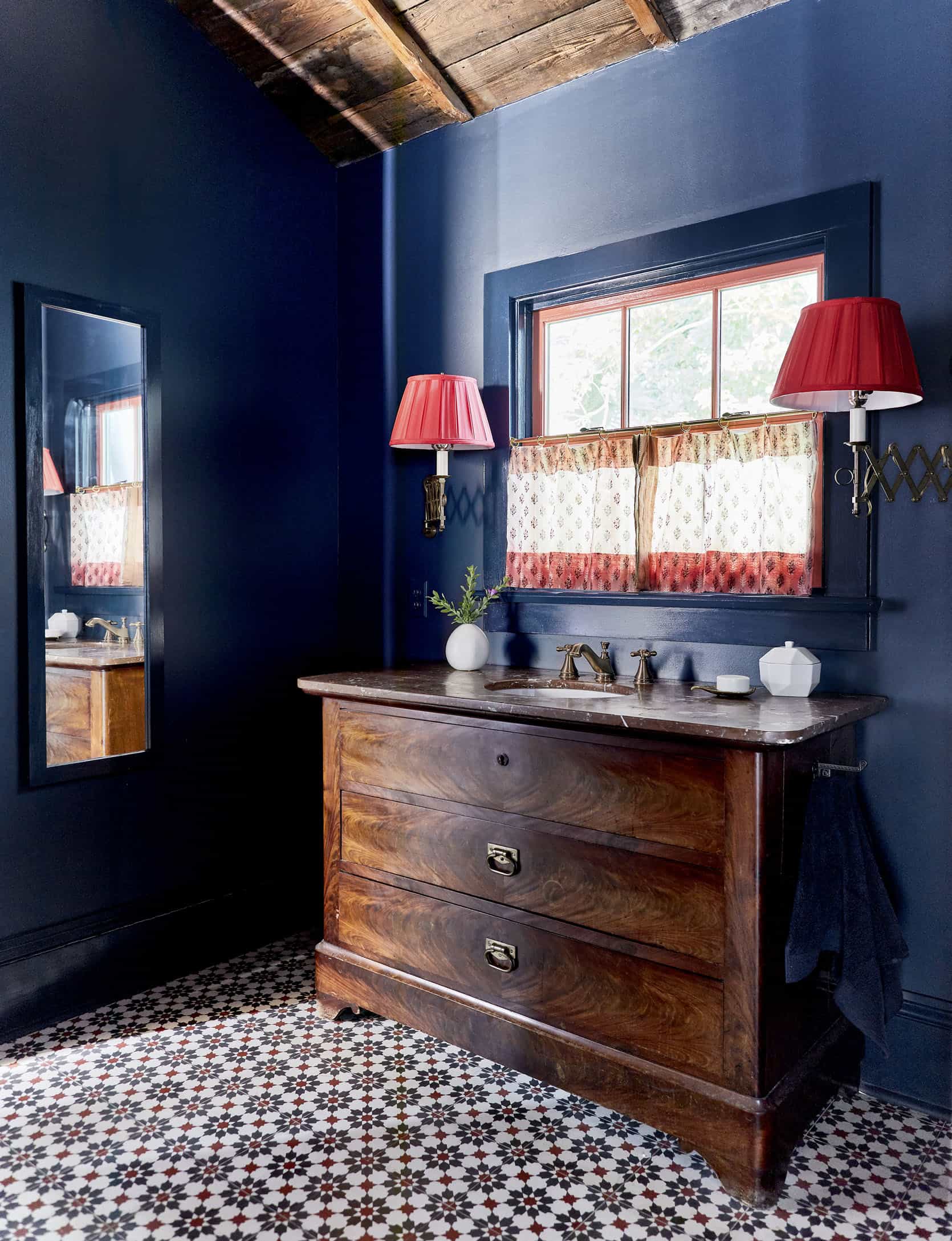
This is the bathroom from the opener shot – again by William Hunter: Let me go ahead and call out all the rules broken:
1. NOT a double vanity – GHAAST. Yes, this is the primary bathroom and he opted for a single off-center sink and countertop space versus shoving two small sinks in there or even just one but centered.
2. Floor to ceiling mirror behind the vanity – I almost stole this move for our primary bath and am kinda regretting not doing it right now. But Brian and Anne thought it was too contemporary for our house (I still don’t think so). But boy does it looks awesome.
3. Tiled Ceiling – So sick. This is partly so awesome because it’s arched and might not have had the same impact if there was a clear ceiling line. By arching the ceiling, tiling over it, and bringing the mirror up to the arch – it creates this incredible sense of space. William is an architect if you can’t tell. I proposed tiling our ceiling in our bathroom and they quoted an additional $5k in just tile labor to do it, so we opted out. HOT TIP: anything done on the ceiling takes a lot longer and therefore is a lot more expensive in labor costs.
4. Side niches and side sconces – Not a rule-breaking moment but I just want to call out those details that keeps the mirror view unobstructed and likely creates enough vanity light.
5. Also please note the chunky furniture feet on the vanity. I love that so much.
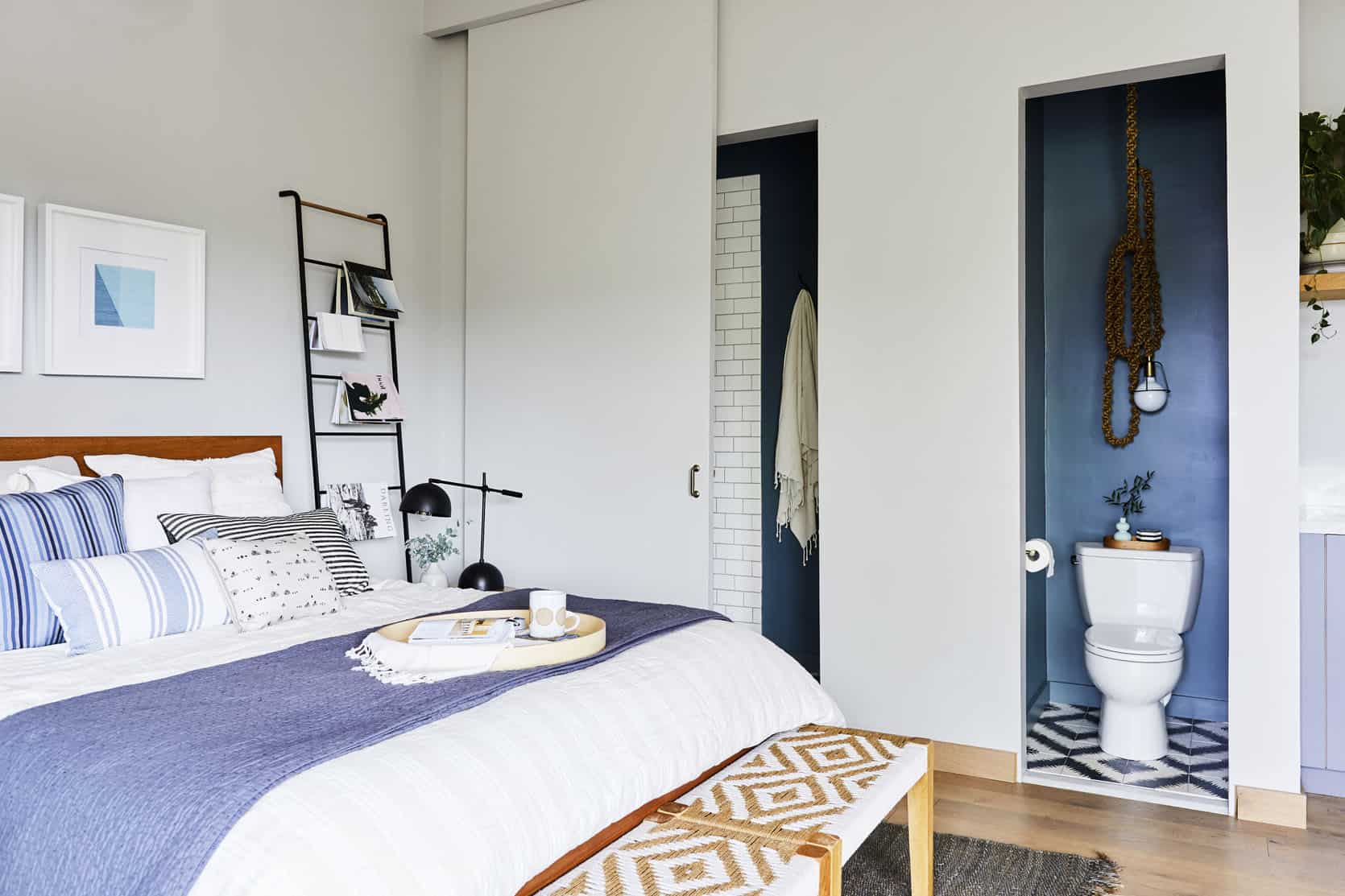
Cleo Murnane of Project M Plus designed their small ADU with a separate toilet room (WC) – the door slid to cover either the shower room or the toilet room. At least one is always exposed! But they look so cool that it just adds to the visuals of the small space and makes it feel bigger. It’s all out on display which is definitely breaking the “hide the toilet” rule which is awesome. Please note that crazy rope light fixture hanging over the toilet. Love it.
Speaking of bathrooms being on display, Ben Medansky, genius ceramicist, has a very open concept bathroom. Walls? Who needs them. I think the look of his floating toilet on the pony wall to his shower looks super cool. Also, how cool is it that the shower just opens up to an outdoor space? Brian and I are big on enclosed showers to stay warm but I can only imagine how awesome it is to shower on a hot LA summer day.
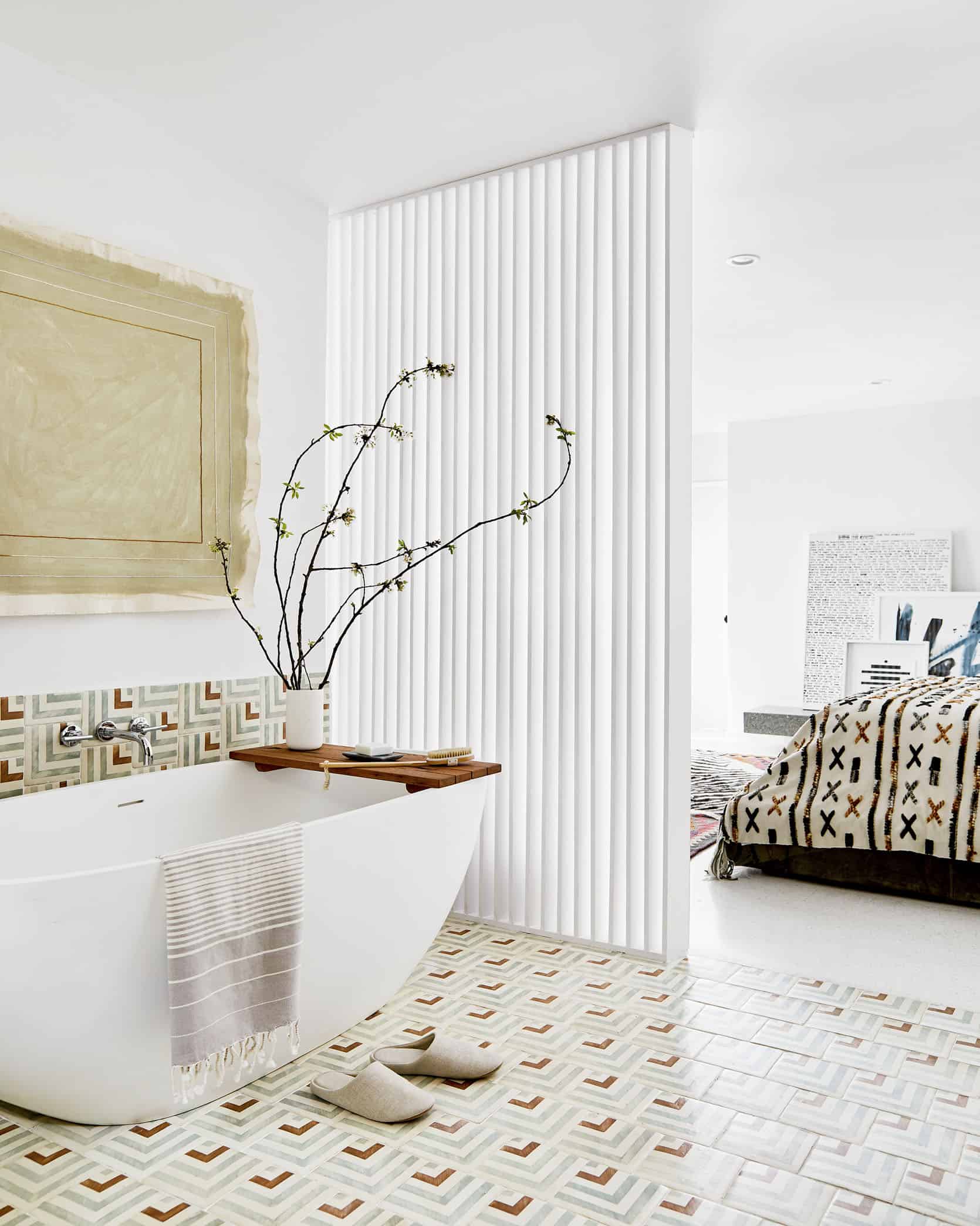
My friend, Annie of Åsom Home forewent the wall in her bedroom suite for a slatted wall which provided light, created an architectural moment, and connected the two spaces.
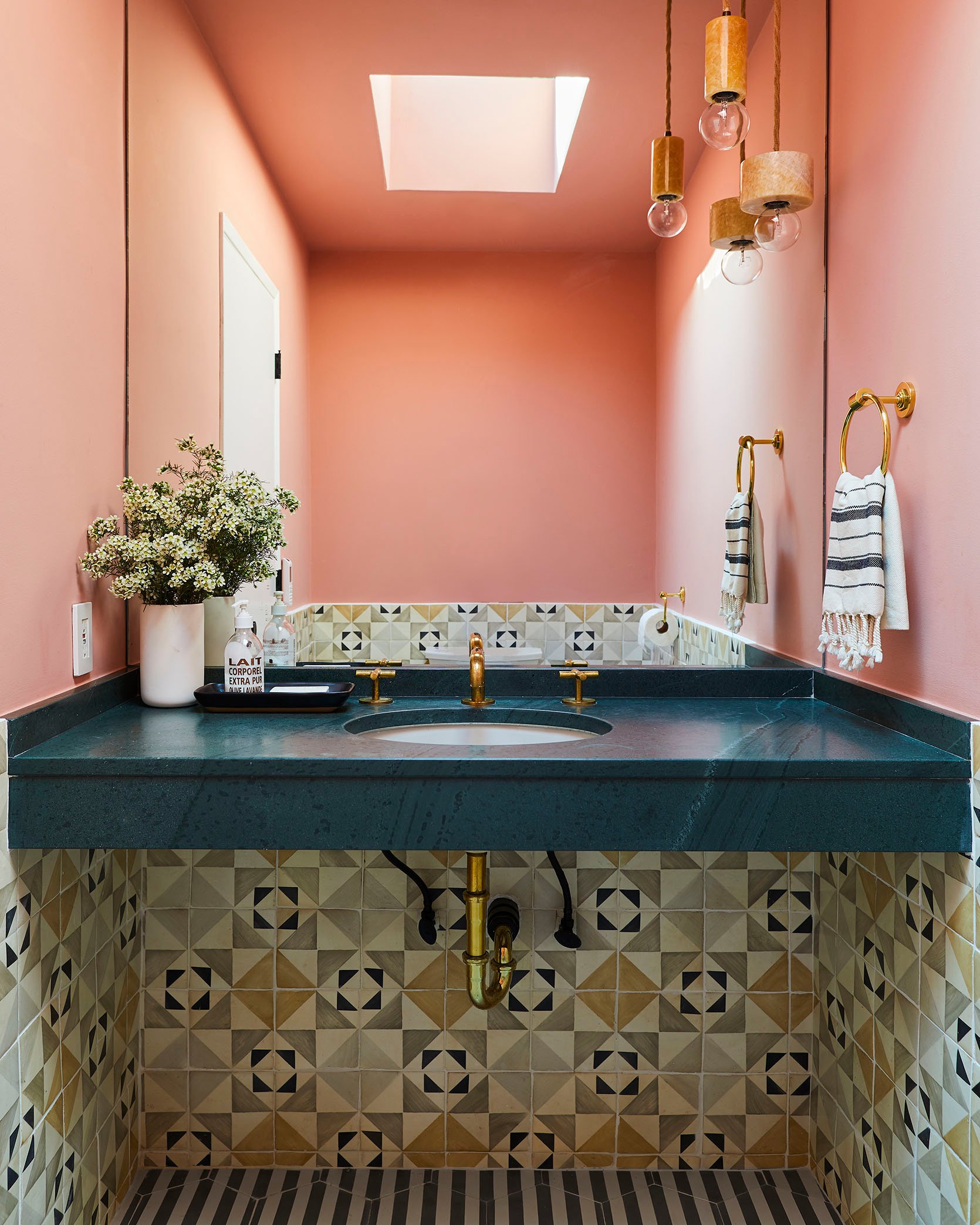
This is the powder bath of my friend Annie’s house and as you can probably tell the lady likes her patterned tile. I am here for it! But what is special and “rule-breaking” about this tile combo is that she used two bold patterns in one bathroom. I always preach to keep your permanent fixtures safe (like tile) and take risks on decor. Well, Annie makes a very good case against that advice if you are someone who really loves pattern and wants to “go for it” design-wise. These two work particularly well because they are within the same color palette but are different enough pattern-wise that they don’t blend together visually. It’s just so cool.
Oh and check out that dark blue stone! Such a risk and SO GOOD.
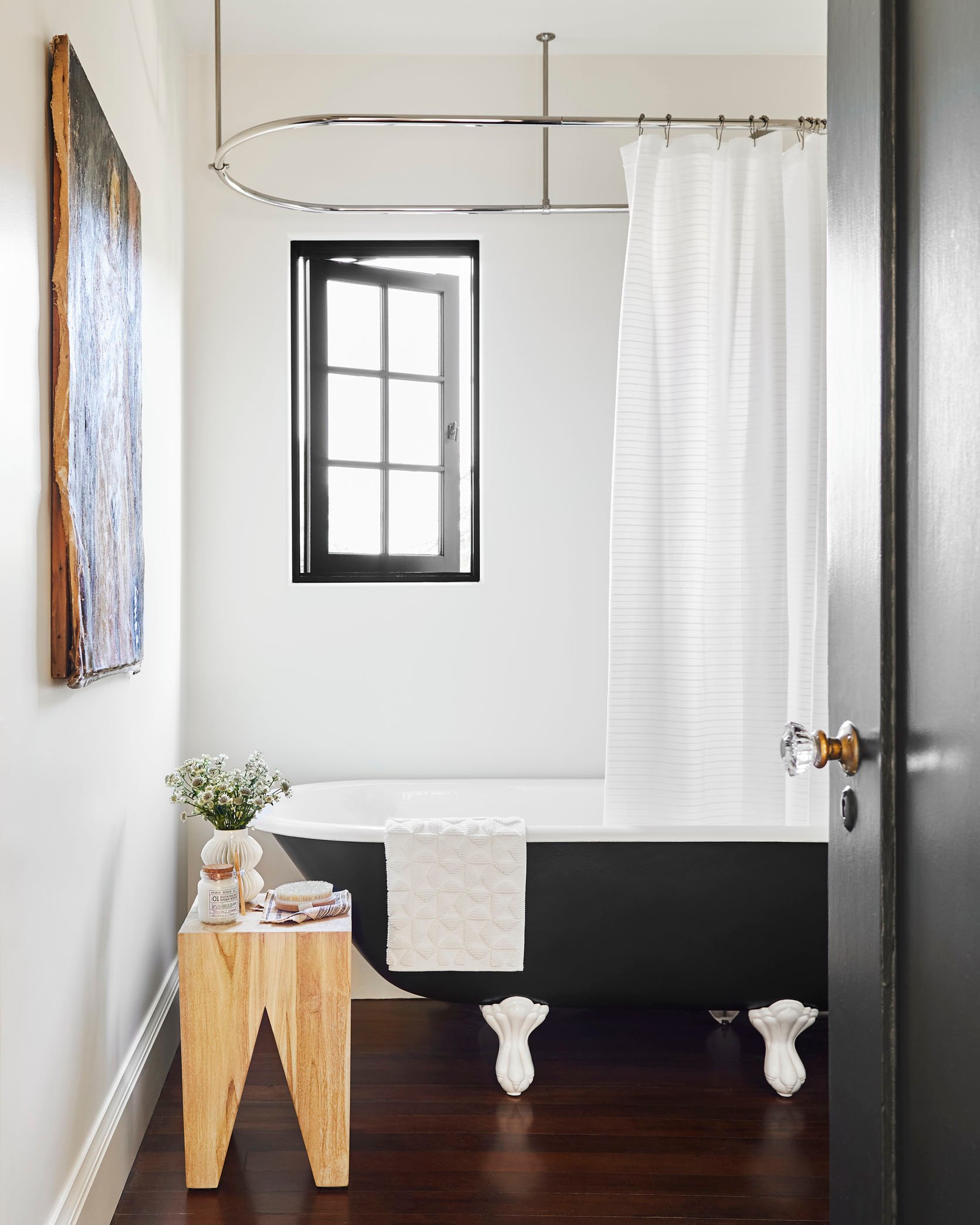
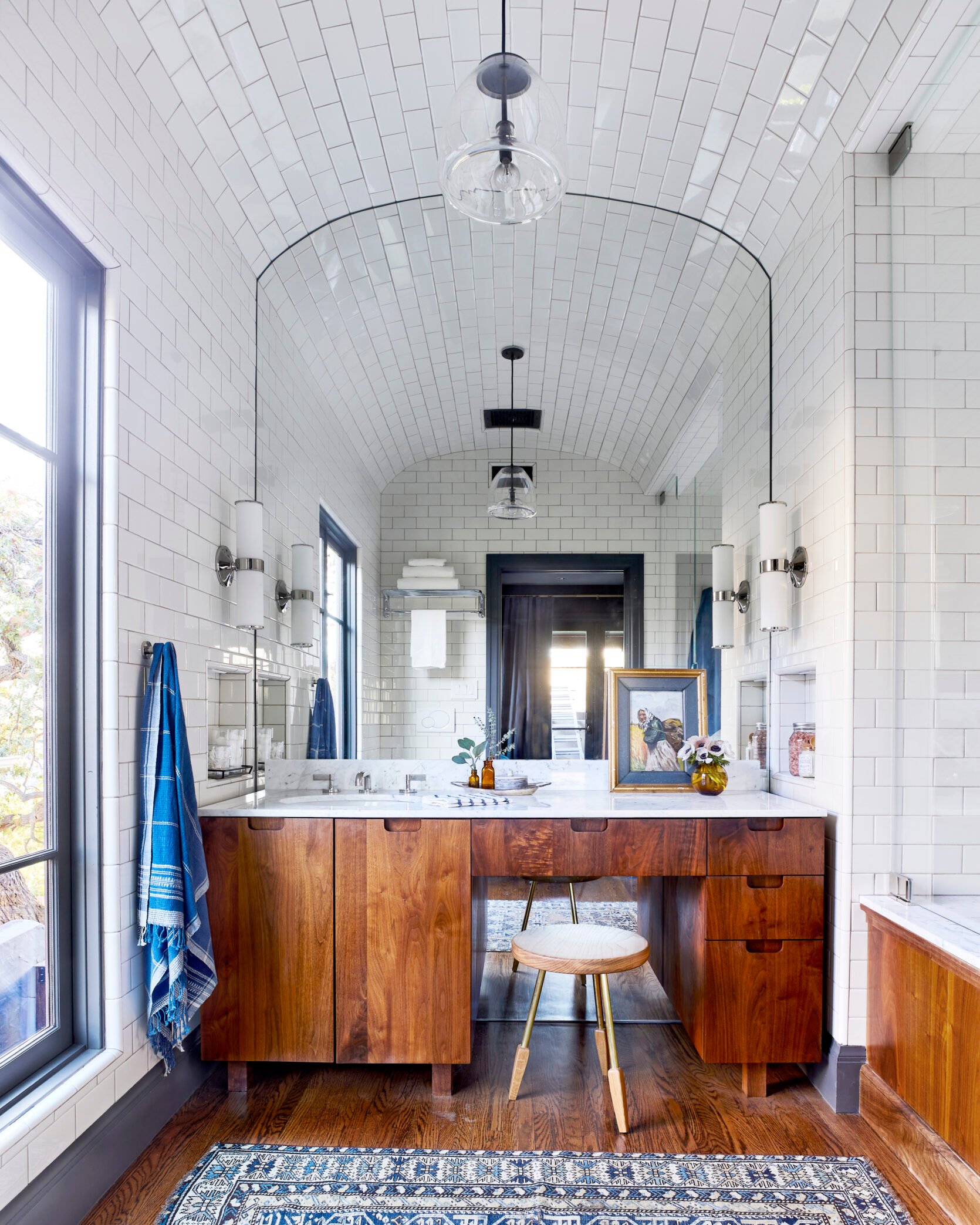
Wood flooring in a bathroom is definitely not the norm because you know, water. Take that up a notch by adding a clawfoot tub. But man, it’s so beautiful and looks so classic. Probably not a great kid’s bathroom option but aside from that, I’m a big fan. This is another William Hunter design so it’s no surprise it’s awesome and risky:)
No mirror over the vanity? When you have a cute window like this, why not enjoy it and just put a mirror to the side. I like that Sara Ruffin Costello chose to put up a long mirror so that whoever is using the bathroom can also do a quick outfit check. Basically, you don’t have to put your vanity against a wall just to have a mirror above it. Break the rules.
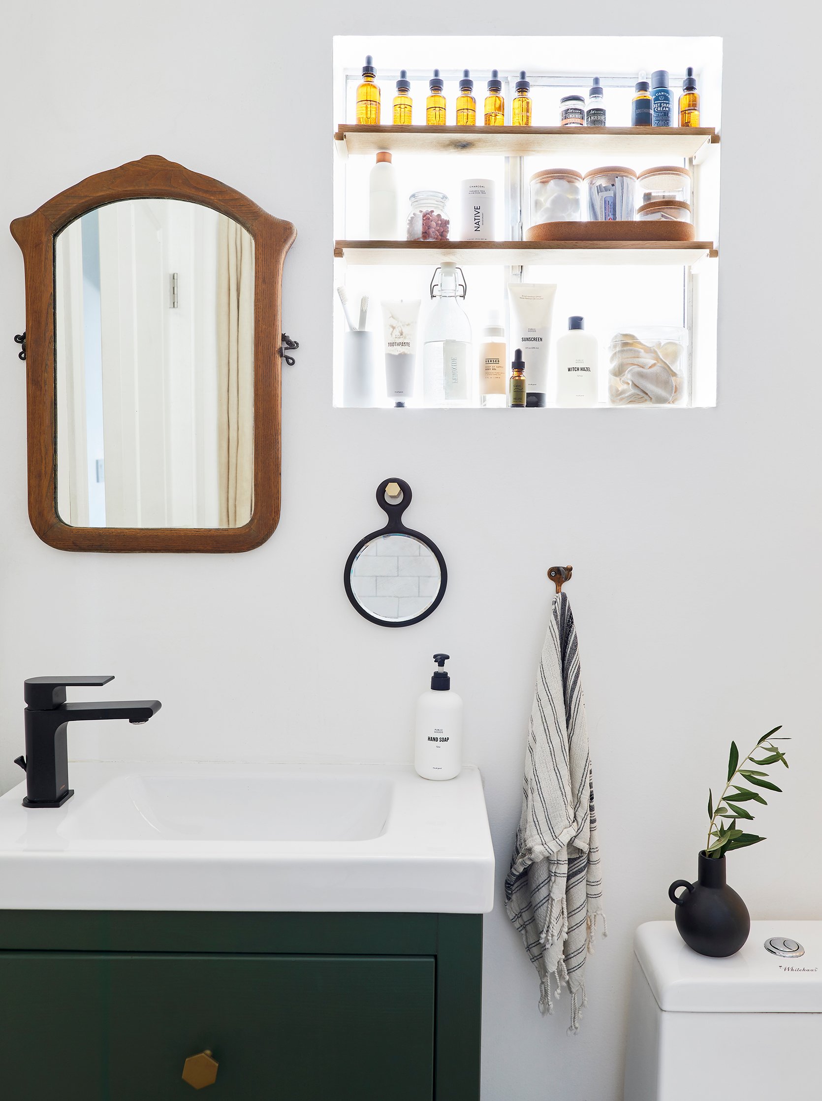
Now, this isn’t technically a “rule that’s been broken,” but it’s an out-of-the-box idea that almost anyone (homeowner or renter) can do. The DIY master, Emily Bowser, decided to maximize her storage space by adding shelves in front of her window. While it may block out a little light, it looks so cute and will make your bathroom WAY more functional if you are lacking counter space. Bonus points for decanting in matching bottles:)
So there you have it. Some fun and rule-breaking ways to take some design risks if you are renovating. There should never be pressure to take a risk unless you want to because it can be an expensive regret. BUT it could also be a priceless reward:) Just try not to stress too much and have fun (she whispers to herself). xx
Opener Image Credits: Design by William Hunter Collective | Styled by Velinda Hellen, Erik Kenneth Staalberg, Emily Edith Bowser, and Julie Rose | Photos by Sara Ligorria-Tramp
THIS POST WAS ORIGINALLY PUBLISHED HERE.
