There is a real irony in today’s post: designing this kitchen to be “simple,” “timeless”, “casual,” and yet “special” took a very very very long time. When you spend so much time creating a tile color to match your favorite Levi’s, or searching for the perfect furniture piece that will double as an island, then well, it’s so. much. fun. I’m extremely happy with the design of this and while it’s not fully executed, I really think all the fun/fussing will have produced exactly what we wanted. We tried extremely hard to choose materials that were timeless, hardworking, high quality, and felt very “us” but appropriate for a farmhouse. It feels really pared back and casual, with some utilitarian elements against simply beautiful materials. Nothing too glam, nothing too traditional, nothing too unexpected or hyper-modern, and hopefully beautiful enough to never need changing (GOOD GOD I HOPE). It really does feel very, very “me” and while it’s not this crazy mix of patterns and trends, I hope that you can see how appropriate it is for our family and this property.
Where We Started:
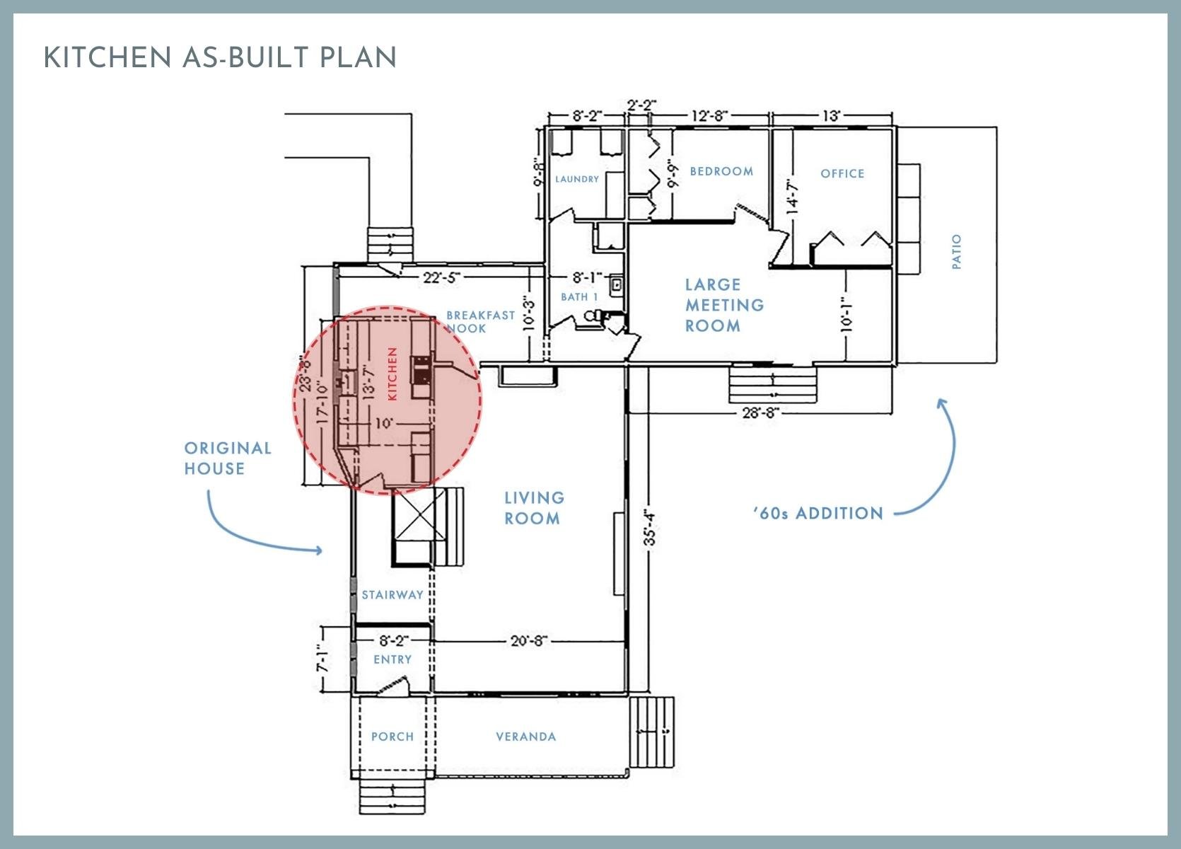
The original kitchen was actually nice, but the location of it and its size weren’t as great for our family. We played around with location, which we went deep into in this post. For those of you just showing up (hi) here are some of the iterations we went through.
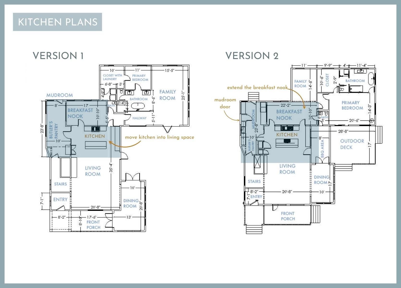
The Different Designs
The Final Plan…Or is it?
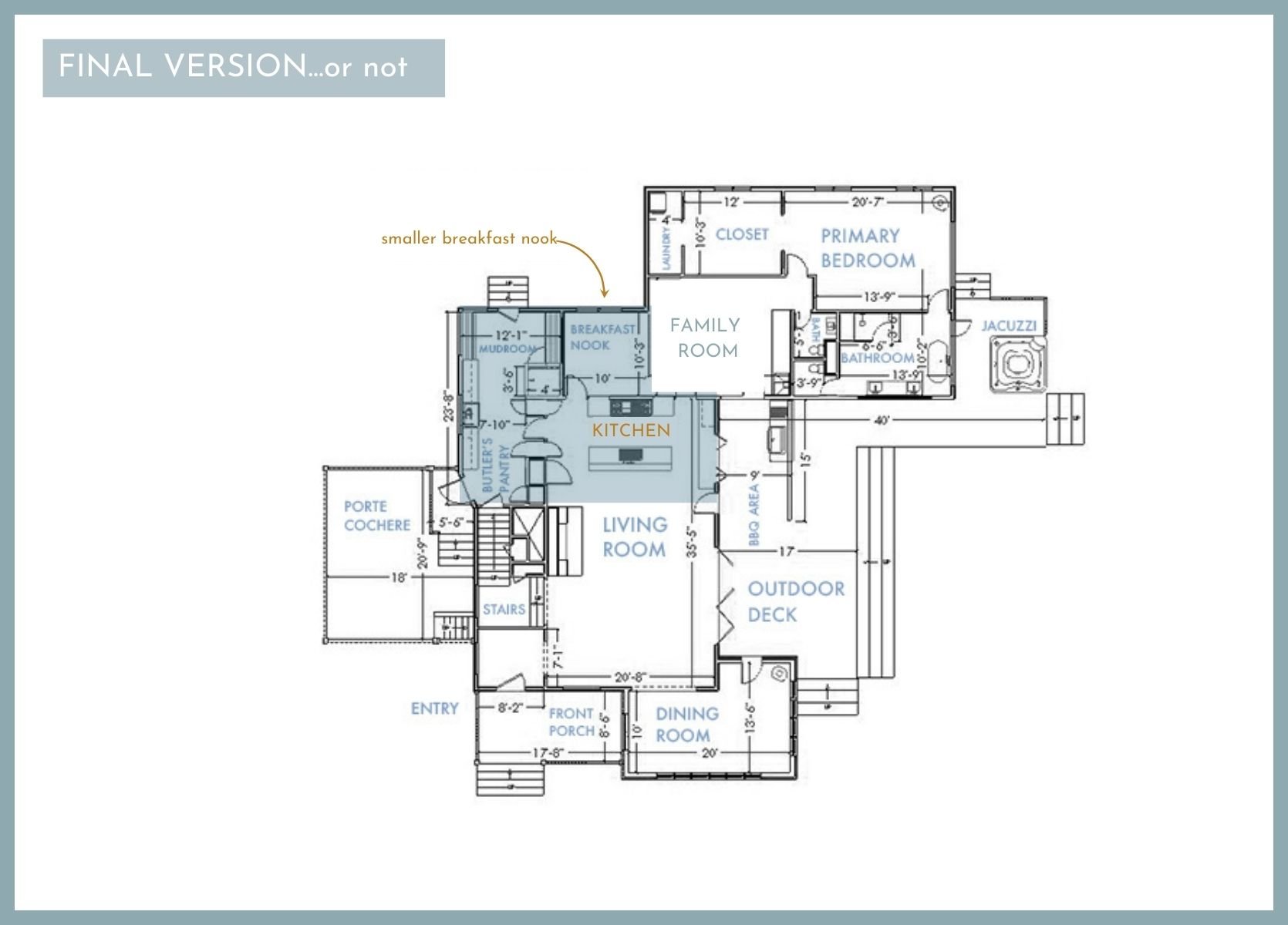
But Then…
We realized we were sacrificing the best natural light in the house to a mudroom and pantry…not okay when you LIVE for the natural light in the winter months in the PNW. So thanks to your suggestions, we scrapped all the designs and started over, reclaiming the best spot in the house filled with natural light for our dream kitchen. It meant quite a bit of reconfiguring and a bit of sacrificing (sorry breakfast nook) but it looks and FEELS amazing and we will be in here all the time. We hope.
The FINAL final Kitchen Layout
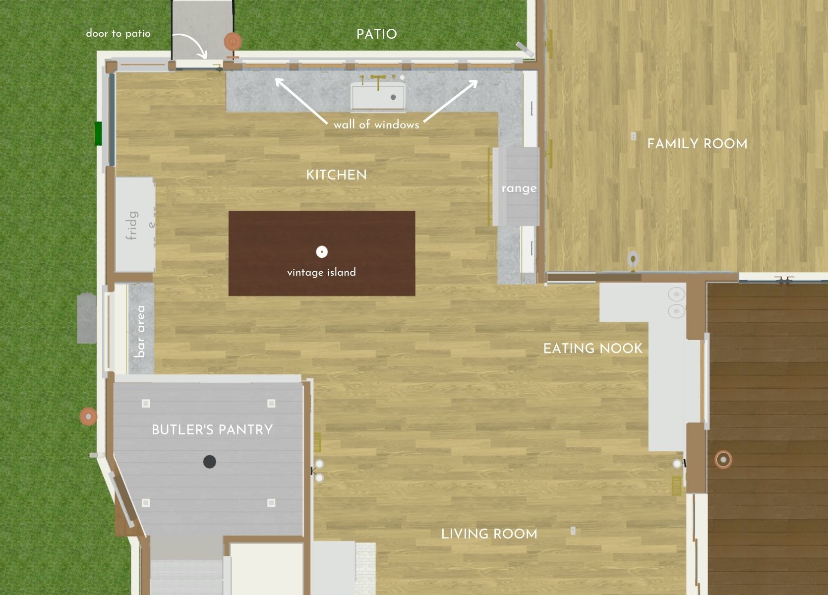
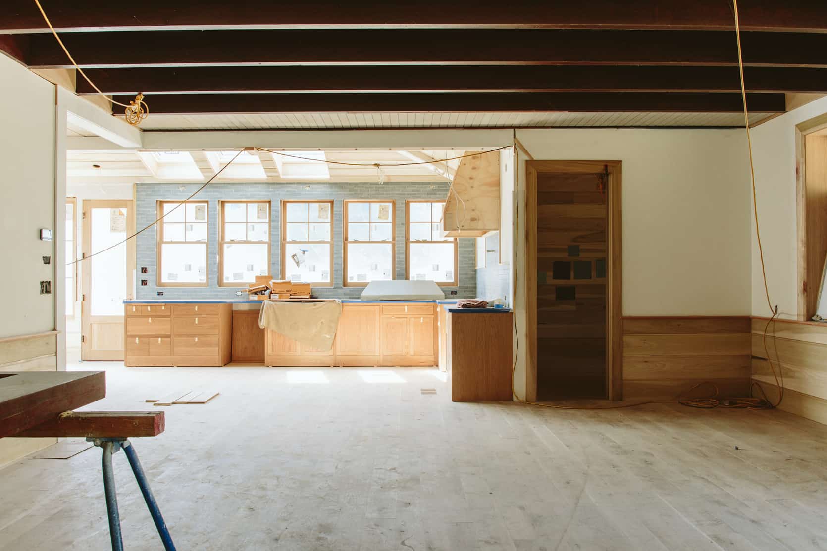
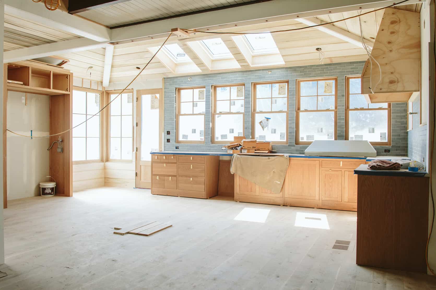
When we walk in there, that wall of south-facing windows and Velux Skylights makes the entire room finally light and bright (the living room was so dark before).
As you can see we ended up putting it in the corner with the best southern light, sacrificing the location of the mudroom (but still getting a mudroom that I literally have dreams about). It’s open to the living room, creating more of a grand room that at times feels almost too big, but don’t you worry – she’s got plans.
The Kitchen Design Plan (With A Huge Peek Into The Final!)

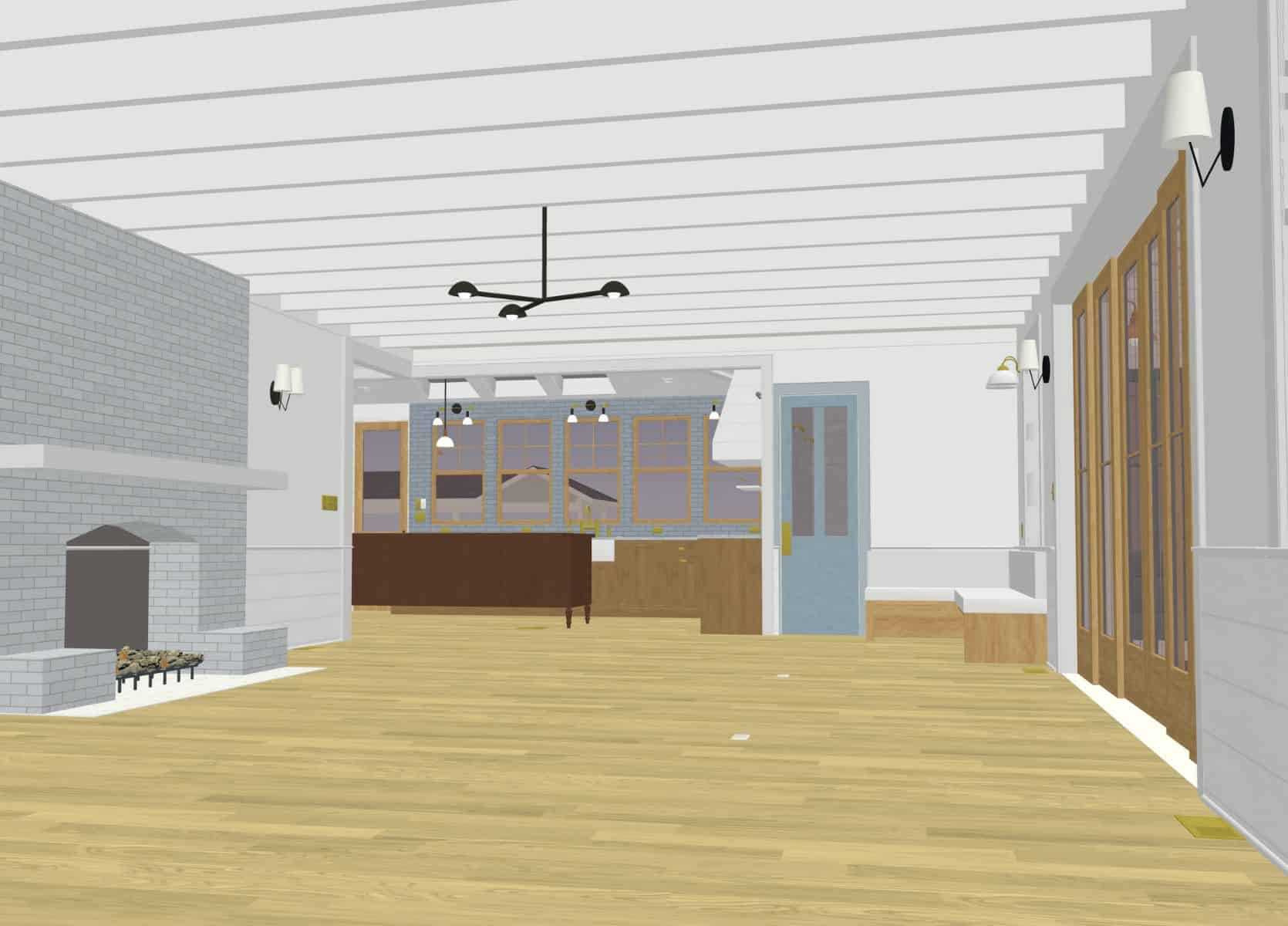
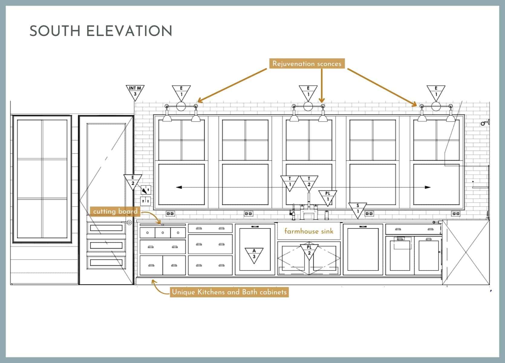
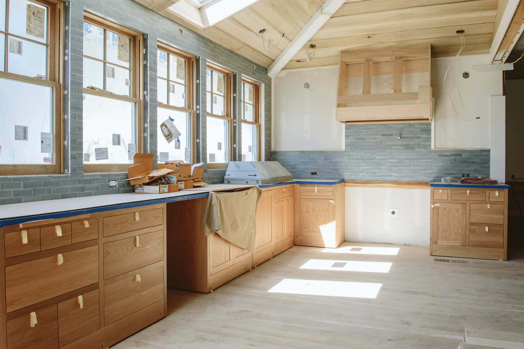
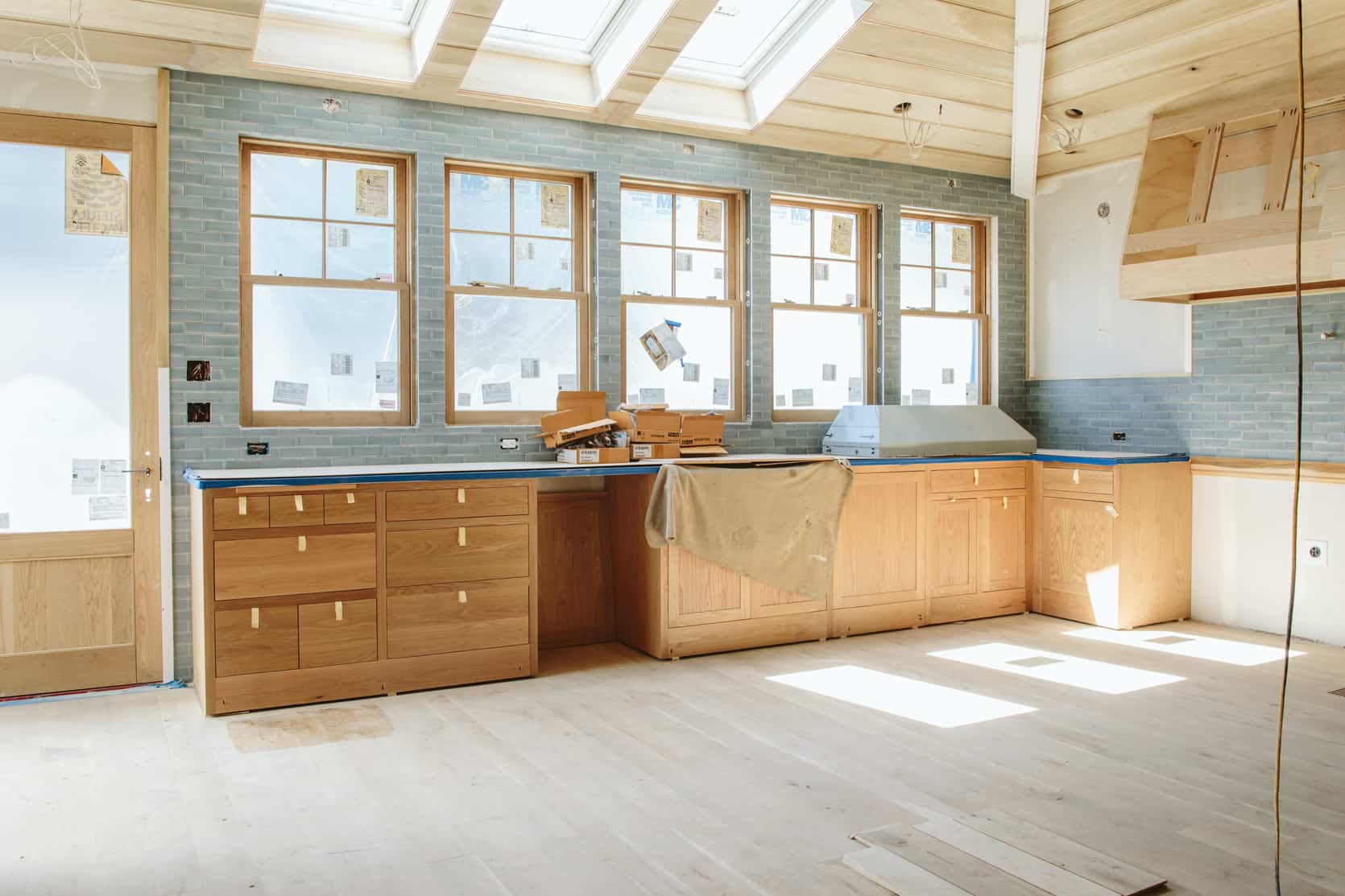
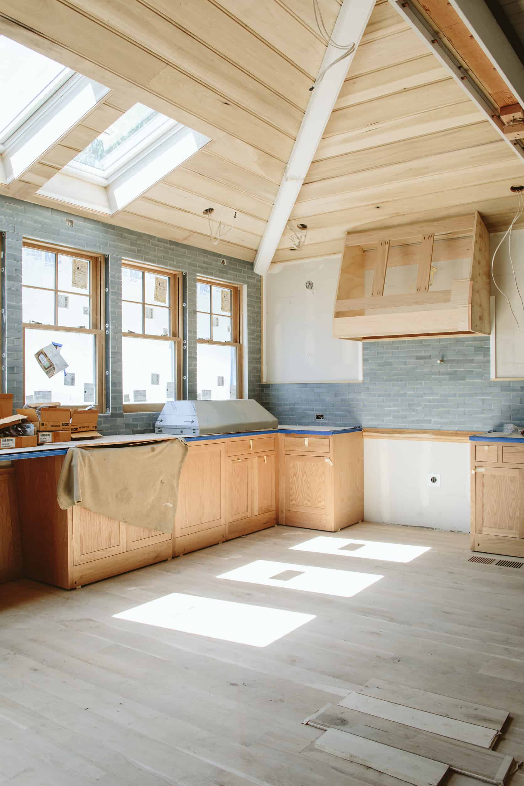
That photo brings me SO MUCH JOY. The main wall, as you can see, has a gorgeous bank of Unique Kitchens & Baths white oak cabinets. They are absolutely stunning and function like a dream. UKB is giving you all a discount if you are looking for kitchen cabinets! This includes the design reach out. Just drop my name for 10% off. We walked you through exactly what is going where in this post. But as you can see, they are very simple, with some shaker panels on the larger cupboards, flat panels on the smaller drawers, all inset. This is also the main tile wall (that Pratt + Larson tile is perfection), where the Velux Skylights and Sierra Pacific Windows create the dreamiest light and really just screams EMILY HENDERSON LIVES HERE. And we haven’t even layered any of my accessories that you know I’m collecting to go in here. I truly could not love this tile any more than I do. It’s absolutely perfect (more on that later).
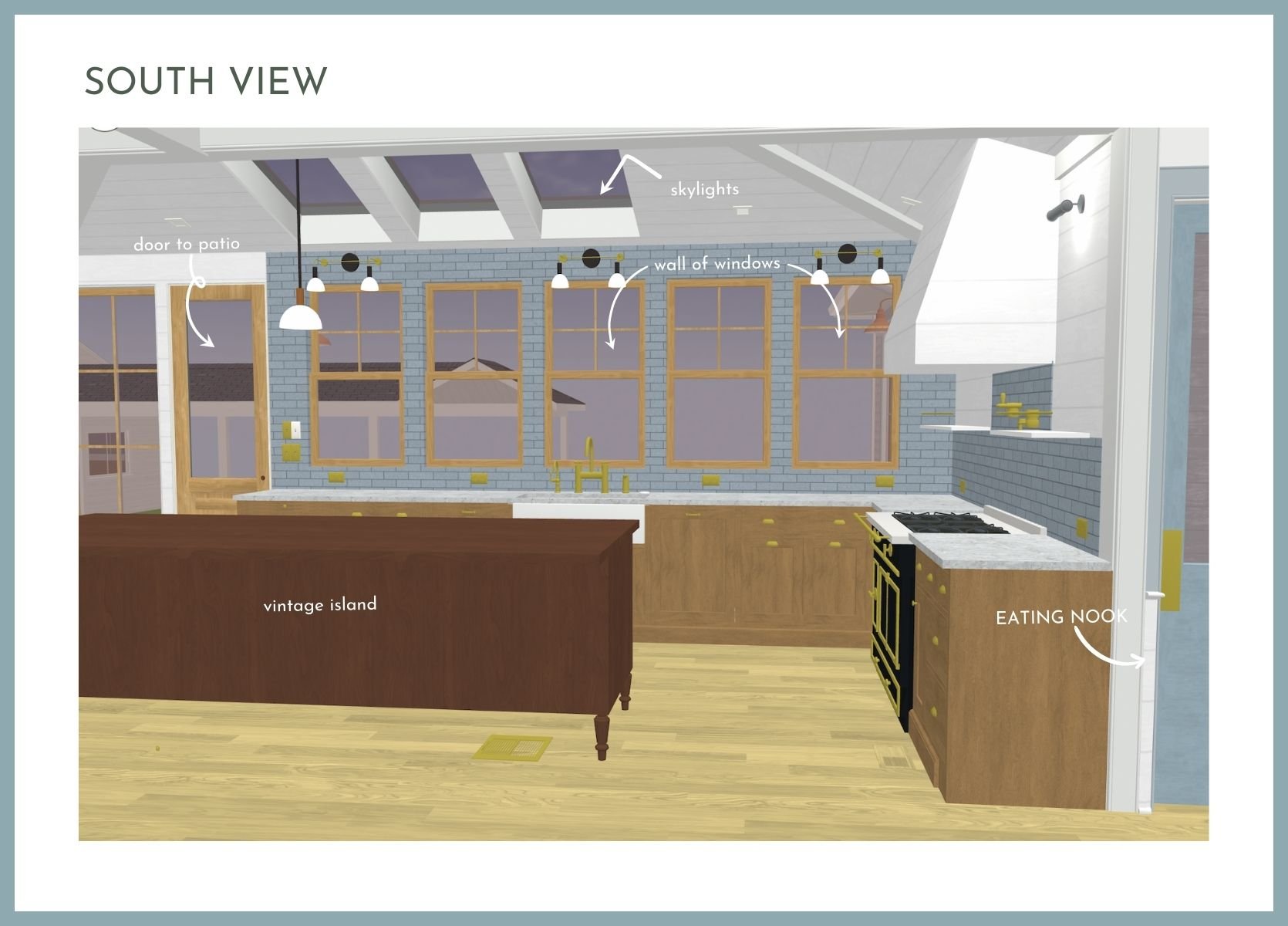
If you are sad about the wood getting painted as a reminder: the wood on the ceiling is poplar and is not stain grade. Do I love the look of real wood? YES. Is it too late to stain it? YES. Besides, as you can see in the renders, we have a lot of wood in here – floor, cabinets, windows, door, and island. The white paneling is the right choice, it’s just hard to see wood first. If you haven’t gotten caught up on the vintage island check out this post.
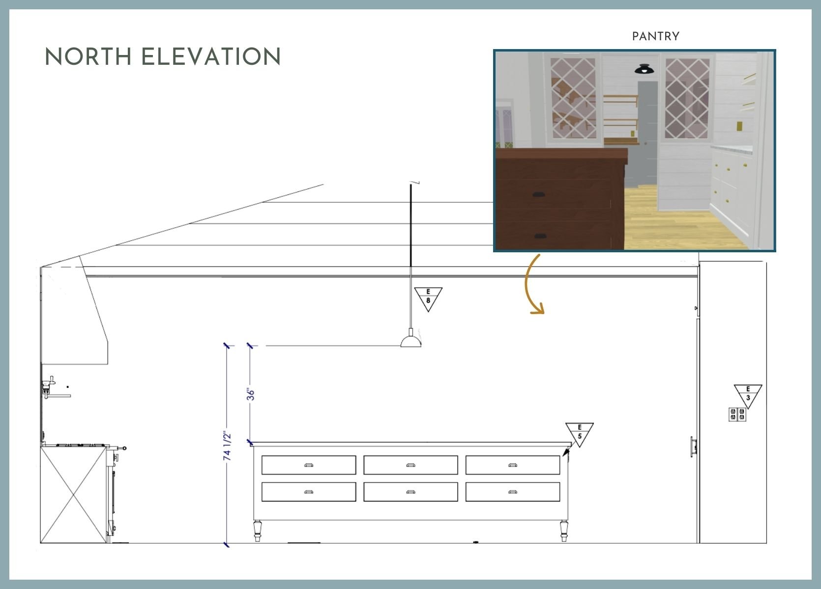
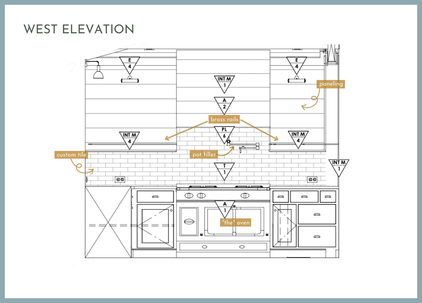
This elevation is a little old as we have three pendants now (and they are higher than 36″, make sure it clears the sight line of whoever is standing and chopping).
Bar And Integrated Fridge/Freezer – EAST Elevation
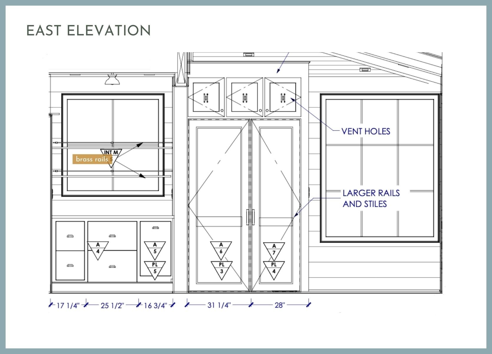
As you know we love our drawer fridges and pebble ice machine, so this will be the bar wall over here…And the vent holes are custom for us (and resemble an “H” 🙂 and are just decorative – we don’t really need to vent that storage up there.
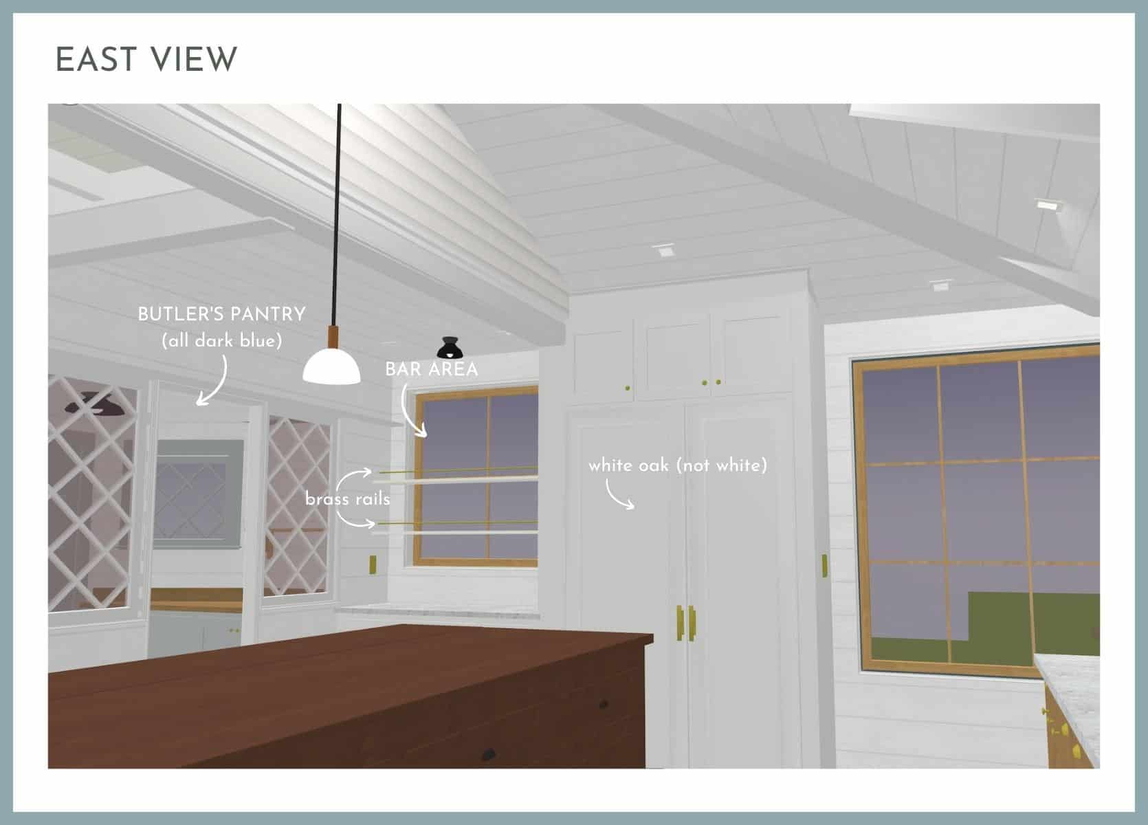
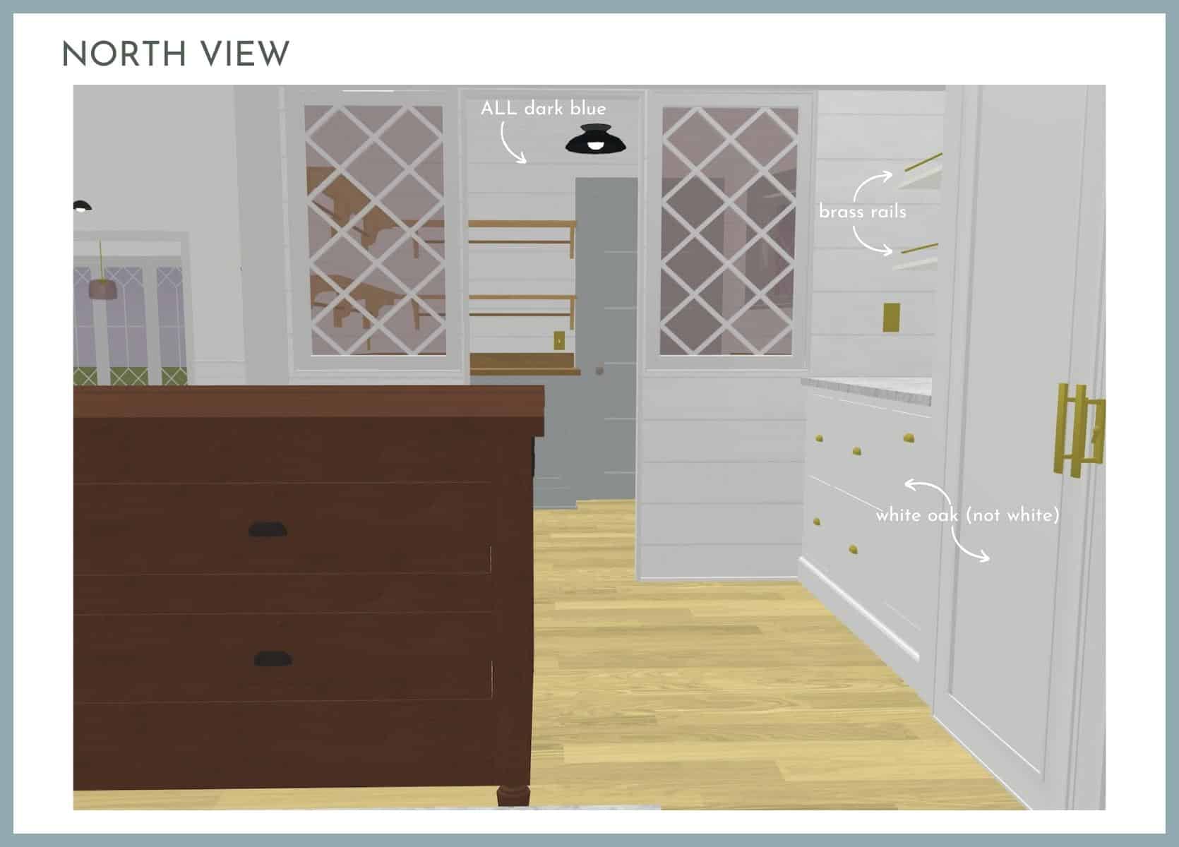
The fridge/freezer is now in white oak (these are old renderings) which was a last-minute change that I’m SO HAPPY we did. I can’t get enough of those pretty wood cabinets.
MATERIALS AND SURFACES
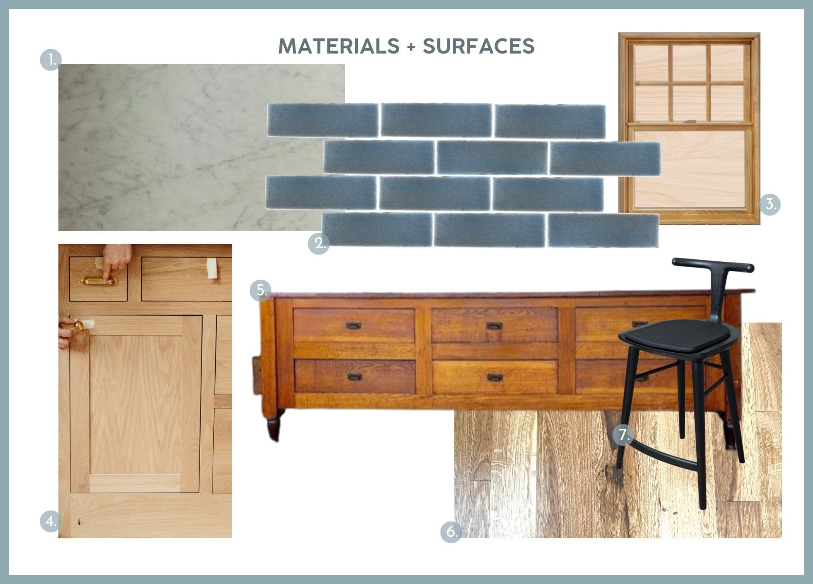
- The Stone: Going against extreme practicality here since we chose this real Carerra marble – but it has a ton of negative space (not a lot of grey veining). Brian doesn’t like veining, I do, but I understand him not wanting that look (he feels like it’s too fancy, which might be just a holdover from the 80s opulence era). So this is a real stone, but super quiet and pretty (honed). We bought from Bedrosian and chose a simple mitered edge (no bull nose, mostly to save money – although honestly, it’s probably nominal at this point). If we had a more contemporary (post-1960s) style home we would have done a quartz, but for an older home, I just couldn’t bring myself to do anything but real stone. This is absolutely a personal choice that only you can make and there is no judgment if you want to do faux marble quartz or porcelain in your older home.
- The Tile: I think this might be my favorite tile in the world. And while I keep saying that I customized it to my favorite jeans, I did and didn’t. I brought my jeans into the Portland showroom to color match, but we found an exact color match in their inventory already, and honestly, I didn’t want to go through a wasteful exercise of trying to get a color that is “different” enough from an existing color when the existing color is perfect. It’s #P146 from the Pratt + Larson Parchment line, Portland finish in a 2×6 staggered pattern. We tiled the window jams with bullnose edges and it’s absolutely gorgeous.
- The White Oak Double-Hung Windows from Sierra Pacific are STUNNING. We’ll seal them with matte oil and that’s it. So pretty, well made, warm, and beautiful.
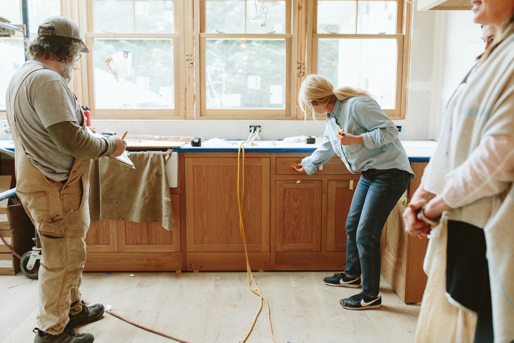
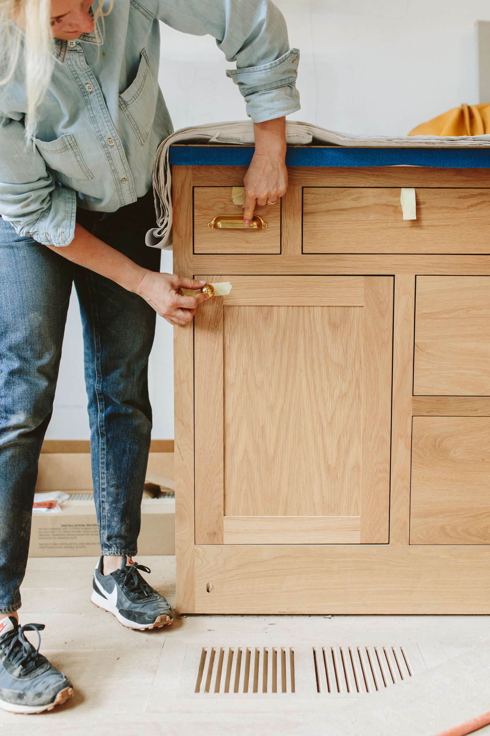
- The White Oak Cabinets from Unique Kitchen & Baths are just so beautiful. I can’t wait to show you all of them. They are so high quality, are perfectly executed, and are super timeless. And working with them has been a dream. They came easy to assemble in blankets! (not packaging) which we really appreciated. And the toe kick has yet to be installed, so that’s still to come.
- The Vintage Furniture Piece doubles as the island of my dreams. We bought it from Aurora Mills, which is a fantastic antique store/warehouse in Aurora. I can’t wait to see it in the actual kitchen.
- The Zena Flooring could not be any prettier. I love that I know it was sustainably grown in Oregon and milled down the street. Read this post to learn about their company (it’s also not as expensive as you’d think it would be…for now).
- Our Counter Stools from Fernweh. Read all about why we chose them, here. They are solid, beautiful, sculptural, and made locally by the most talented team of craftspeople.
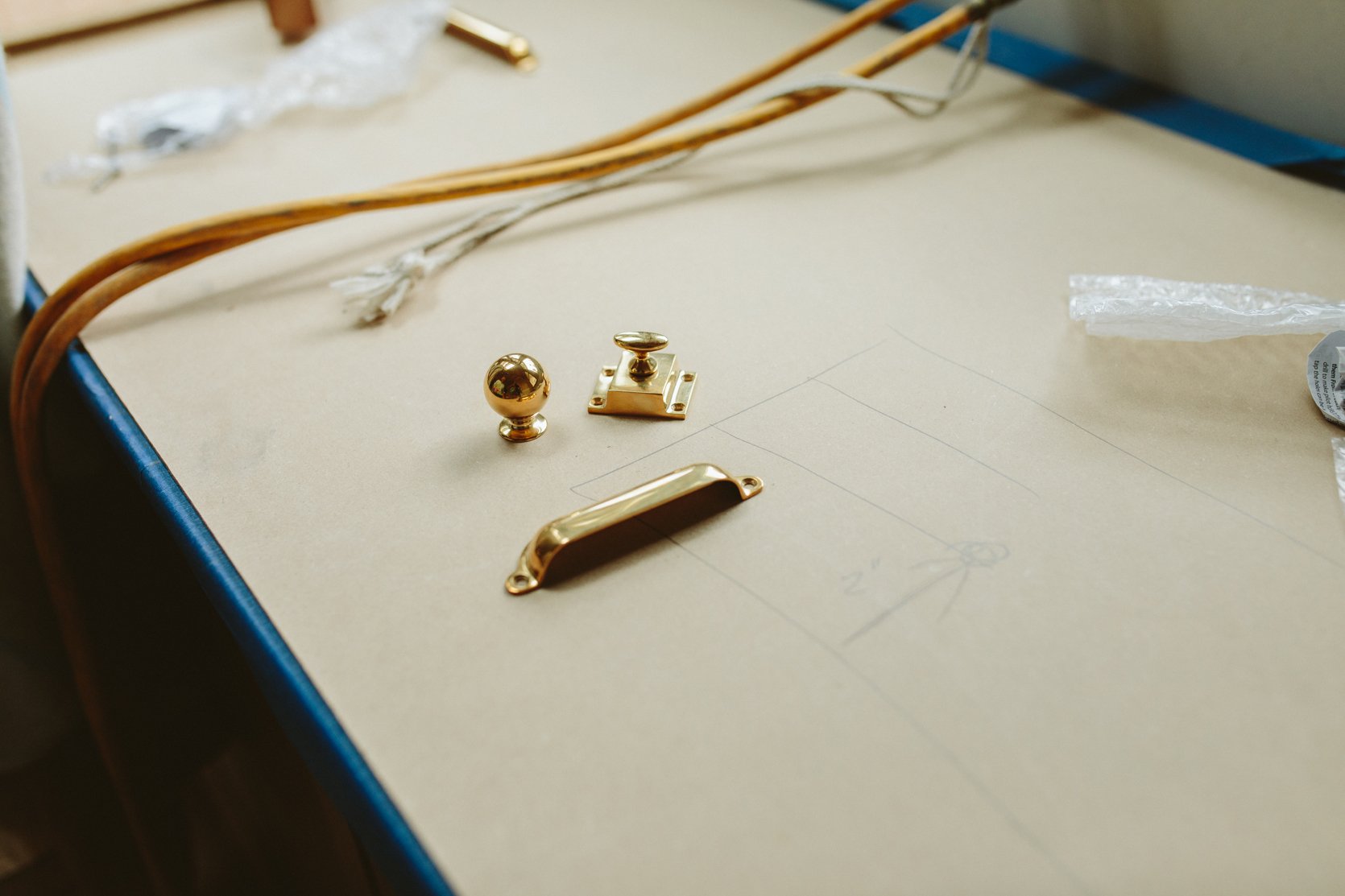
The Hardware
We mixed black (oil-rubbed bronze, which reads as black) and unlacquered brass awaiting that gorgeous patina.
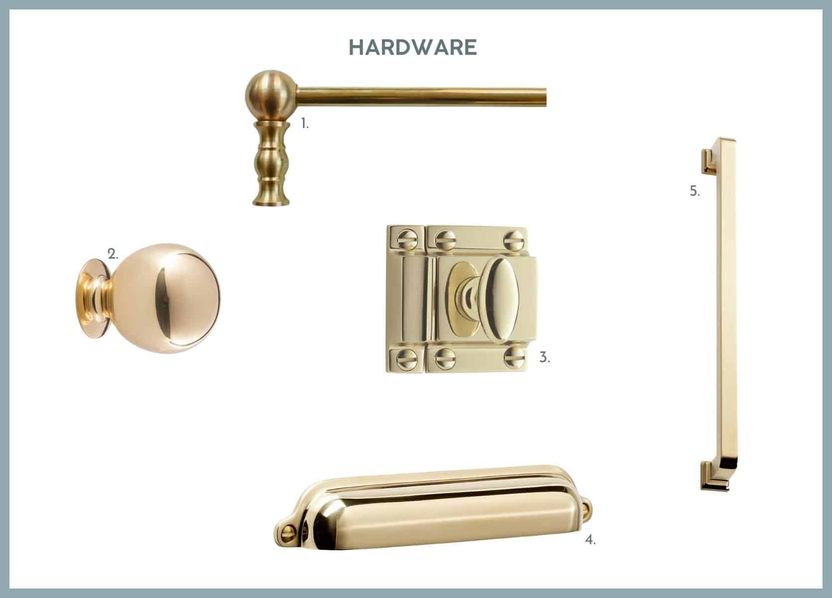
1. Traditional Brass Gallery Rail | 2. Ball Cabinet Knob | 3. Small Oval Cupboard Latch | 4. Vernon Bin Pull | 5. Mission Appliance Pull
We found this brass gallery rail (for the top of the shelves) from a small family-run company called Pepe and Carols, and it’s perfect for our shelves (there and for the bar).
The hardware is a mix of cute little knobs, drawer pulls, and latches. But it’s MOSTLY drawer pulls, per Brian’s extreme request. I’ll be honest that I wanted to mix it up more, but he really felt strongly about having it look like a library. I’ve never done brass on wood before and I’ve never done so many of one style before. I’m going to do a whole post about why and where we are putting them. It’s a thing. So stay tuned…
The Lighting
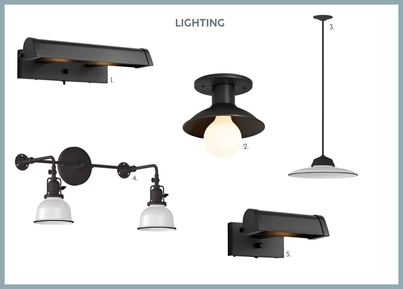
1. Clyde Picture Light | 2. Crawford Flush Mount | 3. Carson Cord Pendant | 4. Fairview Traditional 2 Light Sconce | 5. Clyde Picture Light
As you know we are so happy to be working with Rejuvenation on all our lighting, produced locally in Portland and the customization options are endless (see this post about the process). We mixed my favorite Fairview sconce with those white enamel shades (with the black rim). I LOVE THEM. The scale feels really whimsical and elegant. Flanking the range, we have two art lights (one big, one small) which will illuminate a rotating collection of kitchen-appropriate art (still life oil paintings of vegetables, and I’m even eyeing some chicken art – that’s right! Chicken art trend post coming soon!). Over the island, we have three Carson pendants (not shown in the renderings), then the cute little semi-flush over the bar.
PLUMBING + FIXTURES + THE OVEN!
Where we chose to lean in on the old-world vibe a bit.
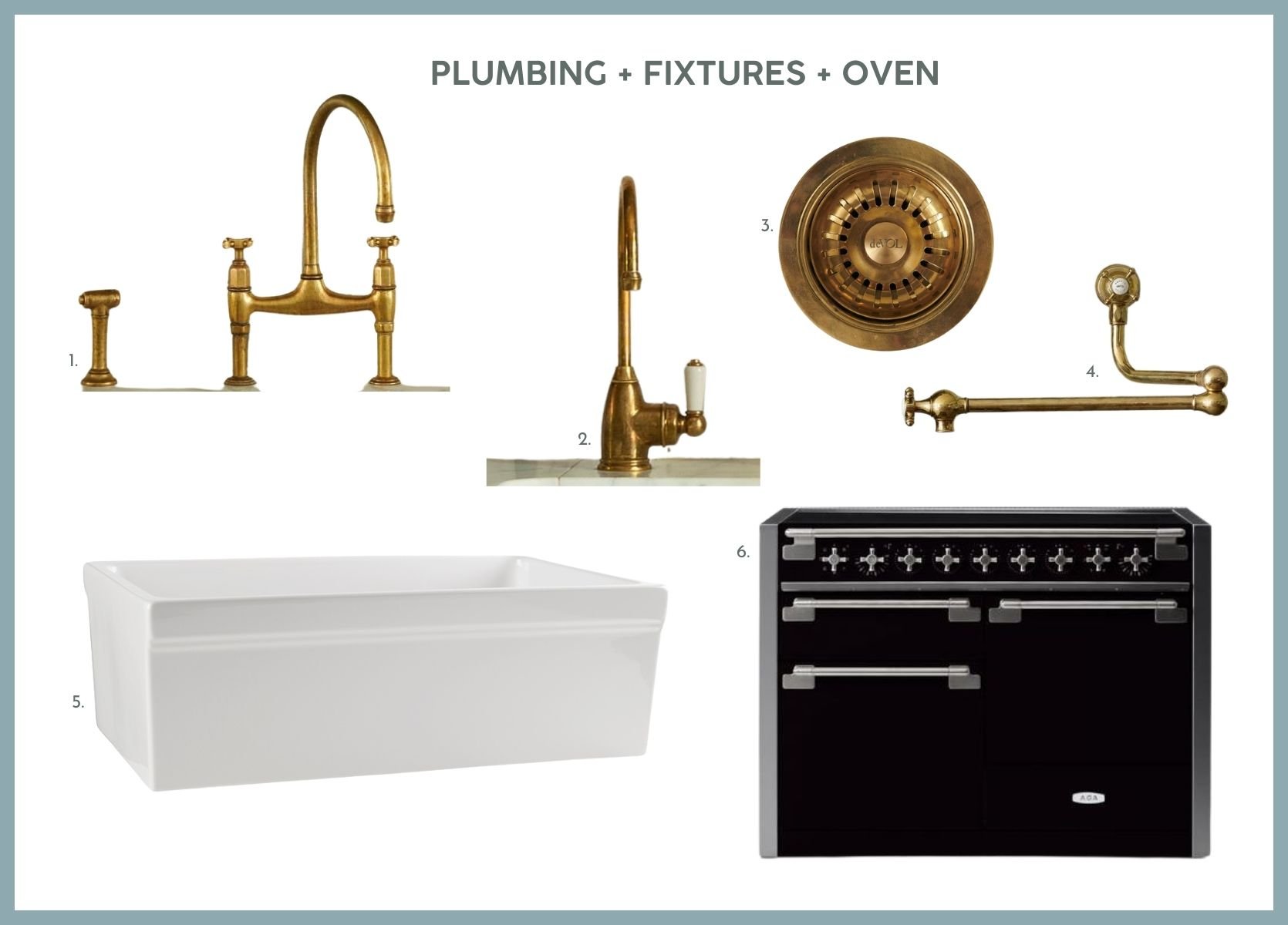
1. deVOL Aged Brass Ionian Tap | 2. deVOL Aged Brass Filter Tap | 3. deVOL Basket Waste Strainer & Overflow Kit in Brass | 4. deVOL Aged Brass Pot Filler Tap | 5. Fireclay Kitchen Sink with Rim | 6. Aga Range
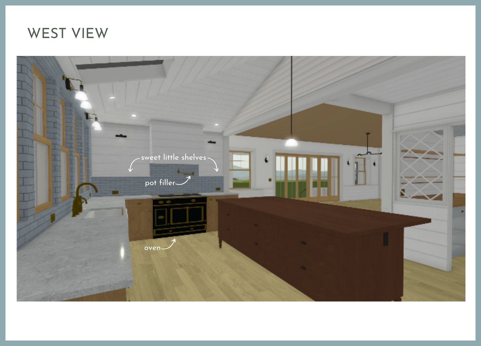
I went for unlacquered brass on the faucets (the only place in the house for plumbing fixtures) and that Aga range from Build with Ferguson has arrived (unopened, and I’m so excited). I can’t wait to try my hand at induction (nervous but we’ll learn together). We ordered brass for the knobs so it’s a mixed metal range, which I’m so excited about (no photos of the mixed metal yet). The farmhouse sink is big and pretty, and the apron is so classic but has some special interest with the ribbing.
THE WHOLE KITCHEN STORY
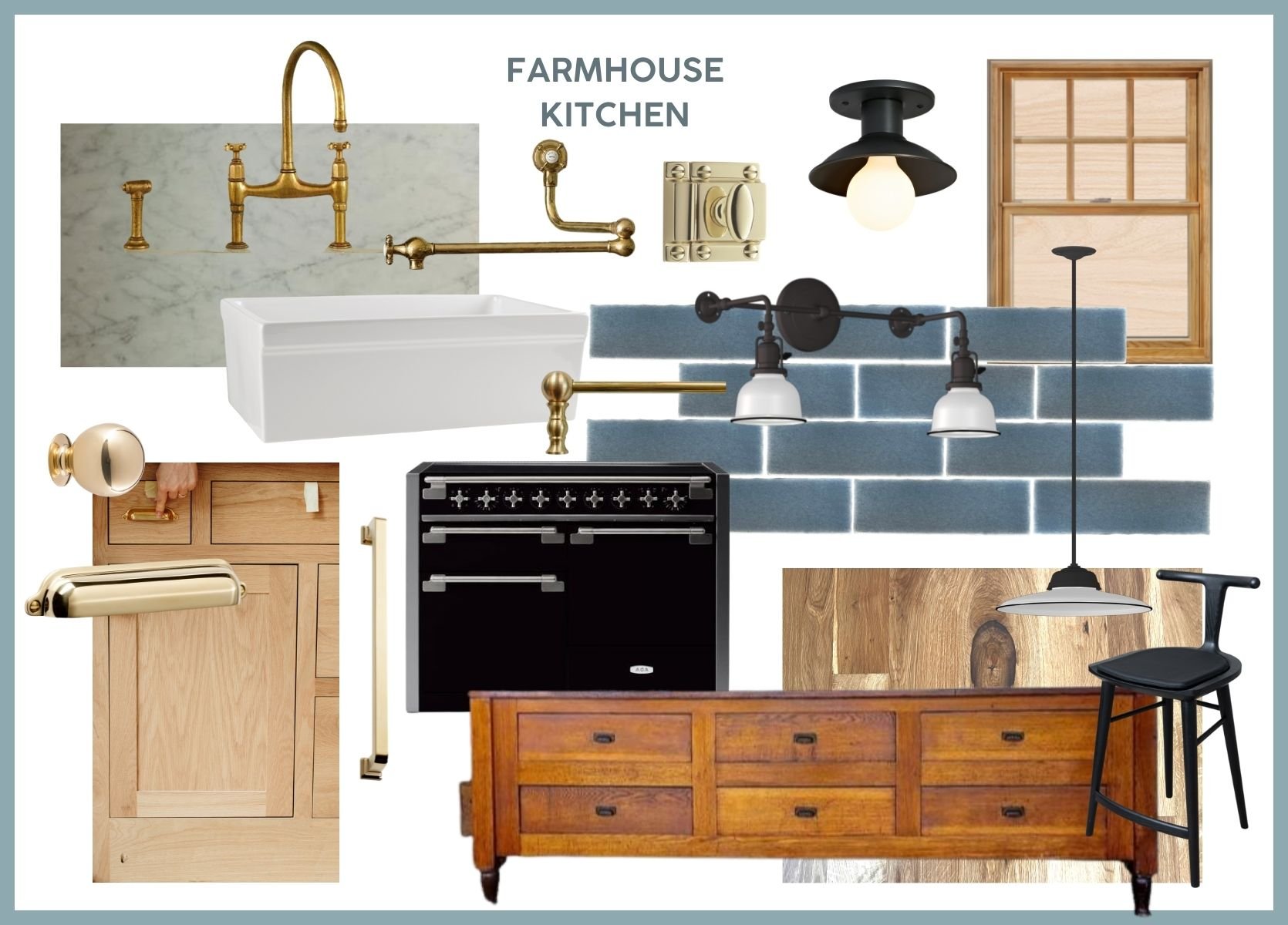
Carrera Marble | PRATT + LARSON 2×6 tile | Sierra Pacific Windows | Unique Kitchen & Baths White Oak Cabinets | Zena Forest White Oak Flooring | Fernweh Woodworking Stools
This mood board is hard to show you because so many of the things are vintage or custom so it’s not the typical product board we do. I think that the renders and updated photos show you better than anything (see below).
IT IS GOING TO BE JUST BEAUTIFUL!
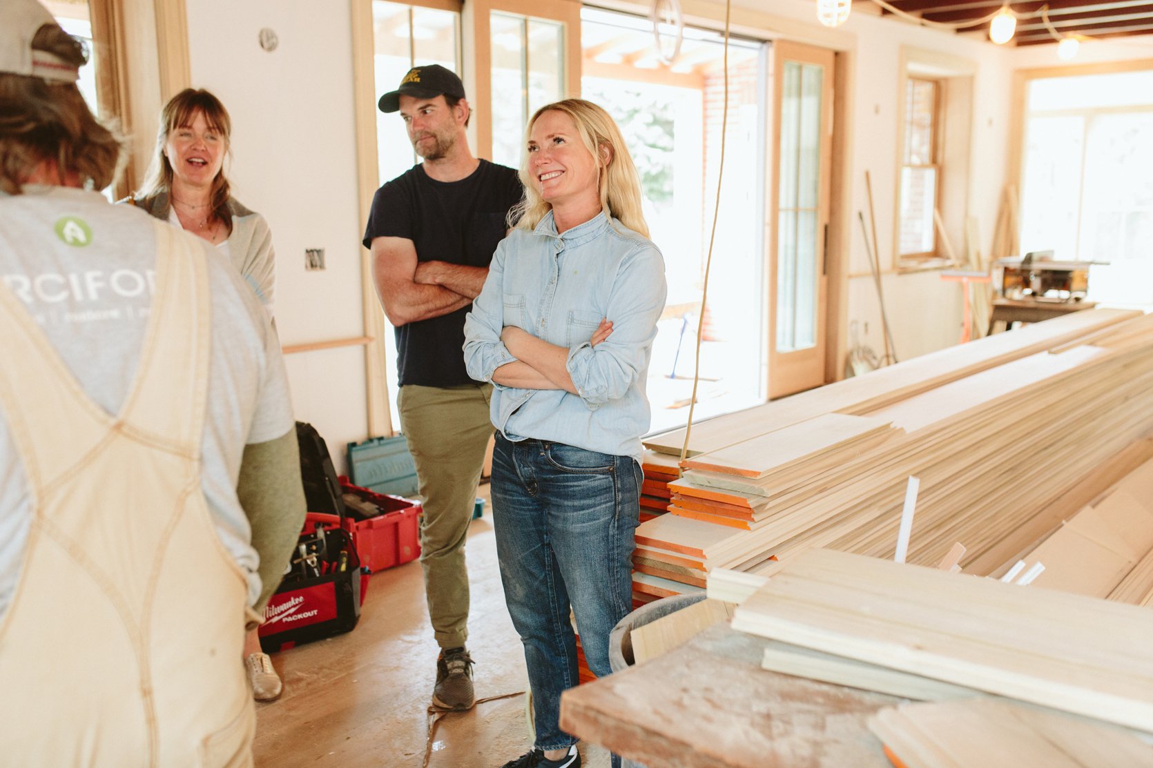
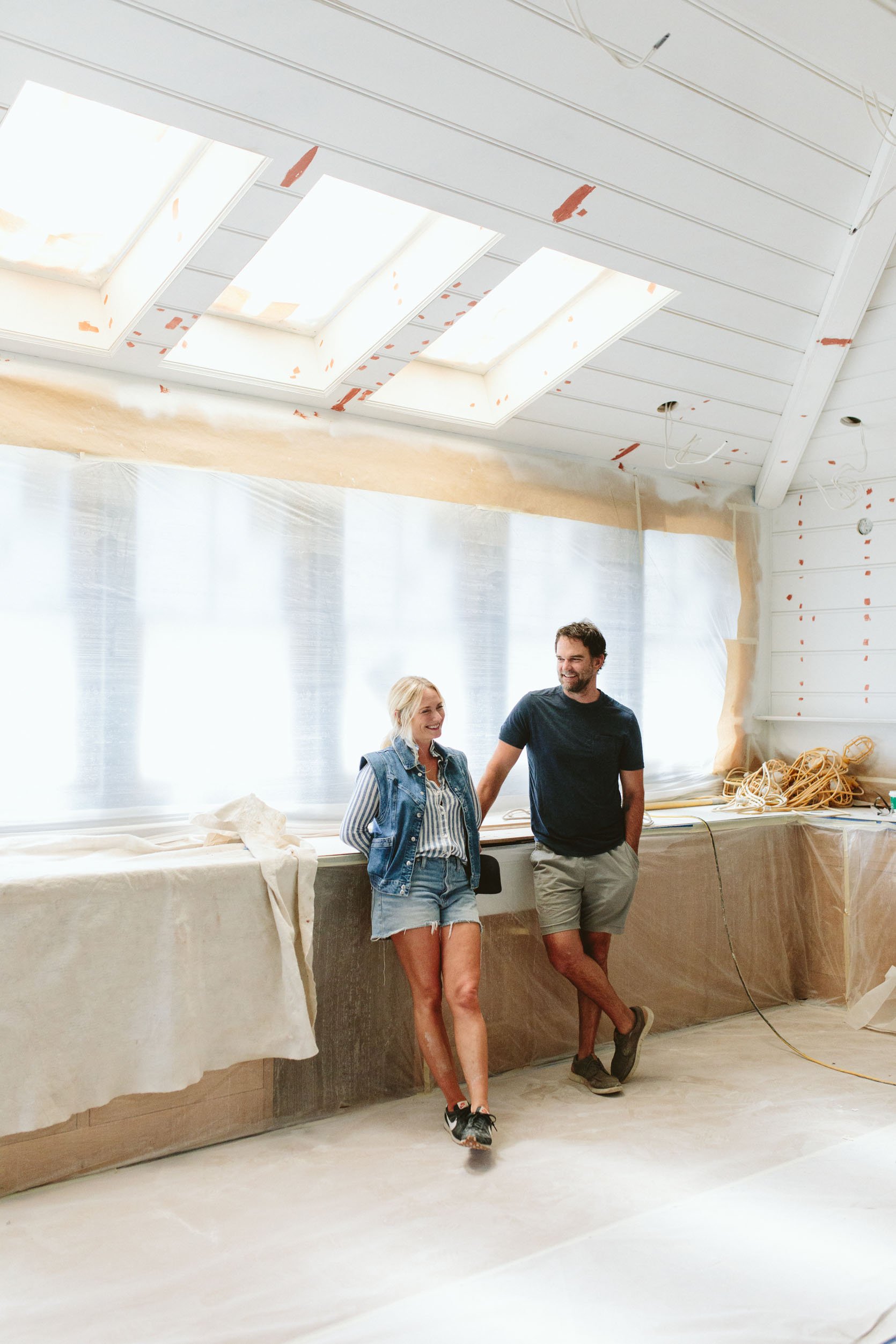
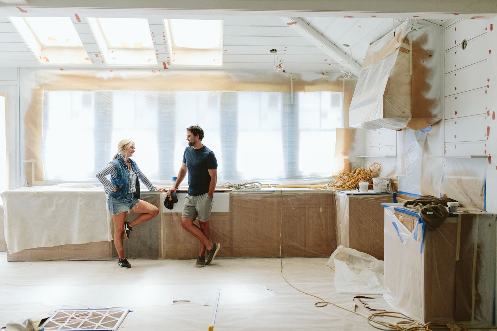
We get closer every day to moving in (hopefully the week of August 22nd) with progress every time we stop by. It’s extremely rewarding to see all the work that myself and ARCIFORM have put into the design and execution of this kitchen. Really sitting here full of gratitude and excitement right now, so thank you all for making it through this post and reading along on this long farmhouse journey. We are so close!!!!
*Opener and Progress Photos by Kaitlin Green
THIS POST WAS ORIGINALLY PUBLISHED HERE.
