As I write this article, a team of movers packs up my house ahead of my new adventure in the UK. A bittersweet moment, to be sure… watching meaningful memories made over the last two years be packed into boxes and hauled out of my front door. Furniture is splayed across the house as the movers debate the packing puzzle that is my weird collection of things. Most walls are bare. Much of my personality has been removed. A vase of flowers in a corner catches warm sunlight streaming through a window—looking out the window as if it’s reflecting fondly on the memories made in this house.
Strangely enough, though, my dining room remains intact. The furniture in this space is being transferred in a different shipment later this week, so this room is the only one that looks vaguely “normal” amidst the pre-move chaos. This is the last room I designed in this house, so it feels satisfyingly poetic that it’s the last room to be emptied. The stillness of the dining room at this moment reflects the timelessness of my design intentions for it—vintage furniture, secondhand pieces, and classic patterns are suspended in time as if they were always meant to be here. I sit in a vintage Broyhill chair across from the dining room—proud of what I’ve accomplished but sad I won’t get to enjoy it beyond this week (until I return stateside in a few years, that is).
At any rate, I could wax poetic for ages, but you probably didn’t come here for my incessant rambling! You probablyyyyy came for the reveal of this space—which I enjoyed designing before my move—and I’m happy to oblige!
When I set out to redesign this room, I already knew my departure was forthcoming and that a renter would be taking over my house imminently. As such, I decided to make changes that weren’t tremendously labor intensive, collecting vintage items to use in the space (that I’d be able to either take with me or enjoy when I move back to the US), and making changes so the dining room feels well-incorporated with the rest of my house for a fully-realized design experience for my incoming renter. In addition, I was challenging myself to explore interesting and complex projects under a limited time constraint…with the added hurdle of avoiding any easily irreversible design decisions…in the middle of a life-changing move across the world. Am I a glutton for punishment? Perhapppssss. However, am I proud of what I’ve accomplished here? Absolutely.
QUICK CHANGES

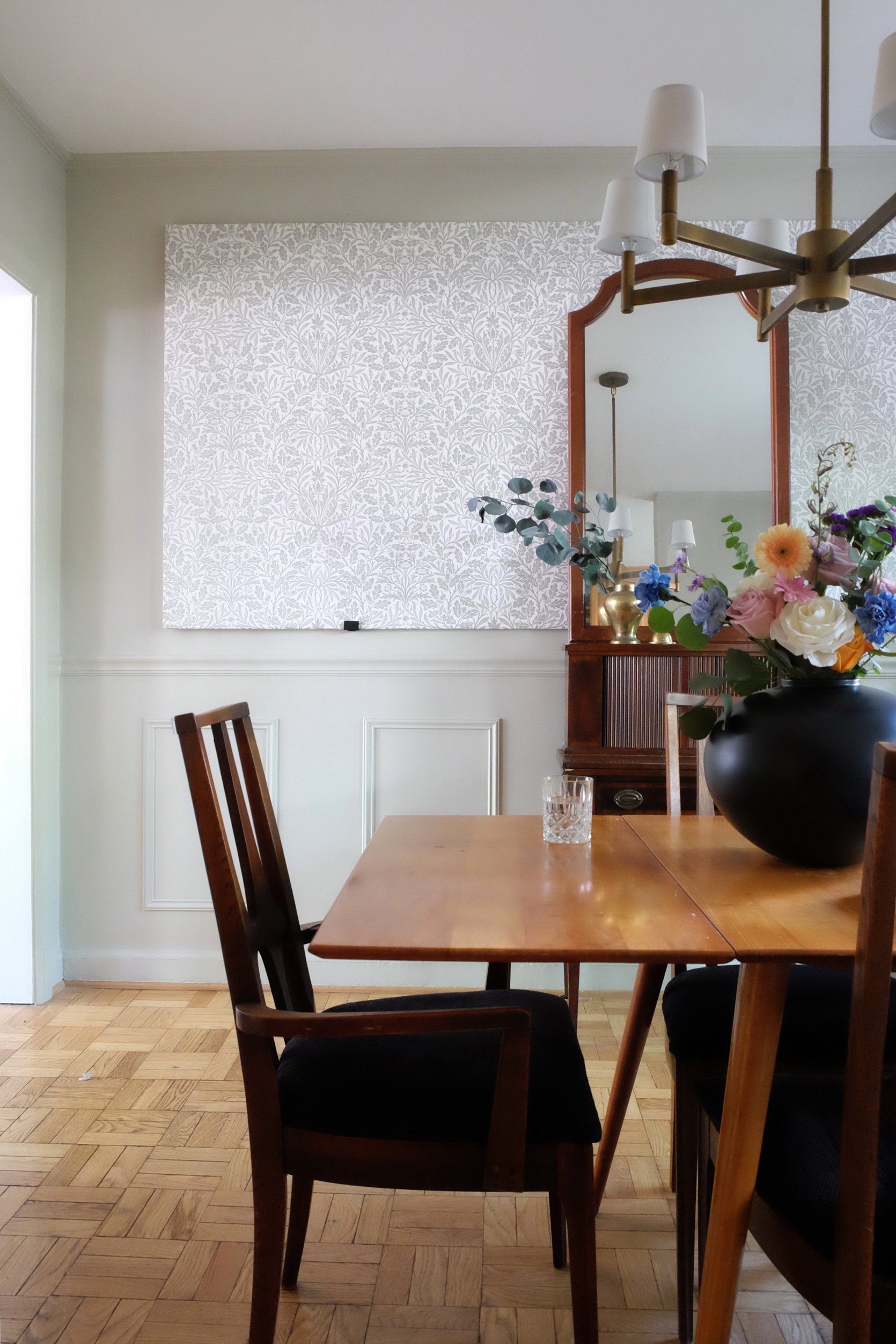
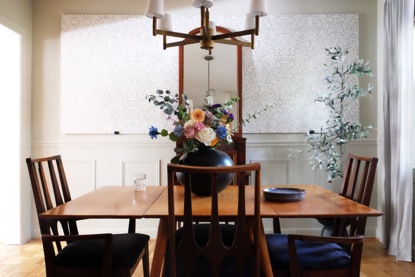
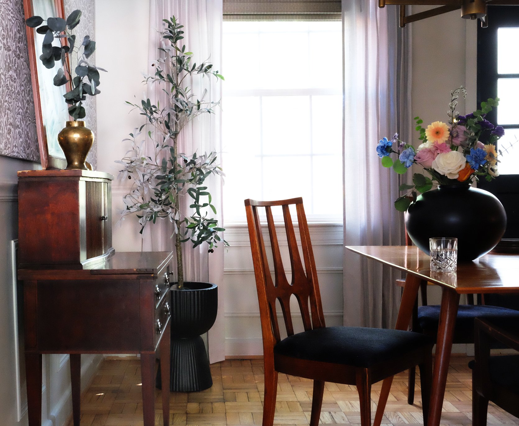
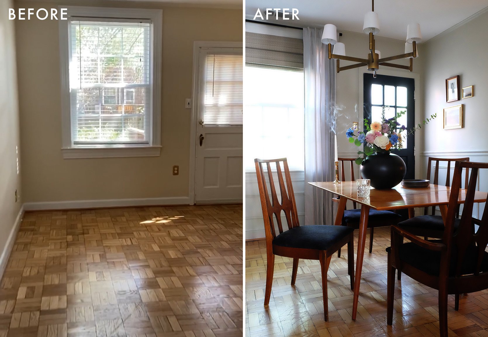
I think the name of the game in this space is simplicity—from the singular paint color used in the space to the timeless appeal of the wainscoting applied throughout. I’ve always enjoyed custom millwork in a space. It adds a tailored touch to a room in a reasonably uncomplicated way (depending on how much detail there is), and it’s relatively easy to design and implement over a weekend. For my purposes in the dining room, I had pieces of trim cut down at a local hardware store, and used my miter saw to cut the corners of each piece to length to make eight boxes around the room of various sizes. I also installed a chair rail around the room to help ground the millwork. I used a nail gun to secure each piece into the wall, caulked the edges, primed the wood, and painted it all in the same, dusty gray tone.
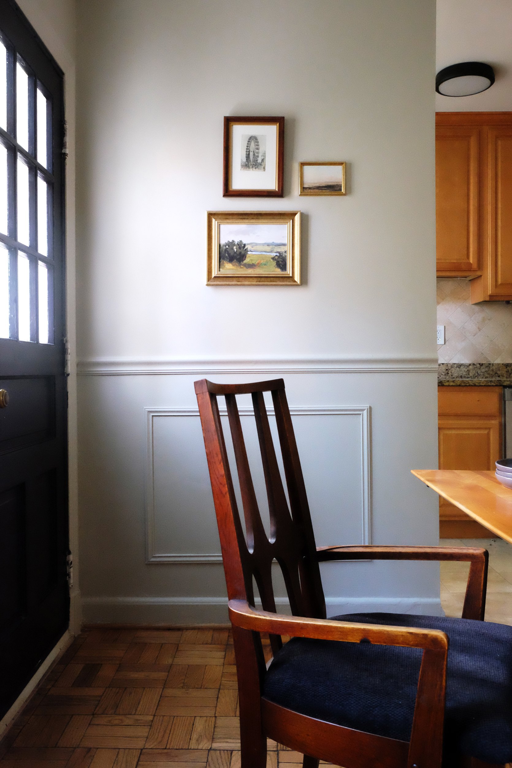
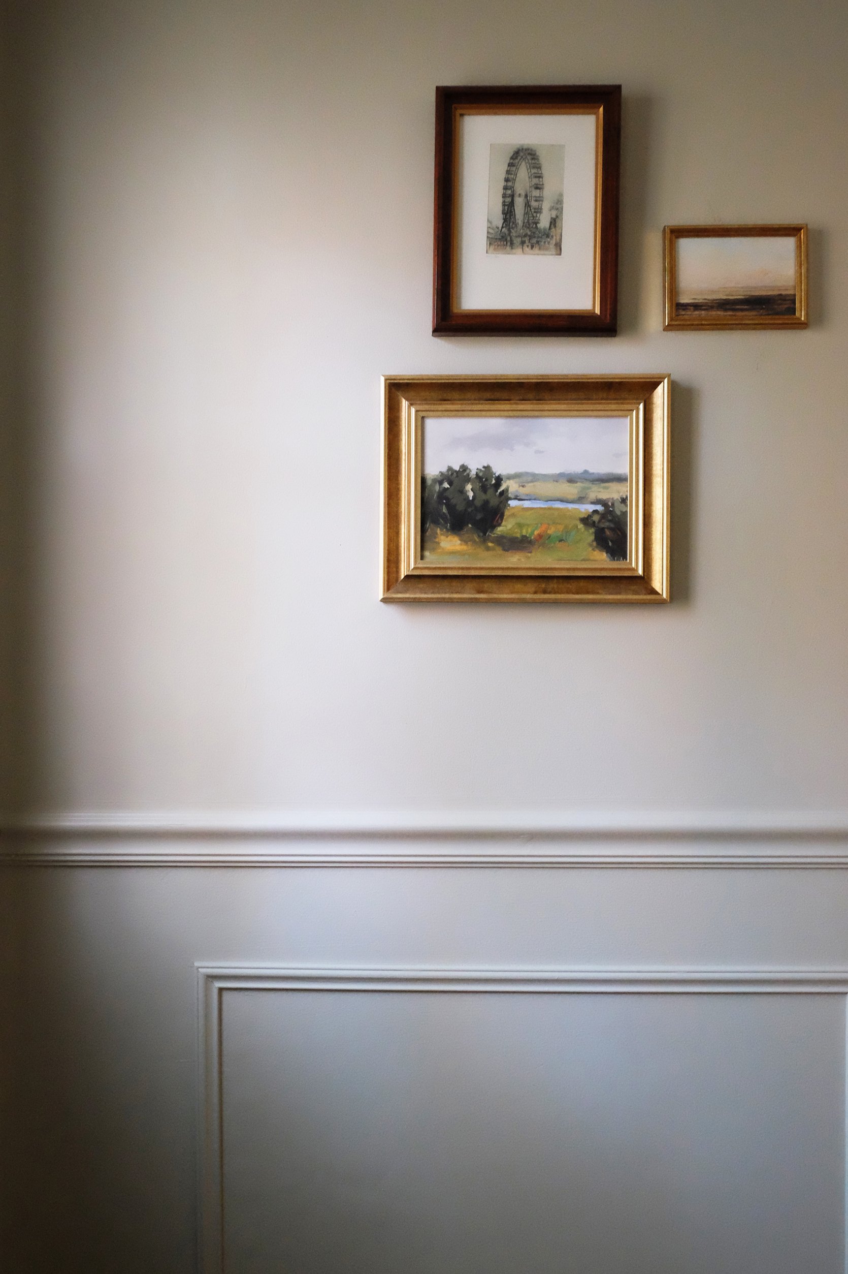
The paint color I used in this dining room is “Hazy Skies” by Benjamin Moore, and it has quickly become a favorite of mine. It has a green undertone that appears and disappears depending on the time of day, but its overall tonality feels neutral enough to play well with a wide variety of textures, styles, and patterns (all of which I’ve explored in this space). I’ve used a “pearl” finish on the wainscoting and below, and a “flat” finish on the upper portion of the walls.
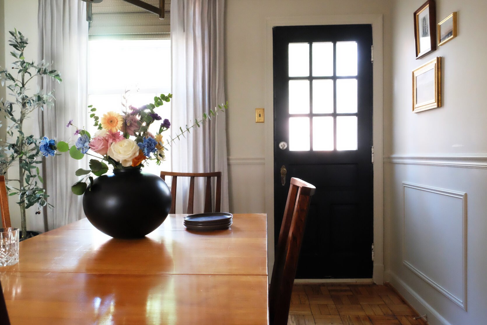
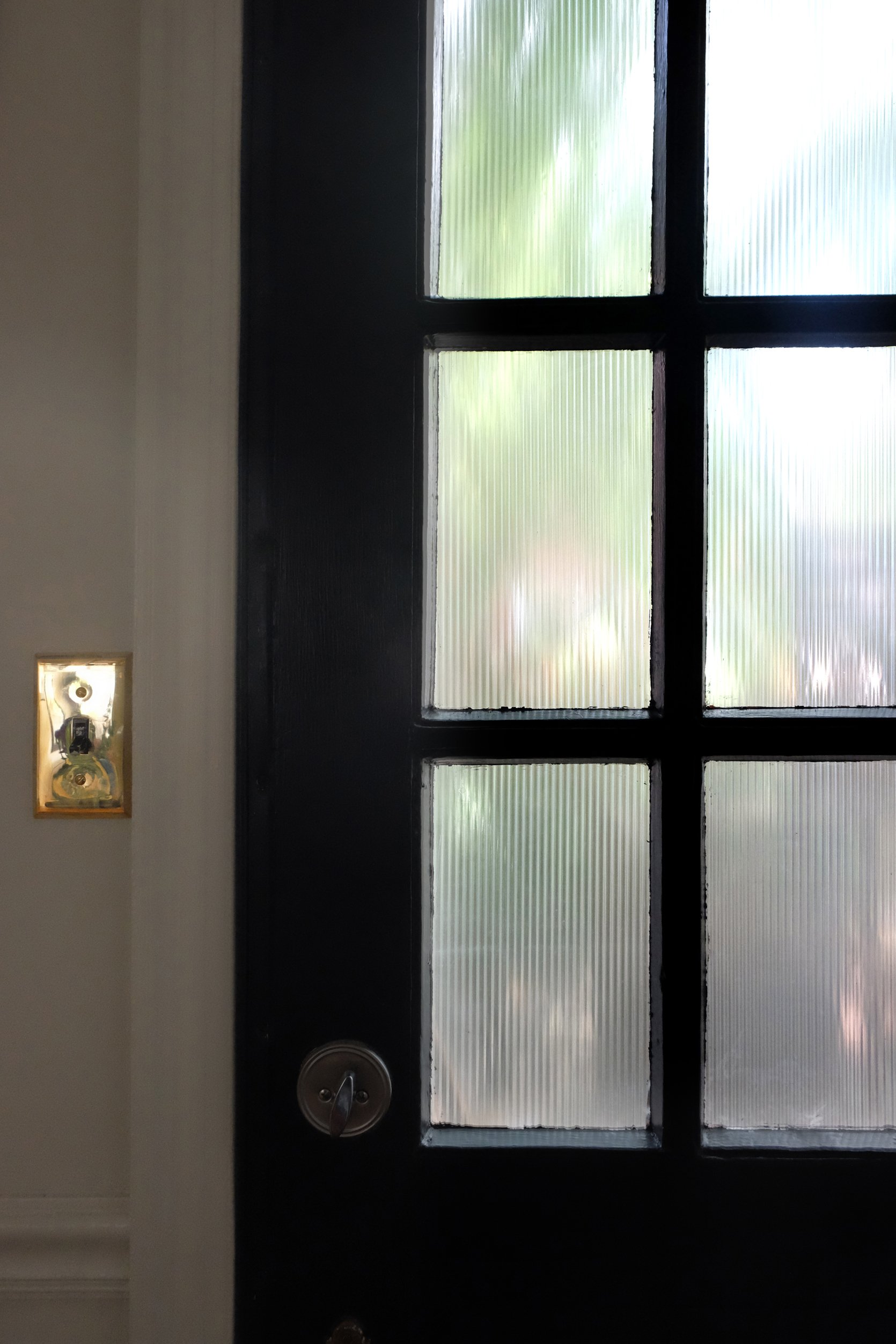
On the door, I used “Black Magic” by Sherwin Williams, but the star of the show here is the DIY reeded glass treatment I’ve applied to its windows!
I struggled to determine how to create privacy through the windows on this door. I didn’t like the blinds that were installed there previously, but they did provide some necessary privacy, and I certainly wanted to maintain that privacy for my renters. I’ve always loved the look of reeded glass, so I jumped online to see if I could find a quick and simple way to create that effect here. That search led me to these stickers on Amazon. They were super easy to install (and will be super easy to remove, whenever necessary), and add privacy without sacrificing style.
Reeded Glass Window Film | Light Plates
Wallpaper | Vintage Chairs | Vintage Dining Table | Vintage Light Fixture
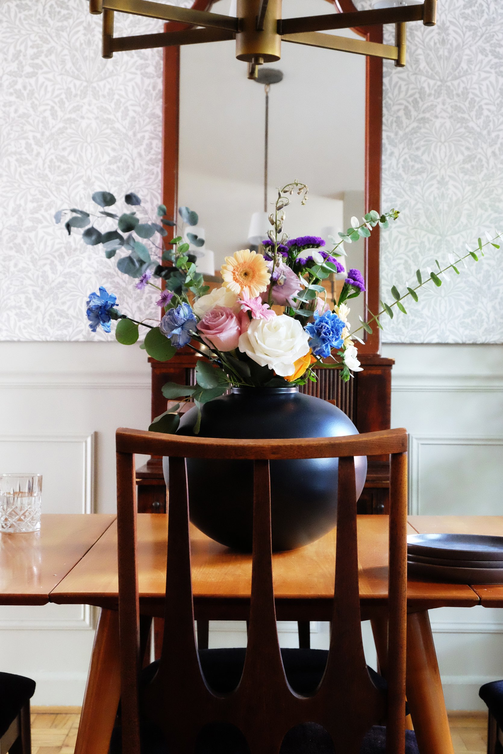
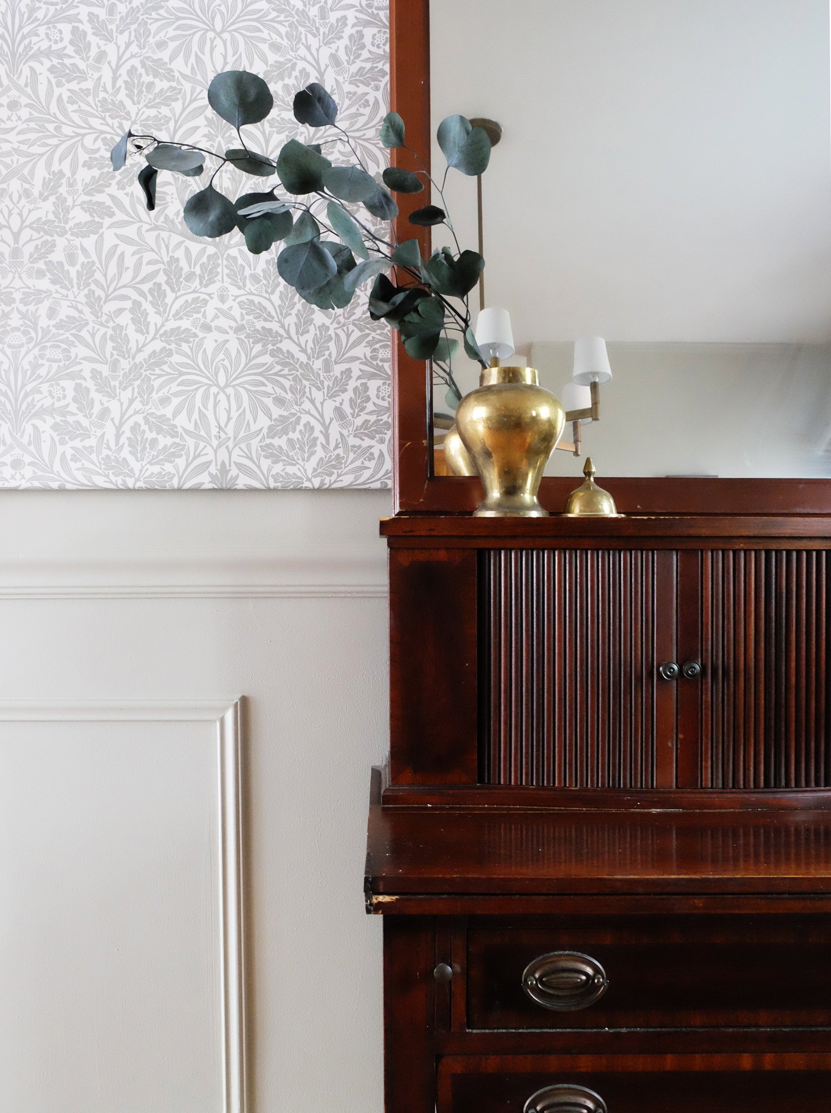
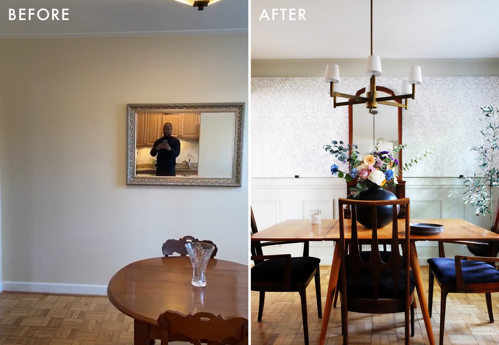
Let’s talk about this GORGEOUS wallpaper by William Morris and Rejuvenation! William Morris is a pretty renowned print and textile designer from the 1800s. He hailed from the UK, so it felt appropriate and meaningful to use one of his prints before my move across the pond. I love the line movement in this print. It’s quintessentially Victorian in style, but somehow still feels relevant amidst some of the more contemporary and modern aspects of this room.
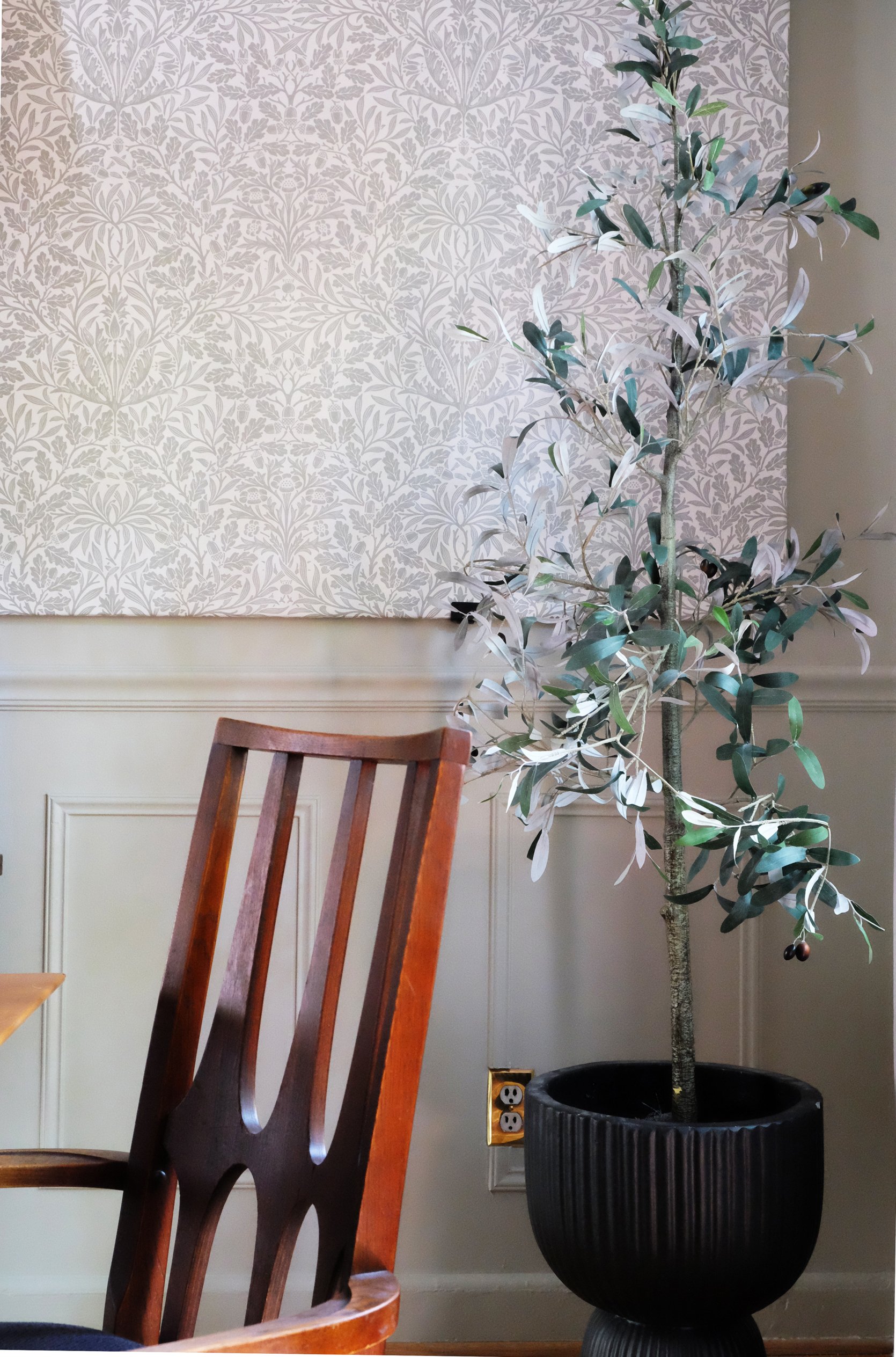
From the moment I had the idea to use this wallpaper, I knew I wanted it to be BIG and carry a lot of visual weight, but I also knew that I didn’t want to apply something directly to the wall that might deter renters who don’t like wallpaper. To that end, I ordered a 4’x10’ piece of drywall from Lowe’s, painted it with an oil-based primer, and applied the wallpaper to it with wallpaper-specific adhesive just as I would’ve if it was going directly on the wall. It was pretty easy—largely in part because I was doing all of the work on the floor. Once the wallpaper adhesive was all set, I hoisted up the piece of drywall (it was very heavy) and positioned it atop brackets that I drilled directly into studs. And, voila! A relatively easy way to use wallpaper in a fairly non-permanent way.
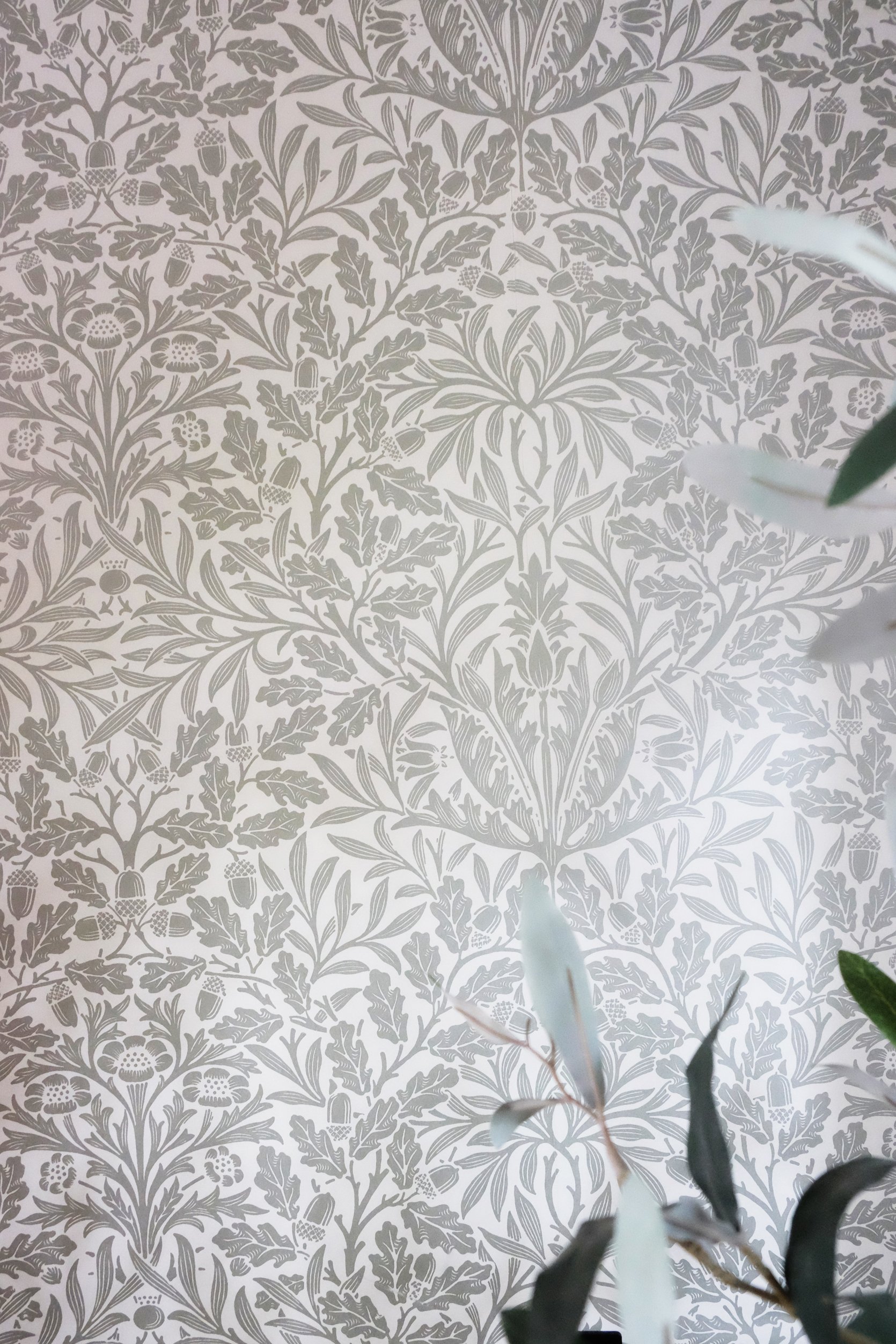
The quality of this wallpaper is a 10 out of 10. The texture is soft to the touch, it has a beautiful sheen to it, and it was ridiculously easy to apply to the drywall after I watched a tutorial. The pattern brings a subtle energy to the room that is meaningful but not at all overbearing. The style of the print fits in well with the rest of the house, which is something that I strived to do heavily in this room.
INTENTIONAL DESIGN CONSISTENCY
Along with being intentional about the “quick changes” I made in the dining room, I wanted to incorporate elements I’ve used throughout the rest of my house to create a thoroughly cohesive experience. I’ve used the same wall plates from Rejuvenation around the home, which is a fairly easy way to create that cohesion. Additionally, I painted the walls in the dining room similarly to how I painted them in the office by extending the paint to the baseboards, door/window trim, and crown molding throughout the space.
Roman Shade | Curtains | Curtain Rod
Additionally, because I’ve used drapery on every other window in the house (mostly from Everhem), I wanted to follow suit in the dining room as well. I didn’t have the time or resources to have custom drapery created in this space, so I opted for off-the-shelf panels from CB2 and a black curtain rod from Target to adorn the window in this room. I also picked up a wooden shade from Lowe’s to finish out the window treatment for a more custom look. I’ve used the same wooden shade in an adjacent window in the kitchen to create some consistency. Ultimately, I decided to remove the curtain panels throughout the house before the renters arrive, since most of them are fairly expensive and I was a little nervous about someone ruining them… but I did leave the curtain rods installed so that anyone can easily hang their own drapery.
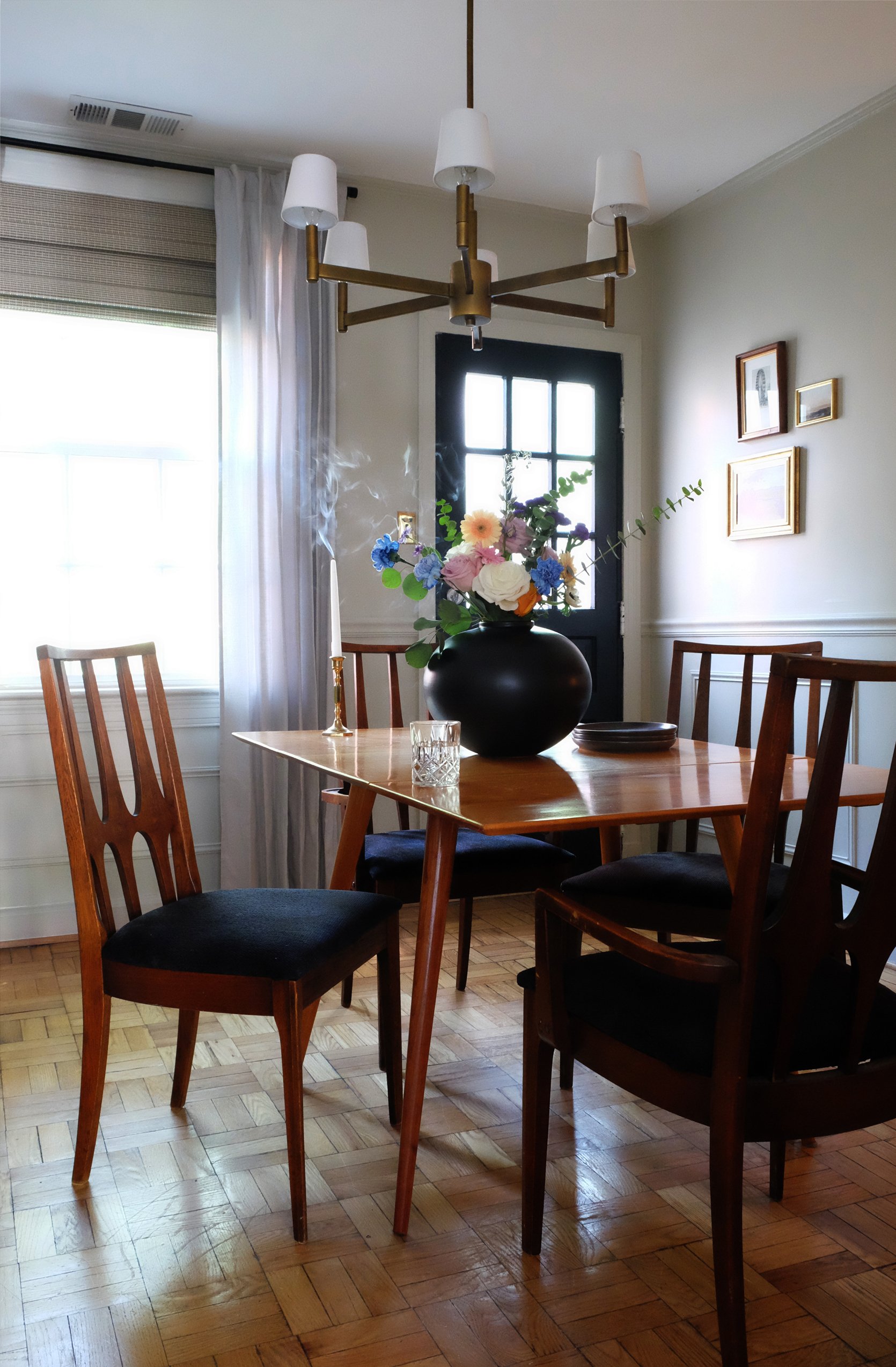
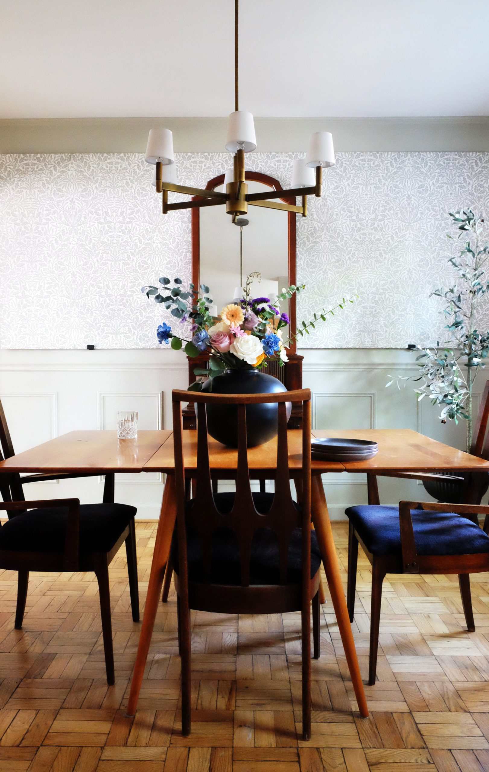
Another feature you’ll find throughout my home—as you’ve seen in my primary bedroom, bathroom, and office remodels—is brass lighting. The fixture I chose for the dining room is no different. Its metallic tone, linear form, and positioning in the space all work together to add a lightness to the room that balances out some of the heavier elements used lower in the room. I added little baby shades from Lowe’s to customize and soften the fixture a bit.

I also switched out an old fixture in the kitchen with a new beaut from Rejuvenation, which speaks to some of the elements in the dining room in a way that helps create some design unity. I’ve loved using Rejuvenation as a lighting resource throughout my home (they also made an appearance in the office and the bathroom), but I’m really loving that the chandelier in the dining room is a secondhand find, along with all of the furniture in the room.
UTILIZING SECONDHAND FINDS
As I mentioned in my introductory article about this space, my vintage Broyhill chairs hold a soft spot in my heart. I lived in Brazil for a few years when I was a kid, and the lines of these chairs are so reminiscent of architecture and art in Brasilia (the nation’s capital). The Cathedral of Brasilia and Alvorada Palace are two architectural gems that embody the style these chairs were inspired by. I vividly remember seeing these buildings and having a curious fascination with them, but I couldn’t quite pinpoint the reason at the time. Now, I can understand that the energy of this style captures a youthfulness and novelty that we don’t often see in contemporary design. That’s likely because when this style was popular in the 1960s, it was inspired by the architecture of Brasilia…which was—at the time—a brand new city. It was all new, interesting, and exciting. There’s a lot to explore here about the novelty of trends and what they’re inspired by—and a question of whether or not anything has been new enough in today’s era to be globally inspirational—but I’ve talked about it enough, I think. Let’s move on!
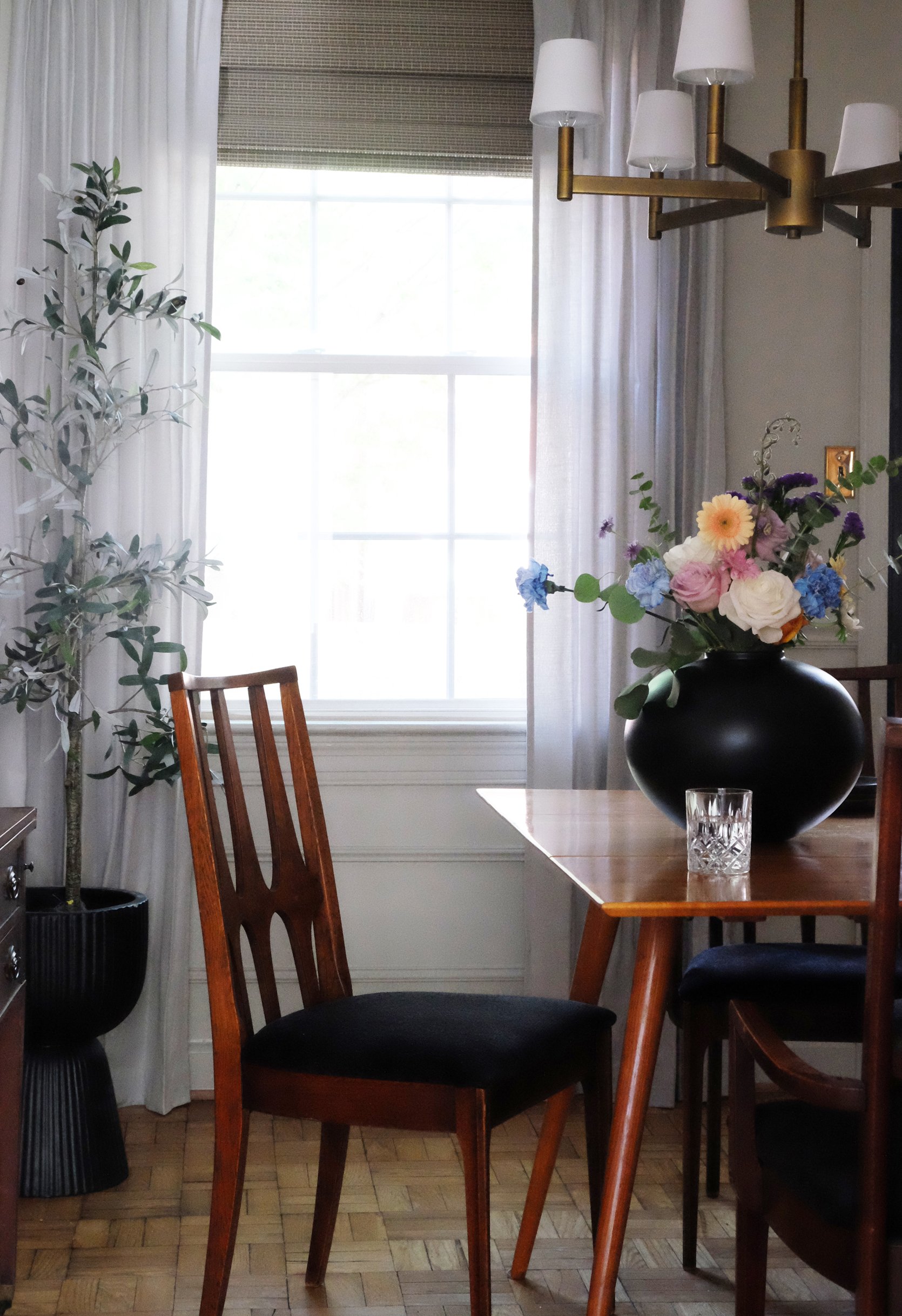
I reupholstered the Broyhill Brasilia chairs in a black fabric, which also helps to ground the space and create a “constant” in coordination with the color of the back door (Black Magic by Sherwin-Williams) and accessories I used throughout the space. In a weird way, I often think about old-school science fair projects when I’m creating a space (stick with me for a minute). For some reason, the idea of a “constant”—which most of us learned about in middle school science class—has always stuck with me. We learned that a “constant” is the part of a science experiment that doesn’t change. It allows us to implement “variables” that consequently allow us to test hypotheses and other scientific mumbo jumbo. For our purposes here…black is the constant, and varying wood tones and interesting patterns are the variables—all of which combine to create an interesting design experiment.
Ha. I really milked that metaphor for all its worth, didn’t I?
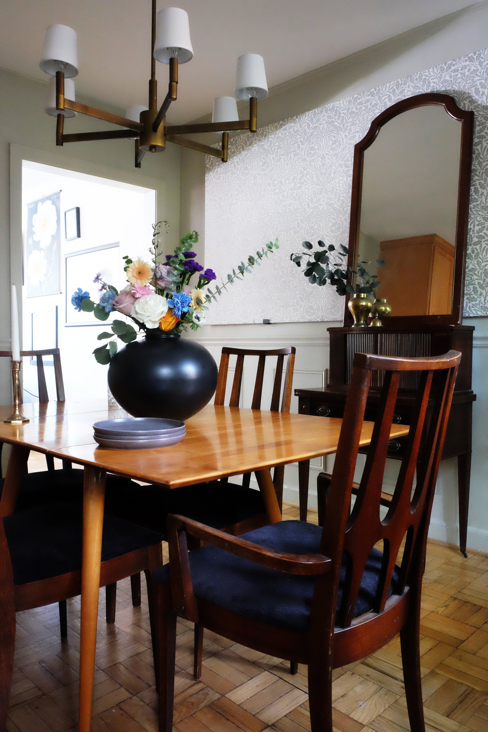
Another aspect of this room I appreciate is the exploration of the various wood tones I’ve incorporated in the furniture pieces and how they speak to the color of the parquet flooring. The table is a light walnut, the chairs and mirror frame are a medium brown, and the secretary desk grounds the room with a deep, cool brown. The different tones create balance in the space in a slightly unconventional way. The conventional wisdom would be to use a similar tone of wood throughout the room, but the vintage of the various pieces of furniture and the intention behind utilizing three distinctly different colors brings a “designer” edge to the room that feels uniquely authentic. From my perspective, anyway. 🙂
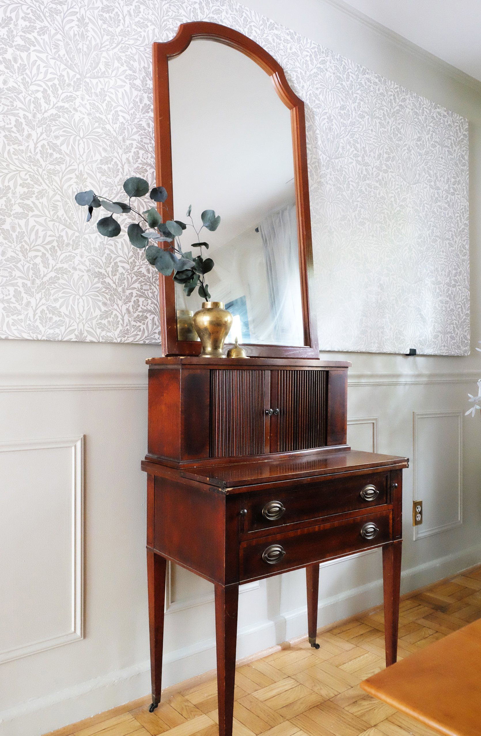
Vintage Secretary Desk
At any rate, the secretary’s desk and the mirror above it (along with the chandelier above the table) were procured from Community Forklift, which is an architectural salvage warehouse close to DC (as a side note, Community Forklift is looking for a new location for its warehouse! If you live in the area and are able to spare a donation to help them with this major move, you can hit this link to support them.) This room has really been an exercise in using existing objects to create a uniquely collected space, and as a result, I think I’ve found a new love for collecting vintage furniture.
I’d be remiss if I didn’t mention that some of the decor items pictured in these shots will be available for sale on my online shop soon! I’ll be selling collections of vintage and handmade goods—most of which will be coming from the UK—so keep an eye out over the next few months if you’re in the market for some one-of-a-kind objects. You can follow me on Instagram for updates on that front!
I was so happy to find this Paul McCobb dining table on Facebook Marketplace while I was finishing out this room. The finish of the table works tremendously well with the tone of my parquet floors, and the modernity of its form fits right in with the age of the Broyhill dining chairs. Synergy!
…I think I’ve said “Synergy!” in every reveal article I’ve had here on Emily’s blog. I’m not mad at it.
I poured my heart into this room, and I’m hoping I’ve created something that inspires you to try something new in your home or inspires you to be more thoughtful and intentional about the design decisions you make for yourself. I’m a firm believer that our spaces should be reflective of our authentic selves and experiences, more so than a direct reflection of whichever trend is currently populating the Pinterest-sphere (even though there’s absolutely nothing wrong with using those tools to help us understand design and identify what we like and don’t like).
Incidentally, as Emily and her team post this article, I’ll be landing in the UK to start the next chapter of my life as a London resident for the next few years. However, I’ll still be showing up here on the blog as long as she lets me! You can expect some European inspiration, rental-friendly makeovers, and other inspiring design ideas the UK will be sure to reveal to me. And, I’ll be back in this house in a few years to redesign the kitchen with newfound insights and inspiration. If you’ve been following along with my home renovation journey here on Emily’s blog, what has been your favorite room? I have a soft spot for my bedroom makeover, but I’m curious to know what you think!
As they say across the pond… Cheers! See you soon!
*Design and Photos by Malcolm Simmons
THIS POST WAS ORIGINALLY PUBLISHED HERE.
