Art hung the wrong way on a wall is like a character in a movie wearing a really bad wig. It’s just kinda hard NOT to see it, and you wish so bad you could just rip it off, knowing that everything would be so much better without it. It doesn’t ruin your experience, but it’s just terribly distracting.
Whenever I walk into a persons home, whom I don’t know too well, they always ask me, nervously, “Do you instantly start analyzing the design and pick it apart?” I typically say some sort of generic, “Oh no! I just shut it off – when I’m not at work I’m not at work!” The truth is, yeah, I totally do. It’s like a chef noticing how food tastes at a neighborhood bbq, or a fashion designer noticing a good dress on a stranger. You just do it whether you want to or not. Do I stare and judge and care? Not at all. But I am aware and often I see the same easy mistakes over and over and over again. So often that I’m just dying to give unsolicited advise to fix them – which is why we started this series.
Besides, The Generic Sofa Roundup | Rugs That Are Too Small | Painting A Small, Dark Room White | Bad Wood Finishes | How To Hang Curtains | Generic Art | Not Having A Plan | Who Pays For Design Mistakes | My Biggest Design Mistakes -And What You Can Learn From Them | When to Hire vs. DIY, I Too Much Furniture In One Room | Different Walls, Same Art Configurations I constantly notice art hung all wrong – mostly too high and too small.
Growing up our art was always crazy high – it always took up the top 1/4 of the wall and you practically had to crane your neck to see it. This trend is still happening. Here are some general tips:
1. Yes, it should be “eye level”, but not if your ceilings are really low (typical is 8 – 9 feet) and not if you are really tall. If the wall were cut up vertically into four sections (going from bottom to top) then think of the art being in the third quadrant (counting from the floor).
2. If it’s a collection of art then you need to treat the whole collection as one piece, and start and stop it where it makes the most sense, as if it were one.
3. Engage as much of the wall as possible and orient the collection in the shape of the wall. The last thing you want is your art to look itty bitty on a big wall. It doesn’t look intentional and isn’t making your art look its best.
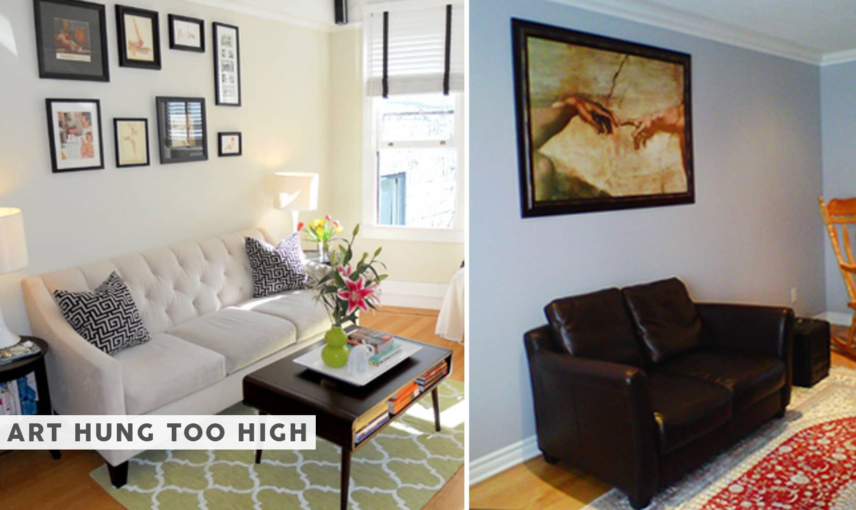
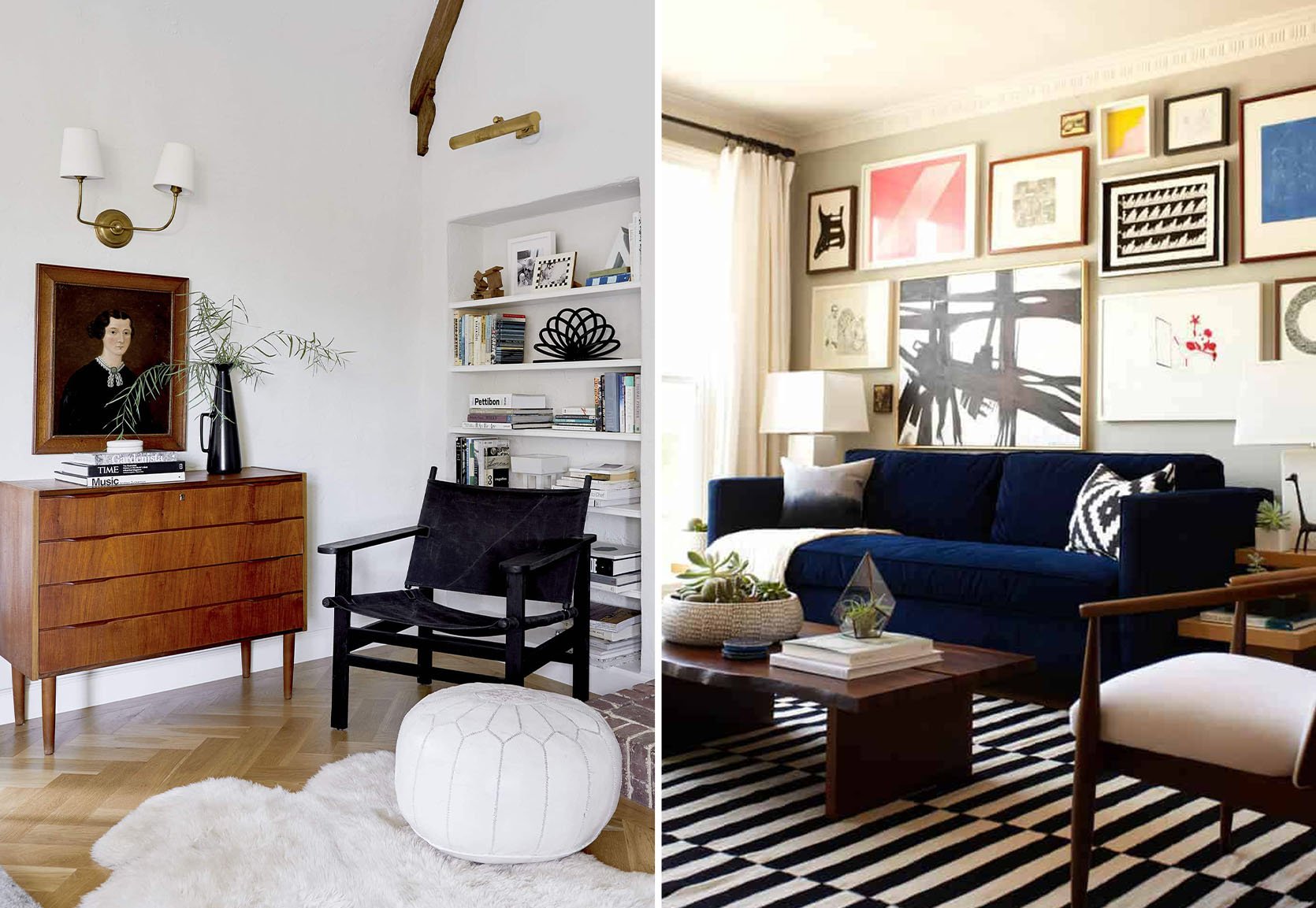
It hurts my soul to see these things. I mean, the room on the right doesn’t really have a chance, but the room on the left (above) could be fine/cute if they just moved that whole collection down 6″. Although they are suffering from the “rug too small” disease as well. If you need a formula for hanging a great gallery wall head here.
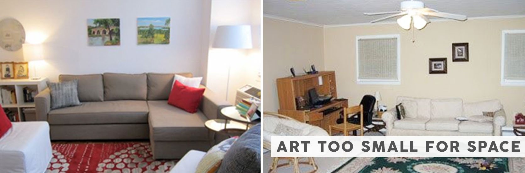
Speaking of too small, the second thing that I notice constantly is art that is just too small for the space.
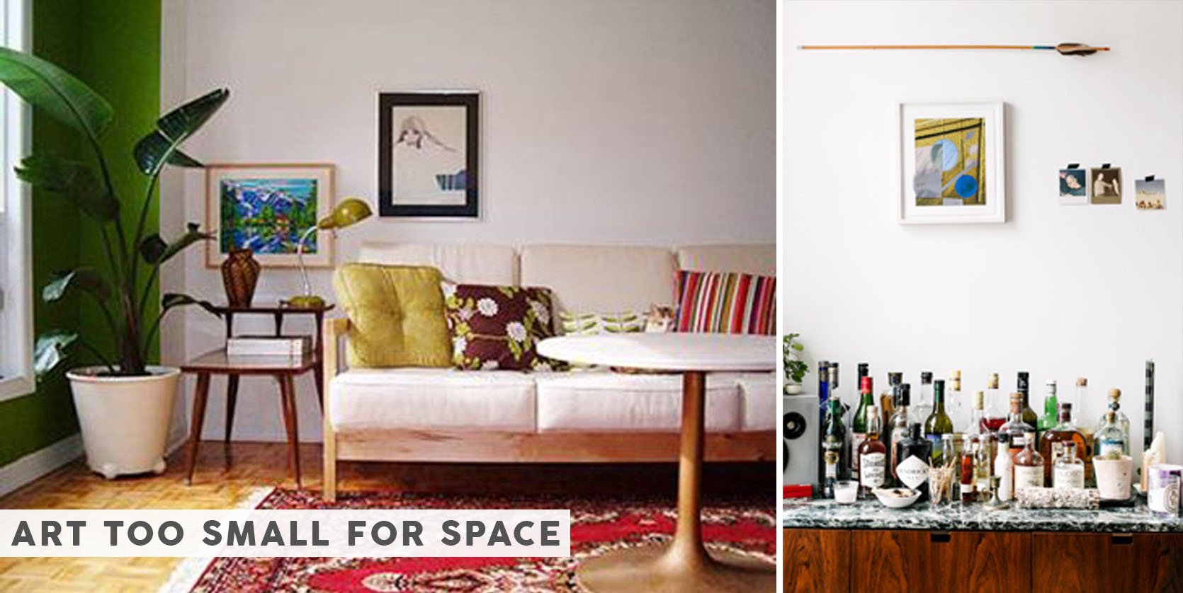
Both of these are cute photos with good art and sometimes intentionally choosing a small piece of art can look dope. However, the rule of thumb is that the space that the art is trying to fill is just way bigger than the pieces can handle. Generally the piece of art or the collection should be in the same shape and orientation of the wall that it is trying to fill. I get it, big art can be expensive, but you have more options these days – check out my epic online art roundup post here.
You know these people. Now let’s save them from themselves.
While the situation is rather nuanced we tried to come up with some general rules for how high or how big the art should be. Remember, if your walls are really tall then you can go higher and if your piece of furniture is really low then consider going lower to help engage that whole space. But generally try to fill as much space on the wall as you can, allowing for a space around the pieces so they aren’t crammed towards the furniture, wall, or moulding.
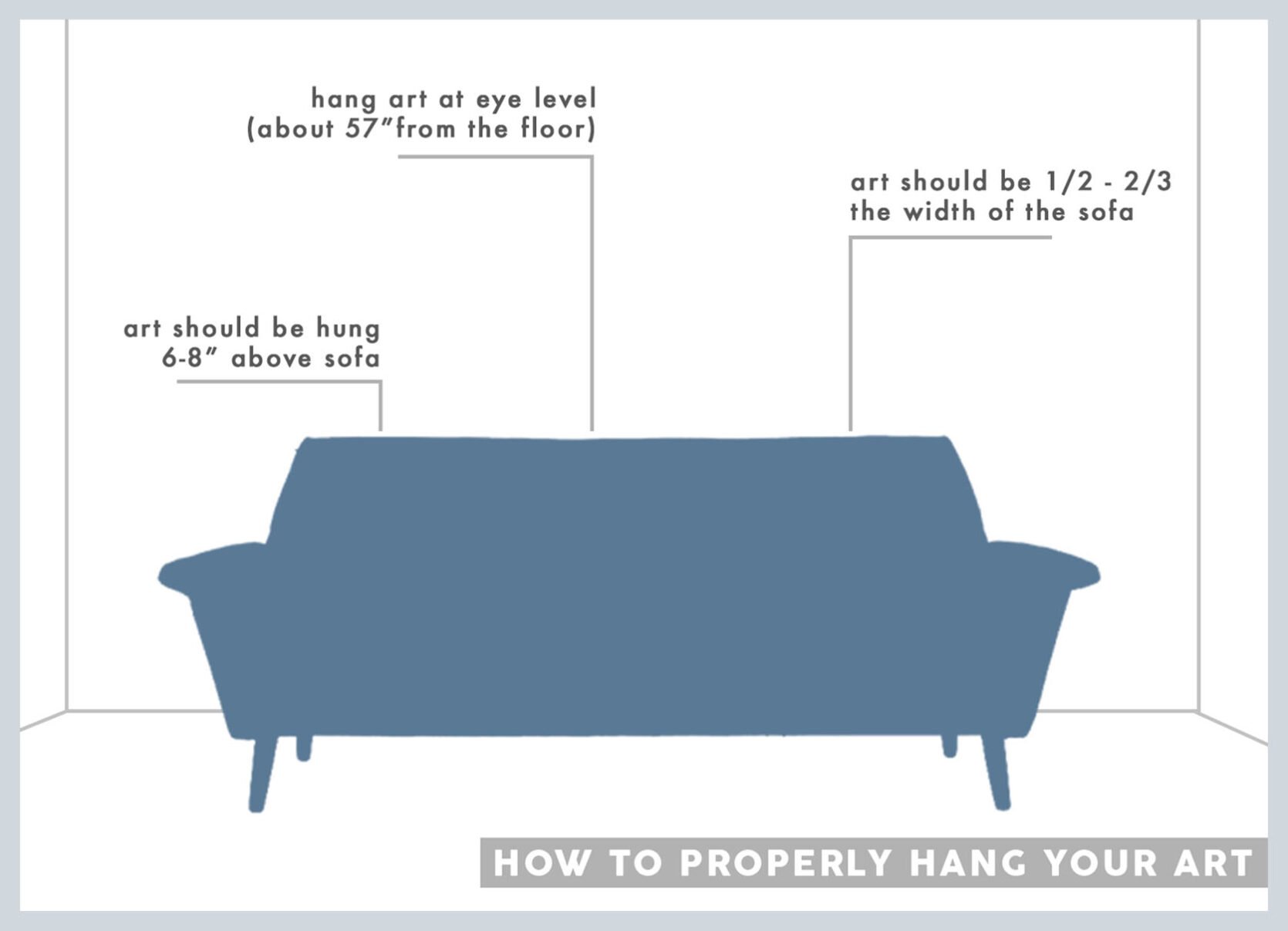
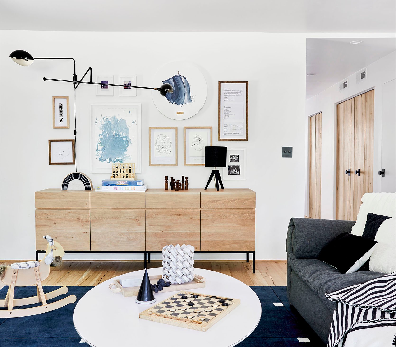
I like art to be around 8″ above a piece of furniture, give or take. I’ve done it closer (like in Orlando’s place below/right), and that one did always look a bit crammed to me. You don’t want it to hit your head if you’re sitting in front of it so typically 6″ – 10″ gives you enough clearance to do that.
Everyone’s “eye level” is different because we are all different heights, so that rule doesn’t really apply too much anymore. I’m sure that galleries have a rule about the middle of the piece being at eye level or something and often that does work, but if there is no piece of furniture below it then it might need to come down. Don’t be afraid of going lower. Consider the space you need to fill (from above a credenza to the ceiling) then place it 6″ – 8″ above the piece of furniture (if it’s big enough) and see how it looks. The artwork and the piece of furniture should relate to each other and live near enough to each other that they collectively engage the whole wall together as a unit. Often, if there is a huge gap in between it will look disjointed.
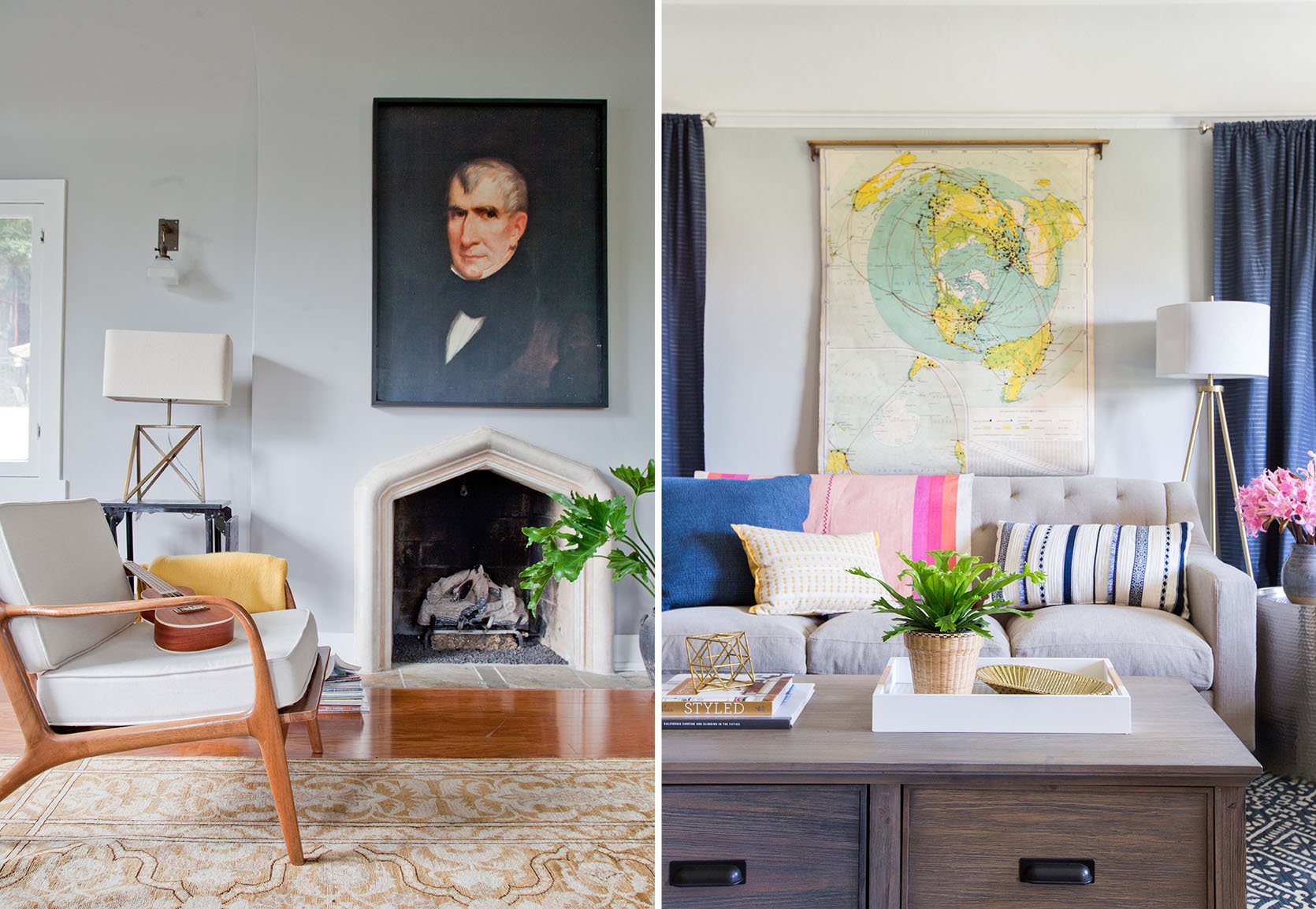
I think these two photos above (mine on the left with it prohibited by the sconce and Orlando’s on the right) could have their collection or that piece of art start a bit higher, but scale-wise its awesome.
Slightly “too big” art is always better than too small. So if you have to choose, go bigger. It looks like you made a really cool choice instead of a size accident.
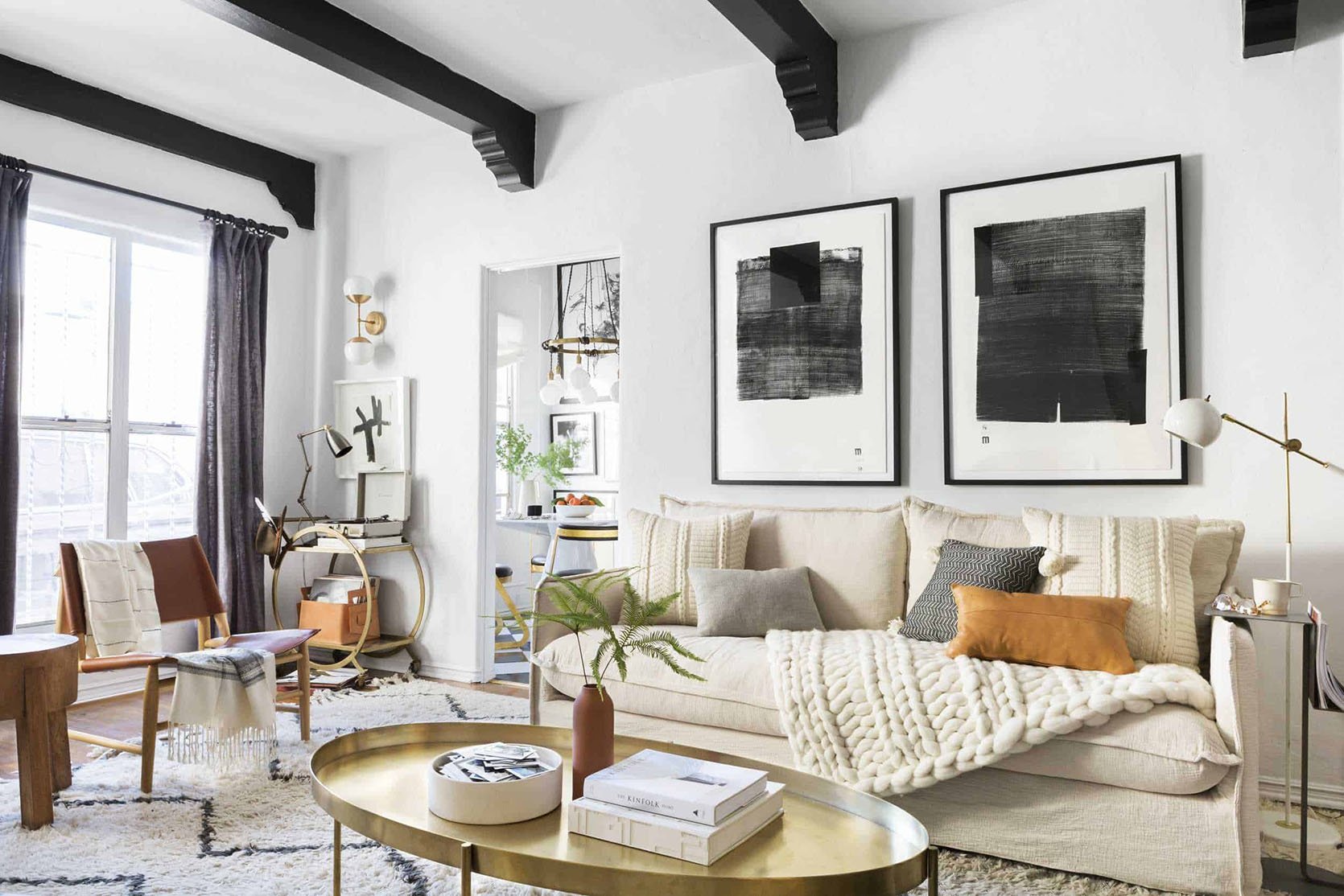
Here are a collection of spaces that I’ve styled with art – showing a variety of what works.
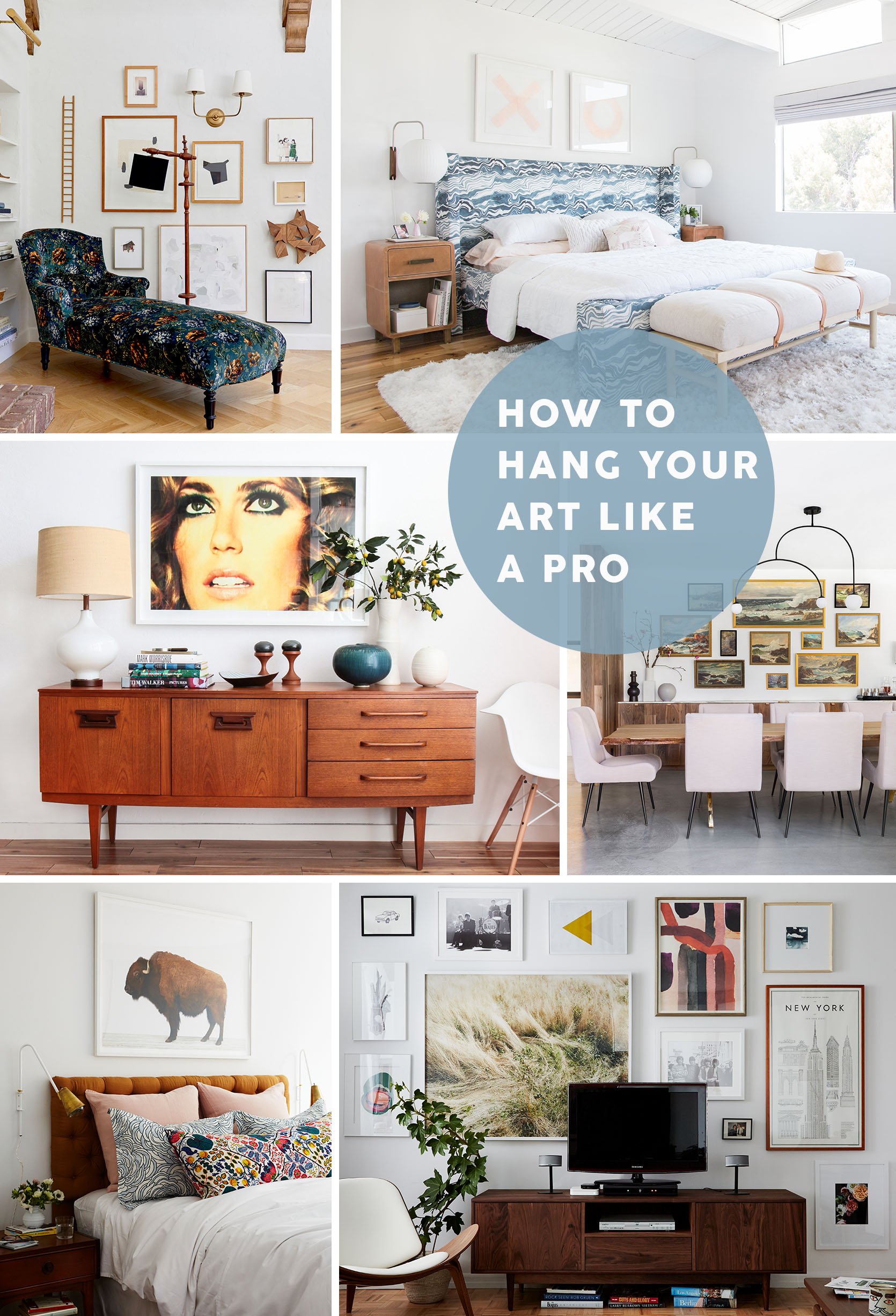
Photos Above: Living Room Update – AGAIN – Our New Sofa, My Dream Floral Chaise And The Pop Of Red I Always Wanted In My Life | Our Master Bedroom – Finally | Mid-Century Credenza | A Modern and Organic Dining Room Makeover | Cup of Joe’s Bedroom | Cup of Joe’s Living Room
To see some of my favorite projects where we incorporated art, check out these different spaces: Oh Joy’s Studio, Mid-Century Eclectic Artist, LA Bungalow Makeover, Oprah Weekend Makeover, and My Best Friend’s Basement to name a few. And if you are looking for good/affordable art check out my roundup of Best Online Art Resources.
I know it’s kind of a complicated situation (for instance, I put the big photo of the face at least 12″ above the piece, breaking my own rule). Here’s a good trick I do ALL THE TIME: Put up the piece of art then stand back and take a photo of it. Pretend it’s not your house and that you have no emotional connection to it. Look at that photo and ask yourself, “if I passed this picture in a magazine would I think that art is too low or high?”
This is a tricky one, so any questions?
Again, in case you want to know what else we think everyone is doing wrong check out these design mistakes: The Generic Sofa Roundup | Rugs That Are Too Small | Painting A Small, Dark Room White | Bad Wood Finishes | How To Hang Curtains | Generic Art | Not Having A Plan | Who Pays For Design Mistakes | My Biggest Design Mistakes -And What You Can Learn From Them | When to Hire vs. DIY | DESIGN MISTAKE: Too Much Furniture In One Room | DESIGN MISTAKE: Different Walls, Same Art Configurations
Opening Image Credits: Photo by Zeke Ruelas | From: Oh Joy’s Studio
THIS POST WAS ORIGINALLY PUBLISHED HERE.
