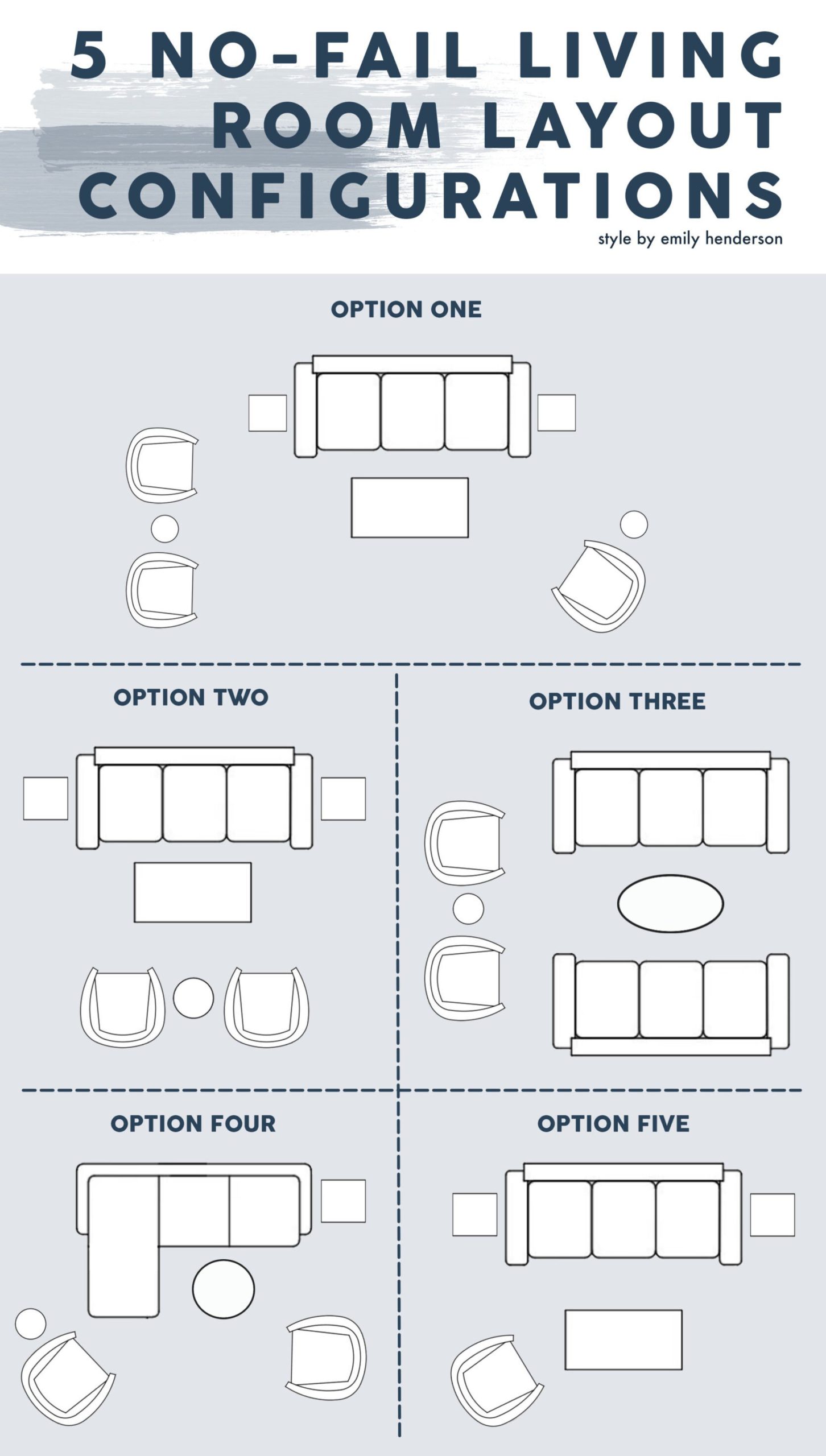
Have you ever had a tough time trying to figure out the right seating layout for your living room? ME TOO. Remember this post? You just want it to make sense AND look good. Now, every living room is basically its own little snowflake, unique and likely stocked with architectural features that make you question if anyone involved in the home building process thinks about furniture placement. Not trying to throw shade buuuuttttt… So today we have our 5 go-to seating furniture configurations to hopefully be the Advil for your layout headache. Now since living rooms aren’t all shaped the same, you may need to slightly modify these to make them work best for your space. But don’t worry because we are going to talk through them all.
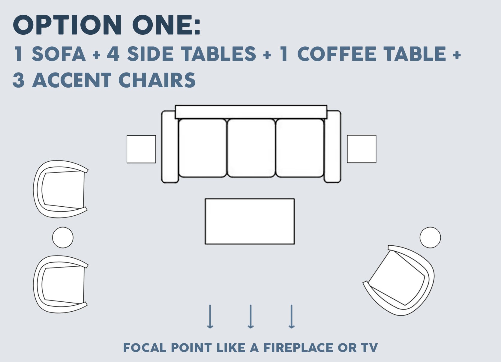
As I was compiling these layouts based on rooms we have actually designed, this one was one of the most popular. It offers lots of seating options, is perfect for a living room with one main focal point (yes, like a fireplace or where you want to put your tv), and really fills out a room but not in a super crowded way (unless you have a small living room).
MODIFICATIONS:
- If you have a smaller living room, you can take away one, two, or all three of the accent chairs (maybe add a small ottoman or two for more seats).
- If it looks too crowded or is unnecessary, you don’t need to have a side table for each seat and/or each side of the sofa.
- The “lone chair” can be placed diagonally as shown in the graphic or placed directly across from the two chairs.
DESIGN TIPS:
- Make sure that all of your accent chairs don’t match. We almost always have the two that are side-by-side match but the third, on the other side, be different.
- Mix up materials in both fabrics and table finishes.
- Mix up table shapes. It’s going to look “one-note” if say all of your tables are circles.
Let’s now look at some examples:
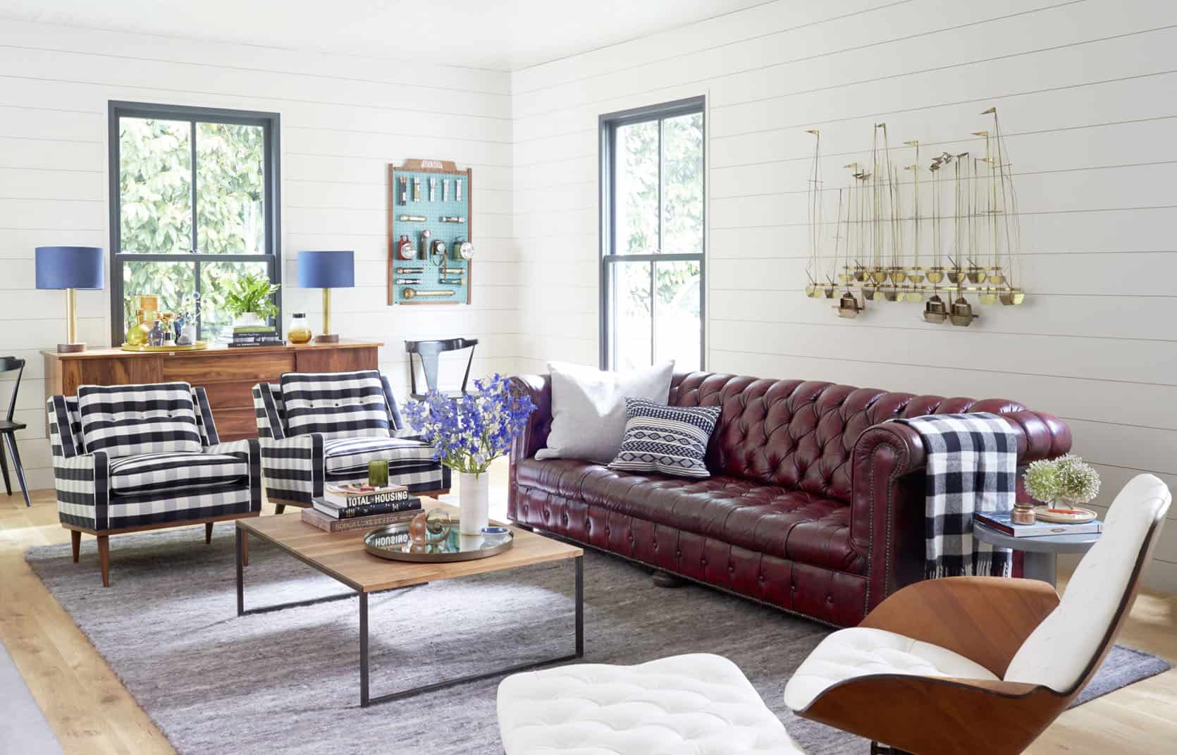
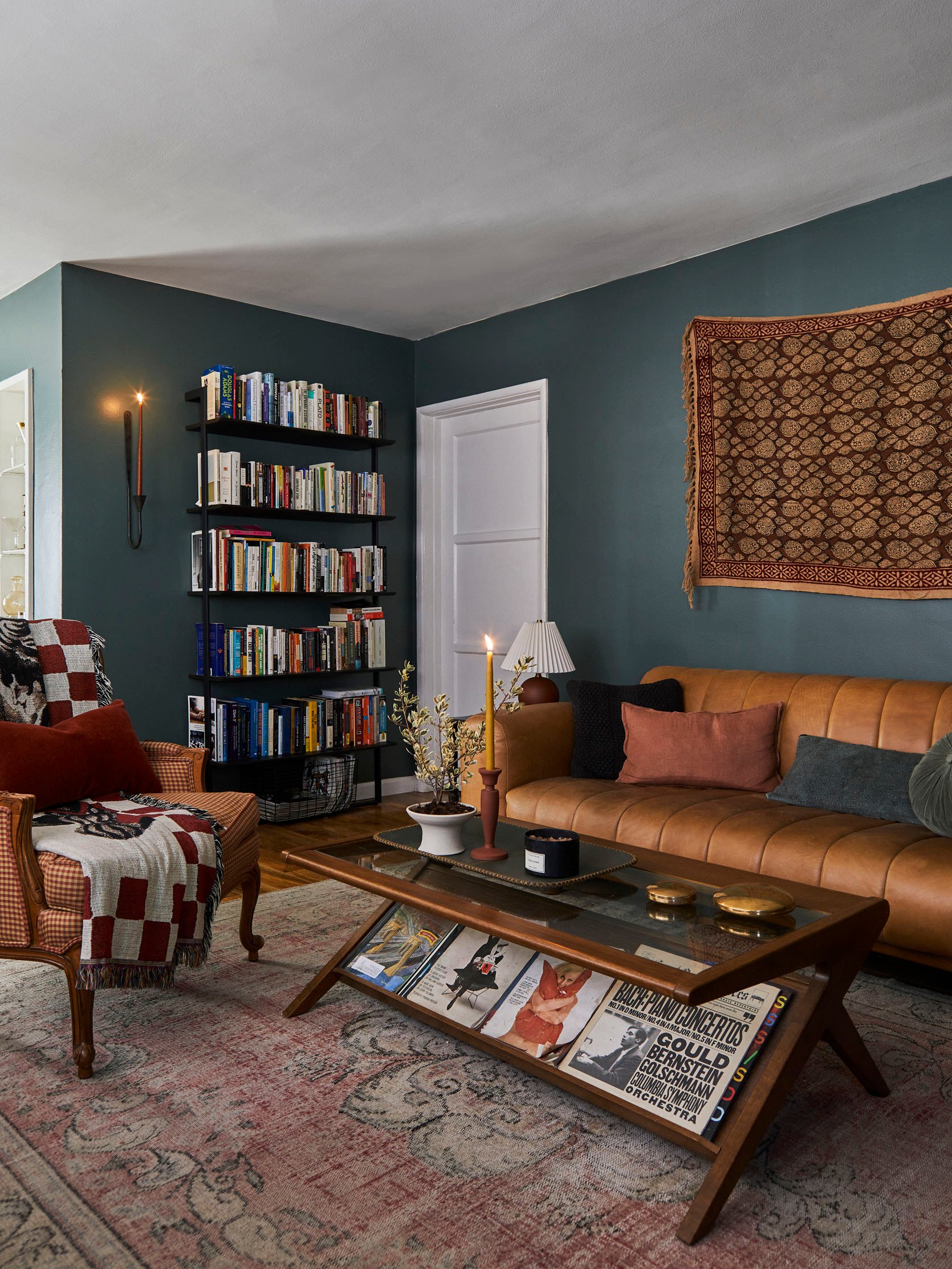
This living room belongs to the founder of Schoolhouse Electric, Brian Faherty, and was styled for Em’s first book. Notice how Brian chose a traditional leather chesterfield sofa, with two midcentury modern style matching chairs in a classic patterned fabric, then to mix up the seating even more he chose a beautiful MCM lounge chair and ottoman. None of the seating matches but they all work together and are perfectly complemented by that simple industrial coffee table. Notice also how he only has one side table. I think it would have felt crowded otherwise. So then with a few other furniture pieces along the perimeter, this layout is comfortable, visually interesting, and perfectly fills in the space.
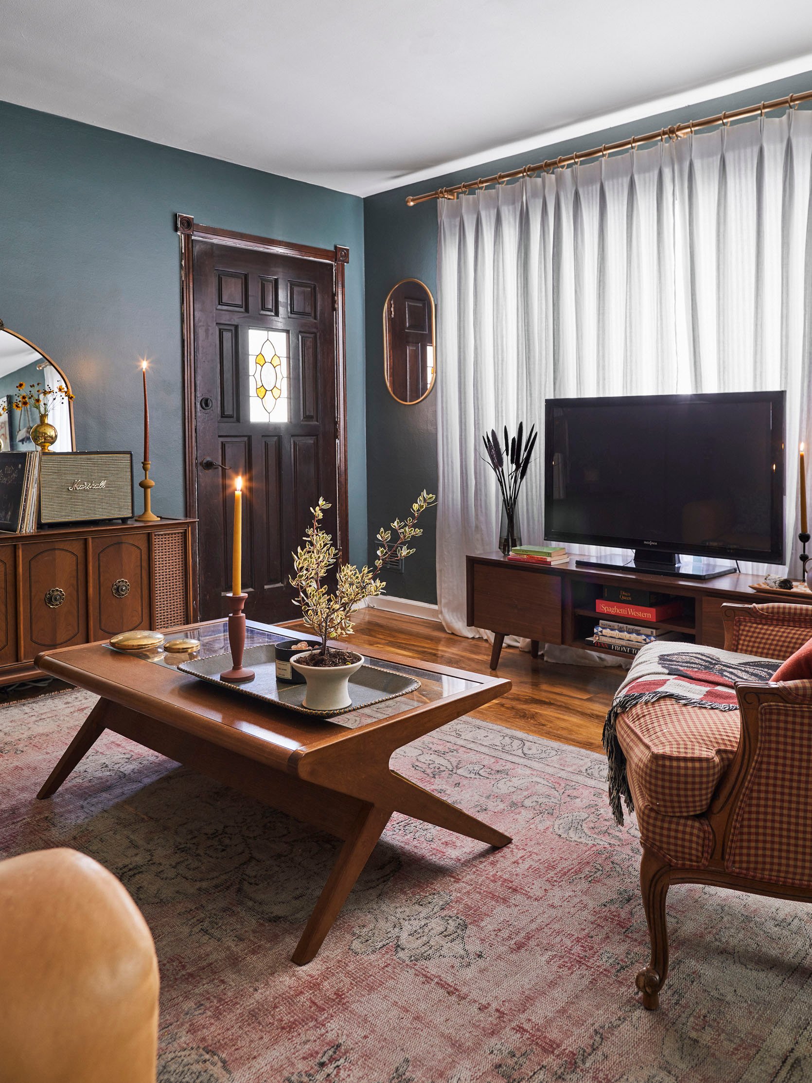
Here was Brady’s first iteration of his living room layout. Same idea as Brian’s but flipped. Brady also added a side table between the set of leather chairs.
Here you now can see that the layout is focused around his awesome fireplace:) Also instead of a larger lounge chair, he choose a fun-shaped accent chair in a lighter toned leather without any kind of ottoman or table. Since his living room was smaller he didn’t need it for the room to feel full.
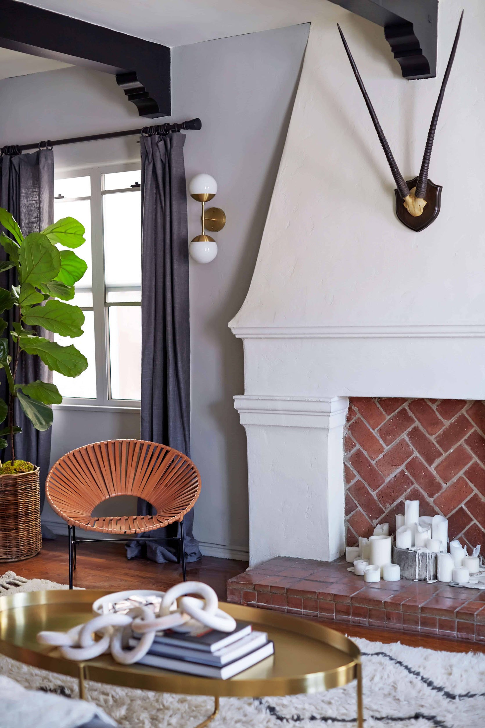
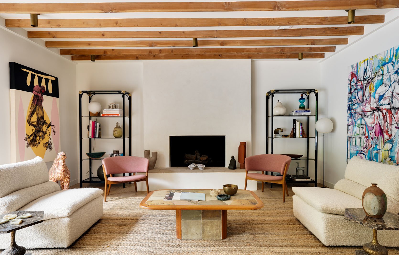
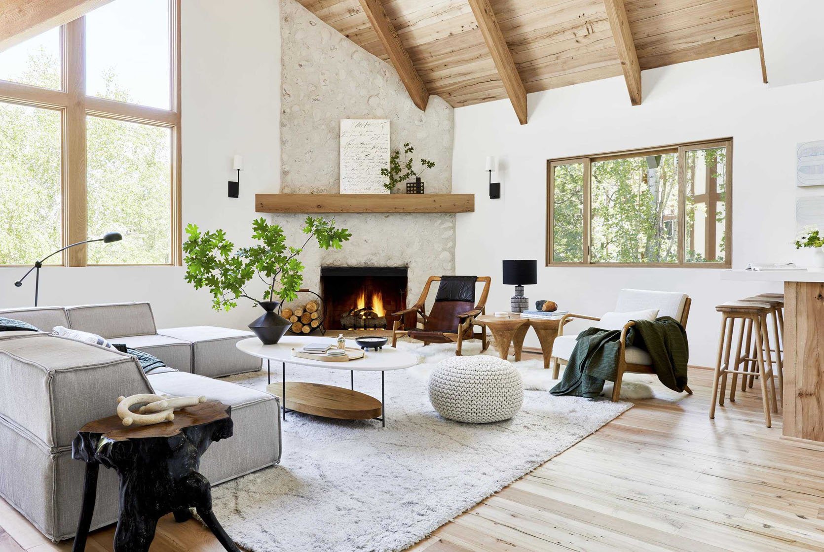
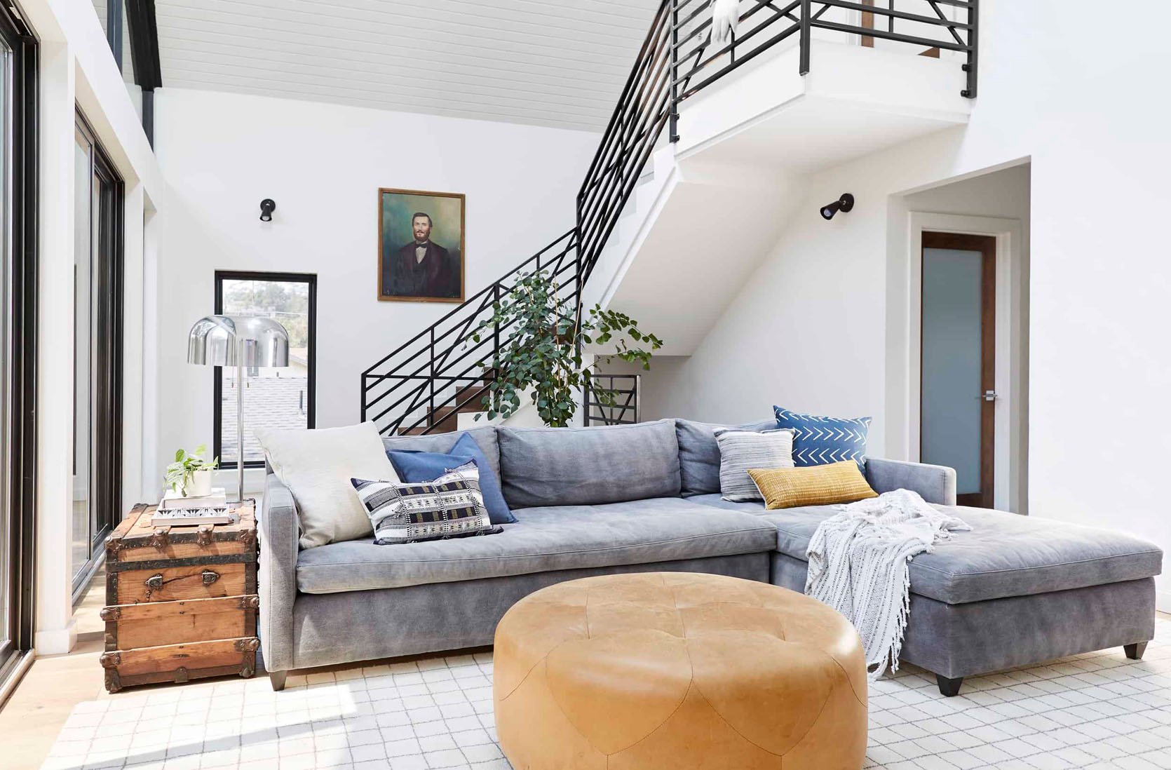
EHD alum, Ginny, also decided this was the best layout for maximum seating and focusing on her fireplace.
Ginny also had to deal with the fact that her front door opened into her living room. Because of that, the two matching chairs are slightly further from the sofa (not touching the rug), giving the illusion of a separate seating area and entry. A very slight modification that makes a big difference for the flow of the room.
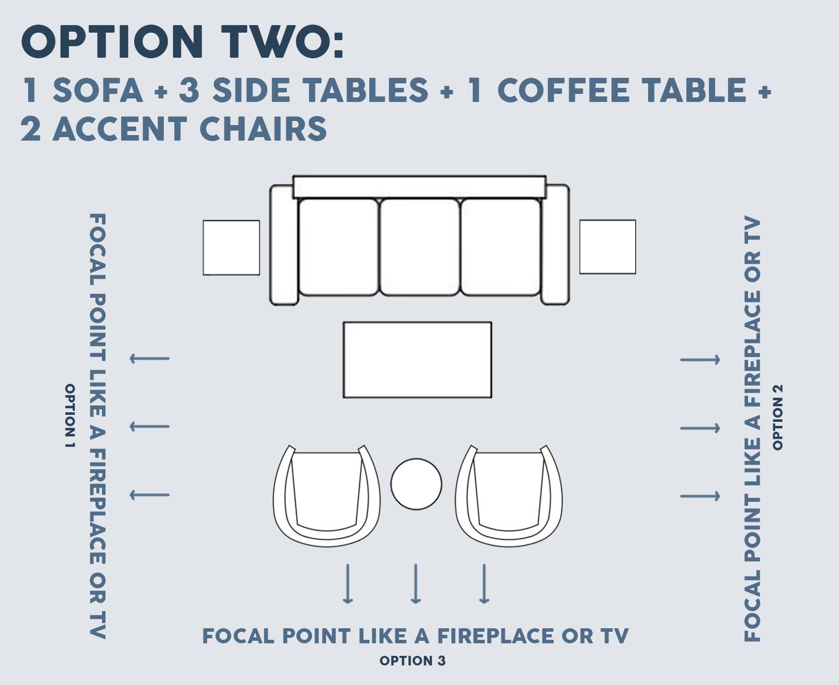
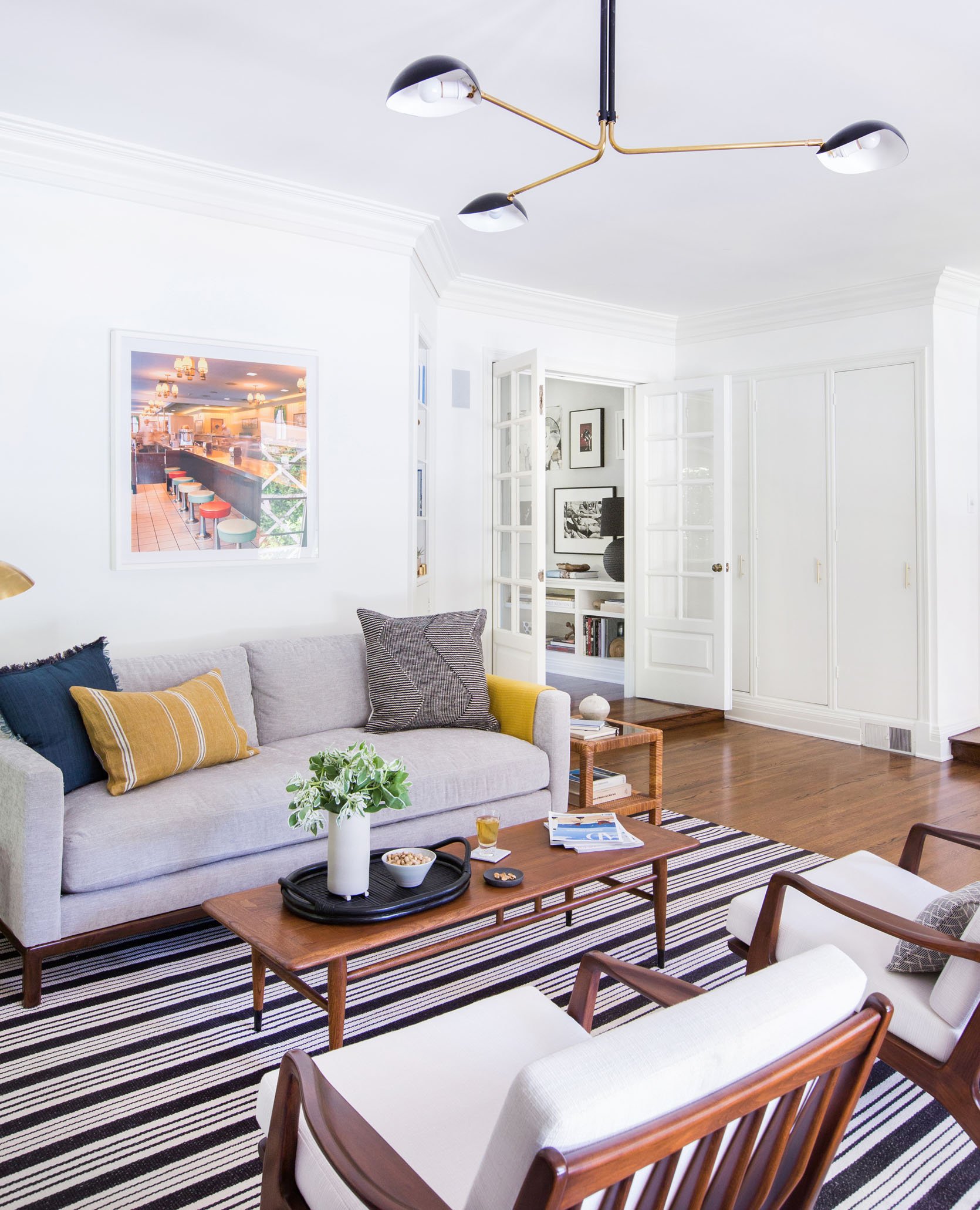
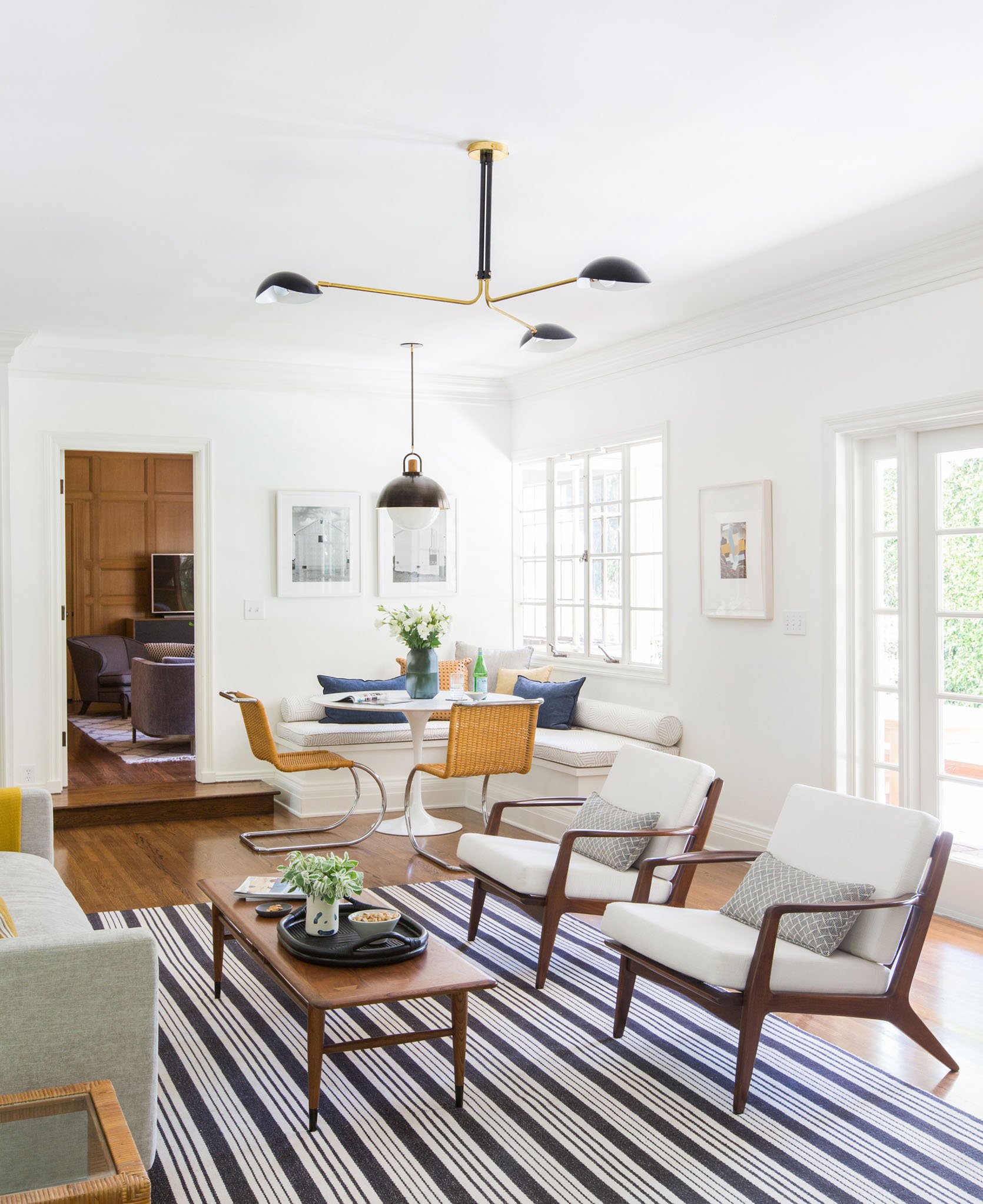
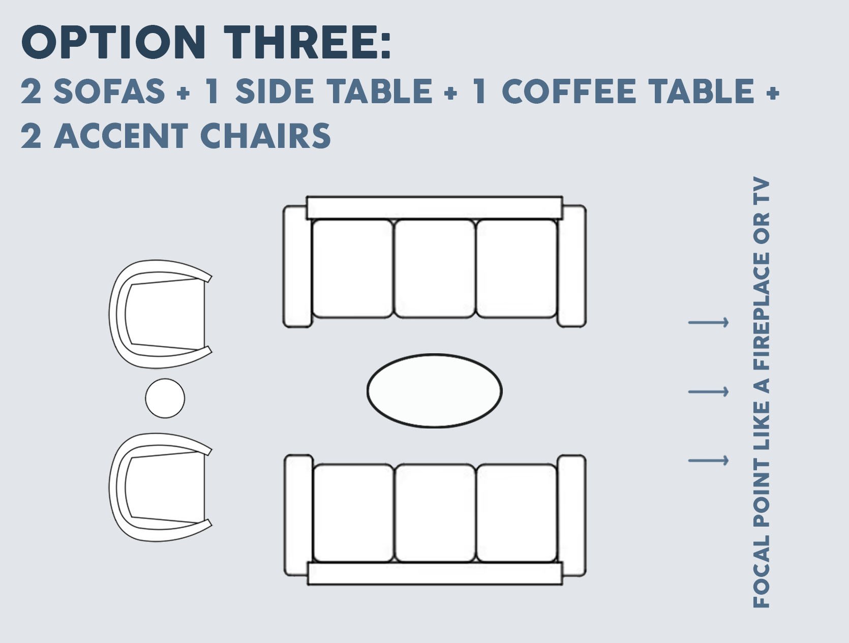
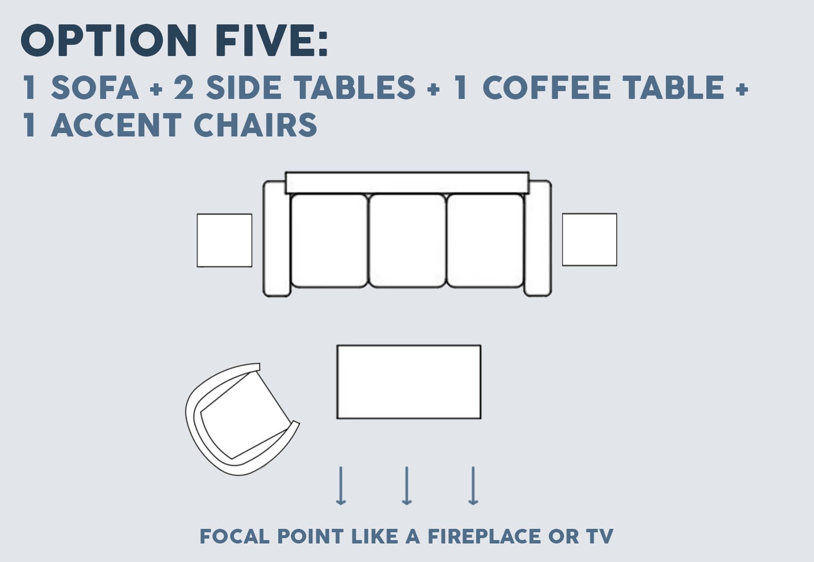
Now for Option Two! So maybe you don’t love that first layout or maybe you have more than one focal point. This is a great option for you then. Having two chairs directly across from your sofa is a great way to prioritize conversation while still making sure your TV can also be a priority.
MODIFICATIONS:
- Chairs can be split up to be across from each other (so a simpler version of Option One)
- You can decrease your number of side tables.
- You can replace the chairs with a bench (but that might not be as comfortable to sit on:))
- The sofa could be a sectional as seen in Em’s old living room.
DESIGN TIP:
- If you want to be able to see what is behind the chairs, make sure they have a low profile. You don’t want to block the TV if no one is sitting in them!
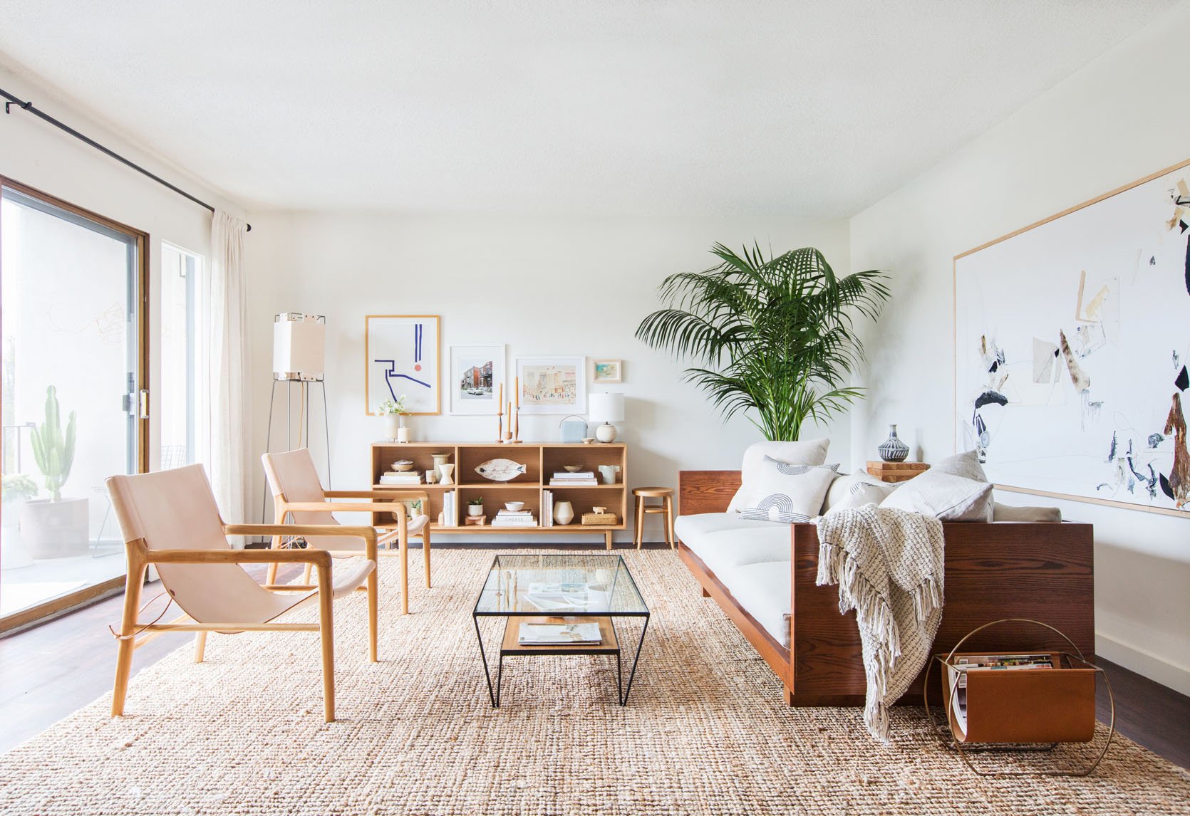
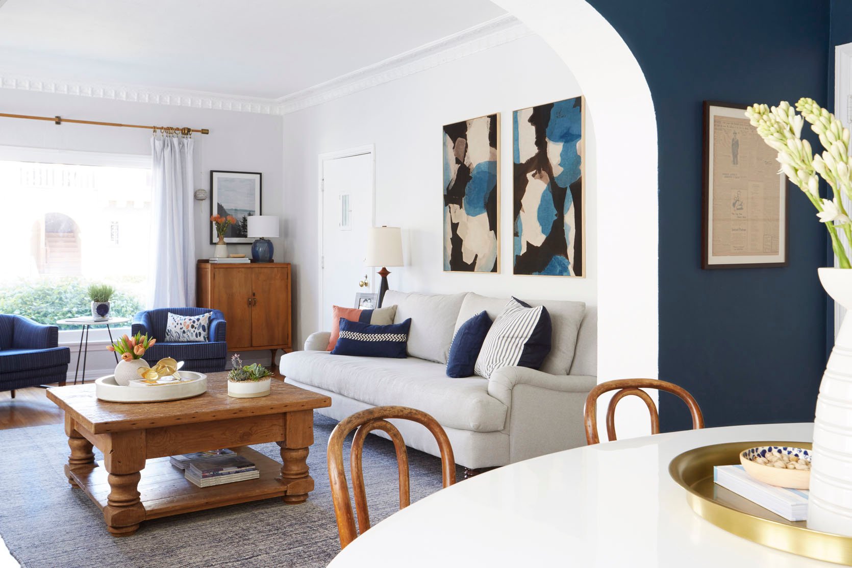
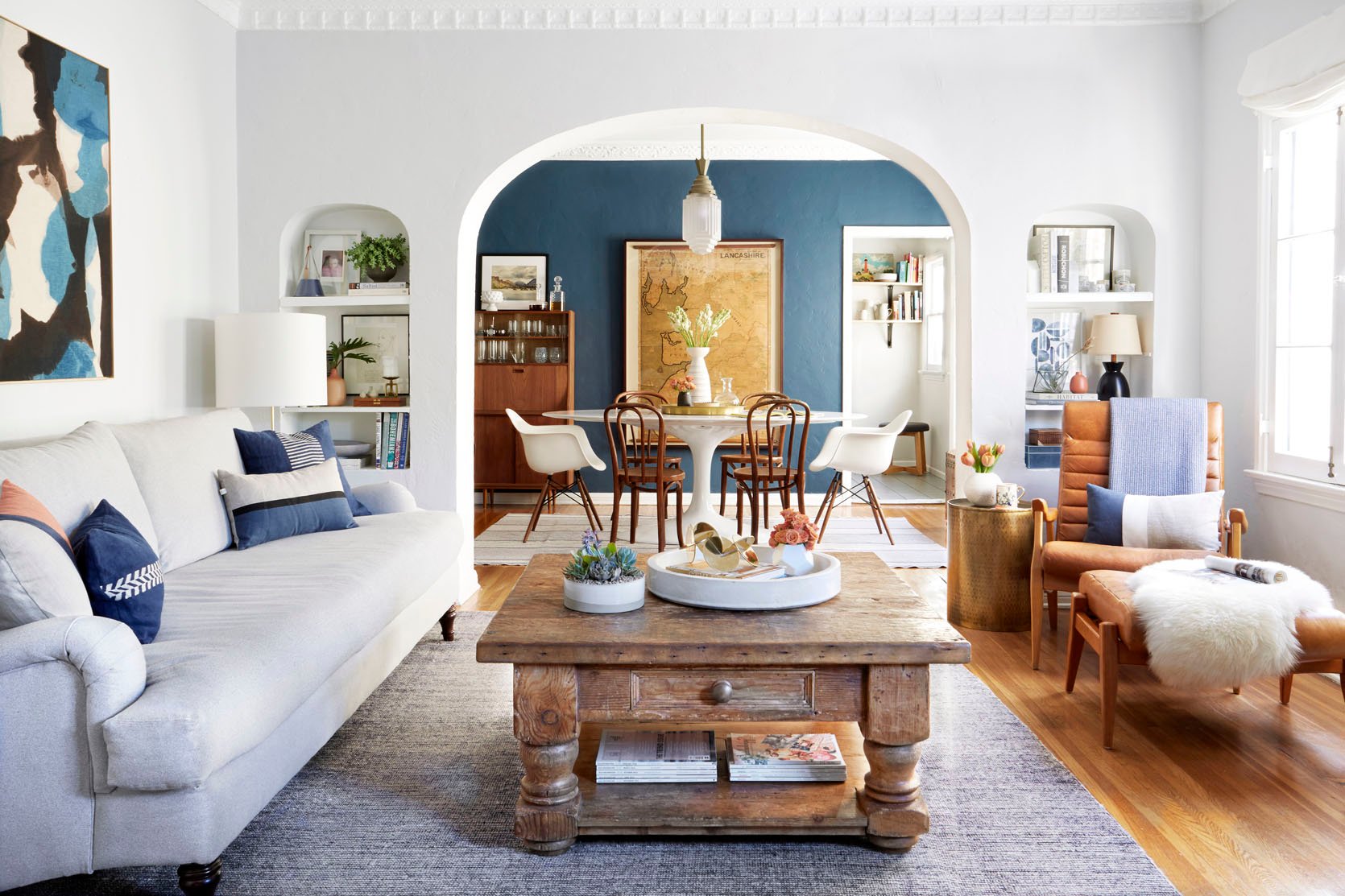
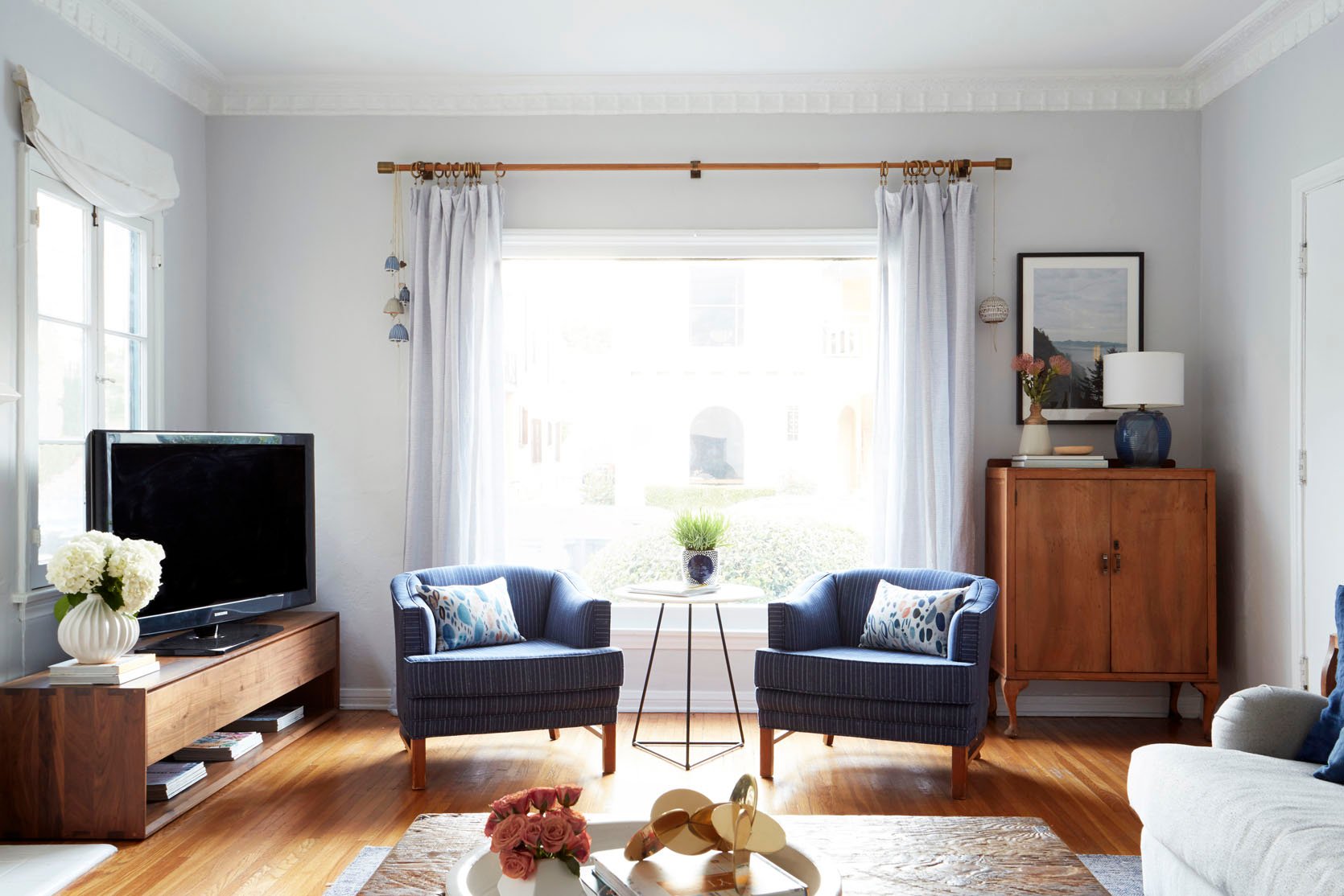
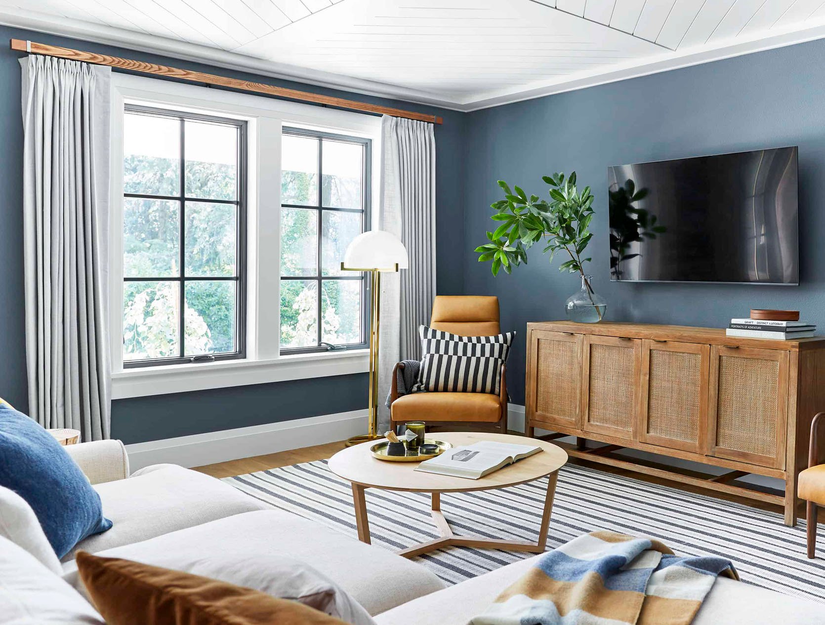
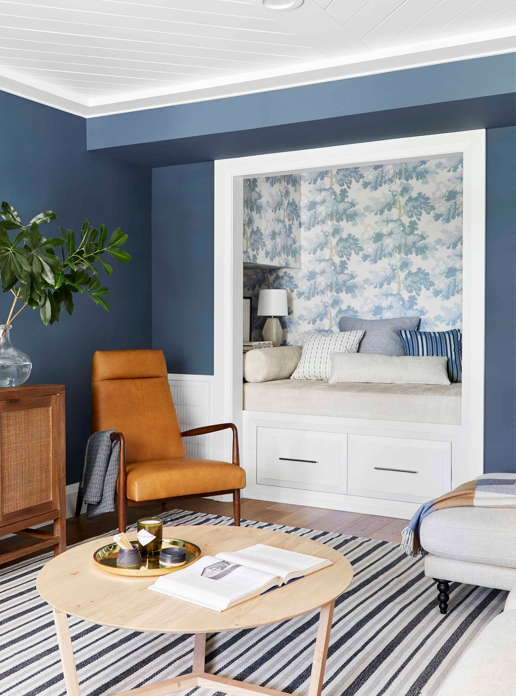
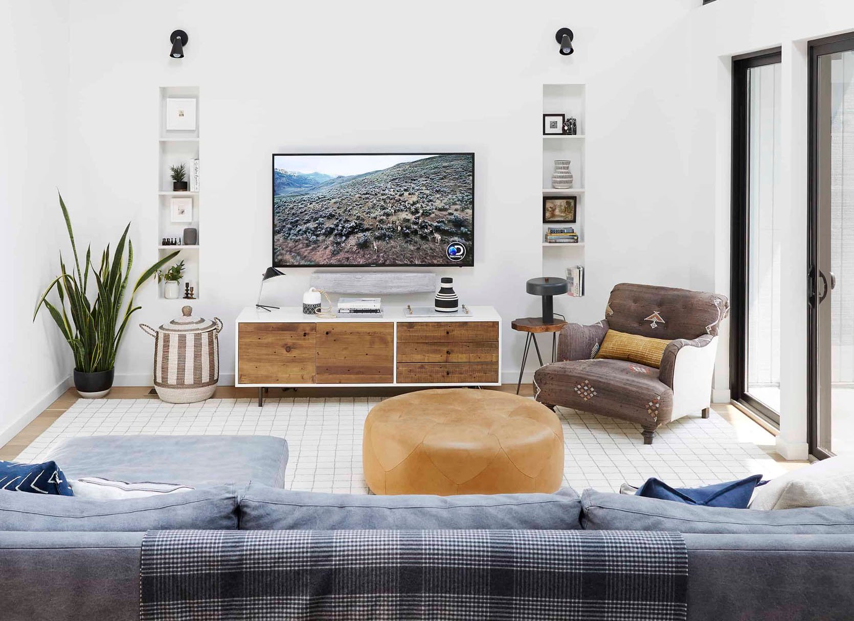
Another EHD Design Team Alum, Mel, perfectly achieved this layout in her old living room. Her view was clearly a priority for her so she chose to have her sofa facing that direction so she could enjoy it. Then to have her living room still feel cozy yet airy, she placed those two beautiful light leather chairs directly across for when she had a few guests over. Notice how the wall with the credenza is another focal point and this layout also invites it in.
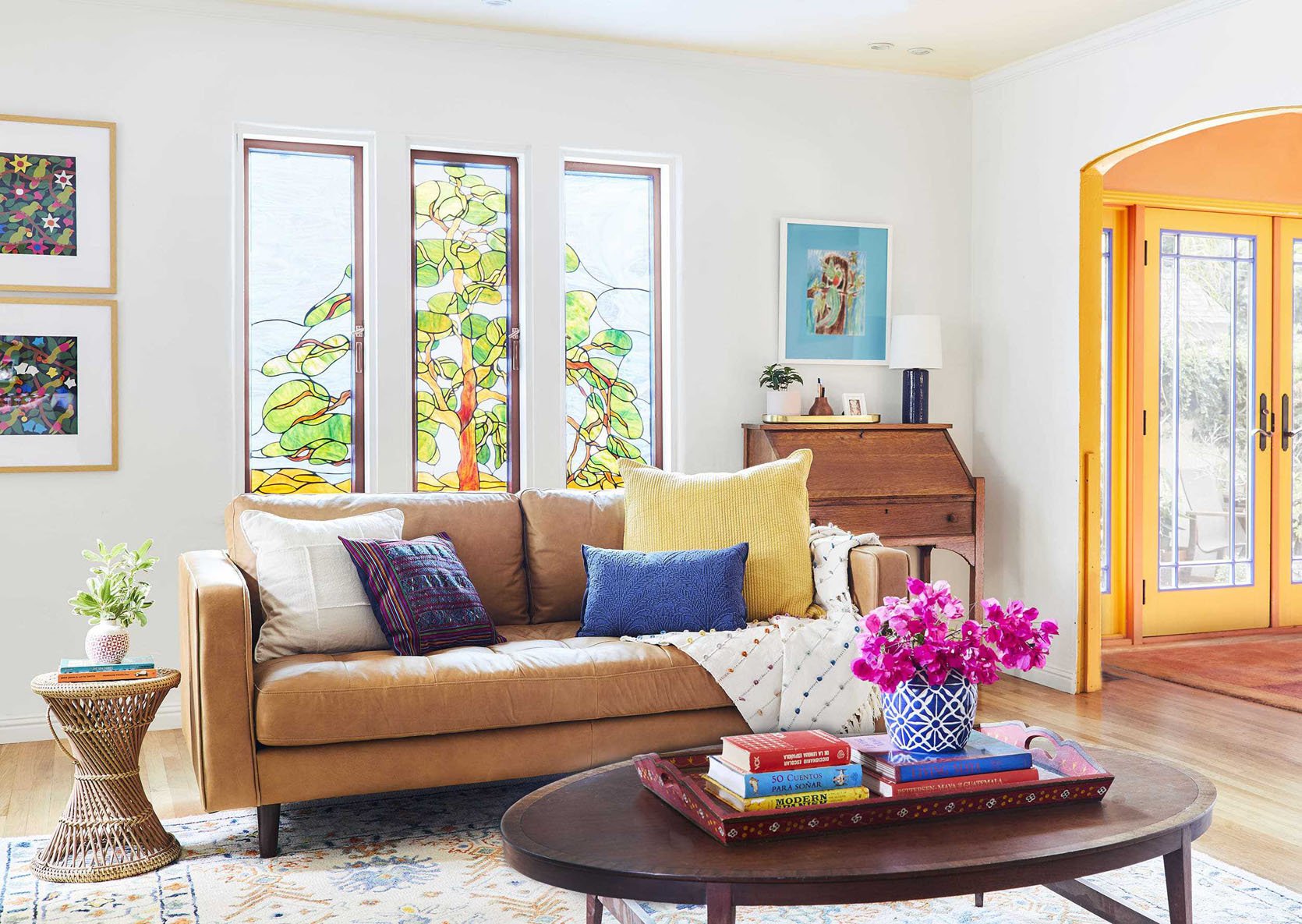
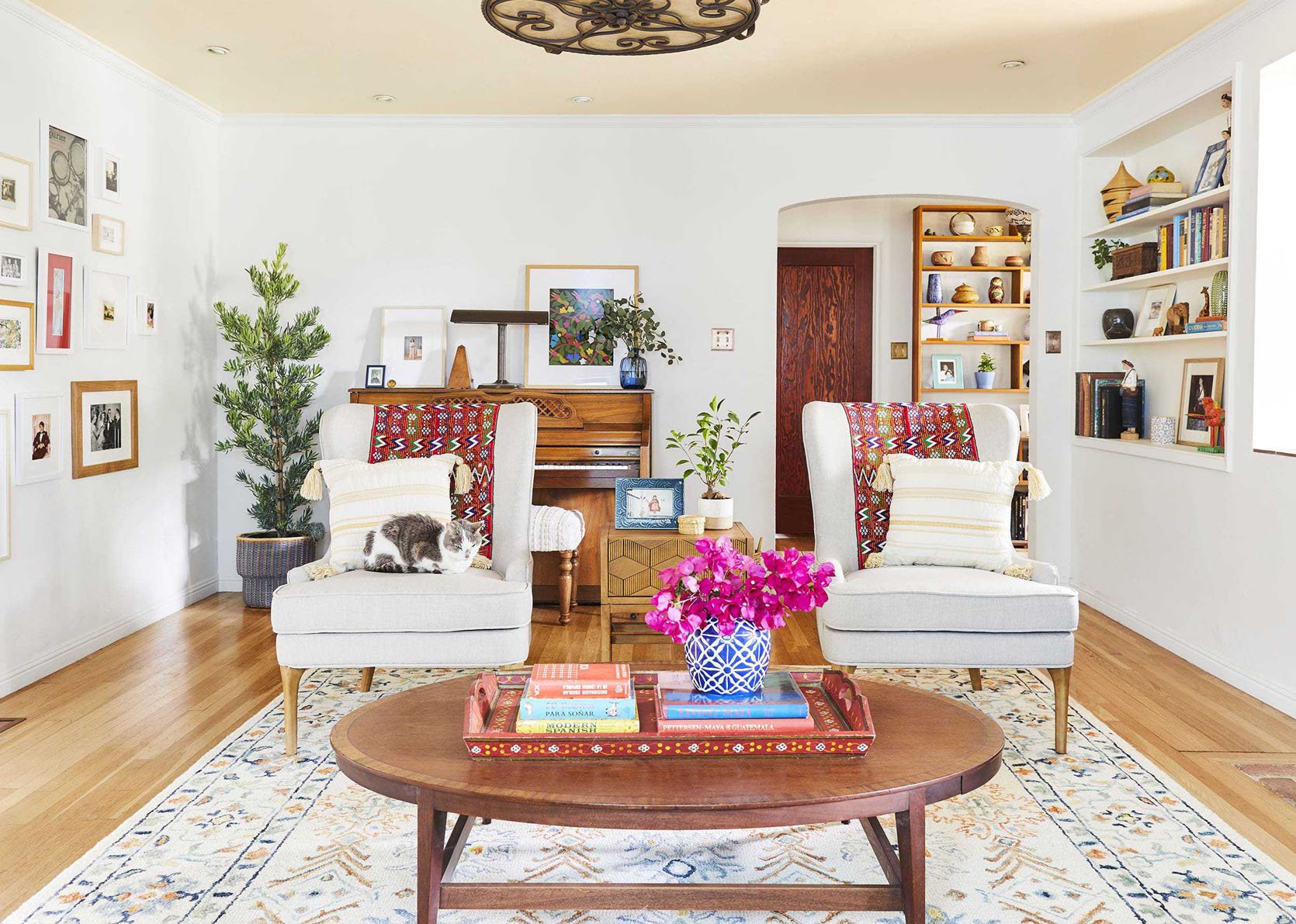
When Sara helped her parents refresh their living room this was also the perfect layout given the two points of entry and the fireplace. It feels open yet cozy. They also didn’t have to worry about a tv for this space so using the taller wingback chairs was an awesome design choice that gave the room more visual levels.
While this isn’t a pass-through room, this is a great layout if you have one. Actually, this is a great example!
If you have a large living room with one designated focal point, this could be a great option for you. It gives you a ton of seating and is perfect for facilitating conversations. I think we could all use more of that!
MODIFICATIONS:
- If you don’t have space for the accent chairs get’em outta there!
- Add or take away side tables as needed.
DESIGN TIP:
- Unless you have a strong vision and want to break the rules, pick matching sofas and then matching accent chairs. If you are desperate to mix things up a little but don’t know where to start, choose the same sofa (or chair) and just pick a different color in the same fabric. Like two of the same velvet sofa in two different colors.
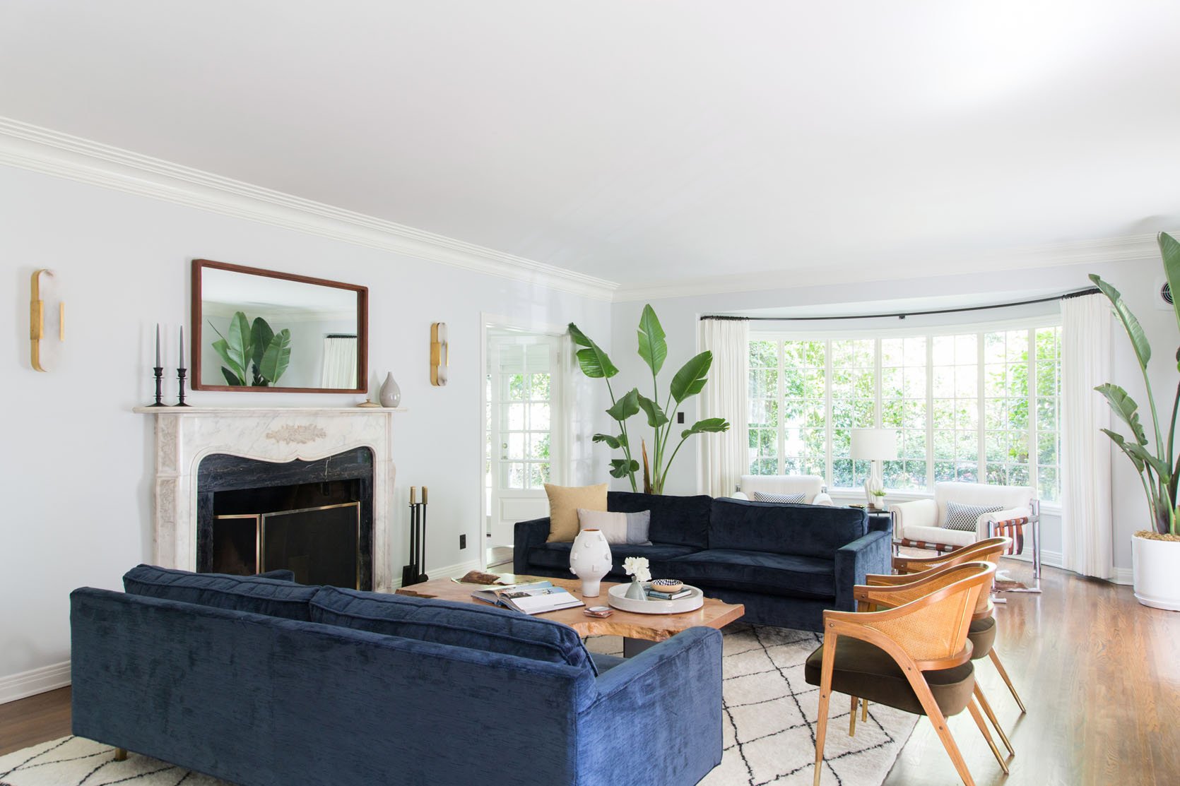
This is best shown in the Griffith Park Living Room. The focal point is clearly the fireplace (ornate and traditional), the sofas (simple and modern) are matching as well as the chairs (modern and vintage). Can you just imagine all the fun game (and maybe wine) nights that have been held in this room?? Also, that organic coffee table is incredible and brings so much movement and contrasts the traditional style of the home perfectly.
So these boucle beauts are more loveseat sized but you still get the idea. The difference with this layout is that the chairs are next to the fireplace and are on a diagonal. Looks very cool and fun.
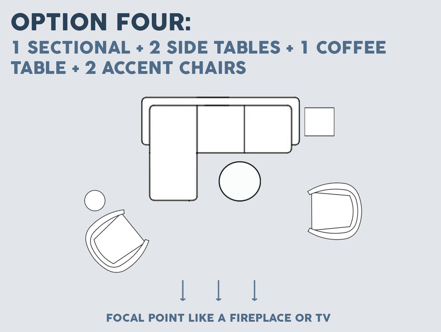
You knew I wouldn’t leave you without talking about a sectional layout:) This is another Em Henderson go-to. It’s great for a large living room with a focal point like a fireplace. Let’s just jump right in:
MODIFICATIONS:
- Doesn’t matter which side the chaise is on.
- Both chairs can be placed at a diagonal.
- Take away a chair if you don’t have the space.
- Add or take away side tables as needed.
DESIGN TIP:
- Personally, I think it’s more visually interesting for the chairs to be different but as you will see below matching look great too.
Ahhh. The stunning Glendale house. Em has always said she didn’t finally nail the layout and color palette of this room until this version (the one she styled to sell it). But the brown leather chair is spaced just far enough from the sectional’s chaise to not crowd it but isn’t so far that it feels all by itself. Then the opposite chair helps to bring in the other side of the room. Big fan.
At the mountain house, Em did more of the “pair of chairs” look across from the sectional but choose mix-matched chairs for a unique, eclectic look. Those organic side tables and coffee table also help to really fill out the space.
The media room from the Portland Project, has this layout but used matching accent chairs and they look great.
Also because they are close to the wall, it was the perfect opportunity to use high-back chairs. No need to worry about blocking any views:)
Last but not least we have “the small living room” layout. I kinda covered this in Option One but I wanted to give you some visual examples.
MODIFICATIONS:
- You can take away the chair or replace it with a small ottoman.
- You can take away a side table.
DESIGN TIP:
Don’t be afraid of standard-sized furniture in a small space. Sometimes “small space” specific furniture can make a room look even smaller. Of course, be sure to measure to make sure the pieces will fit and not overcrowd. It’s a balance:)
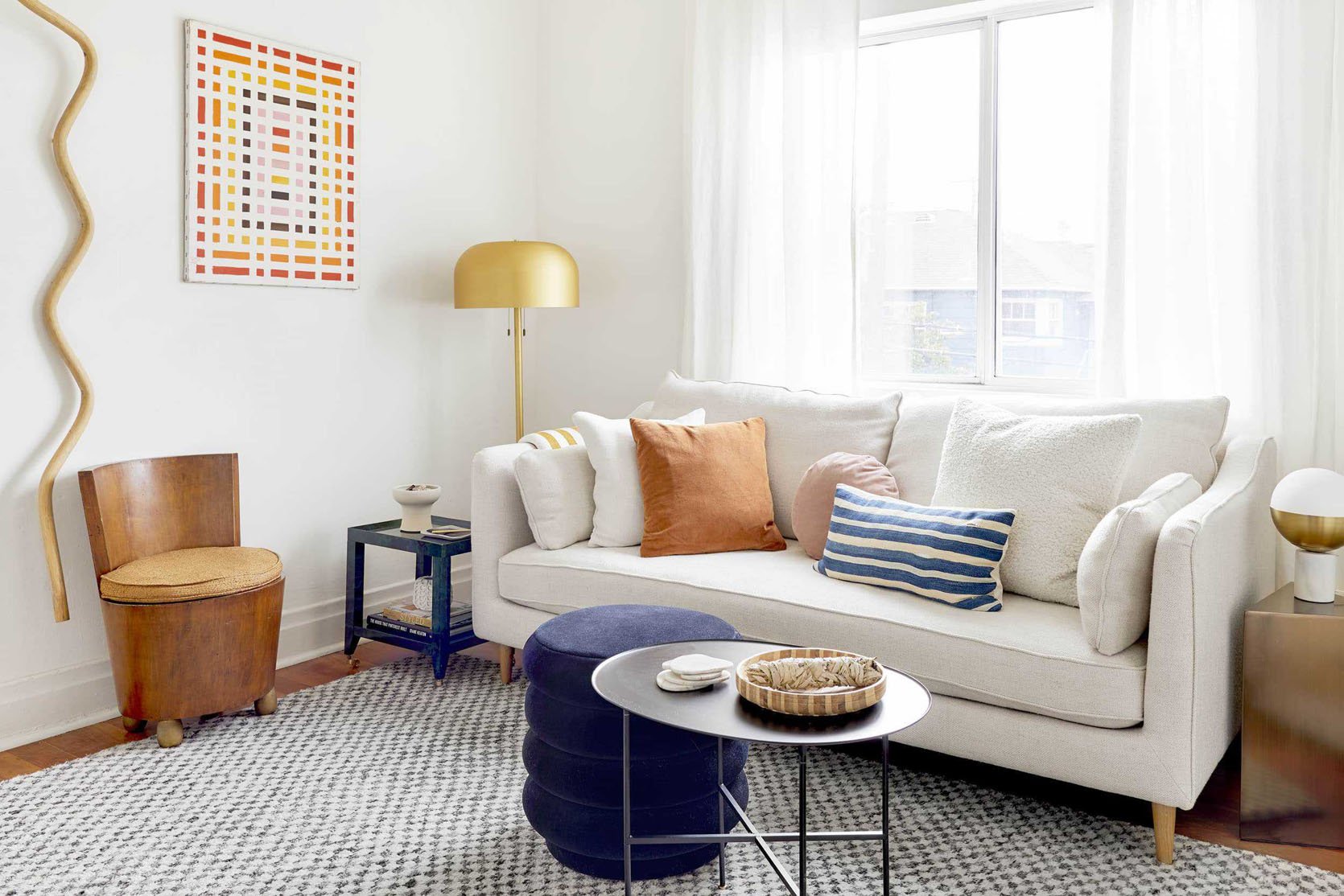
Here’s my old little baby living room. I didn’t choose the smallest size sofa offered and was able to fit two side tables and that fun little accent chair. To be honest, the chair wasn’t sat in very much because of its size BUT it added a ton of personality and was useful for the couple of “parties” I did throw.
Ryann’s living room is also on the smaller side but she was able to get that wonderful vintage wingback chair in there without it feeling crowded. Instead, it helps to define the living space from the dining area.
Emily’s mountain house family room is definitely a more “standard” size but this layout is still great! The key is to make sure the proportions of the furniture are correct. This sofa is big and deep, that incredible chair is larger with a good sized ottoman, and the coffee table is also a great size. Scale is always the hardest in any furniture layout design. You don’t want to overcrowd but you don’t want things to look bitsy. When it’s right is when it looks really well designed:)
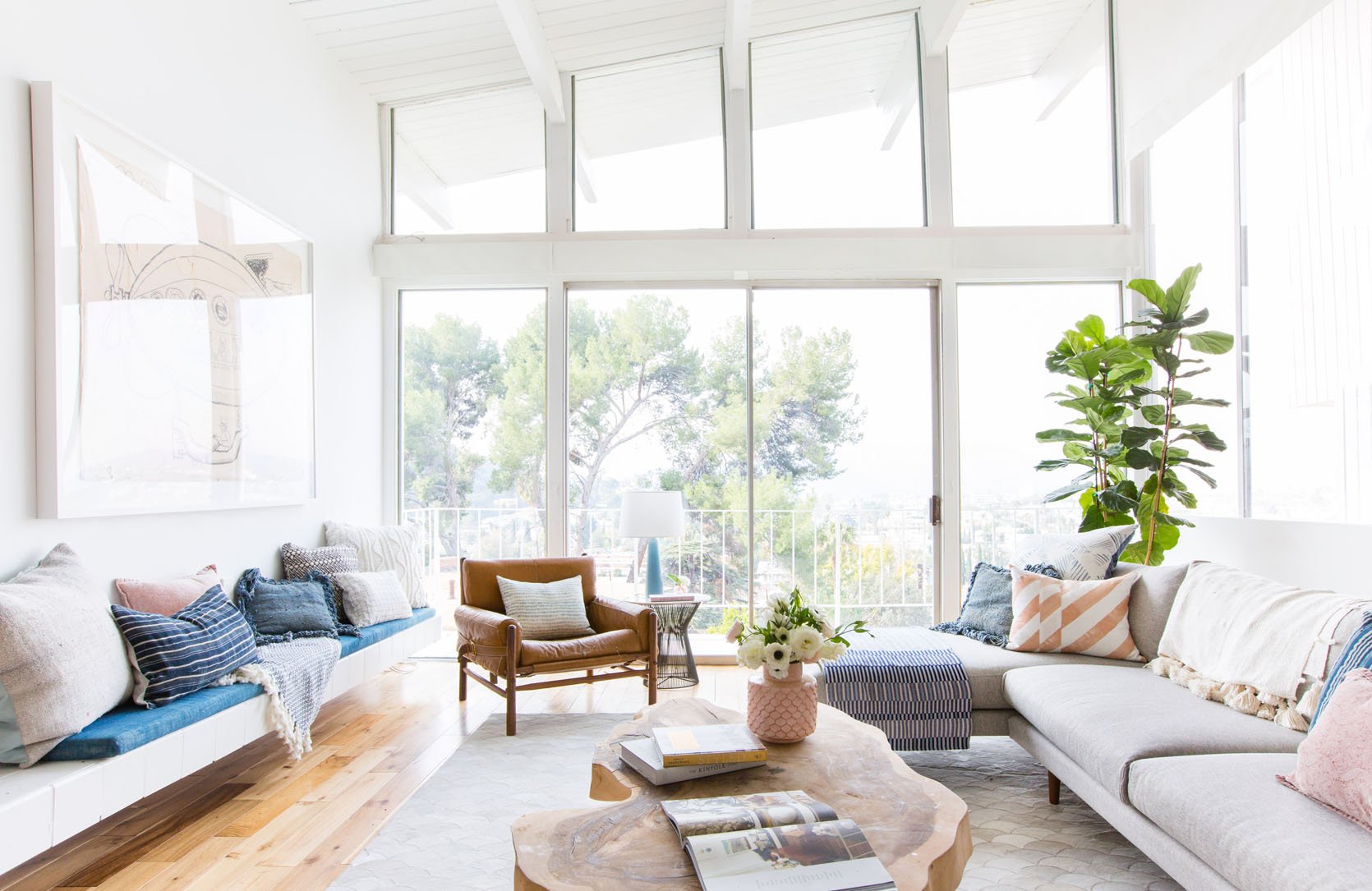
Here’s one more because it’s pretty and I wanted to add it in! It feels really approachable and relatable. Hope it gives you even more confidence to go for it!
So there are our five living room seating layout configurations. There are definitely more but hopefully, these are universal enough to get you the living room you want.
Love you, mean it.
Oh and here they are all together if you want to have them pinned in one place:)
Opening Image Credits: Photo by Zeke Ruelas | From: Ginny’s Living Room Reveal
THIS POST WAS ORIGINALLY PUBLISHED HERE.
