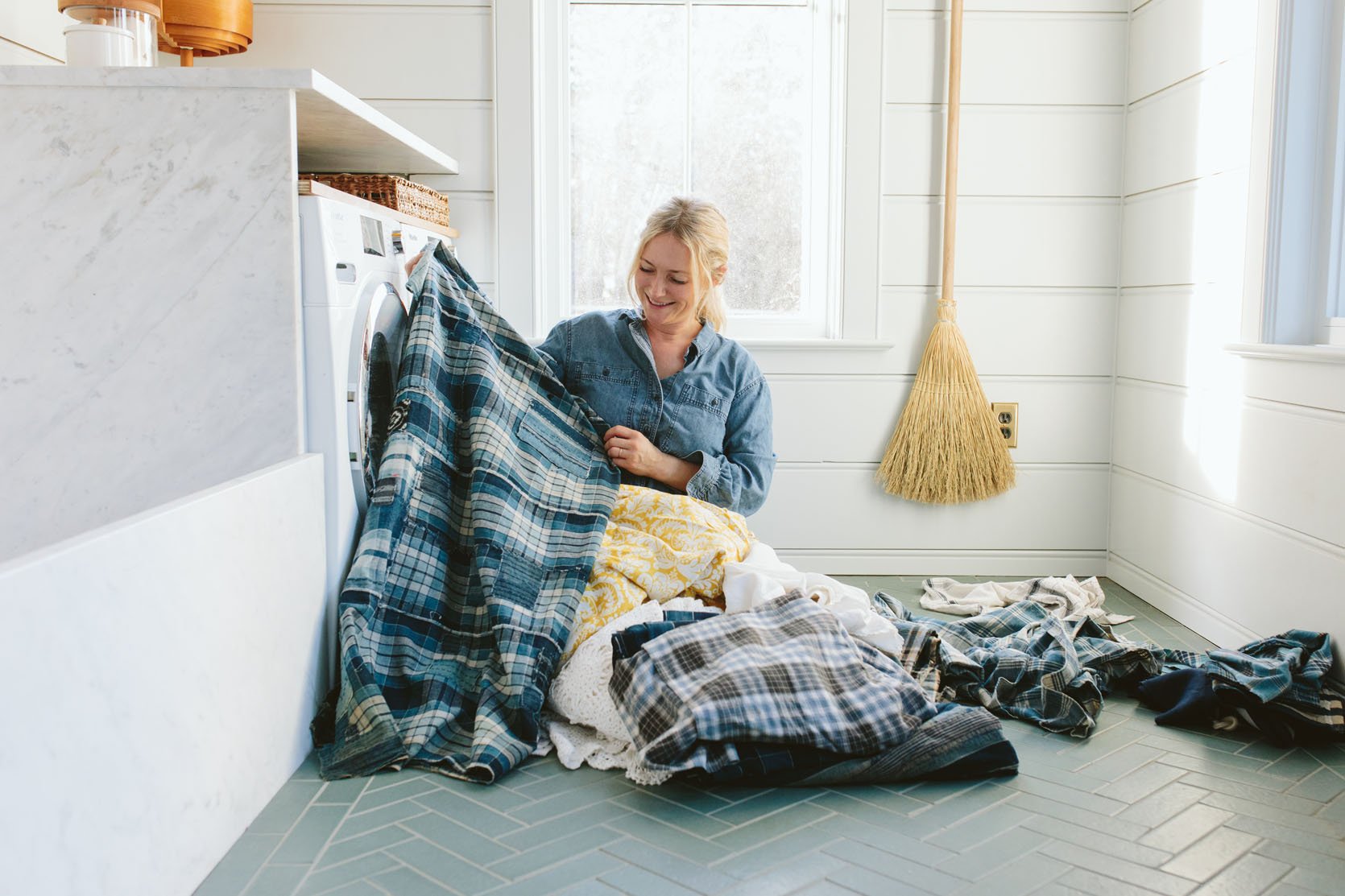
We are getting pretty close to being totally done with the mudroom, which ties with the kitchen, sunroom, and our bathroom for my favorite room in the house. It might win because I’ve never had one before and it’s just so needed in Portland. I have a lot to tell you (like how the dog wash station is actually working), but today is all about the fabric curtain that will hide the washer and dryer and add a pop of pattern that I want in here. I’m obsessed with the tile (Pratt + Larson) and the wall color (Dew Drop SW 9641 by Sherwin-Williams) and the stone is a Carerra from Bedrosians.
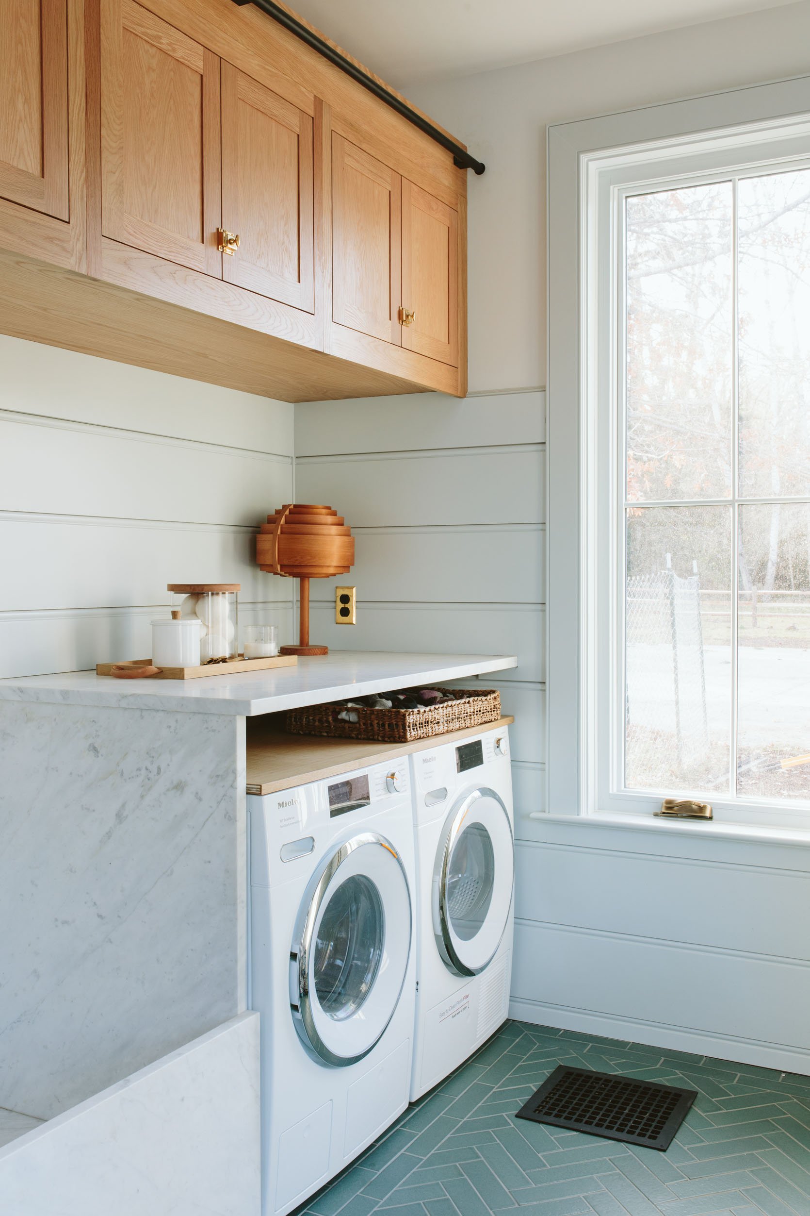
Here’s what we are looking at – we have these high-efficiency Miele washer/dryers (that we got from Build with Ferguson). And they are actually really nice to look at. But I love the idea of bringing a pattern in here. If you are wondering why the marble is higher than the washer/dryer the answer is that I don’t remember:) When it was installed like that I assumed the washer dryer fit in it perfectly but then after we put in the appliances I was like “huh”. Jamie cut and added a piece of leftover white oak as a shelf because we were not going to re-fabricate the stone, and it’s not a big deal but sure, it’s kinda odd. We are going to push the washer/dryer back so that we can hang a curtain. How are we going to hang a curtain you wonder? Me, too! I think I have leftover Pepe and Carol rods that I might play with or even get a small wood dowel and some brackets and use epoxy glue? Stay tuned on that.
Also how pretty are those white oak cabinets??? They are also from Unique Kitchens & Bath, in white oak and very very gorgeous. We just got the ladder installed in December, stained it, and I can’t wait to show you it.
Curtain Fabric Idea Option #1: A Classic Ticking Stripe
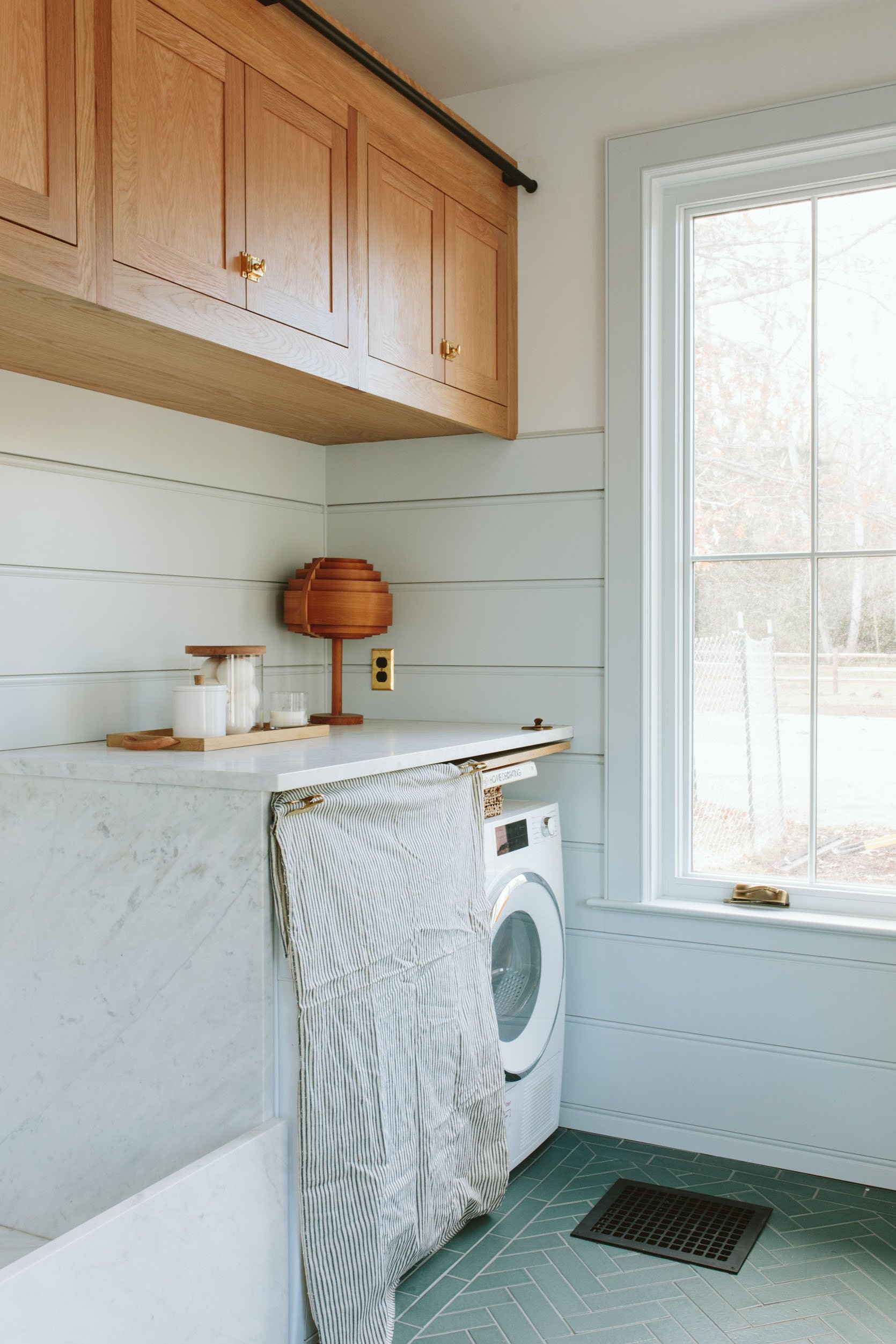
So here’s what I did – I have a pretty solid inventory of vintage fabrics because they make me extremely happy and using them is something that I honestly do consistently use in shoots (for napkins, tablecloths/runners, make into pillows, etc). So everything you see here is what I used to have and some of them are obviously not the right choice, but by trying them out it’s easier to see what will work and what definitely won’t work. This isn’t enough yardage obviously but the idea is a classic, utilitarian ticking stripe. Picture it not wrinkled obviously. It’s fine but maybe a bit boring and expected?
Option #2: Sewn Together Classic Tea Towels
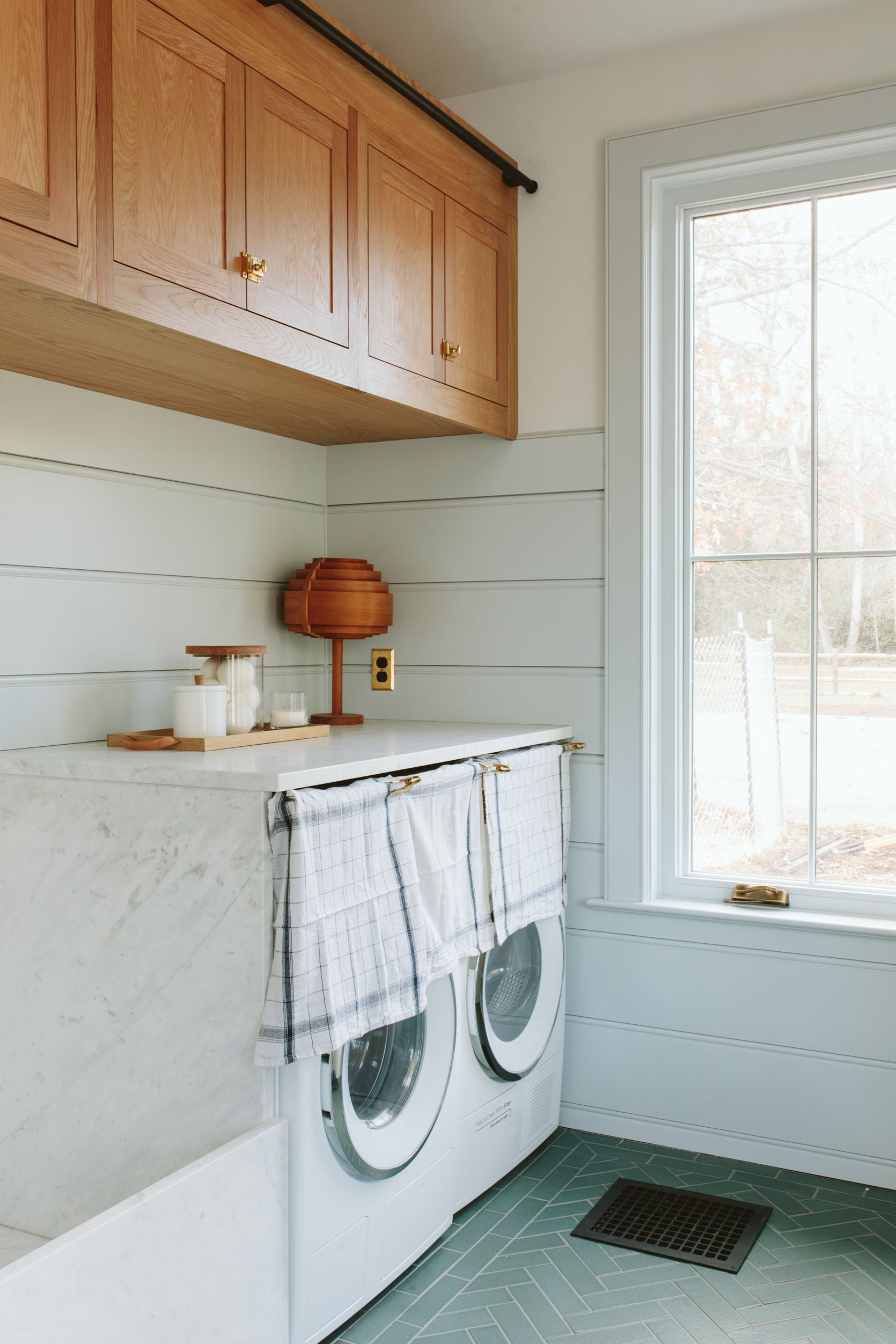
I was and still am REALLY into this idea. So you basically take vintage-inspired tea towels (I bought these at a local store recently for $14 each) and sew them together. This gives me a pattern (check), feels utilitarian which I like for the mudroom, but it’s more unique and kind of a fun twist/idea. Emily M. and Kaitlin weren’t as enthusiastic about it which has made me doubt the idea but even now looking at these photos again I’m like, “ooh this is so cute”.
Option #3: A Vintage Gingham
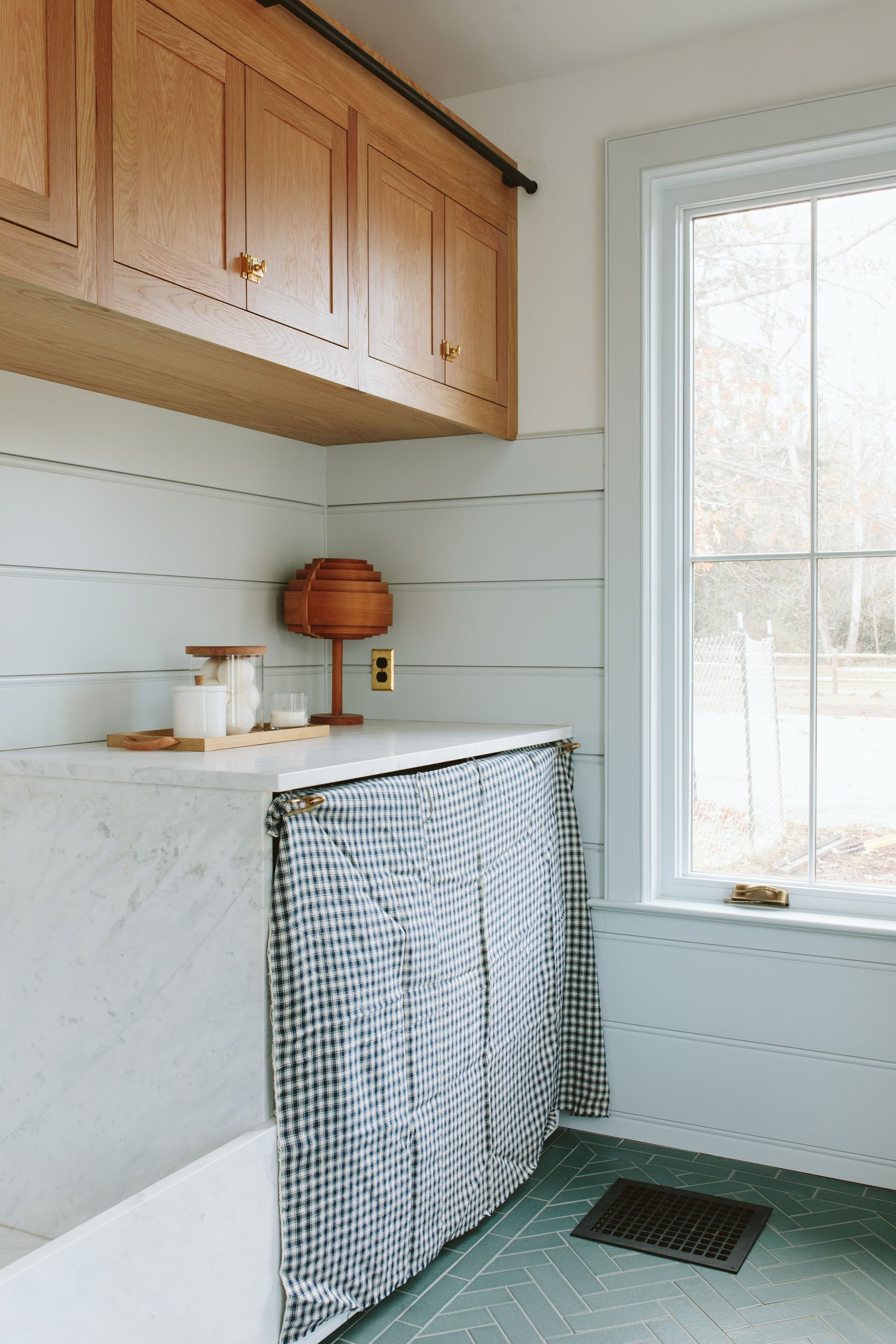
Ok, now this works and is a contender. It’s a homespun gingham (which just means looks/feels handmade and is thick and really drapey). I think there is enough but definitely cutting it close. Classic farmhouse pattern, gives some contrast, and is certainly sweet. Could it be less expected? More interesting? Sure.
Option 4: A Sweet Cotton Tablecloth
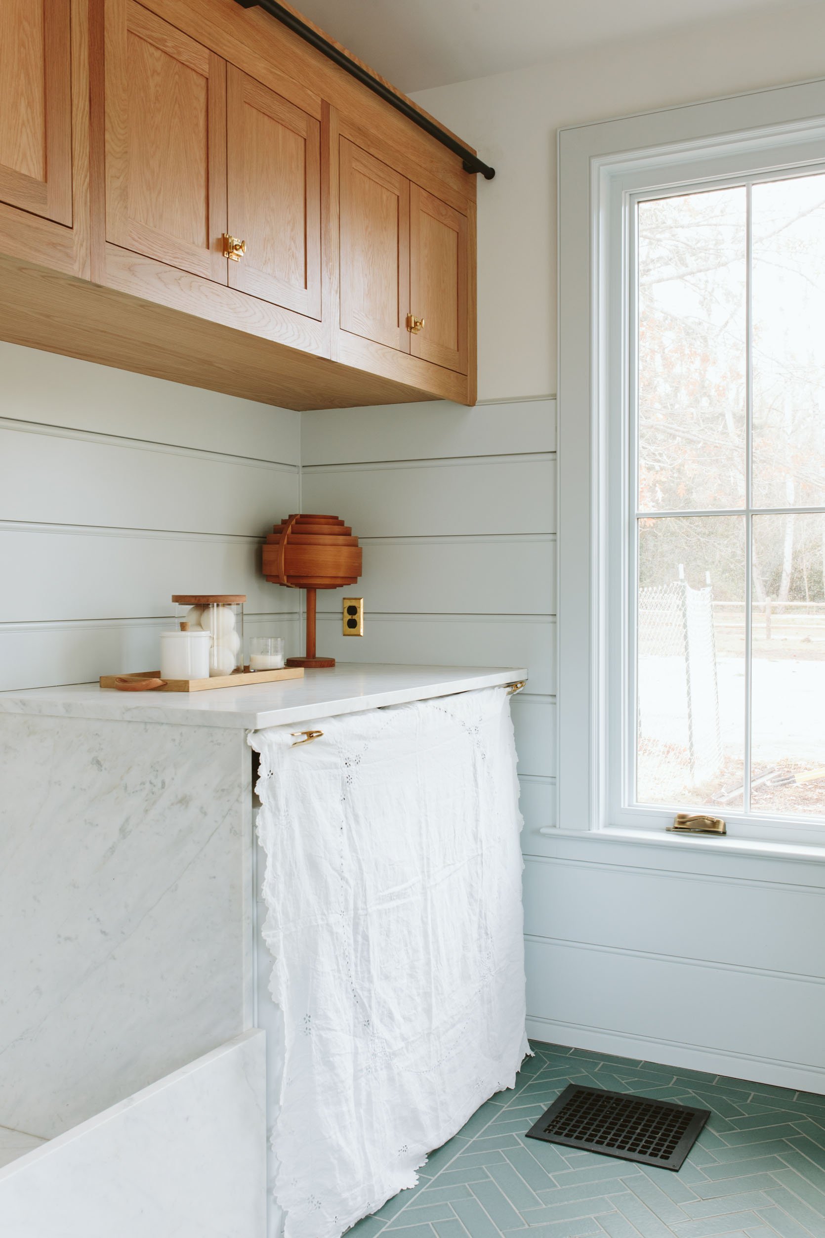
I actually really love this option. I just bought it the other day at the antique store (shout out to Stars) for $13 and it has a sweet ruffle and some embroidery (and whatever those holes are called). It’s super bright white which we love and while it might be a bit small I’m surprised by how much I like it. I do however fear that it’s a no-go due to its proximity to the dog wash and the fact that our dogs shake off their mud all day every day. I’m SO GLAD that we did semi-gloss paint on the walls + tile/stone everywhere else, and really forgiving white oak cabinetry. So I think a white fabric is not a good idea.
Option 5: Vintage Plaid

Here we begin my real plaid show and tell – I’ve been collecting them forever and there are a lot more where these came from (remember when I used to say that I was a combination of Marie Antoinette, Mad Men, and Footloose? I think the Footloose part is still accurate but maybe it’s more Downton Abbey? and more The Marvelous Mrs. Maisel ?? Little House on the Prairie??). Anyway, I like this one but I like others more (keep reading). What makes these all special is that they are patched together, don’t line up perfectly, and just feel so authentic and soulful.
Option 6: A Yellow Floral
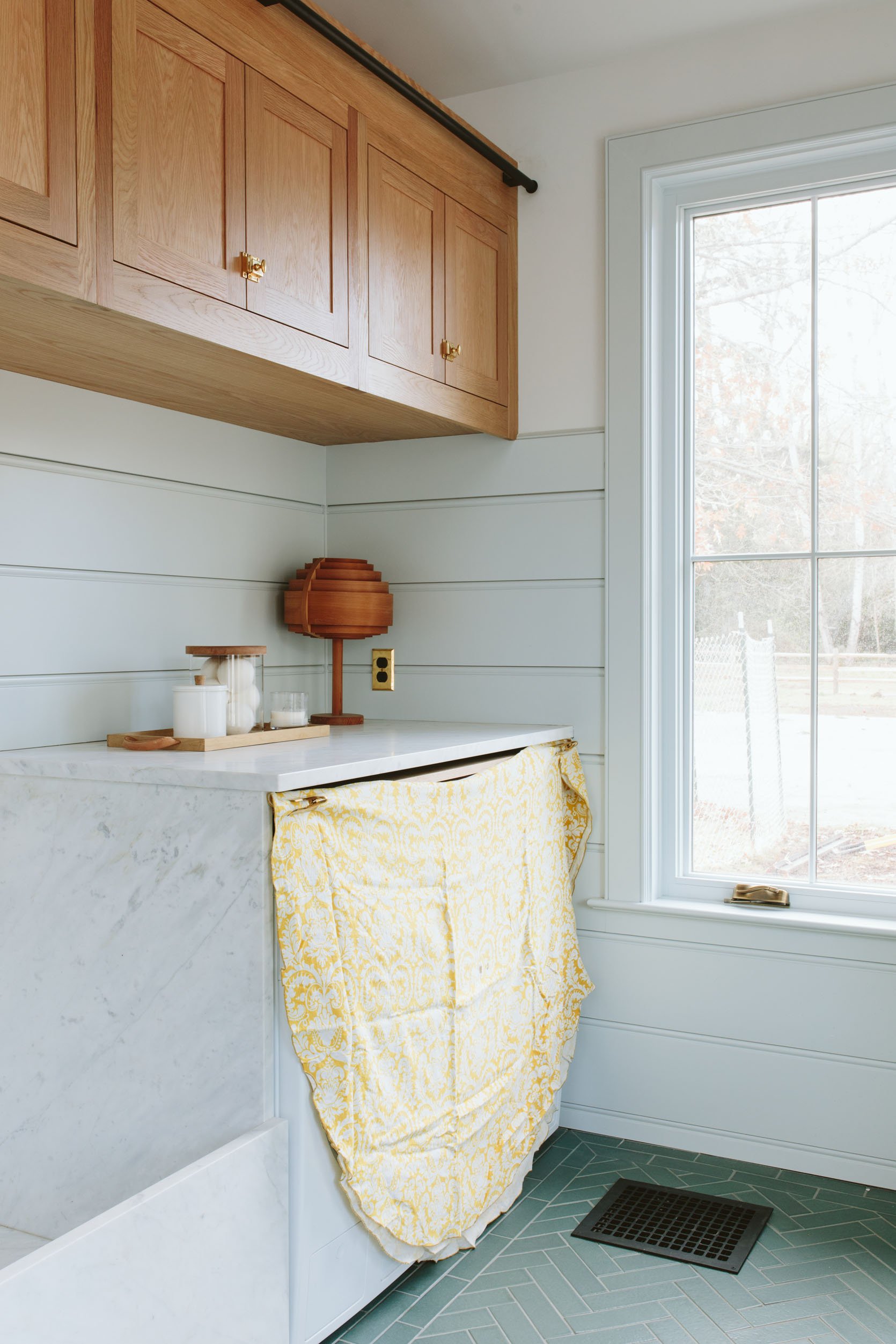
Initially, I wanted a floral in here because I was going to do the plaid in the powder room (which is nearby). But vintage florals that are good are so very hard to find. I’ve had this tablecloth for probably 15 years and have used it for so many spring shoots. I LOVE IT. It isn’t big enough but if we had loved it I might have been able to cut and sew it to make it fit. Ultimately I think it’s not right but fun to see.
Option #7: A Blue/Green Floral
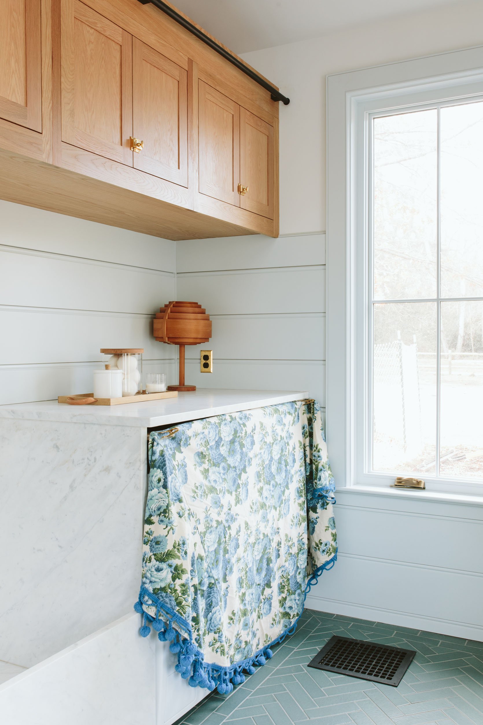
We said no to this on the shoot date but looking at it now I’m like, “HOW CUTE!!!” The colors work OK, it certainly is unexpected, still feels farm, and totally me. I think Kaitlin and Emily M. were more into the plaids and I could go in either direction but this is exciting me a lot. Again, we’d have to cut this up and sew it together to become a rectangle and then reattach the ball fringe (you can’t lose that). But this could also be really cute as a tablecloth in Elliot’s room, on her craft table…
Option #8: Solid Indigo
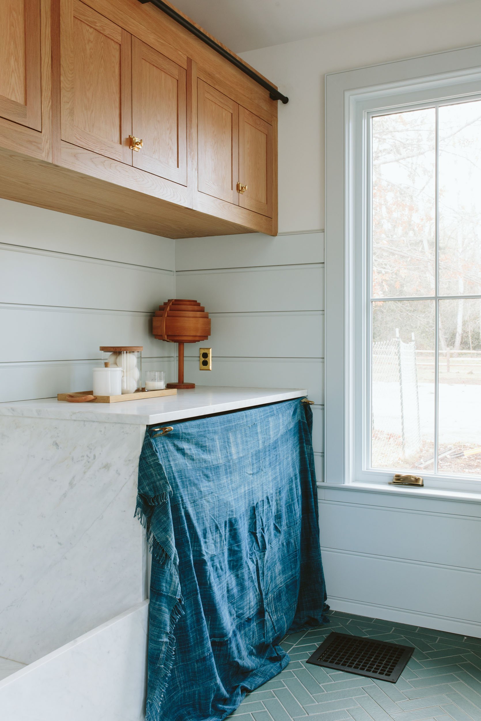
I always hoard indigo fabric and this one is so pretty, but I think it’s a better thrown or tablecloth than this curtain.
Option #9 – Another Vintage Plaid
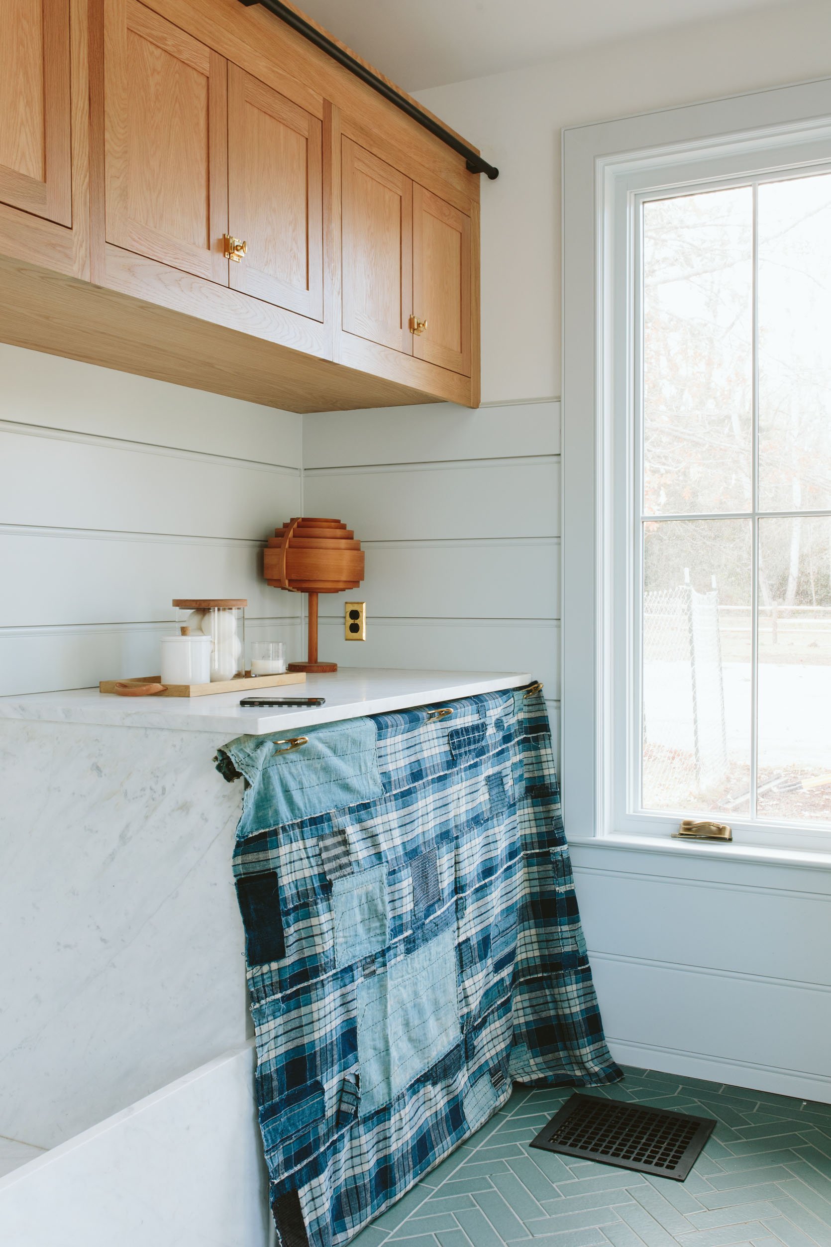
We loved this the day we shot and I love it even more now. It caught my breath. OOF, it’s good. I know I’ll use it somewhere prominent if it’s not here, don’t worry. Definitely in the top 3 for me.
Option #10: Even Another Vintage Plaid
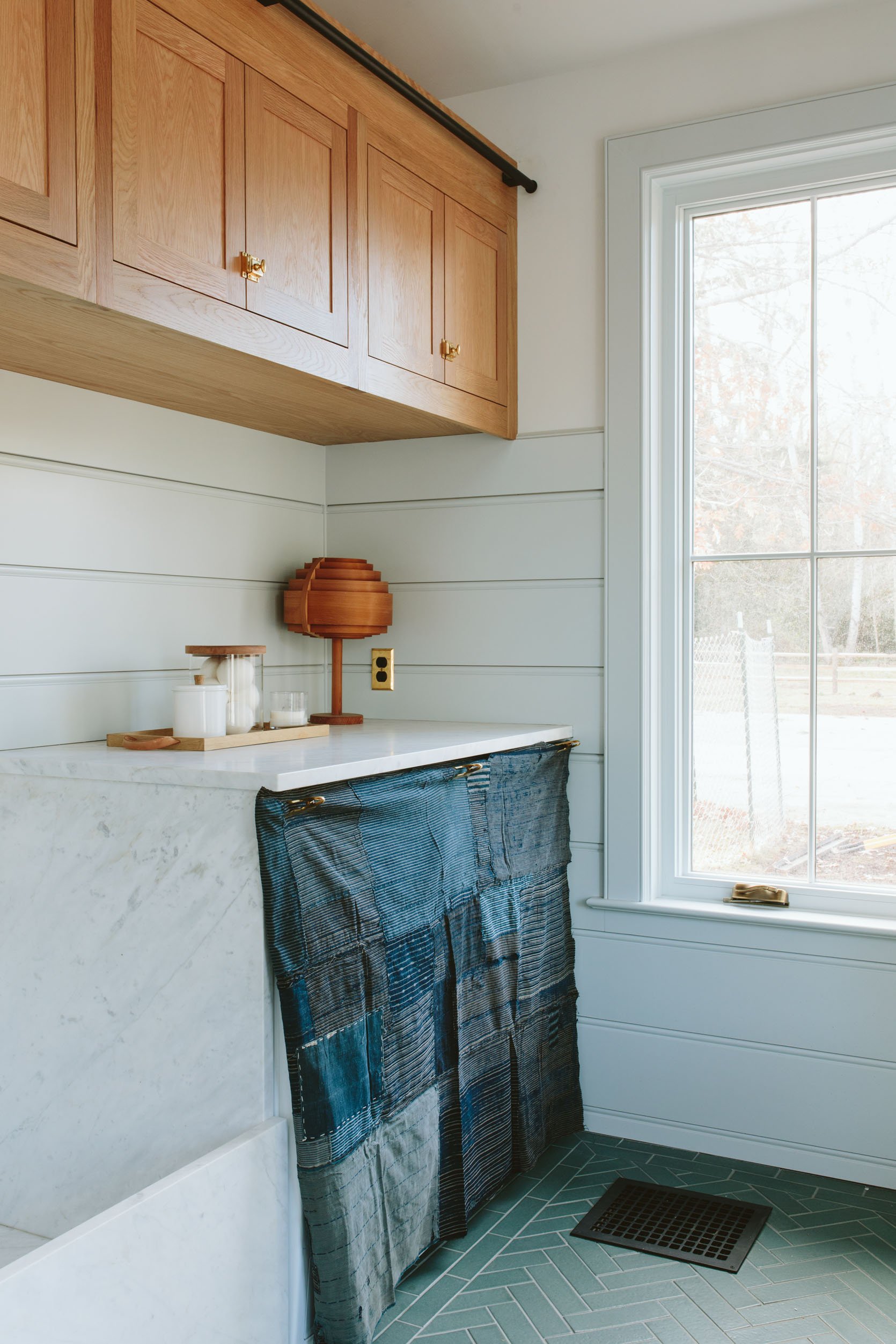
I believe that this was the winner that day because the tones of the plaid worked best with the wall color and the floor color, but now looking at it I’m leaning toward #9! They both look good – this one is just a bit darker and moodier, but maybe not as bright and happy. This is so hard.
These are the stress-free styling decisions that made me fall in love with styling – options that carry so little weight. Like if I choose wrong I can just pull it down and try another and I think 3 of these could totally work. So I’ll let you weigh in – here they are again:
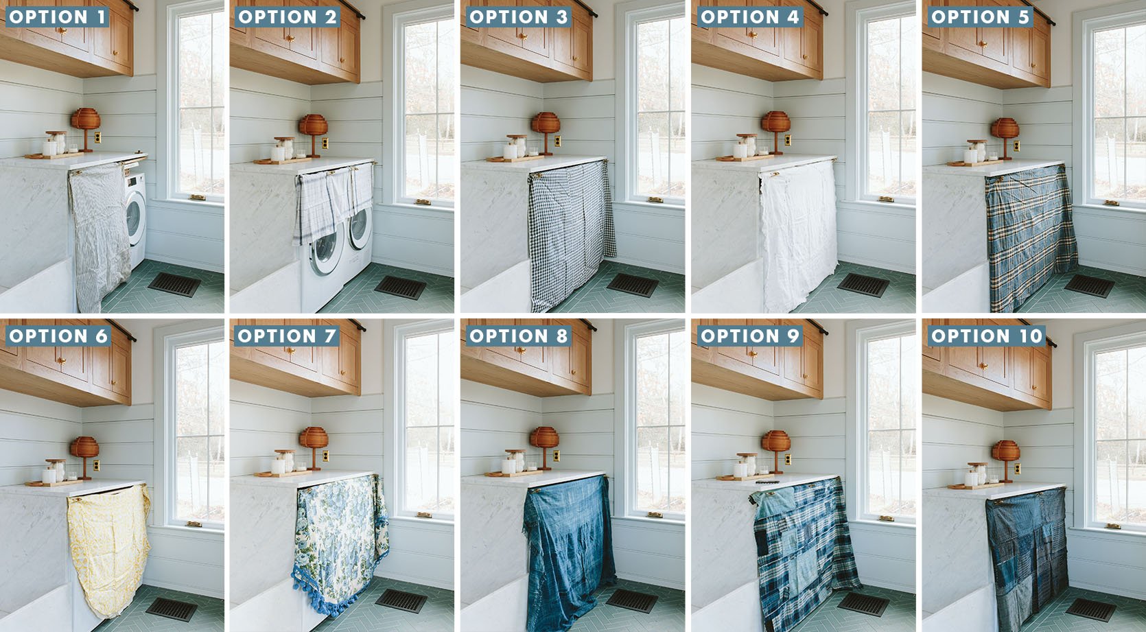
But these are the top contenders:
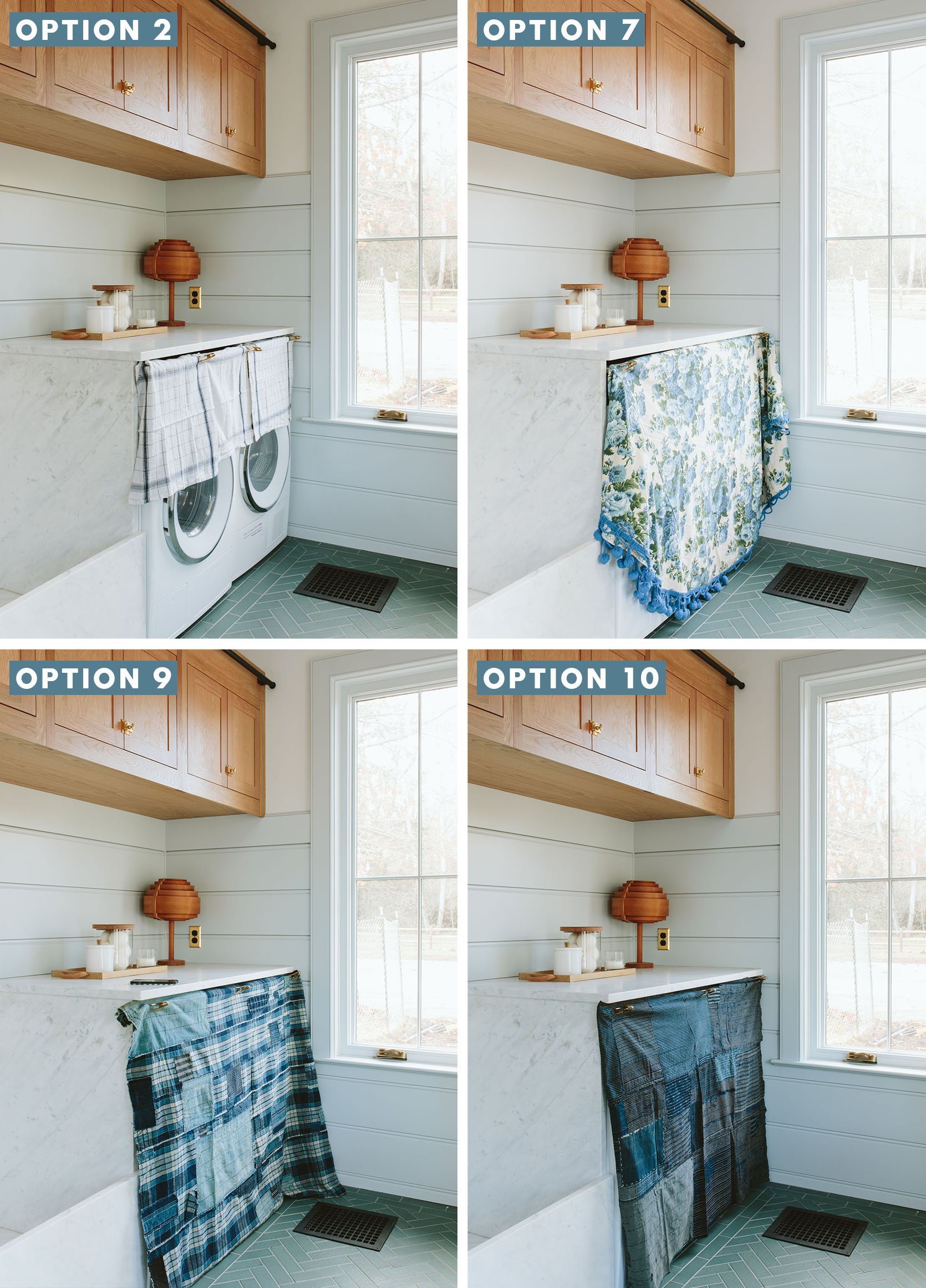
VOTE!!! I may just go with the popular vote on this one because I think all four of these could look good in different ways. LMK. xx
Mudroom Resources:
Cabinetry: Unique Kitchens & Baths
Stone: Bedrosians Tile & Stone
White Oak Windows and Doors: Sierra Pacific Windows
Tile: Pratt + Larson
Wall Color: Dew Drop SW 9641 by Sherwin-Williams
Hardware: Rejuvenation
Appliances: Build with Ferguson
*Photos by Kaitlin Green
THIS POST WAS ORIGINALLY PUBLISHED HERE.
