At EHD, trend predictions are the closest thing we have to a fantasy football draft (am I stretching here?? Maybe). The point is, we ultimately don’t know what trends are going to stick, just like my husband doesn’t know how many points a certain quarterback is going to score (if that is even how fantasy football works??). But all of that is to say that we find it fun and illuminating to put on our research hats and make educated guesses on what’s going to really take off in the design world this year. And at times we are completely right which is *chef’s kiss*. So, won’t you join me in reviewing some of the trends we are seeing and LOVING right now? Quick aside: I am very happy to be writing the bathroom trends predictions this year because I am finally getting serious about giving my rental bathroom a proper makeover. I promise this time. So, while some of the following trends are a little out of my budget/scope, I am feeling VERY inspired by all the innovative bathroom designs and decor choices that are happening right now. And I hope in turn you will feel inspired too. Shall we begin?
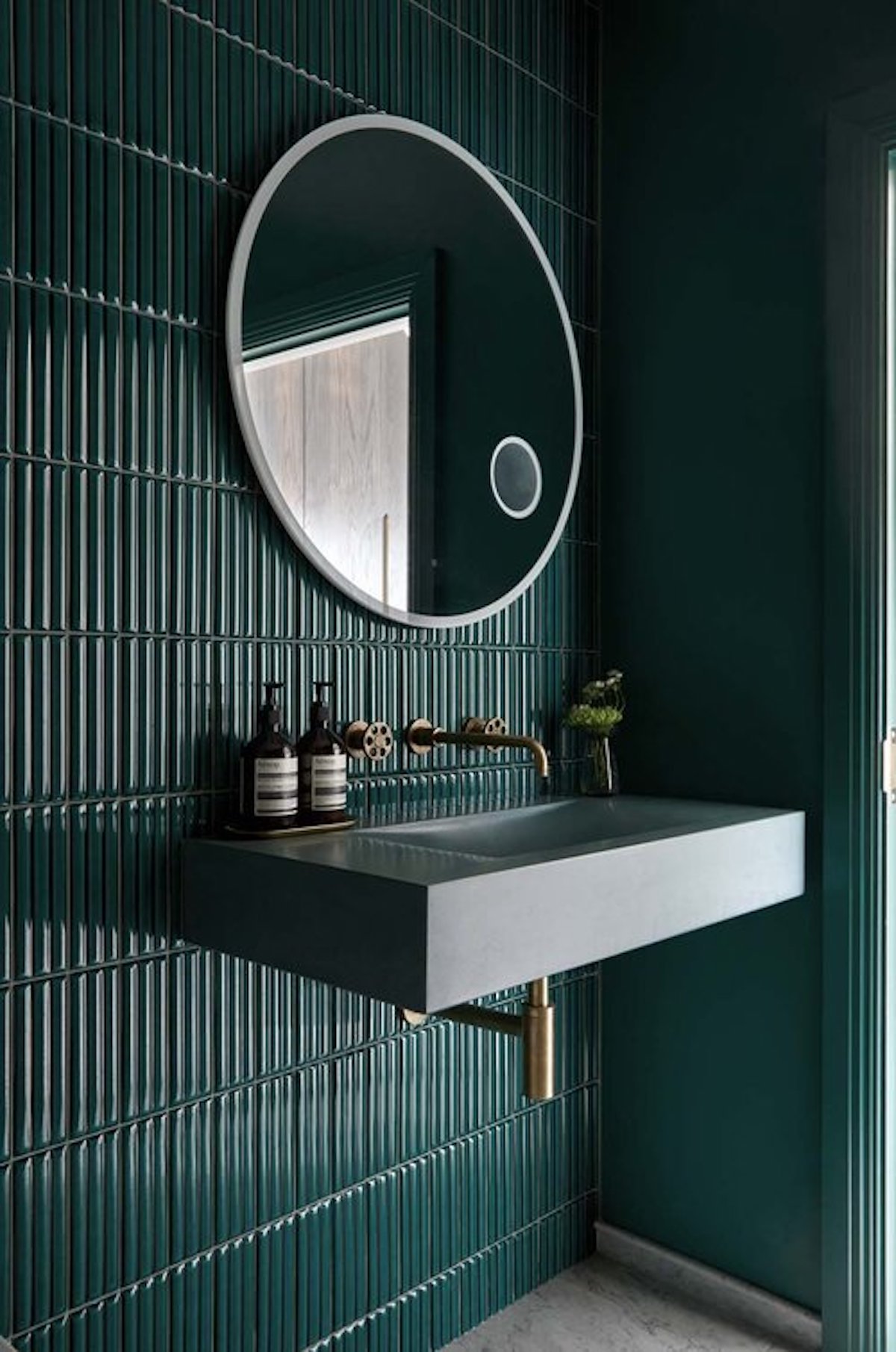
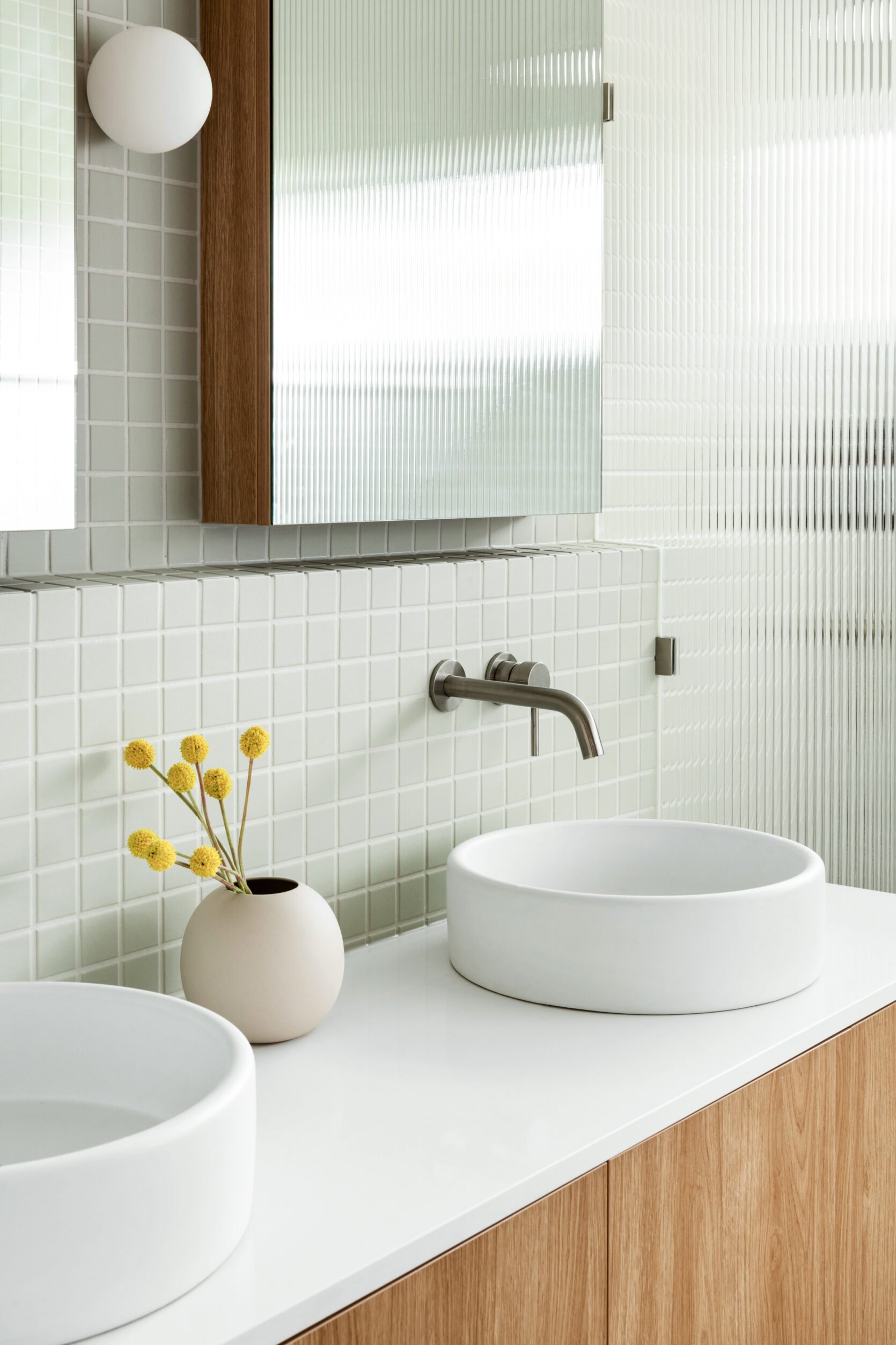
Frameless Mirrors
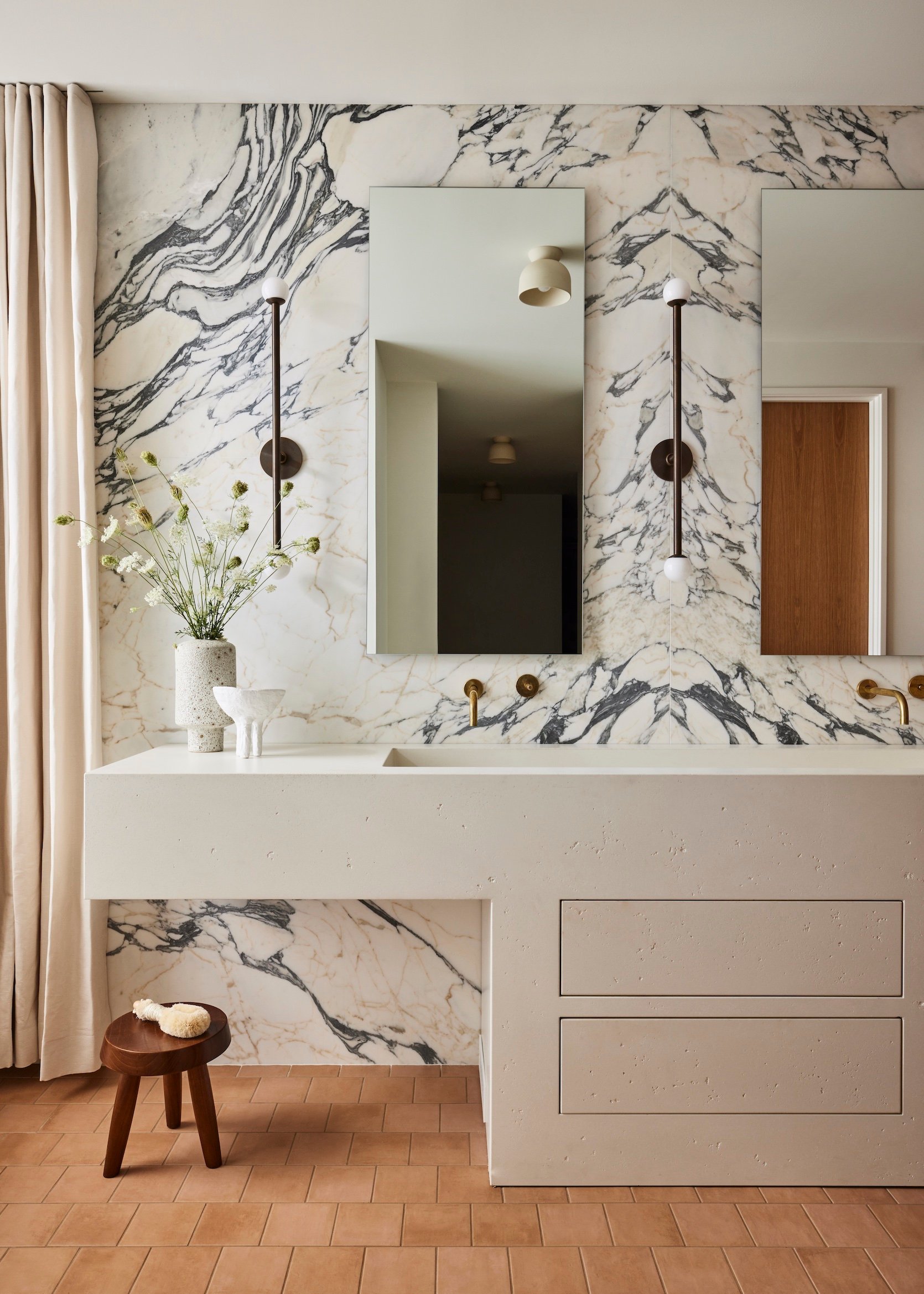
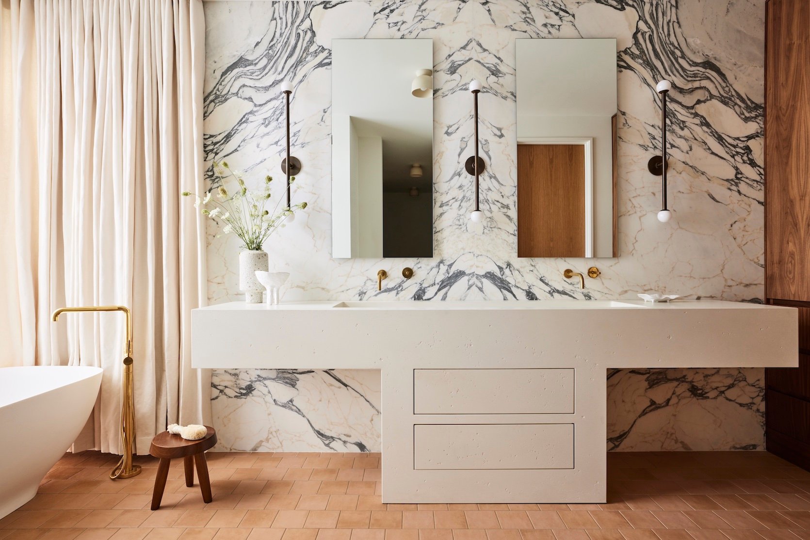
I am delighted, nay, ecstatic about this trend. Frameless mirrors?? You mean mirrors that look a lot like the mirror over my medicine cabinet?? I must be dreaming. But no, it’s actually true because this is a trend I am seeing everywhere, and it’s being done by the most prolific designers, in some stunning bathrooms. Take Sarah Sherman Samuel‘s bathroom above for example. The simplicity of the two mirrors does not take away from the beautiful elements going on here like the marble wall (!!) and gorgeous stone vanity. If anything, they help highlight the eye-catching features even more by being so understated. I LOVE this.
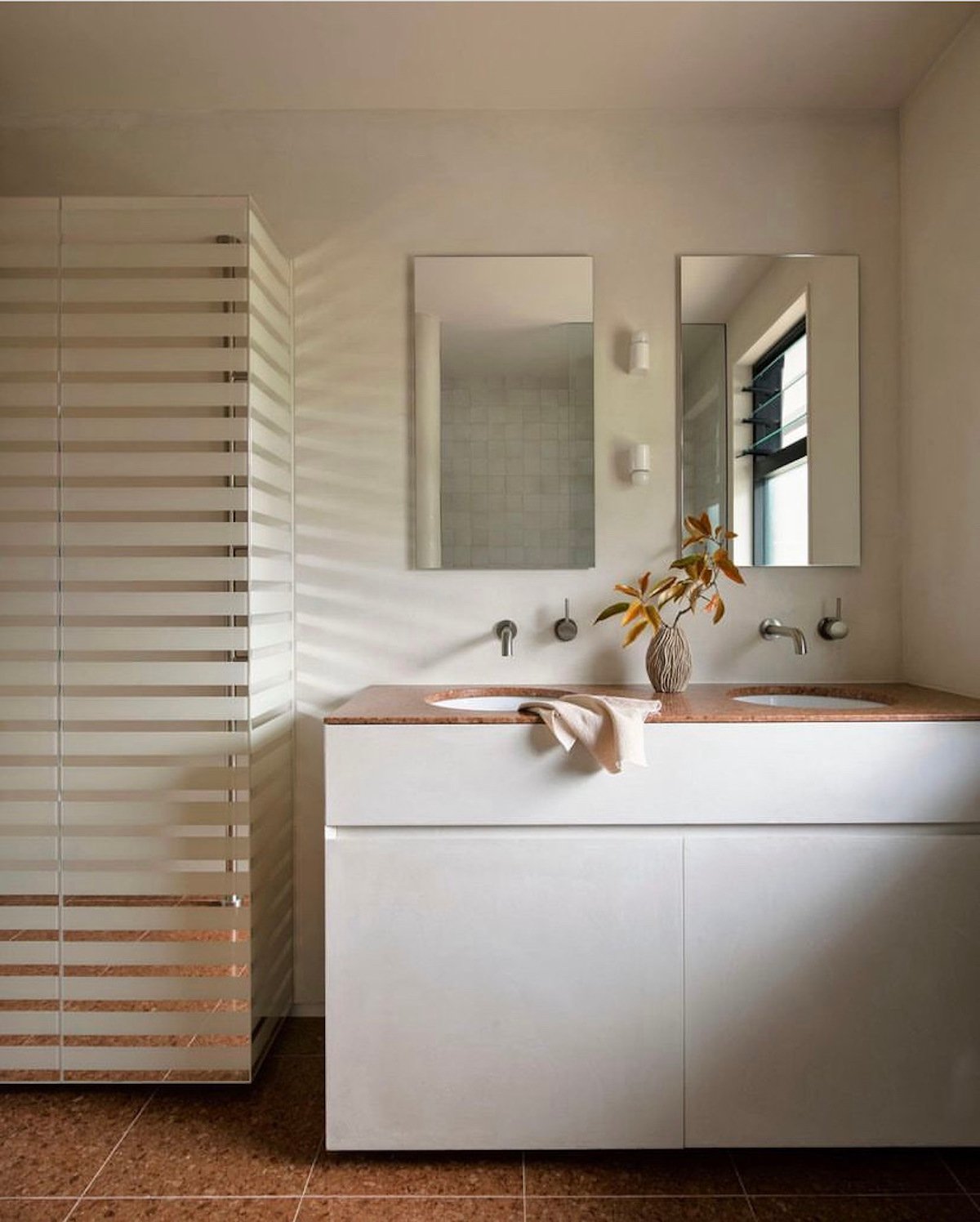
In this minimal bathroom by Arent&Pyke, two frameless mirrors are mounted over the double vanity which creates a very effortless vibe. I love that they lean into the minimalist retro vibe that is happening here, and again create an understated look that is really lovely.
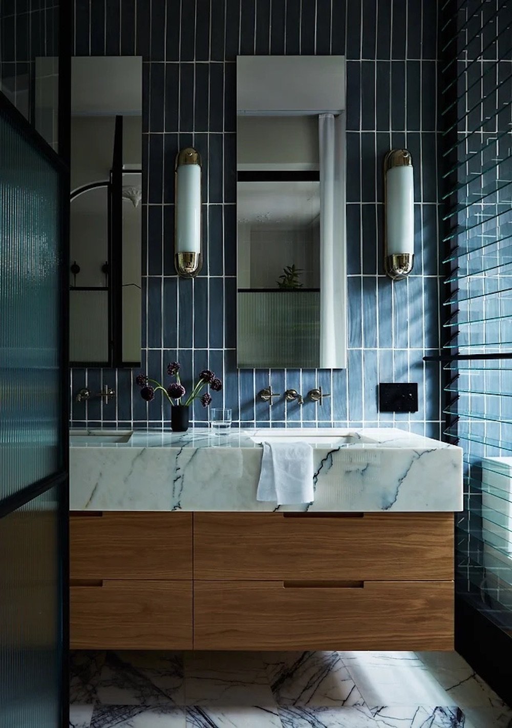
This trend even works in bold bathrooms like the one above by Crystal Sinclair. Since this type of mirror is sleek and minimal, it feels modern and highlights the other modern elements happening in the design.
This bathroom is proof that we renters can rejoice in this trend. I have a medicine cabinet just like this one, and it’s giving me hope that with a little wallpaper or paint, some new hardware, and some courage, my bathroom can look 100x better.
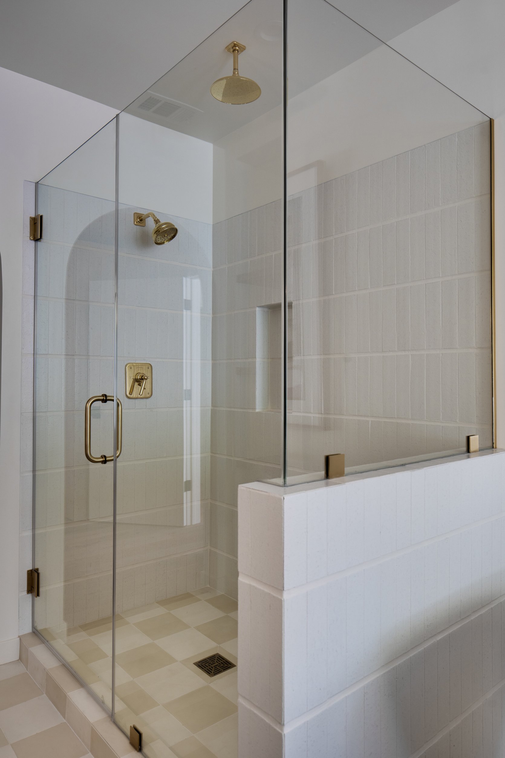
Shower Windows
Shower windows can make a bathroom look bigger, brighter, and more open. Having a large enclosed shower room is a ~luxury~ for sure, and who would want to completely conceal that luxury for no one to see? In this bathroom by Heidi Caillier Design, a glass shower door is accompanied by a glass window so you can easily peer inside the shower and see the gorgeous tile and brass finishes.
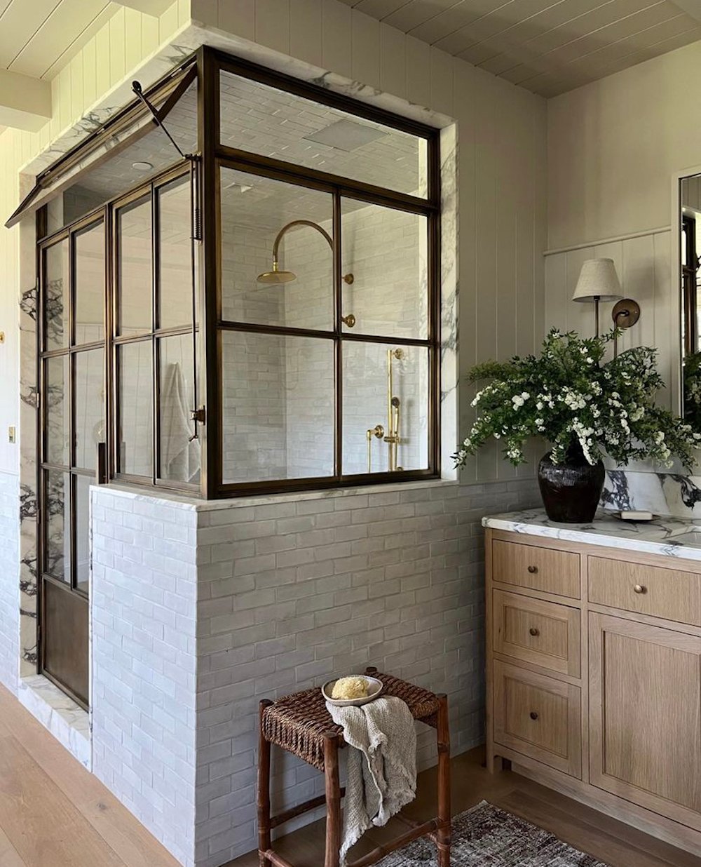
In this bathroom designed by Amber Interiors, the shower room is sectioned off with a low tiled wall and finished with a glass door and windows. I love that there is a top window that opens for ventilation. It’s functional and adds a utilitarian element that looks awesome.
This walk-in shower offers a bit of privacy but still has the open-concept effect because of the window and lack of a shower door. This trend is perfect for anyone who wants their bathroom shower to have a very open, airy feel but would be best applied to primary bathrooms rather than shared guest bathrooms for privacy reasons.
Fluted Tile
I caught on to this one a little later than usual, but once I noticed it was becoming a thing, it started popping up everywhere. We have seen fluted furniture, headboards, and even fluted lighting, but this fluted tile trend is new and very exciting. I love how Noa Santos used a fluted stone to create this natural, organic-looking bathroom vanity. The whole stone slabs also help break up the fluted texture so it’s not too visually overwhelming.
Fluted tile is a great choice if you are thinking about a monotone bathroom. The fluted shape adds texture and movement so there is no shortage of visual interest. The fluted tile wall in this bathroom by Sandra Flashman Studio creates a modern element that is really fun to see.
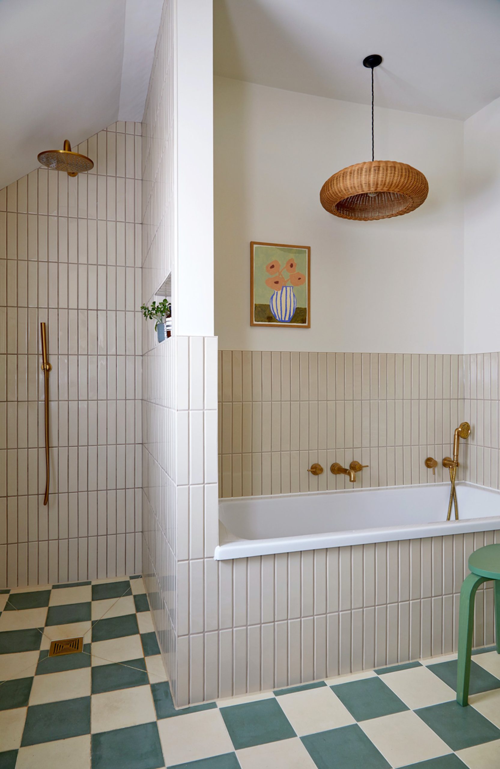
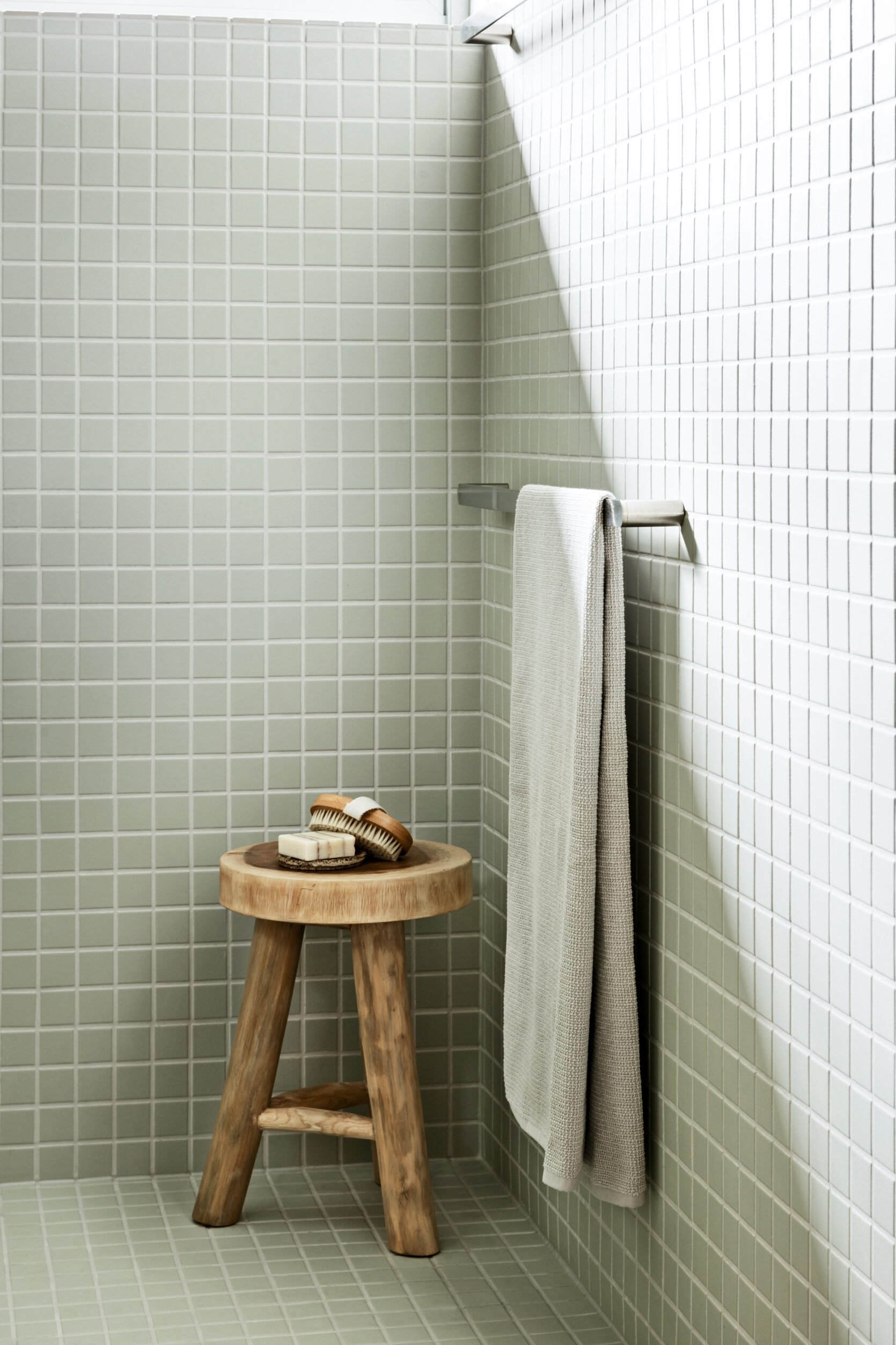
Wide Grout Lines
Here’s a sentence I never thought I would say: Grout is so underrated. It’s like, everyone wants to hide grout or is ashamed of it (and I know it’s hard to clean, trust me!) but embracing the added texture it brings can look very cool. I think that is why we are seeing a major upswing in wide grout lines as of late. Like in this bathroom designed by ASOM home, the horizontal grout lines are noticeably thicker which makes the simple, rectangular tile so much more enticing to look at.
Do you see the difference between the tub and wall tile-to-grout ratio vs. the floor tile-to-grout ratio? With wider grout lines the tile shape itself actually becomes more prominent. I love that there are different tile shapes and two different grout widths in this bathroom designed by Fiona Duke Interiors. It gives the room such a dynamic look and draws your eye in.
In this serene bathroom designed by Matt James, square tile covers the entire bathroom, so the thicker grout lines are a must. The grout creates a noticeable break between the tiles, so you can really appreciate the texture, pattern, and color the tile brings to the space.
Circular Rooms And Nooks
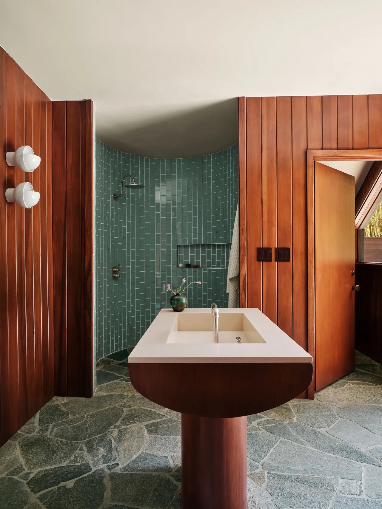
I still see photos of Emma Chamberlain’s home tour and my jaw hits the floor. Her outdoor bathroom suite (above) is the perfect example of the fresh/innovative design choices that were made. The whole home tour feels very new and “Gen Z” in a great way! But back to the bathroom. What struck me most (besides the natural stone floors and wood paneling that creates a very outdoorsy vibe) is the circular shower nook. Anytime a room has walls that are not 90-degree angles, it’s going to be very pleasing to the eye. This bathroom is also a great example of creating a spa-like experience at home, and the circular shower just emphasizes that intention.
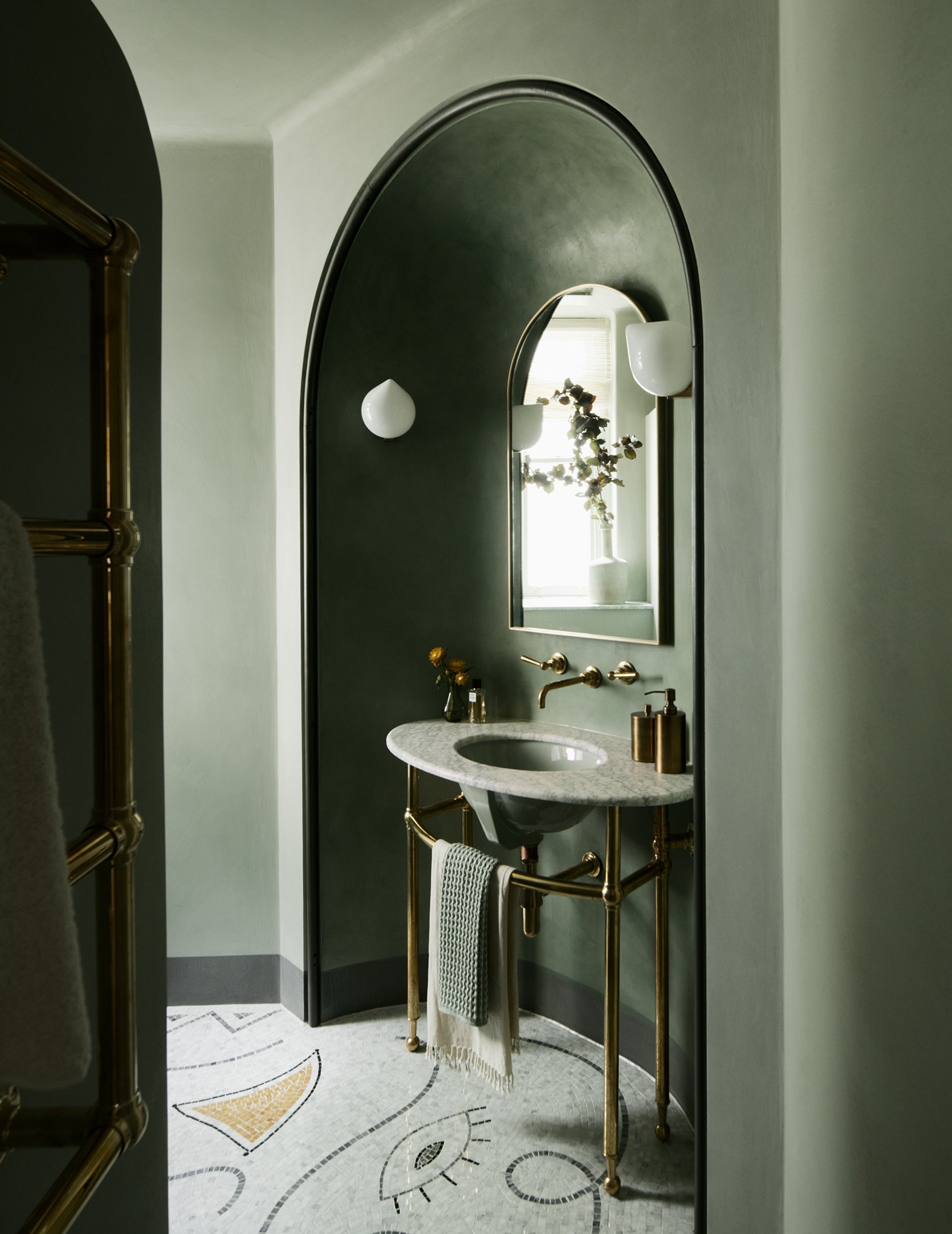
Even a smaller circular wall cut out like this one by Maddux Creative can make a huge impact and is visually so stimulating. Cutting into the wall like this may cost a little extra, but the result is so stunning (and creates a lovely spot for a bathroom vanity). This trend might just give the notorious arch a run for its money!
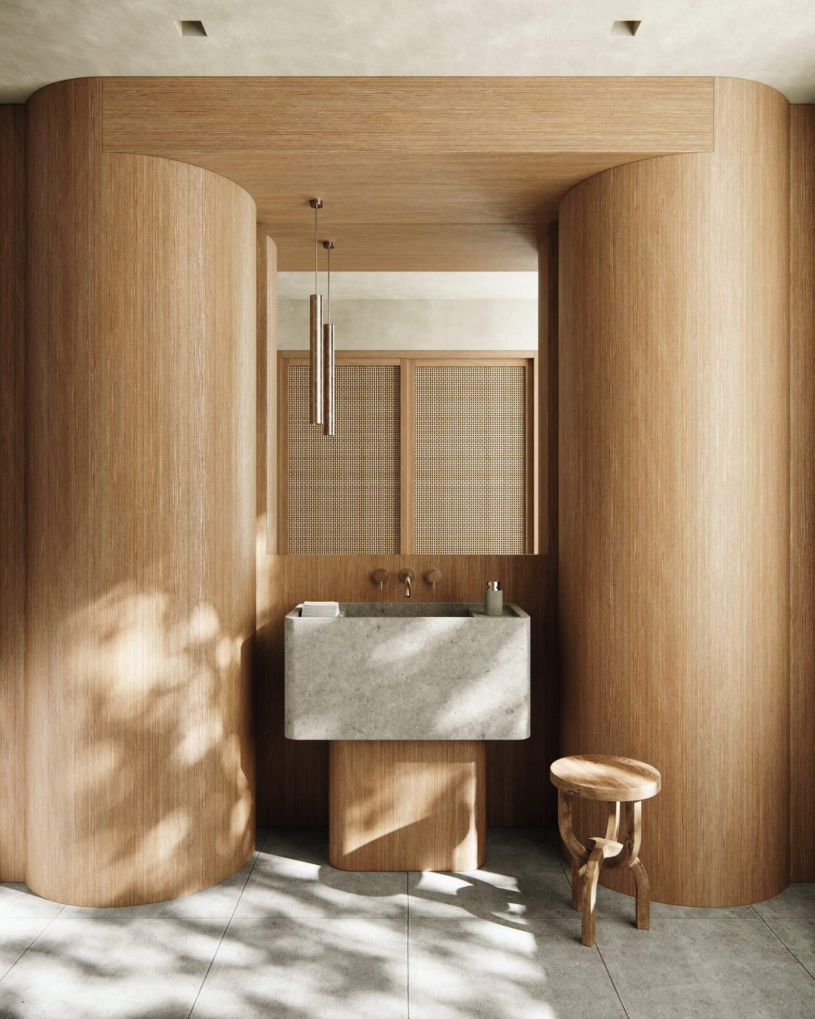
T-Shaped Vanities
We are back to this bathroom by Sarah Sherman Samuel but can you blame me? That vanity needs its own moment. I mean, how exciting is that shape?? What I love most about this choice in this particular bathroom is that it was not a necessity. They could have chosen any size/shape for a vanity so the T-shape is really compelling.
A T-shaped vanity can be small but mighty, too. Here, Noa Santos implemented the T-shaped vanity on a smaller scale, but the result is just as captivating. I love that the base is wood and the sink basin is stone, which creates a nice nuance of color and texture. The T-shape also takes up less physical and visual space, making the bathroom feel more open.
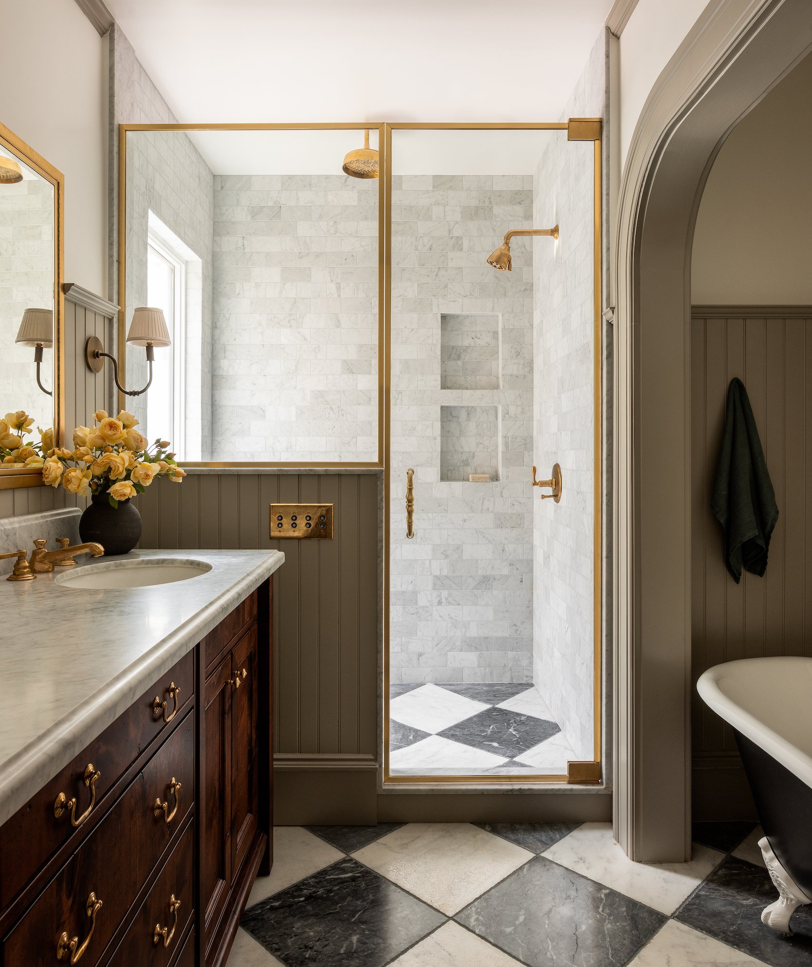
Double Niches
Why have one shower niche when you can have two? In the shower above by Heidi Caillier, the tile is broken up by two niches stacked on top of each other. Practically speaking, having a small niche above the larger one adds a place to put smaller products and ultimately provides more in-shower storage, and prevents clutter. (Have you ever experienced trying to grab a shampoo bottle from a niche that is just overflowing with product bottles? Me too–and it’s not fun). From a design standpoint, the stack simply looks aesthetically pleasing and intentional.
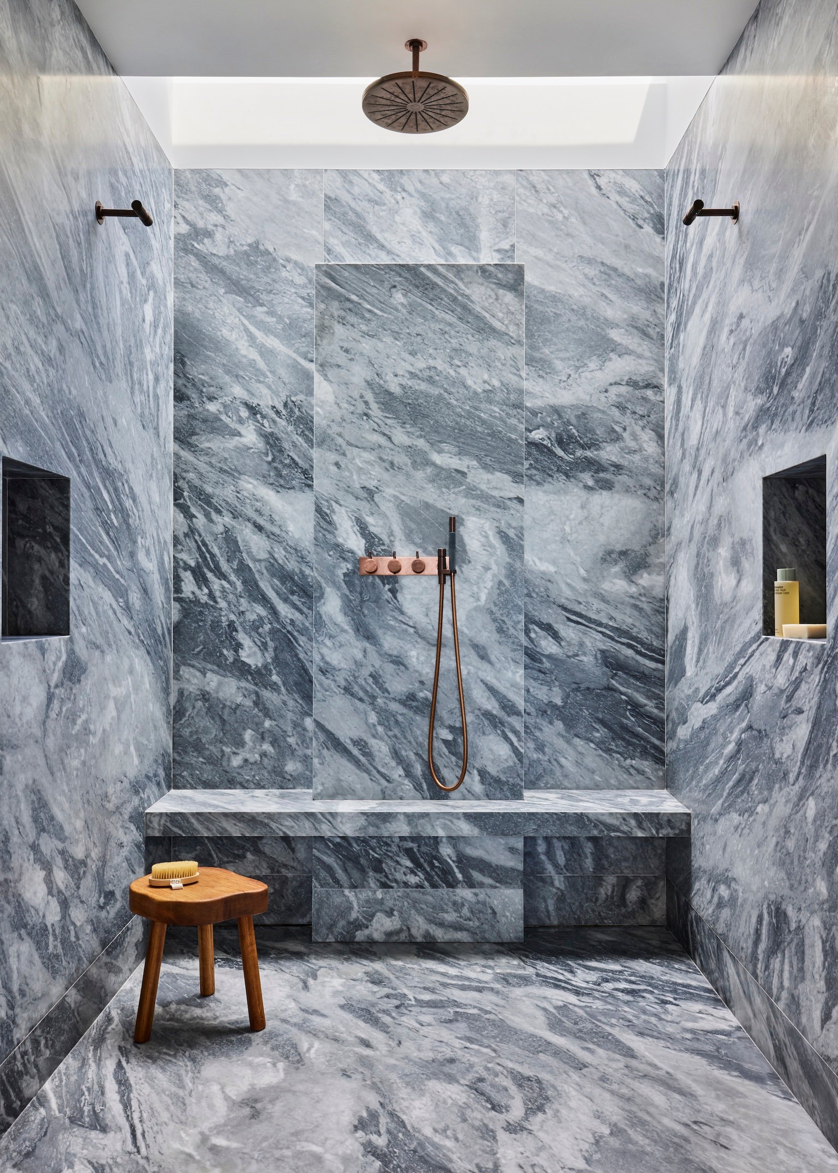
Aside from the stack, you can also implement the two shower niche trend on opposite walls, as Monica Fried did in the above bathroom. In this all-marble shower, the niches provide a necessary break for your eye, and again more in-shower storage. Coming from someone who is niche-less in her own bathroom, I am coveting this trend HARD.
Stained Glass
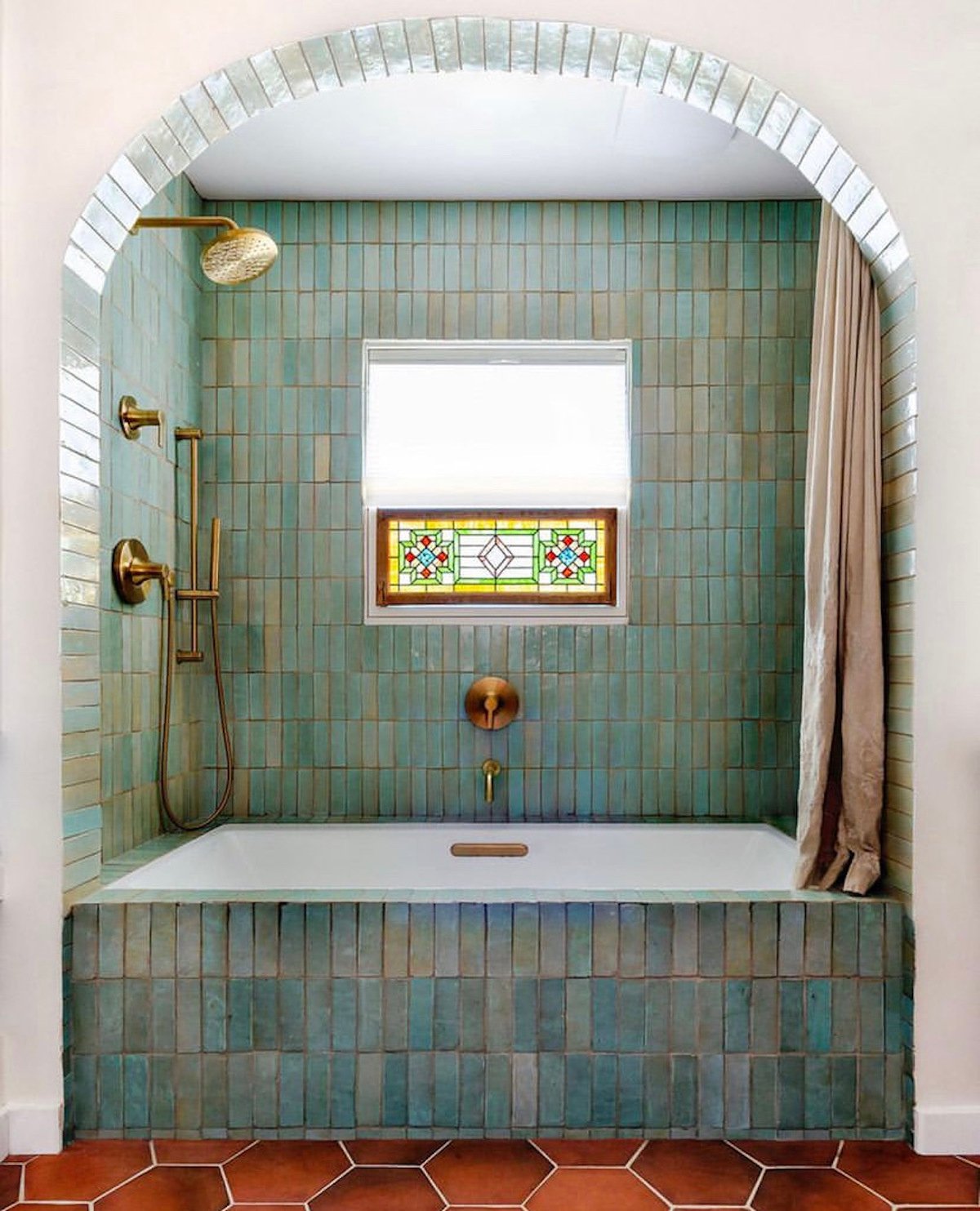
You probably wouldn’t have guessed from looking at the above photo, but the stained glass window was actually added after the renovation of this 1949 ranch-style bathroom. It instantly added charm to this awesome arched bathtub nook and compliments the nuanced blue/green colors of the zellige tile–proving that stained glass doesn’t need to be original to look intentional. The combination of the stained glass window, zellige tile, and Spanish-style flooring creates an old-world character that was completely missing before the renovation (seriously, you must check out the before!).
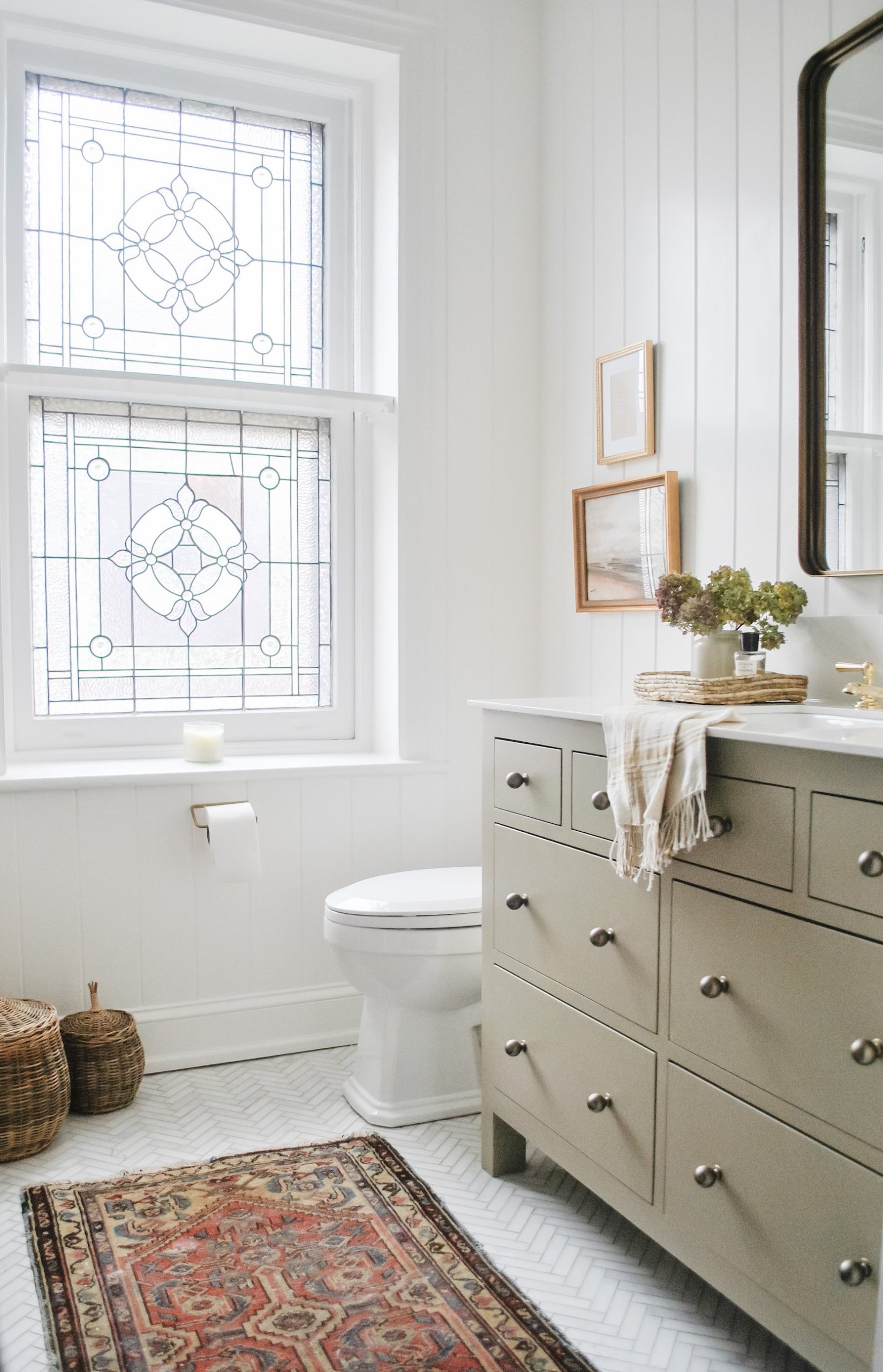
In this modern traditional bathroom, I love Libby Rawes‘ decision to keep the original stained glass window in her 1920s home. It preserves the character and charm, while the rest of the design choices lean more minimal and modern. Stained glass has been around for thousands of years so it inherently provides an antique look that is hard to beat.
And that’s all she wrote, folks. Which of these trends is your favorite? Are there any other trends you’ve been noticing that deserve a shout-out? Sound off in the comments. xx
Opener Image Credit: Design by ASOM Home | Photo by Corey Gibbons
THIS POST WAS ORIGINALLY PUBLISHED HERE.
