“I wanted to create something that hadn’t been done before while remaining timeless and luxurious,” says Rob Diaz, architect and designer of today’s epic home tour. It is a four-bedroom, five-bathroom, double A-frame home plus guest house in Studio City, CA that is rich with old-world charm yet carries a striking freshness due to the contemporary design. Fans of classic European-inspired interiors will adore this home, and the bright, airy California casual influence is just what we need to feast our eyes on while weathering this literal storm here in California. Let’s jump right in.
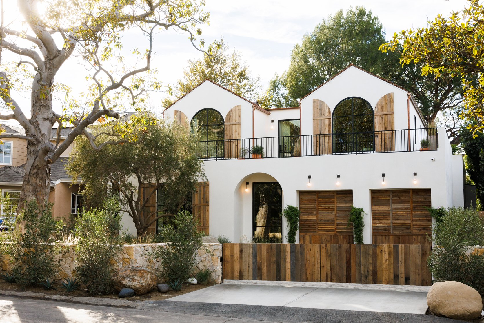
The exterior evokes a laid-back yet luxurious feel with the many arches, smooth stucco finish, and natural wood elements. It is warm and inviting, which is not unlike the interior of the home as you will soon see.
Regarding the style of the home, Rob informed me his vision was to create “a modern take on a French Chateau-style home and feature a mix of old and new design elements. The reclaimed French-tiled roof, cobbled decking, and vintage shutters and pots are beautifully juxtaposed with the copper gutters, louvered custom garage doors, and off-white Santa Barbara clay walls.“
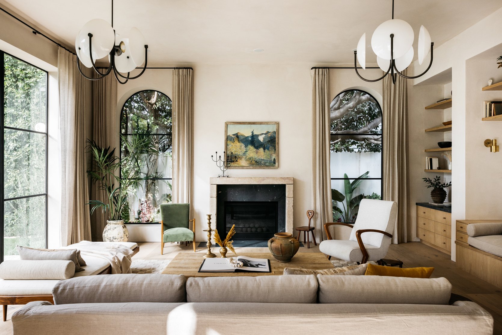
In the living room, you can sense the French Chataeu influence through the double-arched windows, neutral color palette, and the simple yet elegant styling. Sarah Brady, founder of The Platform Experiment, styled the home and knew she wanted to layer in a ton of awesome vintage pieces throughout the home. “I always start with vintage pieces,” she says. “I know this will be my grounding moment – the vintage piece tells the story and can dictate the rest of the room. The vintage element can often feel architectural in a space and once it has found its place in a room, the simpler modern elements are easy to build around it.”
The incredible 4-globe geometric light fixtures are by Allied Maker, and fit the space perfectly while adding a touch of glamor to the room. But Sarah’s favorite decor pieces here are the relic vessel on the coffee table and the vintage painting over the fireplace. They add just the right dose of old-world charm so this room feels layered, warm, and well-rounded.
The checkered area rug provides a modern flair that pairs so well with all of the contemporary architectural elements. This room evokes an elevated yet lived-in feel and the carefully curated pieces make the room feel anything but predictable. Did you notice the small art piece on the left wall? Its small scale and low placement are quite unexpected, which gives off a playful vibe. I also love the muted green velvet chair for a pop of color, and the vintage brown leather chair adds soul and warmth.
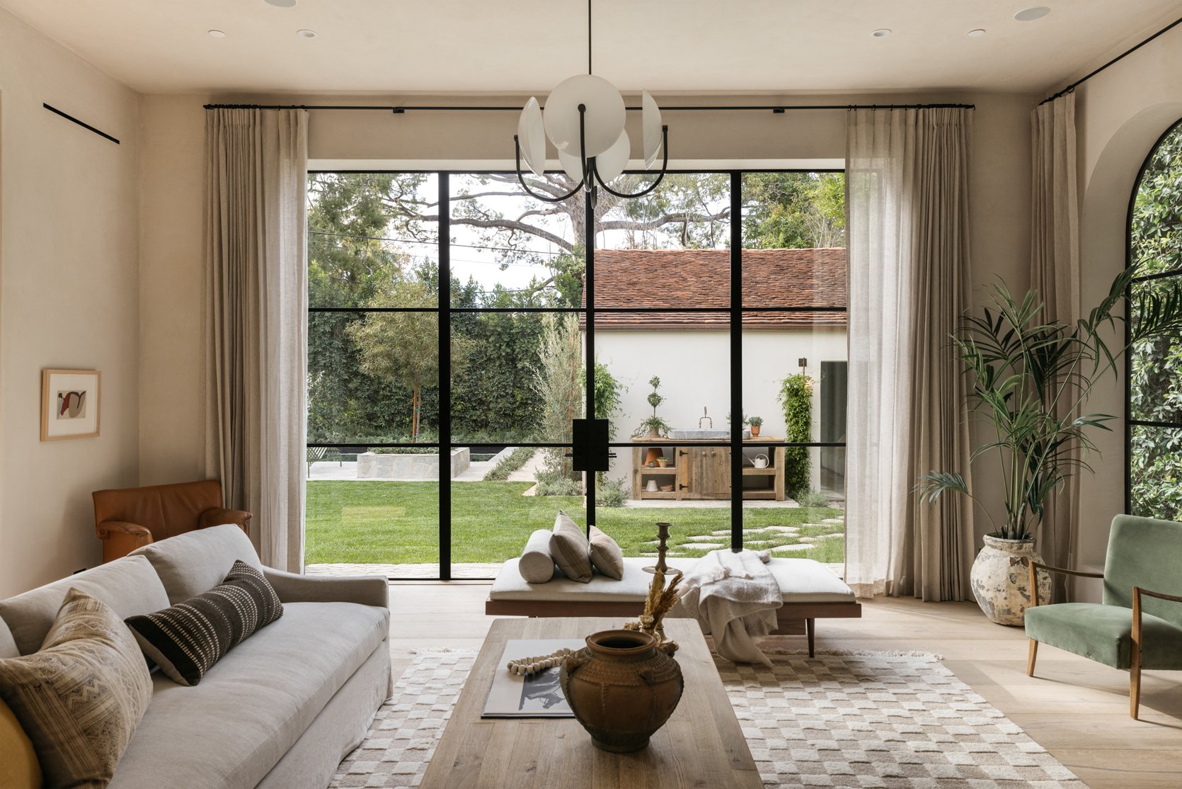
The living room opens up to the backyard via glass doors where the landscape lends to a relaxing, vacation-like ambiance equipped with a luxurious pool and guest house (more on that below).
When I first saw the photos of this home, I was immediately struck by the soft yet eye-catching wall color and texture throughout. Rob explained that the entire home features hand-applied clay from Clayworks USA which is why the walls in each room have a lovely, textural finish. The texture is smooth matte stucco-like material and gives the home warmth, movement, and of course, added visual interest.
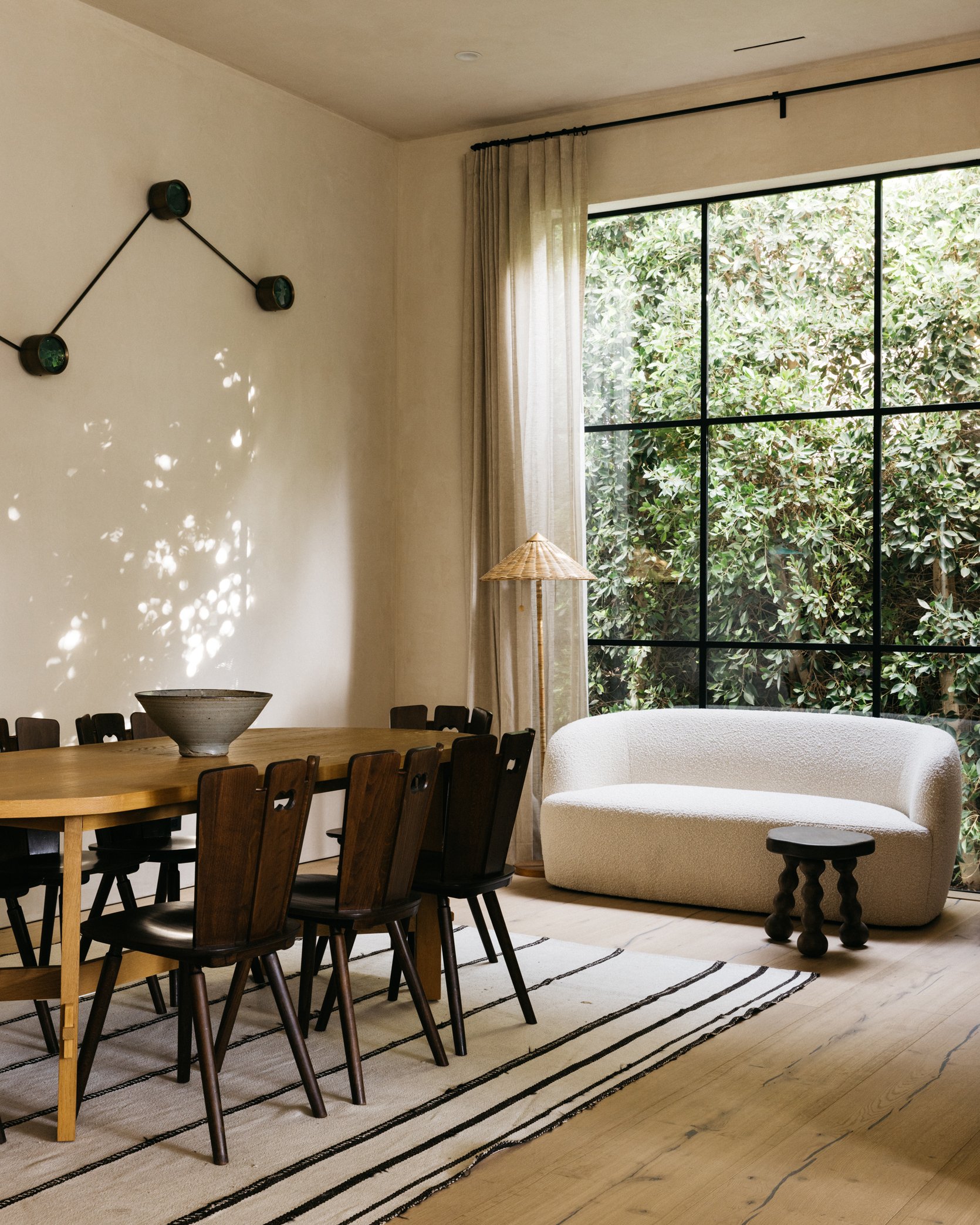
The formal dining area accentuates the relaxed European vibe and is furnished with a mix of incredible vintage and modern pieces. We love the wicker floor lamp and boucle loveseat which present fun textures, and the brutalist vintage dining chairs from Amsterdam Modern are impossible to ignore. The shape of the chairs put forward a sculptural element that elevates the room effortlessly. The dark rich tone of the chairs paired with the light wood table adds visual interest while the vintage rug grounds the space. For some movement and a hint of whimsy, the stool does the trick and really rounds out the room. This is what dining room dreams are made of, folks.
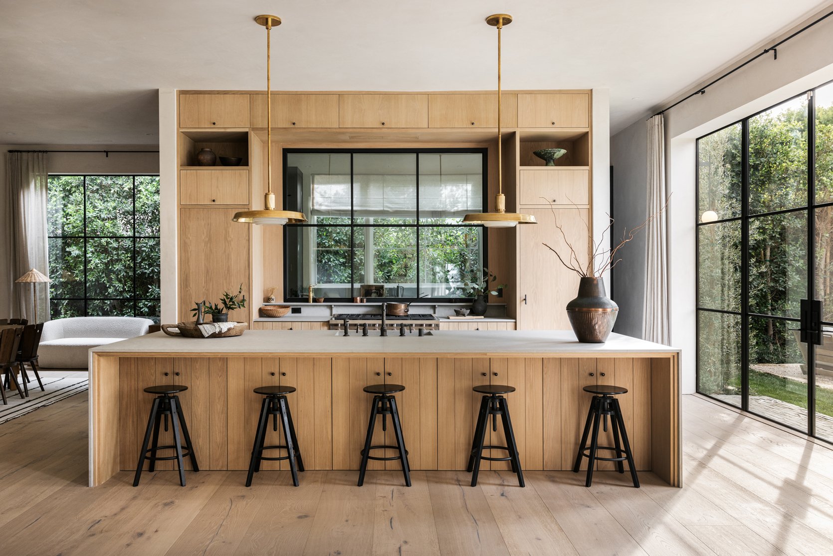
The kitchen is stunning yet understated, warm, and inviting which is no easy feat. The floor-to-ceiling cabinetry adds to this effect and of course, provides ample storage. I asked Rob who the maker of the cabinetry was and he explained, “The kitchen cabinetry was custom-made by our team’s in-house cabinet maker, and we used white oak cabinets throughout. Overall, we wanted to go for an understated, warm, and approachable feel for the kitchen.“
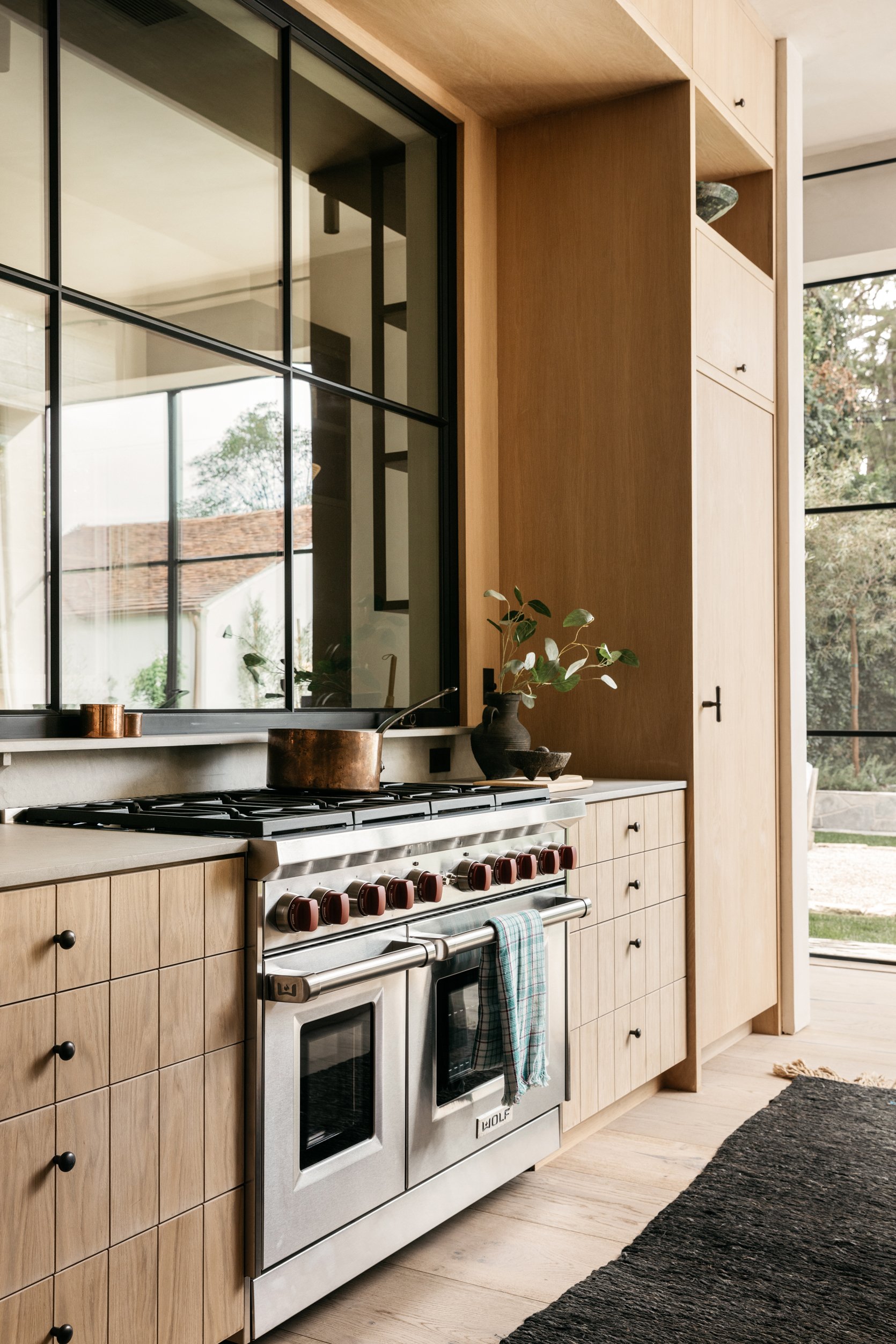
Up close, the cabinetry is even more breathtaking and we love the choice to include a subtle grid design on the lower drawers. This breaks up the wood and creates a tile-like effect which is very cool and unexpected.
Rob wanted the kitchen to feel seamlessly connected to the rest of the home, which is accomplished through the white oak cabinetry, matte black hardware, and neutral countertops. For a modern element and to keep the kitchen feeling open, a large steel Euroline window divides the primary kitchen area from the service kitchen.
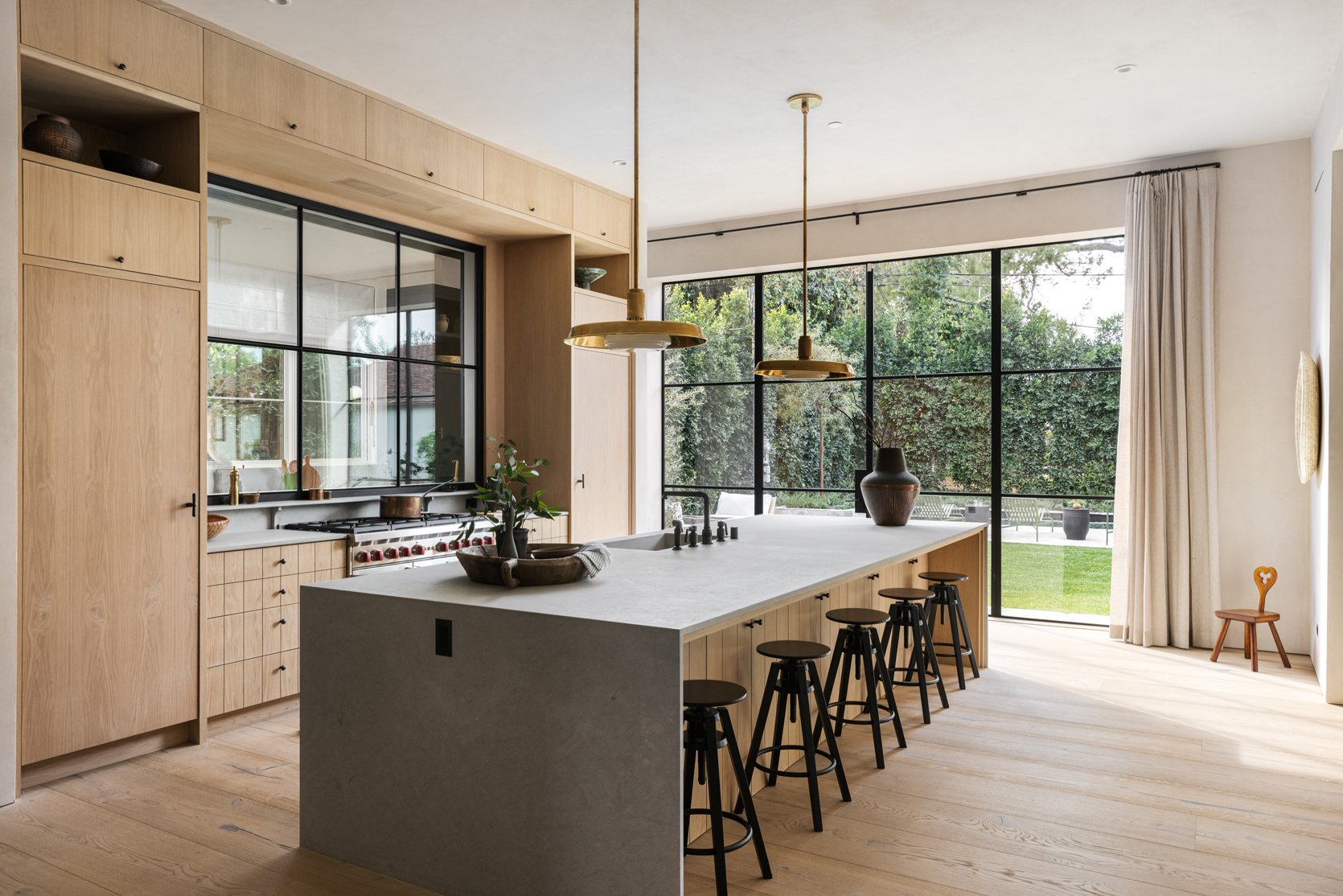
In addition to stunning cabinetry and architectural choices, the minimal styling drives the design home. Note the tiny stool in the corner that is extremely charming and whimsical, and the various vessels that provide a natural, organic aesthetic.
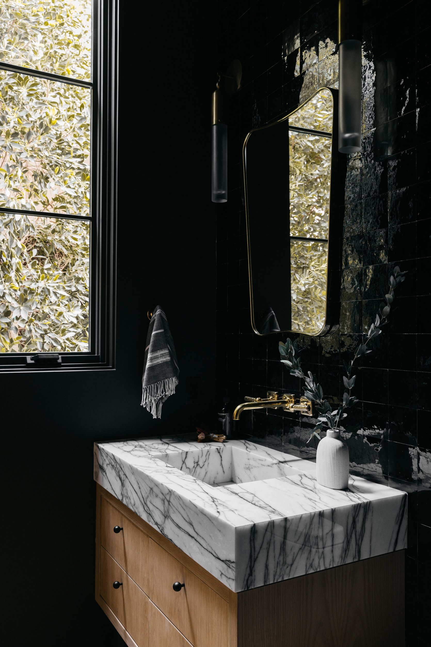
In the powder room, Rob selected two large, vintage Italian sconces and paired them with a classic Gio Ponti mirror and an old limestone sink trough. I love that they chose to go with black tile here, which provides a stark contrast to the neutral colors and warm tones throughout the home. We always say that powder bathrooms are a great place to experiment with color or pattern and make design risks, and this is a great example of that.
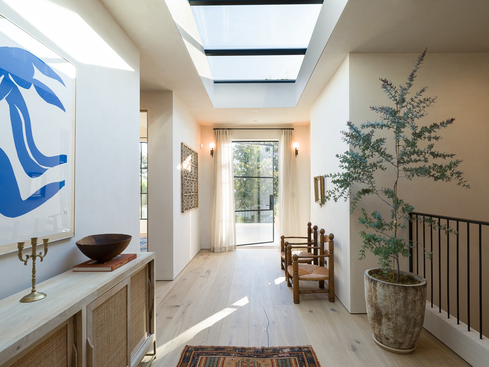
The upstairs landing has a ton of beautiful natural light due to the large skylight and glass door that leads to the balcony. I love that they added light curtains over the door, which provides movement and a bit of privacy. Also, the double vintage wooden chairs are awesome and add a lot of character.
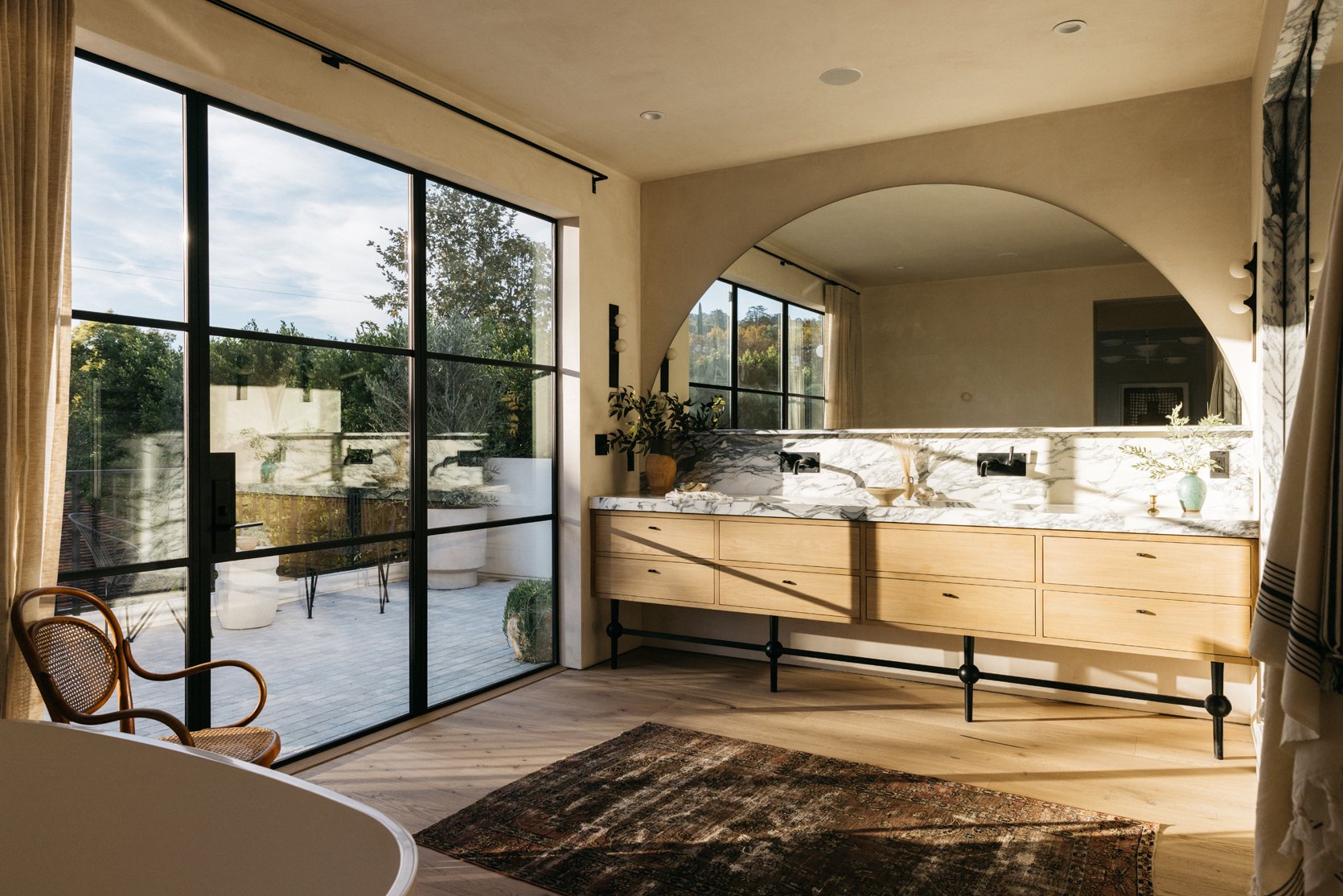
In the primary bathroom, the custom white oak vanity is accompanied by a custom marble countertop/backsplash and a large-scale arched mirror. I love that the mirror shape makes a statement but is not loud or overbearing, which parallels the design throughout the home. It gives this bathroom a very relaxing yet sophisticated feel.
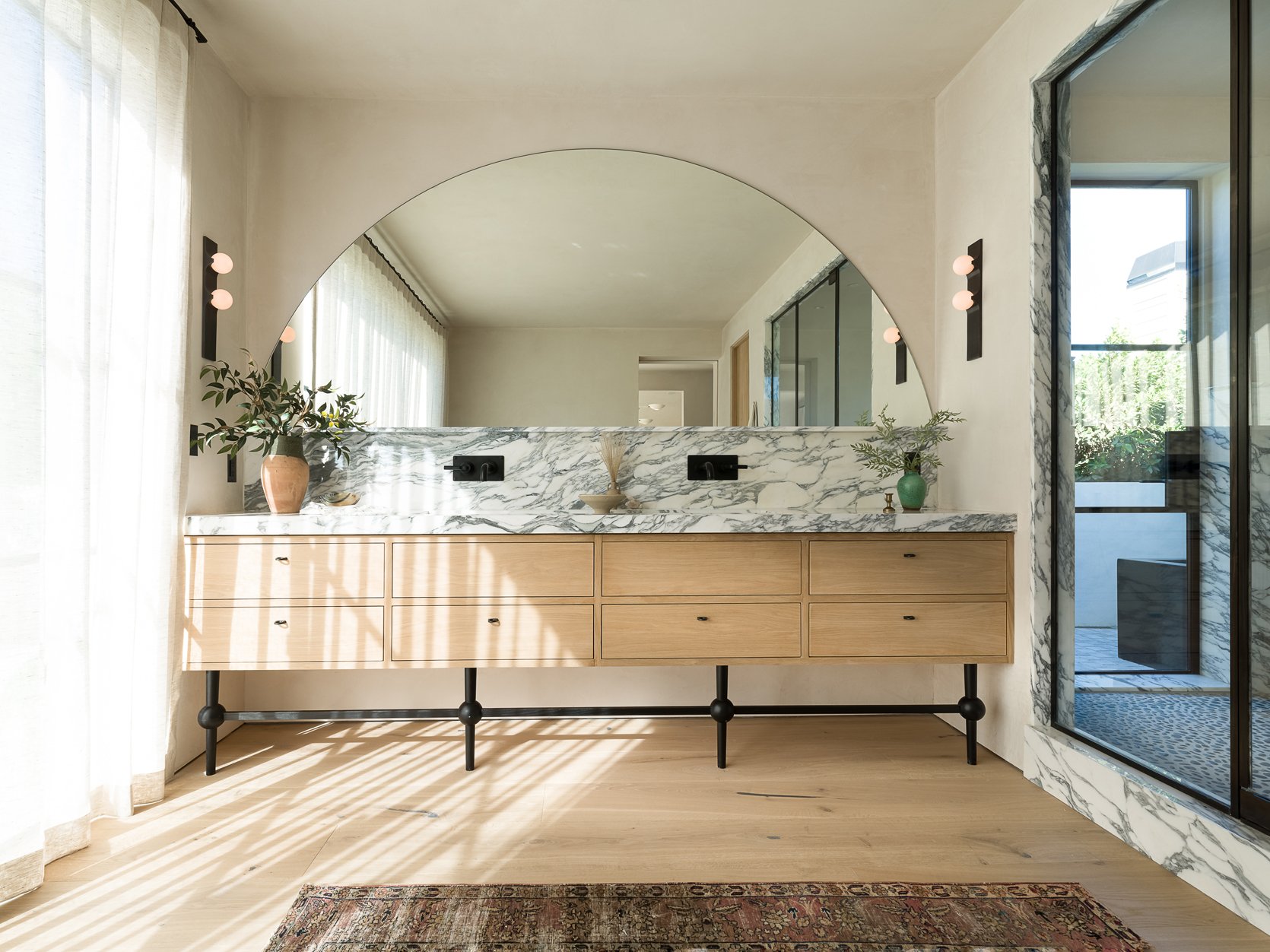
Let’s talk about those vanity legs. The matte black finish is very striking but the shape is of course what I love most. Breaking up the peg legs with circular knobs just gives this vanity an edge that contrasts the minimal elements throughout.
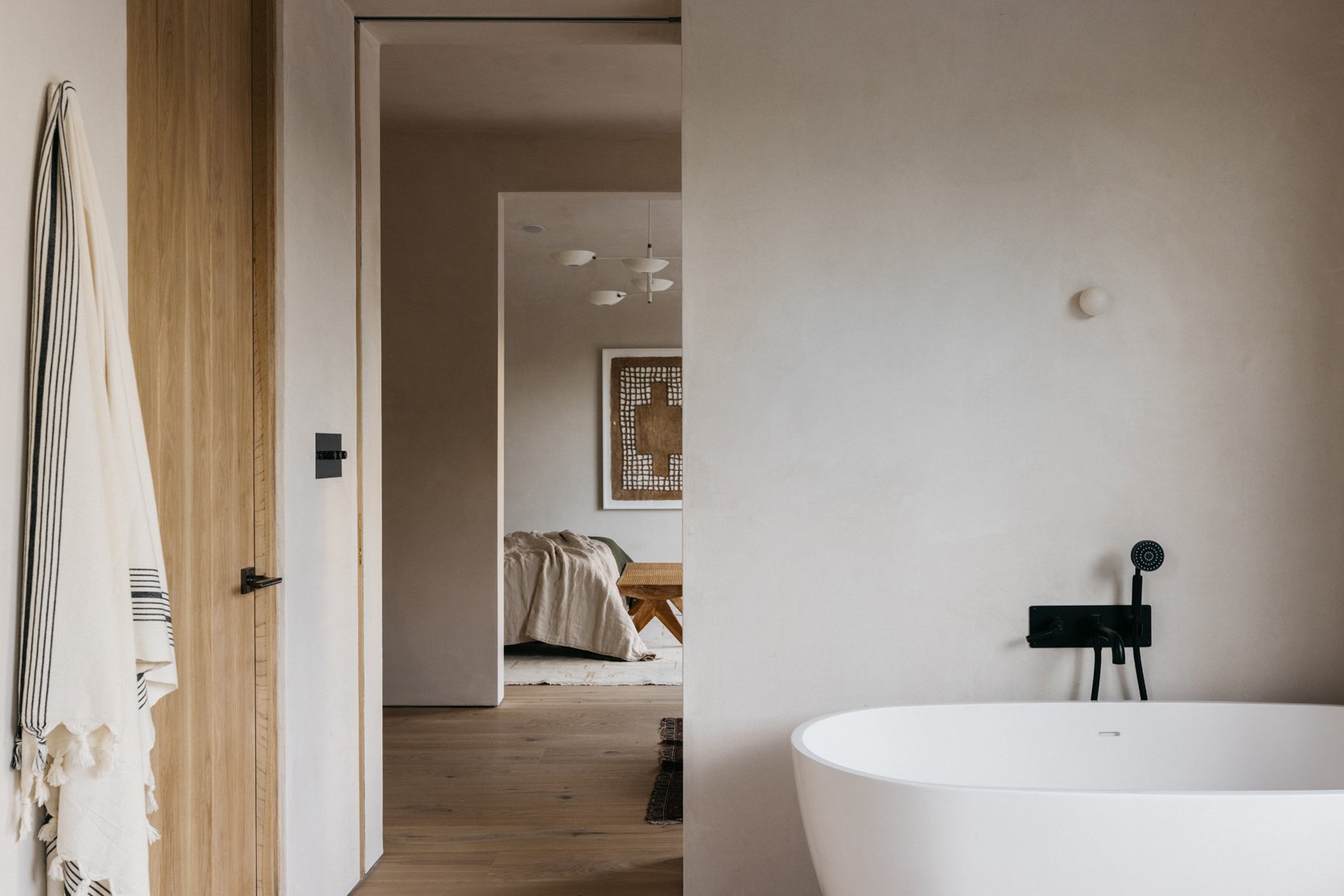
Opposite the bathroom vanity, a tiny bulb light over the free-standing tub is all this wall needs. I LOVE this choice and think it creates such a sophisticated yet unexpected look that is extremely cool and modern.
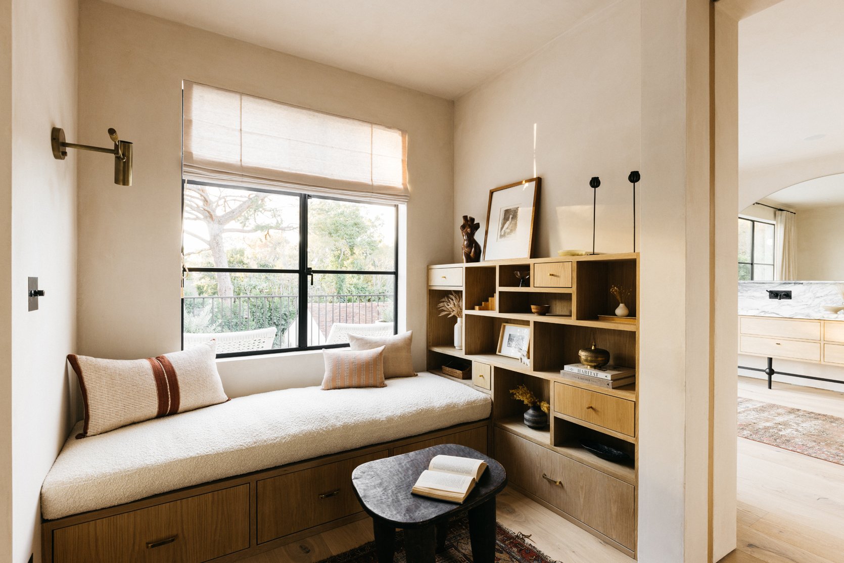
Outside the bathroom, there is this quaint reading nook equipped with a cushioned bench and storage unit. I love how they chose to furnish this small space so it can be used rather than let it become dead space.
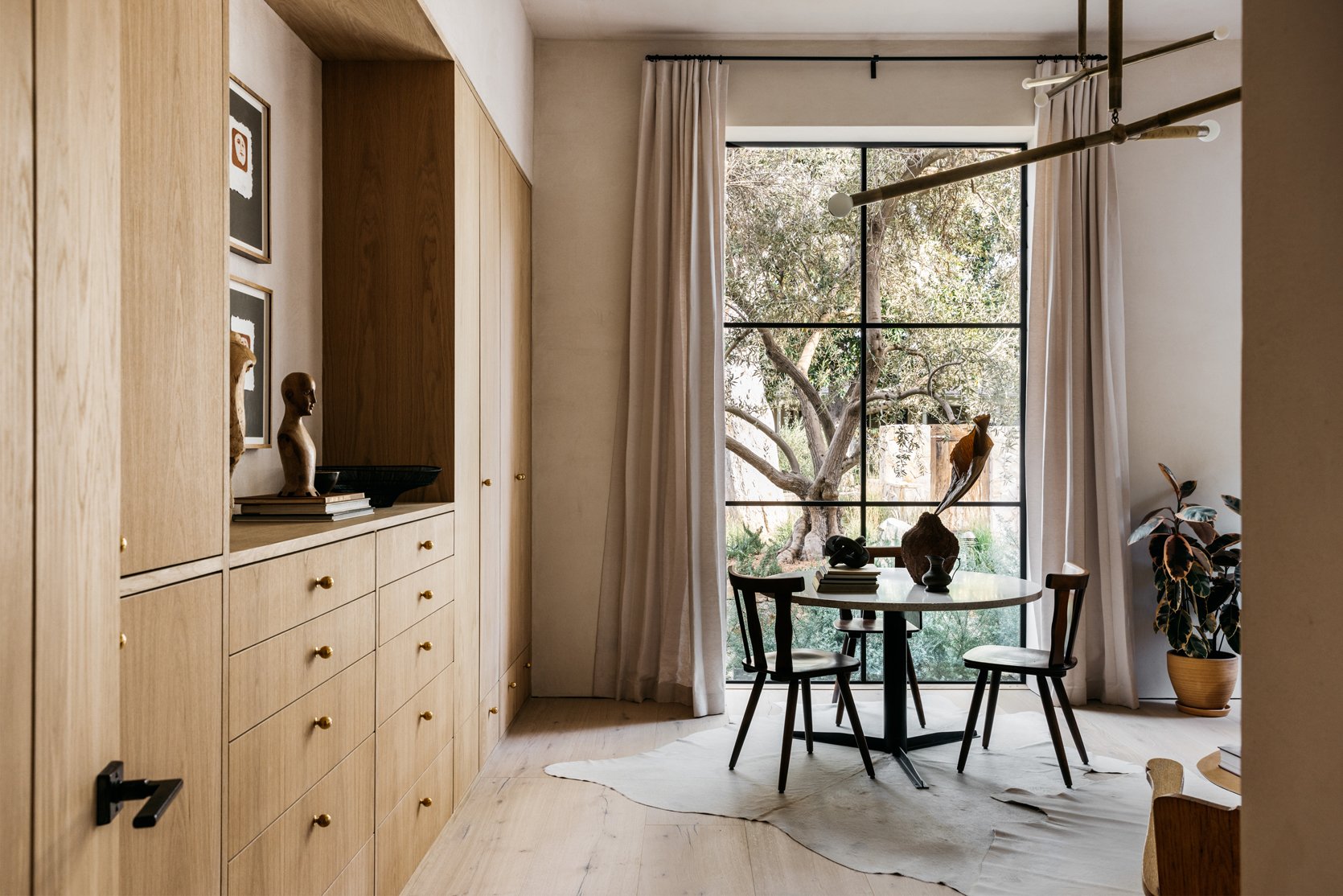
I am sure you have noticed by now that the lighting choices throughout the home are superb, so I had to ask Rob how he chose the lighting in a home of this size. He explained, “When it comes to lighting selection, I love using a mix of classic lighting and pieces with a twist of modern design. I picked several pieces from Apparatus Studio and RW Guild in the main living areas, but I felt that in the guest quarters, it was important to find the right scale and classic silhouettes for those spaces.”
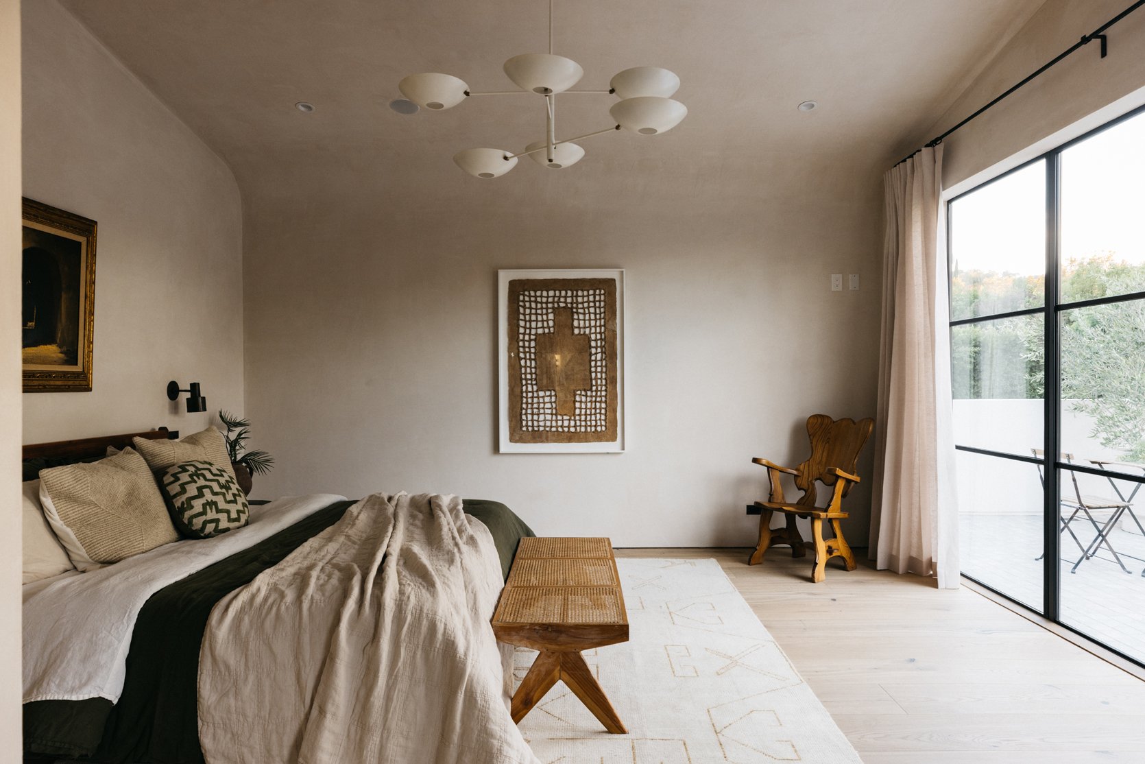
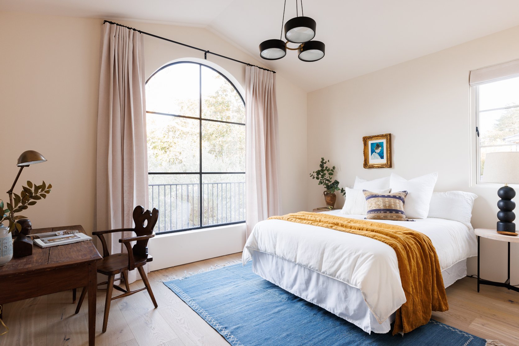
In the above bedroom, the choice to go with a sculptural multi-bulb pendant light accentuates the fresh modern style but is still quite understated so it pairs well with the vintage furnishings and decor.
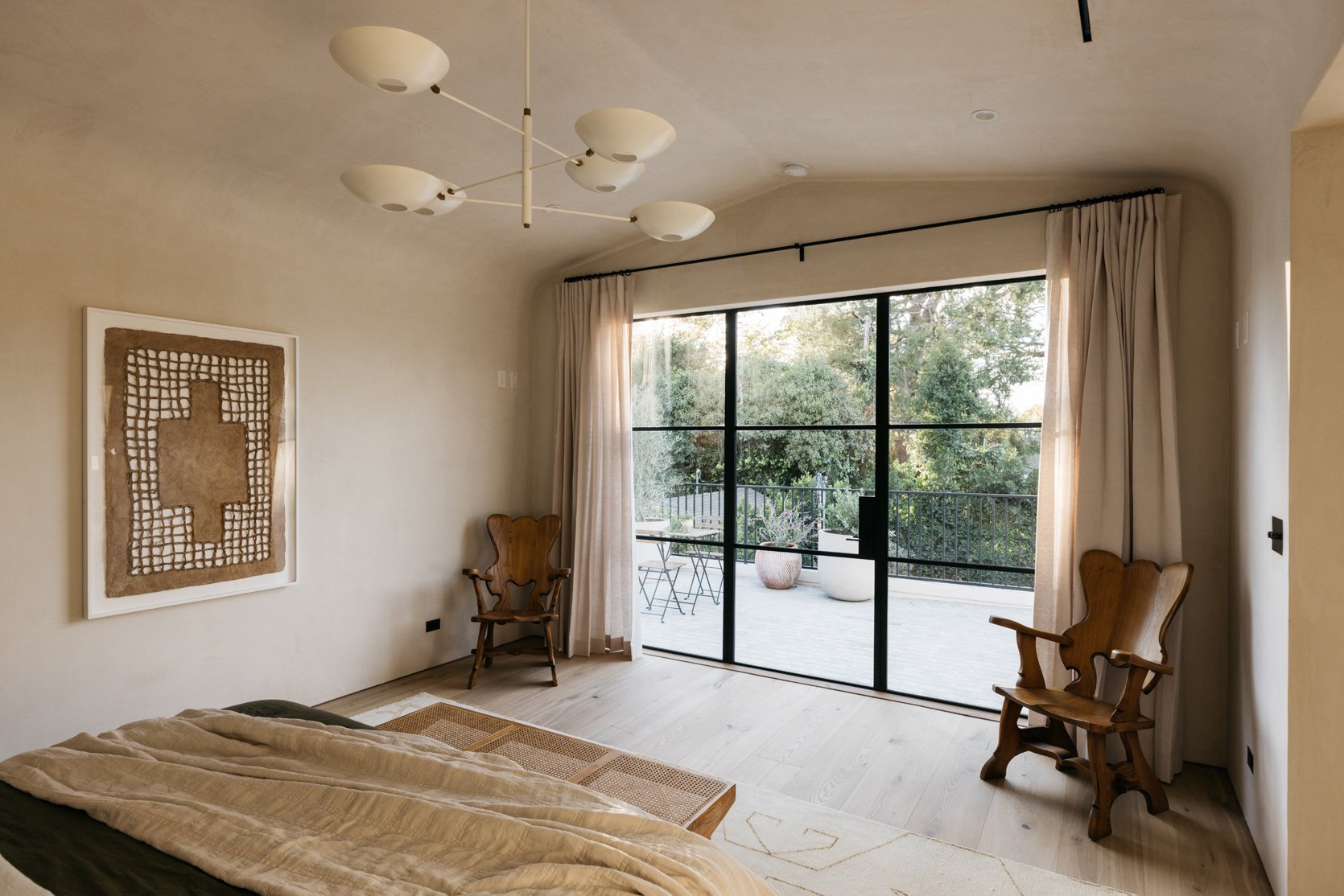
This room is a prime example of how Rob and Sarah nailed the mixing of old and new elements. The pendant light is modern and sculptural and is grounded by the two wooden vintage chairs. The windows are contemporary and the walls and vintage oil painting above the bed provide a warm, old-world aesthetic. Finally, the color palette is driven home with the bedding and that incredible art piece above. It is all SO good and I would die for those vintage chairs.
When it came to styling, Sarah truly felt led by the beauty of each room. The textured walls, the elegant yet edgy lighting, and the natural sunlight streaming in from all the windows created a beautiful backdrop for her to layer decor that would only emphasize the elegance of the home.
I love how in this bedroom she took a different approach with white bedding and added pops of color with the blanket and rug, then included vintage furniture for charm and character. And again, a small-scale art piece is hung low on the wall which will always be one of our favorite unexpected styling choices.
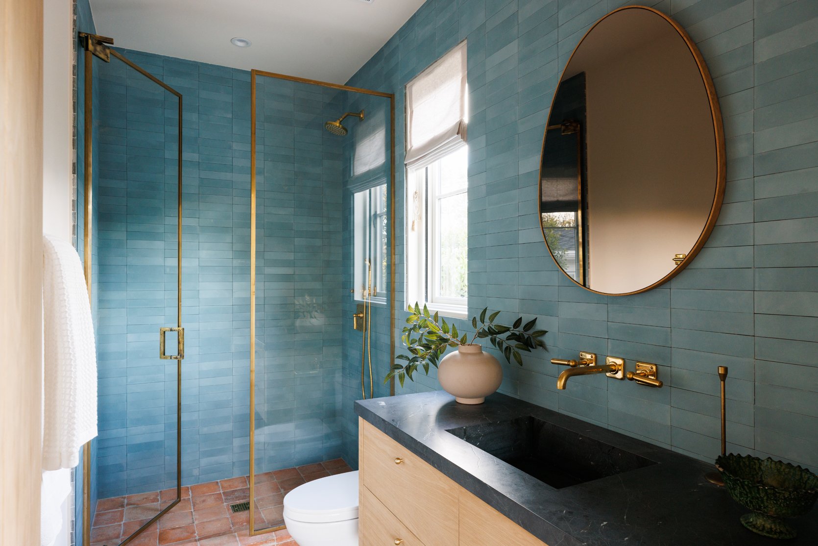
More color comes into play in this bathroom with floor-to-ceiling blue zellige tile and Spanish-style floor tile. As is always the case with zellige tile, the color and texture varies tile to tile, creating a nuanced look. But what is perhaps most striking here is the choice to go with a brass wall-mounted faucet, rather than matte black which is what we have seen throughout the home. It creates a luxe look that is really striking.
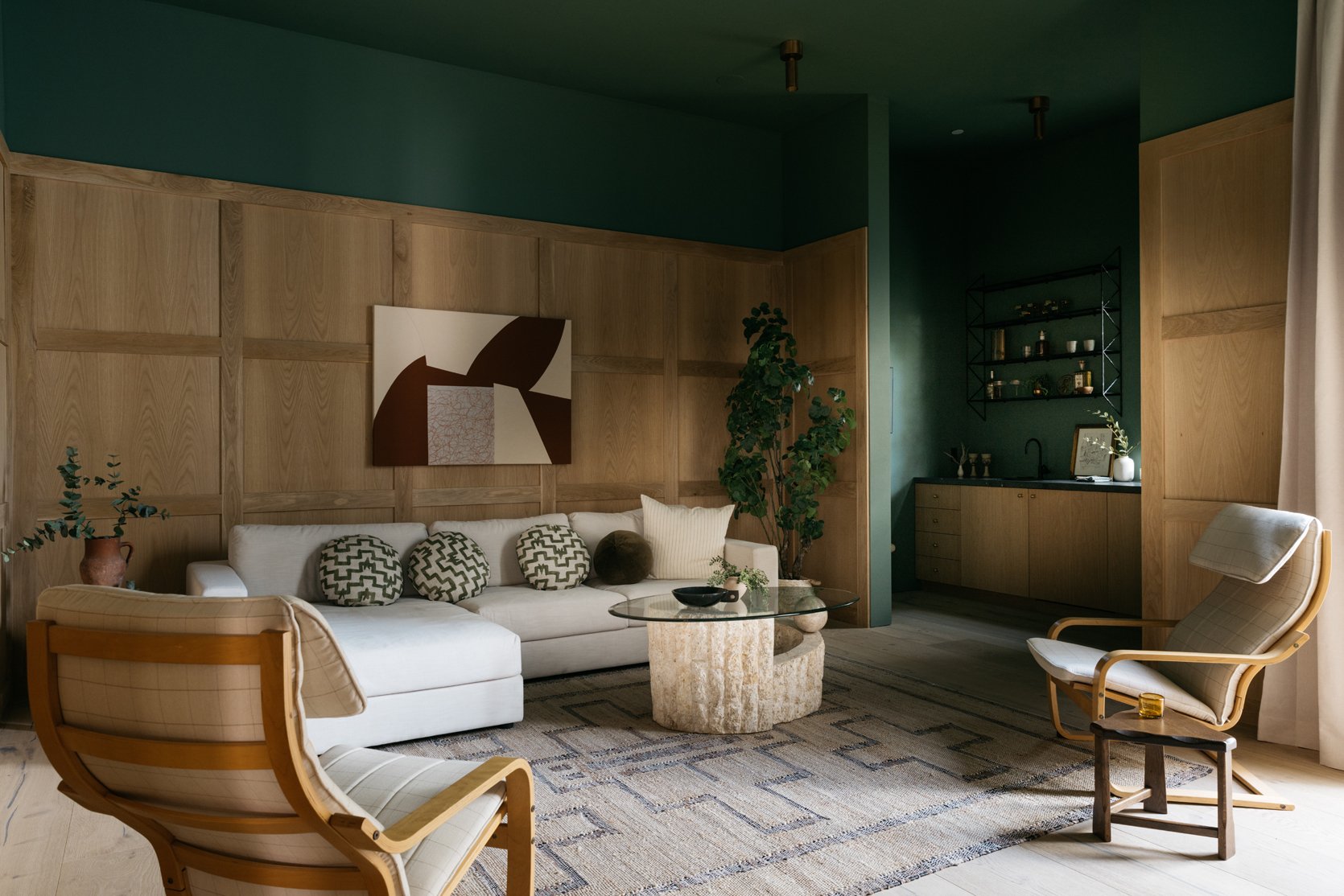
Here we have the architect’s favorite room in the home and it’s not hard to understand why. It is a den that has its own courtyard and bar area and has its own style that feels separate from the home. “The space feels tucked in, serene, and feels like a private retreat from the rest of home.” says Rob. “The mix of the oak, green ceiling, and Apparatus downlights, which flood perfectly are my favorite design elements of this space. “
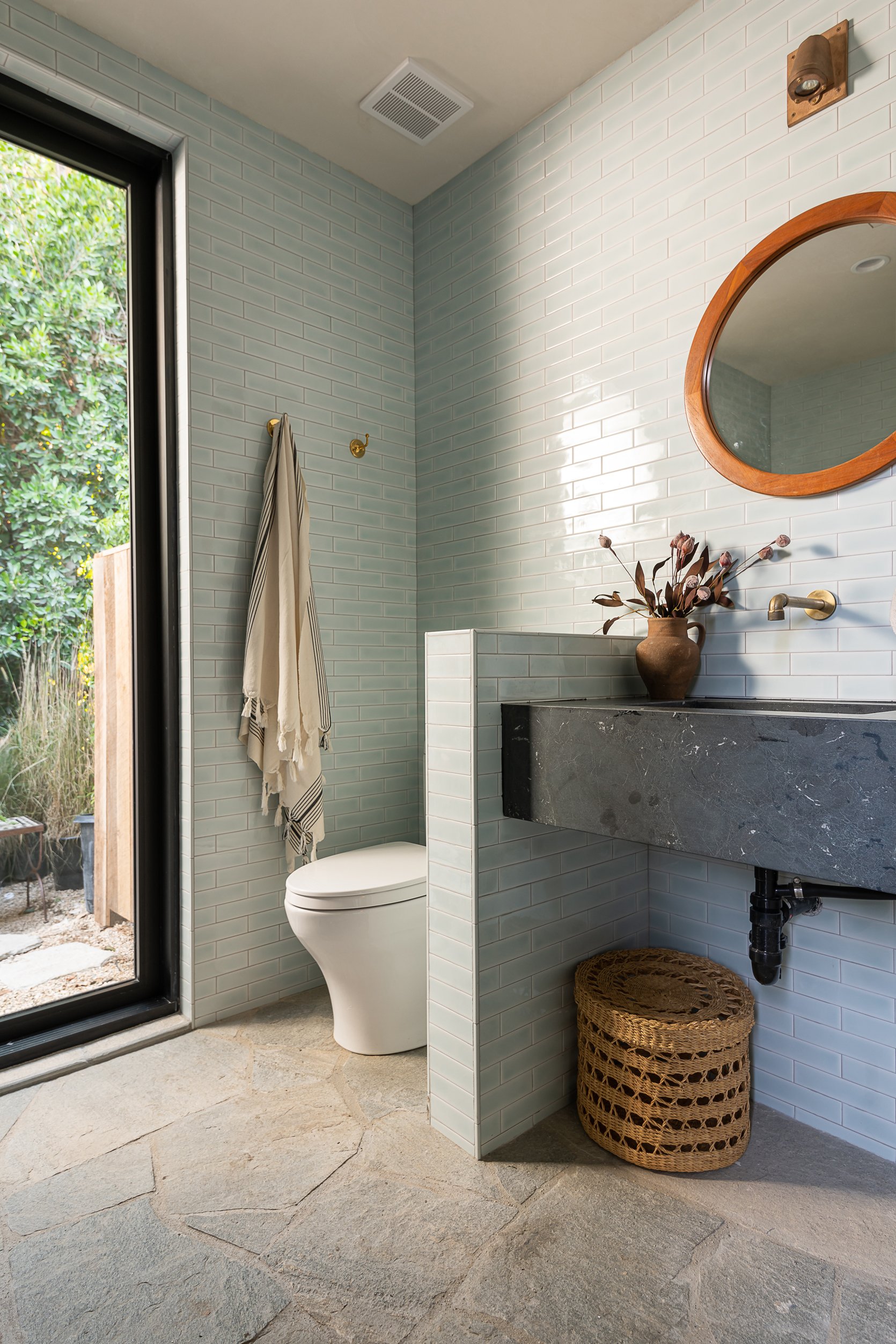
Natural stone flooring in this bathroom creates an organic aesthetic (and perhaps it is worth mentioning that stone flooring might just be another bathroom trend for 2023??). I just love the stone paired with the light blue subway tile and would love to see this trend take off.
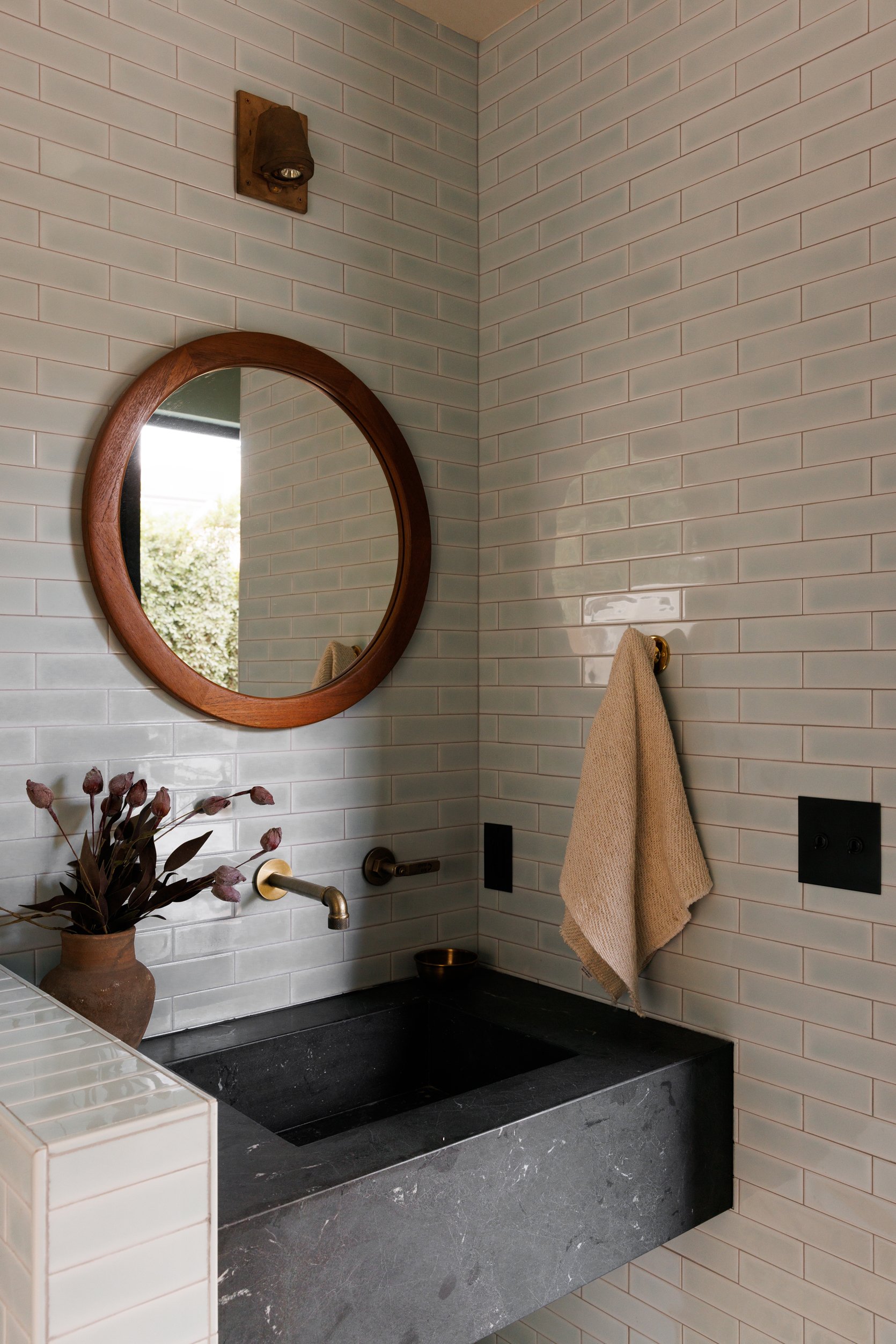
Over the sink, a vintage wood mirror adds warmth that contrasts with the cool tone of the tile, and the vintage micro sconce adds character and depth to the space.
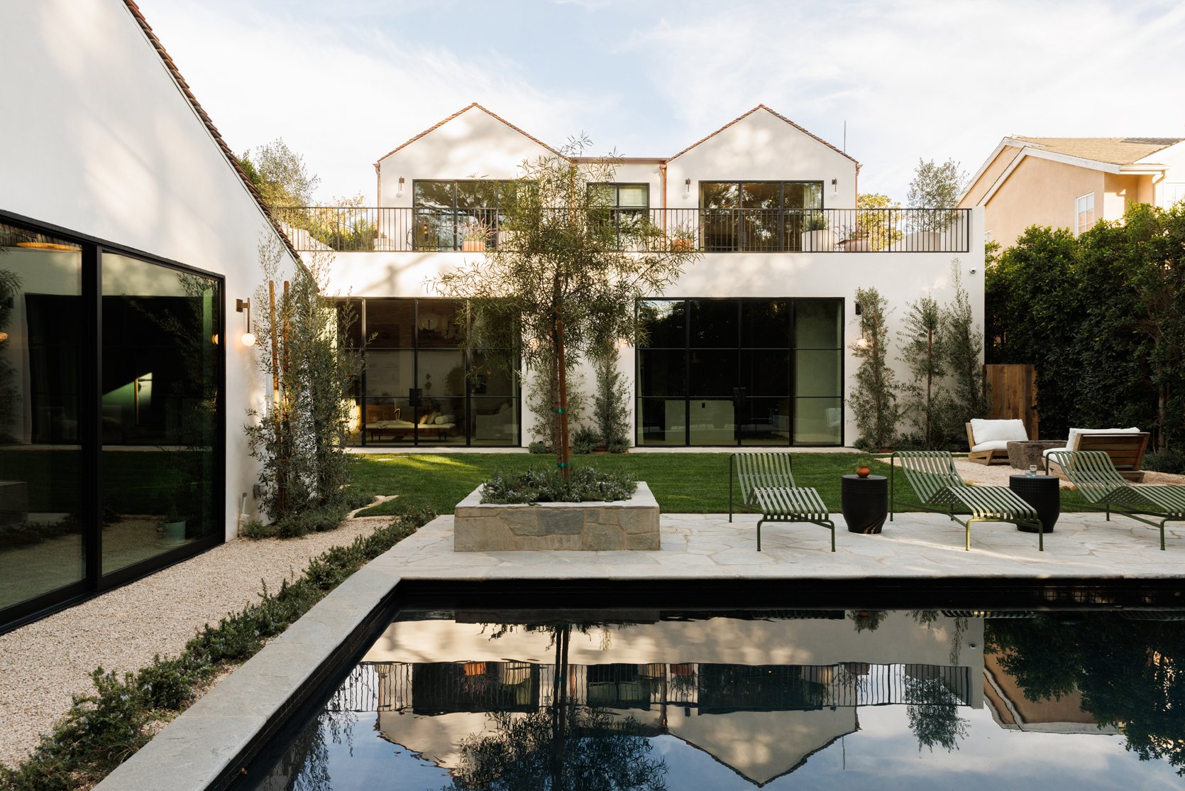
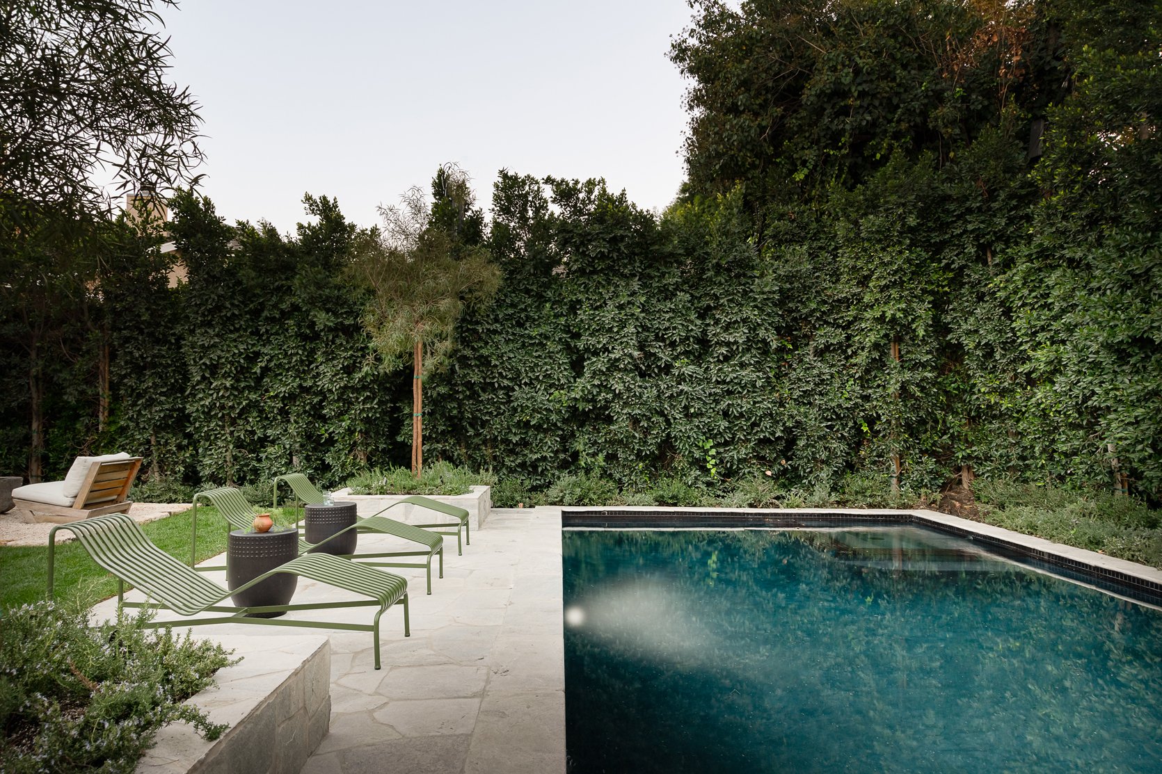
Quite unsurprisingly, the backyard is equally luxurious as the interior. The landscape was also done by Rob Diaz so there is an apparent continuity between the exterior and interior. I imagine you feel drawn to the outdoors when in the home, especially with the large windows on both floors that I am sure will beckon you outside.
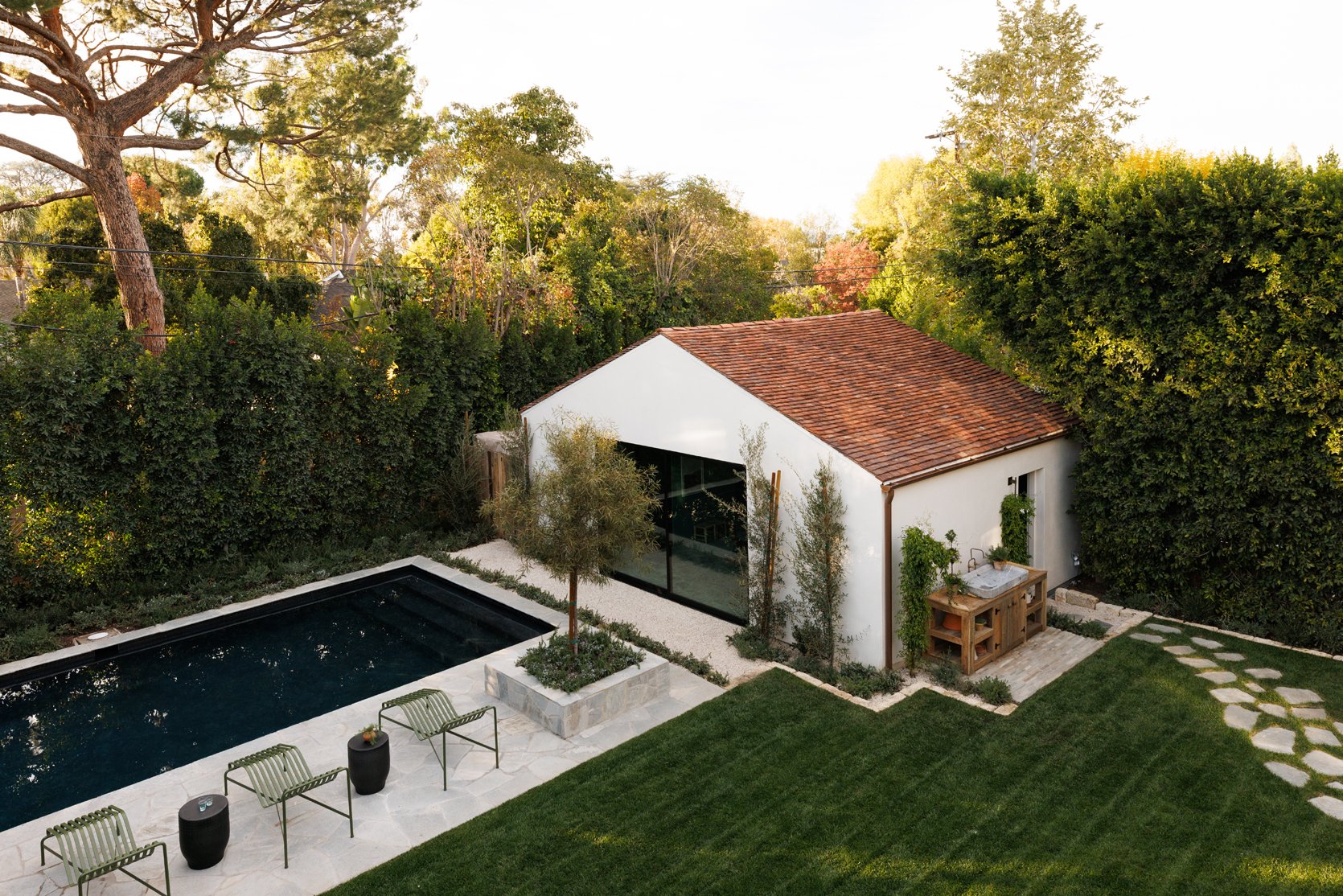
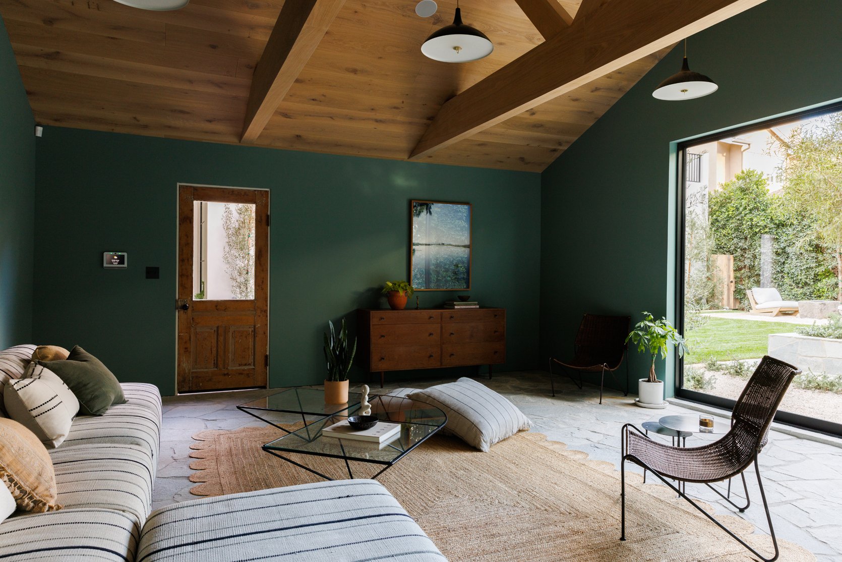
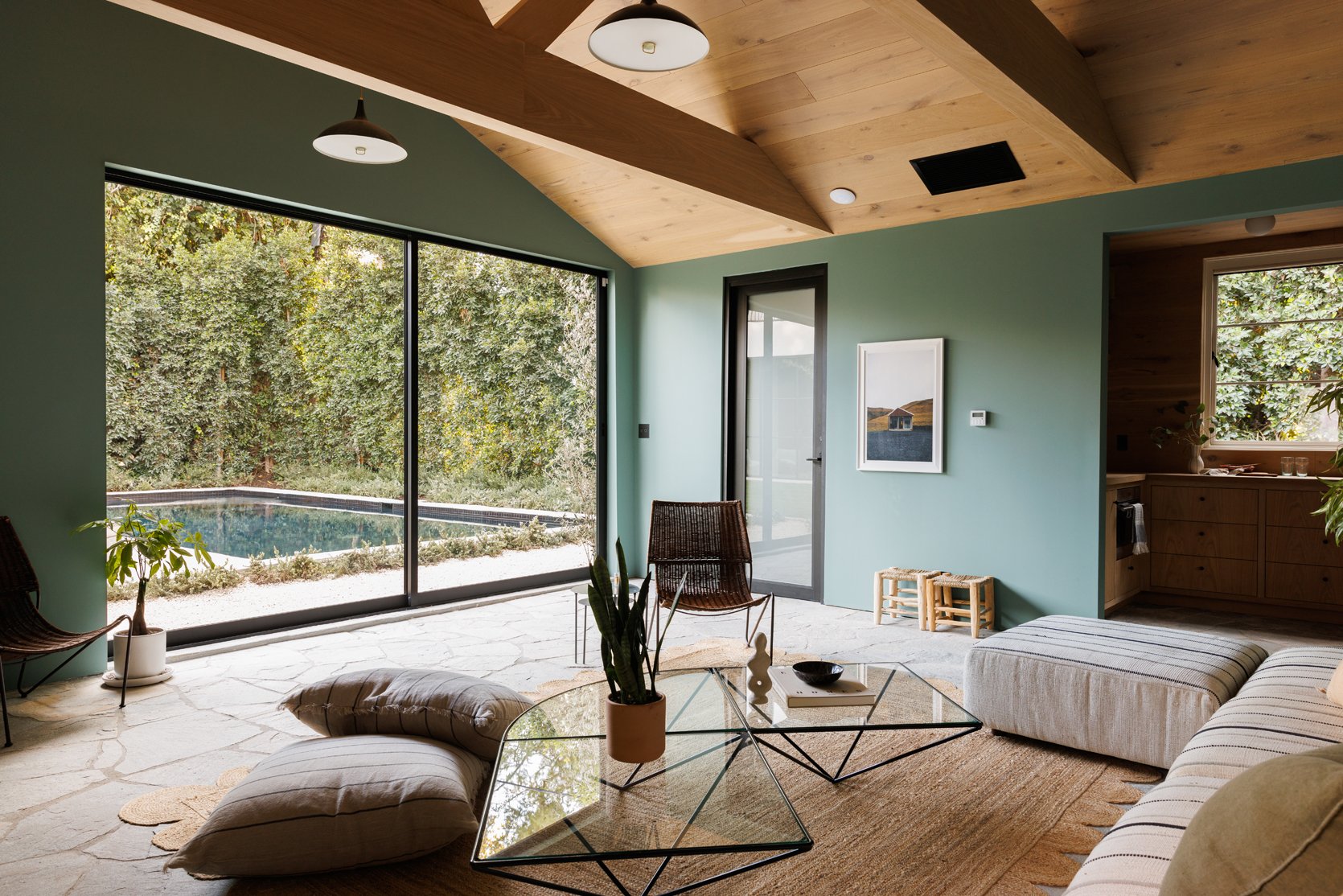
On the last stop of the tour, we have this colorful guesthouse that lives poolside. I love that the design feels very different from the interior of the home but still carries the same elements. The green walls and wood ceiling are grounding and calming and give off a sort of outdoorsy, NorCal aura. But overall, the decor is neutral and minimal, and again strikes the perfect balance between old and new.
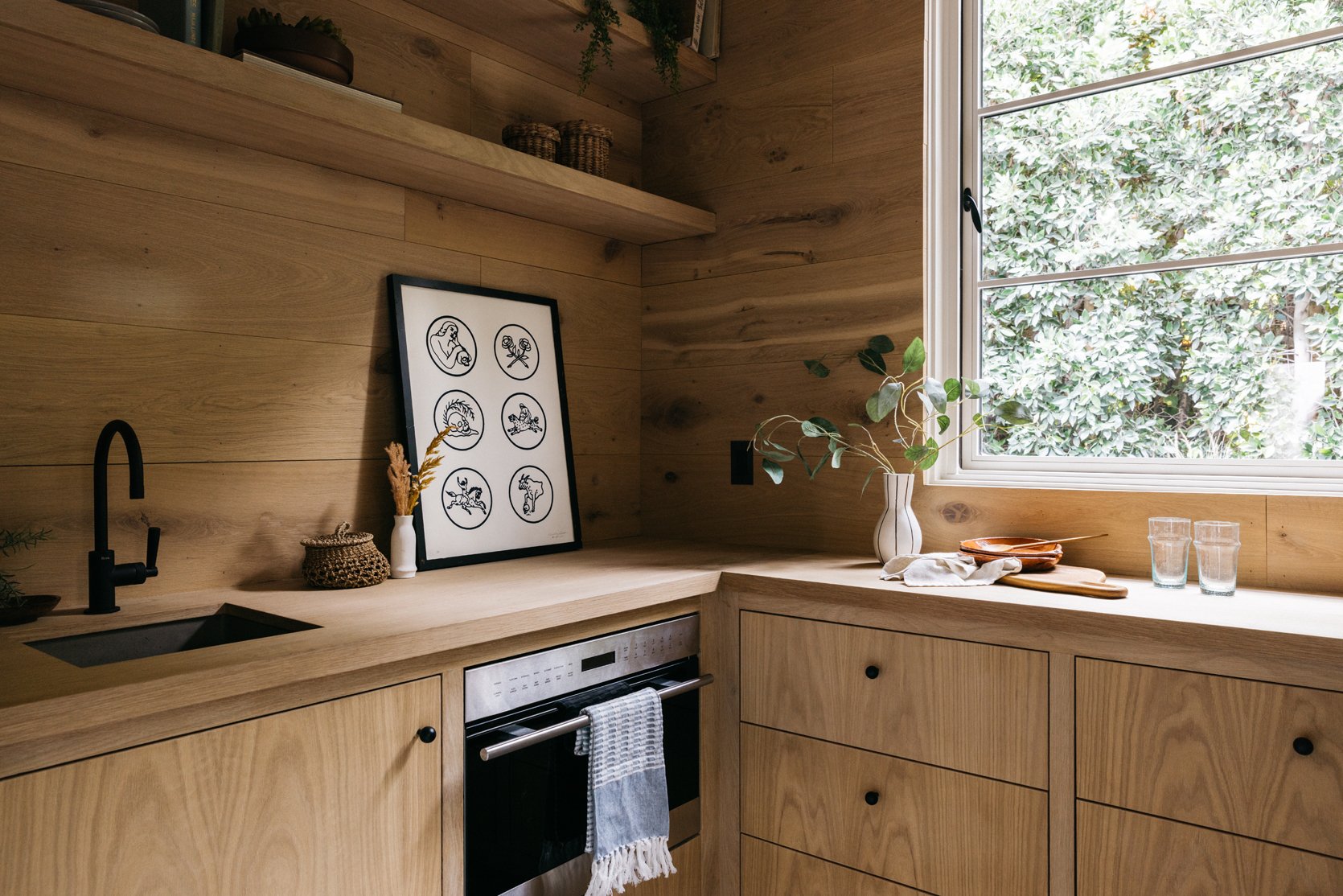
To end our tour, we have this kitchenette that is fully clad with beautiful oak wood. The wood and matte black finishes are reminiscent of the kitchen in the main house, which creates a lovely continuity between the two houses. The leaning modern art piece is just the styling moment this space needed to accentuate the playful, sophisticated, modern meets old-world style that Rob Diaz and Sarah Brady are clearly experts at achieving.
*Design by Rob Diaz Design & Anastasia Ratia, Builder: Diaz + Alexander Studio
**Styled by Sarah Brady of Platform Home
***Photos by Virtually Here Studios & LA Light Photo
THIS POST WAS ORIGINALLY PUBLISHED HERE.
