From Emily: I’ve been a MASSIVE fan of Ben Medansky’s for years and years – his sculptures are so provocative and full of such spirit. I forget if he reached out to me or vice versa, but he invited me over to his home, and I was immediately blown away by every inch of it. Like a true artist, there was this sense of unbridled creativity, yet in a way that was still totally livable. I wish there were more homes of creatives that we could take our kids to because exposing them to homes like Ben’s that are full of color, whimsy and so much quiet rebellion is wildly inspiring. I hope you love it as much as we do.
Hello friends, Ryann here to be your virtual guide through yet another stunning home tour featured in Emily’s book, The New Design Rules. As Emily prefaced above, you are about to get a glimpse inside the home of Ben Medansky, and not unlike his art, his home is endlessly inspiring and encompasses bold uses of color with a breathtaking mix of modern and vintage elements.
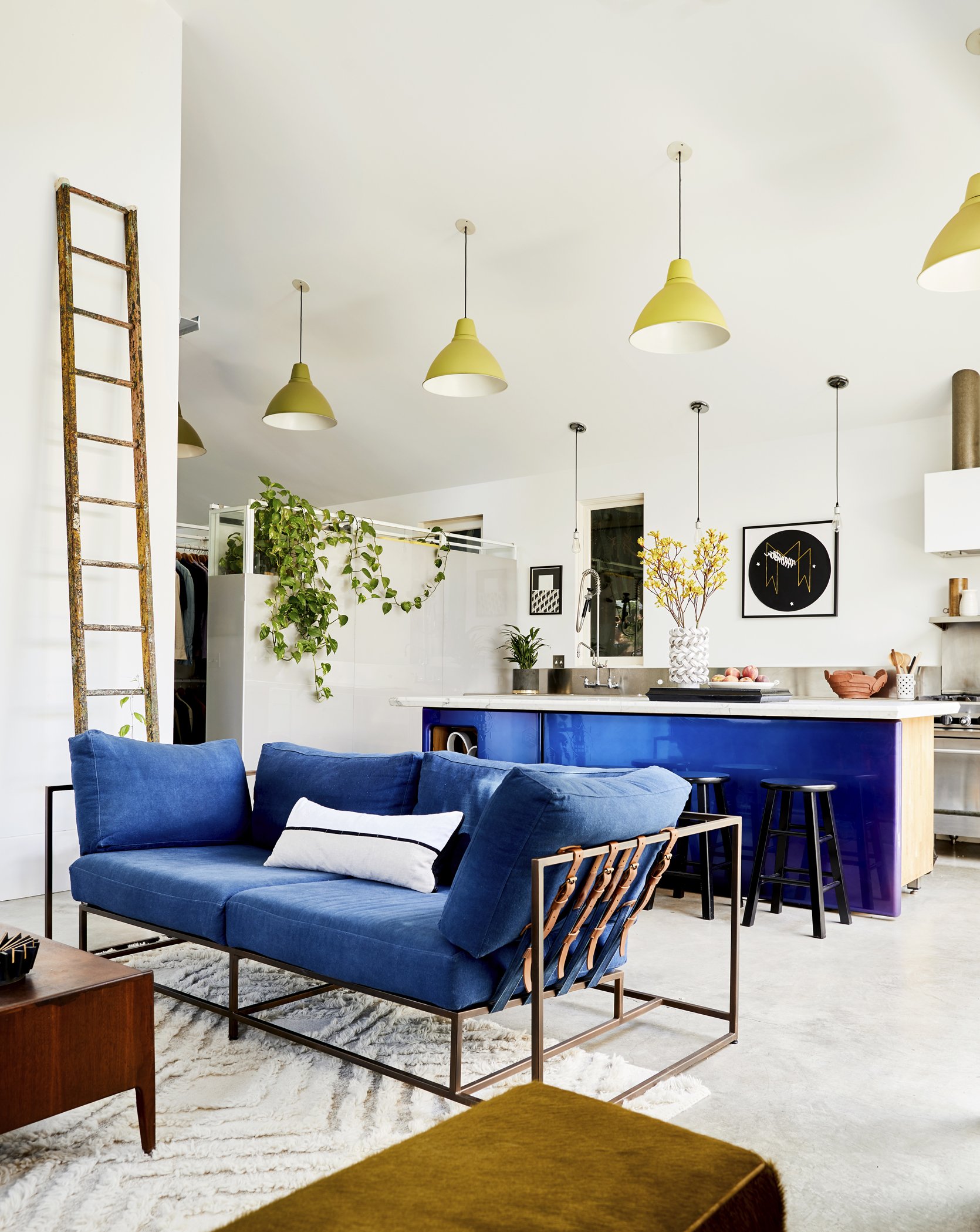
One of the many things I am so drawn to about his home is how effortlessly the Mid-century modern furniture blends with his contemporary art, pops of bold color, and notes of industrial influence. It comes across as effortless, but anyone who has dabbled in mixing styles knows this is far from easy to do so. There is a noticeable balance between different styles and colors that creates a highly lived-in, personal feel.
This room is one of my favorite examples of how to create a space that is personal and straightforward, yet totally unexpected and creative. Despite the amazing use of bold color, this home isn’t maximalist and despite the white walls and wood tones, it isn’t minimalist either. It toes the line between both by perfectly balancing bold modern elements with understated timeless decor. Not surprisingly, this is also mastered through his displays of art (some his, some by friends of his).
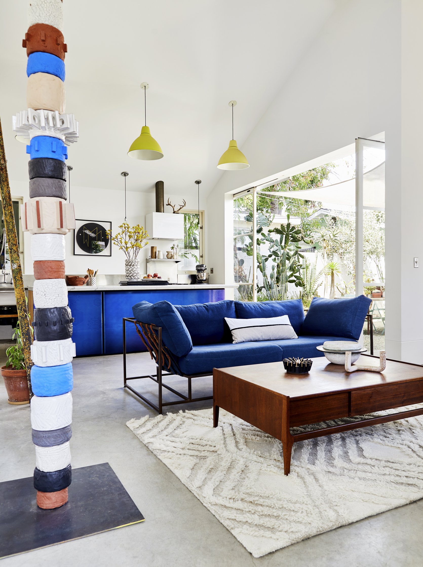
If you are already familiar with Ben’s art (and if you aren’t yet then consider this your introduction), you probably guessed that the awesome ceramic totemic piece is one of his. He made this one for himself and I really love how perfectly it suits this room. The colors play off the rest of the decor and furniture, it adds a lot of texture, and the height is crucial to draw your eye up to the incredible high ceilings.
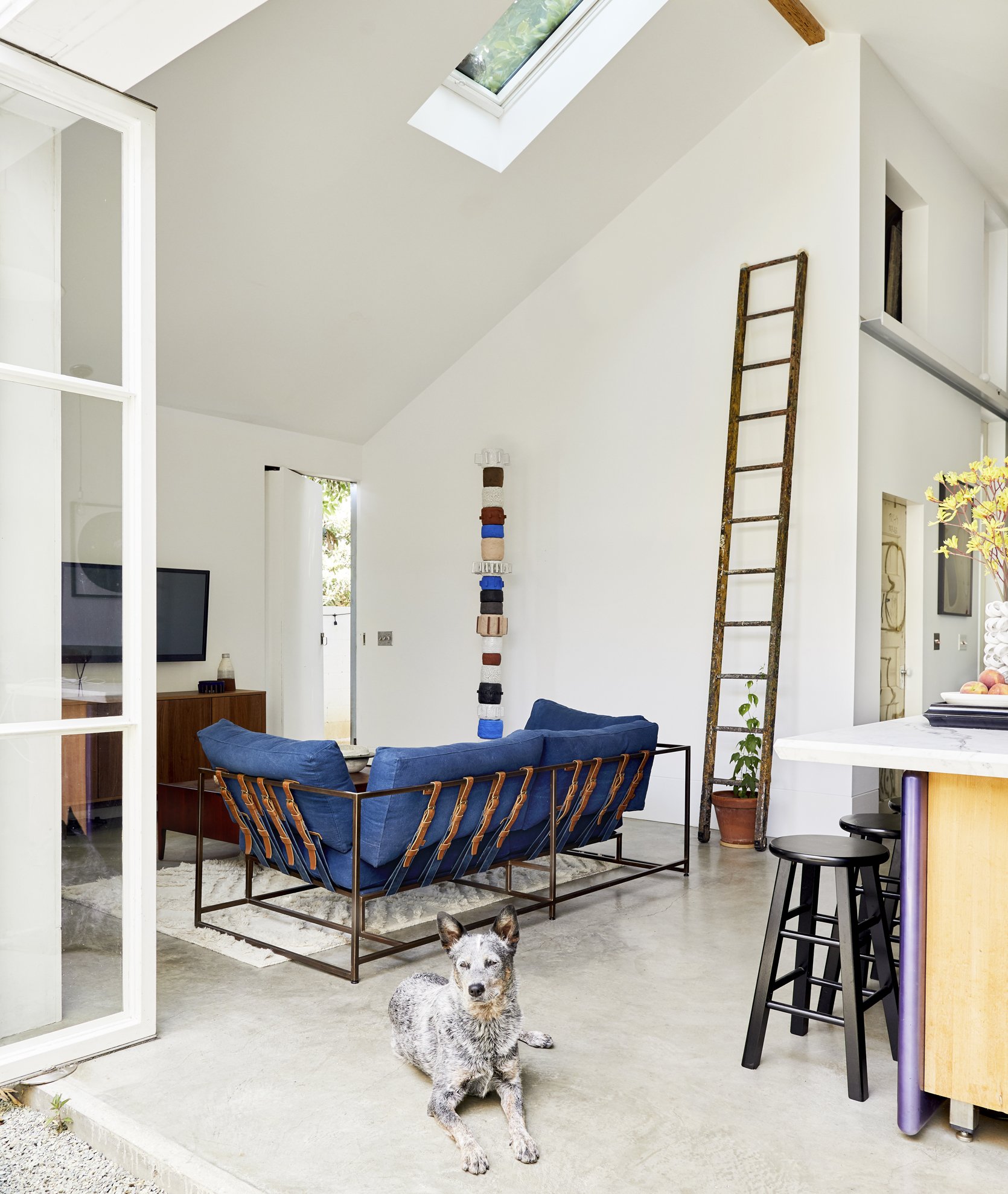
When it comes to living room layouts, having the back of the sofa face out toward another common area is not the most ideal but sometimes it is the only layout that makes sense (which is obviously the case here). A hack we normally suggest when this is the only option is to drape a blanket or vintage fabric over the back of the sofa to create some visual interest. But clearly, this sofa has no need for such a hack. It is an extremely special piece by Stephen Kenn with a metal base and leather belt strappings to keep the cushions in place. It’s functional art as far as we are concerned, so hiding the back of it against a wall may as well be a crime. Luckily, this living room calls for the sofa to “float” out in the open so we all can enjoy a full 360-degree view of the stunning sofa.
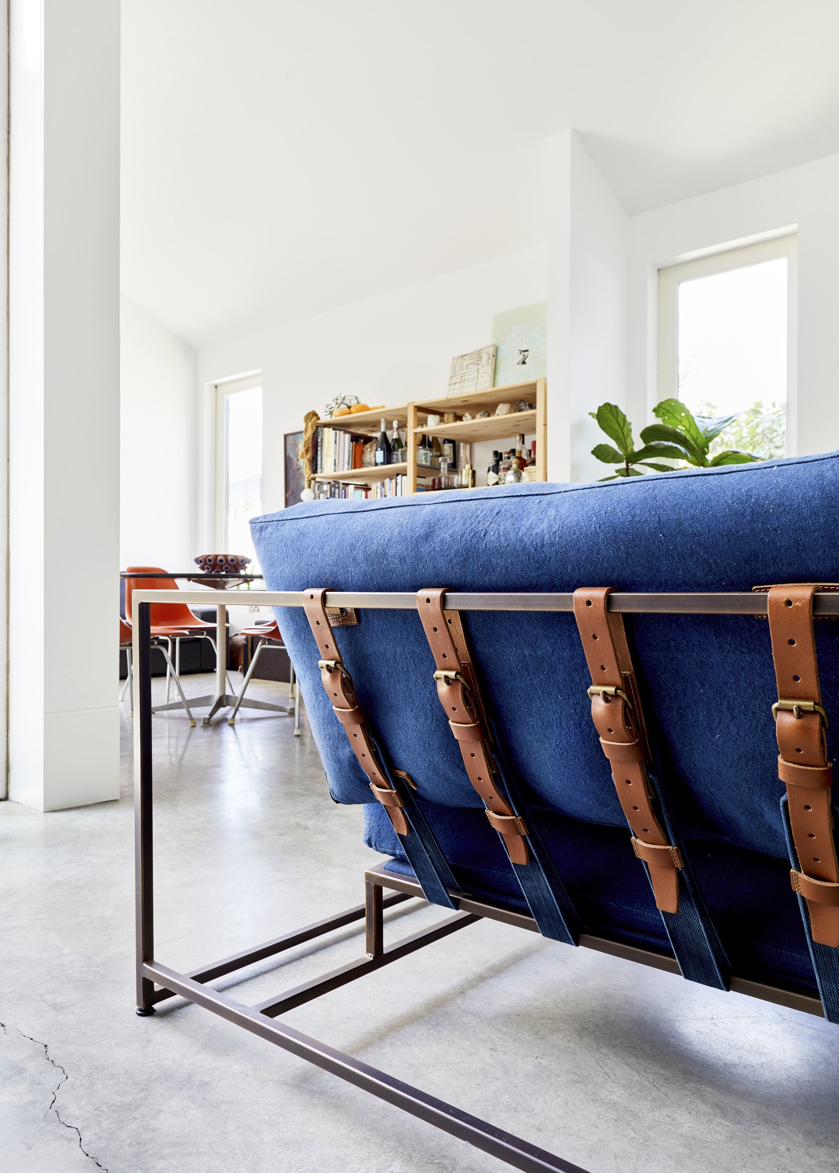
The back of the sofa calls for a close-up. The contrast between the brown leather straps, metal frame, and bright blue cushions is really striking.
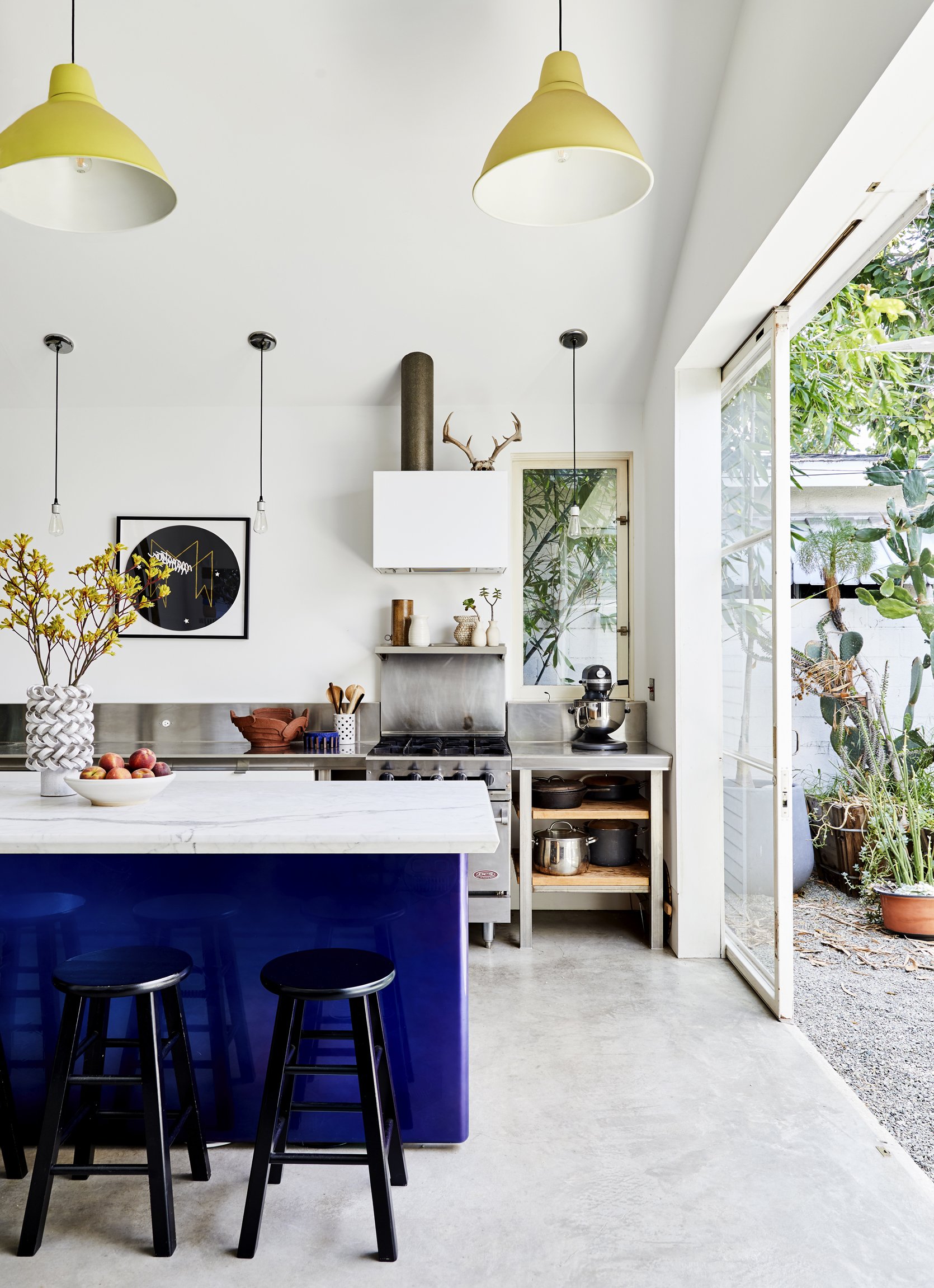
The kitchen is quite simple and utilitarian except for that incredible island so I had to ask Ben to tell me more about it. He told me the kitchen island was custom-made by Eddy and Astrid Sykes of wrinkle.MX who also designed and built the house. The front of the island is made of cast fiberglass and the top is a custom-edged and honed Carrera marble slab. It’s incredible.
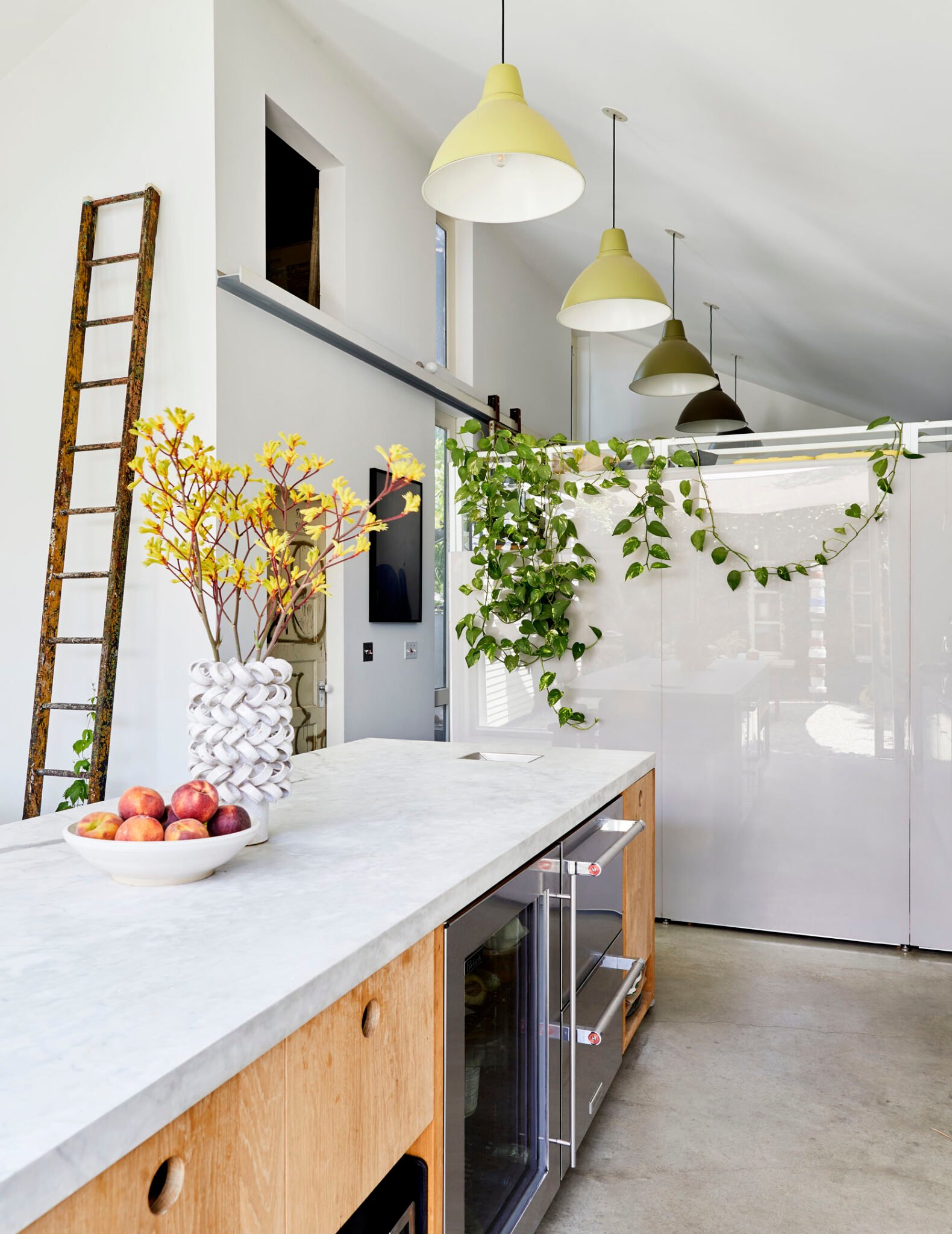
On the opposite side of the kitchen island, the light wood drawers and Carrera countertop create some warmth to contrast with the steel appliances and concrete floors. I LOVE this juxtaposition and how it adds depth and nuance to the space. For the drawers, having circle cutouts instead of hardware adds to this straightforward yet creative style that is carefully exuded throughout the home.
We have talked about those pendant lights on the blog before because they are a great example of breaking a design “rule”. The unspoken “rule” is that an array of lights in a line like so should match one another to maintain continuity and to prevent a space from feeling unfinished or random. Here, the pendants are matching except for their color which is a really cool design risk that 100% paid off. The fact that they go from light to dark creating an ombre effect makes it feel intentional yet totally unique.
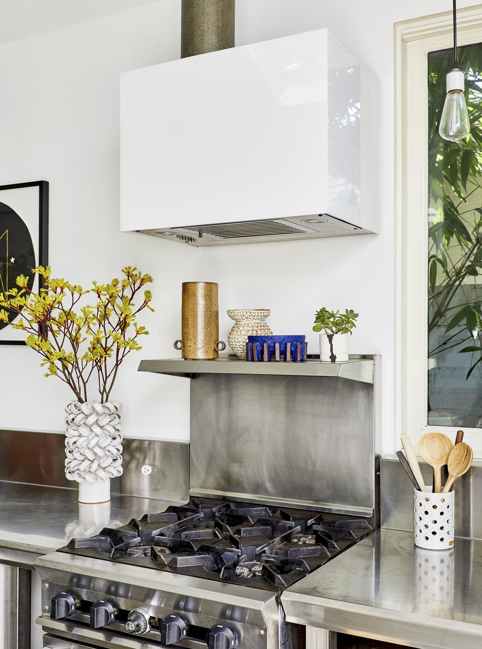
The all-steel stove and counters drive home the industrial style that grounds the home. This utilitarian vibe mixed with contemporary art is really exciting.
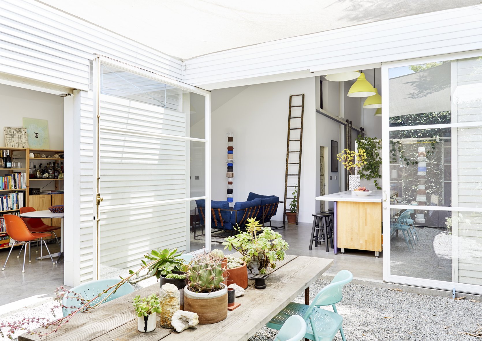
We never take for granted the power of natural light here at EHD, and it is safe to say this home is dripping with it. The kitchen and dining area open up to the backyard with huge floor-to-ceiling sliding doors which allows so much beautiful natural light to flow through. The skylight in the living room always helps, too :).
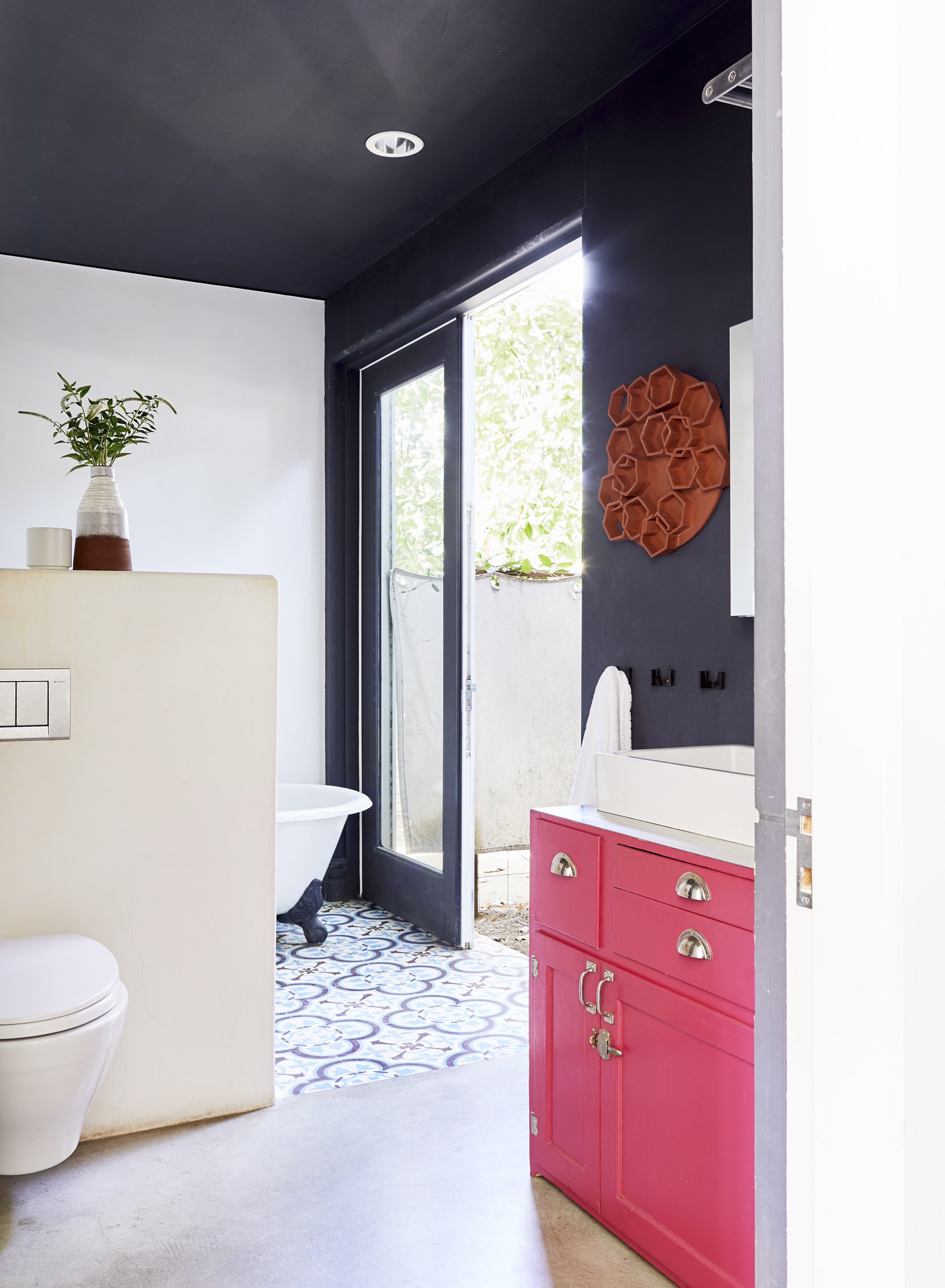
Now onto the bathroom, where this vintage pink dresser-turned-vanity paired with a black accent wall creates such a dynamic look. I love the choice to continue the paint color up the ceiling so it encompasses the room (but he didn’t paint every wall so the color isn’t too overwhelming). SO good.
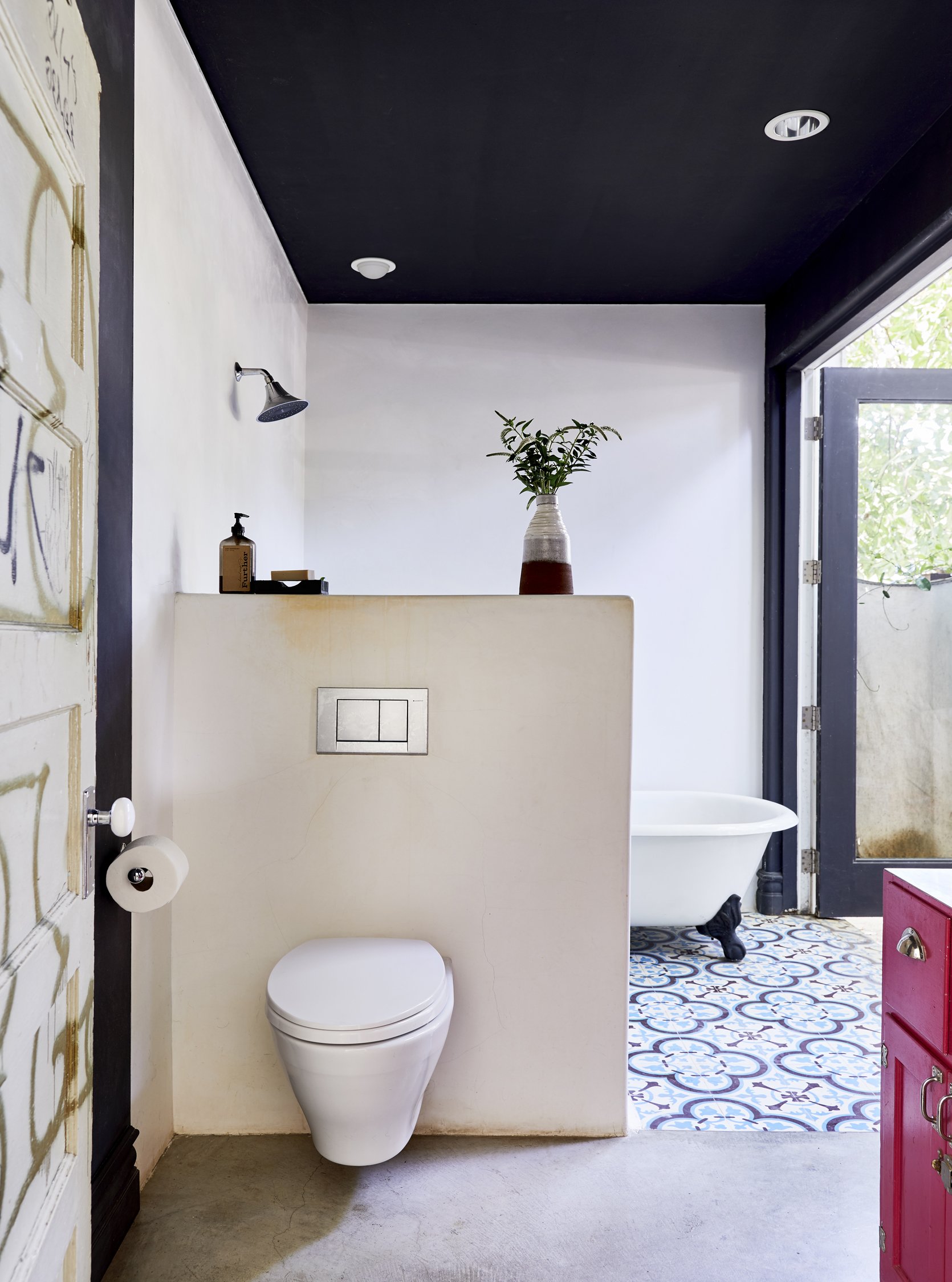
It is very rare we show toilets on the blog (because, well, you know) but I love how simple this one is. Mounting it on the wall partition is very modern and dare I say elegant.
Also, please note the salvaged graffiti door to the left. It’s just another highly creative decor element that speaks to Ben’s style and brings a ton of personality to the space.
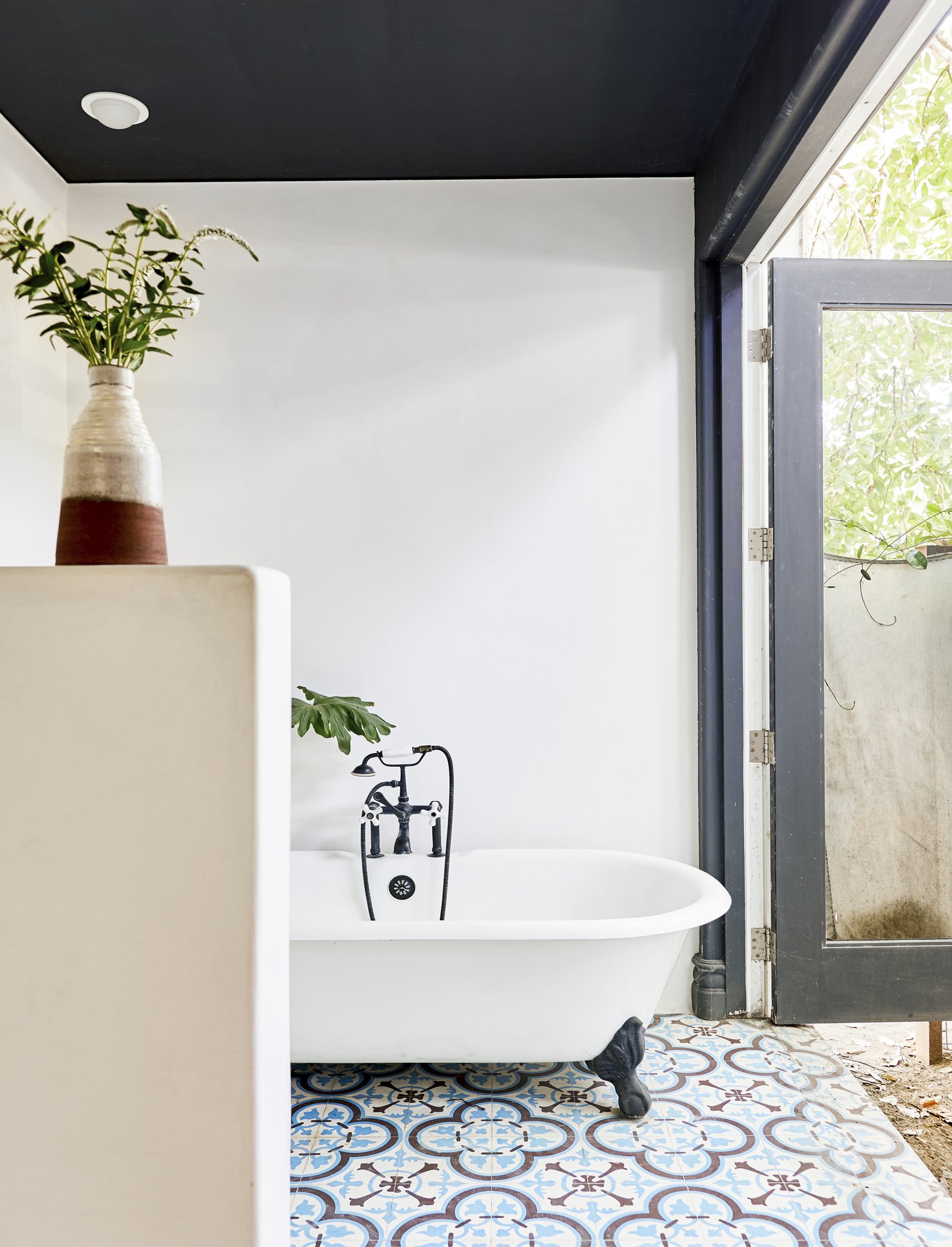
I adore this clawfoot tub and love that the black accents tie in the paint color and tile. It creates continuity without being too expected.
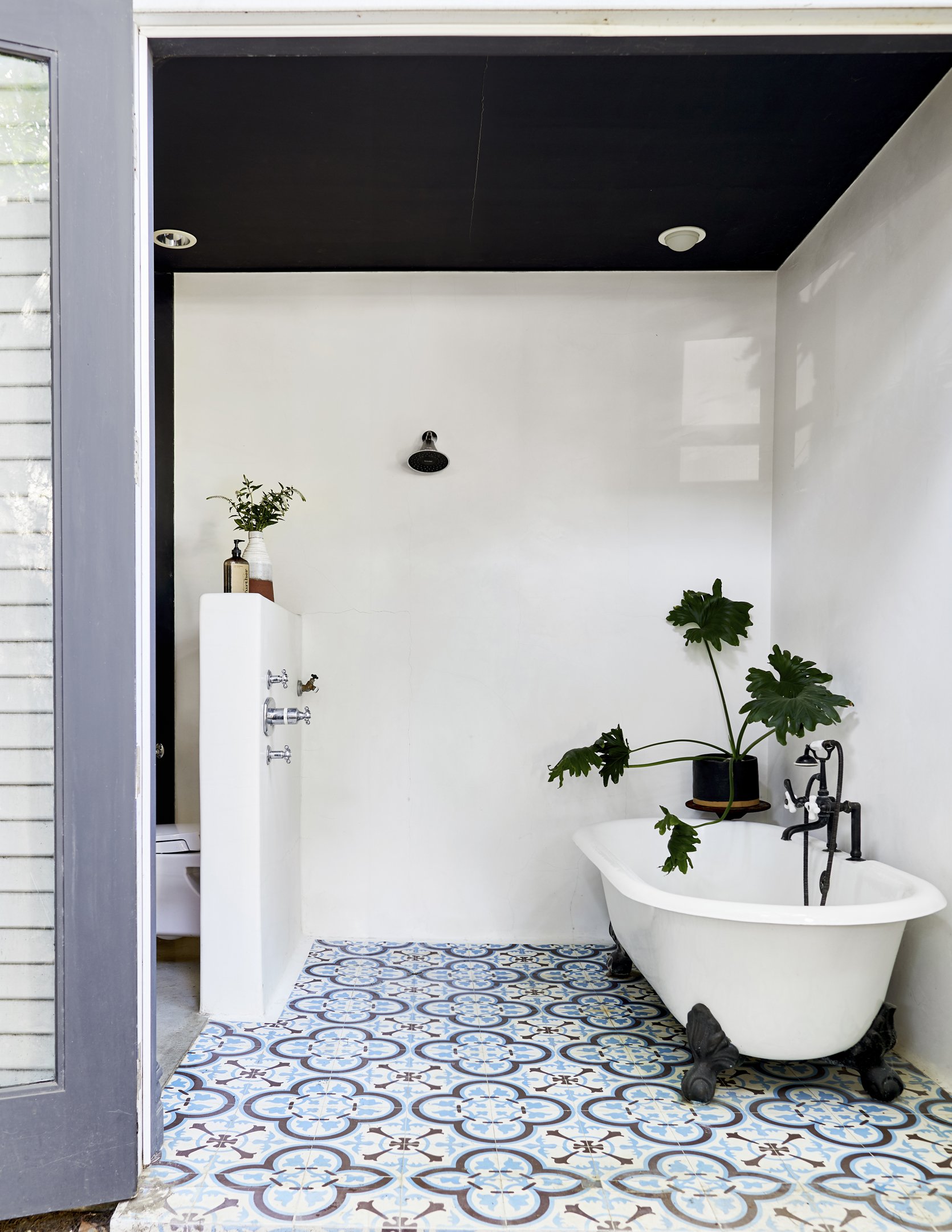
This open shower and bathtub nook is really incredible. The way it is open to the outdoors helps drive home a natural, airy feel that is completely intoxicating. I also love how the plants add to this effect (and now I am thinking I want to see more plants in showers!).
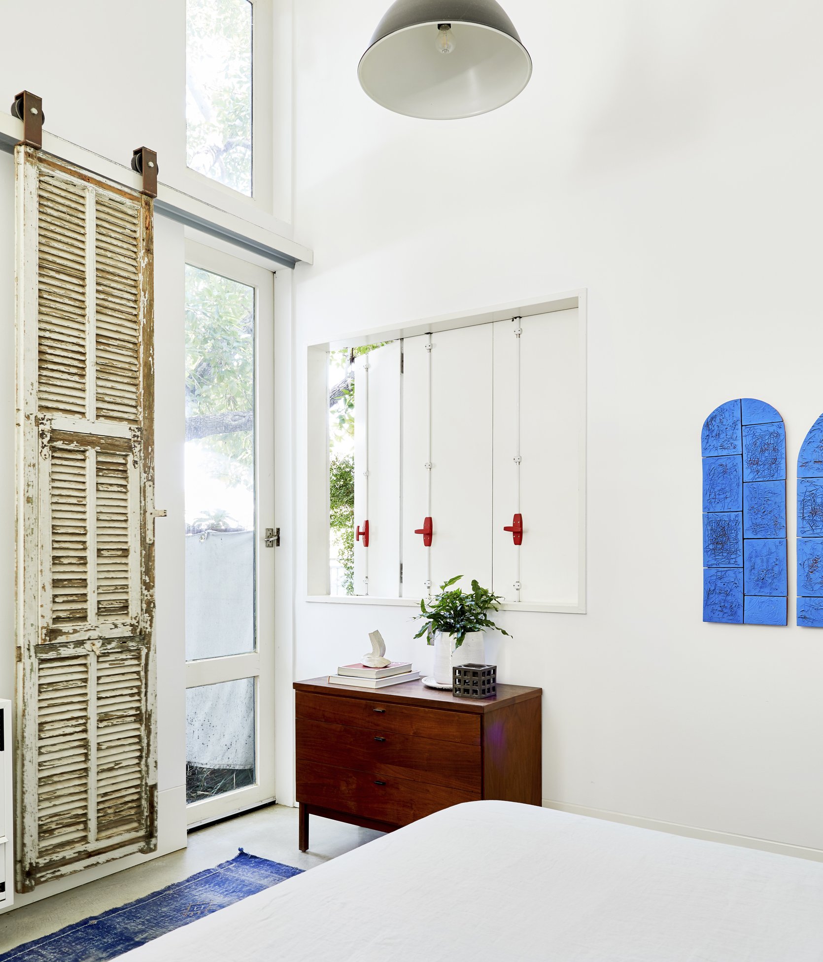
In the bedroom, a vintage wall-mount sliding barn door brings in so much soul. The fact that it is so tarnished compared to the clean white walls creates such an exciting contrast that I just can’t get enough of. And again, dark wood MCM furniture plays into the simple, straightforward style, and then the bold colorful art provides a modern flair.
I could stare at this home all day but unfortunately, this concludes our home tour of the day. I hope you enjoyed it as much as I did, and huge thanks to Ben Mendansky for sharing his incredibly inspiring home with us. xx
Design by Ben Medansky | Styling by Velinda Hellen and Erik Staalberg | Photos by Sara Ligorria-Tramp
THIS POST WAS ORIGINALLY PUBLISHED HERE.
