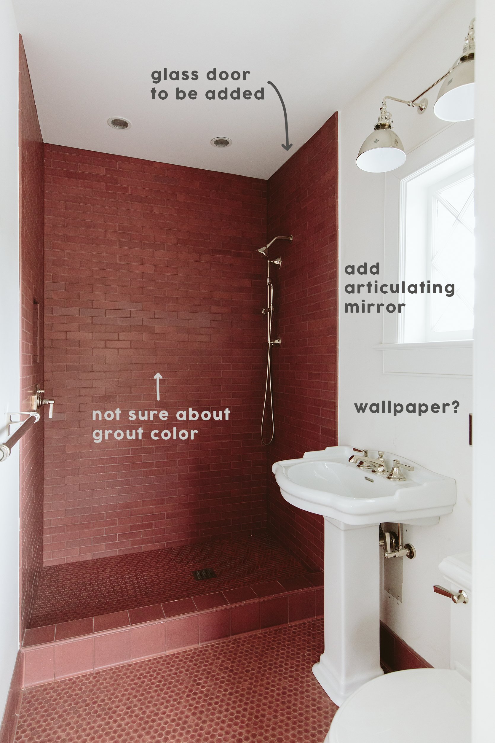
The upstairs guest bath is coming along, not there yet, but coming along. I LOVE the tile, the polished nickel finishes, and the sweet little window. This is a new bathroom that you guys convinced us to put in upstairs on the bedroom floor (and we are happy we did). So many of you suggested that we’d want this specifically when the kids are older so they can each have their own bathroom. They already shower at the same time, one in here and one in the kids’ bath, which cuts down on “bathtime” by 20 minutes. I swear from “time to take a shower” to downstairs in PJs is a solid 45 minutes for whatever reason – and not because they are taking long showers. Distractions! So many distractions. I’m going to start guiding them blindfolded to do their tasks because my goodness they get so distracted by the dogs, the sewing machine (“Is now the time to make a pillow for Sue Sue, Charlie?”, A piece of paper that could be an airplane, a pokemon card that HAS to be set out to bring to school tomorrow, and again the dogs”… “but mama they are soooooo cutttttte”)… Anyway, yes, they use both twice a week and I’m glad this is an option. So let’s revisit where we are in the house:
The Guest Bedroom
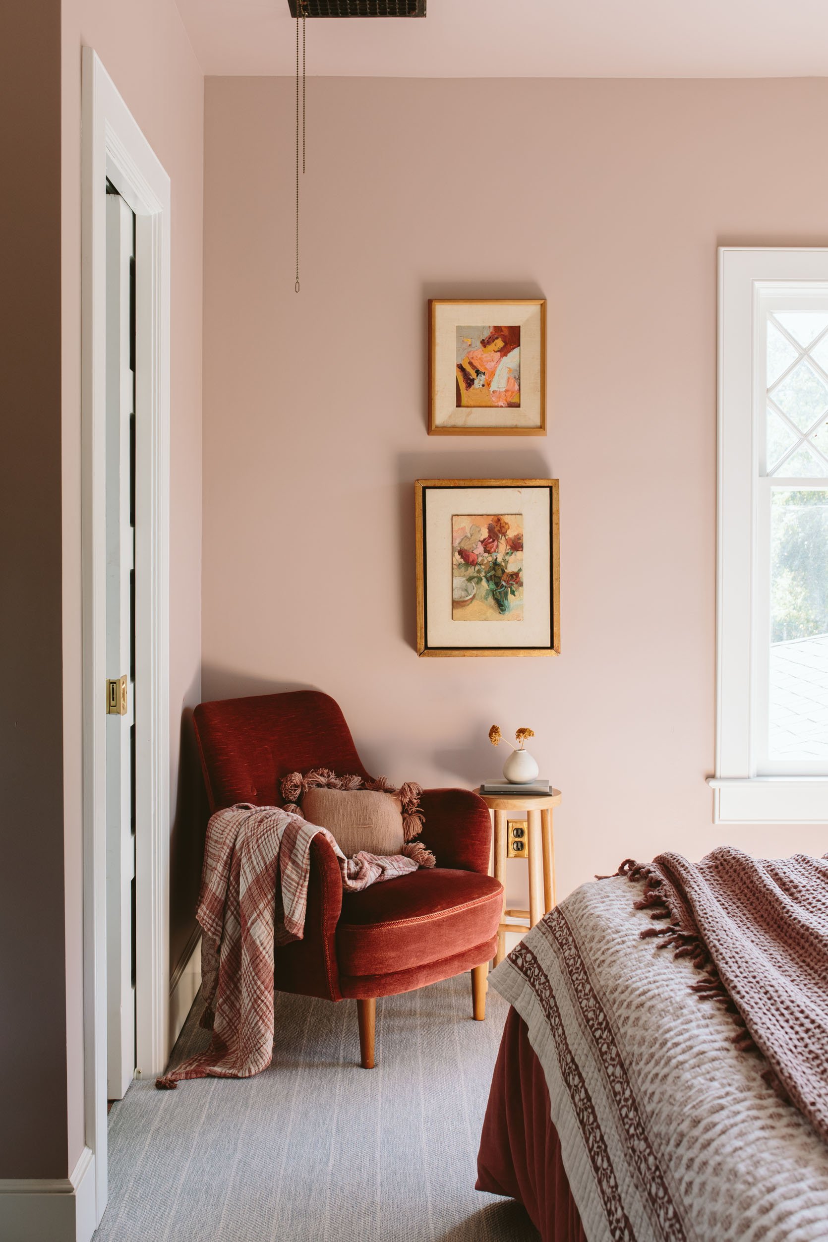
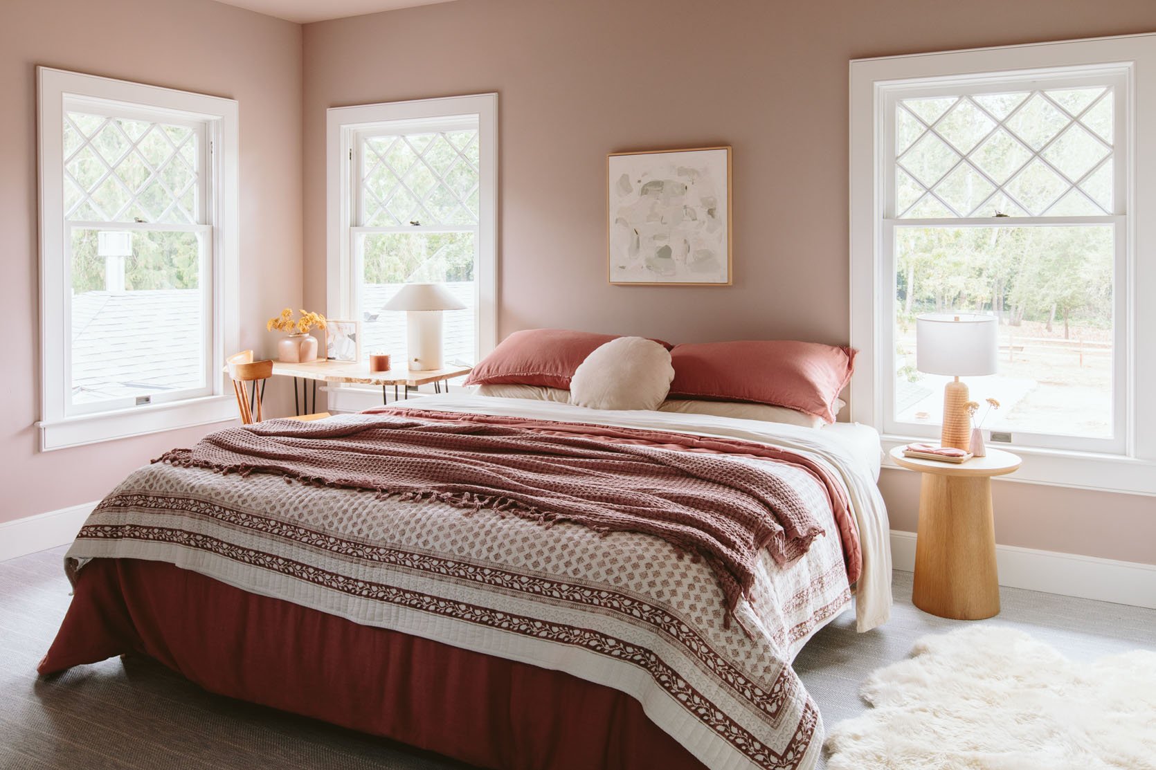
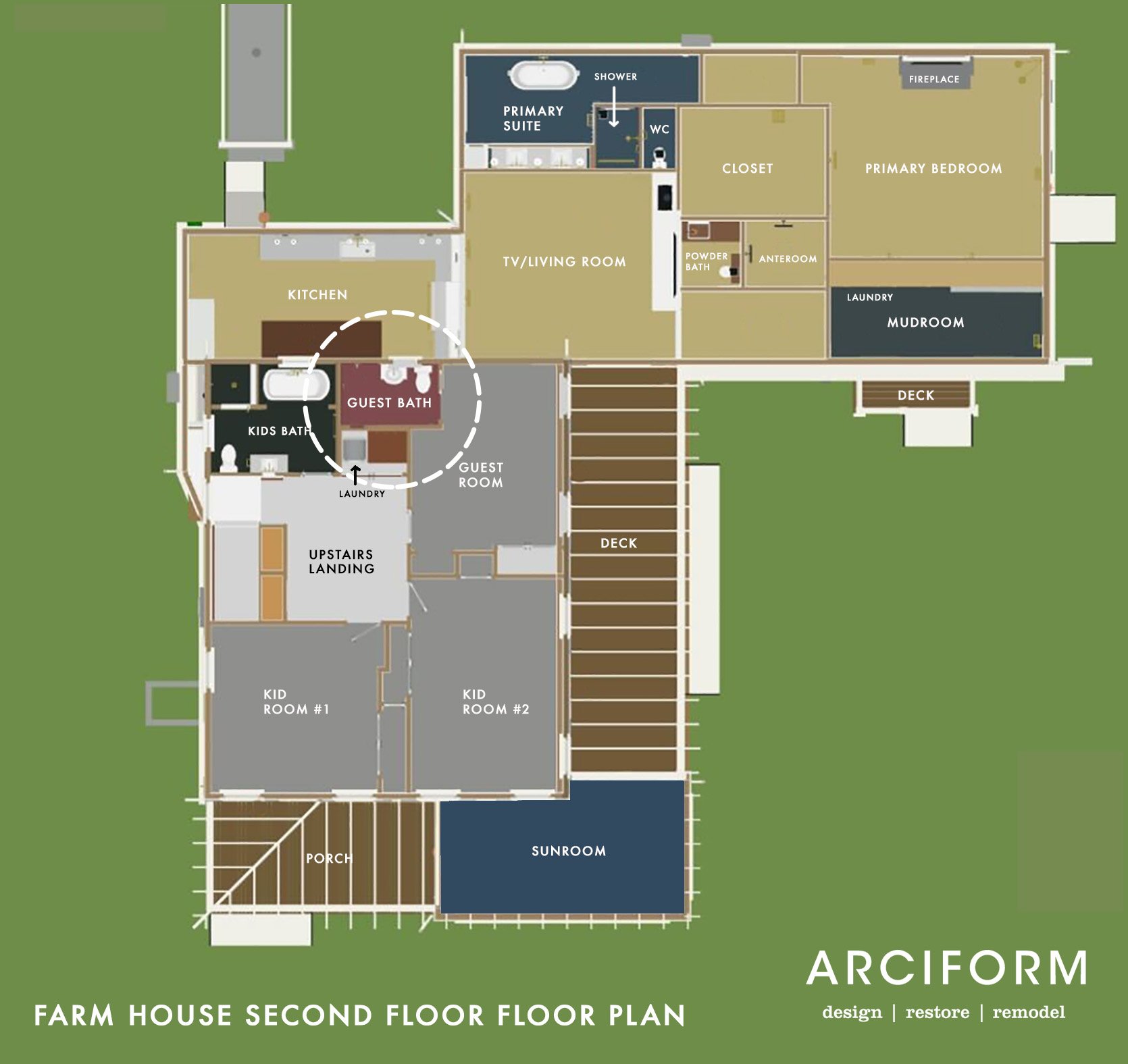
We are upstairs (ignore all the sunroom, kitchen, and TV room stuff–that is all on the first floor). You walk upstairs and there is a large landing which we love, three bedrooms, a hallway shared bath (which I showed you in this post), a guest room (Permanent-function TBD), and this new small attached full bath. We were spoiled (and spoiled our guests) with ensuite bathrooms at the mountain house, but we weren’t going to put an extra bath up here originally (“Guests can share with the kids!” We said) but it is so nice for guests (and since Brian writes in the guest room this has become his personal spot. Ahem).
The vision for this guest bath was similar to the other rooms – have one high-impact color that we’ll never get sick of, but keep it simple and very high quality. We’d bring in more style and risk with the less permanent finishes and fixtures, but stay more classic with tile and plumbing. I’m still sorting through what level of regret I have in this bathroom – some days none, other days I feel like I know what I would have done differently to, you know, jazz it up a bit.
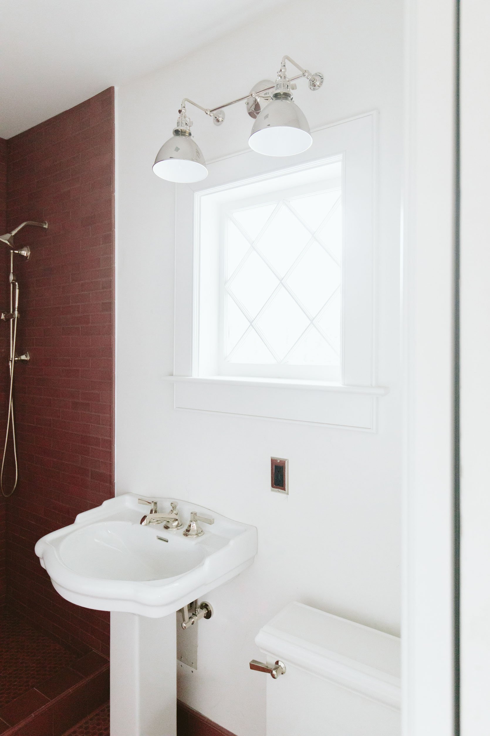
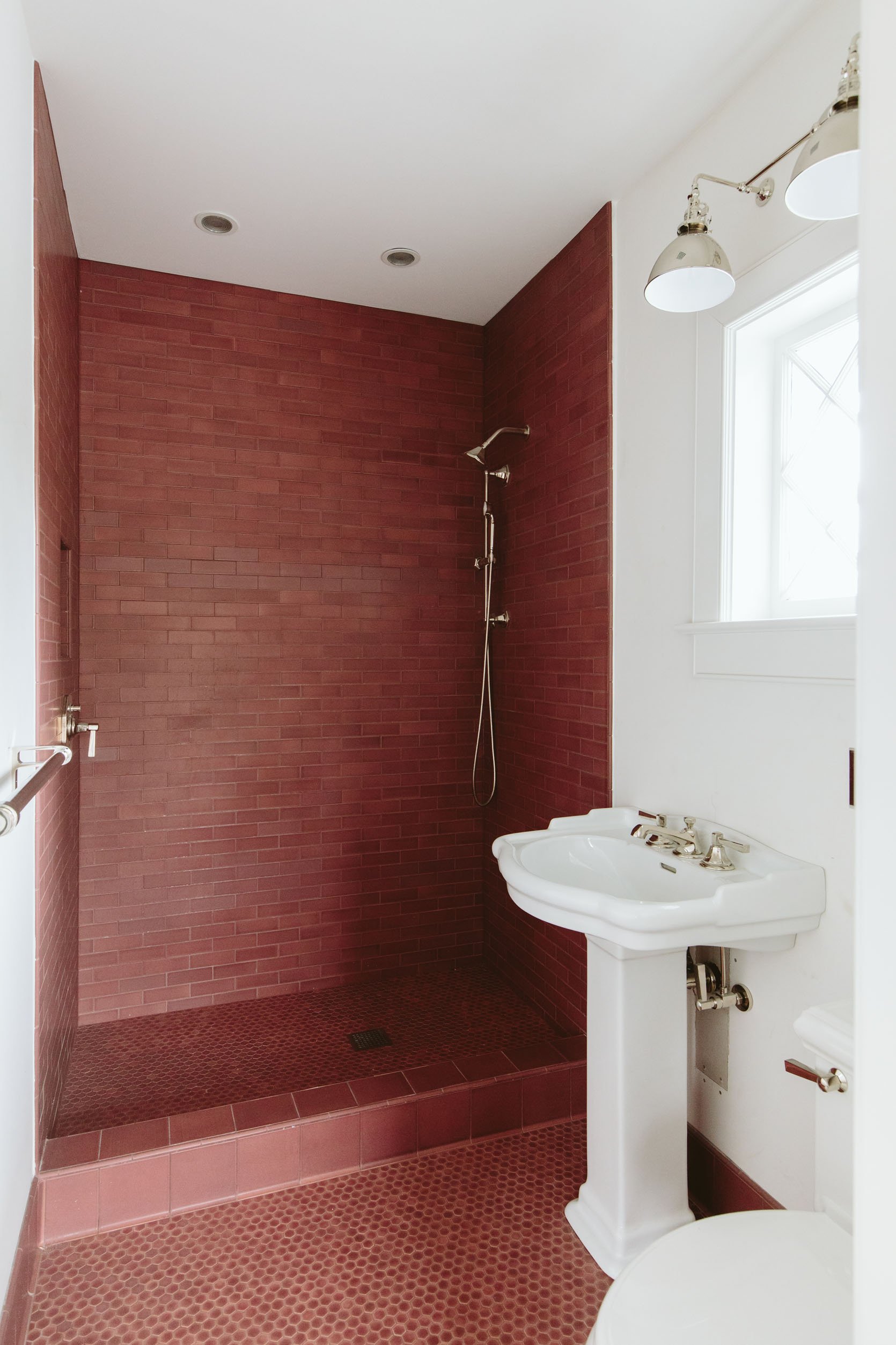
For this bathroom, we fell in LOVE with this deep mauve/rose-colored pink tile from Pratt + Larson and paired it with polished nickel finishes. The combination is so beautiful, but the room doesn’t feel complete yet (likely because it’s not done). Here’s where we are at today:
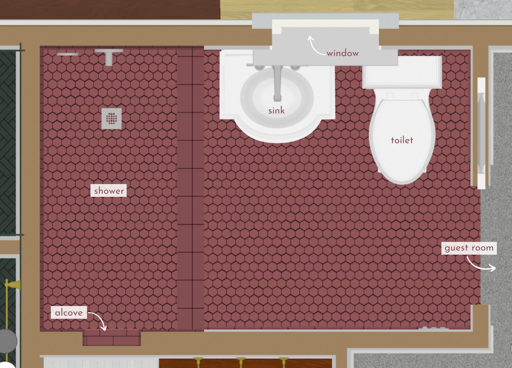
There is a lot of backstory that affected some decisions until those elements changed, but the decisions didn’t – let me explain. This bathroom was stolen from one of the original large bedrooms, and therefore it has a massive bedroom-sized window in it that would have landed between the sink and the toilet. It was relatively close to the ground (about 20″ off the ground) which meant that it would be below any normal vanity and not allow for a normal backsplash. For that reason, we knew that we needed a pedestal or console-style vanity, i.e a sculptural base that could be in front of a window, and ordered this one from Rejuvenation. It’s a quirky solution to an older home remodel and one that was actually really cute (before we changed it). We’d have an oversized window in here, with a pedestal sink in front of it and an accordion mirror coming out the side. For this reason, we also needed a pedestal sink with an integrated backsplash since it would be in front of the window. If you are confused, here is where it was before:
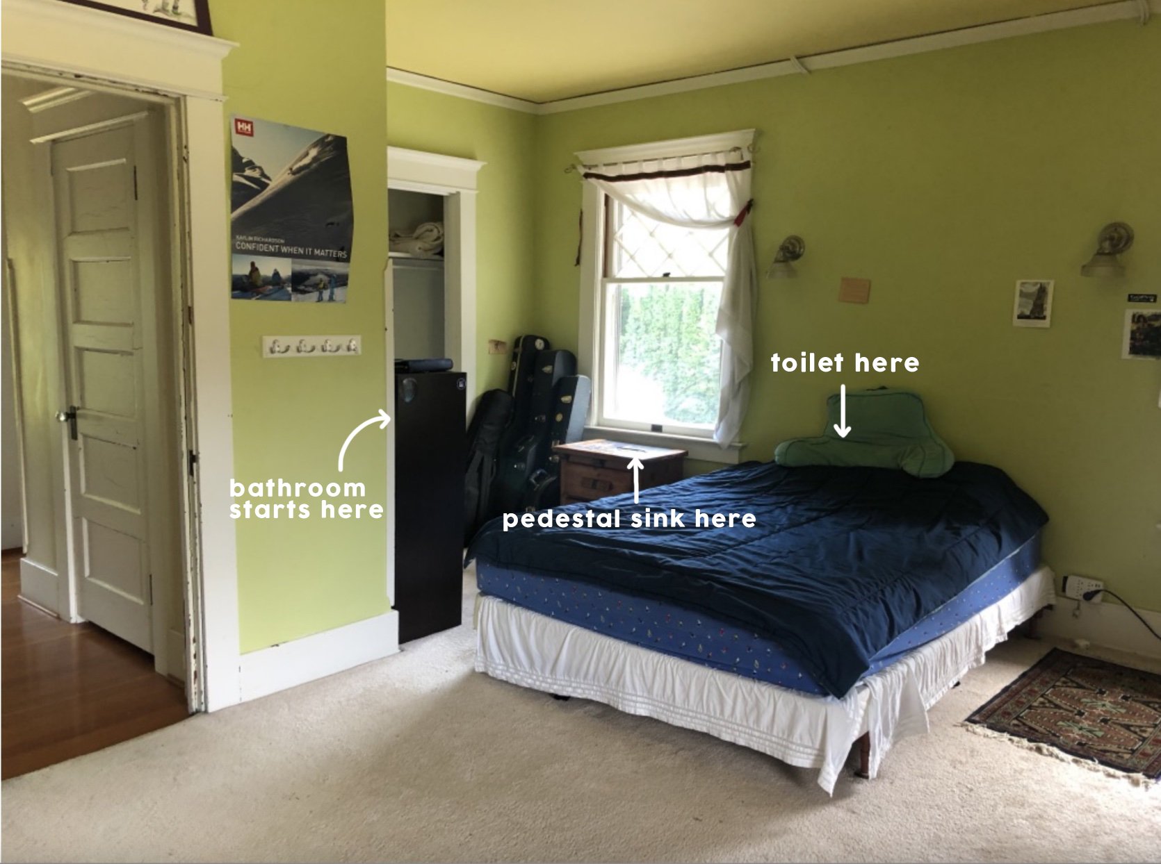
This is the bedroom off of the guest bathroom before we created the bathroom. Are you following? So what we did was steal from the nook in the bedroom and the hall closet to create this 5’x7′ (ish) new bathroom. As you can see from the original photo the window that was going to be incorporated was big (and beautiful).
So as you can see, with the larger original window the vanity couldn’t be a typical storage piece – it needed to have an open base and be freestanding with an integrated backsplash (i.e. again, pedestal or console). We found the perfect one via Rejuvenation and called it a day. Great.
But then, a few months later we realized that the house on the exterior seemed to be missing a window. We didn’t really realize it originally because the whole house had funny awkward windows (and that’s ok for an older home!).

Once everything was demoed and cleared out and the new back-covered porch was going to be such a pretty view, we realized that we need that 4th window.
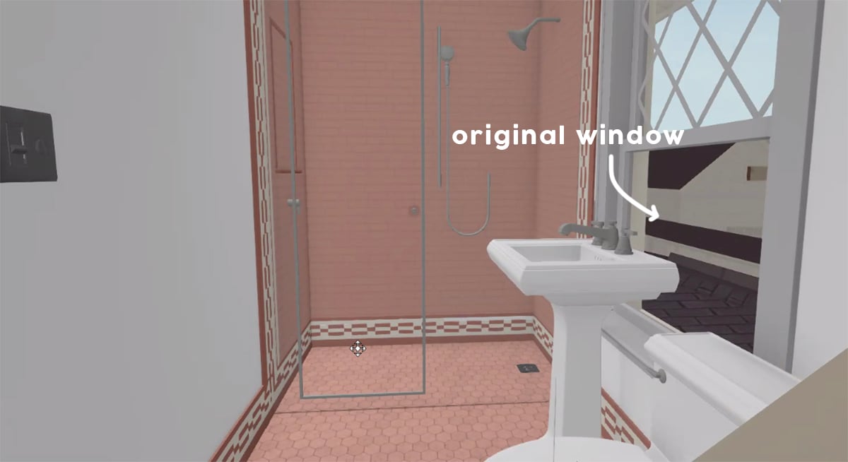
We did some window configuration and realized we could take another one of the unused original windows from downstairs (one of the smaller ones in the entry) and put it up in the bathroom, which would be a better scale for that bathroom. It wouldn’t be operable, but that’s ok (there is a fan). But it was smaller and since we had to reframe it anyway (HOT TIP: do this before re-siding) this felt like a smart swap. We’d put the original large bedroom-now-bathroom window back into the bedroom (matching perfectly) on the much-needed west exterior wall and then add this smaller leftover window in the newly created guest bath on the east wall. It was window musical chairs and it hurt my brain for a while, but so glad we did it.
Here is what it looks like on the outside with the four windows:
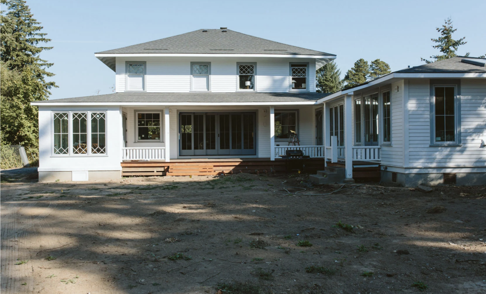
So much better and since this back porch and view have become such a feature of the home I’m SO GRATEFUL that we did it. Thank you, Jamie and ARCIFORM. If you want to watch a full video tour of this bathroom & where we want to take it, then here she is (just wait for the ad to play!):
Sconce | Faucet | Faucet Supply Lines | Outlet Cover | Toilet Lever
So now that that was done, no one realized (including me) that at this point we could have swapped for a different vanity with more storage, or something more custom. Now, to be honest, I’m totally fine with this because this is such a cute pedestal sink, was affordable, vintage-y, and because it was a “one and done” piece it did save us some money by not tiling or fabricating stone for a backsplash. And listen, in order to get a window in there it was always going to be awkward so we decided to do the least awkward thing and center it between the shower and the wall – thus not right above the vanity, but leaving enough room for an articulating mirror. Remember this is the guest bath and maybe a future kids’ bath. But not ours:)
Towel Bar | Shower Set | Shower Head
So here’s where we are. Everything is good and fine and great, but when I walked into this bathroom after renovating for so long I felt this slight pang of disappointment and I didn’t know why. After much thought and a few private tears, I figured it out:
1. The grout color that I loved so much (“matches perfectly” she said) made it so the wall of incredible tile felt flat. I think this move of matching the grout with the tile could absolutely work (and does) in a room with a lot of natural light that reflects off the tile, showing the texture and color variation. We did this in our main bathroom on the floor and it’s PERFECTION. But up here? Without a lot of light (the photos make it much brighter) the tile feature wall just looks dark. Can I change the grout? I mean, you can do anything but it’s a thing. I know that over time grout lightens with soap, hard water, and just general wear/tear so I feel ok about letting it just do that naturally. You could dremel out the top layer of grout (on each individual grout line) and then grout over it, but I’m not there yet. I don’t hate it, I just wish it were lighter so the grout lines would create more of a pattern (literally what I didn’t want to do at the beginning because I didn’t want it to look/feel busy). That’s all to say – if you have a ton of natural light, going tonal with the grout and tile is a great move, but if you have no natural light, contrast the grout so that the tile pops more, adding interest and pattern. End of hard lesson:) But that’s not it…
2. I was super clear at the beginning about having this monochrome tile look – the same color on walls and floors, but different shapes/orientations. But y’all it just doesn’t pop. I wish I had done a white and rose hex combo on the floor – still incorporating the pink tile but with another accent or neutral to shake it up. Or maybe even a powder blue. Dunno.
But then I remembered that wallpaper exists and that I can shake it up through (minor) accessorizing. Hope reemerged and I got to work. So let’s show you what is happening:
The Articulating Mirror
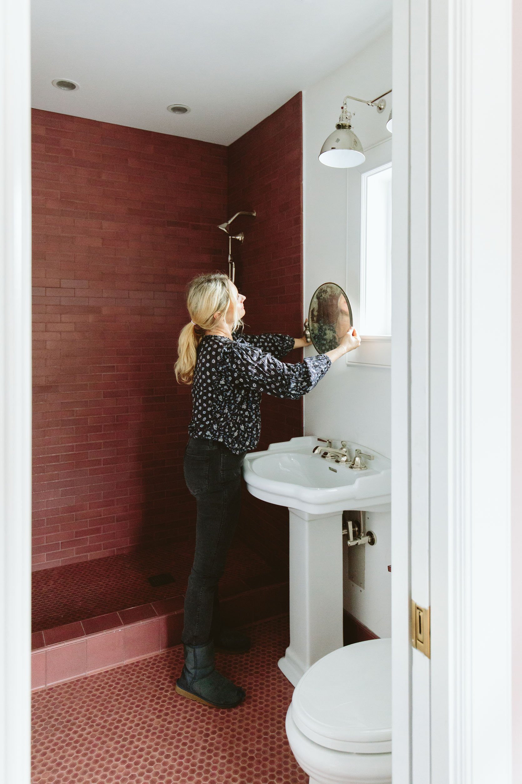
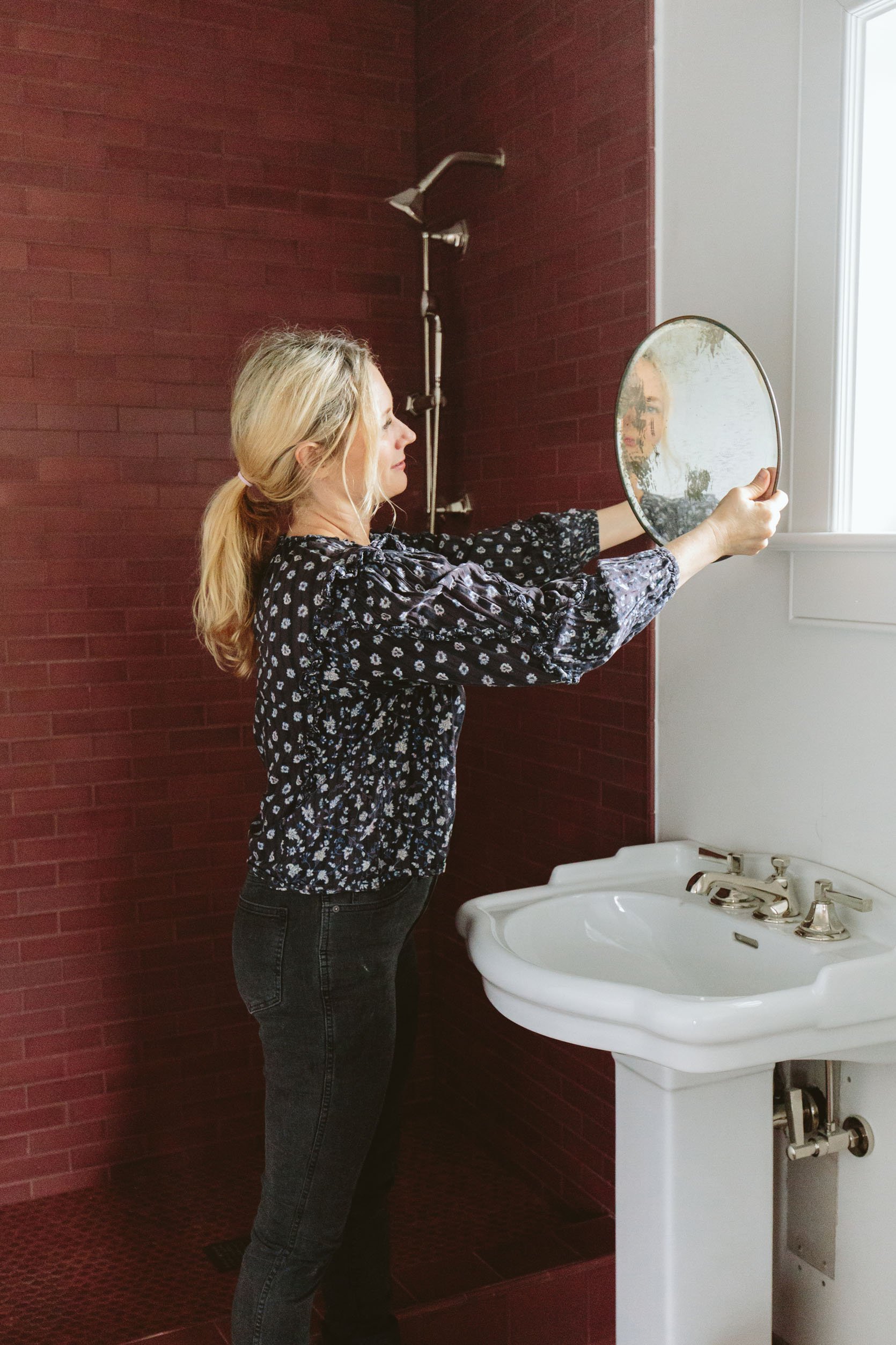
I found this vintage polished nickel at Portland Architectural Salvage and snagged it pretty quickly. I LOVE the polished nickel fixtures in here (from Rejuvenation) and was happy to find a mirror that works with it and can swing in front of the window.
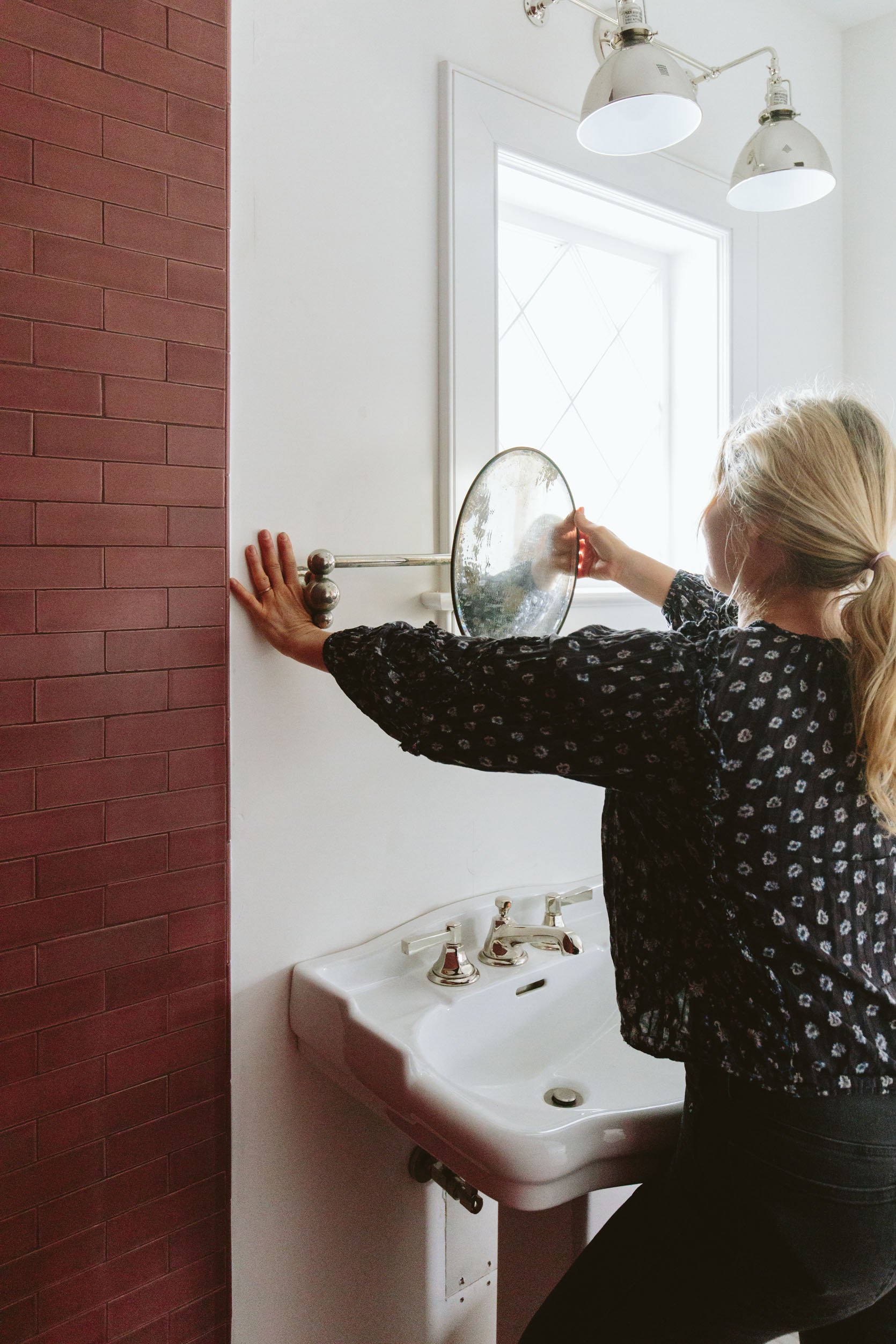
Of course, this is not the bathroom nor mirror to get ready from prom in, if you know what I mean. It’s a real gift I have of finding extremely distorted antique mirrors that barely reflect your face. As you can see she is old and the paint on the back (the mercury that created the mirror effect) is chipping off. I haven’t hung it yet because we have yet to wallpaper, so I still have my eye out for another solution that might give Suz less frustration when she is putting on her lipliner. At the same time, I could also just put another mirror on the wall by the door. I’m not concerned about it AT ALL (likely because it’s not my bathroom) and I feel like not every room gets to be this super dialed 2023 luxury.
The Wallpaper
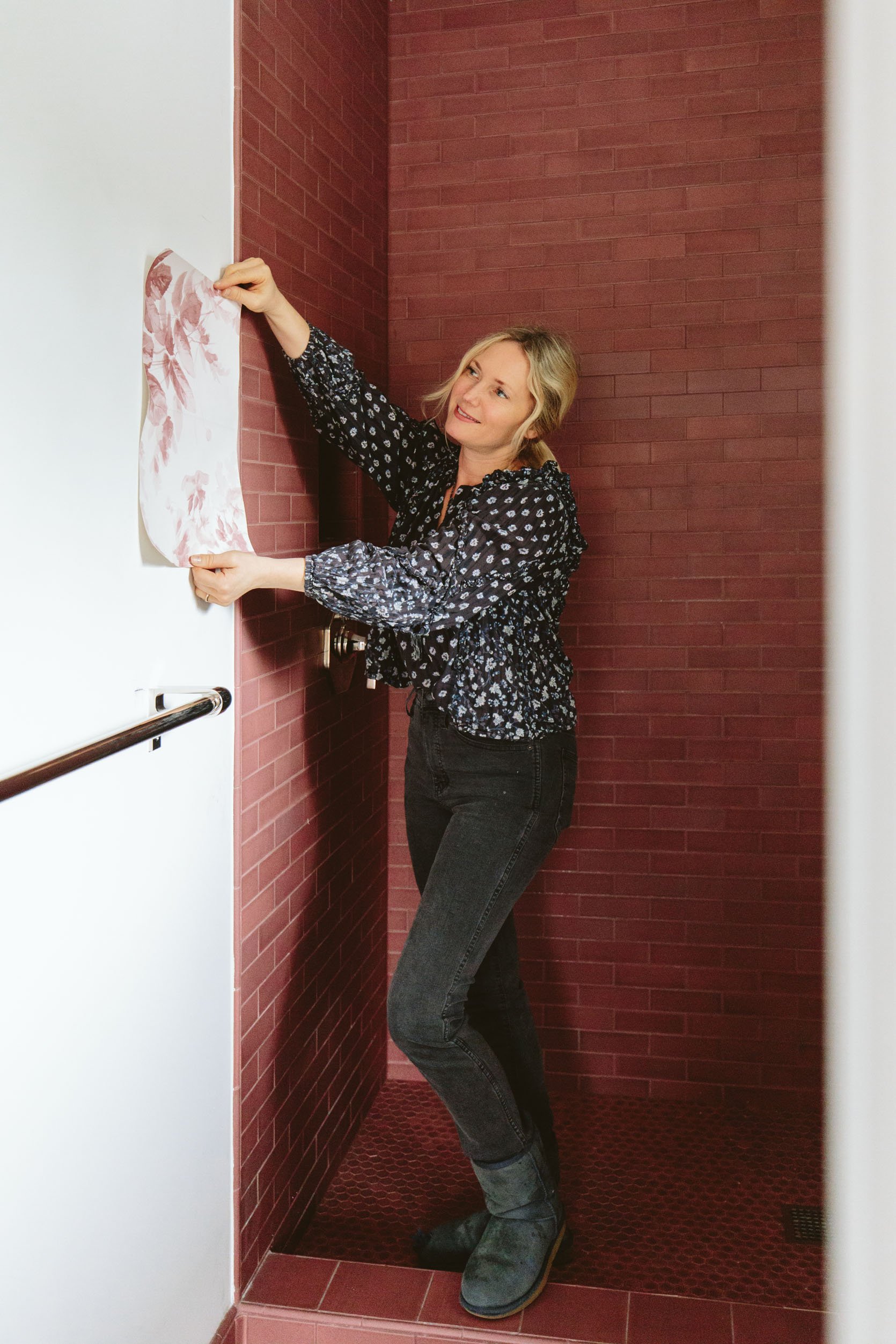
I got pretty excited about putting wallpaper in here, but have yet to make the final decision. Brian and I agreed quickly on this House of Hackney London Rose pattern and we called it a day…until I became unsure of which kid will ultimately “get” this bed/bath when they get older (if either). If it ends up that Charlie (the oldest) moves in here then he’s already told us he does not want a pink floral wallpaper and you can balk at that if you want, but any parent of a seemingly cis male boy won’t try to make it a bigger thing and force it (because that is a weird parenting move and I want to respect who he is and give him a shot at loving this bathroom). I get it and so I’m taking a second to figure it out. Maybe neither kid “gets” this bathroom and the bedroom remains a guest room, with one of them more dominantly showering or getting ready in here when older. It seems easy to let Birdie have it (she is a HUGE FAN of that wallpaper), but she also likes to take baths more and I’m unsure if when she is a tween/teen if it makes more sense for her to “get” the kids bath with the bathtub. Again, I’m not concerned about it at all, this isn’t a real thing, I’m just working it out here in real-time and I really don’t want to replace the wallpaper in 4 years nor do I want Charlie to feel silly or embarrassed showing his friends his room. So is there a wallpaper that could offset the femininity of the pinky/rose just in case? Maybe! I’m waiting on Kelly Ventura’s new samples to get to me (which are likely to do the trick) but meanwhile, I’m going to look around a bit and see if there is something that might make more sense for more family members, long term. The feminist in me wants to make men deal through a few floral wallpapers as we have DEALT with centuries of systemic patriarchal oppression:). But the loving mom in me wants my son to feel like his room represents him as much as Birdie’s room represents her because he’s wonderful, not to blame, and has done no such oppression in his 9 years on this planet. I’m also kinda laughing to myself right now as the tone is so hard to portray in writing (is it time for a podcast?). Why oh why would I open up this conversation in a seemingly innocuous progress post? Who knows. Silly, Emily. But I guess I want you to know why I’m not immediately installing that pink floral wallpaper. Lastly, and with less gender controversy, we were going to do a shower curtain in here to save money and bring in some sweetness, but once I realized that the room needed more pattern (aka wallpaper) I knew that a curtain wouldn’t do and we’d have to put in a glass shower door. You can have a shower curtain with wallpaper, but it’s not terribly advised for overspray and general moisture reasons – especially in Oregon where it is so humid in the winter. I just finalized the glass order and it should be installed in a few weeks, and then I’ll hopefully pick a wallpaper, install the mirror (and that sweet antique polished nickel cup and toothbrush holder), and be done with this little lady. If I’m being honest no matter what wallpaper I choose this bathroom is inherently going to be relatively on the “feminine” side (pink + pedestal sink + wallpaper will do that to a space) so you might see this original wallpaper back up on the walls in a couple of months because that’s what Brian and I want. Stay tuned 🙂
Resources:
Wall Tile: Pratt + Larson
Floor Tile: Pratt + Larson
Sconce: Rejuvenation
Faucet: Rejuvenation
Shower Fixtures: Rejuvenation
Pedestal Vanity: Rejuvenation
Wallpaper: House of Hackney
Wall Paint Color: Pure White by Sherwin-Williams
*Photos by Kaitlin Green
THIS POST WAS ORIGINALLY PUBLISHED HERE.
