Well, I think you saw this coming. I really, really tried to avoid repainting this room. I’ve learned SO MUCH about myself and design during this renovation process, and now I get to share that all with you. Listen, I like to choose paint color last (and always have) because there are endless paint colors to choose from, whereas every other piece of decor is rather finite. So I like to choose the sofa, the rug, all the major players, and then decide on the paint color. Usually, I know roughly what color I want but choosing the right tone is based on those other pieces. Also, there is the whole “we don’t know how we are going to live in this room” conundrum, and only time holds that answer. I’m saying this for all of you who have been in this situation (having to make decisions without enough info) and know that I see you and hear you (and join you). If you are wondering if you can just prime all the rooms and then paint them room by room, trust me, I lobbied for that. But the cold hard fact is that the prep work of the paint is so laborious – all that taping and plastic shielding is a beast, so paying for that twice is not only extremely disruptive to your life and home, but also very expensive. Now if you have more basic drywall (not this much wood that requires more specialty painting) you can do it yourself. That’s all to say, I chose the wrong paint color for this room the first time around and have not only lived through the regret but made it to the other side – RELIEF.

I also want to admit that I am not experienced in painting or living in dark rooms, and have historically played paint fairly safe. This is a byproduct of living in SoCal where natural light floods most rooms so light tones are an extremely safe bet. All of you PNW or British folk are nodding with an “I told you so” fever, and you were right:) The light is just different up here so contrast, color, moodiness, and vibe are far more important (and something you design with in mind). So when we originally wanted a dark green, I changed our mind at the last minute. I now know that the green that we had chosen (SW Privilege Green) wasn’t going to be right anyway, but I do think other people have an easier time with bold dark colors than I do.
We originally wanted “moody” and I screwed it all up. We couldn’t decide on the tone so we chose a dark green (the far left above). Now looking back at the photo, the one that we recently repainted was the one that my left shoulder is touching. It was under my nose the whole time! I think we were so afraid of it being a dark cave. So we went “safe” and this is a great example of when “safe” just doesn’t work in a room.
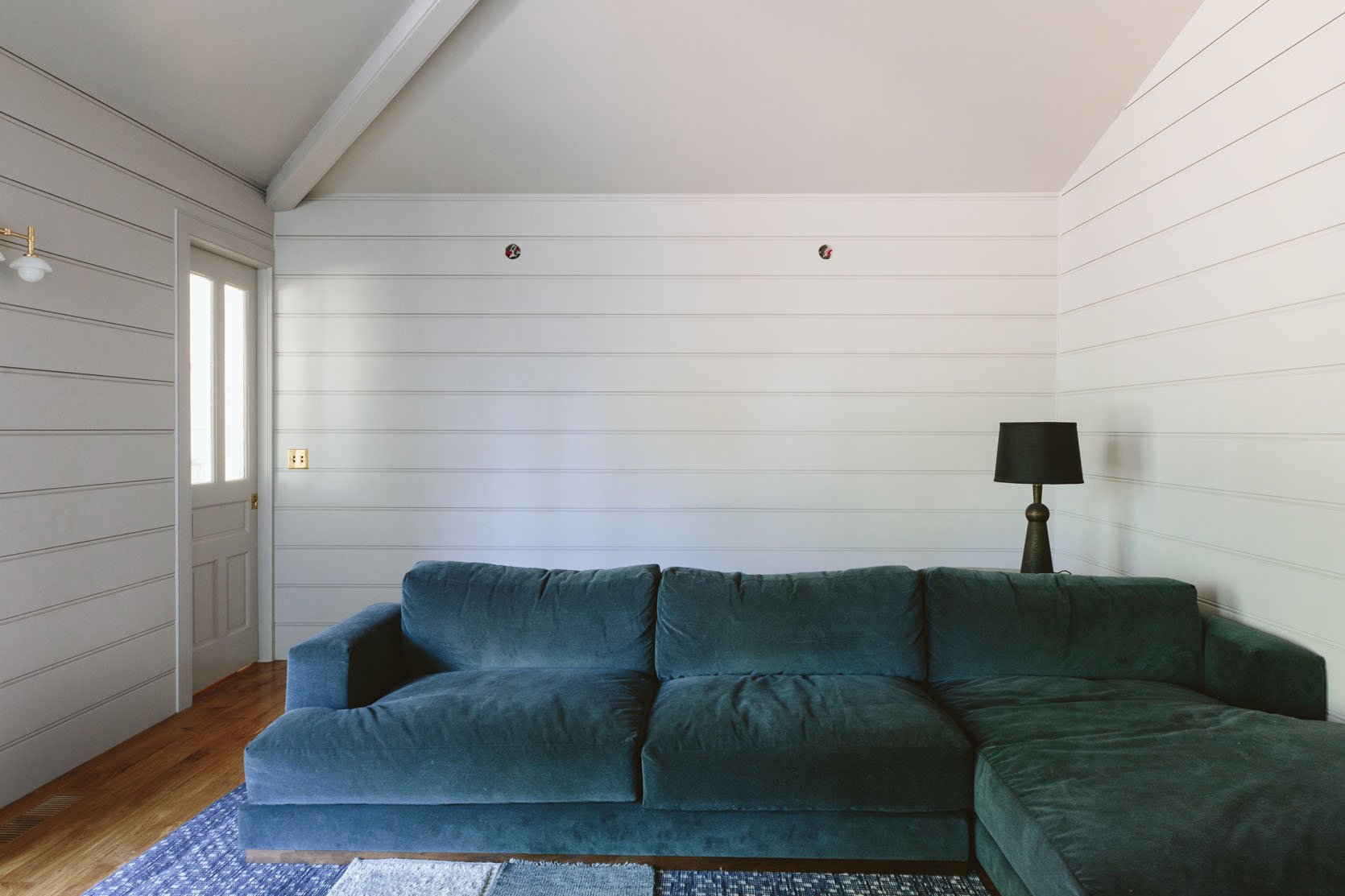
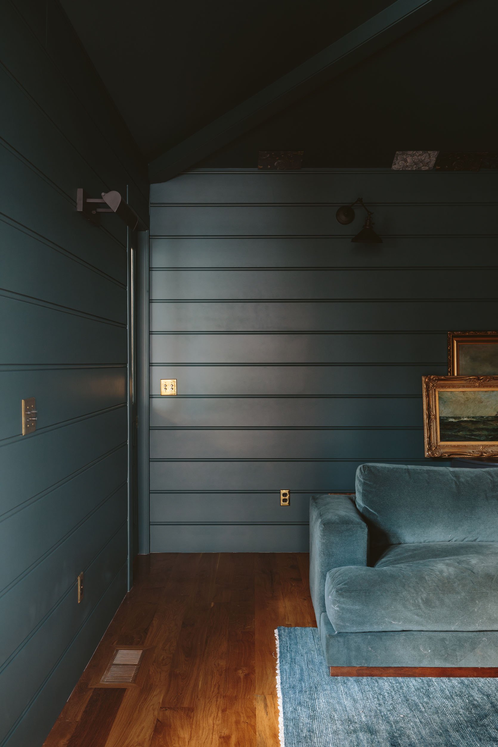
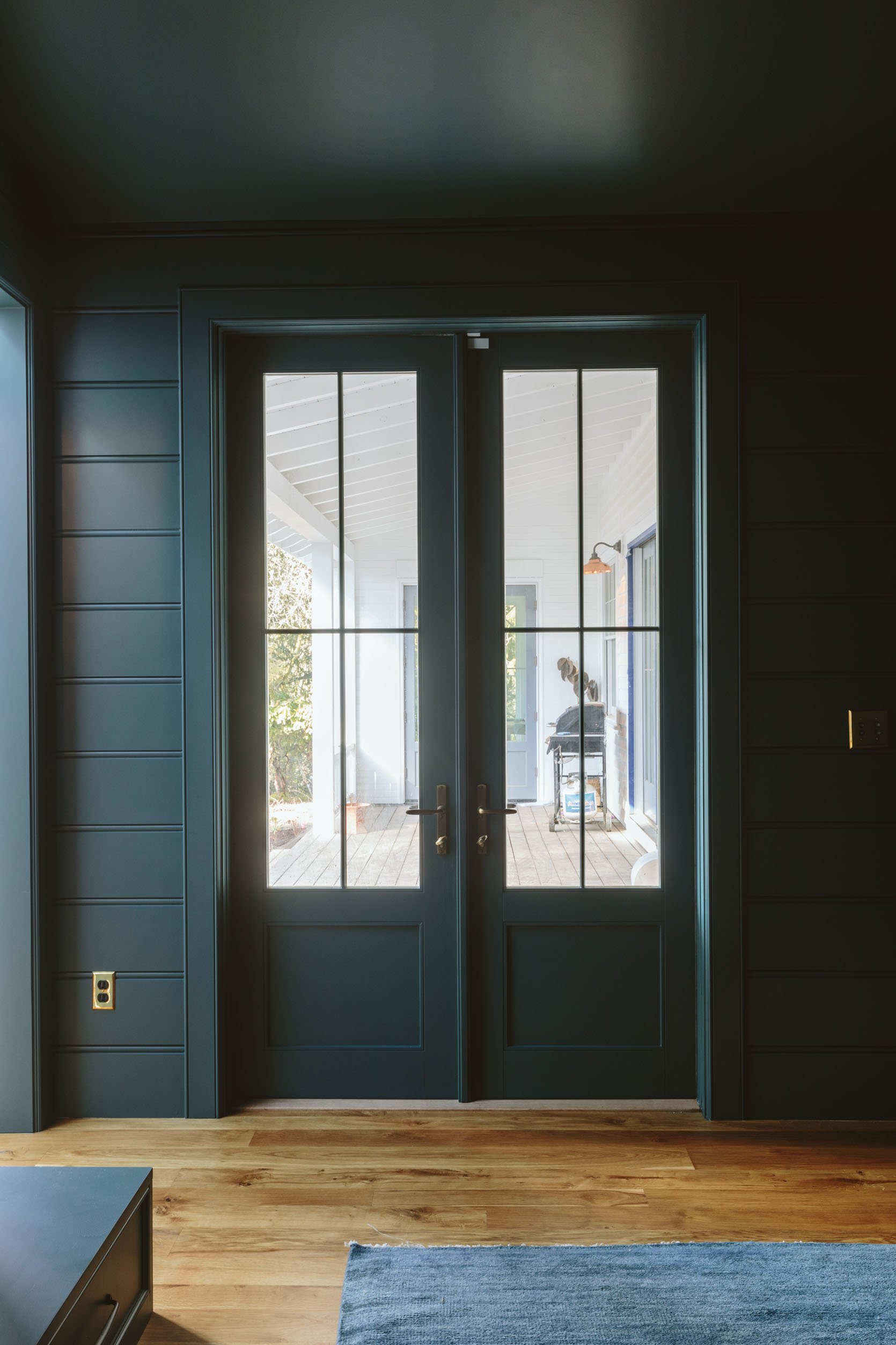
You see, this room has only one source of light and it’s the door to the covered patio (and the glass in the pocket door but that’s pretty minimal). Plus the ceilings are high. So ironically (jokes on me) this paint color which is actually super pretty (SW Ponder) just looked like a non-color because of the lack of natural light. And with the high ceilings, the whole space felt vacuous and cold.
It has purple undertones which I actually liked, but didn’t work with the sofa that we had already selected and it just didn’t have a point of view. I thought I could accessorize it enough to bring life to the room, and I could have. But I knew deep down that the color needed to be darker, richer, deeper, and bolder. So here we are…
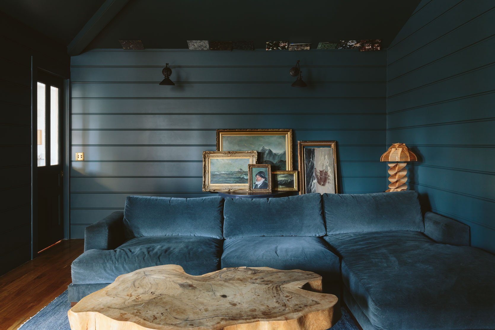
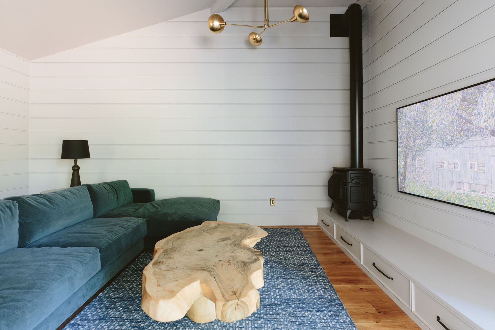
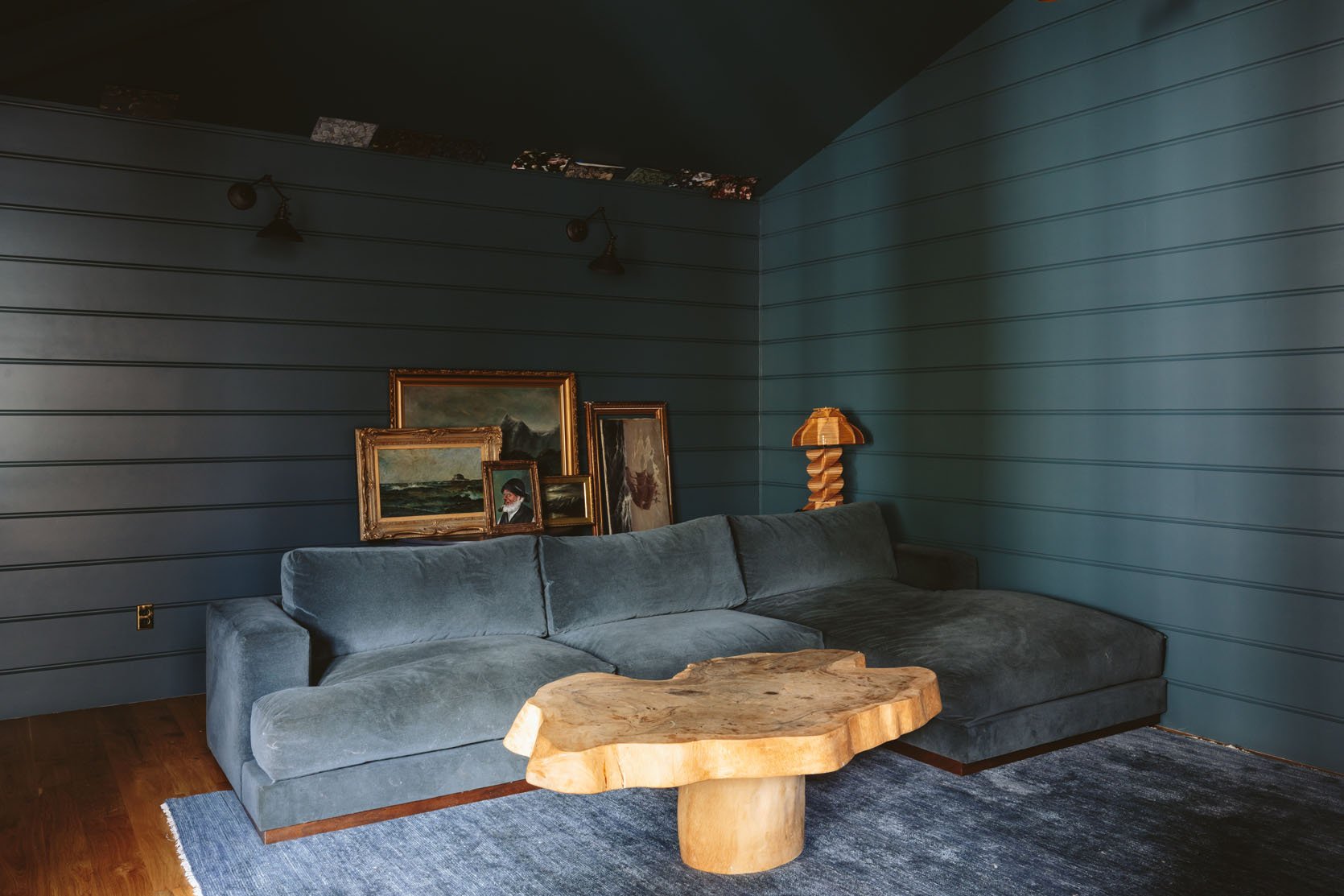
So after staring at the sticker of paint on all four walls for MONTHS I decided that 80% sure was the closest I was going to get to feeling confident. Still Water by Sherwin Williams was the winner – with the same greeny undertones as the sofa, and was dark but “bright” if that makes any sense (still full of color and pigment).
Wait, Is It Super Dark?
I mean, it’s really dark but absolutely wonderful. It’s exciting and calming and moody–making it a really joyful experience to be in here. The color is gorgeous and with the lamps all off (which is how we shot this) it does indeed look and feel very dark, but with the chandelier on (facing the ceiling, not downward) and the lamps on it’s so warm, fun and pure ambiance.
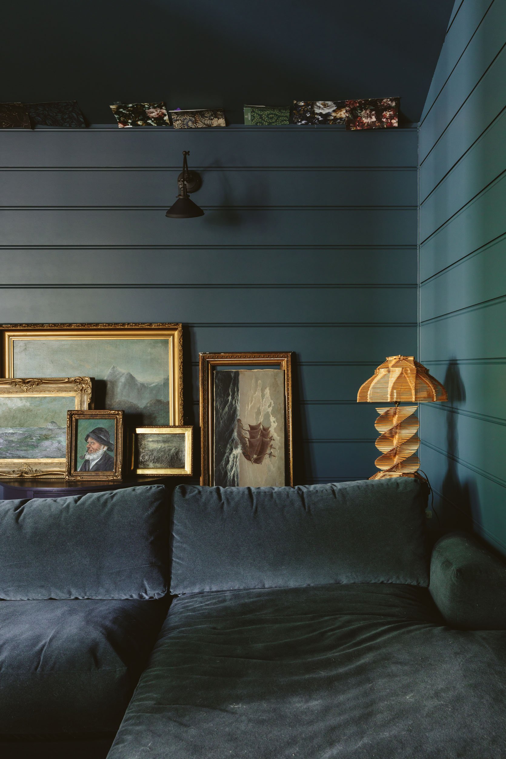
What you may notice is all the wallpaper samples on the ceiling–yes, I want to wallpaper the ceiling with a subtle pattern that makes the high ceilings worth the effort to look up. Nothing bright, bold, or graphic–but more just a secret treat for the eye when you notice it.
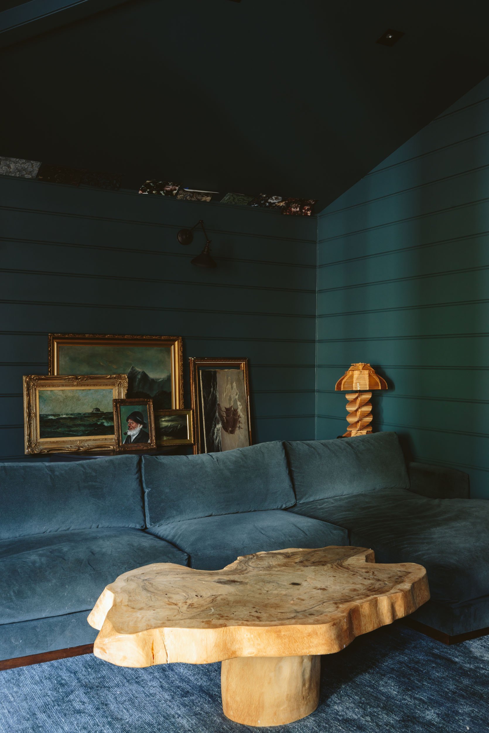
That blue and gold/wood combination is EXCELLENT. Imagine that whole wall of seascapes with the lights on them!
This is THE coziest sectional where I can snuggle both kids in that corner.
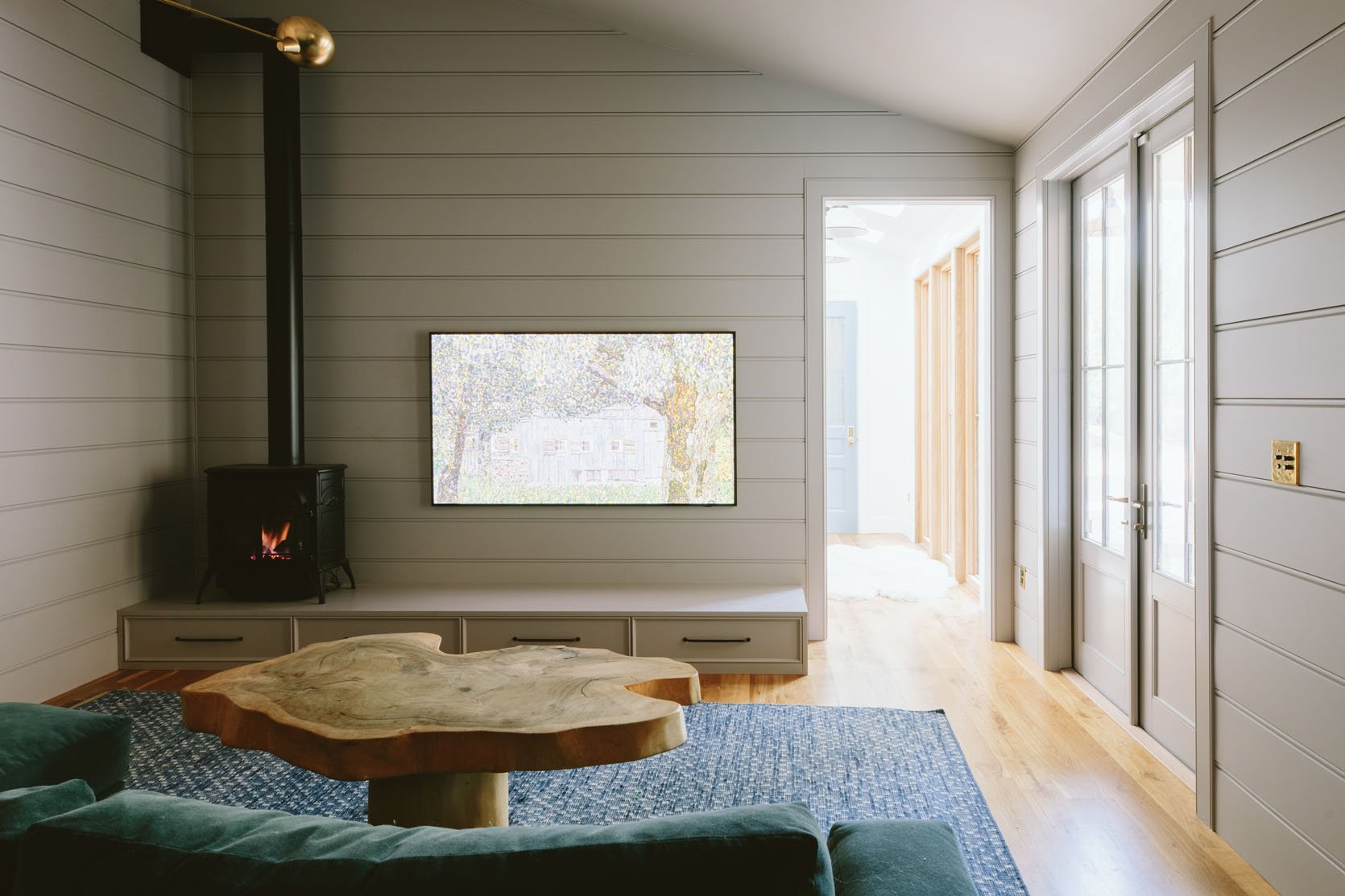
I need to choose art to go up there (I’m thinking a framed version of my favorite vintage plaid).
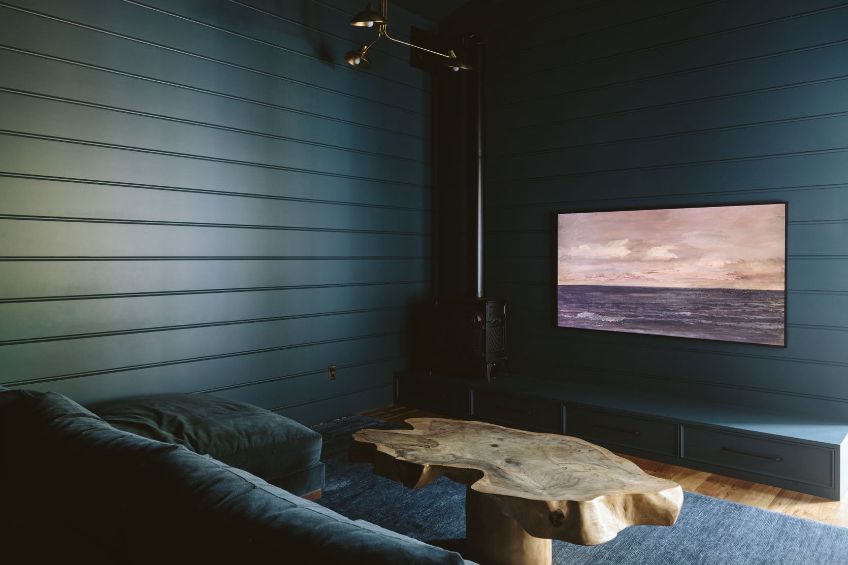
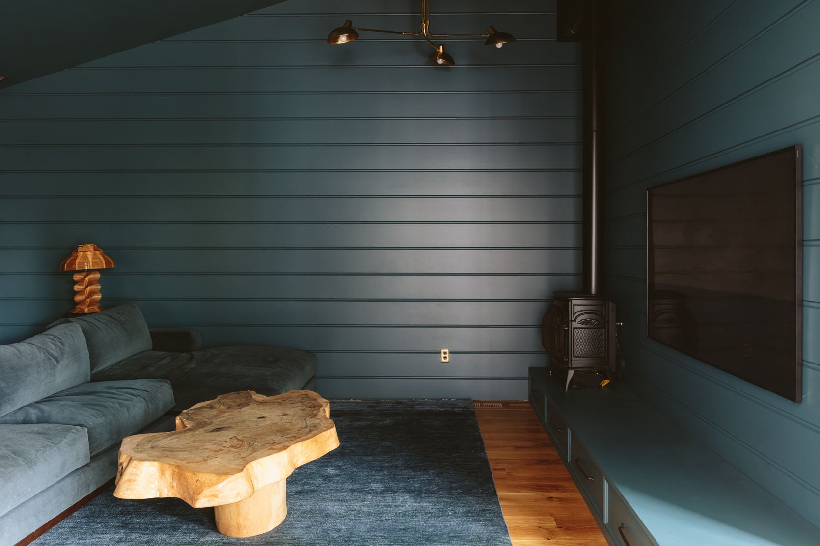
The fact that we shot this without the fireplace and lights on was so dumb! It’s so cozy once you get the ambiance going so I’ll shoot it again soon with both so you can see.
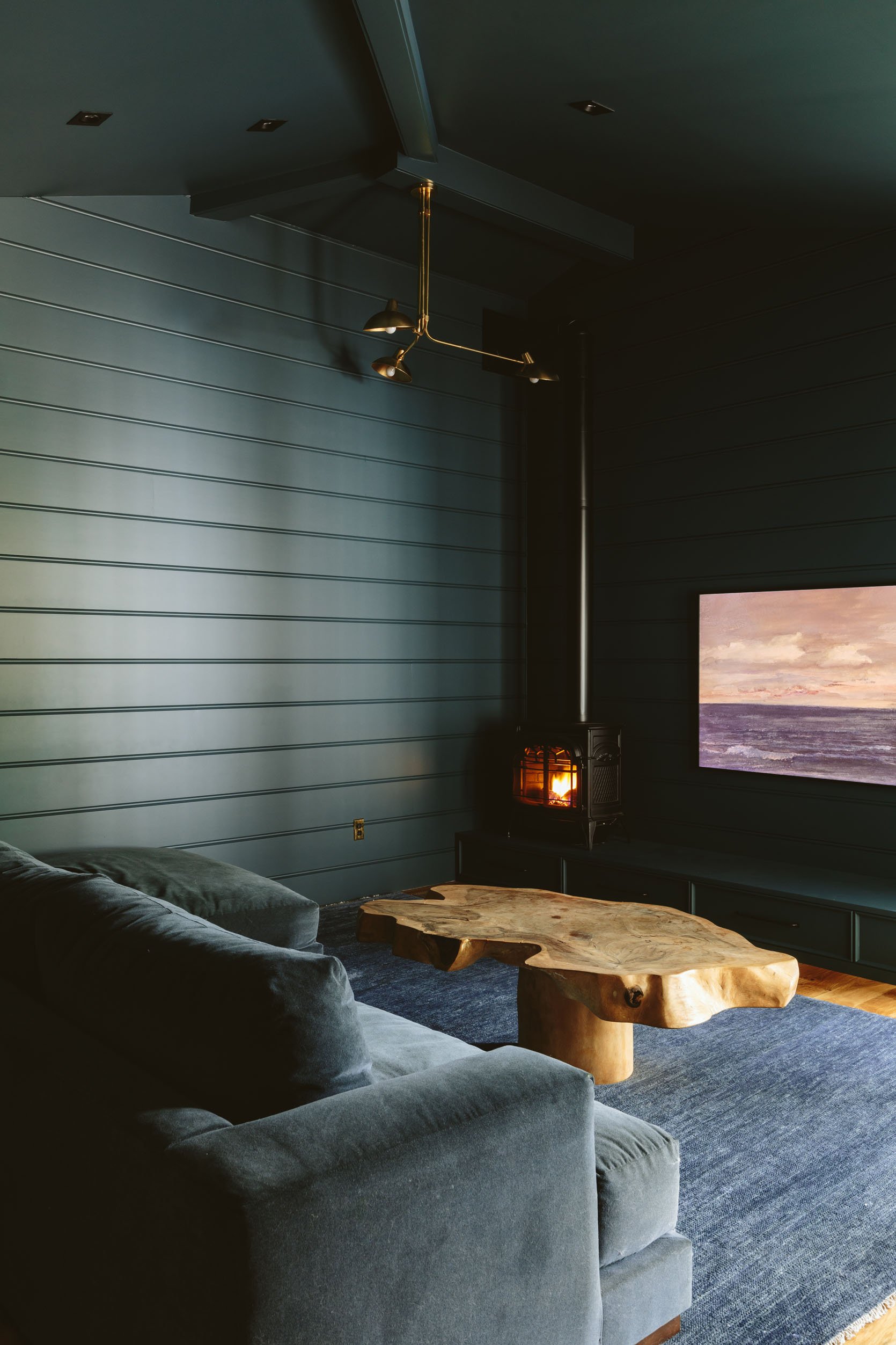
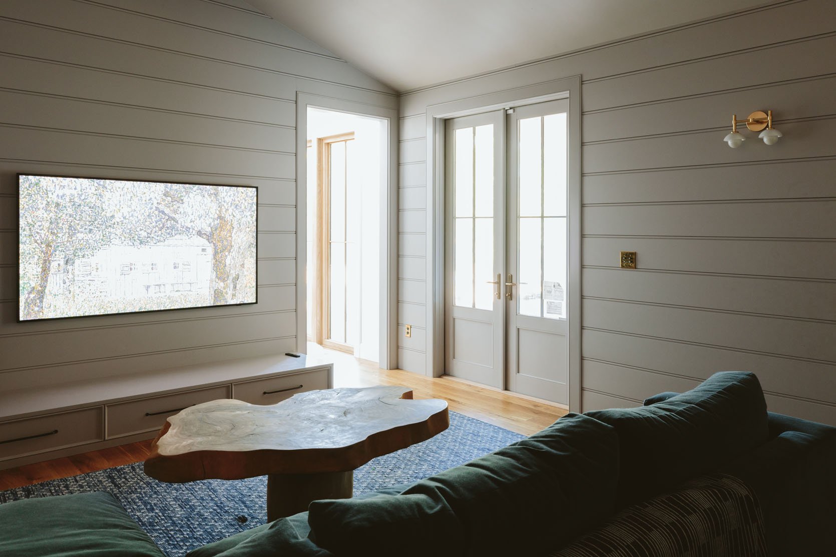
We have a long ways to go for sure (but I’m closer than you think). The coffee table might move into the living room (but looks good in here, too). The rug was supposed to be the greener version (Enkay’s Raksha Rug in Aqua) but this indigo version still looks good and is so pretty! (and the greener version is now back-ordered). So we think we are going to mix blues and greens in art and pillows and make it work. So yes, we need art, a bookshelf behind the sofa (to put lamps and drinks/popcorn on), pillows, and to figure out what goes on top of the bench. We are also still adding the door to the hallway so we can shut off the light when we want to (it’s western and blasts in the summer) and then put roman shades over the glass on the patio doors. We are making it more of a dark room, but I suppose that’s what dens were always supposed to feel like – just a dark respite from the rest of life. Embracing a mood is clearly not easy to always execute, but now that I’ve nailed the wall color I’m alllllllll iiiiiinnnnnn. xx
Resources:
Paint Color: Still Water by Sherwin-Williams
Sectional: Rejuvenation
Chandelier: Rejuvenation
Fireplace: Vermont Castings
Rug: Enkay
Flooring: Oregon White Oak by Zena Forest Products
*Photos by Kaitlin Green
THIS POST WAS ORIGINALLY PUBLISHED HERE.
