As you know this room is my problem child – so much potential and I can really love the great qualities about it, but I’ve been stumped with how to handle it. It’s coming along now (as you can see at the end) but it took a lot of indecision to get to the point where I felt 65% sure that I wanted to paint the drywall – a percentage I wish were higher, but I just went ahead and did it. But before that, I had Misty photoshop some options for the walls to see if that could help my decision process and it did. I didn’t like any of the ideas that I had, so there’s that! Here we go:
Swivel Chairs (from opening photo) | Rug | Sectional | Leather Sofa | Sconces | Chandelier | Black Side Table
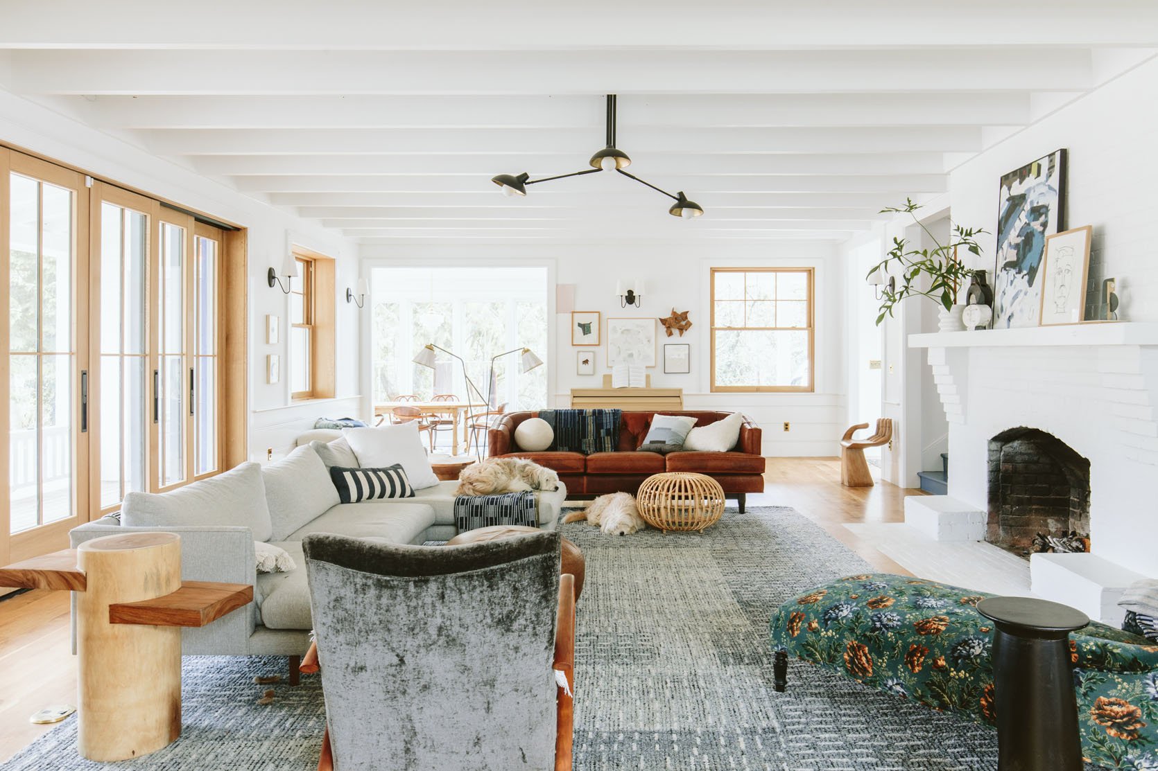
This is where the room was when we sent it to Misty (now realizing she should have done it off the first photo when the walls were bare – sorry Misty!). You can see the room coming along, but the walls felt unfinished and the wood jams and sashes bothered me but I had NO CLEAR SOLUTION.
The three biggest challenges:
- The Paneling and Trimwork. The paneling was painted a very cool white in semi-gloss and repainting it requires a 3-day paint job where the room has to be emptied and sprayed because the paneling can’t be rolled (well it can, but it will look better if its sprayed evenly). I kinda backed myself into this corner on accident, with way less flexibility. This is doable but expensive and extremely disruptive. And then change it to what? Even if I could snap my fingers I didn’t know what the right color would be.
- The Drywall is so broken up. As you can see there are so many doorways, windows, etc., so painting the drywall something darker would make the room so choppy and busy. So we needed lighter… Fine, but choosing the right light tone I find to be much harder than dark because it’s harder to get a sense of the tone from a sample. And boy did I try out a billion samples.
- The paint color shouldn’t compete with and should enhance the kitchen tile.
So we tried some options:
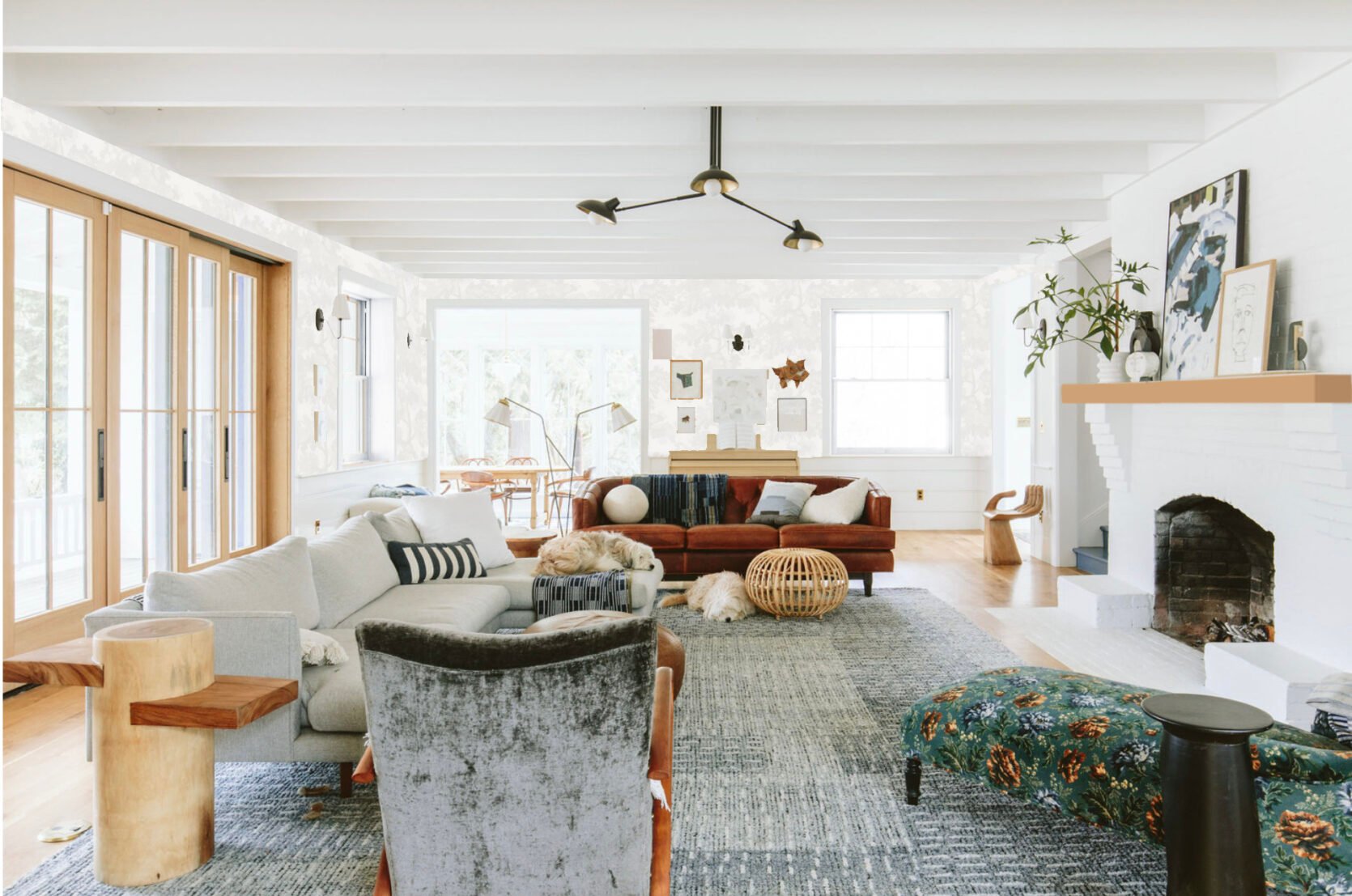
Neutral Wallpaper

I love the Sandberg Rafael white wallpaper so much – just a few tones of white (one that matches our cooler white). But when Misty photoshopped it in here (granted renderings are hard) it was certainly not a hell yes. But then I thought that maybe it’s the wood of the windows that pops too much for me and throws everything off balance (this is still a current running theory).
Neutral Wallpaper With White Painted Windows
Now painting these white oak windows is NOT IDEAL and would take me being 95% sure it’s the right decision. But seeing it photoshopped the same as the trim color is something I do really like. Brian and other people don’t agree so I’m not doing it anytime soon, but to me, it makes the room way less busy so that you can focus on the real moments – the ceiling, the fireplace, and the big wood doors (that we wouldn’t paint). But y’all, once painted you can NOT go back. In this one Misty also made the mantel wood – which I like but don’t love (not sure why).
Light Blue Wallpaper And Trim
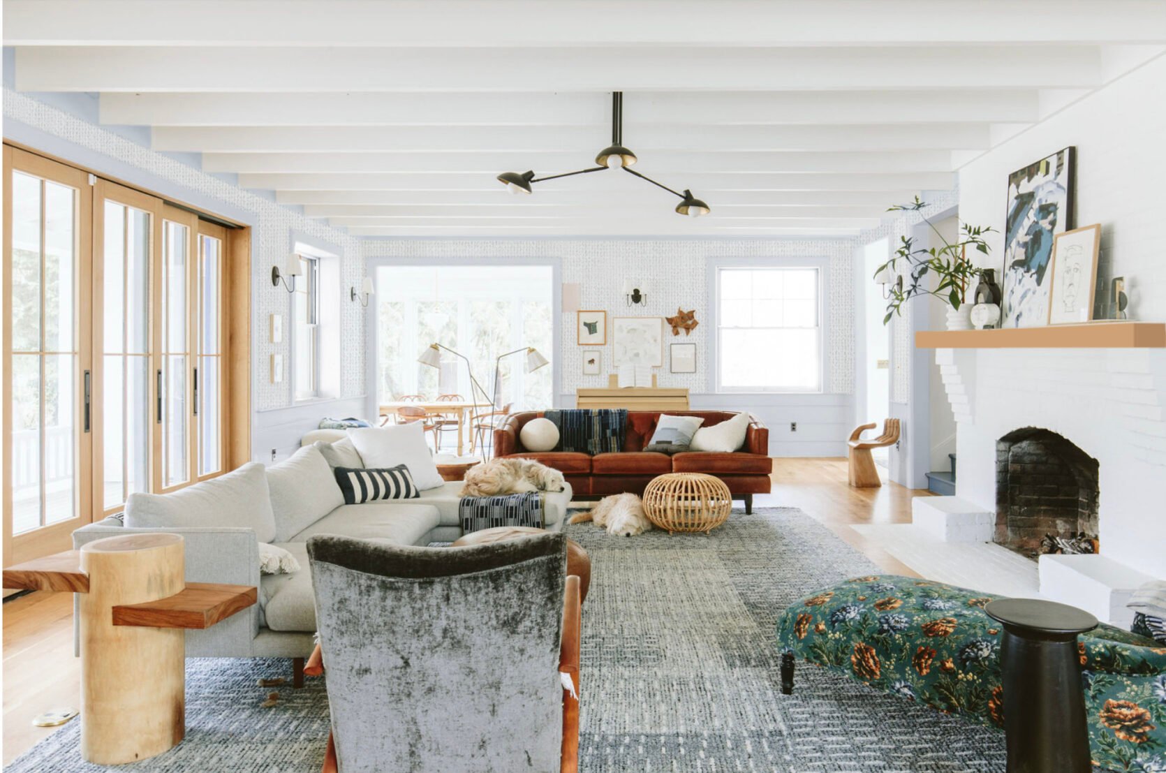
This was meant to be a fabric wallpaper/texture and have the trim match it completely. We tried to make this work really hard – using the Ashley Stark fabric wallcoverings. Again, just a texture (it looks like a pattern up there). Ultimately we worried that the tones of the fabric which you can see here (stone and pebble) might have been a little gray for this room.
Neutral Walls

This was a neutral I thought I liked (to add warmth) but uh, no.
Bold(er) Pink

We have a lot of blue and green (and more green coming) so I thought maybe a pink on the walls would be nice to see. Nope!
Pale Pink

Still nope! Perfect for Easter!
Pale Pink And Trim
But here it is with the windows painted out the same pink (which I still prefer than the wood when you look at the overall room).
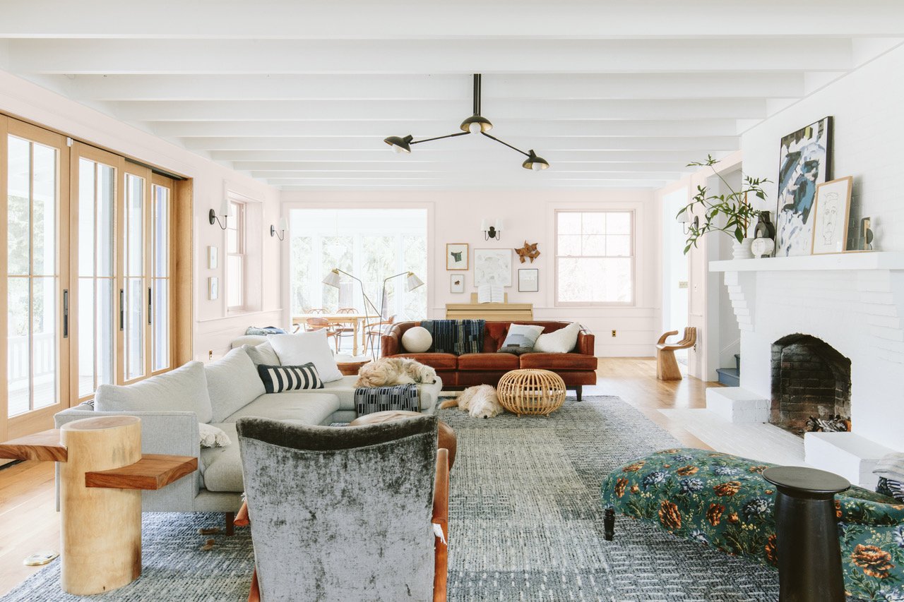
What We Painted – Where We Are This Week

So when we were gone for Spring Break we had the drywall painted Mantra SW 9631 by Sherwin–Williams. It was a last-minute decision but I felt 85% good about the sample and since the drywall was just a few hundred dollars, took one day, and didn’t require spraying (so we didn’t have to unload the room) I said, “let’s just do it”. I came back and was so pleasantly surprised. It’s a happy extremely pale light tone of blue, with some green in it. We were worried about going too gray as to look sad in Portland but it’s such a pretty color. Am I 100% sure that it works? Nope! But I’m moving forward with the other elements that are happening. We have bought this sofa, and am planning on cafe curtains on the deep sills, big curtains on the big doors (maybe), and still considering upgrading the mantel to something warmer (or even still painting the brick). So I would say I’m 70% happy with this color and have no idea how it could be better. I still kinda want to paint the wood of the windows, but last week I played with a piece of sheer white fabric as a cafe curtain and think that might help a lot. I’m going to try everything I can before we paint those windows, FYI. I think my biggest challenge is that the room looks more formal than I want it to be because of all my choices. The paneling in semi-gloss is kinda formal. The lights are very traditional and could be considered formal. And all the trimwork – molding and paneling give off this higher-end vibe, which is not a bad thing but it also reads more formal. But I’m embracing it and really feel hopeful that through furniture and decor, I can make it feel happy, beautiful, and more casual. But all in all, we love this pale color and I can’t wait to show you other angles of it (just need to shoot the dining nook before I can show you :))
More to come soon, but what do you think?
Resources:
Wood flooring: Oregon White Oak by Zena Flooring
Windows and Doors: White oak, Aspen Casement by Sierra Pacific Windows
Stairwell Color: Smoky Blue by Sherwin-Williams
Wall Color: Extra White by Sherwin-Williams
*Photos by Kaitlin Green
THIS POST WAS ORIGINALLY PUBLISHED HERE.
