When people ask me “What wallpaper did you end up choosing for the ______ room,” I find myself responding with a classic Emily caveat, “You are going to be underwhelmed… lower your expectations…” Then I show them the sample and sure enough, they are underwhelmed and often confused, like “why that one?”. Here’s the thing (for me) – I LOVE pattern, texture, and color but if you have all of that in a room it will have a lot of contrast which is fine for people who like a more exciting and visually stimulating home. But (and I feel like a broken record) I want a calm, quiet, warm home. This is virtually impossible with my job (so much production here), kids, pups, and years of hoarding/collecting wonderful things that I want to play with. So for me, the solution is to go big at times (on the floor, like our sunroom) but keep what is at eye level more calm/tonal/quiet. This is the first time I’m doing this strategy so I’m not saying that this it’s foolproof, I’m just trying it to ensure that on a messy Thursday afternoon, after a long week, I don’t look around and see utter chaos and want to escape my own home in search of calm (which used to be the case in LA and why I loved the neutrality of mountain house so much). So if I like “stuff” (which I do) and I like color (which I do) then it’s my current theory that I need to go quieter OR tonal/monochromatic (which is quiet in its own way) on the prominent walls in order for me to be able to still explore with color, pattern and all my vintage “stuff”. So that leads me to gravitate towards and use what you could say are very, very neutral wallpapers.
I also want to quickly say that I did indeed also choose at least two busier/more colorful wallpapers in the house already (Elliot’s room and the guest bath which hasn’t been installed yet). And I have two left to choose and I’m not sure what way I’ll go. That means we’ll have a total of six papers in the house, btw 🙂 See? I like pattern and texture 🙂
The Entry Wallpaper
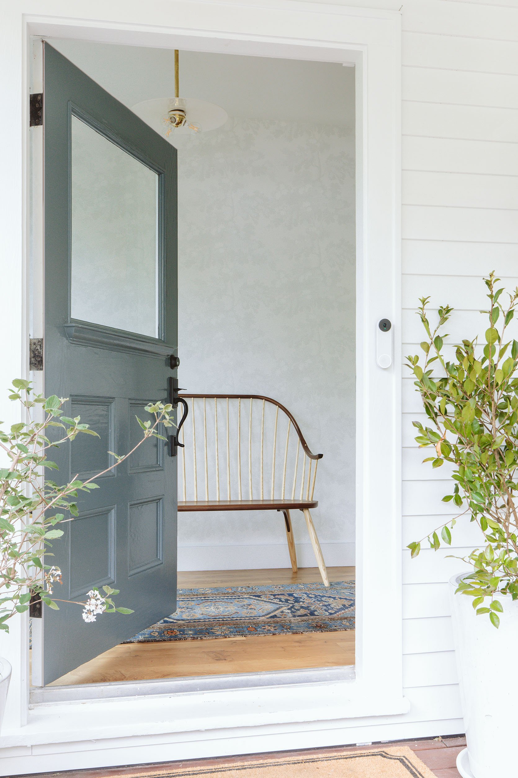
Y’all. It’s so pretty. It’s the Scalamandre Raphael Sandberg wallpaper in white. This wallpaper for this room was extremely hard to choose because of the following:
- It’s the literal first impression of the house so I wanted it to set a happy, calm tone.
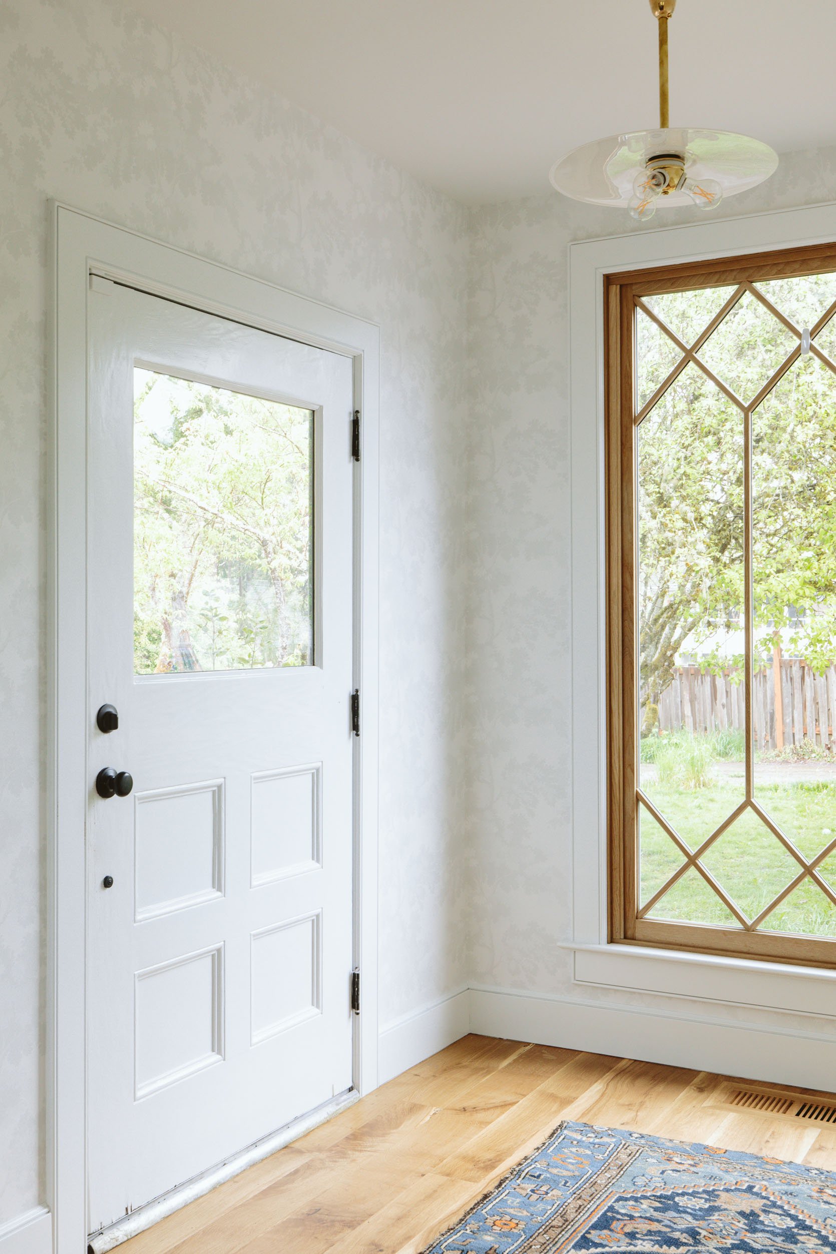
- The window to the left is the star, so whatever pattern we choose needs to complement it, and while I did consider some more linear patterns, something more organic would look better with the window’s lines.
- You see this entry from the living room, dining nook, etc, so has to look good with everything.
- At the same time, this is an enclosed space and could be an opportunity to do something more fun. I didn’t want to just paint.
After looking at more bold florals for months and months and months, some of them I got tired of looking at if I’m being honest. This might be due to again, the fact that I stare at design on the internet all day and I see these patterns repeat (which is going to happen if they are good!), but slowly I began eliminating the ones that I felt that I would tire of or were just wrong for a variety of reasons. And what was left were all the soft neutrals.
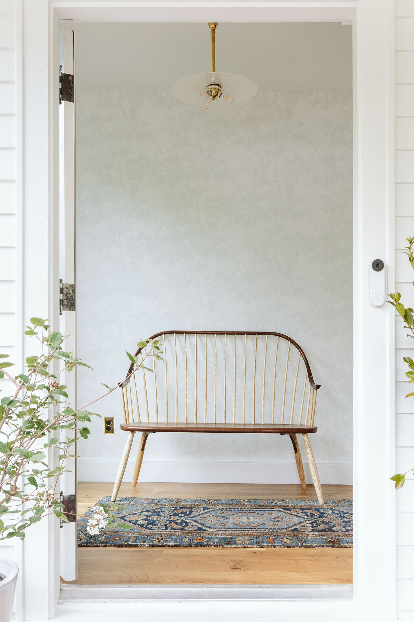
Bench | Pendant Source | Rug (vintage)
I really really really love it. After living with it for two weeks I’m even happier. I had a literal nightmare about it being underwhelming, but when I woke up that morning and came to look at it again I was like, “Nope, this means I get to have more powerful art”.
That light fixture is vintage from the Antiques and Vintage part of Rejuvenation. I LOVE that they still carry vintage on their site since as we all know the profit margin isn’t necessarily high for this compared to manufacturing new. I love that three-way bulb fitter in this as well. Thank you, Jordan 🙂
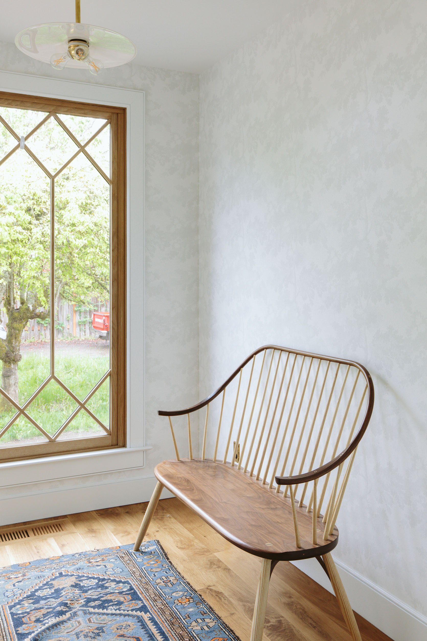
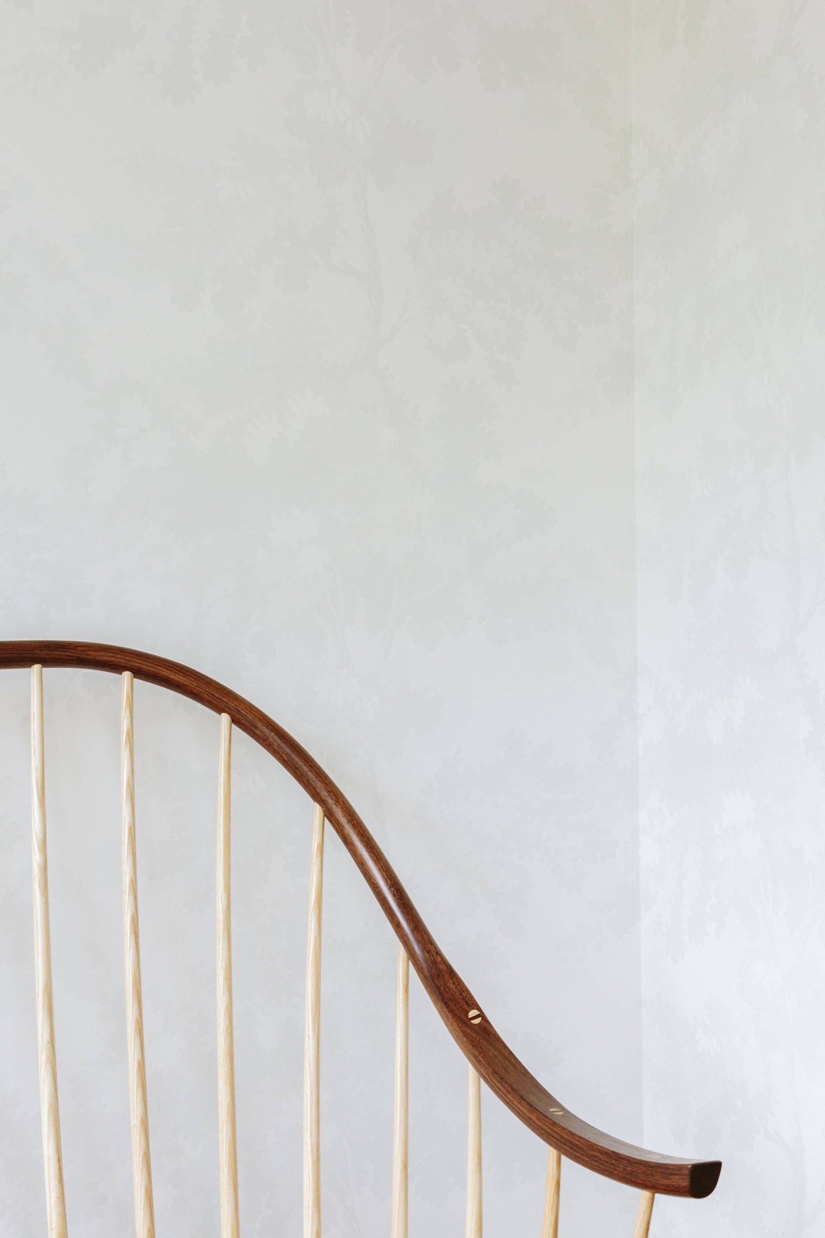
Let’s talk about that bench real quick. It is from Thos Moser and it’s just stunning. I ordered it months ago, awaiting this exact spot. It’s two different kinds of wood – marrying the darker and lighter wood tones we have in the house and the craftsmanship is out of this world. It’s an heirloom piece that we’ll keep forever, by a company that I’ve loved since I was an assistant stylist in New York. Thank you Thos Moser for this beautiful piece that greets our guests. That swoop is just so pretty!!! Also, I may or may not paint the inside of the door 🙂
See what I mean??
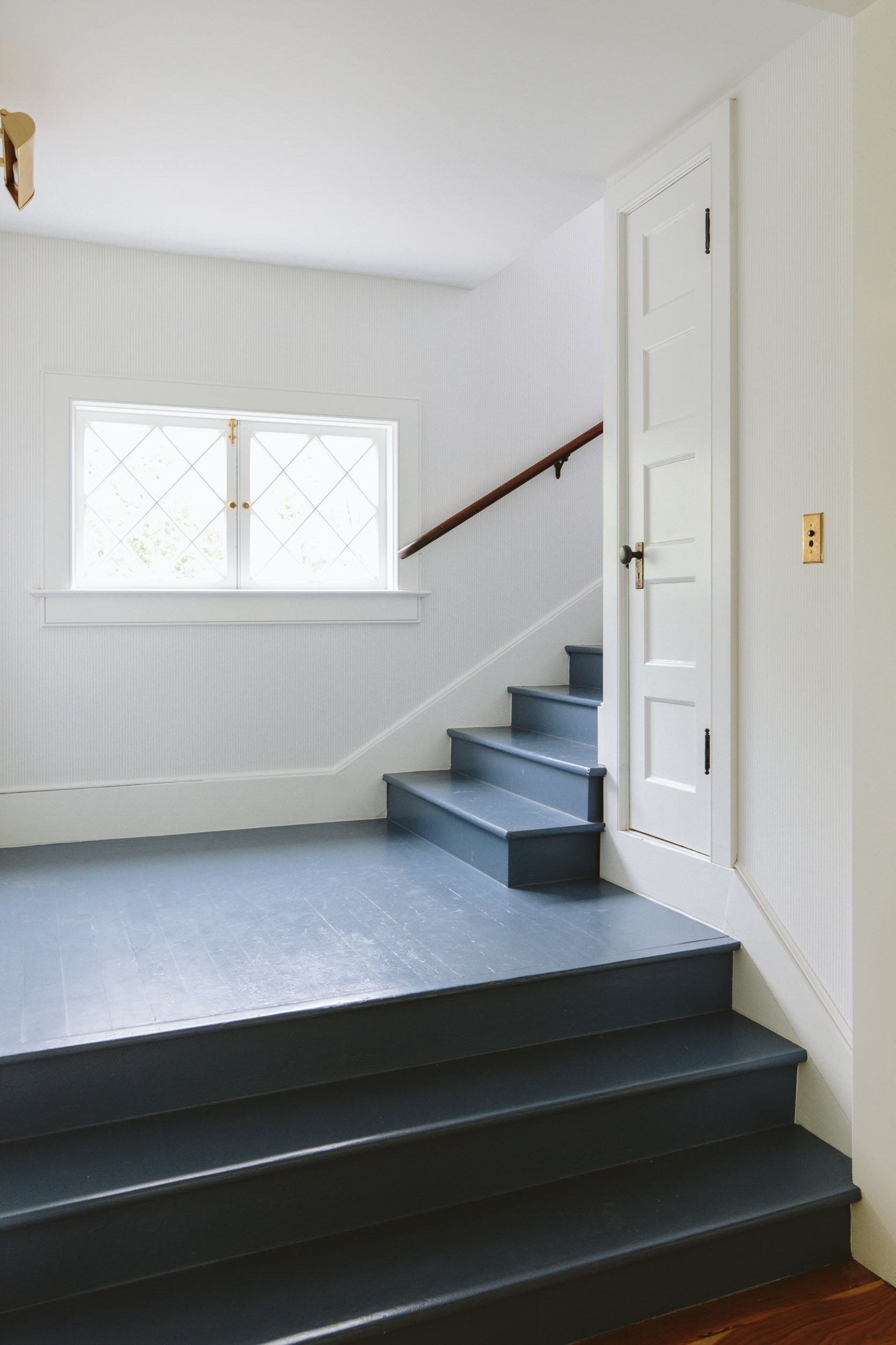
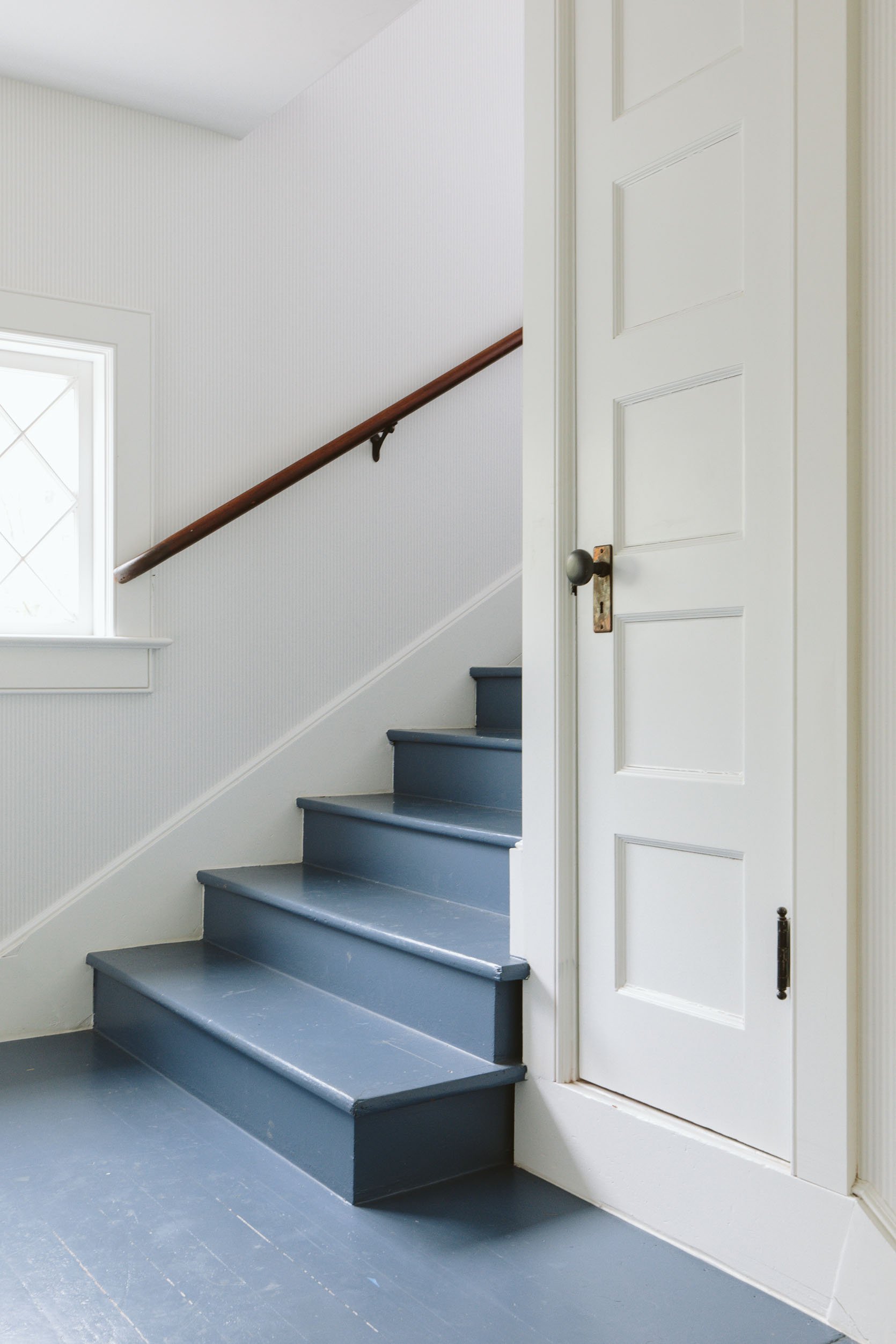
The Stairway Wallpaper
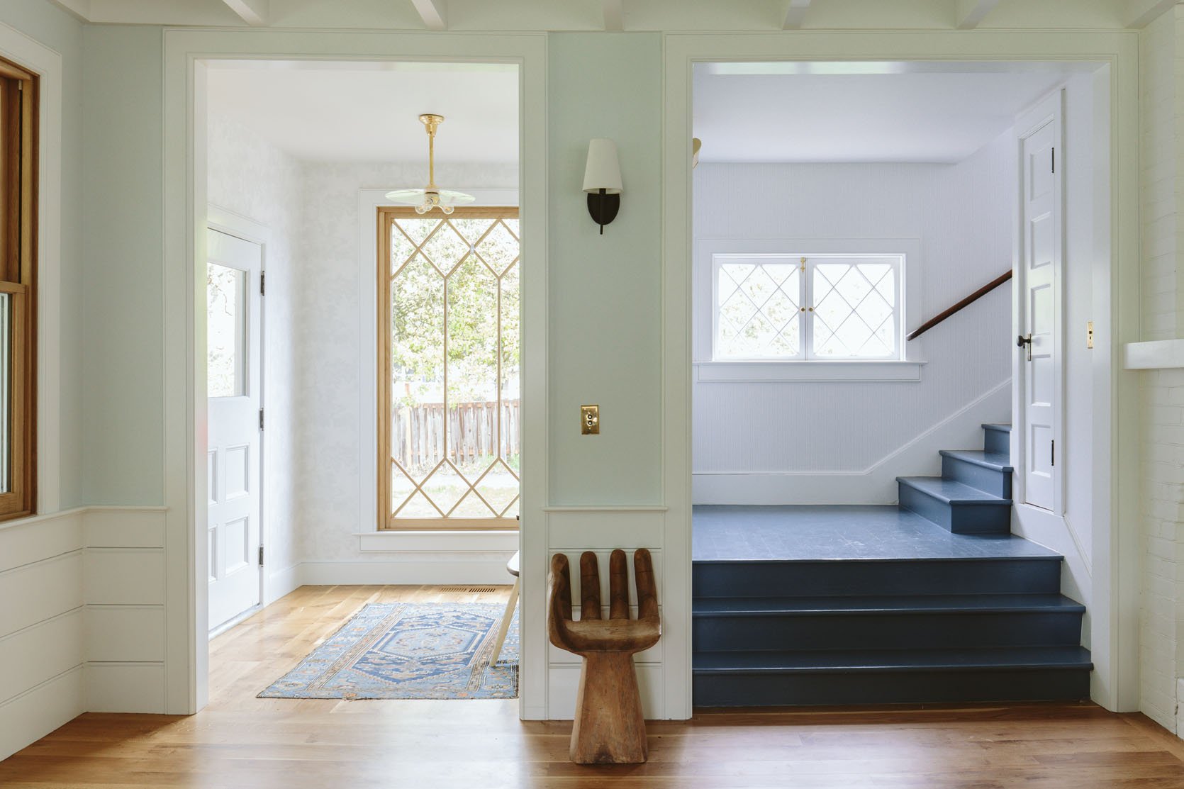
Blue Wall Color | White Trim Color
That window from Sierra Pacific is just ridiculously beautiful. White oak on the interior, a custom pattern that ARCIFORM helped me design. So many high fives. Also, the blue on the walls (SW 9631 Mantra by Sherwin-Williams) is reading bluer than it does in person (but it does change throughout the day for sure). If you look REALLY, REALLY HARD you’ll see that the stairway is indeed papered in a tiny subtle pattern.
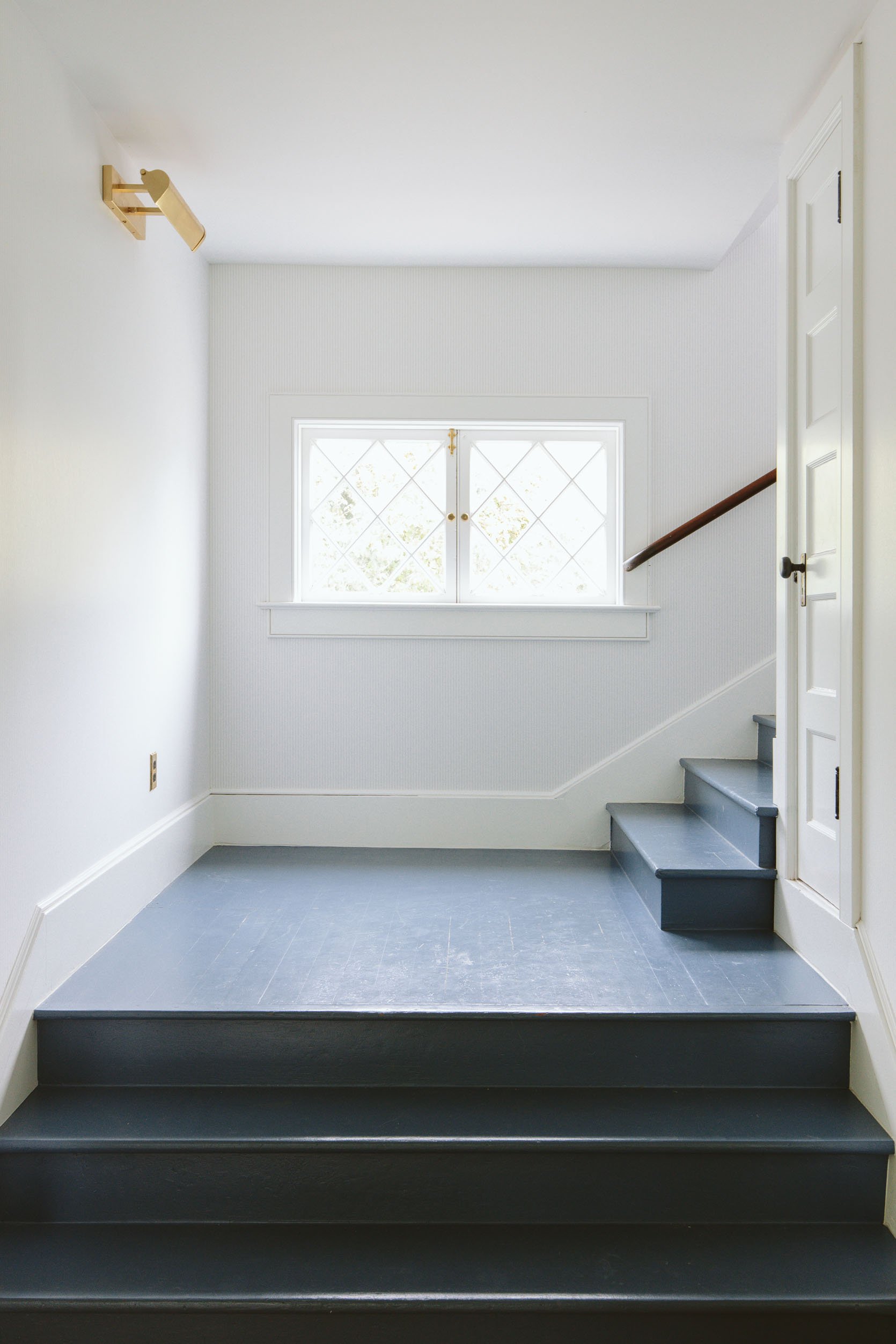
Do you see it here!!??? It’s a very light warm gray/blue and white ticking stripe. I’m ABSOLUTELY obsessed with it and it makes me so happy every time I walk up the stairs. The reason I went so quiet here is that I’m going to be hanging a ton of family photos/personal kids’ art all up the stairway. So I wanted to do something here, but it had to be super quiet in order for it not to look chaotic.
It’s all up on the landing, too (the hallway that enters all the bedrooms) and it looks SO PRETTY. I feel like I’m trying to convince you here (and I must be) and no, it doesn’t necessarily read on camera well (like at all). I guess this shows/proves that I’m designing for me and my experience in this house and less for the camera/photos (which is both good and bad).
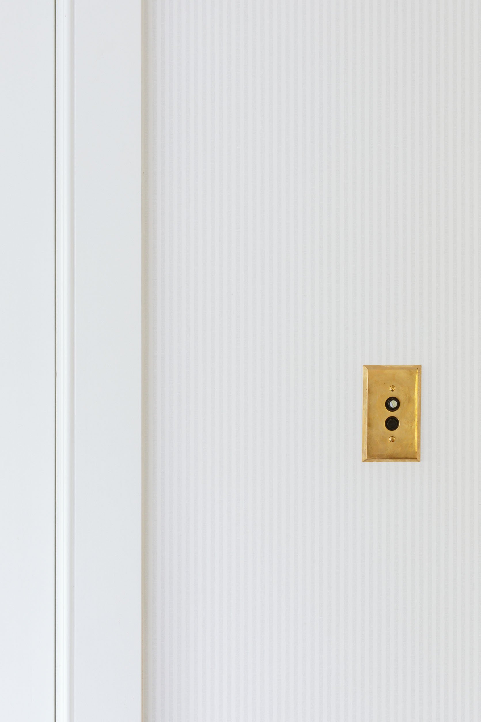
See? There it is 🙂 Here’s my case for it – it’s like limewash or a textured paint treatment. For this house, we didn’t choose a paint texture anywhere but a quiet wallpaper like this does the job of adding texture and interest, without busyness.
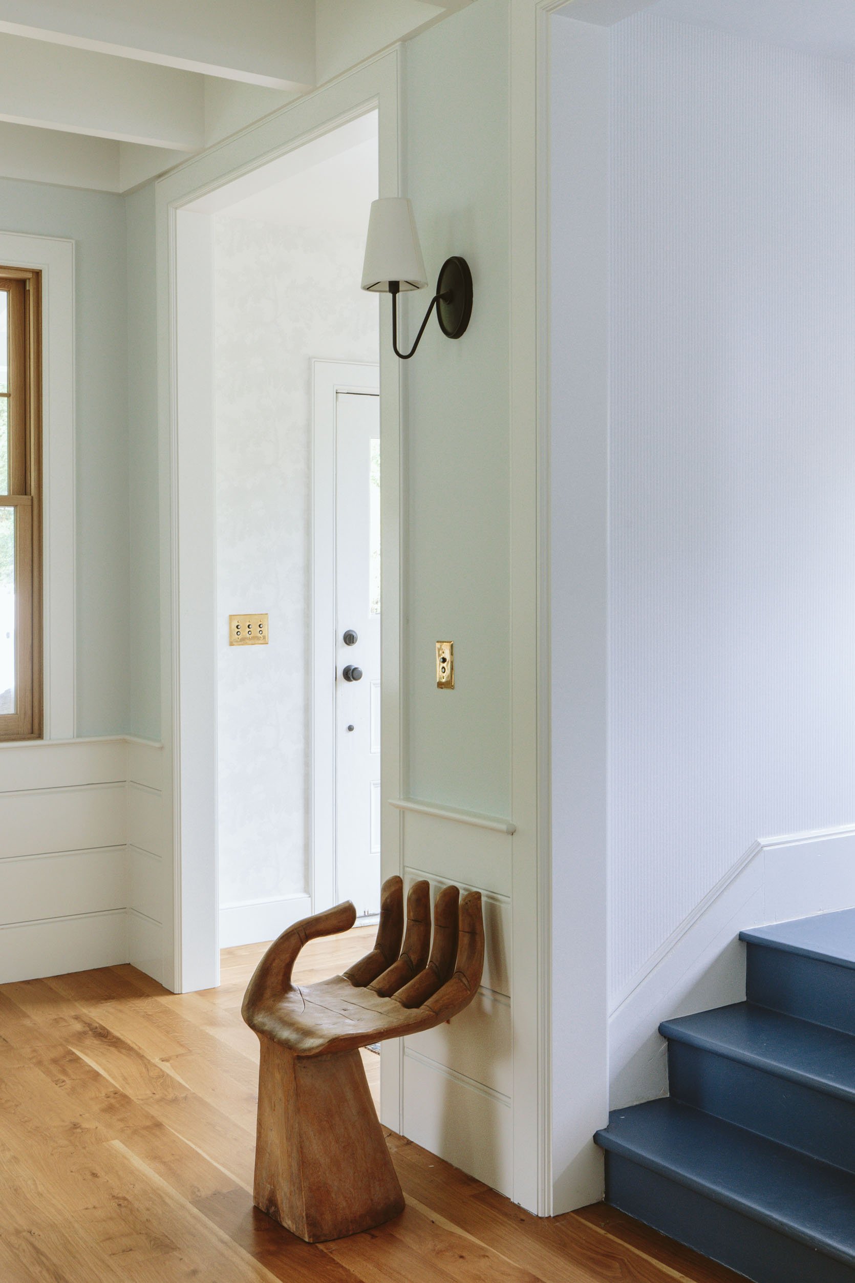
Here you can see both work together and what it looks like from the living room. Both make me so happy and allow me to go a little more nuts on art/rugs. Now the real challenge is how to do a family gallery wall up the stairs without damaging the wall with a million holes… I might, for the first time, try a different technique to ensure that where we hang everything the first time is the right place. Wish me luck 🙂
Resources:
Wood Flooring: Oregon White Oak by Zena Flooring
Windows and Doors: White oak, Aspen Casement by Sierra Pacific Windows
Floral Wallpaper: Scalamandre Raphael Sandberg Wallpaper via Lulu and Georgia
Striped Wallpaper: OSCAR – 6263 by Scandinavian Wallpaper
Stairwell Color: Smoky Blue by Sherwin-Williams
Wall Color: Mantra by Sherwin-Williams
Trim Color: Extra White by Sherwin-Williams
Lighting and Hardware: Rejuvenation
Bench: Thos Moser
*Photos by Kaitlin Green
THIS POST WAS ORIGINALLY PUBLISHED HERE.
