Dear A.I. Robots/Santa, Can you please create a building where we color-loving humans can walk through and experience every single paint color (in both natural light and dark) before we commit to it on our walls? Now that I’ve designed a fair amount of houses and painted many a room I feel extreme confidence in certain colors, even as my fear of trying new ones and getting them wrong runs deep (and at times keeps me from taking some color risks). Wouldn’t it just be magical if Sherwin-Williams had a physical room for every single color??? So I could stroll in, grab Brian’s arm, and say “Ooh I love how this feels!! This is perfect for our family room” instead of painting the room, say, multiple times? Because while the amount of light, direction of the sun, location on the planet, and your hard finishes of course can change the tone of the paint color, for the most part, the fear of getting it wrong lies in whether the color itself is one that you like enough to be surrounded by while enjoying the room. And at times that is just so hard to predict from a 10×12 sample. Trust me.
So today I thought I’d start rounding up my favorite blue paint colors that I’ve personally experienced, and would ABSOLUTELY use again. This all stemmed from me helping design my brother’s river house where we painted 7 different colors – all SO GOOD, and it makes me want to invite the whole world over so you can experience the color versus just looking at it online (which y’all, it’s just hard to trust). I’m going to leak the colors we chose at the end (without photos, yet) because they are all so freaking good. But first, let’s start with what we do have good reference photos of:
Dew Drop by Sherwin-Williams

Soothing, light, and airy, with some green in it – this super light blue is so dreamy, especially in a lot of natural light. I think in a dark room it might not read as a “color” per se, but here against the white and wood it’s so good. My friend painted her teenage son’s room this color and he LOVES it. It’s not baby nor does it feel pastel, just light if that makes any sense.

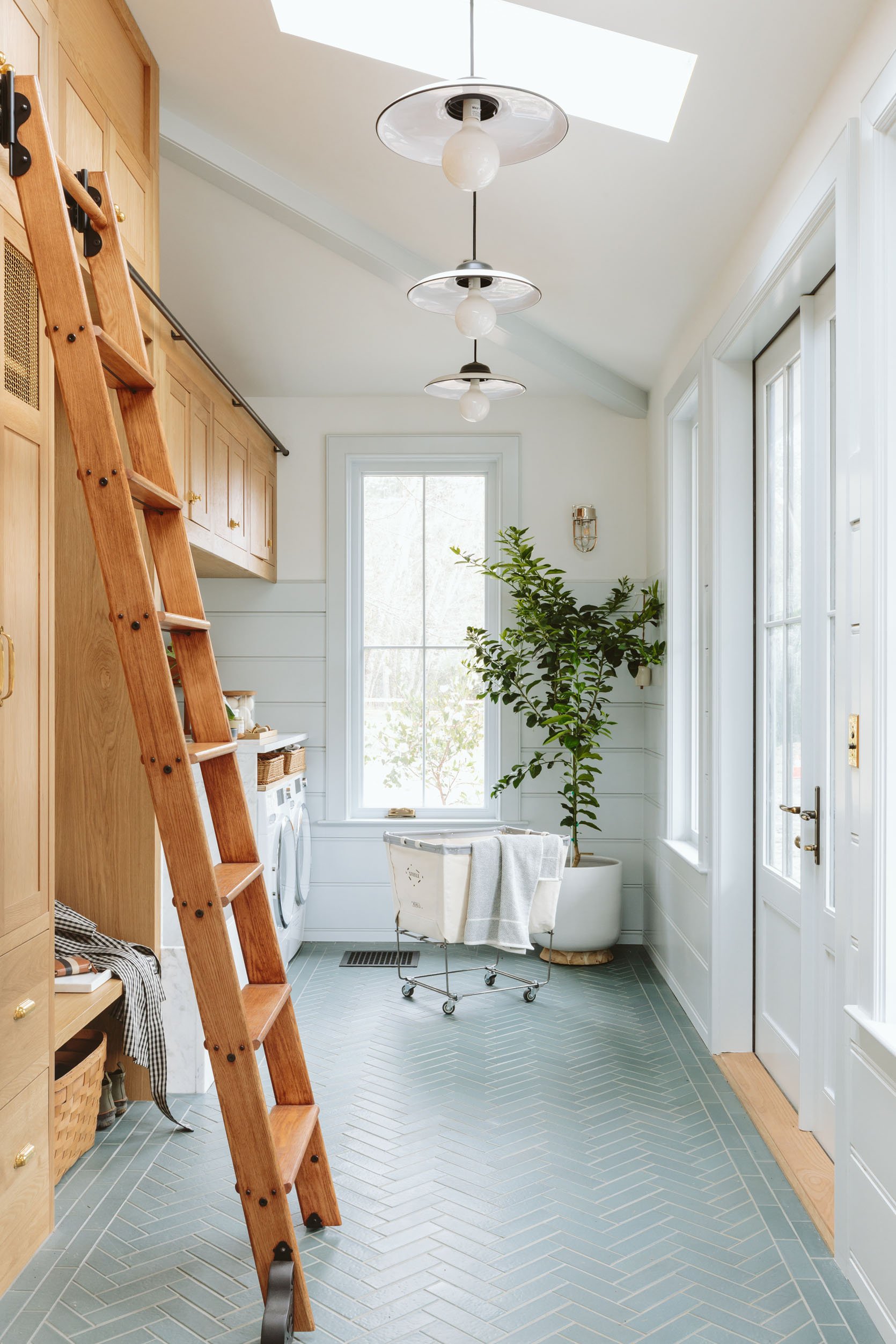
Now for this no-natural-light laundry room, we chose something more saturated (than our well-lit room) which was the right call because it needed to have more pigment to really show up (I’ve had to learn this lesson a bunch of times!). Sleepy Blue is definitely more on the pastel side, thus being so happy and bright. Less grayed out sophisticated and more clean/fresh and happy. I think this color would be awesome in a well-lit room as well, but test it out because it might read more pastel and bold baby blue or it just might be a bright happy sunny blue.


We used Clare Paint’s Good Jeans in our basement bathroom (a pandemic budget upgrade we did right before we sold the house). While bolder than most of my denim, this color felt saturated and calming. It might be even better in a room meant to be darker and cozy like a den or a media room.
Debonair by Sherwin-Williams

I LOVE this color and have it in my bedroom, obviously. Now the only thing I’ll warn you about is I think it’s better in a room with less natural light so that the moodiness is embraced. it has a lot of undertones in it that play differently throughout the day and it’s so cozy at night or when it’s cloudy. Now, sometimes when the light hits it the pigment pops in a way that is jarring, which is why I think this is best for a room with less direct natural light – a room that is meant to feel cozier (dining, office, den, family room). I’ll use it again, but not in a room that has 4 windows and 4 skylights (and if I could snap my fingers I’d change it right now to Eventide – a color we used in my bro’s house that is INCREDIBLE and has the exact amount of blue pigment I want while remaining light and still neutral).

Such a great blue – I wanted it multiple places after I painted this room. While the trend seems to be greener blues right now this grayed-out blue is super timeless, not bold, and has a point of view without being risky at all (IMHO). Also best for rooms with less natural light (y’all, if you want my #3 design rule it’s keep light rooms light and dark rooms dark).
Waterloo by Sherwin-Williams


The basement of the Portland Project, in Waterloo, sure is a happy yet muted blue. Admittedly, it looks like Slate Tile but lighter and perhaps a tiny bit less green? It is a good one and I think great for mid to low-light rooms (this basement looks bright in the photos but it opened to a huge covered patio so it’s def less bright on a normal day.


Here it is in another room, without natural light (except coming from the kitchen). Pretty happy and great 🙂

Clearly, I’ve got a type…this darker moody blue is SO GOOD. I’ve almost used it so many times and it’s always one of the top contenders, and now seeing it here I remember why. What a lovely dark yet still happy shade of a moody blue.


So dark and cool and definitely best for a room that has some but not too much natural light. It can go almost black, in a really good way.
Cyberspace by Sherwin-Williams


Another great “almost black” dark blue that was so nice for this room. It had a lot of natural light because you could see the pigment. I have found that sometimes in a room that has almost no natural light, a super dark paint color is hard for your eye to read and just looks “dark” (see Still Water commentary below) so if you want to see that it’s a super dark blue it needs some light to pick up the color.


Hague Blue is one of my all-time favorites that I haven’t used in a while! It has the slightest tint of green in it, making it a super dark indigo? I painted the exterior of The Fig House this color as well. Farrow & Ball is always a splurge (and color matching can be tricky because their pigmentation process is extremely sophisticated and nuanced), but if you have the budget for certain special rooms I love this color.

For those willing to go more bold, Stiffkey Blue is incredible. It’s not “BRIGHT BLUE” but it sure has a lot of solid pigment that makes it pop regardless of being in a well-lit room or a darker space. It reads as blue no matter what. Gosh, I love it so much and hadn’t thought about it for a while, but it’s for sure one of my favorites ever for rooms like this that can handle a lot of color (Ginny executed it perfectly, of course).

I used Stiffkey Blue in our old primary bathroom in LA which by the way I hadn’t seen in a while and I love it SOOOOO MUCH. I have a bunch of that leftover wallpaper that I’m kinda inspired to put in our little tiny hallway heading into our bedroom now. It’s just so good! Anyway, so is Stiffkey Blue. A solid choice my friends and great for small rooms like this, especially if only on the bottom (it could have worked all the way up but also might have felt a little overwhelming for a small bathroom.


Arlyn perfectly executed this super dark blue-gray-green. I love how its color drenched on the ceiling and she added all the art with white borders to break it up and add so much life.

Now this color, Still Water by Sherwin-Williams, has a lot of green in it but it still falls more in the blue category for me. This color is so unbelievably perfect in here because it’s meant to be a dark room so it still really reads as this dark blue/green/teal. If it were in a room with a ton of natural light it would have probably read extremely bold and TEAL (when we have the overhead lights on it’s a bit too much for me), but in the cozy lamplight, it’s perfect. So yes, just make sure that if you have a really bright room you like the boldness of the pigment. Here, it’s so perfect (THANK GOD).


Now I didn’t choose this color (the architect William Hunter, did) and it’s just so good. Certainly muted and leaning towards charcoal, this French Beret blue does have a lot of gray in it, helping it read muted, sophisticated, and wonderfully moody. We LOVED it in person so much and it was great for this darker space (the doors lead to a covered patio) and made this smallish bedroom feel bigger (kudos for doing the closets and curtains in the same color, William).
If you are into this we are going to do other colors as well, and I can’t WAIT to show you what we used in Ken’s house. Spoiler – Rain Cloud (a dark blue that is sooooo pretty, bold yet muted if that’s even possible??), Eventide – the perfect light blue/gray that doesn’t read as “BLUE” or sad gray (I want it in our bedroom!) and a few greens I’ll share next time 🙂
Oh and here is a great graphic Gretchen made so you can easily pin all of these for easy access!

Opening Image Credits: Photo by Kaitlin Green | From: Family Room Reveal – By Far The Coziest Room In The House And Here’s Why
THIS POST WAS ORIGINALLY PUBLISHED HERE.
