Hello, it’s me – the lunatic who spent thousands of dollars wallpapering her rental apartment. (The full cost breakdown from 2021 is here, in case you’re interested.) Do I regret it? No! But I also wallpapered each space without a corresponding design plan, which did also create a few unintentional challenges – for a hobby designer like me, at least – so today, I’d like to walk you through what I did right, what I did wrong, and a few tips that I’ll be keeping in mind for any future wallpaper projects. I lived it, I learned it, and now I hope I can help you make the perfect wallpaper choice for your home!
Tip 1: They Say To Start Small – They’re Right!

Spoiler: Clichés? They’re cliché for a reason. So the classic wallpaper advice we’ve all grown up with – try it in a powder room! Test it in a closet! Throw it in a space you’re using relatively infrequently! – is TOTALLY CORRECT. If this is your first foray into wallpaper, testing it out in a smaller space is a GREAT call. Will you get sick of seeing the same thing every day? Can you commit to looking at a pattern for years? Find out before you slather your walls in paste and paper!
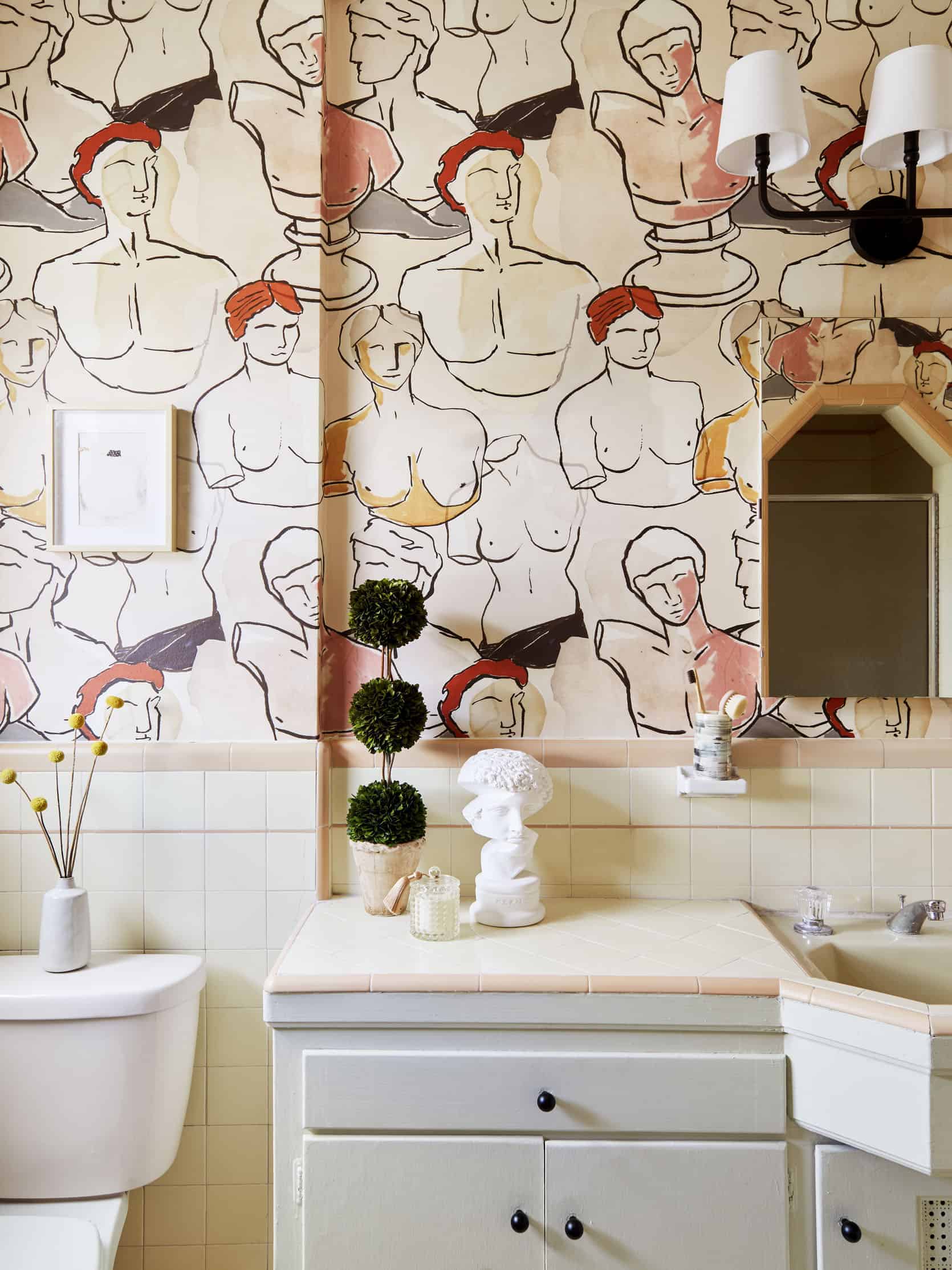
I wallpapered my bathroom first, and it was a great way to gauge my tolerance – I learned that I can handle an “out-there” pattern, I love a graphic print, and I was also awed by its transformational powers! (Who knew that gluing some stuff to the wall would totally change how I felt about my home?) But if I hadn’t liked it, I still would have been totally fine – I’m not spending 8 hours every day in here. It was a functional space before, and it would have been a functional space after. No harm, no foul! (PS. For what it’s worth, it’s been 3 years and we have no peeling, bubbling, or humidity issues in this bathroom! I open the window and my door when I shower and it’s been totally fine. But I also worked with an incredible installer who took some extra steps, like sanding the walls, so keep that in mind if you’re also eyeing a bathroom!)
What To Think About: If you can shut the door to not have to look at your paper 24/7, go wild! But if you’re working with a more open-concept space, read on.
Tip 2: Keep Your Home Saturation Consistent


This is the one thing that I think I’ve done right (as seen above) and wrong (we’ll get there in a minute!). But first, as a refresher: I live in a long, railroad-style one-bedroom apartment with all of my important spaces located off of one VERY long, and VERY dark hallway.
When I decided to go crazy with the wallpaper, I chose the patterns that I would most enjoy in each room…and to that end, I knocked it out of the park! I still love every selection. Buuuuut I also forgot that I live in a home, not in a discrete series of photos on the internet, and I was left reeling as I tried to figure out how to create a more cohesive sense of flow.
So I just went for it: I slathered the hallway – ceilings and all! – in this rich, green-gray paint from Sherwin-Williams. It wasn’t a perfect color match for any of the papers I’d selected – not that they even shared any similar colors, ha – but it had enough visual weight and depth to balance out each of the strong, bold patterns.

And that’s what I think I got wrong in my living room. I played it too safe! I thought that going a bit more neutral in this room would let those patterns shine, but instead, it feels a little off-balance to me. When I look back into the dining room and kitchen, I’m so excited and energized by the pattern – it feels like me! But I held back a bit in the living room and I think it falls a little flat. If you’re gonna go for it, you REALLY gotta go for it, you know?
There’s hope, though! My boyfriend, Dennis, is moving in later this spring, so we’ve been working on some updates – desk space for both of us, a sectional that we can sprawl on, all that jazz – and I’m so excited to take another stab at making the living room feel like it speaks to the dining room AND kitchen. I’ve realized that those walls draw a lot of attention, so it’s okay to bring in some more colorful or denser pieces! Before, I’d assume they’d be competing with those patterns – but now, I know that a punchier living room will help my entire home feel more harmonious.
What To Think About: What sort of visual weight does your home have? If your furniture is on the leggy, airy side, you might want to consider a wallpaper that’s a bit quieter. If you’re drawn to large, statement-making pieces, you can probably pull off a busier, bolder print! It’s like that old What Not to Wear adage – it doesn’t have to match, but it has to go. You want your wallpaper to blend in with your home, not to be the only thing people notice when they walk into a room.
Tip 3: Remember The Repeat Size


This one should seem obvious, but it’s often forgotten: if you have a big space, consider opting for a wallpaper with a bigger repeat! The two (very sweet) rooms above are pretty large, so Emily and our team opted for mural-style wallpapers which keeps your eye bouncing around.


But like most design “rules,” there are exceptions. On the left, this botanical wallpaper is desaturated and quiet – the small repeat still feels calming and refined. Now, imagine if the wallpaper on the right was scaled down to a similar size. It’d be WAY too busy and chaotic, right? You’d probably be begging for it to end! When it comes to design, scale really IS everything.
What To Think About: Hang your wallpaper sample up on the furthest wall and give it a good look. Can you still see all the detail or color that drew you to this paper in the first place? When you look at the wallpaper’s product rendering online, do any jarring patterns or lines emerge in the negative space? It’s hard to go too big, but you can DEFINITELY go too small.
Tip 4: Keep It Simple To Allow For Future Changes

I’ll be real: I’m jealous of Em’s ticking stripe wallpaper! Because she picked this timeless, almost-neutral print, she’ll easily be able to swap art around, try out new color schemes, and play with her design. I didn’t even consider a simpler pattern in my home, but it’s meant that choosing art, furniture, and accessories is WAY more difficult than I’d anticipated. (“Duh,” said everyone.)

I love that Em’s ticking stripe still adds depth and interest and pattern, but it’s also an AWESOME backdrop for whatever she wants her home to look like! In my home, the wallpaper will continue to dictate the design for the remainder of my tenancy. But in Em’s home, she’s the boss.
I’ll be real: when I move into a new spot, I’ll absolutely be wallpapering again – but I’ll be leaving the loud prints for rooms with closed doors and the timeless patterns for the main areas. That said, I’ll only be in my thirties in LA once, and I’m SO GLAD that I really went for it this time around. I’ll always remember this little funhouse apartment SO fondly, and that’s because it’s color-drenched and cheery.
What To Think About: What kind of designer are you? Are you constantly swapping art and accessories, or are you more of an “it’s finished, and I’m not touching it again for a long time” type? If you love to shake it up, consider a more neutral backdrop. If you’re a one-and-done type, consider going for something a little bolder! In my case, I think I’ll be eyeing something more quiet and tonal – I still want color and pattern, but I think it’d be easier to change things up frequently when I have a little less color and pattern.
Tip 5: You Can’t Go Wrong With A Classic


What do these three spaces have in common? They’re all using an iconic pattern! The added bonus? If you’re ever in a design rut, you can search for TONS of great inspiration on Pinterest. Take a peek at your own boards – have you pinned the same wallpaper several times? Are designers using it in different spaces and in different ways? If so, you may have just found your next new wallcovering!
What To Think About: What kind of classic are you? Are you a Martinique, a la Blanche Devereaux? Are you a Raphael, like Emily and Sarah above? There are tons of classic prints out there that fit each architectural and design style – and you know they’re good because we’ve been raving about them for decades!
Well…I hope that helps a bit! (And if you’re on the hunt for any more wallpaper inspiration, I pin a ton of awesome spaces – from all styles and eras! – on this catch-all Pinterest board.) Please drop any questions or tips in the comments – I’d love to hear what you think, too. LET’S CHAT? xx
Opening Image Credits: Design by Caitlin Higgins (me!) | Styled by Emily Bowser | Photo by Sara Ligorria-Tramp | From: The Reveal We’ve All Been Waiting For! Caitlin’s Mostly Thrifted, Postmodern Regency Deco Living Room
THIS POST WAS ORIGINALLY PUBLISHED HERE.
