I like our living room, but it’s not there yet and that’s okay – I’m trying to enjoy the process of tweaking and I still LOVE being in it. I still know what I would do if I could snap my fingers (take the paneling up to the ceiling and repaint a warmer white) but that’s a really expensive and disruptive change and no one else seems to agree with me, so fine, whatever it’s staying like that for now. So one thing I’ve been fantasizing about is painting the fireplace a more grounding color – just something to contrast, pull your eye over there, be more of a focal point and make you smile, etc. I saw on Sarah Sherman Samuel’s IG stories a while ago a blue brick fireplace with the most beautiful color variation and texture and she told me it was lime-washed so I quickly ordered some samples and Gretchen and I whipped up some painted visuals.
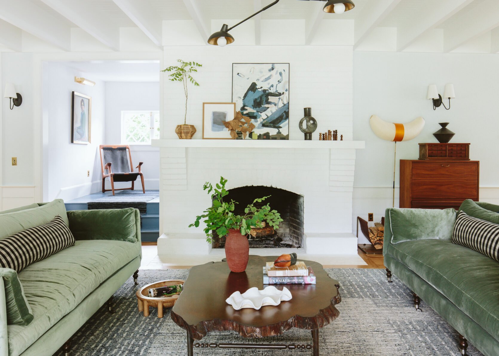
She’s a pretty fireplace, but could it be a bit better? I don’t know! When I look at it here I like how simple and calm it is! Let’s see…

Regardless, it seems like a good opportunity to play around, and show you some pretty lime wash colors even if we decide not to do it…
So I ordered a ton from Portola Paints (non-spon) and we took it all to Kaitlin’s new studio (which we love) and got to work.

We used watercolor paper (thick, matte) and labeled each one on the back before we started painting.


Portola told us to do a back-and-forth, cross-hatch brush stroke. It was obviously super easy and fast (the samples were $10 so I don’t suggest buying this many but for content purposes, we thought would be fun).


I chose mostly blues, greens, neutrals, and a few warmer clay/rose tones…

I was really hoping that the right one would just pop immediately. We loved almost all of the colors for different reasons…

The colors really came to life during the second coat…


They are all so pretty!!! So the next day we hung them up on the fireplace.

Now, what you have to remember is that the stairs are blue (Smoky Blue by Sherwin-Williams) and while I could repaint them, which honestly wouldn’t be hard, I don’t really want to. And then remember that the kitchen tile is right to the right (a really light denim-y blue). So sure, I have my favorite colors, but are they right for the room???

Brian happened to be home and wanted to weigh in (quite the treat). We both were VERY into the dark green but it’s basically just a slightly darker version of the sofa color. Is it too matchy?? Maybe!!!

I love the blue too, obviously, but we have so much blue in here that is it overkill?

I narrowed it down to this pretty soft mauve, medium blue, and darker green. I wish the green were darker TBH.

So Gretchen mocked them all up to show me, including some mantel options. I don’t want the mantle to pop with a lot of contrast, but I have thought about doing a Scandi-inspired painted stencil, cladding it with the same brick and painting it the same color, or even finding a dope tonal high gloss square tile, almost like a tile border. But it’s really fun to see what Gretchen did. Here you go:
Dark Green

Nope. Y’all, I don’t think I love a strong mantel that breaks up the brick. I want it to be more tonal – either match it or play with texture (like a high gloss accent tile).

Nope. Fun to see, but I do not enjoy that strong white…

It’s a lot of green, but it’s a pretty green?? It’s about 3 shades darker than the sofas. I like a cohesive color palette (for my home, I love random and unexpected colors in others – it’s a mental thing). But I don’t know. It’s not a “hell yes”.
A Denim-y Blue

Sure. I love this except that the blue stairs to the left and the blue tile to the right (in the kitchen) = a lot of blue.

I don’t mind the black mantel here as much, but still not motivated to do it.

A Light Mauvey Neutral

Well, this looks sad. I don’t think it is in person, but this looks flat and boring.

It’s better with a tonal mantel, but it’s certainly not coming to life. Of course, we’d add art, something that really pops, but y’all, I thought I would love this way more.
A Darker Indigo

I thought for sure I’d love this dark indigo, but it’s just huge and heavy. Now, this could be because there is no movement or color variation (which is a rendering thing). But more importantly, I think it’s just too big to be this dark. What I have to remind myself constantly is that what you see on a small swatch card isn’t a good tell because it’s so much MORE on a larger area. Like exponentially so.
A Darker Mauve
I nixed this early on – the pink with the green maybe felt like too many mid-tone pastel colors (great for Easter!) but as I was writing this post I reconsidered it and asked Gretchen to Photoshop it real quick.

This is not a “hell yes,” but it’s not a no!! I’m interested in exploring this color more. Again, with these renders you don’t get the pretty soft mauvey texture of the lime wash paint. It does have an earthy element that might reference the original brick (that was painted over decades ago). And if you are wondering if I wish it were just pretty aged terracotta brick, the answer is YEP. Is that an option? SURE. I mean, it would have to be faux’d and would need to be the thin pieces, but bricking over this is wayyyy more work and dough than just painting (which Gretchen and I were going to do ourselves).
Y’all. I’m not stressed AT ALL, but there is no clear obvious YES. There would be if I hadn’t made so many other choices first (like the green sofas, the blue stair paint, the blue tile). I have been acting like a psychopath walking past it from different directions, during different times of the day staring at them all, and waiting for confirmation. So as of now, I’m open to all ideas and we MIGHT just try one (the gallons are $80 and it’s a day of fun) and live with a color and see how we feel. xx
*Photos by Kaitlin Green
THIS POST WAS ORIGINALLY PUBLISHED HERE.
