There is a “fantasy” period while planning a remodel – this happens at the beginning when you haven’t fully comprehended what the ultimate cost is going to be (or maybe as you renovate inflation hits and ruins your “budget” anyway). It’s so easy to think/hope/wish anything is possible, which becomes even more challenging because of the “idea inundation” of the internet (i.e. so many good ideas out there, which ones do I want to do?? What if we did that? Could we do that?). So today I’m showing you some of our more fantasy ideas for our home that we did with ARCIFORM and then eventually nixed, mostly due to budget or major changes that made it impossible to execute. Let’s just say a glass ceiling was involved…
The Kitchen With The Walk Through Apothocary Pantry
What you are seeing here is the kitchen moved into the now living room with a walk-through apothecary cabinet wall into the pantry/mudroom (the glass cabinets with shelving in that light wood). We were SET on this plan until many of you readers pointed out the obvious: “If you want more natural light in the living room (with the best coming from behind the range wall) then open it UP!” There were definitely layout issues with this version, too. The kitchen would be dividing the LR in 1/2 with the fireplace not in the middle of the room so trying to layout our furniture was a massive challenge to me. But I LOVED the idea of that walk-through apothecary.

Anne designed the walk-through from the pantry (with that library ladder) which was the old kitchen (at the time we tried to keep it). Anne had such creative ideas!!! But ultimately we nixed it all and we love how it turned out.

Anne from ARCIFORM was so invested in making this work. This would have made the pantry/mudroom really big (on the left) with these gorgeous walk-through doors with glass (likely a $10-12k unit on its own). I loved the interior windows so much and that symmetry is so perfect. Ultimately, when sitting in this room I truly can’t imagine it being cut in half by the island. We really do use our living room – both sofas, so much. Maybe not all day every day but we have people over enough that having it shoved to one side to accommodate for the kitchen might have been a regret.
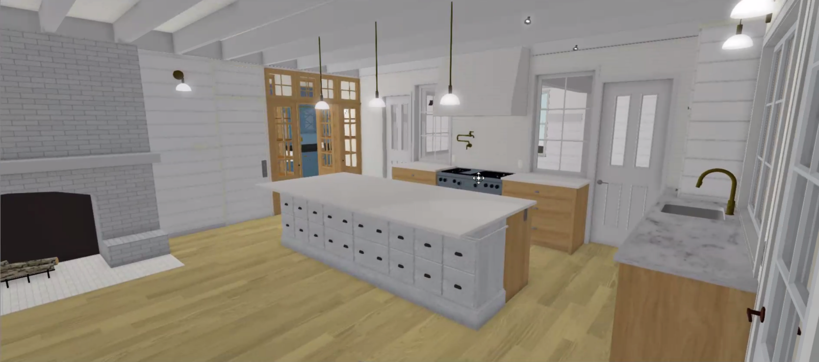
How It Actually Turned Out


While the living room is indeed large, now that we have it laid out with two facing sofas and a big chair it feels GREAT. We love the size and 10 grownups can hang out easily in here (and we do). And yes, it is so light in here because of the kitchen (and sunroom) but it wouldn’t have been without moving the kitchen back and letting that sun flood in.
The Cabinet Filled Entry

At one point I wanted to put in a wall of cabinetry here for front entry storage. Boy, am I glad I got talked out of that. Little did we know that we would NEVER come through that door and if we had it would be for guests and we’d likely want them to look at something like beautiful art – not a wall of cabinets. This was me reacting to the mountain house (where we were living at the time) not having a front door coat or shoe storage situation. This also would have been more expensive than drywall, obviously (like $3-5k). We are still looking for a nice standing coat rack for the rare occasion that guests come over through this door (our kitchen door is the closest to the cars, soooo…)
What We Actually Did: The Entry

Instead, we wallpapered, hung art, and kept it easy. It’s such a pretty entry and I’m so glad that I didn’t insist on those cabinets. And while we do have room for a hook, or four, I know that it would just collect coats that otherwise should be put in the coat closet in the big mudroom.
The Built-In Laundry Hamper Wall

For a while, we were going to create this awesome shaker cabinet unit in the kid’s bath with a shoot into the upstairs laundry room. You would essentially put your laundry into the bathroom on this side and then BOOM it’s on the other side in the laundry room (in a hamper or a built-in cabinet. I think this was a genius idea.


Now the reason we didn’t do this was two-fold:
- We turned that future laundry room into a guest bath (this one), so this laundry room doesn’t even really exist (we put in a laundry closet instead with just a washer/dryer).
- We needed to cut budget and any type of custom built-ins are CRAZY expensive so we had a big old slashing day where we slashed and slashed and slashed. While I loved these for their shaker reference, it just wasn’t necessary.
The Upstairs Guest Balcony

This one really cracks me up. Again, we were in the “dreaming up” phase and not wanting to miss opportunities that we would later regret. Since we were adding this sunroom, someone (I think Brian this time) threw out the idea of a patio on top. And THEN someone (Brian again) said to add natural light we could do a glass ceiling? And for some reason, all of us were so enthusiastic about this! Like we went as far as to reach out to see how a glass ceiling works. Then the following questions arose:
Who is going out on this patio? Our kids? Well, that doesn’t seem too safe. Our guests? Why are we giving our guests their own balcony? We have an abundance of outdoor places to sit. If it’s glass, then if we put furniture or rug on it that would be super weird when you are sitting downstairs in the sunroom. Also what if someone wears a dress?

It just became one of those ideas that stopped making sense in ONE SECOND, but not before Anne was nice enough to do the renders for it. Also please note that the primary bathroom was at one point where our mudroom is and I don’t remember why we moved it. And aren’t you so glad that we did a covered porch along the whole back? In case you need a reminder, here is how it looks now (and I can’t wait to shoot it again after the plants explode, summer #2 is going to be so pretty!!). Back porch decor coming sooooonnnn…

Renovating is wild, y’all. So grateful to get to do it and so glad the main house is done. xx
Opening Image Credits: Design by Emily Henderson and ARCIFORM | Photo by Kaitlin Green | From: The Farmhouse Kitchen Reveal
THIS POST WAS ORIGINALLY PUBLISHED HERE.
