A tiled fireplace is (hopefully) a “live with forever” design element – she’s a permanent lady. So today I’m going to walk you through what we learned about this whole process – You’d think that you just frame it out, drywall, and slap tile on top of it, but there are decisions that you have to make to ensure it looks well executed. LET’S GO.
Wait, Where Are We In The House?
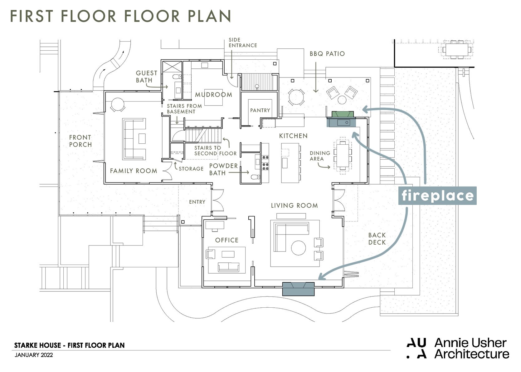
We built two different tiled fireplaces – one in the living room and one in the dining room. The dining room was meant to be an indoor-outdoor fireplace, shared with the kitchen/bbq patio, but for whatever reason it ended up being a normal fireplace backed up to another normal fireplace (IDK all the whys of these decisions as I wasn’t as heavily involved).
So Many Decisions – Starting With Location And Size

Once again we went through the conundrum of where to put the TV and fireplace in the living room (which is a very casual family room as well) and the collective choice, was to put the TV on the fireplace, flanked by windows. I was for this plan so as to not have dueling focal points. My brother wanted a big TV, visible from the kitchen as well, and this layout made sense. Annie, the architect, drew it up and laid it out. Max flanked it with benches, and while it will be painful to put a TV on this beautiful tile, for functional reasons we stand by this being a great choice for the overall design of the first floor, especially considering the layout and flow that’s the best for their family (sports are a real thing here and I know they aren’t alone).
Size and Scale

While this tiled fireplace was meant to go floor to ceiling we obviously explored stopping it and having it be drywall above, or giving it a mantle. Ultimately, the decision was to make it a statement/focal point and give it a bench. The firebox sits about 17″ from the ground, butting up to the surface of the hearth/bench. It’s bordered with about 26″ of tile on either side. The outlet for the TV sits about 80″ up from the ground.
A Fun Max Mockup…

At one point we had chosen the green tile here (literally no clue why we changed to black, I think someone’s color comfort level felt challenged?). Max did this mockup (he was pushing for grids on the windows and walls being paneled, which we didn’t end up doing). His Bachelor in Paradise photos in the render cracked us all up.

Now I’m obviously not going to get into how they framed it all out – this wasn’t DIY’d and our awesome contractor, JP of Sierra Custom Construction managed the subs to execute it perfectly. But essentially it was framed, wired for a Frame TV to be able to hang on it without cords, the firebox was inserted and then everything was drywalled.


In case you are wondering, Ken also built an in-wall sound system behind the drywall (all so new to me and again, I wasn’t involved) which seems both smart and makes me nervous (high tech in a house always makes me hesitant). And FYI we kept extra tile in case any future owner doesn’t want the TV on the fireplace – they’d have to do some tile repair work but it’s doable to hide the wires.
Hearth And Bench Decisions

We knew that we’d flank the fireplace with benches but figuring out how to end them into the fireplaces was the question. Do we build a hearth that the benches die into? Do we take the tile to the floor? Put the firebox closer to the floor? We ended up choosing to add a hearth that sits proud of the bench (“proud” is a fancy word that means “sticks out further”:)). And our stone installer had to make sure that the two integrated really seamlessly.
Time To Choose Tile

You know what the tile is at this point but let’s back up. Max and I chose the tile with my brother and SIL together, which is admittedly a lot of cooks in the Ann Sacks tile kitchen. Some of the time we were making VERY different meals, LOL, but other times we all chose the exact same tile (winner, winner). This black tile was one of them. While it could have been a color, we all knew that no one would get sick of this powerful black fireplace with this incredible texture.
A Note From Max: We knew the fireplace in the living room was a focal point. It’s floor to ceiling, and it had to serve a couple of functions: being the fireplace, of course, and being the TV-watching wall. Generally, when I do TVs on fireplaces, I go with a dark tile, so when the TV is off, it’s a black box on a dark wall rather than a really contrasty dark box on a light wall; it sort of just fades away and doesn’t call attention to itself. As a TV watcher myself in the golden age of television, I also don’t try to hide TVs, but it’s my job to make them look as nice as possible. With this specific fireplace, we wanted a large format tile because there’s a tall ceiling. It wasn’t so interesting that Katie and Ken would get sick of it, yet it’s still interesting. That narrowed things down to a texturey geometric tile. I love the Ann Sacks-made collection (MADE collections means made in Portland) because of its handmade quality and how each tile is a little bit different by the nature of all things handmade. The peak and valley pattern has an almost landscape vibe, and the vertical lines draw your eyes up. The finish is a matte finish with a lot of depth to it.


This tile from Ann Sacks has such an incredible texture and dimension – the light catches it and creates a reflective pattern.
And the Winners Are…


As you can see we went with the chalkboard matte Modern Field Tile, in Peaks and Valleys, from Ann Sacks. It’s so beautiful and powerful in person. Just three design enthusiasts holding pretty tile (that’s Annie Usher, the architect on the left, then Max then me :))
The Dining Room Fireplace Tile…

The dining room fireplace tile is definitely on the subtle side for me, and it looks awesome and so appropriate for this house. Again, the view out the dining windows is all green and blue from the trees and river, so this fireplace is meant to ground the corner and add texture and dimension (and heat, vibe) but is not meant to be the wow factor here, the view is.
Grout Color And Size

1. Pewter | 2. Dove Gray | 3. Chateau | 4. Delorean Gray
The black fireplace was easy for grout- we didn’t want to add any more lines, ensuring that the tile was what your eye saw (not the grout lines). So we chose the darkest black – EASY PEEZY. But this tile was a lot trickier. Too dark would make it look like a super graphic grid, but too light and you lose the whole thing. We ended up going with #4 (bottom right) called Delorean Gray by Custom Building Products and went with a 1/8th grout line (basically the thinnest you can get without butting them up against each other).
To Stack Or Stagger?

For this house, we mostly stacked (you’ll see one stagger at some point). My philosophy is the same as using quartz – that in a midcentury, post-modern, or contemporary house you can stack OR stagger (I like stagger in more traditional homes) but if you have a vintage home or a more traditional style house then a stagger is great. I will say that staggering is way more forgiving because the vertical grout lines can look random which means that you can cut off a tile on either side if you need to.
The Pitfall To Avoid With Stacking

Ok, so one thing we had to troubleshoot was making sure that the tile fit perfectly across the front without cutting any off awkwardly on the side. These are the details that many people won’t notice, but take the design next level. You’d think it was just math (and it is) but until you know the exact grout size it can be hard to execute on paper – there are variables that you might not be able to account for. So you need to think about it twice: once in the drawing stage and once when it’s framed. We realized that we would be a couple of inches short so before they drywalled they furred out the framing to make sure that these corner pieces would fit perfectly, no tile would be smaller.
How To End The Tile On The Corners

Ok, so you have a few different options to finish off a corner:
1. a trim piece like a pencil trim
2. A finished edge on one side so that the non-finished edge dies into the glazed/finished edge
3. a mitered edge, where they cut both tiles on a 45-degree angle – which can’t be done with a lot of types of tile, TBH due to fragility and what they are made out of
4. adding a metal Schluter (a thin piece that goes under one side of the tile and looks finished off)
5. Order corner piece tiles like we did from Ann Sacks – truly a luxury of ordering from them as this is something they offer but many tile manufacturers don’t. In-person, this detail slays.

The same rule applies to the interior of the firebox. We did a corner piece for this fireplace and a black Schluter for the living room fireplace (which you can barely see).
Choosing Stone For The Bench


You have to design it all at once on paper beforehand obviously, and we chose flanking benches and a larger hearth made of stone that matched the tile. Of course, we thought about making the hearth all tile but didn’t like the idea of it being on the flat/seat part of the hearth because the tile is 3D (not flat), and integrating stone on top felt more complicated than necessary so we waterfalled the stone on the top and front of the new hearth for a cleaner look. We chose Caesarstone Black Tempal which looked really organic and has some movement to it (and we have it in other areas of the house so we could use part of those slabs).

For the dining room, we continued the wood bench around the fireplace to look integrated, and yes this is fine for this particular firebox since it’s a direct vent and has glass.
How They Look Right Now

Y’all. They are so pretty. Simple, striking, and timeless IMHO. Obviously, for this entire house we went with more of a textural story, bringing in color in the furniture and decor. The light hitting the fireplace is just so pretty and understated yet super striking. As a reminder, this tile is the Modern Field Tile from Ann Sacks and does come in many colors and glosses.


Dining Room

The dining fireplace turned out so pretty with the wood and view/light – it’s all so soothing and calm but feels really beautifully executed. The texture of the fireplace feels really elevated and rich, yet subtle.

I feel like what I learned the most is that elements like this need to be thought about very closely twice – once in the rendering and square footage/ordering process and then again in the field once everything is framed and you have the tile on hand. Could a different designer choose the grout color before seeing the tile installed? Maybe. But I promise seeing the house coming together and experiencing a space changes a lot of those smaller decisions – decisions that do make a difference. I’m so happy with how both of these turned out and a big kudos to Annie, Max, and JP for the execution.
Architect: Annie Usher
Interior Designers: Emily Henderson and Max Humphrey
Contractor: JP Macy of Sierra Custom Construction
*Photos by Kaitlin Green
THIS POST WAS ORIGINALLY PUBLISHED HERE.
