The year was 2004. My parents were remodeling the circa 1990s kitchen in my childhood home, complete with honey oak cabinets and beige tile countertops (originally a peach Formica). Many trips through IKEA and unnamed kitchen showrooms later, my parents declared my idea of going for a (gasp) white kitchen as unfit for their design aesthetic—”White kitchens will never catch on,” said my mom—and went the way of the penultimate in early aughts sophistication: cherry wood Shaker fronts, black veined granite, 1-inch square multi-color glass tile backsplash. Surely, this would always be a classic, yeah? Well…we all know how that story unfolds (did someone say “white kitchen”?).
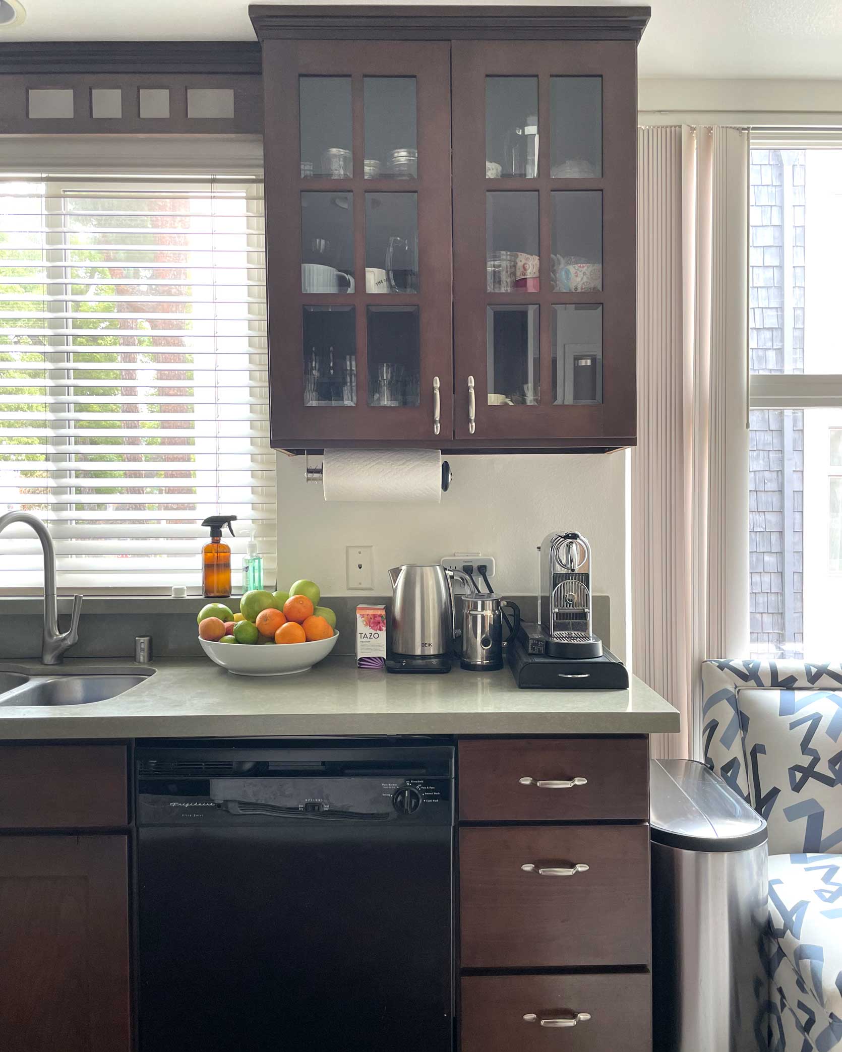
Fast-forward to 2023, where I find myself face-to-face with a blast from a not-so-welcomed design past. You guessed it, folks (probably because you read this post’s title): The cabinets in my new home’s kitchen are cherry. And while there’s nothing inherently wrong with the space—it’s fairly large, it has a good layout for workflow, it gets nice light and has a breakfast nook—it’s really just not my style. Mostly, it’s pretty devoid of character, uninspiring, and pretty 2004.
If any of this sounds familiar and you’ve been battling with what to do in your dated space, whether you rent or own, I’m here to hold your hand and walk us both gently into the great kitchen refresh we all deserve. While this is my journey, and the design ideas I’ve landed on may not work for you specifically, I hope you may be able to pull some inspiration for yourself if needed from how I’m bringing the room closer to “good” and “stylish” and “charming”…all those things we all want our homes to be.
At first, I thought of doing by far the easiest and most cost-effective thing: That is to do ::drum roll:: …………. nothing. Charles would be perfectly content if we went this route. In fact, I’m fairly certain he has no clue I’m even writing this post or talking about any projects in this space apart from window treatments and finding a table and chairs. If he heard me even utter the words “peel-and-stick” floors OR backsplash—or worst yet…armoire/china cabinet—well, I’m not sure what the state of our marriage would look like. And then he’d ask how much it was all going to cost (totally fair).
While the $0-do-nothing plan is enticing, as soon as I started envisioning what it could look like with just a small investment and a few weekends’ worth of work, I got that little bouncing glow inside of me that happens when a new design project is afoot. And I simply cannot ignore a bouncing glow, now can I? AND NEITHER CAN YOU!
So, let’s get started by taking a look at my space, and then we can chat through some solutions for me, you, and the rest of the stuck-with-cherry brigade out there.
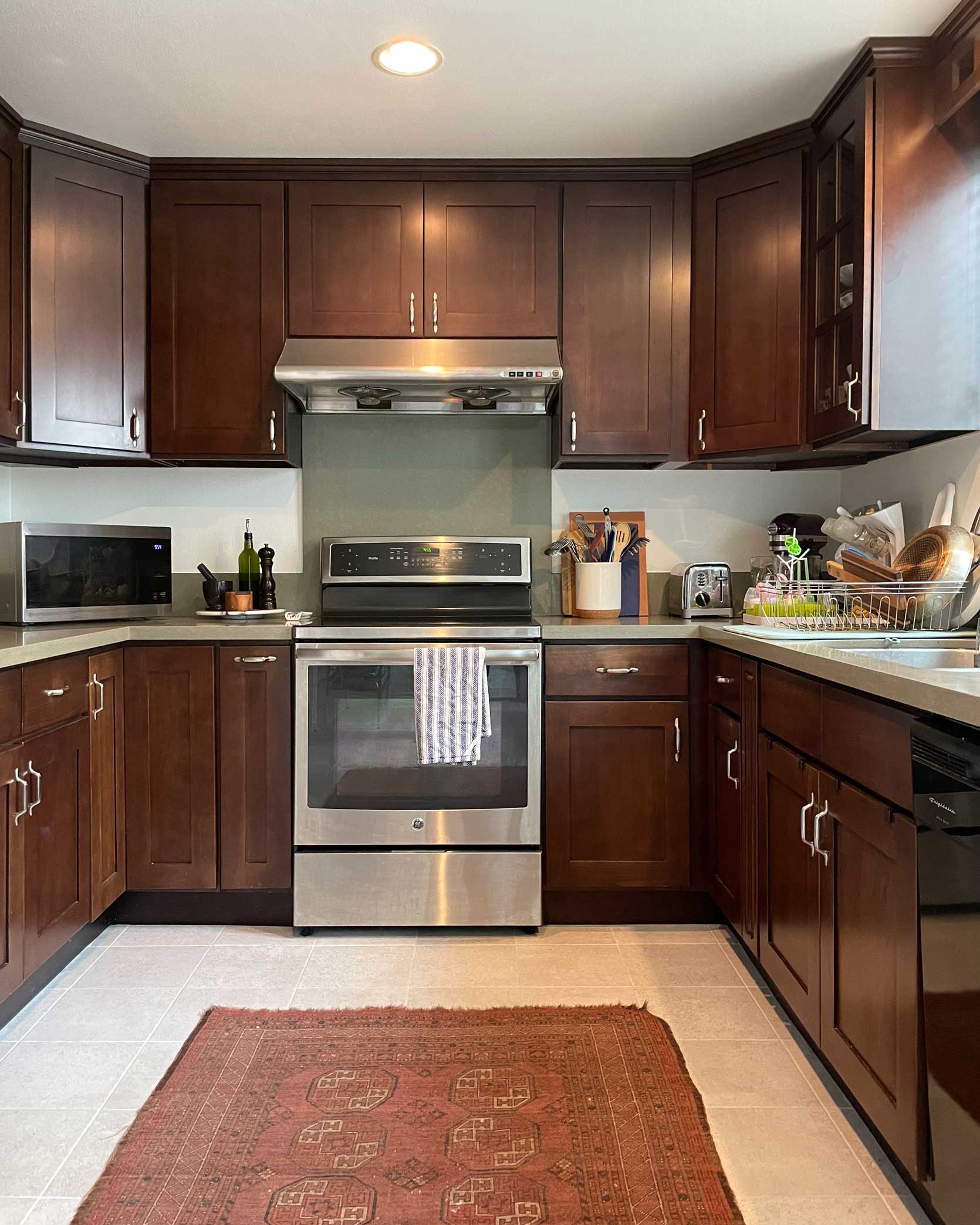
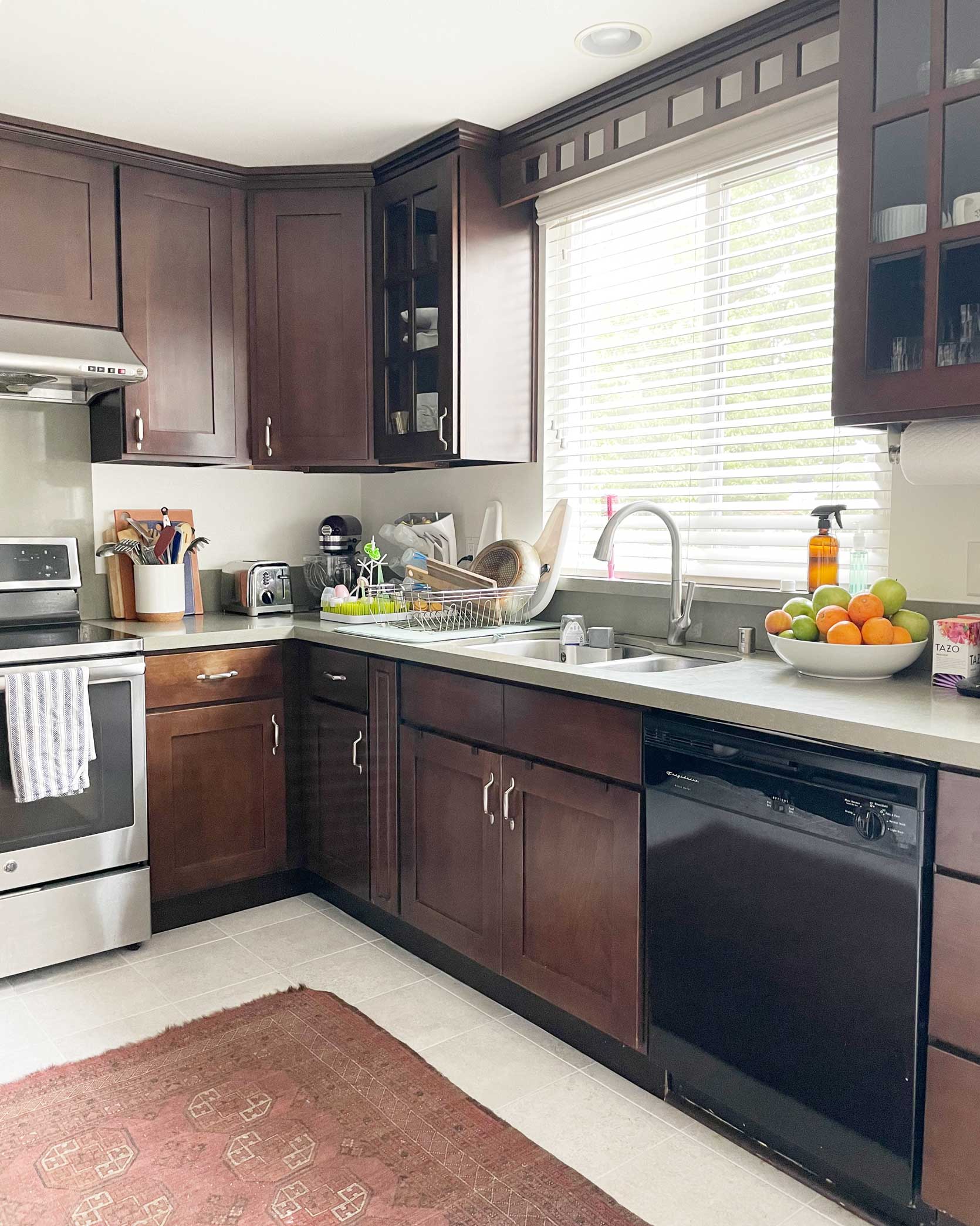
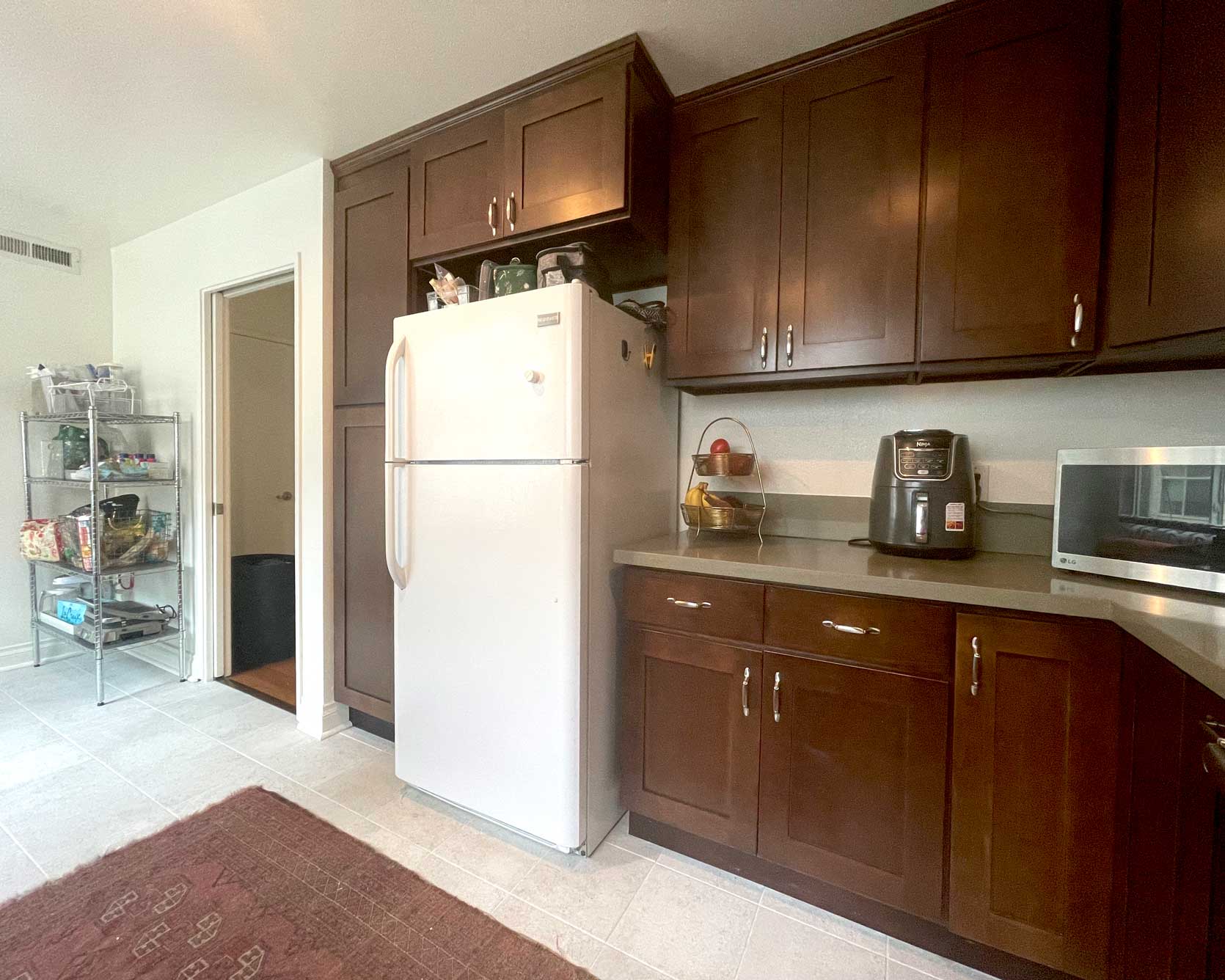
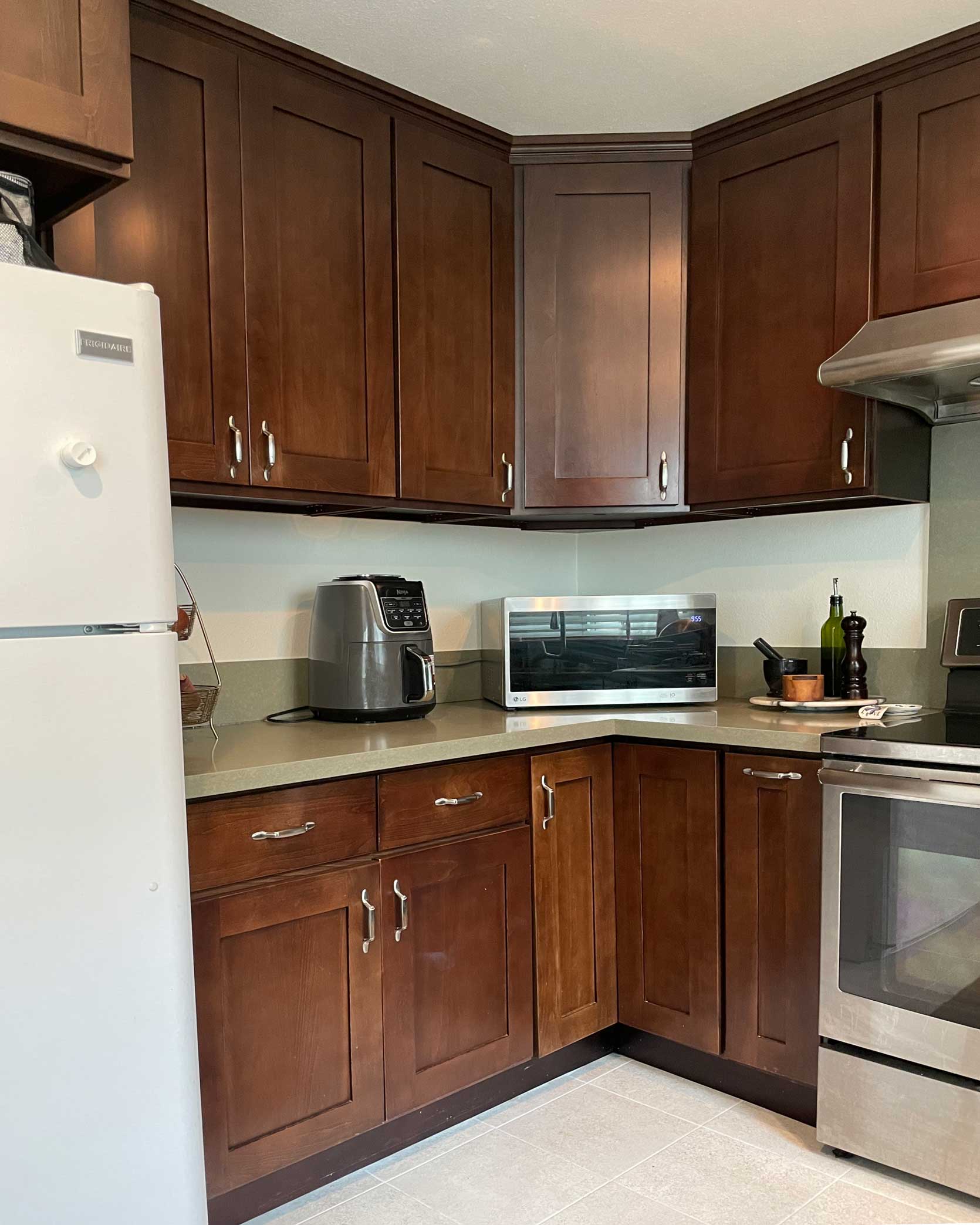
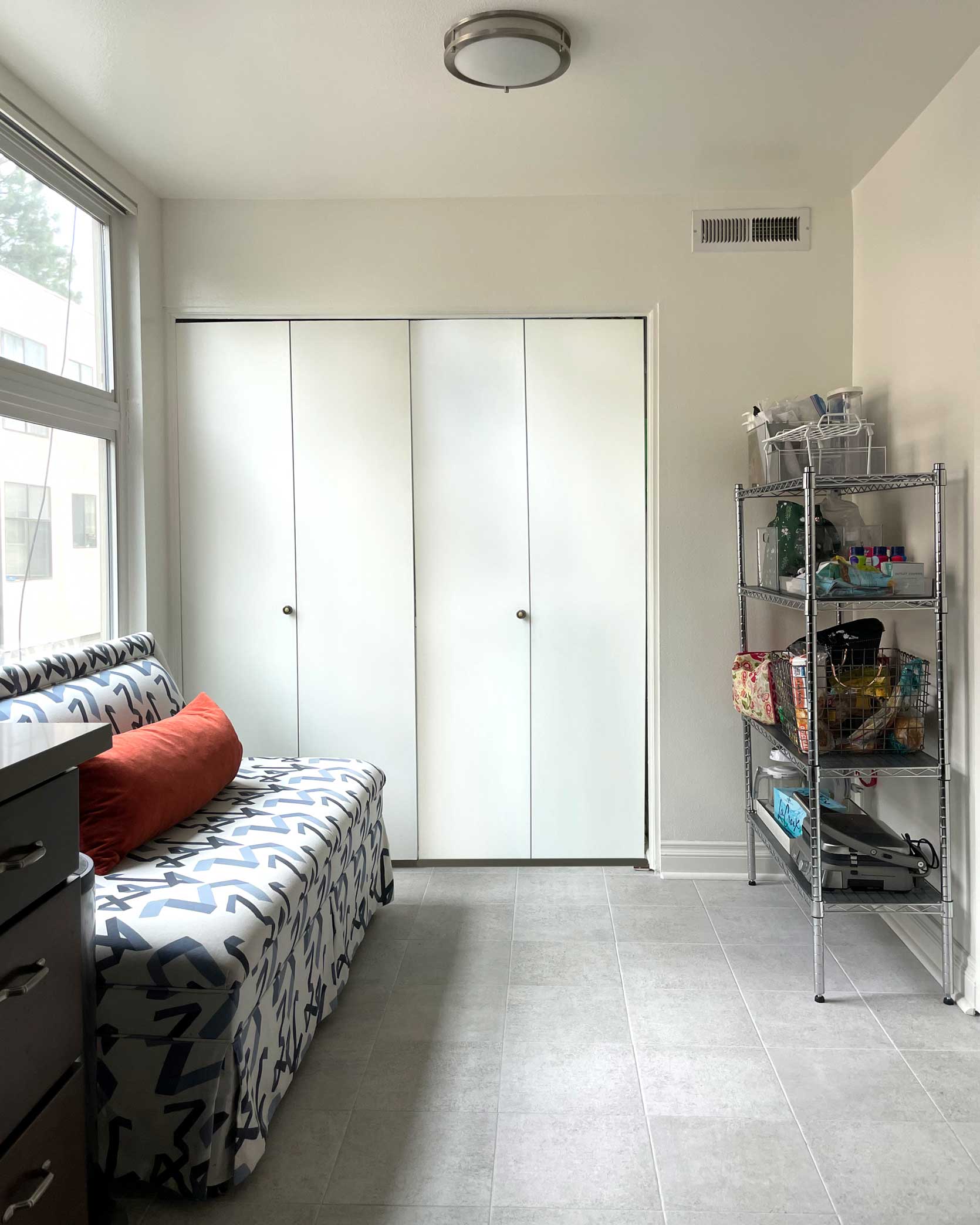
Here we are. Our little rental kitchen. It’s not bad, I know, but it could be better. It says nothing about the people who live here besides “There must be a baby with all those sippy cups” as well as “My goodness, someone here needs to seek help for small appliance addiction.” Nothing a little ingenuity and creative reversible design planning can’t help. Dare I say…I don’t actually hate the wood. While I’d prefer something a bit more toned down and less red, wood cabinetry in general has a ton of style potential.
After doing a good amount of research to see if there was a kitchen design I vibed with that had similar cabinet coloring and finding, well, very little, I started getting creative. I searched for photos of rooms that had mahogany furniture, cherry wood floors, or even just darker-toned wood pieces and studied what they did to tone down the warmth. All the spaces I was drawn to checked the same five boxes:
- Modernized the red by adding natural, neutral wood tones
- Brought down the contrast by going saturated with other colors
- Created a warm, inviting palette
- Changed the focal point with an interesting backsplash, floor, or furnishing
- Added warmth with brass
Let’s explore these ideas a bit, and I can walk you through how I plan to execute them in my own space.
But first…
The Inspiration
In my opinion, the below rooms work to make deeper cherries and mahogany woods feel a bit more classic. Most of the designs are quite “old-world” in feel, which isn’t what I’m going for, personally, but there are still lessons to be pulled from them. In my home, as much as I love the look, it just doesn’t make sense to walk from the fairly contemporary dining room into an English cottage kitchen. It would be style whiplash, so I’ll need to be sure to keep some of the elements a bit more modern, like the shape of the table and chairs, and any soft goods.
This is the closest representation of what I think can be done in my kitchen in terms of aesthetics. Obviously, I will not be painting my uppers, but the designers at Meet West, who reimagined this space, did an amazing job of taking dark stained woodworking and making it feel timeless, inspired and charming.
Queen of modern-yet-charming eclectic English cottage (I made it up, but I think that style applies), Heidi Caillier’s use of the neutral wood tones against the dark stained wood paneling is my muse for the breakfast nook furniture. This marriage does a great job of honoring the richness of the darker wood while modernizing it with blonder tones.
The dusty, French blue here pairs so beautifully with the red tones. I saw this color duo a lot in my hunt for design muses, as well as peacock bluish-green, and, on the opposite spectrum, dusty pinks or peach.
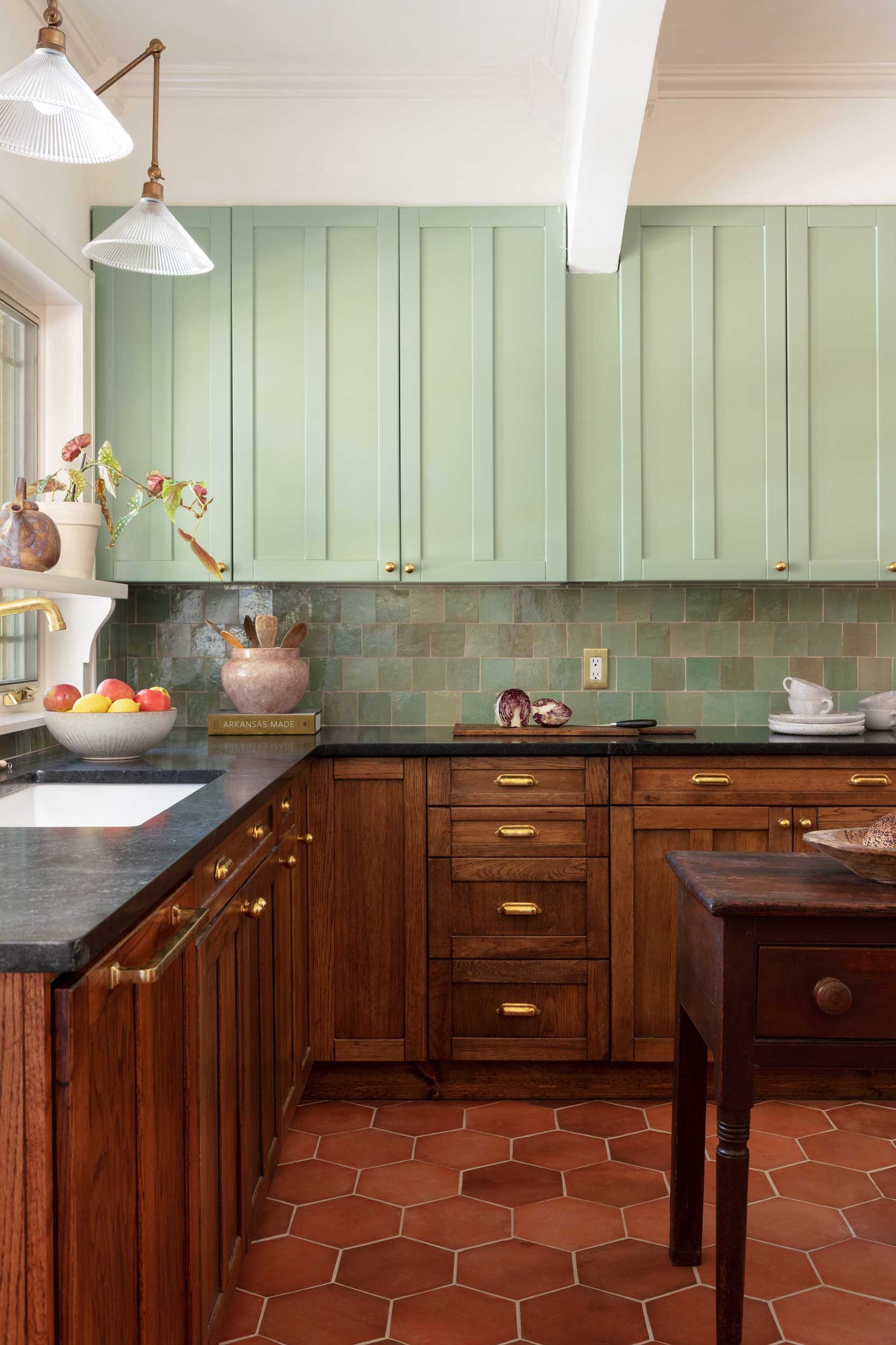
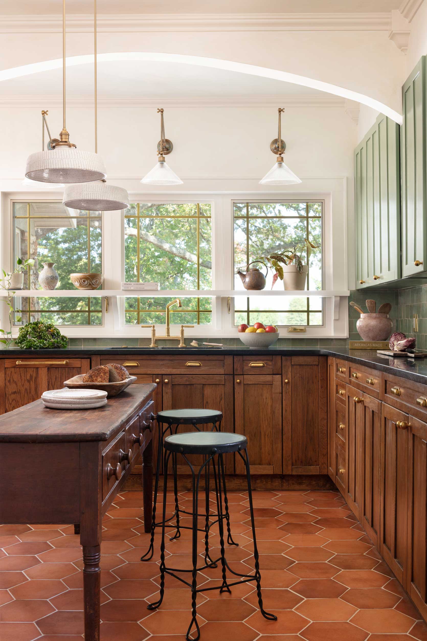
While not exactly “cherry” (okay, not cherry by any means) it’s still a fairly warm cabinet shade and I’m drawn to how the moss green and slate blue makes everything feel grounded, happy, yet timeless.
Okay, finally, let’s get into the plan!
Limit Contrast With A Bold Use Of Color
I don’t actually have a ton of exposed wall space in my kitchen, but leaving them stark white steals the potential charm of warm wood cabinetry. As mentioned, the blueish-greenish-grayish walls of the inspiration spaces (not dissimilar to my old dining room’s Inchyra Blue that I loved so much) may just be the ticket to adding some interest and homeyness here.
In addition, bringing the sage green of the countertops up to fill the space between top and bottom cabinets will visually simplify things. To me, this here feels so choppy. Your eyes have to take in the color of the cabinetry, the color of the backsplash, and the color of the wall in between. At first, I had the idea of just color-matching the counters and painting the white a similar green but now I have a different idea to use peel-and-stick tiles because I think I still wouldn’t have been fully happy with the orange peel texture of the wall juxtaposed with the smooth countertops.
Change The Focal Point
Cherry cabinets are like the protagonist of a play in community theater: it wants all the attention. But here’s a trick to spread the visual love a bit: demote it from the kitchen lead. There are a few ways to do this: make your floors interesting, make your backsplash or walls interesting, make your furniture interesting. In my case, I’m going the floor route because I HATE these tiles. They have a very strange anti-slip texture that I was convinced was powdery residue from the landlord painting the walls with a spray gun. I confidently brought in the floor steamer when we moved in to rid the room of the sensory issue for my feet and, well…I was wrong. It’s just the tile.
As much as I try to avoid bandwagoning on a design trend, I can’t help but think the checkerboard treatment here is a great option. It’ll add a ton of interest underfoot, it’s cheap, and it would work perfectly with my existing tile size (11.75″x11.75″). I’m undecided on color, but there are so many options these days, so I’m sure I’ll find the right combination.
Add Warmth With Brass Hardware
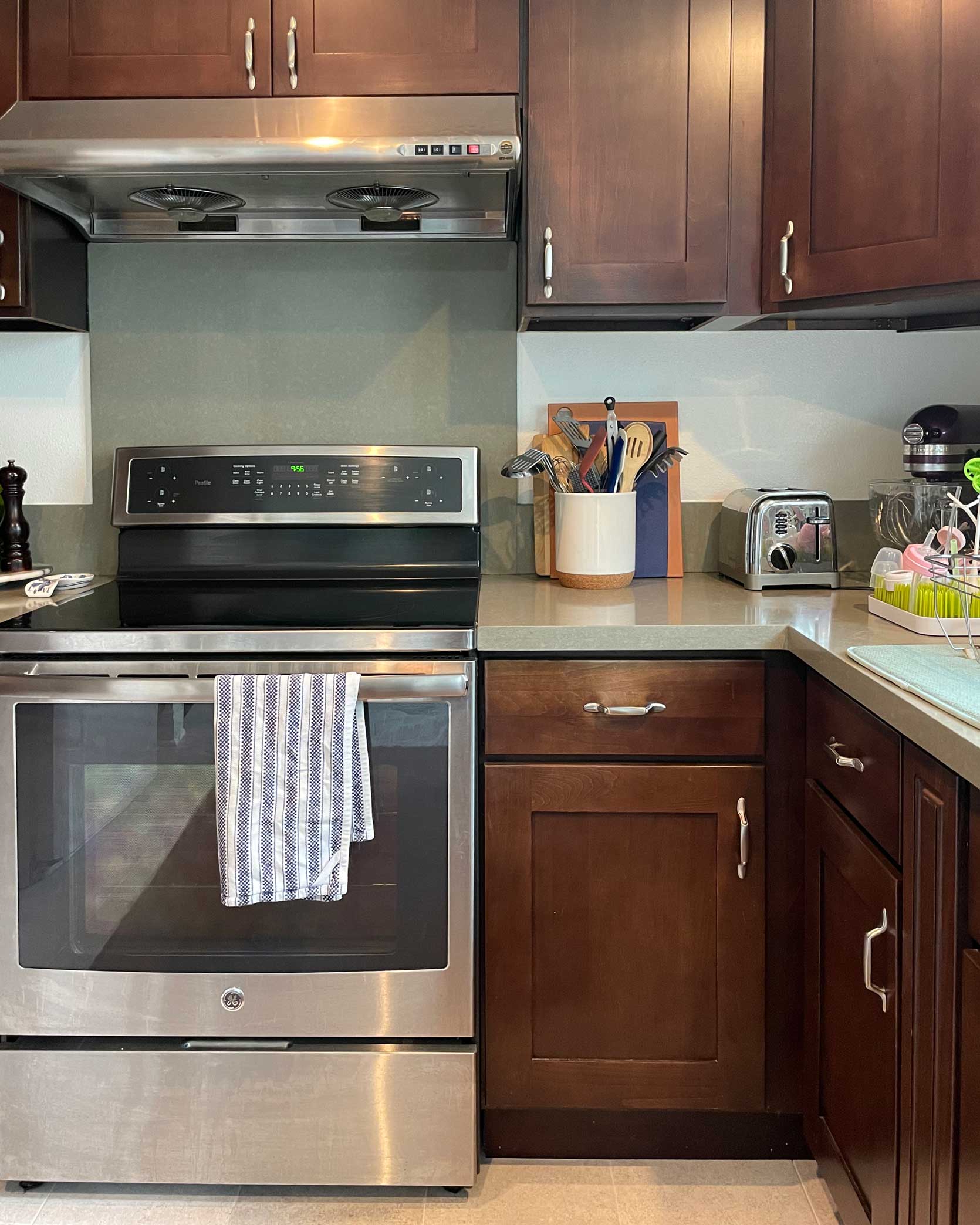
Look, there’s nothing wrong with brushed nickel hardware, as much as Instagram-famous kitchens might make you think otherwise. But in my particular space, I think some brass cabinet pulls in a more modern style will do wonders for updating things. I also love the charm and function that brass rails add, and anytime I see them, my heart pitter-patters a bit.
Because my countertops are currently being eaten by *things*, I also think a rail system will help to bring utensils, produce and prep items up off the surface level to unlock more working space. I found a very affordable option at IKEA I’m pretty pumped about (see moodboard at the end of the post).
Modernize The Red By Adding Natural, Neutral Wood Tones
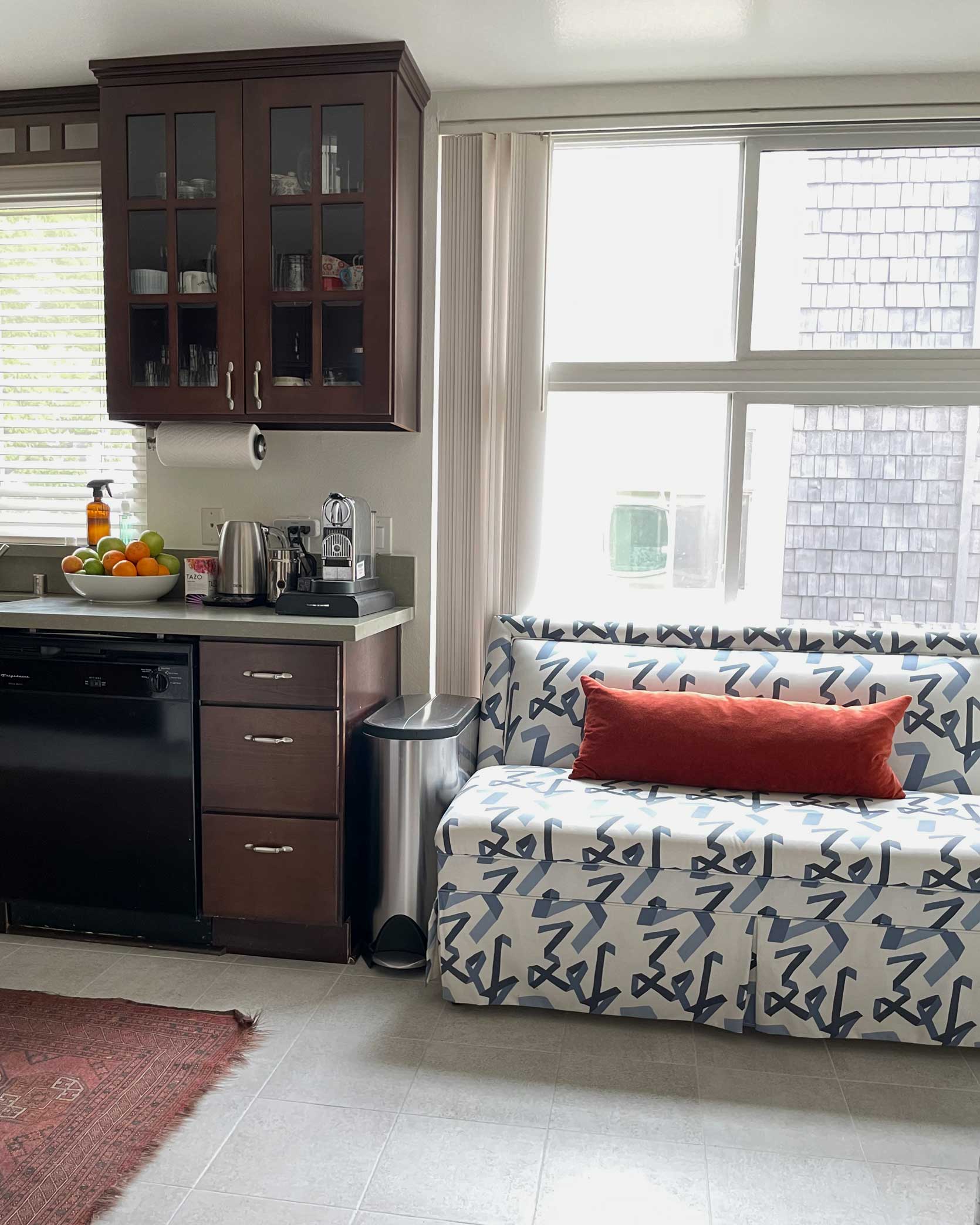
I have long loved the idea of a little eat-in kitchen. A place to sit and sip my coffee in the morning or even plop myself down to work in. From a practical place, I’d really prefer to have my daughter’s high chair here rather than in the dining room for meal times since where she is now is not visible when I’m in the kitchen. So, our plan is to actually have this function as a breakfast (and lunch, and some dinners) nook, which lends the perfect opportunity to bring in some other wood tones.
While I temporarily have my old banquette in here (I was curious if it would fit and look good…it doesn’t, and it doesn’t), I’ll be on the hunt for a lighter-toned wood table and chairs. Possibly something white oak or pine, but the key is to keep the wood tone from going overly orange or red, similar to the example I found from Heidi Callier. Also, sticking to a more monochrome wood look between both table and chairs will simplify the palette.
And since we’re on the topic of simplifying the palette, I’m aiming to find curtains to match the new wall color that will replace the folding doors currently concealing our washer and dryer. That will make it easier to work around furniture since we won’t have to account for the space it takes to open them.
Don’t Let Your Cabinets Be Your Only Touch of Red
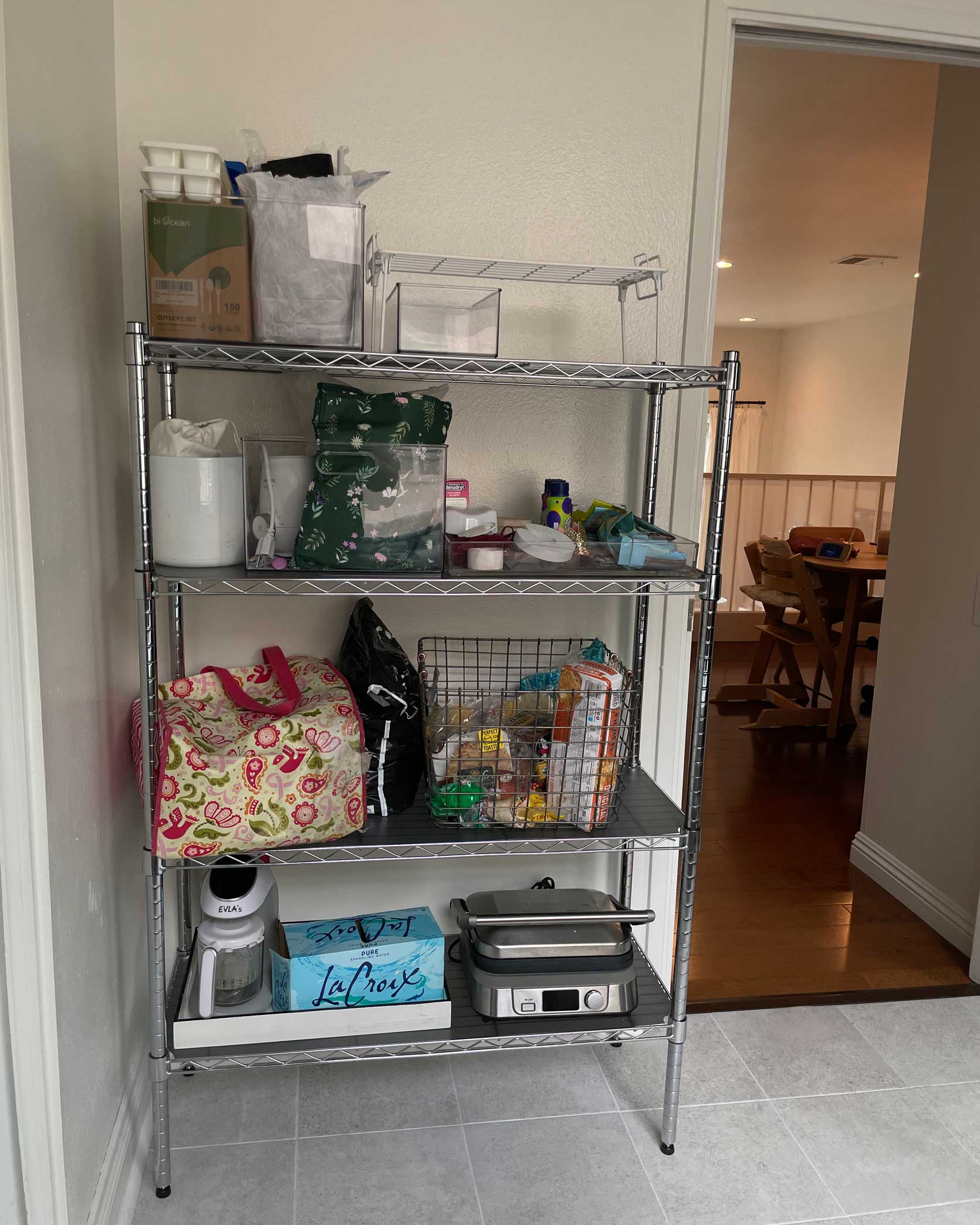
This last tip is a bit less obvious than some of the others, but I think it’s fairly important. Since design is all about balance, adding in a touch of red (either in a brighter hue or slightly different tone) somewhere else in your kitchen will go a long way to completing your color palette. It doesn’t have to be much: maybe some upholstery in a bar stool or the back of a glass cabinet or even just some pretty ceramics. For my space, I plan on achieving this via a burgundy piece I found that will also solve the problem of storing most of my small appliances that are currently scattered all over.
Alright, now that we went through that “how to make cherry modern” lesson, I’m eager to show you the moodboard I’ve put together for my kitchen. It will involve a handful of projects and tasks, which I’ve outlined below:
- Swap out hardware
- Paint walls a blueish-greenish gray to help with contrast
- Install kitchen rail system into new “backsplash” to hold utensils, food prep items, and some produce
- Add peel-and-stick “zellige” tile backsplash
- Swap laundry closet doors for curtains that match the wall color for visual cohesion
- Upgrade floor with reversible peel-and-stick tile
- Bring in cabinet or storage solution for the breakfast nook area to house things I don’t grab constantly but still want regular access to clear counters
- Find light wood table and chairs that are small enough to walk around to access the washer and dryer, but big enough to seat 2 adults and a high chair
The Moodboard & Color Palette
I know my design here won’t work for everyone, but this combination of colors and materials will go a long way to creating an inspiring, more up-to-date kitchen space for my home. Let’s talk through a few things:
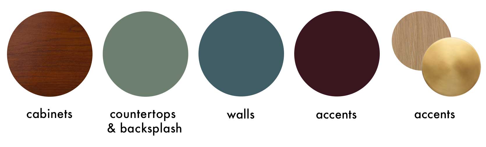
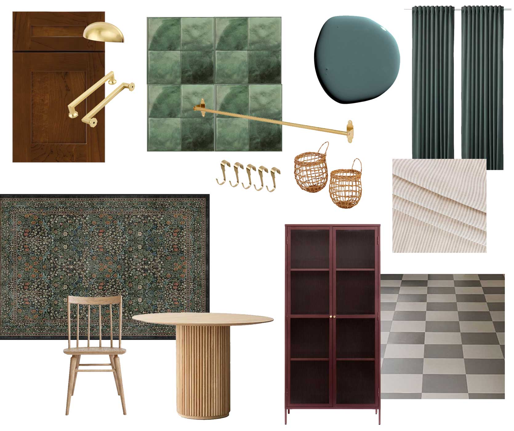
Brass Cup Handle | Brass Bar Cabinet Pull | Green Tile Backsplash | Paint | Curtains | Pinstripe Fabric | Checkerboard Flooring | Brass Rail | Brass Hooks | Wicker Hanging Baskets | Rug | Dining Chair | Dining Table | Burgundy Cabinet
The tile: Believe it or not, those are peel-and-stick made to look like Zellige tiles. They’re a bit glossier than I like, but perhaps I could find a matting spray (or just leave them glossy). I’m undecided if it’s a bit too much square-on-square with a checkerboard floor, so I’m still hunting around for something else. I did find a more vertical “tile” but the color was possibly too yellow. I’ll need to order a sample to really know.
The textiles: The window in the nook is crying out to me to rid it of the broken vertical blinds. If I had shot the space with them closed, you’d see four of the blinds are missing. The window looks like a third grader with a quarter of their front teeth gone. I thought of doing regular drapery here, but I felt it would be too heavy with the laundry closet panels. Plus, I can already see peanut butter hands grabbing at the fabric any chance my tiny human gets. A Roman shade is going to cost a literal fortune to purchase because the window is 70”x75”, so I may try my hand at sewing one with a pretty neutral striped linen. Pray for me.
The cabinet: As mentioned, I need this to replace the wire shelving but also to carry the red through to the other end of the kitchen. Whether I end up with this specific piece or just something I paint, it’ll be a workhorse for much-needed storage.
The table and chairs: The neutral wood moment. I would love a stripped-back vintage table, but I know that’ll make the space feel overly traditional. It needs a modern silhouette to speak the same language as my dining room. The one pictured here comes in a ~32” diameter (as well as 39”) which is just big enough for what we need for daily use, but small enough to walk around and still be able to do laundry. I’ve thought about also making this table because I think it could be quite easy, but then I remember that I have a 15-month-old that requires constant bubble blowing, and think my time would be better spent just throwing money at the problem.
So…that’s what I’m planning to solve my cherry cabinetry woes. I welcome the challenge and hopefully you do now, as well. I’m actually very excited about how this could all look.
Jess, clear your schedule because I’m going to need your help… 🙂
BUT WAIT! Before I go, I just want to say something. For anyone reading this who also read my piece about whether investing in rental homes is a waste of money, I’m still of the mindset that this isn’t for everyone. To be honest, if I didn’t pitch the idea here to rework my space as an example to anyone looking for solutions to a similar kitchen, I might think twice about the time and money I’ll be putting into this room. But the thing is, I spend so much time in here. I want/need it to function better for me, and while I’m at it, look exciting. Everything is highly reversible and mostly damage-free (though if anyone here has had bad experiences with peel-and-stick floors or tiles, could you let me know?). There will be moments in the in-between of starting and finishing that I will 100% regret the decision to do any of this, but when it’s complete, I know I’ll just want to stand in the room and take it all in every single day. I want my daughter to see me making our home our own and putting my passions to work. Watching my mom tinker around my childhood home shaped me greatly.
Stay tuned.
Your friend in design, Arlyn
THIS POST WAS ORIGINALLY PUBLISHED HERE.
